A checkbox and a toggle button give the user the ability to make a choice.
The main property of these controls is the Value property, which returns their state.
These controls usually have two states:
- Checked (the Value property equals True)
- Unchecked (the Value property equals False)
However, they can be configured to allow three alternatives using the TripleState property.
Controlling the visibility of controls
The Visible property controls the visibility of a control. If its value is True, the control is visible, and if it is False, the control is invisible.
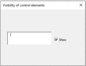
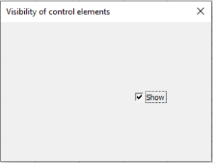
The following example demonstrates how a checkbox can be used to control the visibility of a control (in this case, a text box).
So, create a form and in the code module of the form, type the code.
If the Show checkbox is checked, the text box is displayed; if unchecked, it is hidden.
Controlling the availability of controls for the user
The Enabled property controls the availability of controls for the user.
If the property value is True, the control can receive focus and be accessible to the user.
If the value is False, the control cannot.
The following example shows how a checkbox can be used to control the availability of a control (in this case, a button).
So, create a form and enter the necessary code in the module.
If the Lock checkbox is checked, the Press button is disabled; if unchecked, it is available.

