
One of the simplest statistical calculations you can perform in Excel is correlation. Although simple, it is extremely useful for understanding relationships between two or more variables. Microsoft Excel provides all the tools you need to perform a correlation analysis; you just need to know how to use them.
Basics of Correlation
Correlation is a measure that describes the strength and direction of a relationship between two variables. It is commonly used in statistics, economics, and social sciences for tasks like budgeting, business plans, and more.
The method used to study how closely related variables are is called correlation analysis.
Here are a few examples of strong correlation:
- The number of calories you consume and your weight (positive correlation)
- The outside temperature and your heating bills (negative correlation)
And here are examples of data with weak or no correlation:
- Your cat’s name and its favorite food
- The color of your eyes and your height
One essential thing to understand about correlation is that it shows only how closely two variables are related. However, correlation does not imply causation. Just because changes in one variable are associated with changes in another does not mean one variable actually causes the other to change.
Correlation Coefficient in Excel: Interpreting Correlation
The numerical measure of the degree of association between two continuous variables is called the correlation coefficient (r).
The value of the coefficient is always between -1 and 1 and measures both the strength and direction of the linear relationship between the variables.
Strength
The larger the absolute value of the coefficient, the stronger the relationship:
- The extreme values of -1 and 1 indicate a perfect linear relationship when all data points fall on a line. In practice, a perfect correlation, whether positive or negative, is rarely observed.
- A coefficient of 0 indicates there is no linear relationship between the variables. This is what you’re likely to get with two sets of random numbers.
- Values between 0 and ±1 represent a range of weak, moderate, and strong relationships. As r approaches -1 or 1, the strength of the relationship increases.
Direction
The sign of the coefficient (positive or negative) indicates the direction of the relationship.
- Positive coefficients represent a direct correlation and produce an upward slope on a graph – as one variable increases, the other also increases, and vice versa.
- Negative coefficients represent an inverse correlation and produce a downward slope on a graph – as one variable increases, the other tends to decrease.
For better understanding, consider the following correlation graphs:
- A coefficient of 1 indicates a perfect positive relationship – as one variable increases, the other increases proportionally.
- A coefficient of -1 indicates a perfect negative relationship – as one variable increases, the other decreases proportionally.
- A coefficient of 0 means no relationship between the two variables – the data points are scattered all over the graph.

Pearson Correlation
In statistics, multiple types of correlation are measured based on the type of data you’re working with. In this section, we’ll focus on the most common one.
The Pearson correlation, also known as the Pearson Product-Moment Correlation (PPMC), is used to evaluate the linear relationships between data when a change in one variable is associated with a proportional change in the other. Simply put, the Pearson correlation answers the question: Can the data be represented on a line?
In statistics, this is the most popular type of correlation, and if you come across a « correlation coefficient » without further qualification, it’s likely the Pearson correlation.
Here’s the most commonly used formula for calculating the Pearson correlation coefficient, also known as Pearson’s r:
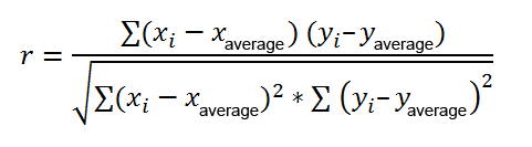
Sometimes, you might encounter two other formulas for calculating the sample correlation coefficient (r) and the population correlation coefficient (ρ).
Calculating Pearson’s correlation manually involves a lot of computation. Fortunately, Microsoft Excel has made it very simple. Depending on your dataset and objective, you can use any of the following techniques:
- Find the Pearson correlation coefficient using the CORREL() function.
- Create a correlation matrix by performing a data analysis.
- Find multiple correlation coefficients using a formula.
- Plot a correlation graph to get a visual representation of the relationship.
Calculating the Correlation Coefficient in Excel
To find the correlation coefficient in Excel, you can use the CORREL() or PEARSON() function and get the result in a split second.
- CORREL() Function
The CORREL() function returns the Pearson correlation coefficient for two sets of values. Its syntax is very simple and straightforward:
CORREL(array1, array2)
Where:
- array1 is the first range of values.
- array2 is the second range of values.
Both arrays must have the same length.
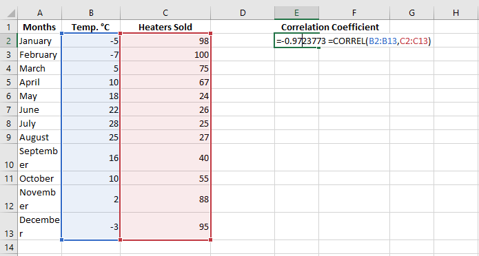
For example, assuming we have a set of independent variables (x) in B2:B13 and dependent variables (y) in C2:C13, our correlation coefficient formula would be:
=CORREL(B2:B13, C2:C13)
Alternatively, we can swap the arrays and still get the same result:
=CORREL(C2:C13, B2:B13)
In all cases, the formula shows a strong negative correlation (around -0.97) between the average monthly temperature and the number of heating units sold.
Key Things to Know About the CORREL() Function in Excel
To successfully calculate the correlation coefficient in Excel, keep in mind these 3 simple facts:
- If one or more cells in an array contain text, logical values, or blanks, those cells are ignored; cells with null values are included in the calculation.
- If the arrays provided are of different lengths, an #N/A error will be returned.
- If one of the arrays is empty or if the standard deviation of their values is zero, a #DIV/0! error will occur.
PEARSON() Function
The PEARSON() function in Excel does the same thing – it calculates the Pearson correlation coefficient.
=PEARSON(array1, array2)
Where:
- array1 is an independent values range.
- array2 is a dependent values range.
Since PEARSON() and CORREL() both calculate the Pearson linear correlation coefficient, their results should match, and they typically do in recent Excel versions (2007 and onward).
In Excel 2003 and earlier, however, the PEARSON() function may display rounding errors. Therefore, in older versions, it’s recommended to use CORREL() instead of PEARSON().
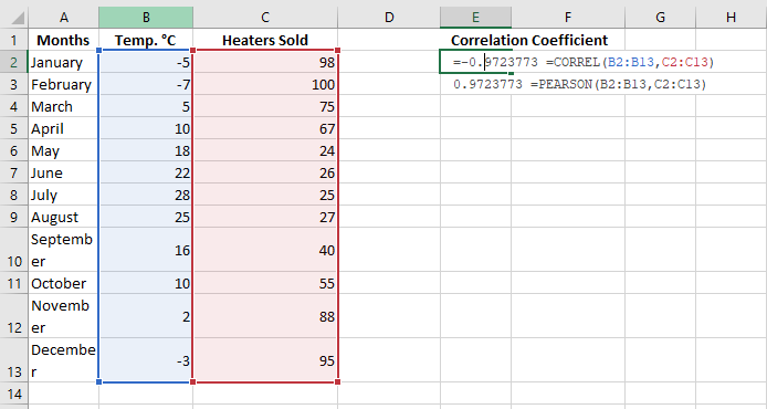
For our example dataset, both functions give the same result:
=CORREL(B2:B13, C2:C13)
=PEARSON(B2:B13, C2:C13)
Creating a Correlation Matrix
When you need to test the interrelationships between more than two variables, it’s useful to build a correlation matrix, sometimes called a multiple correlation coefficient.
A correlation matrix is a table that shows the correlation coefficients between variables at the intersections of the corresponding rows and columns.
To create a correlation matrix in Excel, you’ll use the Correlation tool from the Analysis ToolPak add-in. This add-in is available in all versions of Excel from 2003 to 2019, but it’s not activated by default. If you haven’t activated it yet, do so now by following these steps:
- In Excel, click File > Options.
- In the Excel Options dialog box, select Add-ins from the left sidebar, ensure Excel Add-ins is selected in the Manage box, and click Go.

- In the Add-ins dialog box, check the box for Analysis ToolPak and click OK.
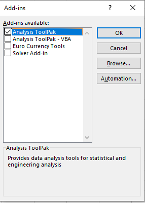
This will add the Data Analysis tools to the Data tab of your Excel ribbon.
Once the data analysis tools are added, you’re ready to perform a correlation analysis:
- In the top-right corner of the Data tab/group, click the Data Analysis button.

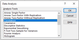
- In the Data Analysis dialog box, select Correlation and click OK.
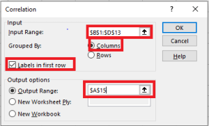
- In the Correlation Analysis dialog box, configure the settings as follows:
- Click in the Input Range box and select the range of your source data, including column headers (e.g., B1:D13 in our case).
- Under Grouped By, ensure Columns is selected (since your data is grouped by columns).
- Check Labels in First Row if your selected range includes column headers.
- Choose the desired output option. For output on the same sheet, select Output Range and specify the reference for the leftmost cell where the matrix should appear (e.g., A15).
- Once finished, click OK.
Your correlation coefficient matrix will be completed.

Performing Multiple Correlation Analysis with Formulas
Creating a correlation table with the Data Analysis tool is easy, but this matrix is static, meaning you need to run a new correlation analysis every time the source data changes.
The good news is you can easily create a similar table yourself, and this matrix will automatically update whenever you modify the source values.
To do this, use this generic formula:
CORREL(OFFSET(first_range_variable, 0, ROWS($1:1)-1), OFFSET(first_range_variable, 0, COLUMNS($A:A)-1))
In our case, the first variable range is $B$2:$B$13 (note the $ sign which locks the reference), and the correlation formula looks like this:
=CORREL(OFFSET($B$2:$B$13, 0, ROWS($1:1)-1), OFFSET($B$2:$B$13, 0, COLUMNS($A:A)-1))
Now, let’s build a correlation matrix:
- In the first row and column of the matrix, input the variable labels in the same order as they appear in your source table.
- Enter the above formula in the leftmost cell (e.g., B16).
- Drag the formula down and across to fill the matrix with as many rows and columns as needed (3 rows and 3 columns in our example).
The resulting matrix will contain multiple correlation coefficients. The coefficients returned by our formula will match those provided by Excel in the previous example.
Potential Issues with Correlation in Excel
The Pearson moment correlation only reveals a linear relationship between two variables. This means that your variables could be strongly related in a non-linear manner and still have a correlation coefficient close to zero.
Additionally, Pearson’s correlation doesn’t distinguish between dependent and independent variables. For example, when using CORREL() to find the relationship between average monthly temperature and the number of heaters sold, we obtained a -0.97 coefficient, which shows a strong negative correlation. However, if we reverse the variables, we would get the same result, leading someone to incorrectly conclude that higher heater sales cause a drop in temperature, which clearly doesn’t make sense.
Moreover, Pearson’s correlation is very sensitive to outliers. If you have one or more data points that differ significantly from the rest, it can distort the relationship between the variables. In such cases, it may be wise to use Spearman’s rank correlation instead.
Understanding Correlation Better
Correlation is based on covariance, represented by Sxy:
This formula may look familiar if you’ve seen the section on variance. There, you saw that variance is calculated by subtracting the mean from each value and adjusting the deviation, i.e., squaring the deviation. Note that the denominator in the covariance formula is N – 1. This is the same reason as for variance: when working with a sample from which you want to infer about a population, the degrees of freedom instead of N are used to make the estimate independent of sample size.
Excel provides a function called COVARIANCE.S() to use with a sample of values and COVARIANCE.P() to use with a population of values.
To move from covariance to correlation, you can easily divide the covariance by the product of the standard deviations of X and Y:
r = Sxy / (Sx * Sy)
This formula helps remove the effect of the standard deviations of the variables from the measurement of their relationship. As a result, the correlation coefficient is bounded between -1.0 (perfect negative correlation), +1.0 (perfect positive correlation), and 0.0 (no relationship).