
A normal distribution chart in Excel visually represents the phenomenon of normal distribution within a dataset. This type of chart is created by first calculating the mean (average) and the standard deviation of the data, and then computing the normal distribution values based on these parameters. Although this explanation applies to Excel 2013 versions and later, creating a normal distribution chart is straightforward because Excel includes built-in functions specifically designed to calculate normal distribution values and standard deviation. The resulting chart closely resembles the well-known bell-shaped curve.
Definition
A normal distribution chart represents a continuous probability function. To clarify, probability is a mathematical technique used to quantify the likelihood or chance of the occurrence of a particular event or variable. A probability distribution is a function that assigns probabilities to the possible values of a variable. There are two main types of probability distributions: discrete and continuous.
The fundamental concept behind a normal distribution, as outlined above, is that it describes how data values are uniformly spread around a central mean value. More formally, a normal distribution measures the extent to which data is symmetrically distributed around the average.
Mathematically, the probability density function (PDF) of a normal distribution is given by the formula:
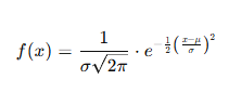
where:
-
x is the variable value,
-
μ is the mean (expected value) of the distribution,
-
σ is the standard deviation (a positive number representing data dispersion),
-
e is the base of the natural logarithm.
While this formula may seem complex, Excel simplifies the process by providing a built-in NORM.DIST function that calculates the normal distribution for a specified value. In any Excel cell, the formula can be entered as:
where:
-
x is the specific value for which you want to calculate the normal distribution,
-
mean is the average of your dataset,
-
standard_dev is the standard deviation of the dataset,
-
cumulative is a logical value (TRUE or FALSE) indicating whether to compute the cumulative distribution function or the probability density function.
The three fundamental parameters for calculating normal distribution in Excel are:
-
x: The value at which the distribution is evaluated.
-
Mean (Expectation): The arithmetic average of the data.
-
Standard Deviation: A measure of the amount of variation or dispersion in the data set. It must be a positive number.
The chart generated from these values is called a normal distribution chart, commonly known as the bell curve. But what exactly is a bell curve? It is a typical shape that describes how values of a variable are distributed in a symmetric, uniform manner around the mean. The peak of the curve represents the mean value, while the spread is determined by the standard deviation, illustrating how data tends to cluster near the average.
How to Create a Normal Distribution Chart in Excel?
Below are examples of normal distribution charts in Excel (bell curve).
Example 1
First, we will take some random data. For example, in column A, take values from -3 to 3. Then, we need to calculate the mean and standard deviation in Excel before calculating the normal distribution. After that, we can create the normal distribution chart in Excel.
So, take a look at the data below.
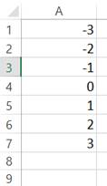
Follow the steps below:
First, calculate the mean of the data, that is, the average. Then, in cell D1, enter the following formula.
Press the « Enter » key to get the result.
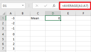
Now, we will calculate the standard deviation for the given data. So, in cell D2, enter the following formula.
Press the « Enter » key to get the result.
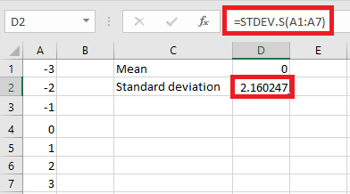
Now, in cell B2, we will calculate the normal distribution using Excel’s built-in formula. Note the following formula in cell B2.
The formula returns the result, as shown below:
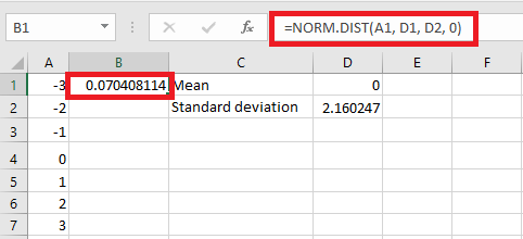
Now, drag the formula down to cell B7.
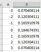
In cell B2, we have the normal distribution for the chosen data. To create a normal distribution chart, go to the « Insert » tab and under « Charts, » select a « Scatter plot » chart with smooth lines and markers.
When we insert the chart, we see that our bell curve or normal distribution chart is created.
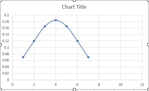
The above chart is the normal distribution chart of the random data we took. We now need to understand something before moving to a real data example. The Standard Deviation « S » means Standard Deviation Sample because we have a huge amount of data in real data analysis, and we select a sample of data to analyze.