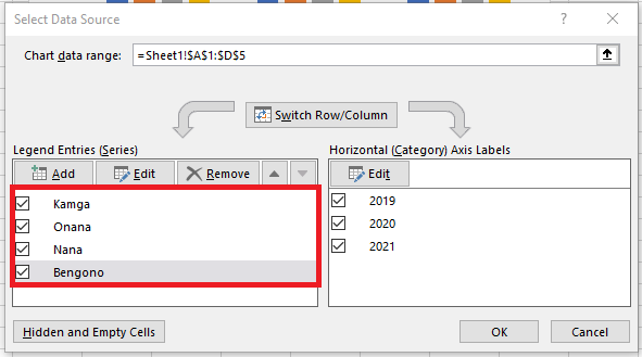
Switching rows and columns in your data can be useful if the layout of the worksheet data is not ideal. It can also give you an alternative chart layout, which may be more suitable depending on how you intend to use your chart. This feature allows you to swap your legend entries (series) with your horizontal axis labels (categories).
Note: This only works with a single data series, so I removed the Costs series for this example.

To switch rows and columns in your chart:
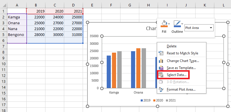
- Right-click the chart and select Select Data.
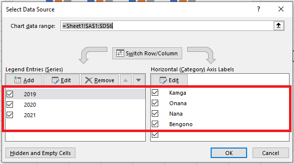
 Here is what the Select Data Source window looks like:
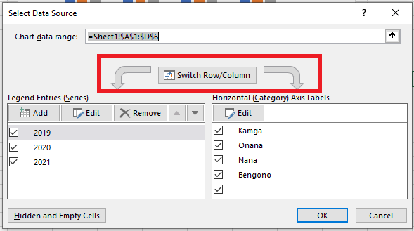
- Then click the Switch Row/Column button, and click OK to update the chart.
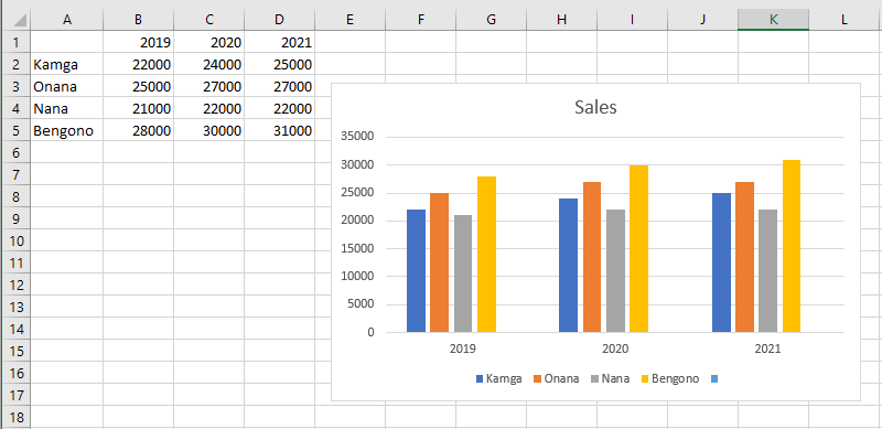
Notice how the states are now my legend key, and the sales are on my Y-axis, with the legend entries / horizontal axis labels switched.
Other Methods
A quicker alternative method:
- Click the Chart Design tab.
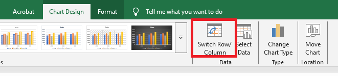
- Click the Switch Row/Column button.
- The rows are now converted to columns.