Chart elements provide more context and description to your charts, making your data more meaningful and visually appealing. In this section, you’ll learn about chart elements.
Follow the steps below to insert chart elements into your chart. When you click on the chart, three buttons appear in the upper-right corner:
- Chart Elements
- Chart Styles and Colors
- Chart Filters
Clicking on the Chart Elements icon displays a list of available elements:
- Axes
- Axis Titles
- Chart Title
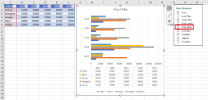
- Data Labels
- Data Table
- Error Bars
- Gridlines
- Legend
- Trendline
You can add, remove, or modify any of these chart elements.
Hover over each chart element in the list to preview how it will appear. For example, selecting Axis Titles highlights both the horizontal and vertical axis titles.
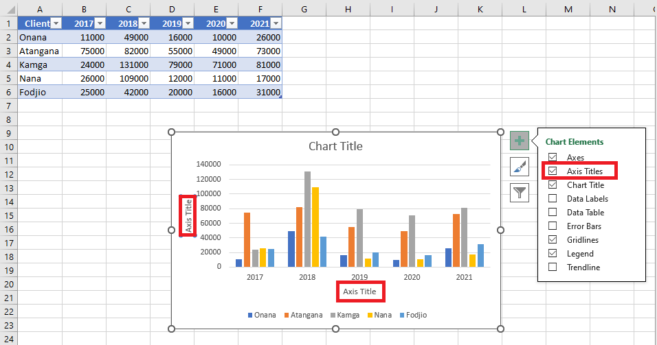
A small triangle appears next to Axis Titles in the list. Click the triangle to see available options.
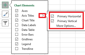
Check or uncheck the elements you want to display on your chart.
Axes
Charts usually have two axes used to measure and categorize data:
- A vertical axis (also called value axis or Y-axis)
- A horizontal axis (also called category axis or X-axis)

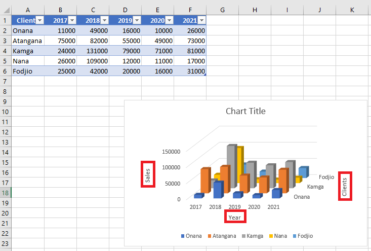
3D column charts include a third axis, the depth axis (also called series axis or Z-axis), and data can be plotted along this depth.

Radar charts don’t have horizontal/category axes. Pie and doughnut charts do not have axes at all.
Not all chart types display axes the same way:
- XY scatter charts and bubble charts display numeric values on both the X and Y axes.
- Column, line, and area charts display numeric values on the Y-axis and text groupings (categories) on the X-axis.
- The depth axis is another form of category axis.
Axis Titles
Axis titles help users understand what the axes in a chart represent.
- You can add axis titles to horizontal, vertical, or depth axes.
- You cannot add axis titles to charts without axes (e.g., pie or doughnut charts).
To add axis titles:
- Click on the chart.
- Click the Chart Elements (+) icon.
- Select Axis Titles from the list.

- Axis titles appear on the chart for each axis. Click on an axis title to edit it and enter meaningful labels.
You can also link axis titles to cells in the worksheet. When the cell’s text changes, the axis title updates automatically:
- Click on any axis title in the chart.
- In the formula bar, type an equal sign
=and then select the worksheet cell containing the desired text. - Press Enter.
 The axis title now displays the content of the linked cell.
Chart Title
When you create a chart, a Chart Title box appears at the top.
To add or change a chart title:
- Click on the chart.
- Click the Chart Elements icon.
- In the list, select Chart Title.

- A chart title box appears. Click in the box and type your desired title.

You can also link the chart title to a worksheet cell:
- Click on the chart title.
- In the formula bar, type
=and select the cell with the desired text. - Press Enter. The chart title will now reflect the cell’s content and update automatically when the cell’s value changes.
Data Labels
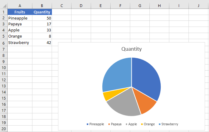
Data labels enhance a chart by showing details of each data point.
Example: In a pie chart, you may notice that pineapples and papayas have the largest slices, but it’s unclear what the exact values are.
To add data labels:
- Click on the chart.
- Click the Chart Elements icon.
- Select Data Labels from the list. Labels now appear on each slice of the pie.
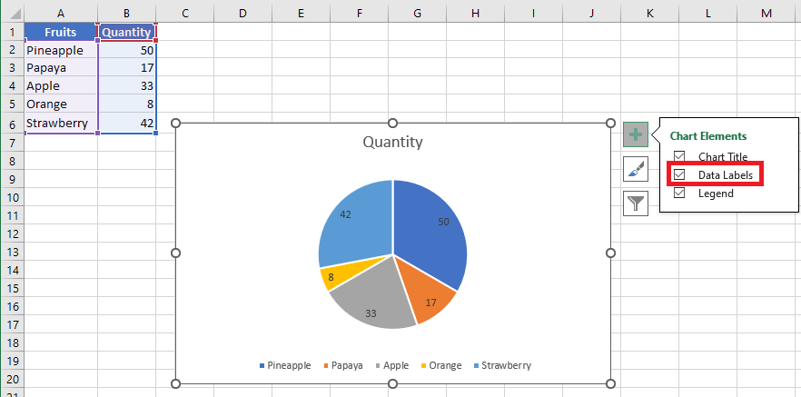
Now you can clearly read: 50 pineapples, 42 papayas, and 33 apples.
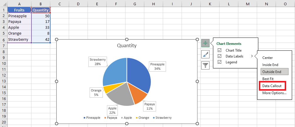
You can change the label position:
- Click the triangle next to Data Labels to see placement options.
- Hover over each option to preview the layout (e.g., outside end, center, etc.).
Data Table
Data tables can be added to line, area, column, and bar charts.
To insert a data table:
- Click on the chart.
- Click the Chart Elements icon.
- Select Data Table from the list. A table appears below the chart, replacing the horizontal axis with a header row.
In bar charts, the data table is aligned with the chart but doesn’t replace an axis.
Error Bars
Error bars graphically represent potential error margins in each data point.
Example: Show ±5% margins in scientific experiment results.
You can add error bars to series in 2D area, bar, column, line, scatter, and bubble charts.
To insert error bars:
- Click on the chart.
- Click the Chart Elements icon.
- Select Error Bars. Click the triangle to view more options.
- Click More Options… to open the error bar settings dialog.
- Select the data series and click OK.
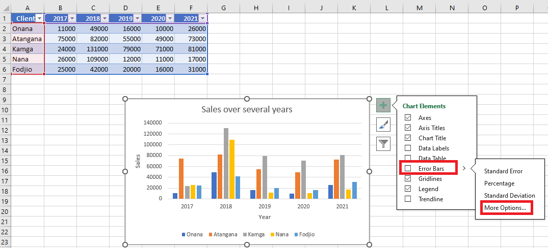 Error bars will now appear for the selected series.
If you modify values in the worksheet, the error bars adjust automatically.
For scatter and bubble charts, you can show error bars for X values, Y values, or both.
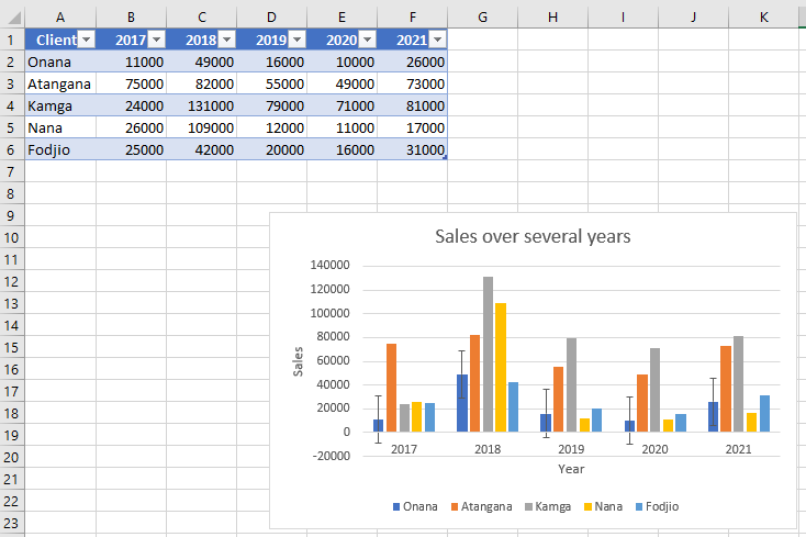
Gridlines
Gridlines help interpret chart data by extending from axes across the chart plot area. You can display horizontal, vertical, and depth gridlines (in 3D charts).
To insert gridlines:
- Click on the 3D column chart.
- Click the Chart Elements icon.
- Select Gridlines from the list. Click the triangle to see all gridline types.
- Select Primary Major Horizontal, Primary Major Vertical, and Primary Major Depth.
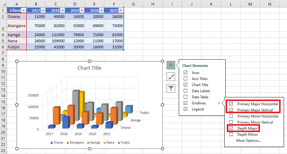
Gridlines appear on the chart accordingly.
Note: Gridlines cannot be added to chart types without axes, such as pie or doughnut charts.
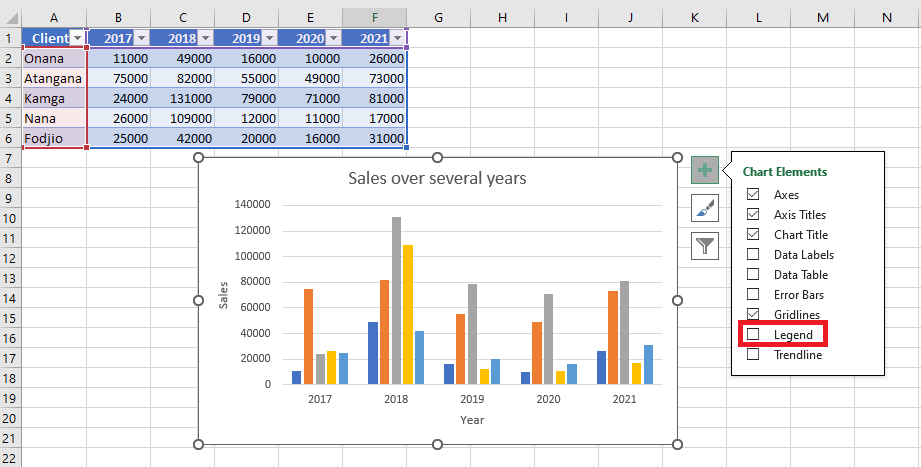
Legend
When you create a chart, the legend appears by default.
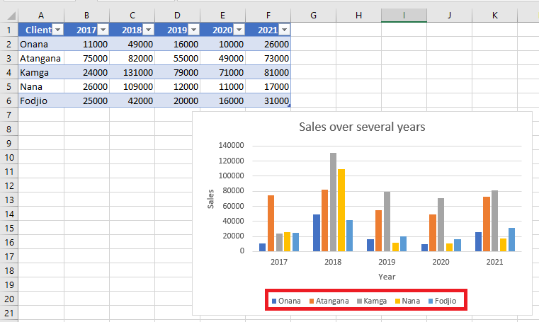
To hide it, simply uncheck Legend in the Chart Elements list.
Trendline
Trendlines are used to visualize trends and perform predictive analysis (also called regression analysis).
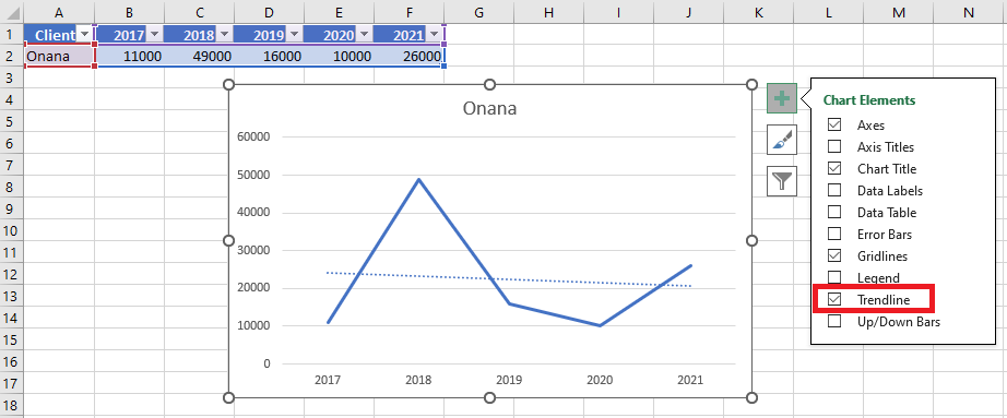
You can extend a trendline beyond existing data points to forecast future values based on historical trends.