
SPEEDOMETER GRAPH
When it comes to presenting data in an understandable way in Excel, charts stand out. And few charts are specific and can be used to present a specific type of data.
I’m going to show you exactly how to create a SPEEDOMETER in Excel. It’s also one of the most controversial classifications, so we’ll explore it in every way so you can use it in your Excel dashboards when they’re really needed.
1 What is a SPEEDOMETER graph?
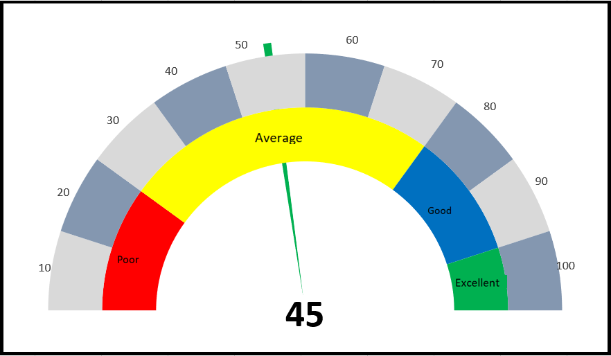
An Excel SPEEDOMETER chart is like a speedometer with a needle that tells you a number by pointing it on the gauge and this needle moves when there is a change in the data . This is a single point chart that helps you track a single data point against its target.
2 Steps to Create a SPEEDOMETER
Here are the steps to create a SPEEDOMETER in Excel that you need to follow.
As I said, we need to insert two doughnut charts and one pie chart, but before we start creating a SPEEDOMETER, you need to organize the data for it.
In the spreadsheet below, we have three different data tables (two for the doughnut charts and one for the pie chart).
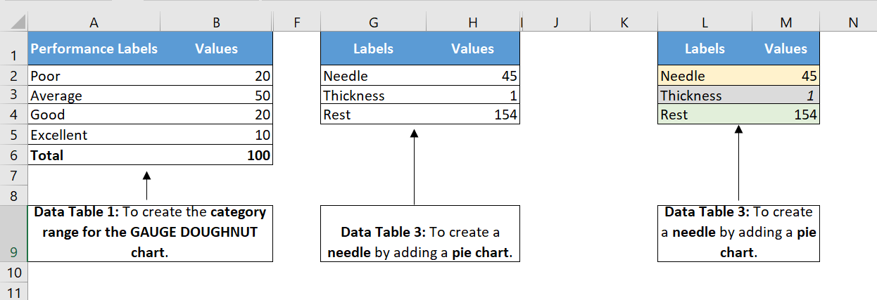
The first data table is to create the category range for the final SPEEDOMETER, which will help you understand the performance level.
The second data table is used to create labels ranging from 0 to 100. You can modify it if you want to have a different range.
And in the third data table , we have three values that we will use to create the pie chart for the needle. The pointer value is the actual value you want to track.
To create a SPEEDOMETER in Excel, you can follow the steps below:
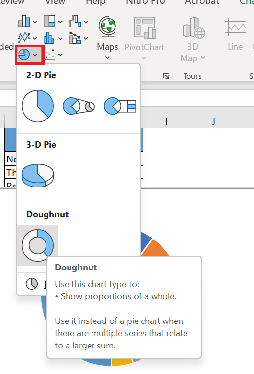
- First, go to Insert I insert in the graphics group, select donut chart ( with this you will get a blank chart ).
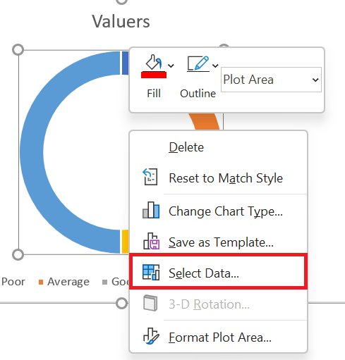
- Now right click on the chart and then click on « Select Data ».
- Data » window , click « Add » and type « Category » in the name input bar. After that, select the « Value » column in the first data table.
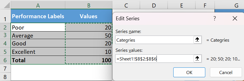
- Once you click OK, you will have a donut chart like below.
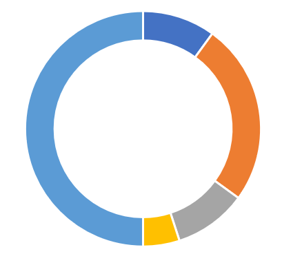
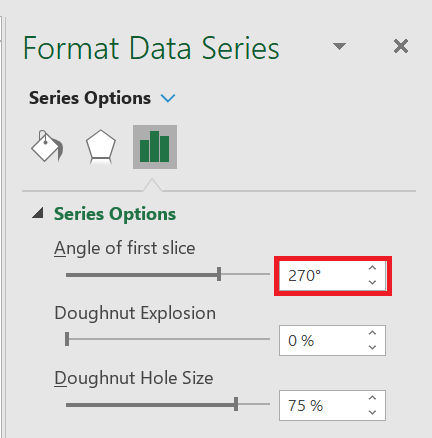
- From here, the next thing to do is to change the angle of the chart and to do this, right-click on the chart and then click on « Format Data Series ».
- In « Data Series Formatting », enter 270° in « First Slice Angle » and press Enter.
- After that, you need to hide below half of the chart. To do this, click only on this part of the chart and open « Format Data Point » and select « No Fill ».
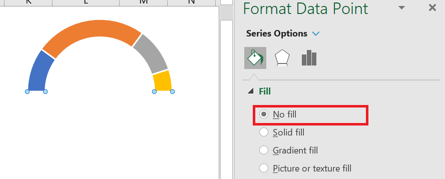
- For the remaining four data points, I used four different colors (red, yellow, blue, and green). At this point, you will have a chart like the one below, and the next step is to create the second doughnut chart to add labels.

- Now right click on the chart and then click on « Select Data ».
- In the « Select Data Source » window, click « Add » to enter a new « Legend Entry » and select the « Values » column in the second data table.
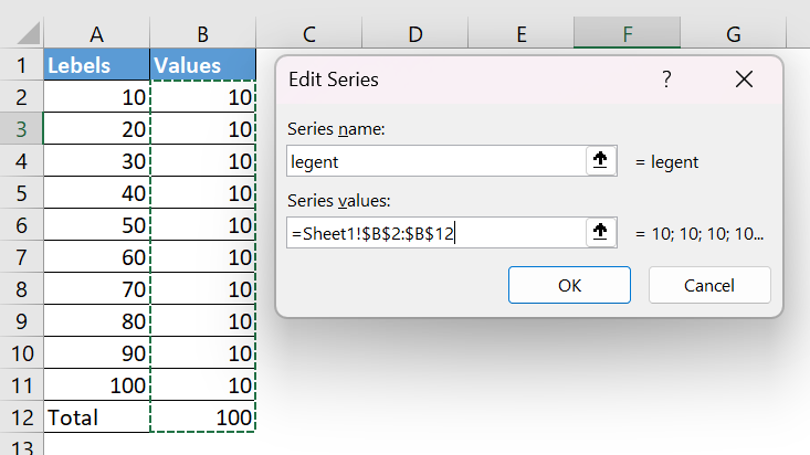
- Once you click OK, you will have a donut chart like below.
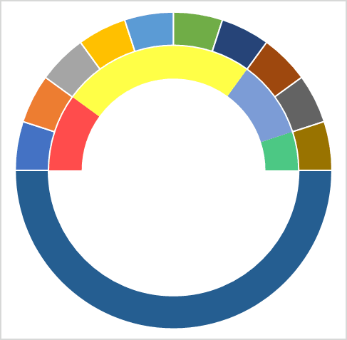
- Again, you need to hide the bottom half of the chart using « No Fill » for the color and I also added a color scheme for the labels. After that, you will have a table like below. Now, the next thing is to create a pie chart with a third data table to add the needle.
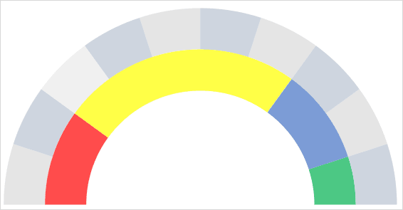
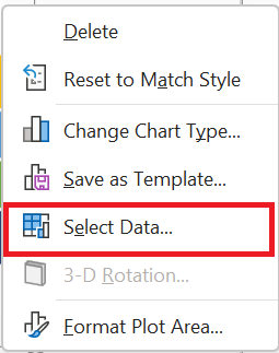
- To do this, right-click on the chart and then click on “Select data”.
- In the « Select Data Source » window, click « Add » to enter a new « Legend Entry » and select the « Values » column in the third data table.
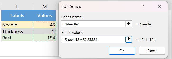
- After that, select the chart and go to Chart Tools ➜ Design Tabs ➜ Change Chart Type .
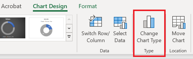
- In the « Change Chart Type » window, select the Pie chart for « Needle » and click OK.
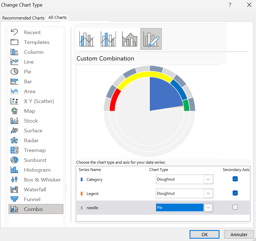
- At this point you have a table like below.
Note : If after selecting a pie chart the angel is not correct (there is a chance), make sure to change it to 270.
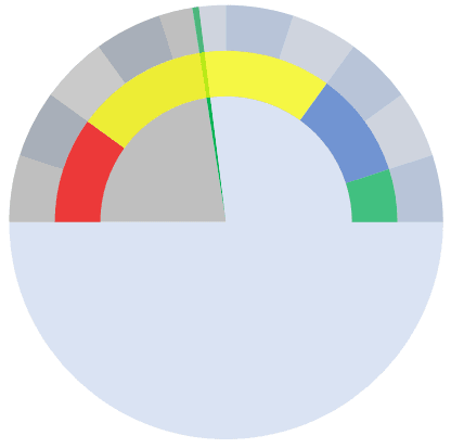
- Now select the two large data parts of the chart and don’t apply any fill color to them to hide them.
- After that, you will only have the small part of the circular diagram left which will be our needle for the SPEEDOMETER.
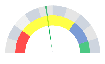
- Next, you need to get this needle out of the table so that it can be easily identified.
- To do this, select the needle and right-click on it, then click « Format Data Point ».
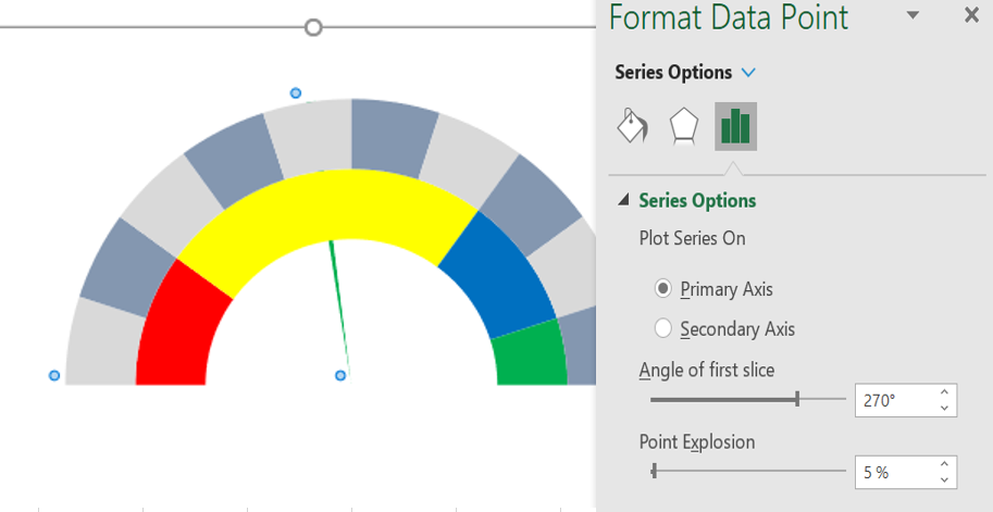
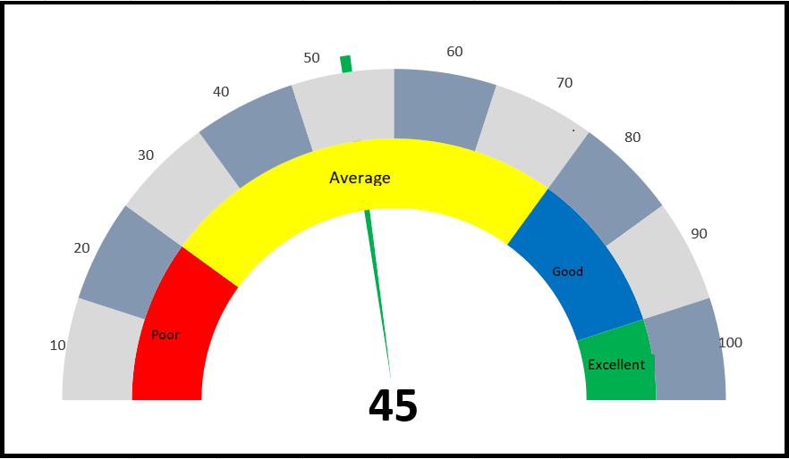
- In « Format Data Points », go to » Series Options » and add 5% to « Point Spacing ». At this point, you have a ready-to-use SPEEDOMETER (as below), one final touch is required and this last thing is to add data labels and we have to do it one by one for the three graphs.
- First, select the category table and add data labels by right-clicking ➜ Add Data Labels ➜ Add Data Labels .
- Now select the data labels and open « Format Data Label » and after that click on « Cell Values ».
- From there, select the performance label in the first data table, then uncheck “Values”.
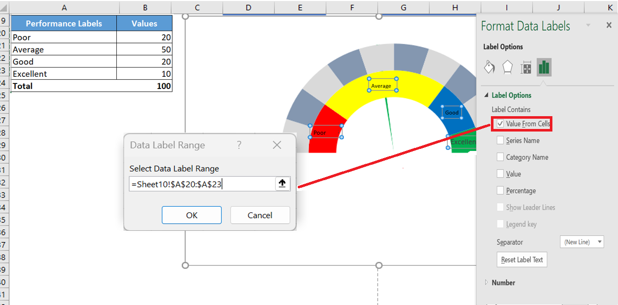
- After that, select the label chart and do the same with it by adding labels from the second data table.
- And finally, you need to add a custom data label for the needle (this is the most important part).
- To do this, insert a text box and select it, then in the formula bar, enter « = » and select the cell with the needle values, press ENTER.
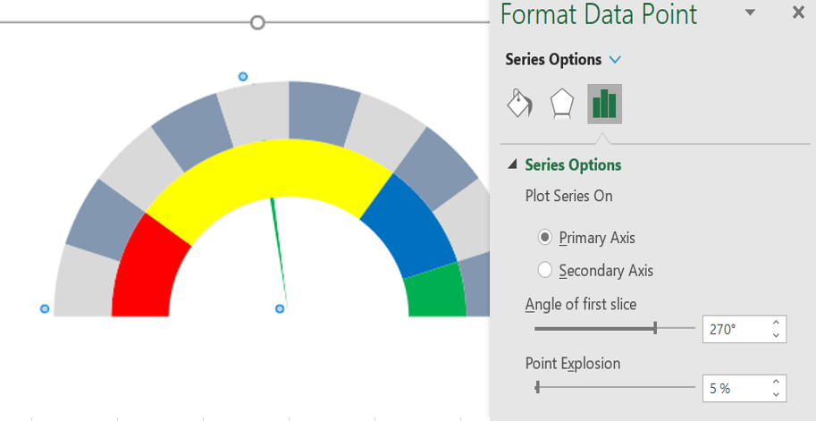
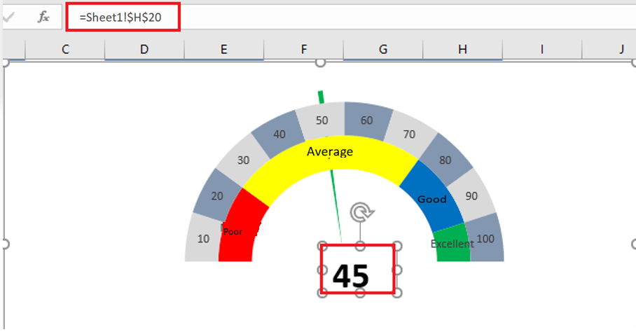 29. At the end, you need to move all the data labels to the end corners, like below:
3 When to use a SPEEDOMETER chart?
As I said, this is one of the most controversial charts. You can find many people saying not to use a SPEEDOMETER or GAUGE chart in your dashboards.
I have listed some of the points that can help you decide when you can use this table and when you should avoid it.
1. Tracking a single data point
As we know, using a SPEED can only be relevant (like customer satisfaction rate) when you need to track a single data point. So if you need to track data (like sales, production) where you have more than one point, there is no way to do it.
2. Only data from the current period
This is another important point to pay attention to when choosing a SPEEDOMETER for your dashboard or KPI reports, as you can only present current data on it. For example, if you use it to present customer satisfaction rate, you can only display the current rate.
3. Easy to understand but time-consuming to create
As I said, a SPEEDOMETER is a single data point graph, so it is quite focused and can be easily understood by the user.
But you have to spend a few minutes to create it because it is not there in Excel by default.
Conclusion
A SPEEDOMETER or GAUGE chart is one of the most commonly used charts in KPIs and dashboards. Even so, you can find many people who don’t like using it at all.
But this is one of those charts that can help you make your dashboards look cool.