The Quick Analysis tools in Excel are features provided to help you analyze data instantly, rather than using the traditional method of manually inserting a chart or table. A yellow Quick Analysis box appears at the bottom right corner of the selection—or you can press CTRL + Q to open the Quick Analysis tools.
Quickly calculate totals, insert tables, apply conditional formatting, and more.
Totals
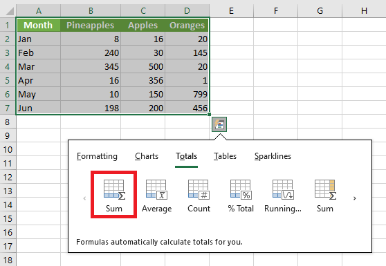
Instead of manually adding a total row at the end of an Excel table, use the Quick Analysis tool to calculate totals instantly.
- Select a range of cells and click the Quick Analysis button.
- For example, click Totals, then click Sum to add up the numbers in each column.
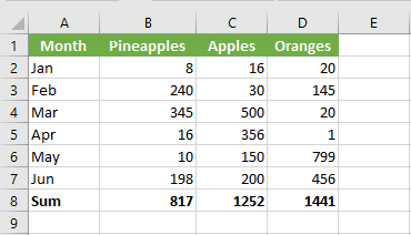
Result:
Select the range A1:D7 and add a column with a running total.
NOTE:
Total rows are highlighted in blue, and total columns appear in yellow-orange.
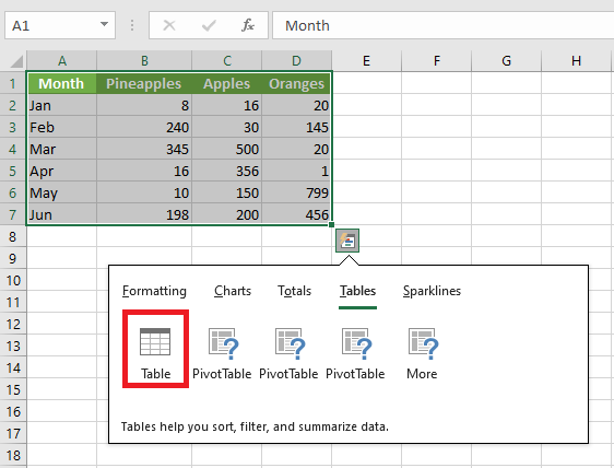
Tables
Use tables in Excel to sort, filter, and summarize data. A PivotTable in Excel lets you extract meaning from a large, detailed dataset.
- Select a range of cells and click the Quick Analysis button.
- To quickly insert a table, click Tables, then click Table.
Result:

A structured Excel table is created with filter controls and automatic formatting.
Formatting
Data bars, color scales, and icon sets in Excel make it easy to visualize the values in a cell range.
- Select a range of cells and click the Quick Analysis button.
- To quickly add data bars, click Data Bars.
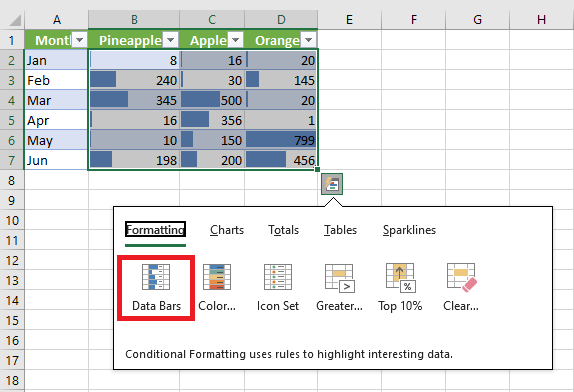
A longer bar represents a higher value.
- To quickly add a color scale, click Color Scale.
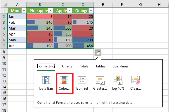
The shade of the color reflects the value in the cell.
- To quickly add an icon set, click Icon Set.
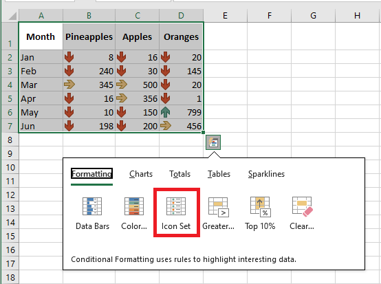
Each icon represents a range of values.
- To quickly highlight cells greater than a certain value, click Greater Than.
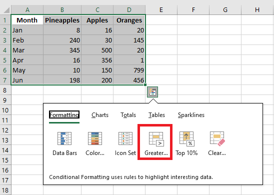
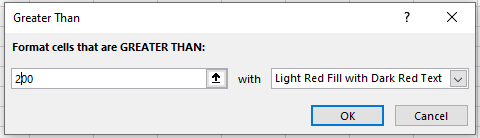
- Enter the value 200 and select a formatting style.
- Click OK.
Result:
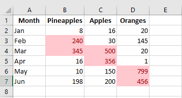
Excel highlights cells with values greater than 200.
Charts
You can use the Quick Analysis tool to create a chart instantly. The Recommended Charts feature analyzes your data and suggests useful chart types.
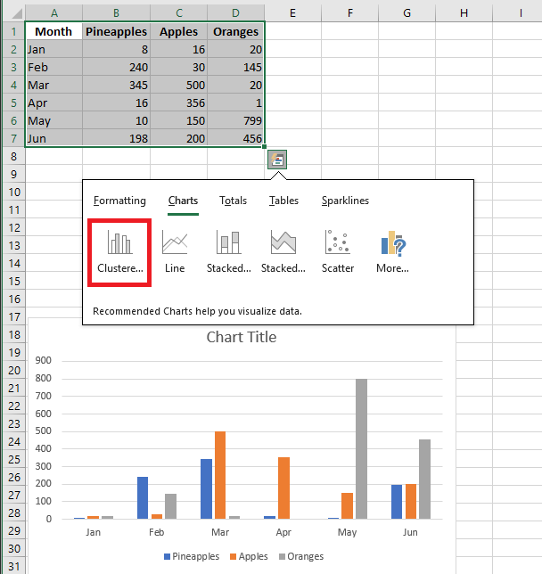
- Select a range of cells and click the Quick Analysis button.
- For example, click Charts, then click Clustered Column to create a grouped column chart.
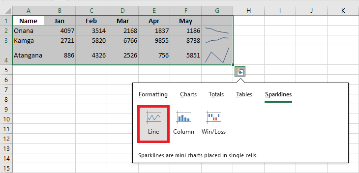
Sparklines
Sparklines in Excel are miniature charts that fit inside a single cell. They are ideal for showing trends.
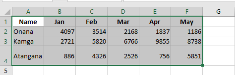
- Select the range A1:F4 and click the Quick Analysis button.
- For example, click Sparklines, then click Line to insert sparklines.
Custom Result:
Each selected row gets a compact line graph showing the evolution of values across the row.