Are you looking for a way to visualize a large volume of data in a small space? Sparklines are a quick and elegant solution. These mini-charts are specifically designed to show data trends inside a single cell.
Creating a Sparkline Chart
A sparkline chart is a small chart that resides in a single cell. The idea is to place a visual next to the original data without taking up too much space, which is why sparklines are sometimes called “inline charts.” Sparklines can be used with any numerical data in a tabular format. Typical uses include visualizing temperature fluctuations, stock prices, periodic sales figures, and any other time-based variation.
You insert sparklines next to rows or columns of data and get a clear graphical presentation of a trend in each individual row or column.
Sparklines were introduced in Excel 2010 and are available in all later versions: Excel 2013, Excel 2016, Excel 2019, and Excel for Microsoft 365.
To create a sparkline in Excel, follow these steps:
- Select a blank cell where you want to insert a sparkline, typically at the end of a data row.
- On the Insert tab, in the Sparklines group, choose the desired type: Line, Column, or Win/Loss.
![]()
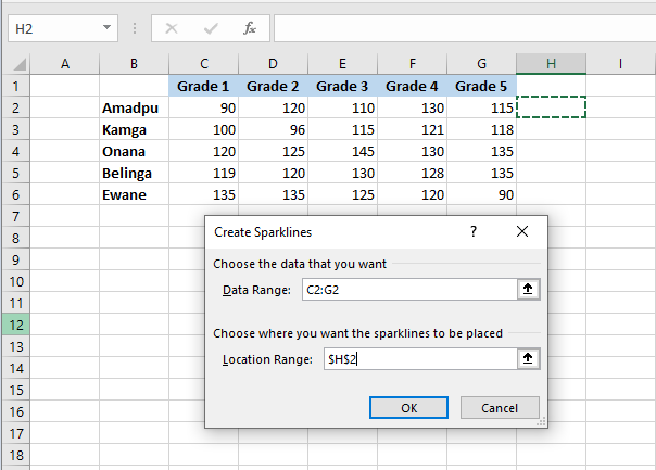
- In the Create Sparklines dialog box, place your cursor in the Data Range box and select the range of cells to include in the sparkline.
- Click OK.
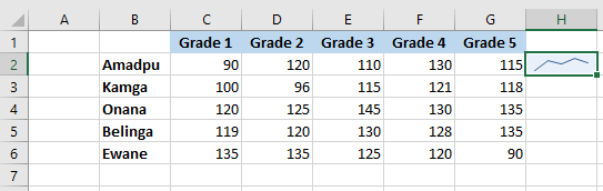
And there you have it – your very first mini-chart appears in the selected cell. Want to see how the data evolves in other rows? Simply drag the fill handle to instantly create a similar sparkline for each row in your table.
Adding Sparklines to Multiple Cells
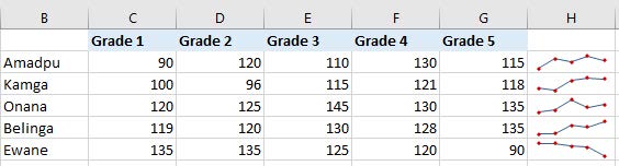
In the previous example, you learned one way to insert sparklines into multiple cells: add it to the first cell and copy it. Alternatively, you can create sparklines for all the cells at once. The steps are exactly the same as described above, except you select the full range instead of a single cell. Here are the detailed instructions:
- Select all the cells where you want to insert mini-charts.
- Go to the Insert tab and choose the desired sparkline type.
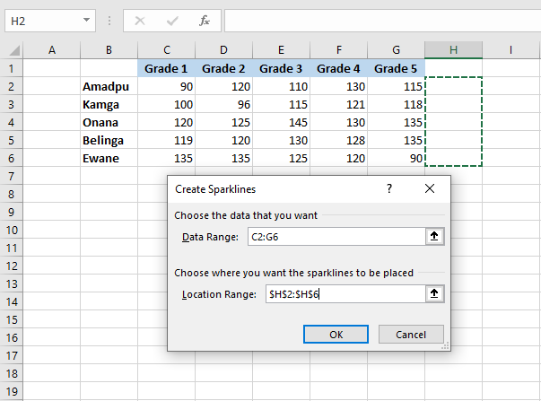
- In the Create Sparklines dialog box, select all the source cells for the Data Range.
- Make sure Excel displays the correct location range where your sparklines should appear.
- Click OK.
Types of Sparklines
Microsoft Excel provides three types of sparklines: Line, Column, and Win/Loss.
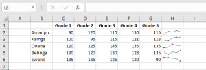
Line Sparklines
These sparklines look very similar to tiny line charts. Like traditional line charts in Excel, they can be drawn with or without markers. You are free to modify the line style as well as the line and marker colors. We’ll cover how to do that later. For now, here’s an example of line sparklines with markers:
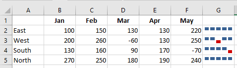
Column Sparklines
These tiny charts appear as vertical bars. Just like a standard column chart, positive data points are above the x-axis and negative ones are below. Zero values are not shown – a blank space is left for a zero data point. You can set the color of your choice for positive and negative mini-columns, and highlight the highest and lowest points.
Win/Loss Sparklines
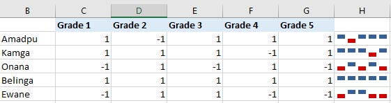
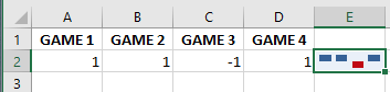
This type resembles a column sparkline but does not show the magnitude of a data point – all bars are the same size regardless of the original value. Positive values (wins) are plotted above the x-axis and negative values (losses) below. A Win/Loss sparkline can be thought of as a binary micro-chart, best used with values that have only two states such as True/False or 1/-1. For example, it works perfectly to display game results where 1s represent wins and -1s losses:
Editing Sparklines
After creating a sparkline in Excel, what’s the next thing you’d usually want to do? Customize it to your liking! All customization is done via the Design tab that appears once you select an existing sparkline in a sheet.
Changing the Sparkline Type
To quickly change the type of an existing sparkline:
- Select one or more sparklines in your worksheet.
- Go to the Design tab.
- In the Type group, choose the desired type.
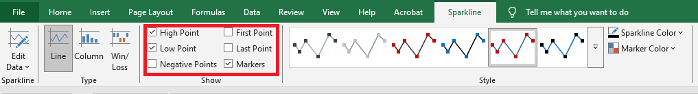
Showing Markers and Highlighting Specific Data Points
To make the most important points in your sparklines more visible, you can highlight them in a different color. You can also add markers for each data point. Just select the desired options on the Sparkline tab, in the Show group:
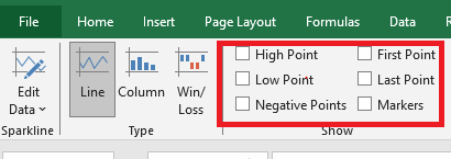
Available options include:
- High Point – highlights the maximum value.
- Low Point – highlights the minimum value.
- Negative Points – highlights all negative values.
- First Point – highlights the first data point.
- Last Point – changes the color of the last data point.
- Markers – adds markers to each data point (available only for line sparklines).
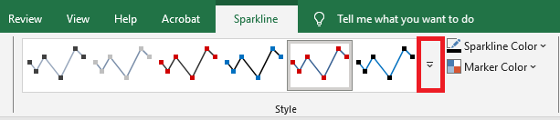
Changing Sparkline Color, Style, and Line Width
To change the appearance of your sparklines, use the style and color options on the Design tab in the Style group:
- To apply a built-in sparkline style, select it from the gallery. To see all styles, click the More button in the lower-right corner.
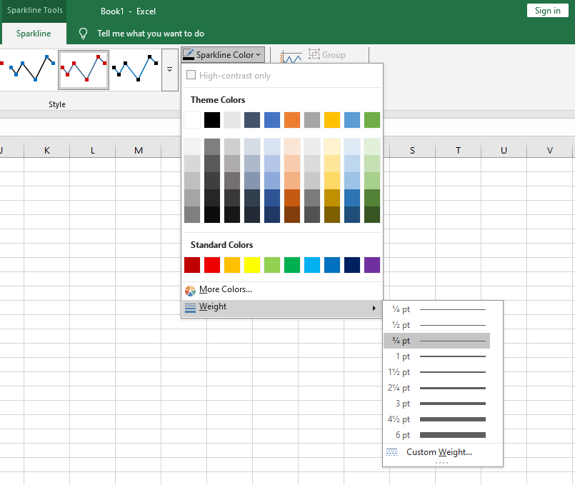
- To change the default color, click the arrow next to Sparkline Color and pick your preferred color.
- To adjust line thickness, click the Weight option and choose from preset widths or set a custom thickness (available only for line sparklines).
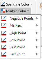
- To change marker color or specific data point colors, click the arrow next to Marker Color and select the desired item:
Customizing the Sparkline Axis
By default, Excel sparklines are drawn without axes or coordinates. However, you can display a horizontal axis if needed and perform a few other customizations. Details are provided below.
How to Change the Axis Starting Point
By default, Excel draws a sparkline so that the smallest data point appears at the bottom, and all other points are scaled relative to it.
In some situations, this can be misleading — it may give the impression that the lowest data point is near zero and that the variation among data points is greater than it actually is. To fix this, you can make the vertical axis start at 0 or at any value you consider appropriate.
To do so, follow these steps:
- Select your sparklines.
- On the Design tab, click the Axis button.
- Under Vertical Axis Minimum Value Options, select Custom Value…
- In the dialog box that appears, enter 0 or another minimum axis value you prefer.
- Click OK.
The image below shows the result — by forcing the sparkline to start at 0, we now get a more realistic picture of the variation between data points:
Note: Be very careful with axis customizations when your data contains negative numbers — if you set the vertical axis minimum to 0, all negative values will disappear from the sparkline chart.
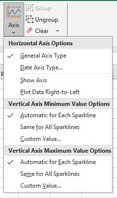
How to Show the X-Axis in a Sparkline
To display a horizontal axis in your micro-chart, select it, then click Axis > Show Axis on the Sparkline tab.
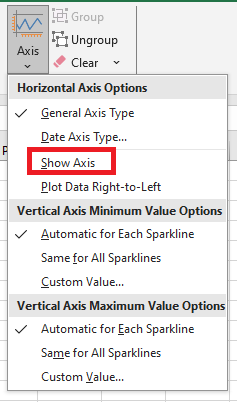
This works best when data points fall on both sides of the x-axis — that is, when you have both positive and negative numbers:
How to Group and Ungroup Sparklines
When you insert multiple sparklines in Excel, grouping them gives you a major advantage: you can change the entire group at once.
To group sparklines, do the following:
- Select two or more mini-charts.
- On the Design tab, click the Group button.
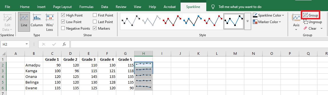
To ungroup sparklines, select them and click the Ungroup button.
Note: When you insert sparklines into multiple cells, Excel automatically groups them.
How to Resize Sparklines
Because Excel sparklines are background images inside cells, they resize automatically to fit the cell.
- To change the width of sparklines, make the column wider or narrower.
- To change the height, increase or decrease the row height.
How to Delete a Sparkline
When you decide to remove a sparkline that you no longer need, you may be surprised to find that pressing the Delete key does nothing.
Here are the steps to delete a sparkline in Excel:
- Select the sparkline(s) you want to remove.
- On the Design tab, do one of the following:
- To delete only the selected sparkline(s), click the Clear button.
- To delete the entire group, click Clear > Clear Selected Sparkline Groups.
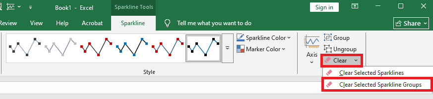
Tip: If you accidentally deleted the wrong sparkline, press Ctrl + Z to undo the action.