First, the program code:
Sub ModifyChartSheet()
    Dim CH As Chart
    Set CH = ThisWorkbook.Charts(1)
    ChangeChart CH
    Set CH = Nothing
End Sub
This program is divided into two parts. The first part applies only to chart sheets:
A variable of type Chart is declared, and it is assigned to the first chart sheet in the workbook.
The procedure ChangeChart() is called, with the first chart sheet Charts(1) passed as a parameter.
The second part of the program applies both to chart sheets and embedded charts:
Sub ChangeChart(CH As Chart)
    ' Chart area formatting
    CH.ChartArea.Interior.Color = vbCyan
    ' Plot area formatting
    CH.PlotArea.Interior.Color = vbYellow
    ' Title
    CH.HasTitle = True
    CH.ChartTitle.Text = "Temperature"
    ' Legend
    CH.HasLegend = True
    With CH.Legend
        .Interior.Color = vbYellow
        .Border.Color = vbBlue
        .Border.Weight = xlThick
    End With
    ' Category axis
    With CH.Axes(xlCategory)
        .HasTitle = True
        .AxisTitle.Text = "Date"
        .TickLabels.NumberFormatLocal = "DD.MM."
    End With
    ' Value axis
    With CH.Axes(xlValue)
        .HasTitle = True
        .AxisTitle.Text = "Degrees"
        .MinimumScale = 5
        .MaximumScale = 35
    End With
    ' Data series
    With CH.SeriesCollection(1)
        .Border.Color = vbRed
        .MarkerStyle = xlMarkerStyleCircle
        .MarkerForegroundColor = vbRed
        .MarkerBackgroundColor = vbRed
    End With
    ' Data point
    With CH.SeriesCollection(1).Points(3)
        .Border.Color = vbBlue
        .ApplyDataLabels xlShowValue
        .MarkerStyle = xlMarkerStyleSquare
        .MarkerForegroundColor = vbBlue
        .MarkerBackgroundColor = vbBlue
    End With
End Sub
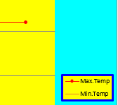
Changed chart area colors, legend, and data series
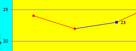
Modified axes and data point appearance
Explanation:
The ChartArea property represents the entire chart area, including the plot area, title, and legend. It has an Interior property that defines the fill (background) of this area, similar to how a cell’s interior can be formatted. In this example, the chart area’s interior color is set to cyan.
The PlotArea property represents the plot area specifically—the region where the data is graphed. Its Interior color is set to yellow here.
Charts may have a title, controlled by the Boolean property HasTitle. Setting this to True enables the title; False removes it. The title text is set using the ChartTitle.Text property.
Similarly, charts can include a legend, controlled by HasLegend. Its formatting is accessible via the Legend property, which exposes Interior and Border properties. These allow setting the background color and border color/thickness of the legend box.
All chart axes are contained in the Axes collection. Each axis is an object of type Axis. To select a specific axis, the Axes() method is called with parameters:
- xlCategory for the horizontal (category) axis
- xlValue for the vertical (value) axis
In this example, both axes have titles enabled (HasTitle = True), and the title text is assigned.
For the category axis, the tick label format is customized with NumberFormatLocal to display dates as “DD.MM.”.
For the value axis, the scale is set manually by defining minimum (MinimumScale = 5) and maximum (MaximumScale = 35) values.
The SeriesCollection holds all data series of a chart. Each series is a Series object. You access a series by its index starting at 1.
The series border color (which for line charts affects the line color) is set to red here. Marker appearance for data points on the series is customized with properties like MarkerStyle (e.g., circle), MarkerForegroundColor, and MarkerBackgroundColor.
The Points collection contains all data points in a series. Each data point is a Point object. You select a specific point by index.
In this example, the third data point’s border color is changed to blue. Data labels showing values are applied with ApplyDataLabels xlShowValue. The marker style is set to square with blue foreground and background colors.