SOME TYPES OF GRAPHICS
A common question among Excel users is « How do I know what type of chart to use for my data? » Unfortunately, this question doesn’t have a clear answer. Perhaps the best answer is vague: use the type of chart that most simply gets your message across. Excel’s recommended charts are a good starting point. Select your data and choose Insert Charts / Recommended Charts to see the chart types Excel suggests. Keep in mind that these suggestions aren’t always the best choices.
On the ribbon, the Charts group on the Insert tab displays the Recommended Charts button, along with nine other drop-down buttons. Each of these drop-down buttons displays multiple chart types. For example, column and bar charts are all available from a single drop-down button. Similarly, scatter and bubble charts share a single button. The easiest way to choose a particular chart type is probably to select Insert / Charts / Recommended Charts, which displays the Insert Chart dialog box. Select the All Charts tab , and you’ll get a concise list of all chart types and chart subtypes.
1 Column charts
Perhaps the most common chart type is the column chart, which displays each data point as a vertical column, the height of which corresponds to the value. The value scale is displayed on the vertical axis, which is usually on the left side of the chart. You can specify any number of data series, and the corresponding data points in each series can be stacked on top of each other. Typically, each data series is represented in a different color or pattern.
Column charts are often used to compare discrete items and can represent the differences between items in a series or items in multiple series. Excel offers seven types of sub-histograms.
The following figure shows an example of a clustered column chart that represents the monthly sales of two products.
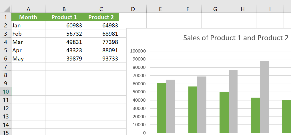
From this graph, it is clear that sales of Product 1 have always exceeded sales of Product 2. Moreover, sales of Product 2 have decreased over the five-month period, while sales of Product 1 are increasing.
The same data, in the form of a stacked column chart, is shown in the following figure.
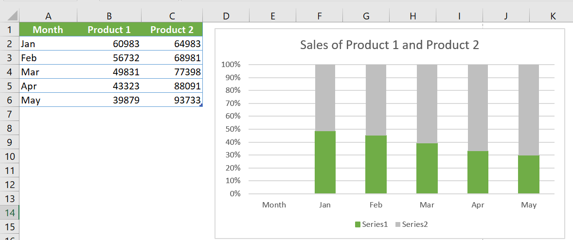
This graph has the added benefit of representing combined sales over time. It shows that total sales have remained fairly stable each month, but the relative proportions of the two products have changed.
This stacked column chart displays sales by product and represents total sales.
The following figure shows the same sales data plotted as a 100% stacked column chart. 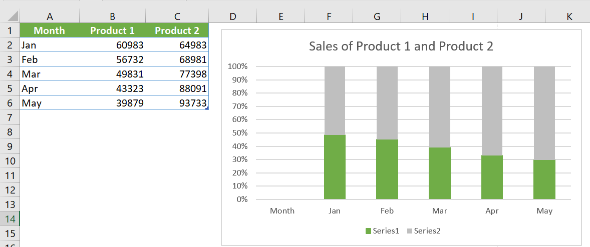
This type of chart shows the relative contribution of each product by month. Note that the vertical axis displays percentage values, not sales amounts. This chart does not provide any information about actual sales volumes, but this information could be provided using data labels. This type of chart is often a good alternative to using multiple pie charts. Instead of using a sector to show the relative sales volume each year, the chart uses a column for each year.
The data is plotted using a 3D clustered column chart in the following figure.
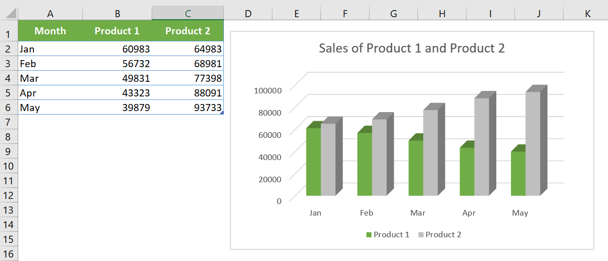
The name is a bit misleading because the chart only uses two dimensions, not three. Many people use this type of chart because it has more visual pizzazz. Compare this chart with a « true » 3D column chart (which has a second category axis), shown in the following figure.
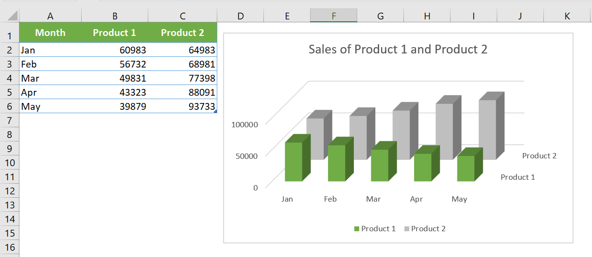
This type of chart can be visually appealing, but accurate comparisons are difficult due to the distorted perspective view.
For 3D columns, you can choose a different column shape in the Format Data Series dialog box. Excel offers variations such as cylinder, cone, and pyramid.
2 Bar charts
A bar chart is essentially a column chart that has been rotated 90 degrees clockwise. A distinct advantage of using a bar chart is that the category labels can be easier to read. The following figure shows a bar chart that displays a value for each of the ten survey items.
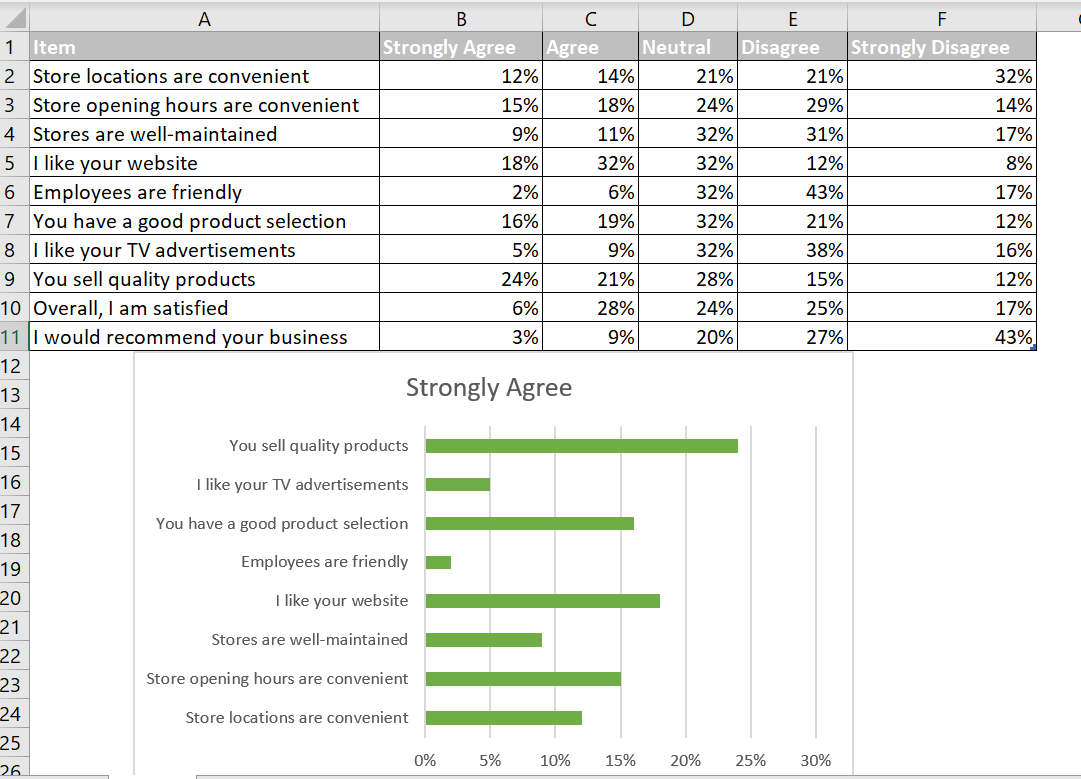
Category labels are long and would be difficult to display legibly with a histogram. Excel offers six subtypes of bar charts.
Unlike a histogram, no subtype displays multiple series along a third axis. (That is, Excel doesn’t provide a 3D bar chart subtype.) You can add a 3D look to a bar chart, but it will be limited to two axes.
You can include any number of data series in a bar chart. Additionally, bars can be « stacked » from left to right.
3 Line graphs
Line charts are often used to plot continuous data and are useful for identifying trends. For example, plotting daily sales as a line chart can help you identify fluctuations in sales over time. Typically, the x-axis of a line chart displays equal intervals. Excel supports seven subtypes of line charts.
See the following figure for an example of a line chart that represents monthly data (676 data points).
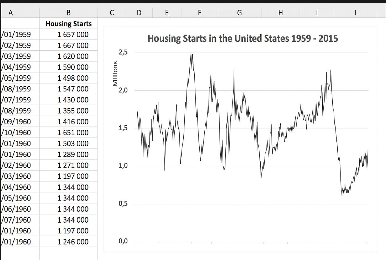
Although the data varies greatly from month to month, the graph clearly depicts the cycles.
A line chart can use any number of data series, and you distinguish the lines by using different colors, line styles, or markers. The following figure shows a line chart with three series.
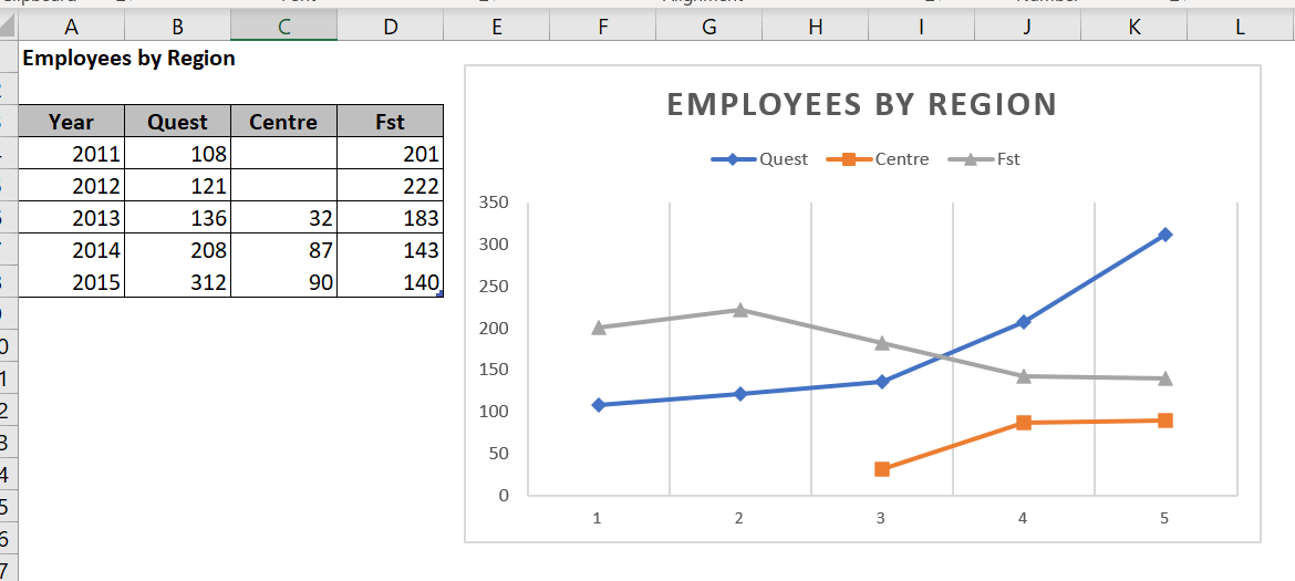
The series are distinguished by markers (circles, squares, and triangles) and different line colors. When the chart is printed on a non-color printer, the markers are the only way to identify the lines.
The last line chart example, shown in the following figure, is a 3D line chart.
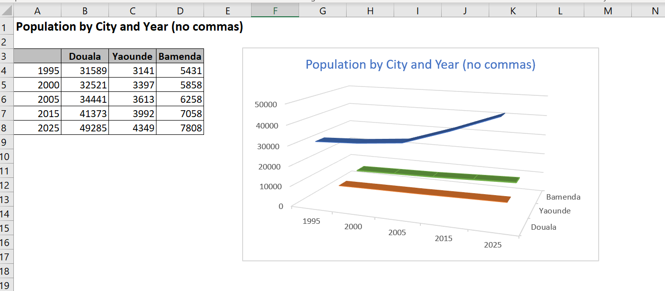
While it looks good, it’s definitely not the clearest way to present data. In fact, it’s pretty lame.
4 Pie Charts
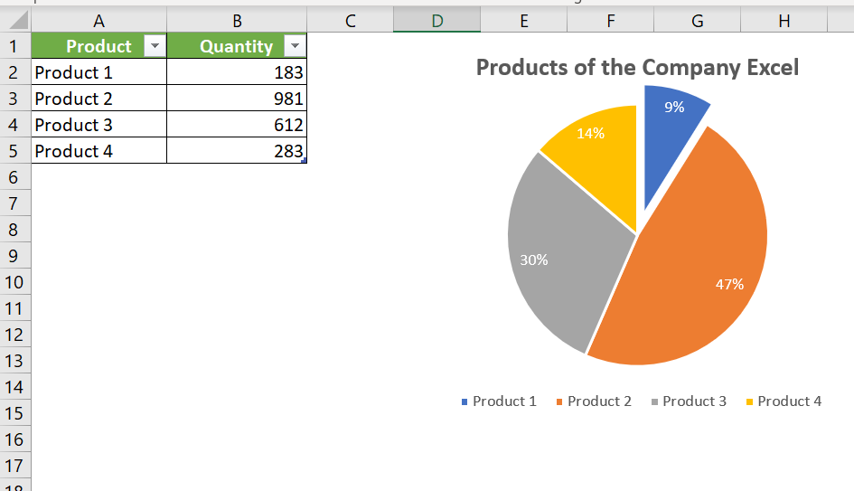
A pie chart is useful when you want to show relative proportions or contributions to a whole. A pie chart uses a single data series. Pie charts are most effective with a small number of data points. As a general rule, a pie chart should use no more than five or six data points (or slices). A pie chart with too many data points can be difficult to interpret.
All values in a pie chart must be positive numbers. If you create a pie chart that uses one or more negative values, the negative values will be converted to positive values, which is probably not what you wanted.
You can « explode » one or more slices of a pie chart to emphasize it. Activate the chart and click any slice to select the entire pie. Then click the slice you want to explode and drag it away from the center.
5 XY Charts ( Scatter Plots)
Another common type of chart is an XY chart (also called a scatter plot). An XY chart differs from most other types of charts in that both axes display values.
This type of graph is often used to show the relationship between two variables.
The following figure shows an example of an XY chart that plots the relationship between sales calls made (horizontal axis) and sales (vertical axis).
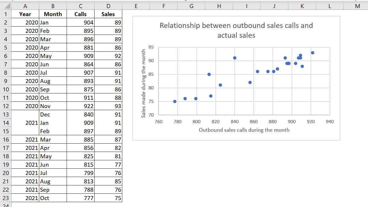 Each point on the graph represents a month. The graph shows that these two variables are positively correlated: months with more calls generally had higher sales volumes.
Although these data points correspond to time, the graph does not convey any time-related information. In other words, the data points are plotted based only on their two values.
6 Area Charts
Think of an area chart as a line chart in which the area under the line has been colored. The following figure shows an example of a stacked area chart.
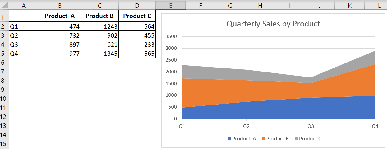
Stacking data series allows you to clearly see the total, as well as the contribution of each series.
The following figure shows the same data, plotted as a 3D area chart.
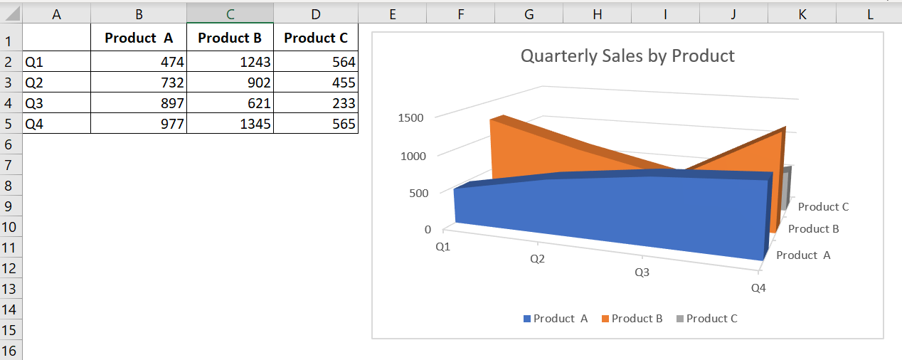
As you can see, this isn’t an example of an effective chart. The data for products B and C is hidden. In some cases, the problem can be solved by rotating the chart or using transparency. But generally, the best way to recover a chart like this is to select a new chart type.
7 Radar Maps
You may not be familiar with this type of chart. A radar chart is a specialized chart that has a separate axis for each category, and the axes extend outward from the center of the chart. The value of each data point is plotted on the corresponding axis.
The following figure shows an example of a radar map.
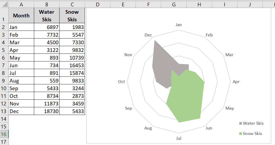
This chart presents two data series across 12 categories (months) and shows the seasonal demand for snow skis versus water skis. Note that the water ski series partially obscures the snow ski series.
Using a radar chart to display seasonal sales can be an interesting approach, but it’s certainly not the best type of chart. As you can see in the following figure, a stacked bar chart shows the information much more clearly.
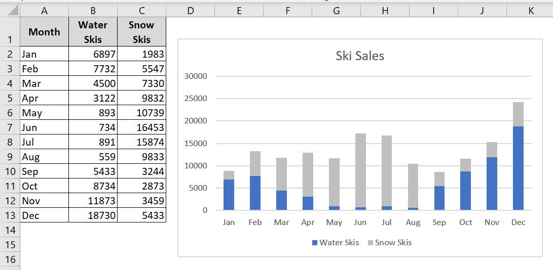
A stacked bar chart is a better choice for ski sales data.
8 Surface Graphs
Surface charts display two or more data series on a surface. As the following figure shows, these charts can be quite interesting.
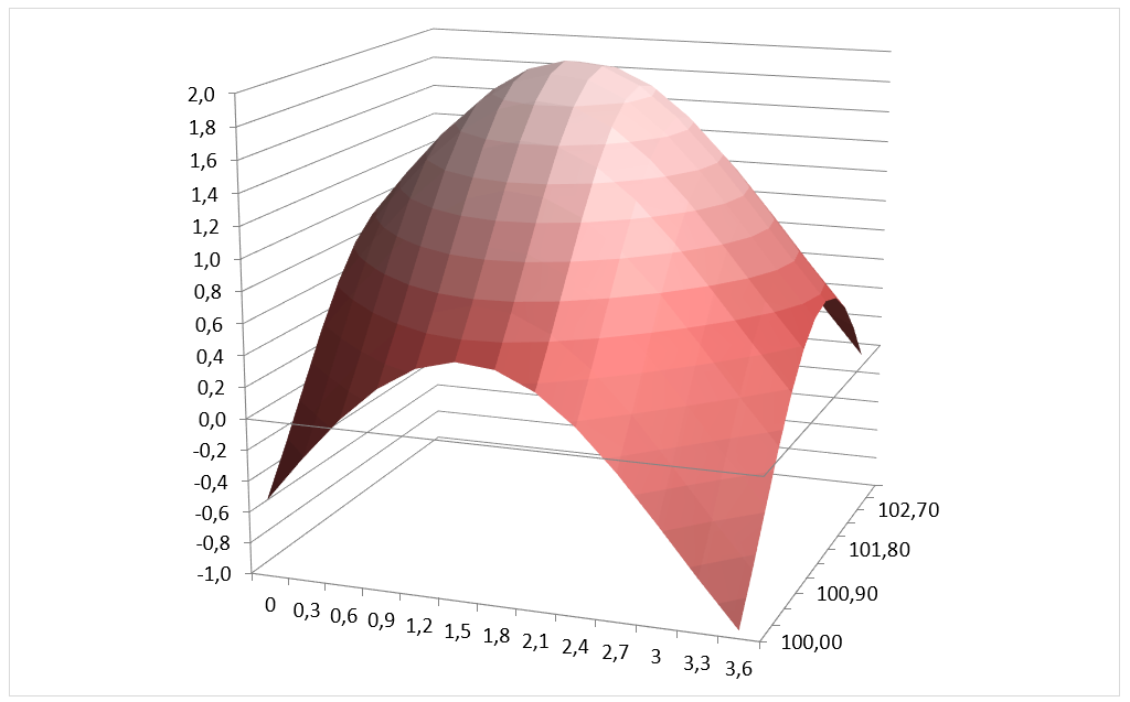
Unlike other charts, Excel uses color to distinguish values, not data series. The number of colors used is determined by the major unit scale setting for the value axis. Each color corresponds to one major unit.
NOTE ■■■■■■
Un graphique en surface ne trace pas de points de données 3D. L’axe des séries pour un graphique en surface, comme pour tous les autres graphiques 3D, est un axe des catégories et non un axe des valeurs. En d’autres termes, si vous avez des données représentées par des coordonnées x, y et z, elles ne peuvent pas être tracées avec précision sur un graphique de surface à moins que les valeurs x et y soient également espacées.
9 Bubble Charts
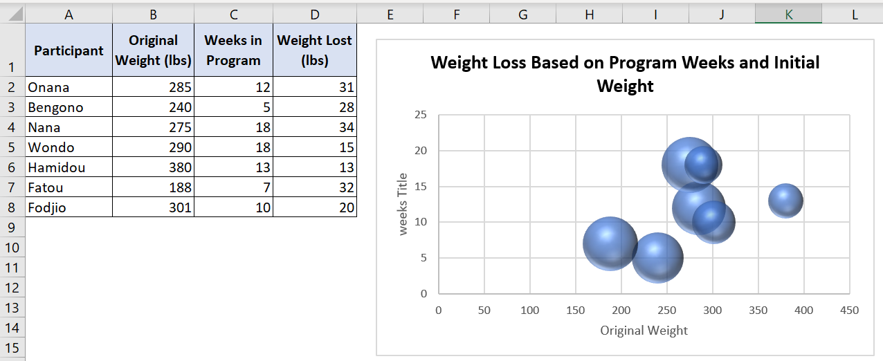
Think of a bubble chart as an XY chart that can display an additional data series, represented by the size of the bubbles. As with an XY chart, both axes are value axes. (There is no category axis.)
The following figure shows an example of a bubble chart illustrating the results of a weight loss program. The horizontal value axis represents the initial weight, the vertical value axis indicates the number of weeks in the program, and the size of the bubbles represents the amount of weight lost.
10 Stock Charts
Stock charts are most useful for displaying stock market information. These charts require three to five data series, depending on the subtype.
The following figure shows an example of each of the four types of stock charts.
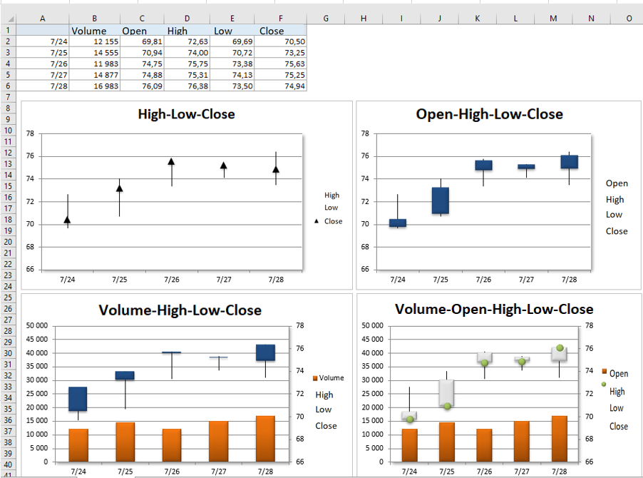
The bottom two charts display trading volume and use two value axes. Daily volume, represented by columns, uses the left axis. Up bars, sometimes called candlesticks, are the vertical lines that represent the difference between the opening and closing prices. A black up bar indicates that the closing price was lower than the opening price.
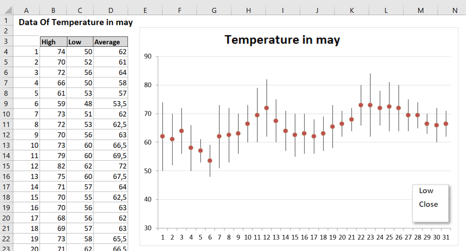
Stock charts aren’t just for stock price data. The following figure shows a stock chart depicting the maximum, minimum, and average temperatures for each day in May. This is a high-low-close chart.
11 Pareto Charts
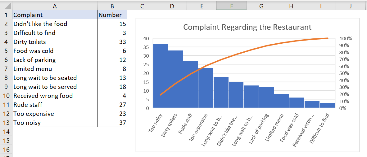
A Pareto chart is a combination chart in which the columns are displayed in descending order and the columns use the left axis. The line shows the cumulative percentage and uses the right axis.
The following figure shows a Pareto chart created from the data in the range A2:B14. Notice that Excel has sorted the chart items. The line shows, for example, that about 50 percent of all complaints are in the first three categories.
12 Waterfall Charts
A waterfall chart is used to show the cumulative effect of a series of numbers, usually positive and negative numbers. The result is a staircase-like display.
The following figure shows a waterfall chart that uses the data in column D.
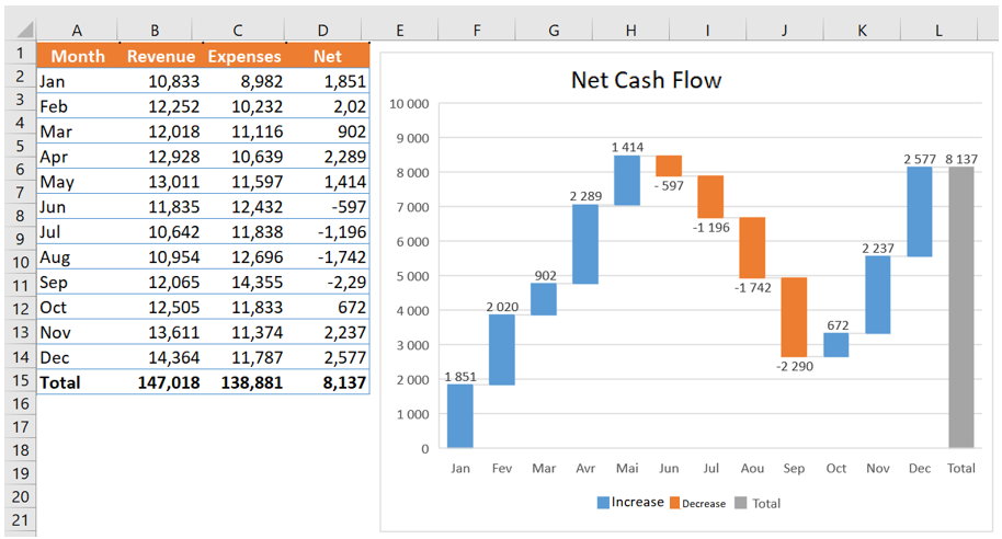
Waterfall charts typically display the final total as the last bar, with its origin at zero. To correctly display the total column, select the column, right-click, and choose Set as Total from the context menu.
13 Box and Whisker Charts
A box plot (also known as a whisker or quartile chart) is often used to visually summarize data. In the past, it was possible to create such charts using Excel, but it required a fair amount of setup. In recent versions of Excel, this is straightforward.
The following figure shows a box and whisker plot created for four groups of subjects.
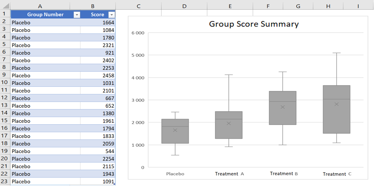
The data is in a two-column table. In the graph, the vertical lines extending from the box represent the numerical range of the data (minimum and maximum values). The « boxes » represent the 25th to 75th percentile. The horizontal line inside the box is the median (or 50th percentile) value, and the X is the mean. This type of graph allows the user to make quick comparisons between groups of data.
As you can see in the figure, the Series Options section of the Format Data Series task pane contains options for this type of chart.
14 Sunbeam Graphic
A sunburst chart is like a pie chart with multiple concentric layers. This type of chart is particularly useful for hierarchically organized data. The following figure shows an example of a sunburst chart representing a music collection.
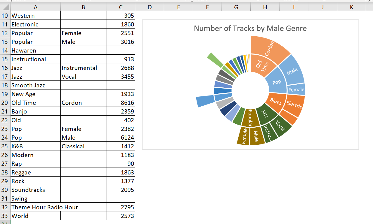
It displays the number of tracks by genre and subgenre. Note that some genres do not have subgenres.
A potential problem with the chart type is that some slices are so small that data labels cannot be displayed.
15 Tree Charts
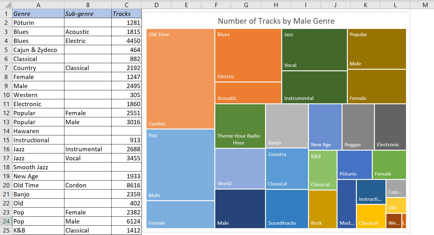
Much like a sunburst chart, a tree chart is suitable for hierarchical data. The data, however, is represented as rectangles. The following figure shows the data from the previous example, plotted as a tree chart.