
Worksheet controls help you create a custom project interface embedded directly into the worksheet — that is, an interface as close to the user as possible. They automate user tasks, thereby simplifying and increasing work efficiency. Such controls also provide the necessary protection for your data.
Overview of Toolbar Commands
Controls are an integral part of the Windows graphical user interface. Examples of controls include command buttons, text boxes, lists, scroll bars, and other interface elements that you can use to enter a number, select a value, or perform another action. Various controls can be placed on an Excel worksheet. Controls are accessed by clicking the Insert button under the Developer tab in the Controls group on the ribbon. Note that when you click the Insert button, two groups of controls are available: Form Controls and ActiveX Controls, as shown in the figure below.
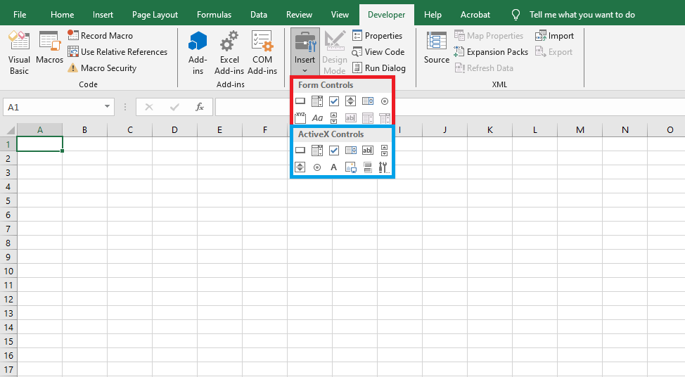
The Form Controls group is mainly intended to ensure compatibility with earlier versions of Excel (up to Excel 97) that used these corresponding controls. They are far less powerful than the controls found in the ActiveX Control panel. Some of these elements cannot be used at all in newer Excel documents — such as text boxes and combo boxes. However, they have some functionalities that ActiveX controls do not, for example, they can be placed on chart sheets.
ActiveX Controls are independent components from various applications and can also be used in Excel. The following table lists the main commands and corresponding buttons in the toolbar:
| Button | Prefix | Icon | Description |
|---|---|---|---|
| Label | Lbl |  |
Allows adding text that the user cannot modify, like a caption under a chart. |
| TextBox | Txt |  |
Contains text that the user can enter or modify. |
| ComboBox | Cbo |  |
Displays a combo list with a text field. |
| ListBox | Lst |  |
Displays a list of items for the user to choose from. |
| CheckBox | Chk |  |
Creates a box the user can check to indicate True or False. |
| OptionButton | Opt |  |
Displays multiple options where only one can be selected. |
| ToggleButton | Tgl |  |
Creates a button that can be toggled on or off. |
| Frame |  |
Creates a graphical or functional group of controls. | |
| CommandButton | Cmd |  |
Creates a button that the user can click to execute a command. |
| TabStrip |  |
Defines several pages for the same window area or dialog box. | |
| MultiPage |  |
Displays multiple screens as a set. | |
| ScrollBar | Scr |  |
Graphical tool to quickly access many list items or large amounts of data; shows current position on a scale. |
| SpinButton | Spn |  |
Counter control to increment/decrement numbers or scroll values. |
| Image | Img |  |
Displays a bitmap, icon, or metafile image for decoration (uses fewer resources than PictureBox). |
| More Controls | Displays a list of additional ActiveX controls available on your computer that you can add to a custom form. |
Placing a Control on a Worksheet
Creating a control on a worksheet involves two steps: placing the control and customizing it.
Customization involves defining the control’s properties — for example, linking the control to specific worksheet cells, customizing its appearance, and other settings.
To place a control on a worksheet:
- Click the Insert button from the Developer tab in the Controls group and select the desired control from either Form Controls or ActiveX Controls. The mouse pointer changes to a cross.
- Position the cross pointer where you want the control, and click the left mouse button. The control appears on the worksheet.
- Drag the white squares (handles) to resize the control.
To insert additional controls using the dialog:
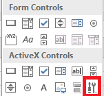
- Click the More Controls button in the ActiveX Controls toolbar (as shown below).
- Select the desired control from the list. The pointer becomes a cross.
- Move the pointer to the desired position on the worksheet and click. The control will appear.
- Resize the control if necessary.
The control is not tied to any worksheet cell and can be moved freely. Both the mouse and keyboard can be used to reposition the control, although the mouse is more practical for long-distance moves.
To move the control using the mouse:
- Highlight the desired control. For an ActiveX control, click Design Mode in the Controls group under the Developer tab, then select the control. The selected control shows a border with handles.
- Drag the control using its border or its image — not the caption area — otherwise it may enter edit mode instead of dragging.
To select multiple controls, hold down + and click each control.
To move the control vertically/horizontally, hold down while dragging. To snap to gridlines, hold . You can combine both keys.
To move a control using the keyboard:
- Select the control.
- Use the arrow keys <←>, <↑>, <→>, and <↓> to move it.
To copy a control:
- Highlight the desired control.
- Hold down , drag the object to the new location, and release the mouse. A copy appears.
You can group, align, layer, or snap controls just like any other object.
Controls are objects. Like all objects, they have properties, methods, and events. Properties can be set both during design time and via code.
To set properties during design:
- Select the control and click the Properties button under the Developer tab. The Properties window appears.
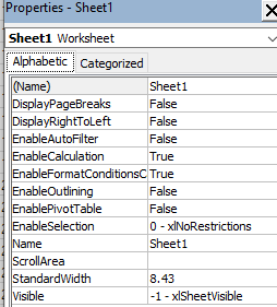
- The left side lists property names; the right side shows fields or drop-downs for setting values.
You can also link a macro or VBA procedure to a control triggered by an event. Event-handling code is written in the sheet module where the control is located.
To access this module:
- Select the control and click View Code under the Developer tab in the Controls group.
After finishing, exit Design Mode by clicking the Design Mode button again.
Your First Project with a Control
Let’s now create our first project with a control. We’ll place a button on the worksheet, and when clicked, a message box saying “Bonjour à tous!” will appear.
Steps:
- Click the CommandButton in ActiveX Controls, found under Insert in the Controls group on the Developer tab.
- Draw the button on the worksheet.
- Select the button, then click Properties under the Developer tab. In the Properties window:
- Set
NametocmdBonjour - Set
Captionto"Bonjour à tous"
- Set
- Select the button again and click View Code under the Developer tab. This opens the Visual Basic Editor, which automatically creates the event handler:
Private Sub cmdBonjour_Click()
End Sub
- Inside the
cmdBonjour_Clickprocedure, add the message box instruction:
Private Sub cmdBonjour_Click()
    MsgBox "Hello everyone!", vbExclamation
End Sub
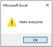
Exit Design Mode by clicking its button again. Your project is ready — test it by clicking the button: a greeting dialog box will appear.
Control Properties, Methods, and Events
General Properties of Controls
Controls have many properties that define settings ranging from position and size to displayed text and graphics. The table below summarizes common control properties:
| Property | Description |
|---|---|
| AutoSize | Whether the control resizes automatically to fit content |
| BackColor | Background color |
| BackStyle | Background transparency |
| BottomRightCell, TopLeftCell | Refer to cells under control corners |
| Caption | Text displayed on the control |
| ControlTipText | Tooltip text |
| Enabled | Whether the control is available to the user |
| Font | Returns a Font object to set font properties |
| ForeColor | Font color |
| Height, Width | Control size |
| Left, Top | Coordinates of top-left corner |
| MouseIcon | Custom mouse pointer |
| MousePointer | Type of mouse pointer |
| Name | Object name |
| OldHeight, OldWidth | Previous size of the control |
| OldLeft, OldTop | Previous position of the control |
| Parent | Reference to containing object |
| Picture | Link to bitmap file for background image |
| PicturePosition | Image position relative to text |
| PrintObject | Whether control appears in print |
| Tag | Used to identify a control |
| TakeFocusOnClick | Whether the control gains focus on click |
| Visible | Control visibility |
| WordWrap | Whether text wraps to next line |
Common Control Methods
Controls have several methods for moving, positioning, and managing them:
| Method | Description |
|---|---|
| Move | Moves the control |
| SetFocus | Sets input focus to the control |
| BringToFront, SendToBack | Sends control to front or back |
| ZOrder | Controls layering: values include fmTop and fmBottom |
Common Control Events
Controls support many events triggered by user/system actions — like mouse clicks or errors:
| Event | Description |
|---|---|
| BeforeDragOver | Occurs when dragging data over |
| BeforeDropOrPaste | Occurs before dropping or pasting dragged data |
| Click | Occurs when the user clicks the control |
| DblClick | Double-click event |
| Enter, Exit | When control gains/loses focus |
| Error | Triggered when control encounters an error |
| KeyDown, KeyUp | Keyboard key pressed/released (when control has focus) |
| KeyPress | Character key pressed (non-function keys) |
| MouseDown, MouseUp | Mouse button pressed/released |
| MouseMove | Mouse pointer moves over control |
The CommandButton Control
The CommandButton control is mainly used to execute certain actions triggered by clicking the button, such as starting or stopping a program, printing results, and so on. Thus, the main event associated with a command button is the Click event. The key property of a CommandButton is the Caption property, which gets or sets the text displayed on the surface of the button.
Command Button Menu
Let’s create a workbook containing three worksheets: Sheet1, Sheet2, and Sheet3. The first sheet contains two buttons named after the other two sheets, as shown in the following figure.
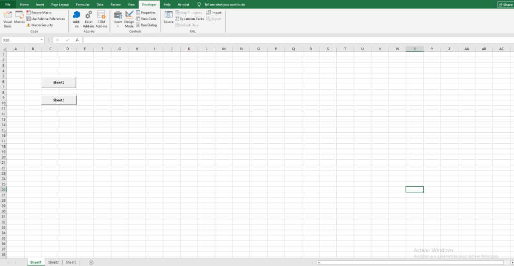
Clicking the button leads to the activation of the sheet with the corresponding name, and when the second button is pressed, not only is the sheet activated, but it also scrolls so that the specified cell appears in the top-left corner of the worksheet window.
Using the Properties window, set their property values as shown in the following table:
| Object | Property | Value |
|---|---|---|
| Command Button | Name | cmdFeuil2 |
| Caption | Feuil 2 | |
| Command Button | Name | cmdFeuil3 |
| Caption | Feuil 3 |
In the module for Sheet1, enter the following code:
Private Sub cmdFeuil2_Click()
    Worksheets("Sheet2").Activate
End Sub

Private Sub cmdFeuil3_Click()
    Worksheets("Sheet3").Activate
    ActiveWindow.ScrollColumn = 20
    ActiveWindow.ScrollRow = 30
End Sub
Comments:
- Clicking the « Feuil 2 » button activates Sheet2 using the
Activatemethod of the Worksheet object. - The worksheet scrolls so that the specified cell appears in the top-left corner using the ScrollColumn and ScrollRow properties of the Window object.
- The ScrollColumn property gets or sets the number of the leftmost visible column. Syntax:
expression.ScrollColumn, whereexpressionis a Window object. - The ScrollRow property gets or sets the number of the topmost visible row. Syntax:
expression.ScrollRow, whereexpressionis a Window object.
Displaying a Value with CommandButton
The CommandButton can be used not only for navigation but also for inputting values into cells. For example, you can use it to display total amounts, costs, or profits.
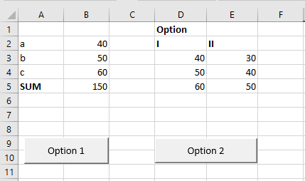
Let’s consider the problem of finding the total sum a + b + c for three variables with two possible sets of values, as shown in the following table:
| I | II | |
|---|---|---|
| a | 40 | 30 |
| b | 50 | 40 |
| c | 60 | 50 |
Steps to implement the described example:
- On the worksheet, place variables a, b, and c in cells B2, B3, and B4.
- In cell B5, enter the formula
=SUM(B2:B4)to compute the total. - In range D3:D5, enter the first set of values.
- In range E3:E5, enter the second set of values.
- Create two buttons and set their properties as follows:
| Object | Property | Value |
|---|---|---|
| Command Button | Name | cmdVar1 |
| Caption | Option 1 | |
| Command Button | Name | cmdVar2 |
| Caption | Option 2 |
In the Sheet1 module, enter the following code:
Private Sub cmdVar1_Click()
    Range("B2").Value = Range("D3").Value
    Range("B3").Value = Range("D4").Value
    Range("B4").Value = Range("D5").Value
End Sub

Private Sub cmdVar2_Click()
    Range("B2").Value = Range("E3").Value
    Range("B3").Value = Range("E4").Value
    Range("B4").Value = Range("E5").Value
End Sub
Comments:
- Clicking Option 1 reads values from range D3:D5 using the Value property and inputs them into B2:B4.
- Clicking Option 2 does the same using values from E3:E5.
Decorating a CommandButton with Images and Custom Mouse Pointer
Adding images can make buttons look more presentable. Changing the mouse pointer can also enhance visual appeal.
The image is loaded onto the button using the Picture property. The PicturePosition property sets the relative position of the text and image. The MousePointer property sets the mouse pointer type. Valid values are listed below. In VBA, the Picture and MouseIcon properties are set using the LoadPicture function, with the filename as the argument.
| Constant | Value | Description |
|---|---|---|
| FmMousePointerDefault | 00 | Default |
| FmMousePointerArrow | 01 |  |
| FmMousePointerCross | 02 |  |
| FmMousePointerIBeam | 03 |  |
| FmMousePointerSizeNESW | 06 |  |
| FmMousePointerSizeNS | 07 |  |
| FmMousePointerSizeNWSE | 08 |  |
| FmMousePointerSizeWE | 09 |  |
| FmMousePointerUpArrow | 10 |  |
| FmMousePointerHourglass | 11 |  |
| FmMousePointerNoDrop | 12 |  |
| FmMousePointerAppStarting | 13 |  |
| FmMousePointerHelp | 14 |  |
| FmMousePointerSizeAll | 15 |  |
| FmMousePointerCustom | 99 | User-defined |
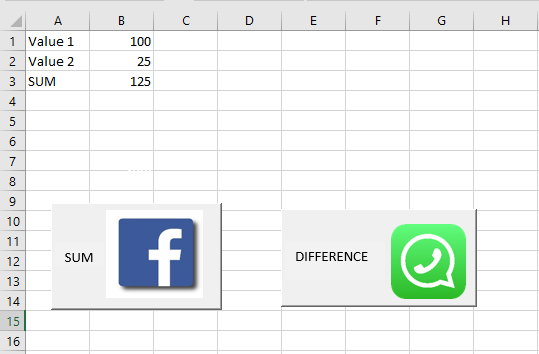
Example: Calculate values of x + y and x – y using formulas entered via buttons.
Steps:
- On the worksheet, place variables Value1 and Value2 in cells B1 and B2. Cell B3 will contain the formula inserted via code.
- Create two buttons and assign the following properties:
| Object | Property | Value |
|---|---|---|
| Command Button | Name | CmdSomme |
| Caption | Sum | |
| Picture | Link to an image file (e.g., Facebook logo) | |
| PicturePosition | FmPicturePositionRightCenter | |
| MousePointer | FmMousePointerAppStarting | |
| Command Button | Name | CmdDifference |
| Caption | Difference | |
| Picture | Link to an image file (e.g., WhatsApp logo) | |
| PicturePosition | FmPicturePositionRightCenter | |
| MousePointer | FmMousePointerCustom | |
| MouseIcon | Path to custom cursor (e.g., C:\Windows\Cursors\Inodrop.cur) |
Code to place in the worksheet module:
Private Sub cmdSomme_Click()
    Range("B3").Formula = "=B1+B2"
    Range("A3").Value = "Sum"
End Sub

Private Sub cmdDifference_Click()
    Range("B3").Formula = "=B1-B2"
    Range("A3").Value = "Difference"
End Sub
Comments:
- Clicking Sum places the formula
=B1+B2in B3 and sets cell A3 to “Sum”. - Clicking Difference places
=B1-B2in B3 and sets A3 to “Difference”. - The Formula property sets a formula to a range. Syntax:
expression.Formula.
Interactive Button with CommandButton
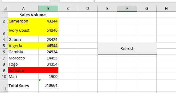
Using MouseDown and MouseUp events, you can make a button interactive. Let’s illustrate this with a sales table for a company, « Bristols House », which exports products.
We aim to highlight:
- The row with the highest sales in red
- Rows with sales above average in yellow
Since sales data change constantly, we’ll automate the highlighting.
Steps:
- Enter sales data in range B2:B10.
- In cell B11, enter
=SUM(B2:B10)to compute the total. - Create a CommandButton and set the following properties:
| Object | Property | Value |
|---|---|---|
| Button | Name | CmdActualiser |
| Caption | Refresh |
In the worksheet module (e.g., Sheet1), enter the following code:
Private Sub cmdActualiser_MouseDown(ByVal Button As Integer, _
      ByVal Shift As Integer, ByVal X As Single, ByVal Y As Single)
   With cmdActualiser
      .Font.Bold = True
      .Font.Size = 16
      .ForeColor = vbRed
      .Shadow = True
      .BackColor = vbBlue
   End With
End Sub

Private Sub cmdActualiser_MouseUp(ByVal Button As Integer, _
      ByVal Shift As Integer, ByVal X As Single, ByVal Y As Single)
   With cmdActualiser
      .Font.Bold = False
      .Font.Size = 12
      .ForeColor = vbBlack
      .Shadow = False
      .BackColor = vbGreen
   End With
   RefreshData
End Sub

Sub RefreshData()
   Dim maxVal, avgVal As Double
   Dim i As Integer
   With WorksheetFunction
      maxVal = .Max(Range("B2:B10"))
      avgVal = .Average(Range("B2:B10"))
   End With
   For i = 2 To 10
      With Range(Cells(i, 1), Cells(i, 2)).Interior
         If Cells(i, 2).Value = maxVal Then
            .Color = RGB(255, 0, 0)          ' Red for max
         ElseIf Cells(i, 2).Value >= avgVal Then
            .Color = RGB(255, 255, 0)        ' Yellow for ≥ average
         Else
            .ColorIndex = xlColorIndexNone   ' No fill
         End If
      End With
   Next
End Sub
Comments:
- Clicking Refresh recalculates and updates the table.
- MouseDown and MouseUp event procedures modify the button’s appearance: font style, size, text color (ForeColor), background color (BackColor), and shadow effect (Shadow).
- ForeColor defines text color:
expression.ForeColor. - BackColor defines background color.
- Shadow adds a shadow effect.
- Recalculation is handled by the
RefreshDataprocedure. WorksheetFunctionis a property of theApplicationobject and contains built-in Excel functions.Coloris a property ofInteriorused to set cell color.- Setting
ColorIndextoxlColorIndexNoneremoves fill color. ColorIndexis an index value from the current color palette or a constant likexlColorIndexAutomaticorxlColorIndexNone.