
Create a bar chart to check if the inventory is within a set range
Often, you need to track a quantity (inventory, cash, number of accidents) and you want to know if the quantity remains between historical upper and lower limits. A bar chart provides a useful tool for monitoring the evolution of a process over time. The following figure shows an example of a bar chart.
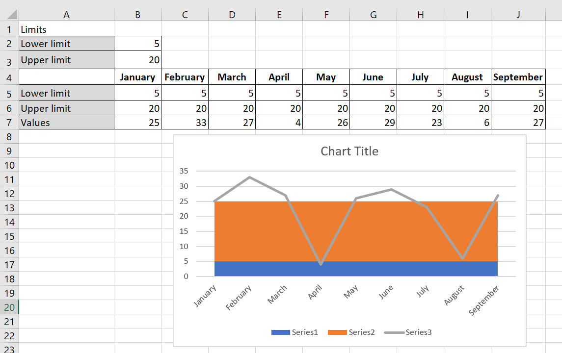
A bar chart summarizes inventory levels.
To create the bar chart, follow these steps:
1. You entered your lower limit on inventory (5) in B2 and your upper limit (25) on inventory in B3.
2. In line 5, you enter the lower limit for each month by copying the formula = $B$2 from B5 to C 5:J 5.
3. Copying the formula = $B $3 – $B$2 from B6 to C 6:J 6 calculates the upper limit – lower limit, as shown in the following figure.
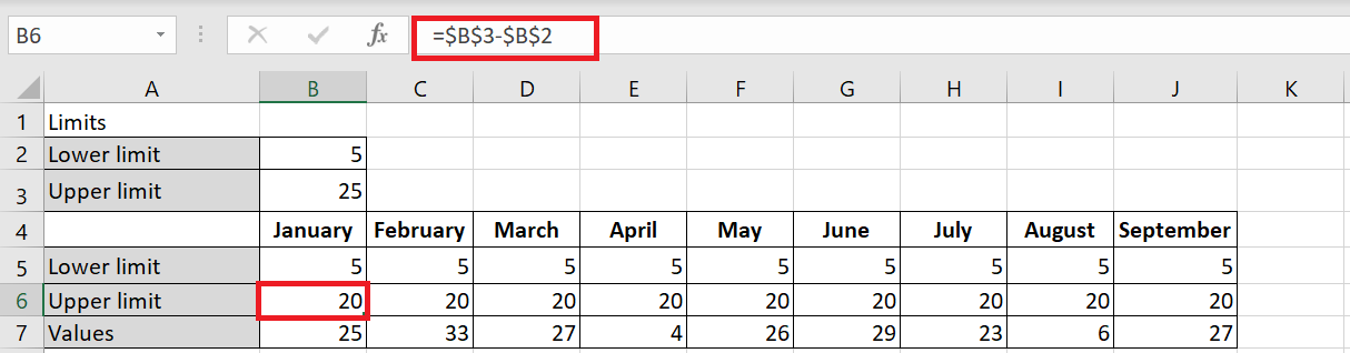
Name this row Upper Limit , as this row will be used to generate the row representing your upper inventory limit of 25 units.
4. Select the range B 5: J7 and select a stacked area chart (the second 2D area option), from the Insert tab of the ribbon.
Values data series on the chart that appears, right-click Change Chart Type Data Series and choose the first Line chart option, as shown in the following figure.
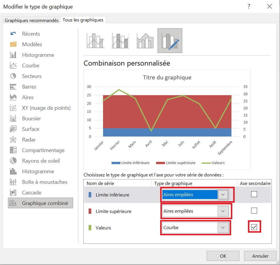
6. Add a secondary axis to the Values series, which you would later remove from the chart.
7. Right-click the Upper Limit and Lower Limit series and select Stacked Areas. Click OK to close the dialog box.
8 On the chart that appears, right-click the Lower Bounds data series and select Format Data Series . In the dialog box that appears, click the Fill category and select No Fill.
Your bar chart shows that you are having great difficulty maintaining inventory levels between your desired lower and upper limits.