Votre panier est actuellement vide !
Catégorie : Excel diagram
Editing chart data with a drop-down list
Editing chart data with a drop-down list
drop-down controls to give your users an intuitive way to select data via a drop-down selector. The following figure shows a thermometer chart controlled by the drop-down list above. When a user selects the Maroua market, the chart responds by plotting the data for the selected market.
Use drop-down lists to give your users an intuitive drop-down selector.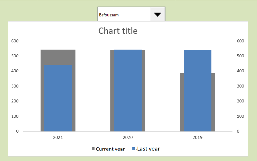
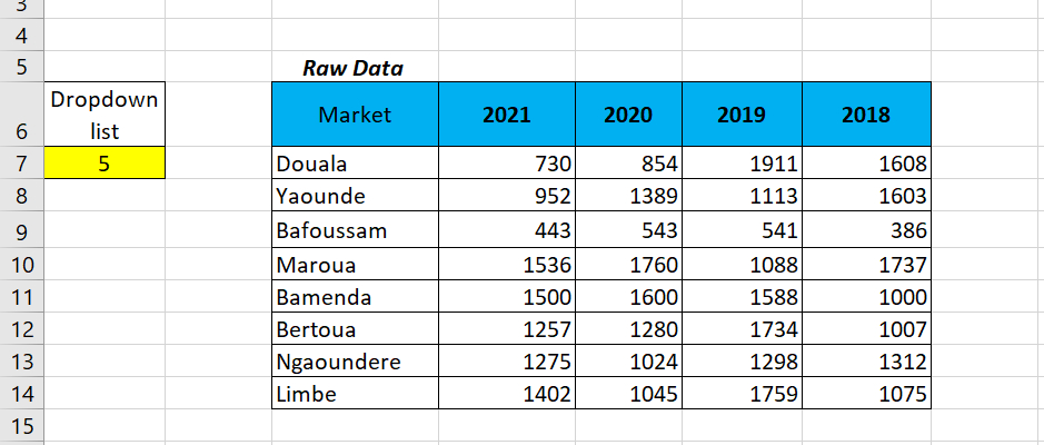
To create this example, start with the raw dataset shown in the following figure. This dataset contains the data for each market. Near the raw data, reserve cell A7 where the drop-down list will display its value. This cell detects the index number of the selected drop-down list entry.Raw data set and cell in which the drop-down list can display its value.
You then create the analysis layer (the staging table) consisting of all the formulas, as shown in the following figure. The chart is linked to this staging table, allowing you to control what the chart sees. The first cell of the staging table contains the following INDEX formula:
=INDEX(D7:D14,$A$7)
Create a staging table using the INDEX function to extract the appropriate data from the raw dataset.
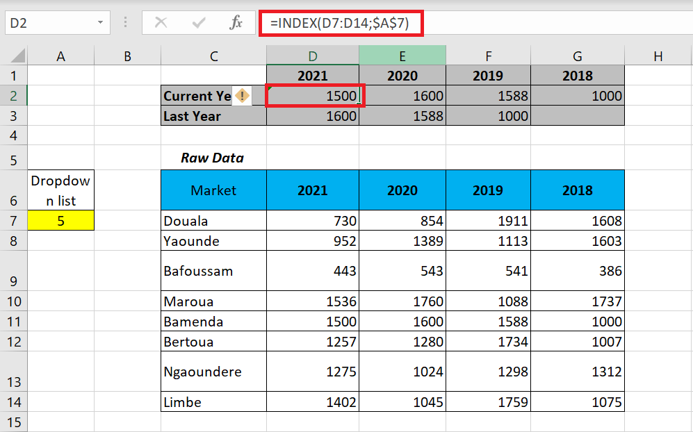
The INDEX function converts an index number into a recognizable value. An INDEX function requires two arguments to work properly. The first argument is the range of the list you are working with. The second argument is the index number.
In this example, you use the index number of the combo box (in cell A7) and extract the value from the appropriate range (2021 data in A7 : A14). Again, note the use of absolute dollar signs ($). This ensures that cell references in formulas don’t change when copied and traversed.
Look at the previous figure to see what happens. The INDEX formula in cell D2 points to the range containing the 2021 data. It then captures the index number in cell A7 (which intercepts the output value of the drop-down list). The index number happens to be 7. So, the formula in cell P2 will extract the seventh value from the 2021 data range (Ngaoundéré).
When you copy the formula, Excel adjusts the formula to extract the seventh value from each year’s data range. Once your INDEX formulas are in place, you have a clean staging table that you can use to create your chart.
Displaying Multiple Views Through a Chart
Displaying Multiple Views Through a Chart
One way to use radio buttons is to populate a single chart with different data , depending on the option selected. The following figure illustrates an example. As each category is selected, the single chart is updated to display the data for that selection.
This chart is dynamically populated with different data depending on the radio button selected.
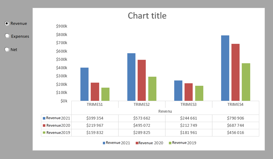
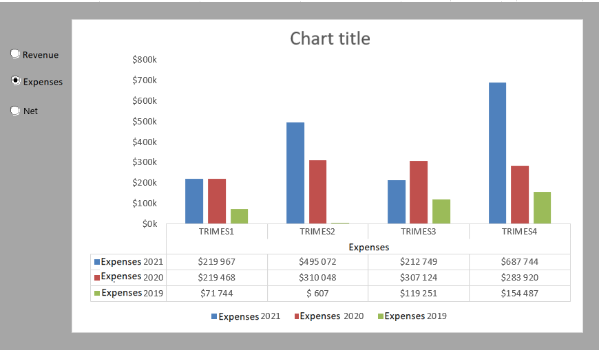
Now, you can create three separate charts and display them all on your dashboard at the same time. However, using radio buttons as an alternative saves valuable real estate by not having to display three separate charts. In addition, it is much easier to troubleshoot , format, and maintain one chart than three.
To create this example, start with three raw datasets—as shown in the following figure—containing three categories of data ; Income, Expenses, and Net. The radio button controls display their values in cell A8. This cell contains the ID of the selected option: 1, 2, or 3.
Raw datasets and a cell where radio buttons can display their values.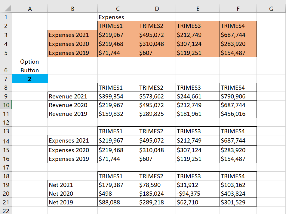
You then create the analysis layer (the staging table) consisting of all the formulas, as shown in the following figure. The chart is bound to the data in the staging table, which allows you to control what the chart sees. The first cell in the staging table contains the following formula:
=IF ($A$8 = 1; B9; IF ($A$8 = 2; B13; B17))Create a staging table and enter this formula in
the first cell.
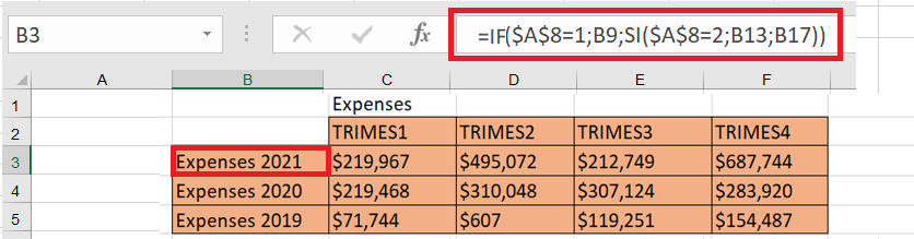
This formula tells Excel to check the value in cell A8 (the cell where the option buttons display their values). If the value in cell A8 is 1, which represents the value of the Income option, the formula returns the value in the Income dataset (cell B9). If the value in cell A8 is 2, which represents the value of the Expenses option , the formula returns the value in the Expenses dataset (cell B13). If the value in cell A8 is not 1 or 2, the value in cell B17 is returned.
Note that the formula shown in the following figure uses absolute references with cell A8. That is, the reference to cell A8 in the formula is prefixed with dollar signs ($A$8). This ensures that cell references in formulas do not change when copied and traversed.
To verify that the formula is working correctly, you can manually change the value in cell A8, from 1 to 3. When the formula works, you simply copy the formula to fill the rest of the staging table. Once the configuration is created, all that’s left is to create the chart using the staging table.Enabling and Disabling a Chart Series
Enabling and Disabling a Chart Series
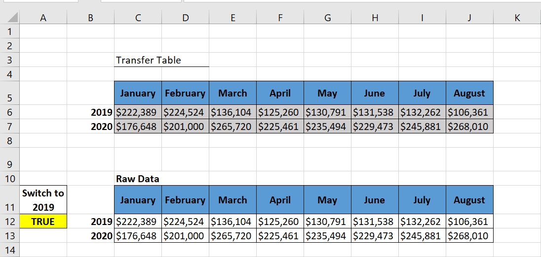
The following figure shows the same chart twice. Notice that the top chart contains a single series, with a checkbox offering to display 2019 trend data. The bottom chart shows the same chart with the checkbox selected.A checkbox can help create the effect of disappearing data series.
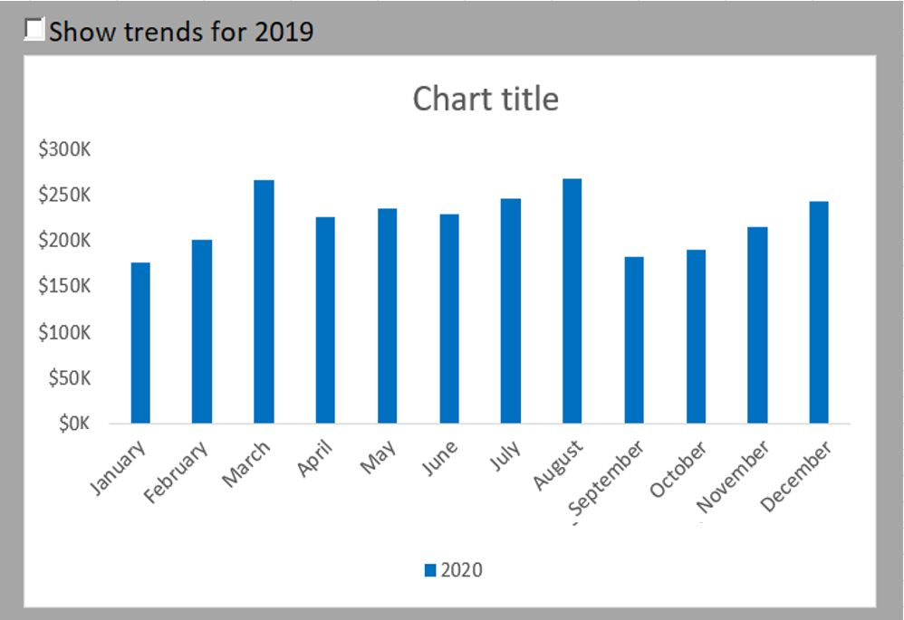
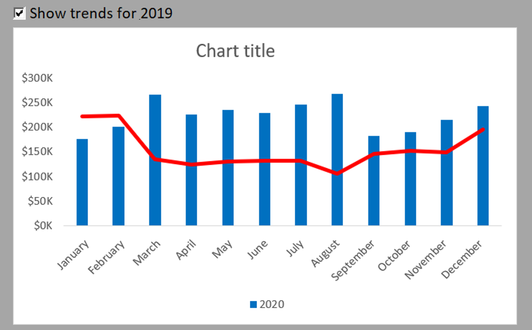
You start with the raw data that contains both 2019 and 2020 data; see the following figure. The Check Box control will display its value (TRUE or FALSE) in cell A12.
Next, create the analysis layer (staging table) consisting of all the formulas, as shown in the following figure. The chart is bound to the data in the staging table, not the raw data. This way, you can control what the chart sees.
Start with the raw data and a cell where a Check Box control can output its value.

Transfer table that will populate the graph. The values of this data are all formulas.
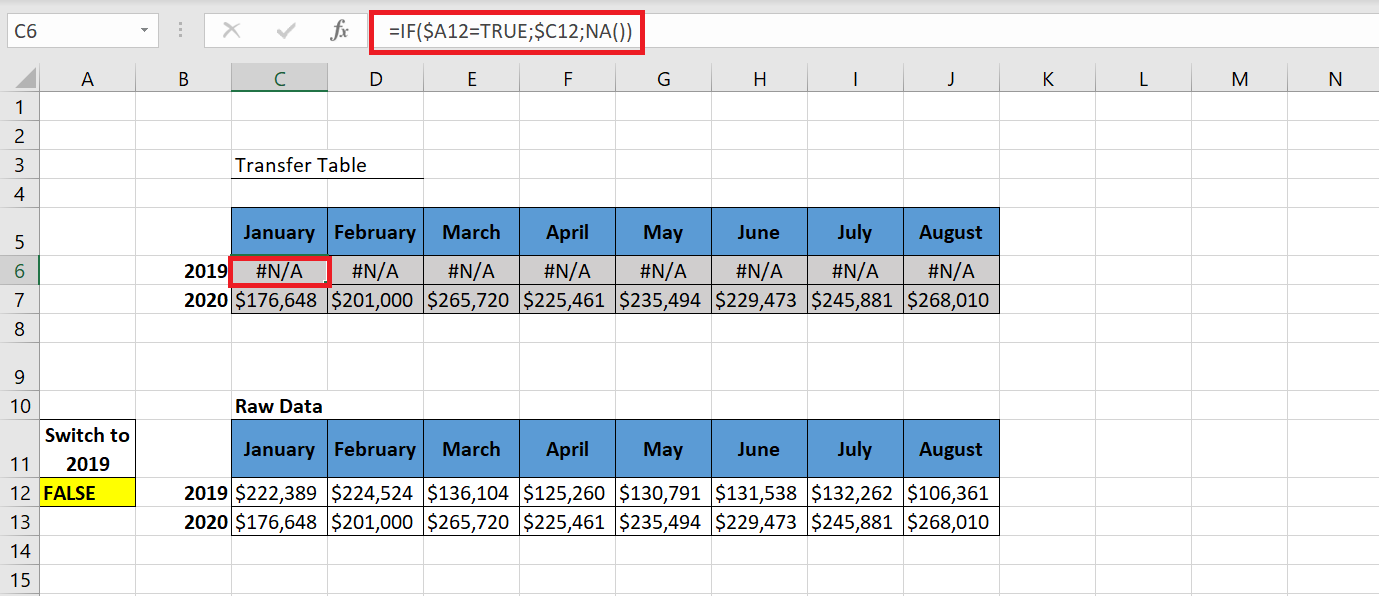
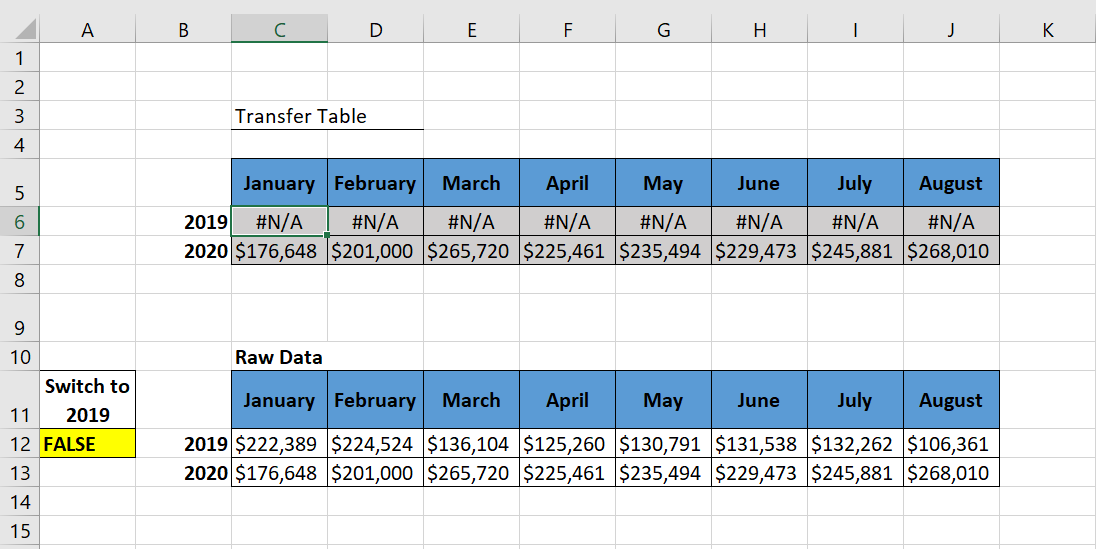
As you can see in the previous figure, the formulas for the 2020 row simply reference the raw data cells for each respective month. You do this because you want the 2020 data to appear at all times.For row 2019, test the value in cell A12 (the cell containing the checkbox output). If A12 reads TRUE, you are referencing the respective 2019 cell in the raw data. If A12 does not read TRUE, the formula uses Excel’s NA() function to return a #N/A error. Excel charts cannot read a cell with the #N/A error. Therefore, they simply do not show data series for cells that contain #N/A. This is ideal when you do not want a data series to be displayed.
Note that the formula shown in the previous figure uses an absolute reference with cell A12, that is, the reference to cell A12 in the formula is prefixed with a $ sign ($A12). This ensures that column references in formulas do not change when they are copied.
The following figure illustrates both scenarios in action in the staging table. In the scenario shown at the bottom of the following figure, cell A12 is set to TRUE, so the staging table actually brings in data for 2019. In the scenario shown at the top of the following figure, cell A12 is set to FALSE, so the staging table returns #N/A for 2019.
When cell A12 reads TRUE, 2019 data is displayed; when it reads FALSE, the 2019 row only displays #N/A errors.
F inally, to create the graph that we saw previously at the beginning of this section, we will follow the following steps:
1 Select the data range of the transfer table (B5 :J7 ), in the Insert tab of the ribbon, select Insert Histogram .
2 Perform the following formatting
- Select the 2019 legend and delete it because the data is hidden ;
- Select the Main Grid and delete it;
- Select the data series, change its color to blue and increase the Range Width.
- Right-click on the vertical axis and select Format Axis . In the Format Axis dialog box that appears, in the Number category , select « $ »# ##0 k
Now the histogram looks like the following figure
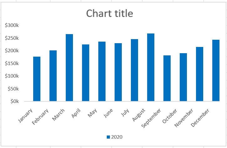
3 Click Insert on the Developer tab of the ribbon and select the Check Box form control .
4 Proceed as follows to customize the checkbox:
- Right-click the Checkbox and select Edit Text to rename it to Show 2019 Trends .
- Right-click the checkbox control and select Format Control. In the dialog box that appears, enter $A$12 in the Linked Cell box . In the dialog box, select 3D Shading to make the checkbox control more visible.
Now, when you check the checkbox control , the 2019 trend chart appears as a histogram.
5 To change the chart type to 2019 trend chart, right-click on the chart and select Change Chart Type Data Series . A dialog box will appear where you will change the chart type as shown in the following figure and click OK.
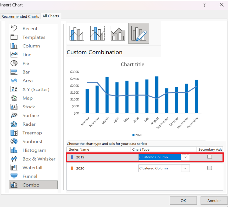
6 Finally, right-click on the 2019 trend chart and select
Format Data Series to change the color.
How to create a graph using the REPT function
Creating a graph using the REPT function
The REPT function is one of Excel’s text functions. It is used to fill a cell with multiple instances of a text string. Its syntax is REPT(text;number_of_times) . The first argument is the text to repeat. The second argument is the number of times the text should be repeated.
In the following figure, column B shows Banana’s exports. The numbers range from 700 to 10. You create the bar charts in column C by repeating the | sign repeatedly. However, instead of displaying a 900-character row in cell C4, the repeat argument in cell B4 is 700 divided by 10. Therefore, cell C4 contains 90 vertical bars. Cell C20 contains one vertical bar. Even though 13 divided by 10 is 1.3, Excel only displays whole bars.
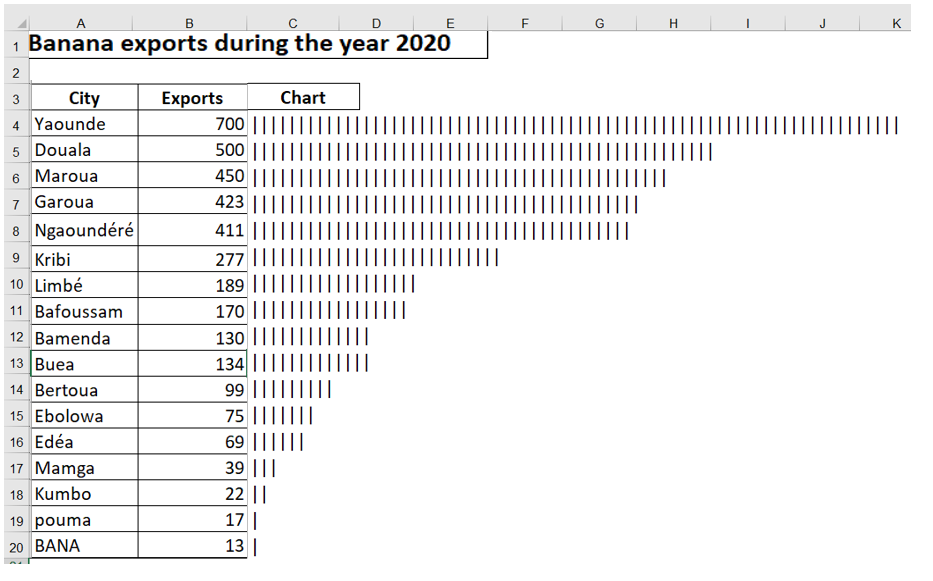
Figure 9.31 . Using the REPT function is a quick way to produce a bar chart directly in a spreadsheet. The trick is to use the appropriate scale factor.
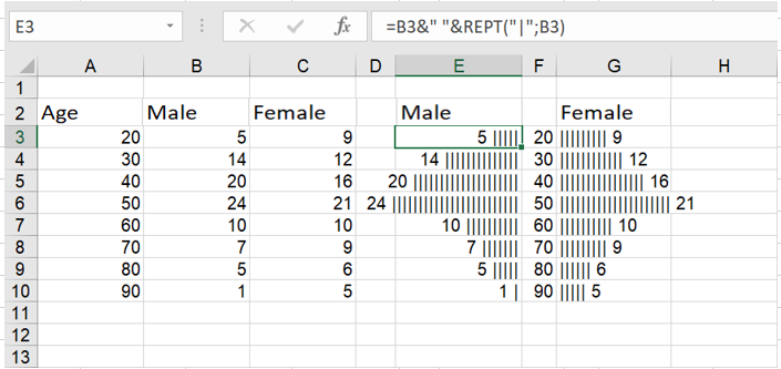
The result of the REPT function can be left-justified or right-justified. In the following figure, the results in column E are right-justified, and the results in column G are left-justified to create a comparative histogram. The formulas on the right side of the chart use a REPT function concatenated with a space, then the value ( = B3 & » « &REPT(« | »;B3) ). The formulas on the left side of the chart concatenate the value, a space, and the REPT function.
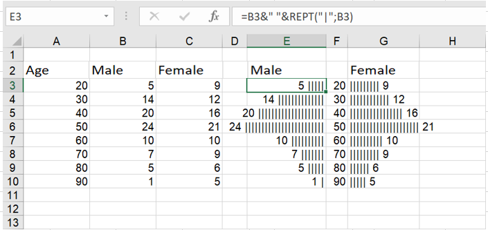
Here, pairs of REPT functions create a comparative histogram.
How to add conditional colors to a chart
Add conditional colors to a chart
Let’s say you’re plotting actual and target sales for each month, and you want months that hit 90% of target or better to be blue, 75% of target or worse to be green, and other months to be red. The trick to creating this chart is to put the data for each color on a different row. To start, put the sales you want colored blue in row 19 by copying the formula =IF(F13/F14>F15;F13/F14; » ») from F19 to G19: M19. Then, to put the sales you want colored red in row 20, copy the formula =IF(AND(G13/G14>G16;G13/G14<= G15 )) ; G13/G14, » « ) from F20 to G 20: M20. Finally, place the sales for the months that should appear in green in row 21 by copying the formula =IF(COUNT(F 19:F 20)=0,F13/F14, » « ) from F21 to G21: M21. Now select the range E 18: M21 and create a column chart. You can easily change the colors of each data series as desired.
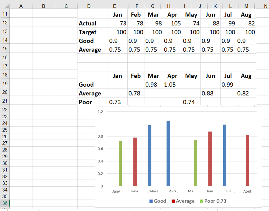
Blue indicates a good month, green a bad month, and red a bad month.
How to manage the appearance of hidden data
Manage the appearance of hidden data
Often, we plot data such as daily sales and filter the data in the worksheet. In this situation, Excel gives you the choice to continue displaying all the data in the chart or just display the filtered data. The hidden data worksheet contains the daily sales of a product for one year. If you represent the data as a line graph, you see the graph shown in the following figure. If you right-click the data and select Show data in hidden rows and columns , shown in the following figure, even if you filter the data, all the data points will still be displayed in the chart.
For example, as shown in the following figure , the data is filtered to show only December sales, but the chart still displays all daily sales for the entire year. If you did not select Show data in hidden rows and columns, only December sales would be visible in the chart.
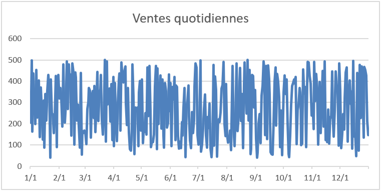
FIGURE 52-9 This is a graph showing daily product sales.
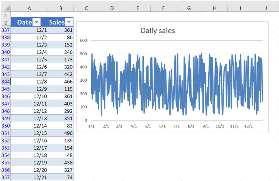
The data is filtered, but not the graph.
How to manage missing data
How to manage missing data?
Often, some rows in a spreadsheet contain missing data. Excel offers three ways to graphically represent missing data:
■ Display data as zeros.
■ Display data as blanks (gaps).
■ Replace a missing data point with a line joining adjacent data points.
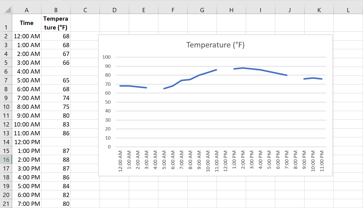
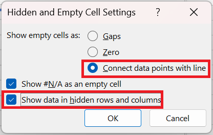
Missing Data worksheet contains hourly temperatures, but several values are missing. After plotting the data as a line chart, right-click the data and choose Select Data . This opens the dialog box shown in the following figure.
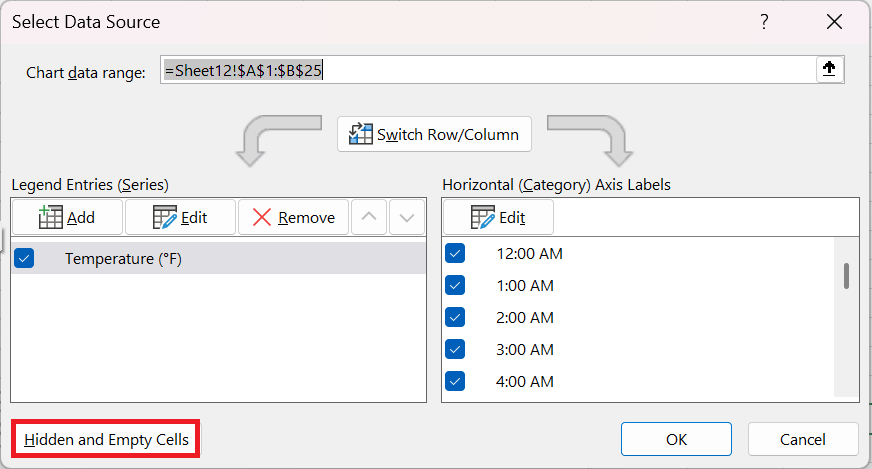
In this dialog box, click Hidden Cells and Empty Cells. A new dialog box appears, as shown in the following figure
This figure shows the Cell Settings dialog box hidden and empty.
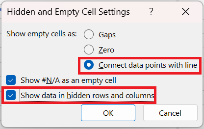
After selecting Connect data points with a line , you get the chart shown in the following figure. Choose the line chart with points and lines so that you can select the missing data, because missing data points do not have markers.
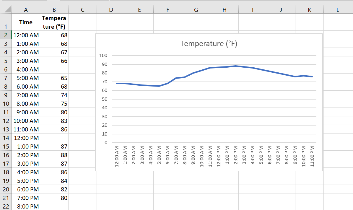
Missing data is replaced with rows.
How to use a bubble chart to summarize the variation of three variables
Use a bubble chart to summarize the variation of three variables
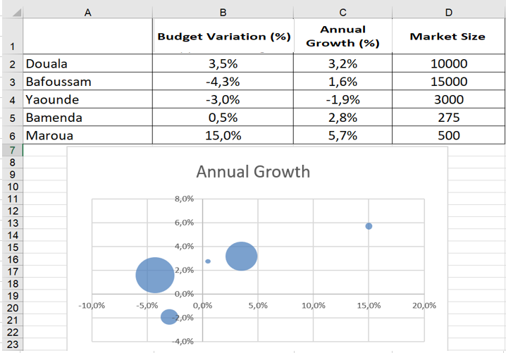
While a scatter plot shows you how two variables vary, a bubble chart allows you to visually summarize three variables. The Bubble worksheet contains, for several cities, the percentage change in sales from budget, the annual sales growth, and the market size for each city. To summarize this data in a bubble chart, select the range A1 :D6 , click Scatter Plot, and select Bubbles . After adding a data label for each bubble based on city (cell range A2 : A6) and placing the labels above each bubble, you end up with the bubble chart shown in the following figure. The areas of the bubbles are proportional to the market size of each country. For example, the Bafoussam bubble contains 50% more land area than the Douala bubble.
How to separate pre- and post-merger performance
Separate pre- and post-merger performance
Let’s say your company merged with another company on January 10, 2021, and you’re calculating daily sales. You might want to insert a vertical line into your chart to indicate the merger date. If you draw the vertical line with the Excel Shapes function and the chart is moved, the line will be in the wrong place. To fix this, start by selecting the range E 10: F32 ; create a scatter plot with lines (third option). In the range B 15: C16 , enter the merger date and the lower and upper limits on the y-coordinates of your vertical line. In this case, the lower limit = 0 and the upper limit = 120. Copy the range B 15: C16 and right-click on your chart to select Paste Option , which will insert the vertical line on the date January 10.
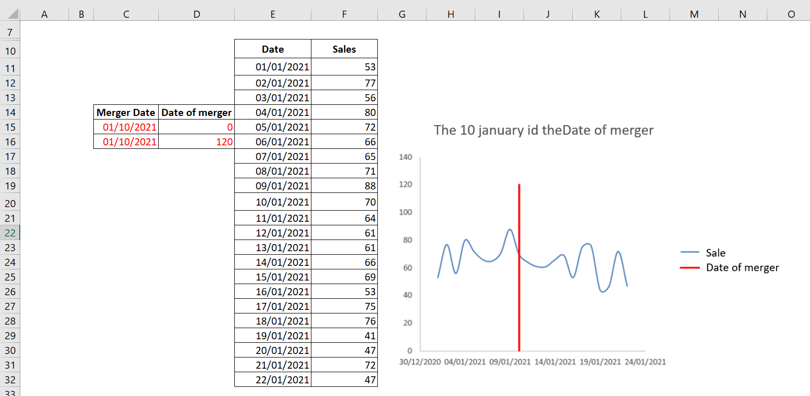
The vertical line indicates that January 10, 2021 was the merger date.
To change the legend to Merge Date , right-click the legend and select Select Data . A dialog box appears as shown in the following figure.
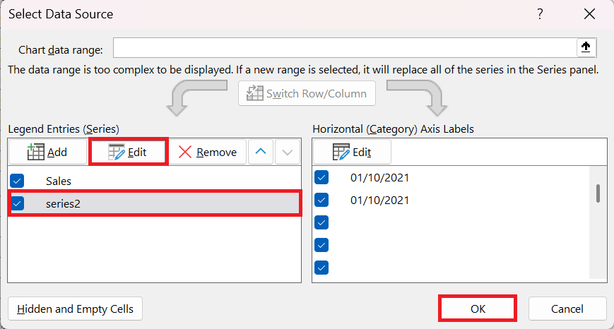
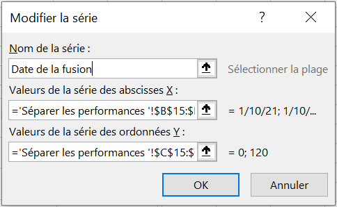
In this dialog box, select Series2 and click Edit to change the name Series2 to Merge Date , as shown in the following figure.
How to Create a radar chart
Create a radar chart
Radar charts allow you to present data in a similar way to bar charts, with distinct data categories. However, the difference between radar charts is that they are circular rather than horizontal or vertical, allowing each data category to have its own axis. The term radar chart comes from the chart’s close resemblance to a radar screen, such as those found on airplanes, ships, and submarines. They are also called « spider paintings » because they also resemble a spider’s web.
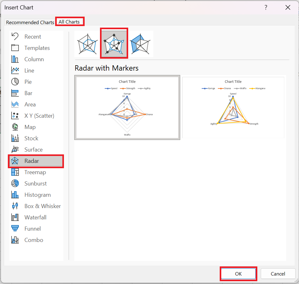
The spreadsheet summarizes four athletes in terms of strength, speed, and agility. Select the range C 2:F 6 and click Recommended Charts on the Insert tab . Select All Charts and click the radar chart icon and select Radar with Markers as shown in the following figure.
The center of the radar chart indicates a score of 0, and the further a marker is from the center, the better the score. The graph makes it easy to see, for example, that Waffo performs poorly on all measures and that Atangana performs well on all three measures.
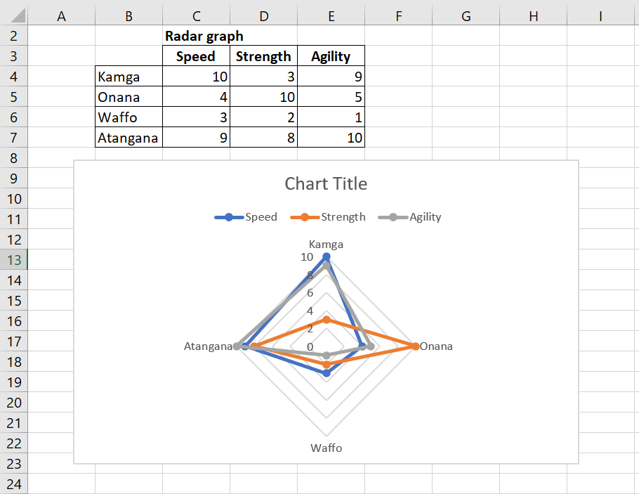
This is a radar chart with markers.