
How to Create a Pie Chart in Excel
Pie charts, or circular charts , as they are also called, are a common way to show how individual amounts or percentages contribute to the total. In such charts, the entire pie represents 100% of the whole, while the pie slices represent portions of the whole.
People love pie charts , while visualization experts hate them, and the main scientific reason for this is that the human eye is unable to compare angles accurately.
But if we can’t stop making pie charts , why don’t we learn how to do it properly? A pie chart can be difficult to draw by hand, with tricky percentages presenting an additional challenge. However, in Microsoft Excel, you can create a pie chart in a minute or two. And then, you might want to invest a few more minutes customizing the charts to give your Excel pie chart a sophisticated, professional look.
1 How to Create a Pie Chart
Creating a pie chart in Excel is extremely simple and only takes a few clicks. The key is to properly organize the source data in your spreadsheet and choose the most appropriate pie chart type.
1. Prepare the source data for the pie chart.
Unlike other charts, pie charts require you to organize the source data in a column or row . This is because only one data series can be plotted in a pie chart.
You can also include a column or row with category names, which must be the first column or row in the selection. The category names will appear in the pie chart legend and/or data labels.
In general, here are some characteristics of a pie chart :
- Only one data series is plotted in the chart.
- All data values are greater than zero.
- There are no empty rows or columns.
- There are no more than 7 to 9 data categories, as too many sectors can clutter your chart and make it difficult to understand.
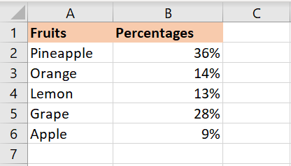
We will create a pie chart from the following data:
2. Insert a pie chart into the current worksheet.
Once you’ve properly organized your source data, select it, go to the Insert tab , and choose the type of chart you want. In this example, we’re creating the most common 2D pie chart:
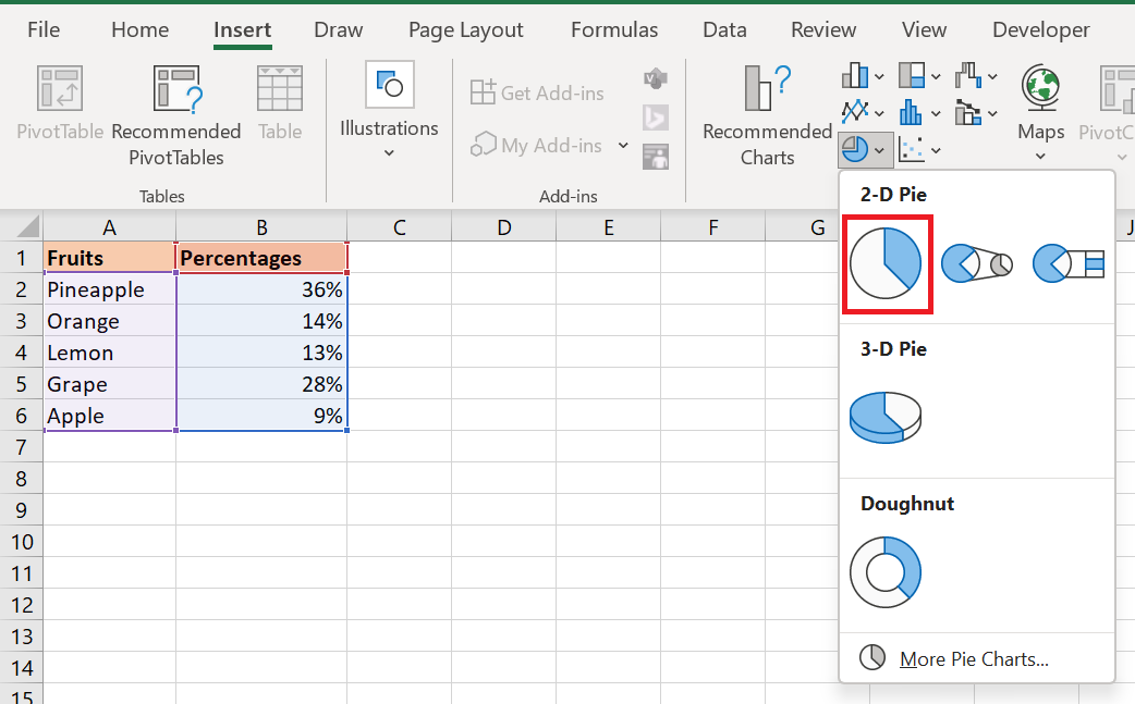
Include column or row headers in the selection if you want the value column/row header to automatically appear in your pie chart title.
3. Choose the pie chart style (optional).
Once the new pie chart is inserted into your spreadsheet, you can go to the Chart Design tab / Charts group and try out different pie chart styles to choose the one that best suits your data.

The default pie chart (Style 1) inserted into an Excel spreadsheet looks like this:
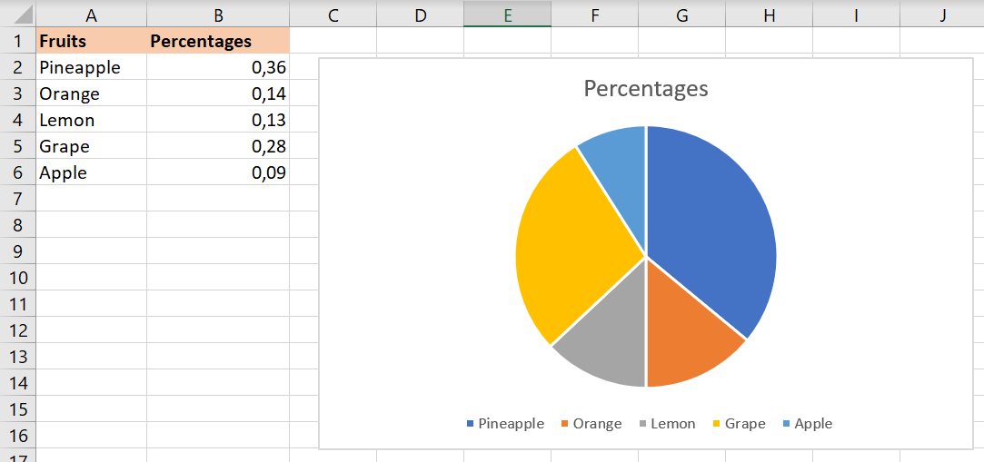
This pie chart looks a bit plain and could definitely use some improvements, such as adding a chart title, data labels, and perhaps some more attractive colors. We’ll talk about all of these things a little later, and now let’s take a quick look at the types of pie charts available in Excel.
2 How to Create Different Types of Pie Charts
When creating a pie chart in Excel, you can choose one of the following subtypes:
- 2D Pie Chart
- 3D Pie Chart
- Pie and bar chart
- Donut chart
7.2.1 Excel 2D Pie Charts
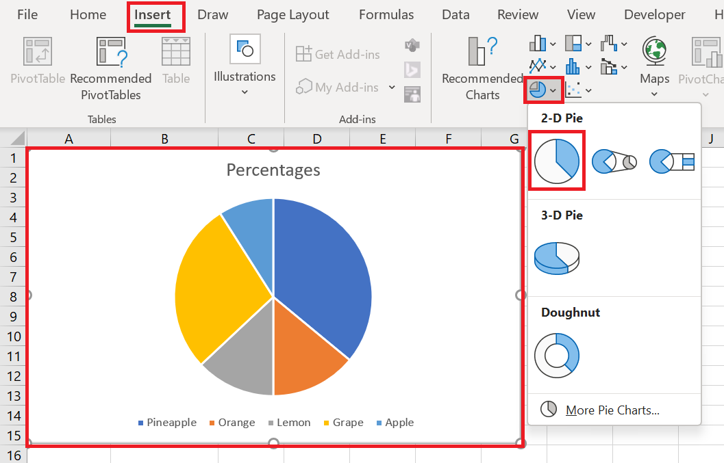
This is the standard and most popular Excel pie chart that you would probably use most often. It is created by clicking the 2D pie chart icon in the Insert / Graphics group .
Excel 3D Pie Charts
A 3D pie chart is similar to a 2D pie chart, but it displays data on a third depth (perspective) axis.
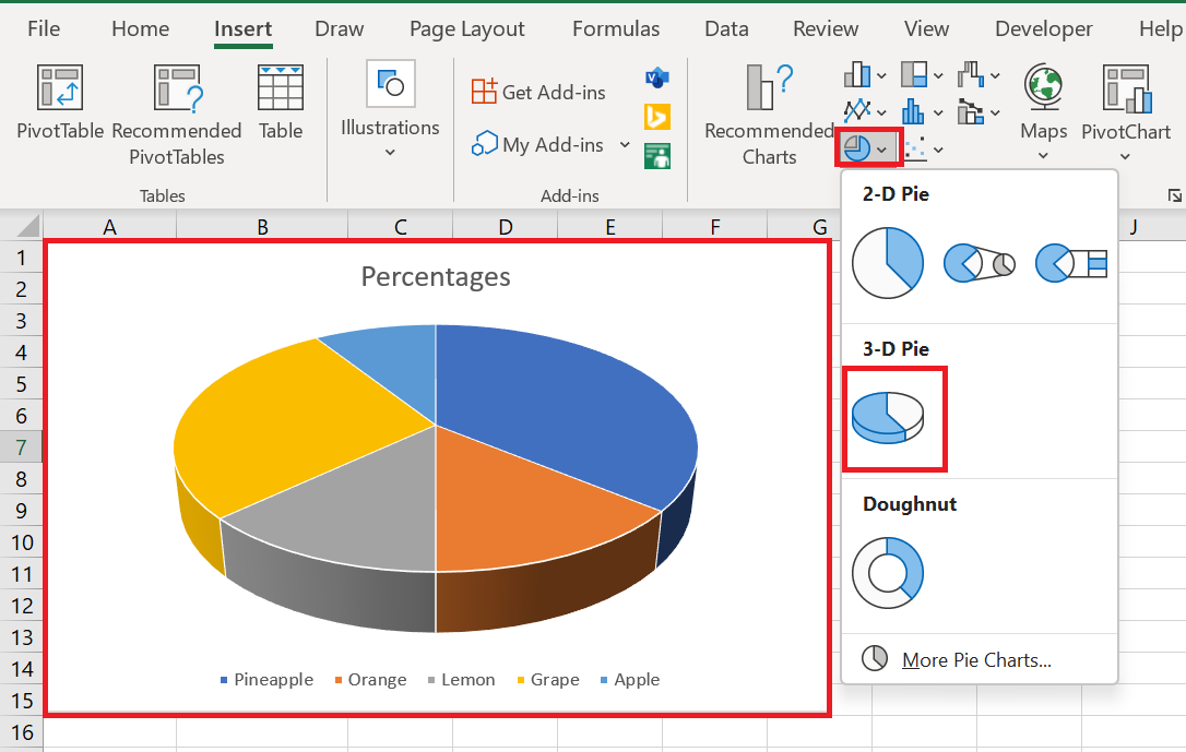
When you create 3D pie charts in Excel, you have access to additional features such as 3D rotation and perspective .
2.2 Pie and Bar Charts
If your Excel pie chart has too many small slices, you may want to create a pie chart and display small slices on an additional pie, which is a slice of the main pie.
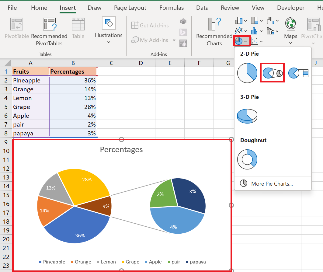
The pie bar chart is very similar to the pie chart, except that the selected slices are displayed on a secondary bar chart.
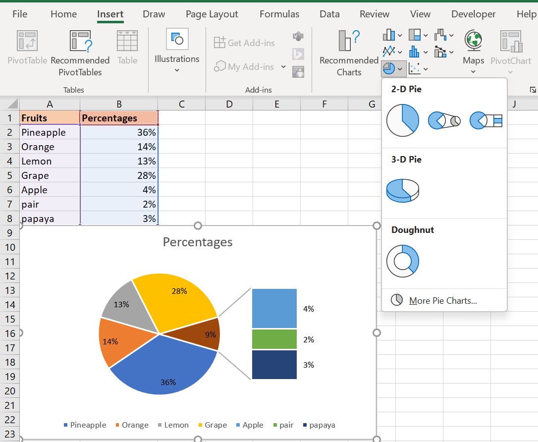
When you create a pie chart in Excel, the last 3 data categories are moved to the second chart by default (even if they are the largest categories!). And because the default choice doesn’t always work well, you can either:
- Sort your spreadsheet’s source data in descending order so that the worst-performing items end up in the secondary chart, or
- Choose the data categories to move to the second chart.
2.3 Choosing Data Categories for the Secondary Chart
To manually choose which data categories to move to the secondary chart, follow these steps:
- Right-click any slice in your pie chart and select Format Data Series… from the context menu.
- In the Format Data Series pane , under Series Options , select one of the following options from the Separate series by drop-down list :
- Position – allows you to select the number of categories to move to the second chart.
- Value – allows you to specify a threshold (minimum value) below which data categories are moved to the additional chart.
- Percentage Value – this is like Value, but here you specify the percentage threshold.
- Custom – allows you to manually select any slice of the pie chart in your spreadsheet, and then specify whether you want to place it in the primary or secondary chart.
In most cases, setting the percentage threshold is the most reasonable choice, but it all depends on your source data and personal preferences. The following screenshot illustrates splitting the data series by percentage value :
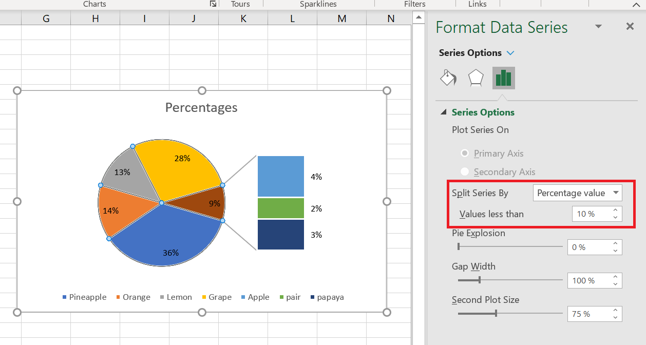
Additionally, you can configure the following settings:
- Change the gap between two charts . The number under Gap Width represents the gap width as a percentage of the secondary chart width. To change the gap, drag the slider or type the number directly into the percentage box.
- Change the size of the secondary chart . This is controlled by the number below the Secondary Plot Size box , which represents the size of the secondary chart as a percentage of the primary chart’s size. Drag the slider to make the secondary chart larger or smaller, or type the desired number in the percentage box.
2.4 Donut Charts
If you have multiple data series related to each other, you can use a doughnut chart instead of a pie chart. However, doughnut charts make it difficult to estimate the proportions between items in different series, so it makes sense to use other chart types, such as a bar chart or a column chart, instead.
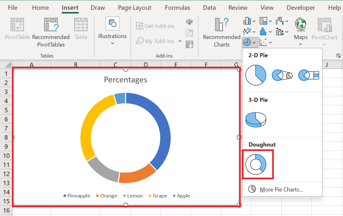
2.5 Changing the size of holes in a doughnut chart
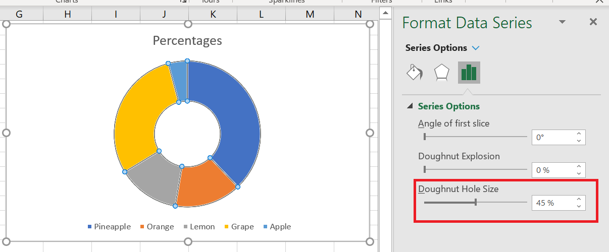
When creating donut charts in Excel, the first thing you might want to change is the size of the hole. And you can easily do this by doing the following:
- Right-click any data series in your donut chart and select the Format Data Series option from the context menu.
- In the Format Data Series pane, go to the Series Options tab and resize the hole by moving the slider under Donut Thickness or by entering an appropriate percentage directly in the box.
3 Customizing and Enhancing Pie Charts
If you’re creating a pie chart in Excel just to get a quick overview of certain trends in your data, the default chart may be sufficient. But if you need a beautiful chart for a presentation or similar purposes, you might want to make some improvements and add some finishing touches.
3.1 How to label a pie chart
Adding data labels makes Excel pie charts easier to understand. Without labels, it would be difficult to deduce the exact percentage of each slice. Depending on what you want to highlight on your pie chart, you can add labels to the entire data series or to individual data points.
Adding Data Labels to Excel Pie Charts
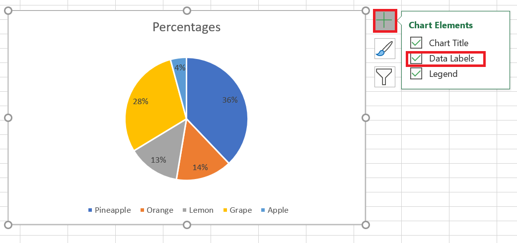
In this pie chart example, we’ll add labels to all the data points. To do this, click the Chart Elements button in the top  right corner of your pie chart and select the Data Labels option .
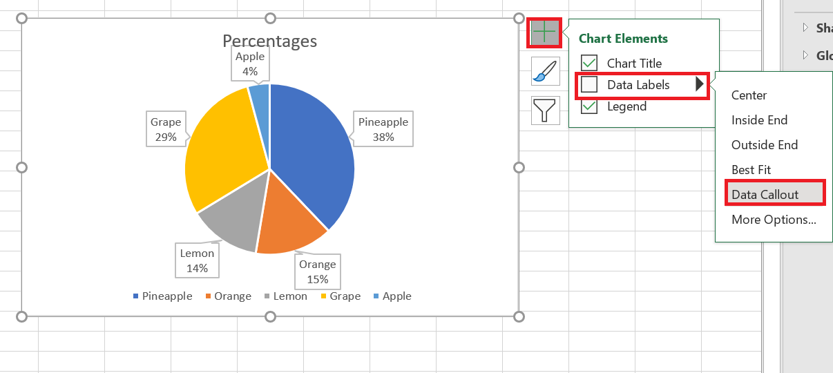
Additionally, you may want to change the label placement for Excel pie charts by clicking the arrow next to Data Labels . Compared to other Excel charts, pie charts offer the widest range of label placements:
If you want to display data labels inside bubble shapes , select Data Legend :
If you chose to place the labels inside the slices, the default black text may be difficult to read on dark slices like the dark blue slice in the pie chart above. For better readability, you can change the font color of the labels to white (click on the labels, go to the Formatting / Text Fill tab ).
Displaying data categories on data labels
If your Excel pie chart has more than three slices, you may want to label them directly rather than forcing your users to go back and forth between the legend and the chart to figure out what each slice is about.
The quickest way to do this is to choose one of the predefined chart layouts in the Chart Design tab / Chart Styles group / Quick Layout . Layouts 1 and 4 are the ones with data category labels:
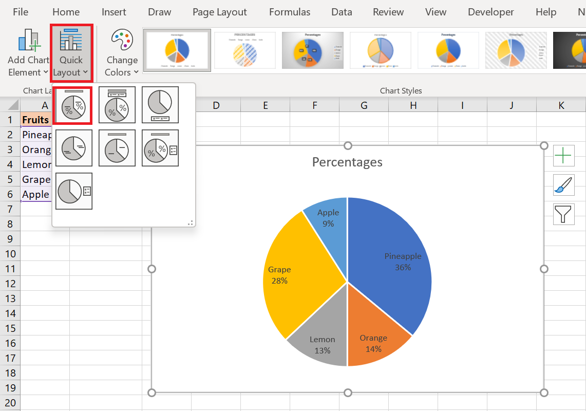
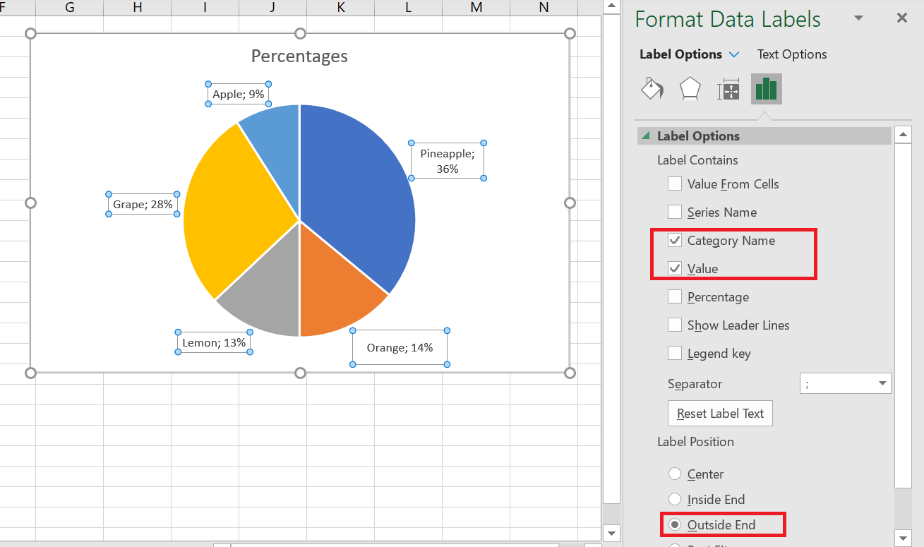
For more options, click the Chart Elements button ( green cross) in the upper-right corner of your pie chart, click the arrow next to Data Labels , and choose More Options… from the context menu. This will open the Format Data Labels pane on the right side of your worksheet. Switch to the Label Options tab and select the Category Name check box .
Additionally, the following options may be helpful to you:
- Under Label Contains, select the data to display on the labels ( Category Name and Value in this example).
- Separator drop-down list , select how to separate the data displayed on the labels ( New line in this example).
- Under Label Position , choose where to place the data labels ( Outer end in this pie chart example).
Now that you have added the data labels to your Excel pie chart, the legend has become redundant and you can remove it by clicking the Chart Elements button and unchecking the Legend box .
3.2 Displaying percentages on a pie chart
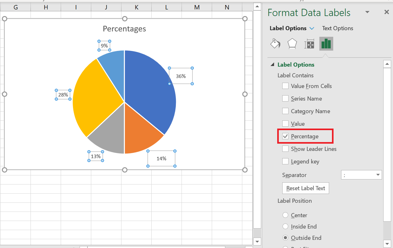
When the source data plotted in your pie chart is percentages , % will automatically appear on the data labels as soon as you enable the option Data Labels under Chart Elements , or select the Value option in the Format Data Labels pane , as shown in the pie chart example above.
If your source data is numbers , you can configure the data labels to display the original values or percentages, or both.
- Right-click any slice in your chart and select Format Data Labels… from the context menu.
- In the Format Data Labels pane , select the Value or Percent box , or both, as in the following example. Percentages will be calculated automatically by Excel, with the entire chart representing 100%.
4 Explode a pie chart or extract individual slices
To highlight individual values in your Excel pie chart, you can « explode » it , that is, move all the slices away from the center of the chart. You can also emphasize individual slices by removing them from the rest of the pie chart.
Exploded pie charts in Excel can be displayed in 2D and 3D formats, and you can also explode doughnut charts:
4.1 Explode the entire pie chart
The quickest way to explode the entire pie chart in Excel is to click on it so that all the slices are selected , then drag them out of the center of the chart using the mouse.
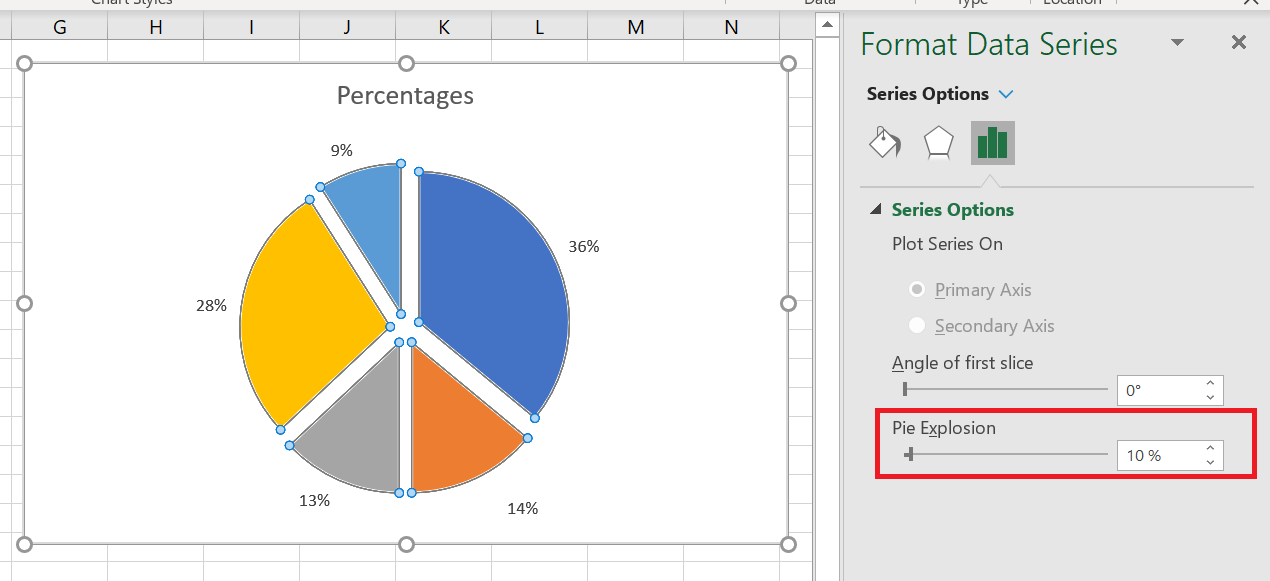
For more precise control over the separation of the pie charts, proceed as follows:
- Right-click any slice in your Excel pie chart and select Format Data Series from the context menu.
- In the Format Data Series pane , switch to the Series Options tab and drag the Slice Break slider to increase or decrease the gaps between slices. Or, type the desired number directly into the percentage box:
4.2 Extract a single slice from a pie chart
To draw your users’ attention to a certain slice of a pie chart, you can remove it from the rest of the chart.
And again, the quickest way to remove an individual slice is to select it and drag it out of the center with the mouse. To select a single slice, click on it, then click again so that only that slice is selected.
You can also select the slice you want to move, right-click it, and select Format Data Series from the context menu. Then, go to Series Options in the Format Data Series pane and set the desired point explosion:
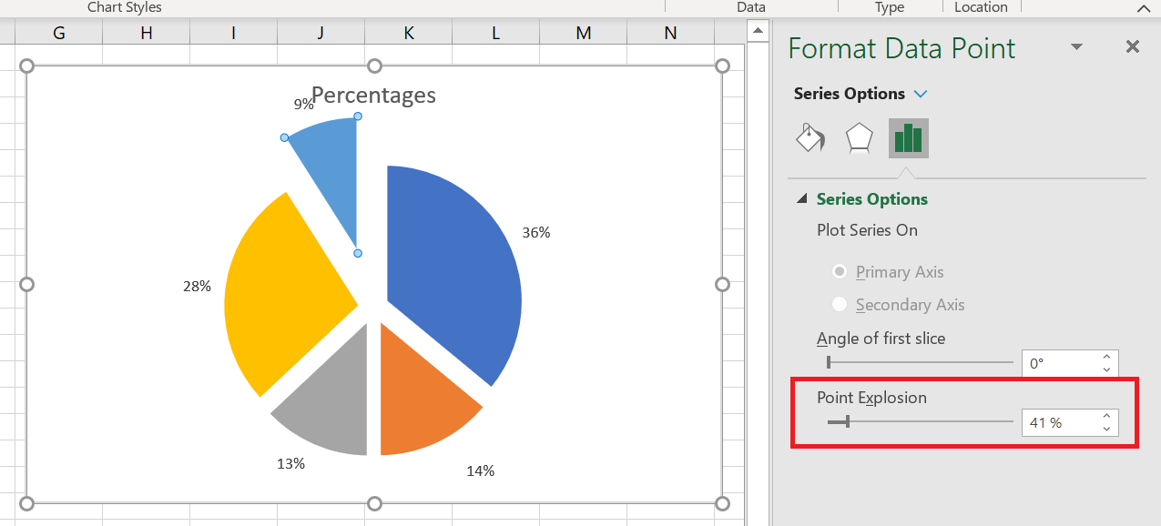
If you want to remove multiple slices, you will need to repeat the process for each slice individually, as shown in the screenshot above. It is not possible to extract a group of slices in an Excel pie chart; you can explode the entire sector or one slice at a time.
5 Rotate a Pie Chart
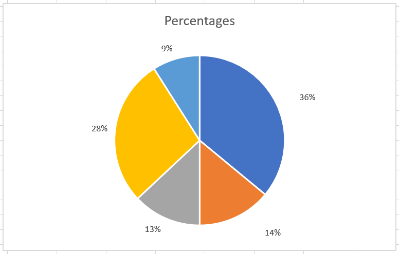
When creating a pie chart in Excel, the plot order of data categories is determined by the order of the data in your worksheet. However, you can rotate your chart within 360 degrees of the circle for different perspectives. Typically, Excel pie charts look best with the smallest slices in the foreground.
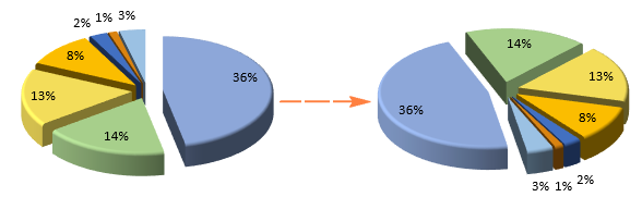
To pivot a pie chart in Excel, follow these steps:
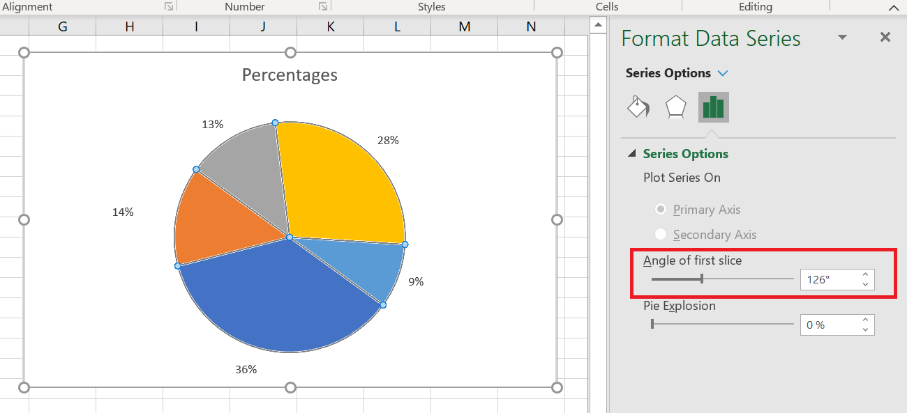
- Right-click any slice of your pie chart and click Format Data Series .
- In the Format Data Series pane , under Series Options , drag the First slice angle slider away from zero to rotate the pie clockwise. Or, type the number you want directly into the box.
6 3D Rotation Options for 3D Pie Charts
For 3D pie charts in Excel, more rotation options are available. To access 3D rotation functions, right-click any slice and select 3D Rotate … from the context menu.
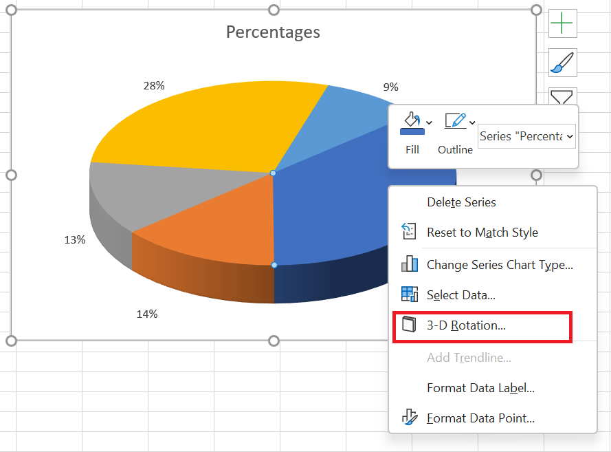
This will bring up the Format Chart Area pane, where you can configure the following 3D rotation options :
- Horizontal rotation in X rotation
- Vertical rotation in Y rotation
- The degree of perspective (the field of view on the map) in the perspective
Excel pie charts can be rotated around the horizontal and vertical axes, but not around the depth axis (Z axis). Therefore, you cannot specify a rotation degree in the Rotate Z box.
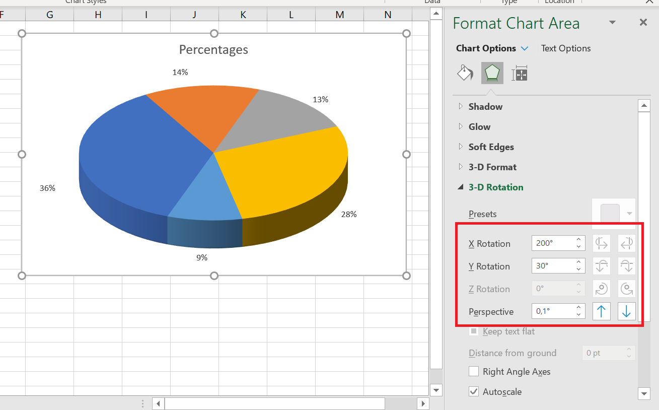
When you click the up and down arrows in the rotation boxes, your Excel pie chart will immediately rotate to reflect the changes. So you can continue clicking the arrows to move the pie in small increments until it’s in the correct position.
7 Change the colors of the pie chart
If you’re not entirely happy with the default colors of your Excel pie chart, you can either:
- Change the color theme
- Choose colors for individual slices
To choose a different color theme for your Excel pie chart, click the Chart Styles button, go to the  Color tab , and select the desired color theme.
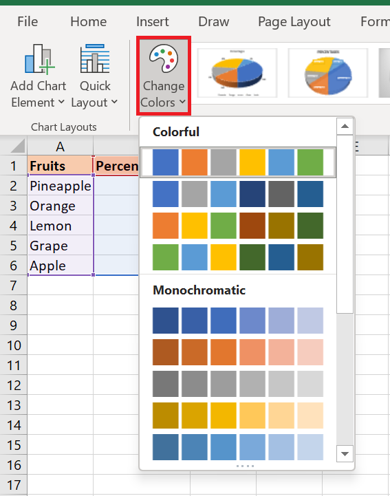
You can also click anywhere in your pie chart to activate the Chart Tools tabs on the ribbon, go to the Chart Design tab / Chart Styles group and click the Change Colors button :
Choose colors for each slice individually
As you can see in the screenshot above, the choice of color themes for Excel charts is quite limited, and if you want to create a stylish and attractive pie chart, you can choose each slice color individually. For example, if you’ve chosen to place data labels inside the slices, black text can be difficult to read on dark colors.
To change the color of a certain slice, click on that slice, then click it again so that only that slice is selected. Go to the Format tab , click Shape Fill , and choose the color you want:
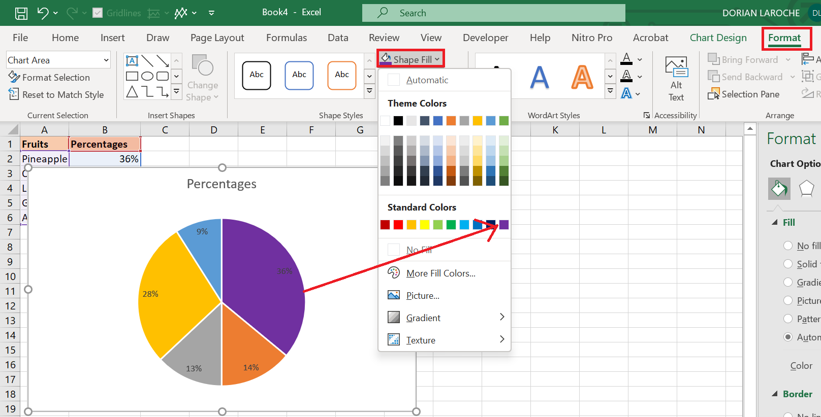
If your pie chart has many small slices, you can « gray out » them by selecting gray colors for these small, irrelevant slices.