
How to Create a Pareto Chart in Excel
In a perfect world, everything would be in harmony—every job would pay the same price, every taxpayer would receive the same tax benefits, every player would be equally important to a team. But our world isn’t perfect, and the relationships between inputs and outputs aren’t equal. Want to know the main causes you should devote the most effort to? This is what the Pareto Principle, or the law of the few, is all about.
1 Pareto Analysis in Excel
Pareto analysis is based on the Pareto Principle, named after Italian economist Vilfredo Pareto. This principle states that for many events, approximately 80% of the effects come from 20% of the causes. This is why the Pareto Principle is sometimes called the 80/20 rule.
Here are some practical examples of the Pareto principle:
- In economics, the richest 20% of the world’s population control about 80% of global income.
- In medicine, 20% of patients use 80% of healthcare resources.
- In software, 20% of bugs cause 80% of errors and crashes.
To identify the most important factors you need to focus on, you can draw a Pareto chart in your Excel spreadsheet.
A Pareto chart is a graph based on the Pareto principle. In Microsoft Excel, it’s a sorted histogram that contains both vertical bars and a horizontal line. The bars, plotted in descending order, represent the relative frequency of values, and the line represents the cumulative total percentage.
Here’s what a typical Excel Pareto chart looks like: 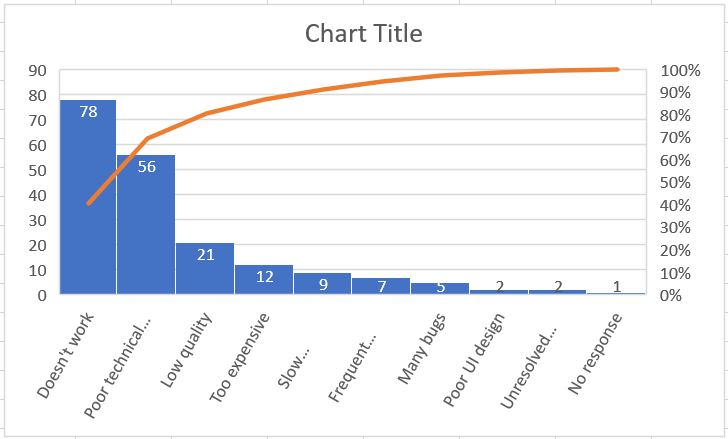
As you can see, a Pareto chart highlights the main elements of a data set and shows the relative importance of each element to the total. Below are detailed instructions on how to create a Pareto chart in different versions of Excel.
2 How to Make a Pareto Chart in Excel 2016 or 2019
Drawing a Pareto chart in Excel 2016 or 2019 is easy because it has a built-in Pareto chart type. All you need is a list of items (issues, factors, categories, etc.) in one column and their number (frequency) in another column.
As an example, we will perform a Pareto analysis of typical user complaints about software based on this dataset: 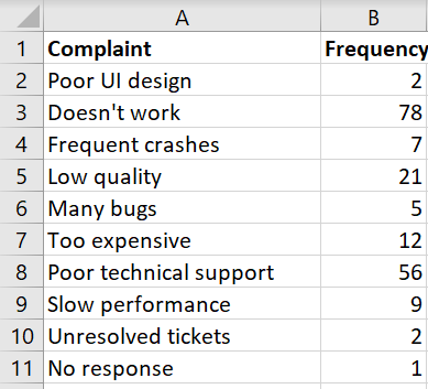
To create a Pareto chart in Excel, please follow these simple steps:
- Select your table. In most cases, you only need to select a single cell and Excel will automatically select the entire table.
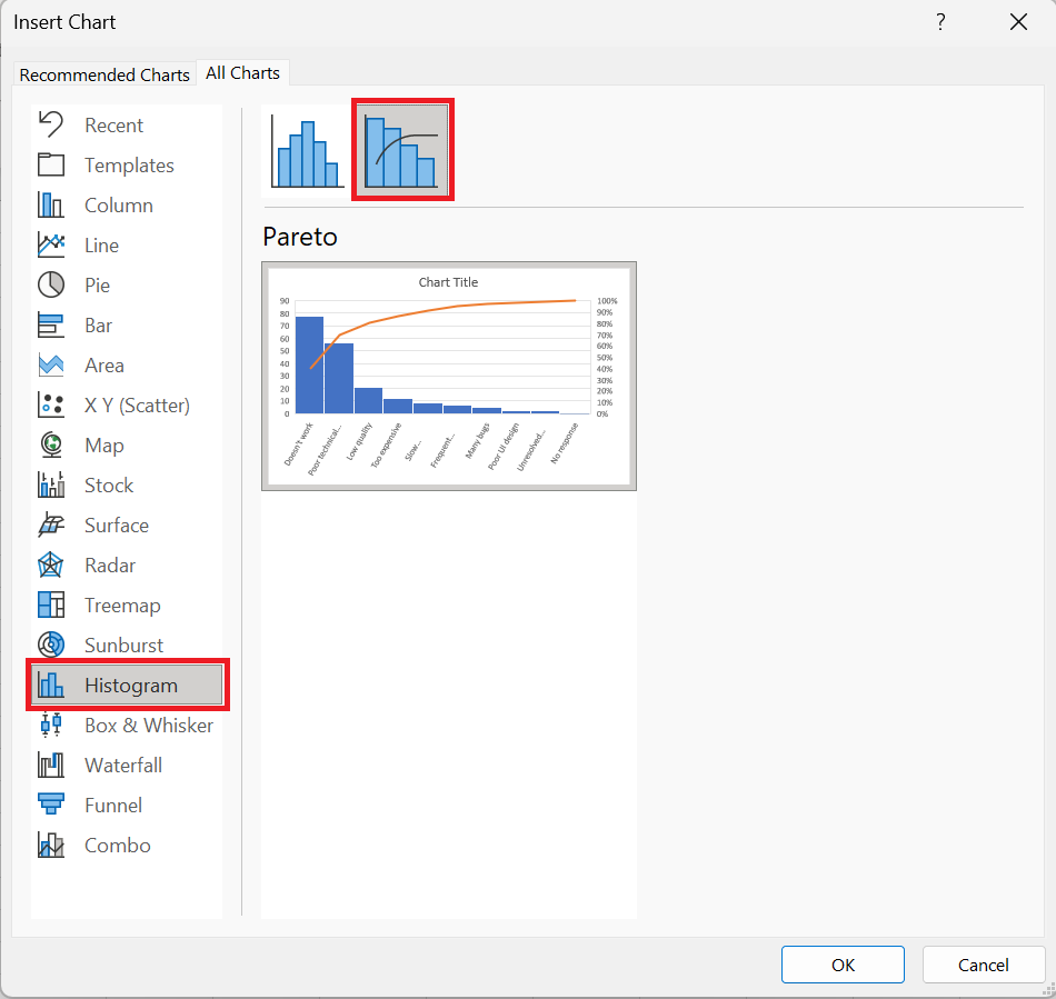
- Insert tab , in the Charts group , click Recommended Charts.
- All Charts tab , select Histogram in the left pane, and click the Pareto tile .
- Click OK .
That’s all there is to it! The Pareto chart is immediately inserted into a spreadsheet. The only improvement you’d probably want to make is adding/editing the chart title: 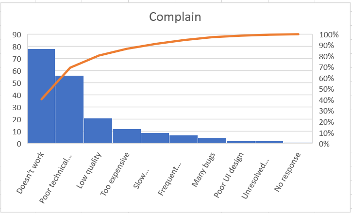
3 Customizing the Pareto Chart
The Pareto chart created by Excel is fully customizable. You can change the colors and style, show or hide data labels, and more.
3.1 Design the Pareto chart as you wish
Click anywhere in your Pareto chart to bring up the chart tools on the ribbon. Switch to the Chart Design tab and experiment with different chart styles and colors: 
3.2 Show or hide data labels
to display the bar values, click the Chart Elements button on the right side of the chart, check the Data Labels box , and choose where you want to place the labels:
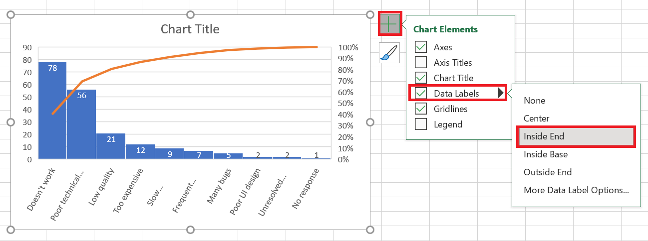
displaying the same values has become superfluous and you can hide it. To do this, click the Chart Elements button again , then click the small arrow next to Axes and uncheck the Main Vertical Axis box .
The resulting Pareto chart will look like this: 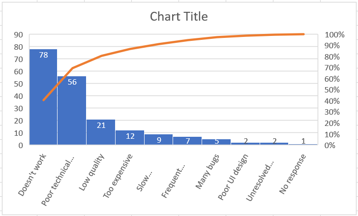
4 Create a Pareto Chart in Excel 2013
Excel 2013 doesn’t have a predefined Pareto chart option, so we’ll use the Combination chart type, which is closest to what we need. This will require a few extra steps because all the manipulations Excel 2016 or 2019 performs behind the scenes will have to be done manually.
4.1 Organizing Data for Pareto Analysis
Configure your dataset as explained below:
1. Calculate the cumulative total percentage
Add an additional column to your dataset and enter the cumulative total percentage formula here:
=SUM($B$ 2:B 2)/SUM($B$2:$B$11)
Where B2 is the first and B11 is the last cell with data in the Frequency column .
In the dividend, you put a cumulative sum formula that adds the numbers in the current cell and all cells above it. Then you divide the part by the total to get percentages.
Enter the above formula in the first cell, then copy it down the column. To display the results as percentages, set the column format to Percent . If you want the percentages to be displayed as integers, reduce the number of decimal places to zero.
2. Sort by number in descending order
Because the bars in a Pareto chart should be plotted in descending order, arrange the values in the Number column from highest to lowest. To do this, select any cell and click A-Z on the Data tab , in the Sort & Filter group . If Excel prompts you to expand the selection, do so to keep the rows together when sorting.
At this point, your source data should look like this:
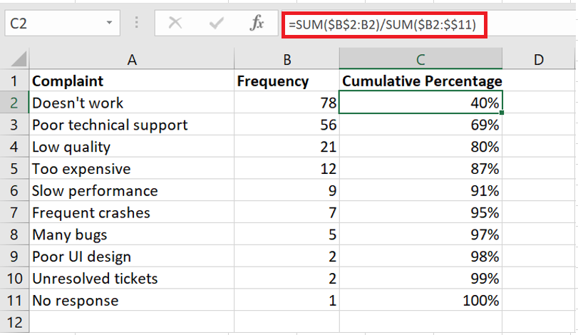
4.2 Drawing a Pareto chart
With properly organized source data, creating a Pareto chart is as easy as 1-2-3. Literally, just 3 steps:
- Select your table or any cell within it.
- Insert tab , in the Charts group , click Recommended Charts .
- All Charts tab , select Combo Chart on the left side, and make the following changes:
- For the Frequency series , select Clustered Histogram (default type).
- line type and check the Secondary Axis box .
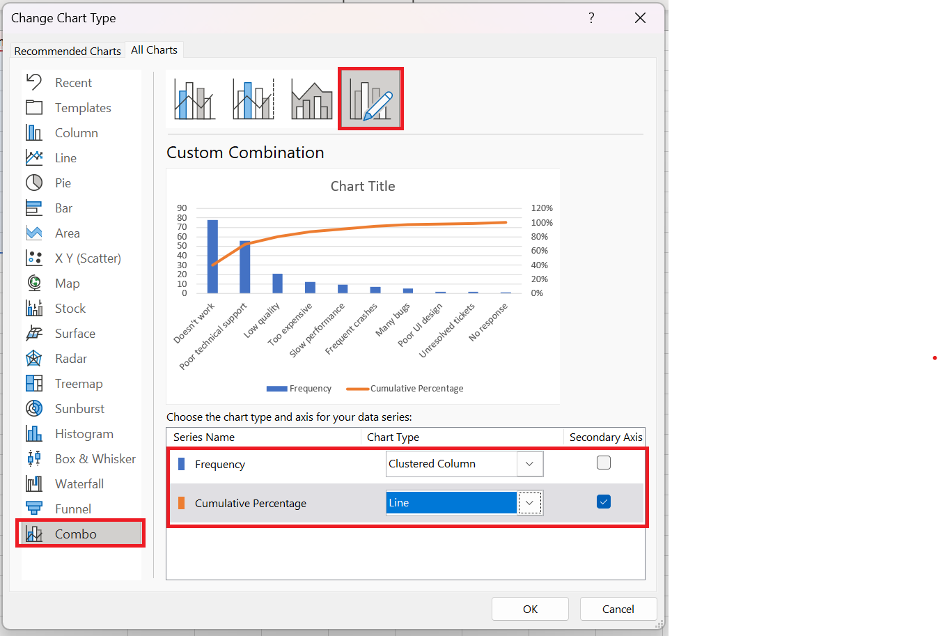
The chart that Excel inserts into your spreadsheet will look like this: 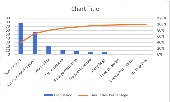
4.3 Improving the Pareto chart
Your chart already looks a lot like a Pareto chart, but you might want to improve a few things:
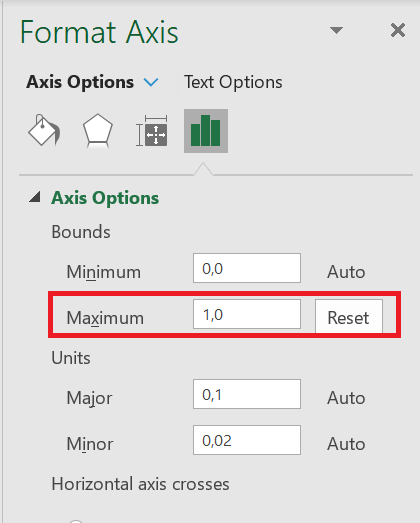
1. Set the maximum percentage value to 100%
By default, Excel has set the maximum value of the secondary vertical axis to 120% when we want it to be 100%.
To change this, right-click the percentage values on the Y axis on the right side, and choose Format Axis. In the Format Axis pane , under Limits , set the Maximum to 1.0 :
2. Remove the extra spacing between the bars
In a classic Pareto chart, the bars are plotted closer together than in a combo chart. To resolve this problem, right-click the bars and choose Format Data Series. In the Format Data Series pane , set the width and the interval desired, let’s say 5 %: 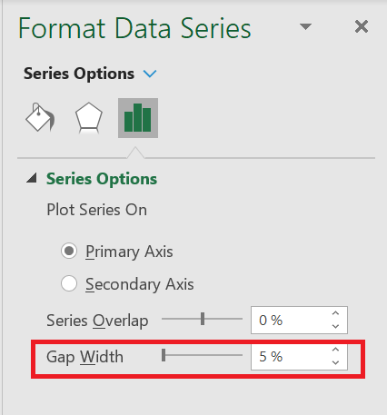
Finally, change the chart title and optionally hide the chart legend.
What you have now looks like a perfect Excel Pareto chart: 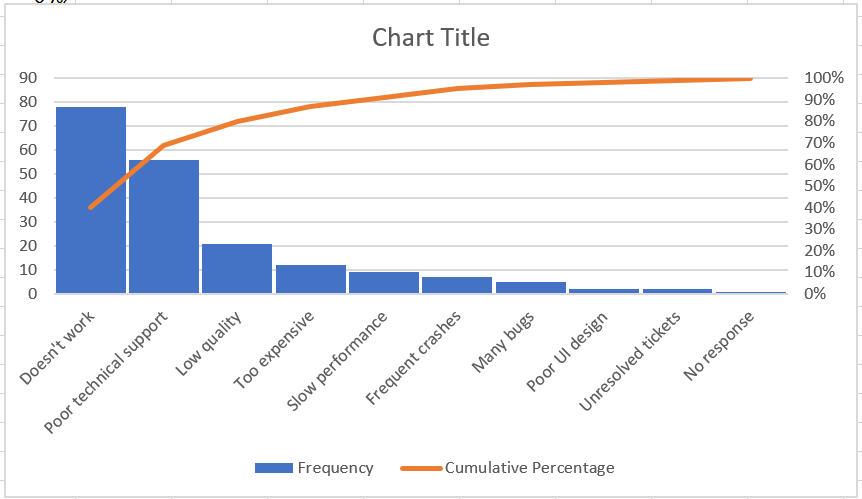
5 How to Draw a Pareto Chart in Excel 2010
Excel 2010 doesn’t have a Pareto or Combo chart type, but that doesn’t mean you can’t draw a Pareto chart in earlier versions of Excel. Sure, it’ll be a bit more work, but it’ll also be more fun 🙂 So, let’s get started.
- Organize your data as explained previously: sort by number in descending order and calculate the cumulative total percentage.
- Select your table, go to the Insert tab / Charts group and choose the 2D Clustered Column chart type.
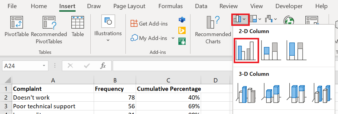
This will insert a column chart with 2 data series ( Frequency and Cumulative Percentage ) .
- Right-click on the Percentage bars Cumulative , then click Change Chart Series Type . (This can be the trickiest part because the bars are very small. Try hovering your mouse over the bars until you see the » Cumulative Percent » series index , then right-click.)
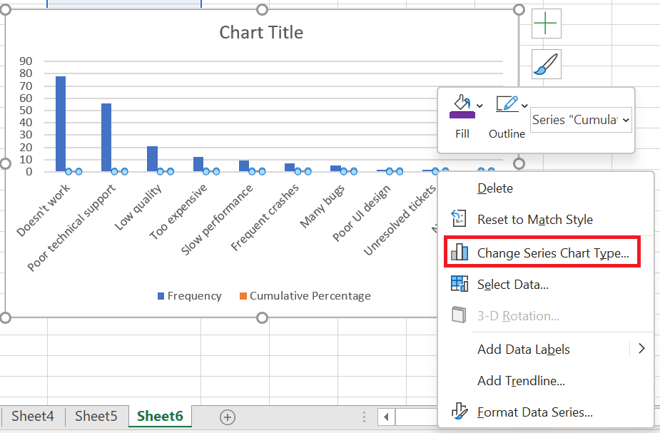 Chart Type dialog box , choose a line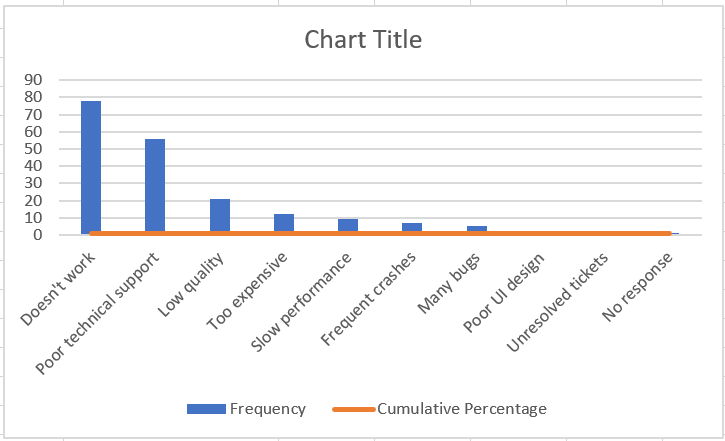
- At this point, you have a bar chart with a flat line along the horizontal axis. To give it a curve, you need to add a secondary vertical axis to the right. To do this, right-click the Cumulative Percentage line , then click Format Data Series …
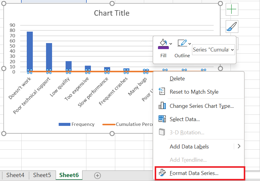
- Data Series dialog box , choose Secondary Axis under Series Options and close the dialog box:
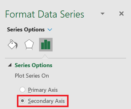
- Add the finishing touches: Set the maximum value of the secondary vertical axis to 100%, widen the bars, and optionally hide the legend. The steps are basically the same as in Excel 2013 described above.
There you have it, your Pareto chart in Excel 2010 is ready: 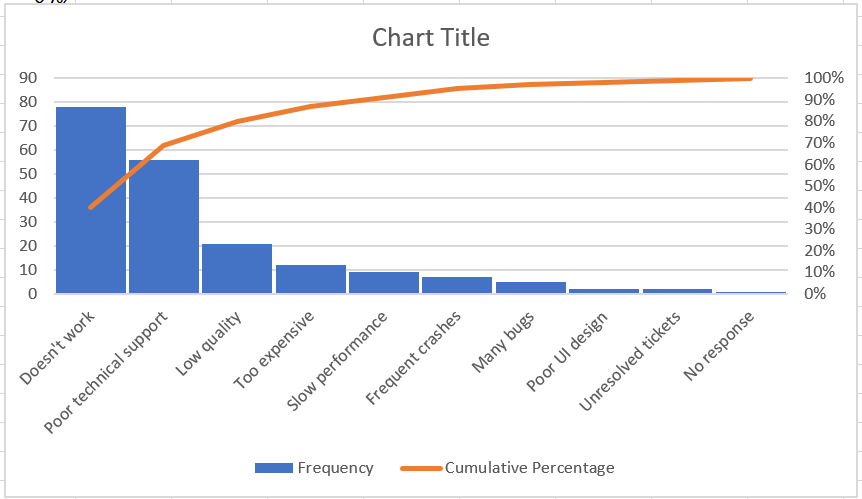
That’s how to create a Pareto chart in Excel. If you’d like to learn more about other types of charts, I encourage you to check out the resources below.