
How to Create a Waterfall Chart in Excel
Microsoft Excel offers many predefined chart types, including column, line, pie, bar, radar, and more. In this section, we’ll go beyond basic chart creation and take a closer look at a special chart type: the waterfall chart in Excel. You’ll learn what a waterfall chart is and how useful it can be.
1 What is a waterfall chart?
Let’s first look at what a simple waterfall chart should look like and when it can be useful.
A waterfall chart is actually a special type of Excel column chart. It is normally used to demonstrate how the starting position increases or decreases through a series of changes.
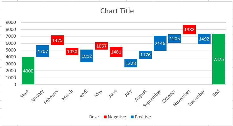
The first and last columns of a typical waterfall chart represent the total values. The middle columns appear to float and show a positive or negative change from one period to the next, culminating in the final total value. Typically, these columns are color-coded to distinguish between positive and negative values.
A waterfall chart is also known as an Excel bridge chart because the floating columns form a bridge connecting the endpoints.
These charts are very useful for analytical purposes. Whether you need to evaluate a company’s profits or product revenue, conduct an inventory or sales analysis, or simply show how the number of your Facebook friends has changed over the past year, a waterfall chart in Excel is exactly what you need.
2 How to Create an Excel Bridge Table
Don’t waste your time searching for a waterfall chart type in Excel—you won’t find it there. The problem is that Excel doesn’t have a built-in waterfall chart template. However, you can easily create your own version by carefully organizing your data and using a standard Excel stacked column chart type.
Let’s create a simple example table with positive and negative values to better understand things. We’ll use sales figures as an example. If you look at the table below, you’ll see that sales increase in some months and decrease in others compared to the starting position.
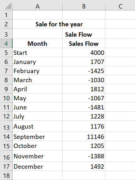
The Excel bridge chart will be an ideal way to visualize sales flow over twelve months. But if you now apply a stacked column chart template to these particular values, you won’t get anything resembling a waterfall chart. The first thing to do is carefully rearrange your data.
Step 1: Reorganize the data table
You start by inserting three additional columns into your Excel spreadsheet. Let’s call them Base, Negative, and Positive. The Base column will be a calculated amount that is used as the starting point for the Negative and Rise series in the chart. Any negative numbers in the Sales Flow column will be placed in the Negative column , and any positive numbers will be in the Positive column .
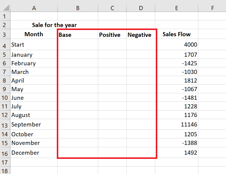
We’ve also added the End row at the bottom of the Month list to calculate the sales amount for the entire year. Now move on to the next step and fill in these columns with the necessary values.
Step 2. Insert formulas
The best way to complete the table is to enter special formulas in the first cells of the corresponding columns, and then copy them to the adjacent cells using the fill handle.
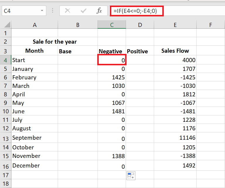
- Select cell C4 in the Negative column and enter the following formula : = IF(E4<=0; -E4;0)
The formula indicates that if the value in cell E4 is less than or equal to zero, the negative number will be displayed as positive and the positive number will be displayed as zero.
If you want all values in a waterfall chart to be greater than zero, you must enter a minus sign ( – ) before the second cell reference (E4) in the formula. And two minuses will make a plus.
- Copy the formula to the end of the table.
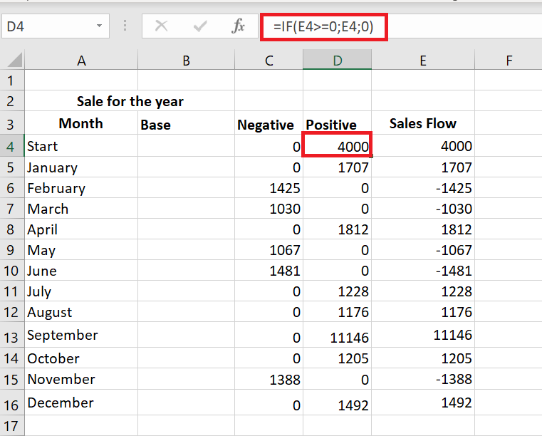
- Click on cell D4 and type =IF(E4>0, E4, 0).
This means that if the value in cell E4 is greater than zero, all positive numbers will be displayed as positive and negative numbers as zero.
- Use the fill handle to copy this formula down the column.
- Insert the last formula =B4+D4-C5 into cell B5 and copy it; include the end row.
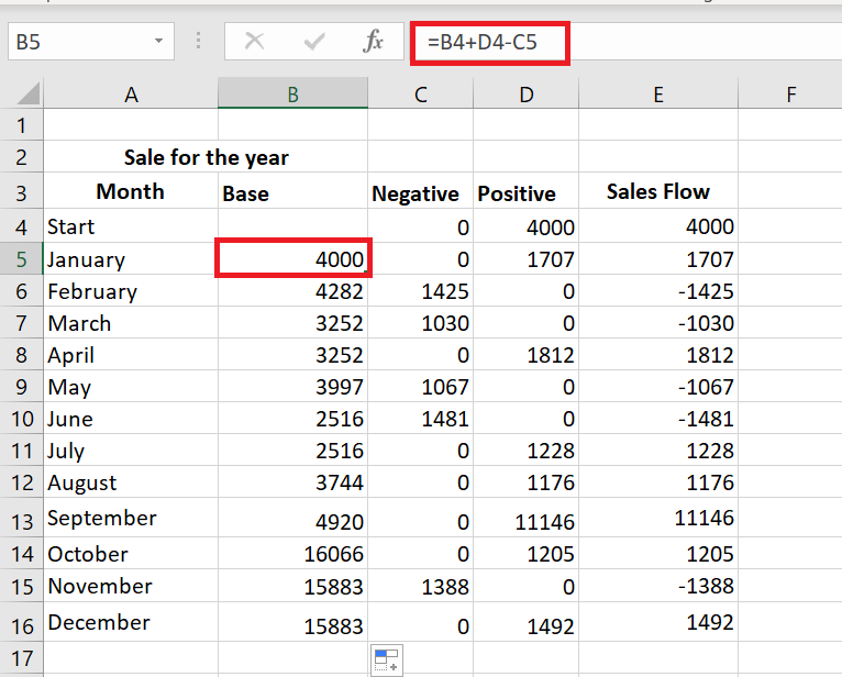
This formula calculates the base values that will support the rises and falls at the appropriate height.
Step 3. Create a standard stacked column chart
Your data is now well organized and you are ready to create the chart itself.
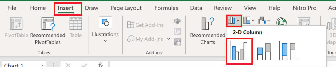
- Select your data, including column and row headers, exclude the Sales Flow column.
- Charts group on the Insert tab .
- Click on the icon Insert a column chart and choose Stacked Column from the drop-down list.
The chart appears in the spreadsheet, but it hardly looks like a waterfall chart. Continue to the next step and turn the stacked column chart into an Excel waterfall chart.
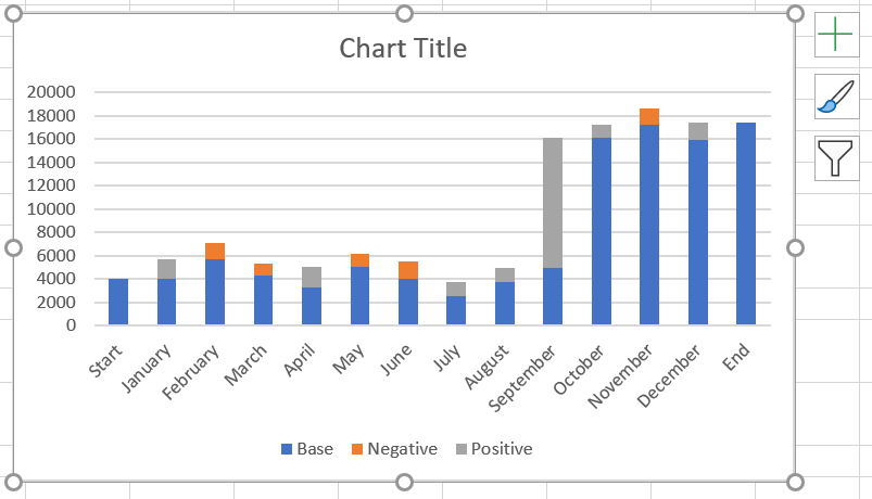
Step 4. Transform the column chart into a waterfall chart
Now’s the time to learn the secret. Simply make the Base series invisible to create a waterfall chart from a stacked column.
- Click on the base series to select them, right-click and choose the Format Data Series… option from the context menu.
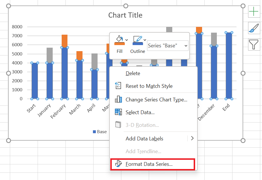
Format Data Series pane appears immediately to the right of your worksheet.
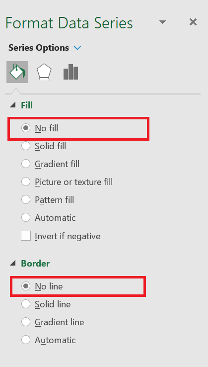
- Click the Fill & Stroke icon.
- Select No Fill in the Fill section and No Line in the Border section .
When the blue columns become invisible, simply remove Base from the chart legend to completely hide all Base series traces.

Step 5. Format the Excel bridge chart
First we’ll make the flying bricks brighter and highlight the start and end values in the graph:
- Select the Fall series in the chart and go to the Formatting tab.
- Click Shape Fill in the Shape Styles group .
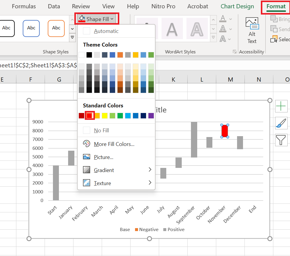
- Choose the color you want from the drop-down menu.
You can also experiment with column outlines or add special effects to them. Simply use the Shape Outline and Shape Effects options on the Formatting tab to make changes.
Next, you should do the same trick with the Positive series. As for the Start and End columns, you need to color-code them individually, but they must be the same color.
When you’re done, the graph should look like the one below:
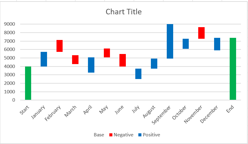
You can also change the color and outline of the chart columns by opening the Format Data Series pane or choosing the Fill or Outline options from the context menu.
Then you can remove the excess white space between the columns to make them closer together:
- Double-click one of the chart columns to display the Format Data Point pane .
- Change the gap width to something smaller, like 15% . Close the pane.
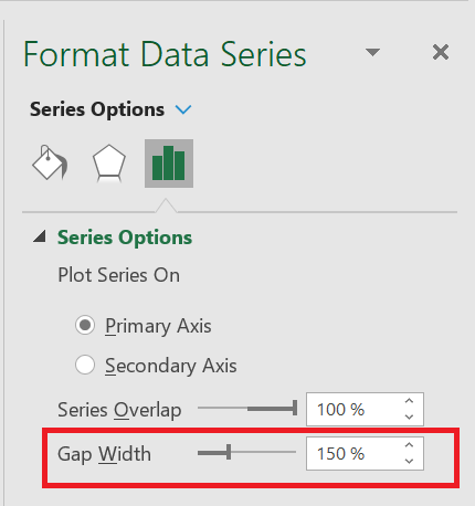
Now the holes in the bridge table are filled.
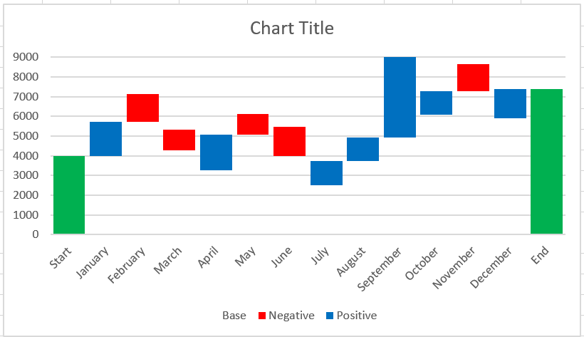
When you look at the waterfall chart above, some of the flying bricks appear to be the same size. However, when you refer to the data table, you will see that the values represented are different. For more accurate analysis, I would recommend adding data labels to the columns.
- Select the series you want to label.
- Right click and choose the option Add data labels from the context menu.
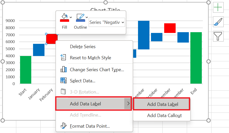
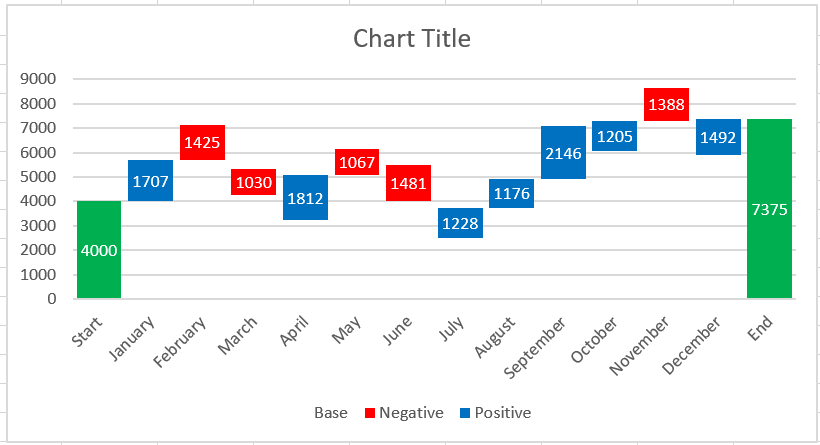
Repeat the process for the other series. You can also adjust the label position, text font, and color to make the numbers more readable.
If there is an apparent difference in column sizes and the details are not important, you can omit the data labels, but then you should add a Y axis for better interpretation of the data.
When you’re done labeling the columns, simply delete unnecessary elements such as zero values and the legend. You can also change the default chart title to a more descriptive one.
Add-ins for creating waterfall charts
As you can see, manually creating a waterfall chart in Excel 2016-2010 isn’t difficult at all. However, if you don’t want to bother rearranging your data, you can use special add-ins that can do all the work for you.
Jon Peltier suggests using his Peltier Technical Chart utility to automatically create waterfall charts and other custom charts from raw data. You can choose to create a standard waterfall chart or a stacked waterfall chart. There’s no need to enter any formulas; simply select your data, click the Waterfall Chart command on the ribbon, set a few options, click OK, and your Excel bridge chart is ready. In addition to custom charts, the add-in provides you with various charts, data, and general tools to make your work in Excel easier.

You can even create a waterfall chart online and receive it as an Excel file via email. This is possible thanks to a great online waterfall chart service. All you have to do is submit your data, specify your email address, and wait less than a minute while your chart is generated. Then check your inbox. The waterfall chart is sent to you in an Excel file. You can then edit the title, labels, colors, etc. just like in any other Excel chart. However, you cannot edit the numerical data. In this case, you will have to recreate a chart. You must also follow certain rules for submitting your data if you want your waterfall chart to look as expected.
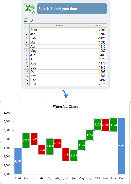
The more complex a chart you want to create, the more complex formulas you’ll need to enter when rearranging your data. And the chance of errors increases. In this situation, the Waterfall Chart Creator add-in for Microsoft Excel can help you save time and effort. With this add-in, you can create, edit, and update multiple waterfall charts at once. It lets you specify colors, a solid or gradient fill, display values and position, and offers many other options. You can also customize the default settings and colors for new charts.
You now have a collection of waterfall charts in Excel. I hope it won’t be a problem for you to manually create your own version of a waterfall chart. If not, you can take advantage of Excel waterfall chart add-ins.