How to Create a Line Chart in Excel
The line chart is one of the simplest and easiest charts to create in Excel. However, being simple doesn’t mean being worthless. Line charts are very popular in statistics and science because they clearly show trends and are easy to plot.
So, let’s take a look at how to create a line chart in Excel, when it’s particularly effective, and how it can help you understand complex data sets.
Excel Line Chart
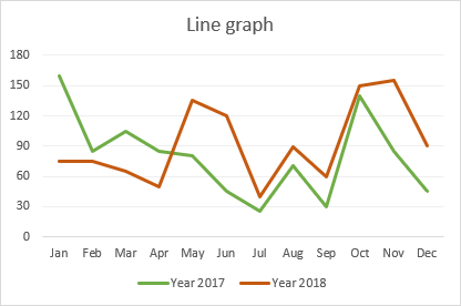
A line chart is a visual that displays a series of data points connected by a straight line. It is commonly used to visually represent quantitative data over a period of time.
Independent values, such as time intervals, are plotted on the horizontal x-axis, while dependent values, such as prices, sales, and others, go on the vertical y-axis. Negative values, if any, are plotted below the x-axis. Downward-sloping and upward-sloping lines on the graph reveal trends in your data set: an upward slope indicates increasing values, and a downward slope indicates decreasing values.
When to Use a Line Chart
Line charts work well in the following situations:
1. Good visualization of trends and changes. Of all the Excel chart varieties, a line chart is best suited to show how different things change over time.
2. Easy to create and read. If you’re looking for a simple and intuitively clear way to visualize large, complex data, a line chart is the right choice.
3. Show relationships between multiple data sets. A multi-line chart can help you reveal relationships between two or more variables.
When Not to Use a Line Chart
There are a few cases in which a line chart is not suitable:
1. Not suitable for large data sets. Line charts are best used for small data sets with fewer than 50 values. More values would make your chart more difficult to read.
2. Ideal for continuous data. If you have discrete data in separate columns, use a bar chart.
3. Not suitable for percentages and proportions. To display data as a percentage of the whole, you’re better off using a pie chart or a stacked column chart.
4. Not recommended for schedules. While line charts are great for showing trends over a period of time, a visual view of planned projects over time is best achieved with a Gantt chart.
How to Create a Line Chart in Excel
To create a line chart in Excel 2019, 2016, 2013, 2010, and earlier, follow these steps:
1. Set up your data
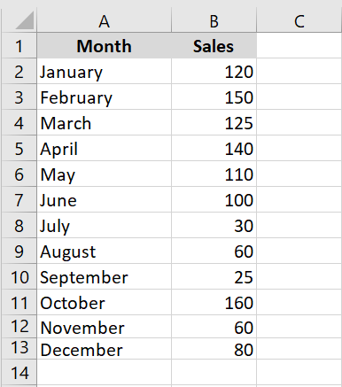
A line chart requires two axes, so your table must contain at least two columns: the time intervals in the leftmost column and the dependent values in the rightmost column(s).
In this example, we’ll create a single-line chart, so our sample dataset has the following two columns:
1. Select the data to include in the chart
In most situations, selecting a single cell is enough for Excel to automatically select the entire table. If you only want to plot a portion of your data, select that portion and make sure to include the column headers in the selection.
2. Insert a line chart
Once the source data is selected, go to the Insert tab / Charts group, click the Insert Line or Area Chart icon, and choose one of the available chart types.
When you hover over a chart template, Excel will show you a description of the chart and its preview. To insert the chosen chart type into your worksheet, simply click on its template.
In the screenshot below, we’re inserting the 2D line chart:

How to Plot Multiple Lines in Excel
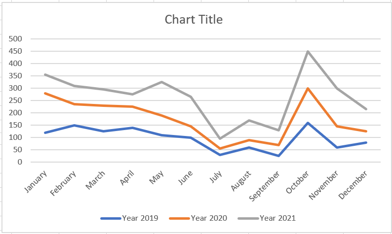
To plot a multi-line chart, follow the same steps as for creating a single-line chart. However, your table must contain at least three columns of data: time intervals in the left column and observations (numeric values) in the right columns. Each data series will be plotted individually.
With the source data highlighted, go to the Insert tab, click the Insert Line or Area Chart icon, and then click 2D Line or another chart type of your choice:

A multi-line chart is immediately inserted into your spreadsheet and you can now compare sales trends for different years.

When creating a multi-line chart, try to limit the number of lines to 3-4, as more lines will make your chart cluttered and difficult to read.
Types of Excel Line Charts
In Microsoft Excel, the following types of line charts are available:
• Line. The classic 2D line chart shown above. Depending on the number of columns in your data set, Excel will draw a single-line or multi-line chart.
• Stacked Line. This chart is designed to show how parts of a whole change over time. The lines in this chart are cumulative, meaning that each additional data series is added to the first, so the top line is the total of all the lines below it. Therefore, the lines never cross.
• Stacked 100% Line. This is similar to a stacked line chart, except the y-axis displays percentages rather than absolute values. The top line always represents a total of 100% and crosses the top of the chart. This type is typically used to visualize a part-to-whole contribution over time.
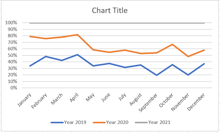
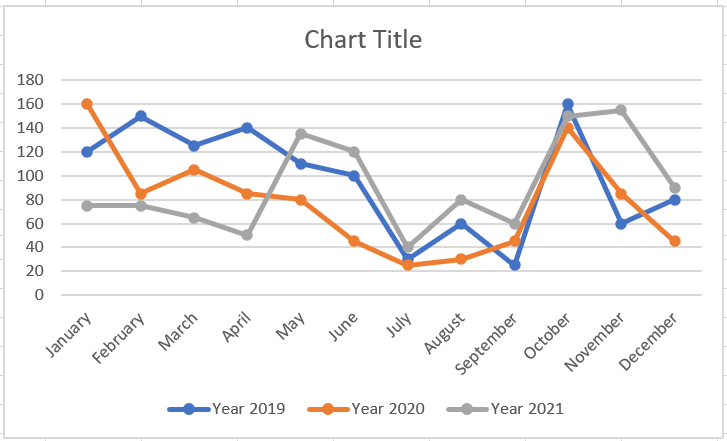
• Line with markers. The marked version of the line chart with indicators at each data point. Marked versions of the Stacked Line and 100% Stacked Line charts are also available.
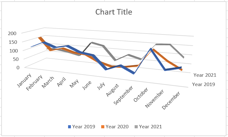
• 3-D Line. A three-dimensional variation of the basic line graph.
How to Customize and Improve an Excel Line Chart
The default line chart created by Excel already looks great, but there’s always room for improvement. To give your chart a unique and professional look, it makes sense to start with common customizations such as:
• Adding, editing, or formatting the chart title.
• Moving or hiding the chart legend.
• Changing the axis scale or choosing a different number format for axis values.
• Showing or hiding chart gridlines.
• Changing the chart style and colors.
How to Show and Hide Lines in a Chart
When creating a chart with multiple lines, you may not want to display all the lines at once. Therefore, you can use one of the following methods to hide or delete irrelevant lines:
1. Hide columns. In your spreadsheet, right-click a column you don’t want to plot in the chart and click Hide. Once the column is hidden, the corresponding row will immediately disappear from the chart. As soon as you unhide the column, the row will immediately return.
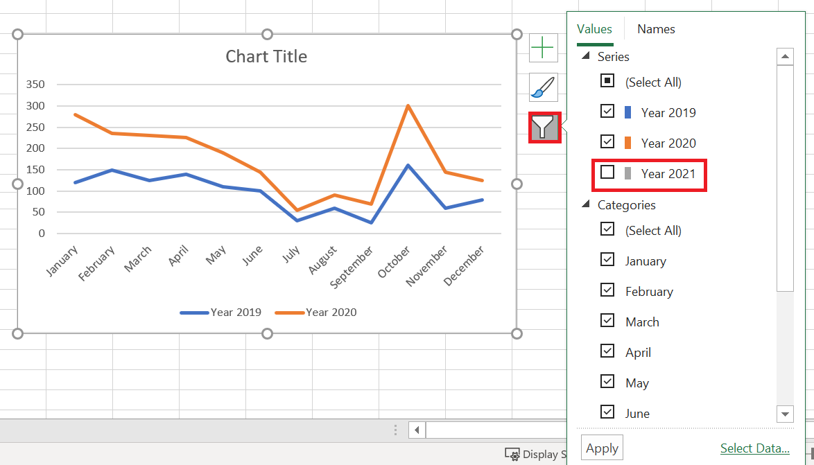
2. Hide rows in the chart. If you don’t want to distort the source data, click the Chart Filters button on the right side of the chart, uncheck the data series you want to hide, and click Apply:
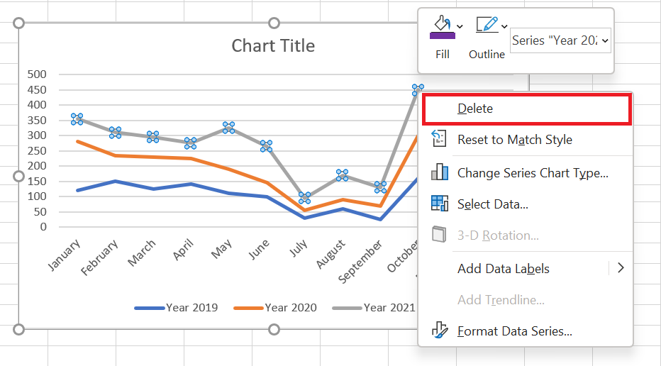
1. Delete a line. To permanently delete a certain line from the chart, right-click on it and select Delete from the context menu.
Changing Data Markers in a Line Chart
When creating a line chart with markers, Excel uses the Circle marker type by default, which, in my humble opinion, is the best choice. If this marker option doesn’t fit well with your chart design, you can choose another one:
1. In your chart, double-click the line. This will select the line and open the Format Data Series pane on the right side of the Excel window.
2. In the Format Data Series pane, switch to the Fill & Line tab, click Marker, expand Marker Options, select the Built-in radio button, and choose the desired marker type in the Type box.
3. Optionally, enlarge or reduce the markers using the Size box. 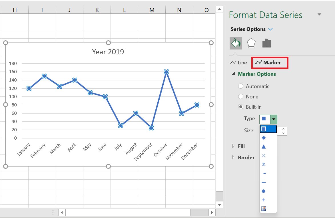
Changing the Color and Appearance of a Line
If the default line colors don’t seem very appealing to you, here’s how you can change them:
1. Double-click the line you want to recolor.
2. In the Format Data Series pane, switch to the Fill & Line tab, click the Color drop-down list, and choose a new color for the line.
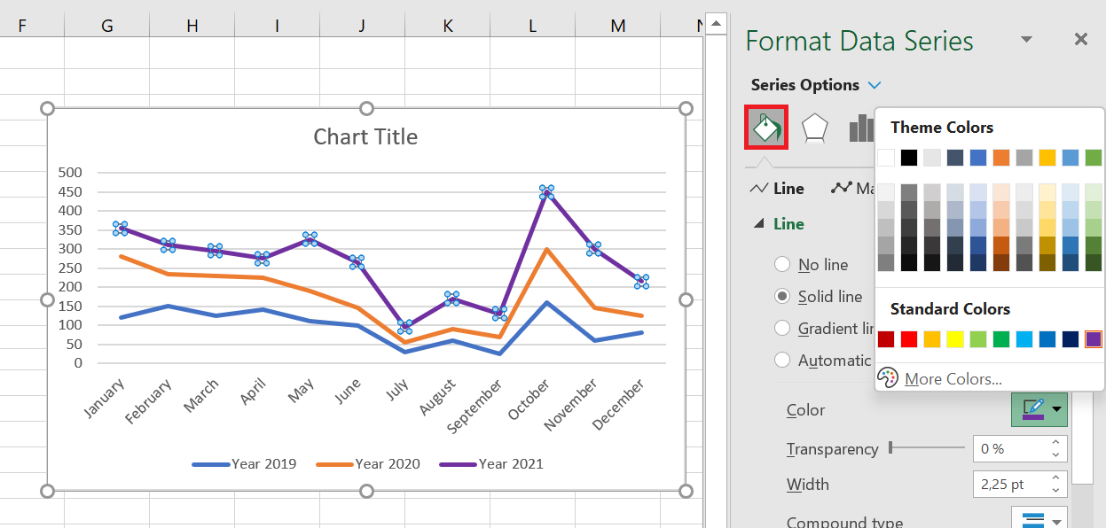
If the standard color palette isn’t sufficient for your needs, click More Colors… and then choose the RGB color of your choice.
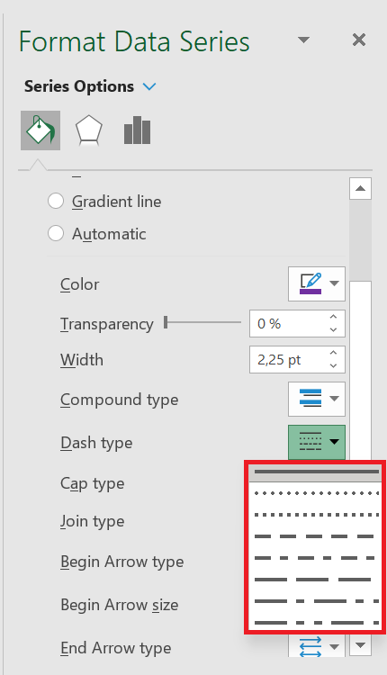
In this pane, you can also change the line type, transparency, dash type, arrow type, and more. For example, to use a dotted line in your chart, click the Dash Type drop-down list and choose the desired pattern:
Even more formatting options are available in the Chart Tools tabs (Chart Design and Format), which are activated when you select the chart or its element.
Smooth Line Chart Corners
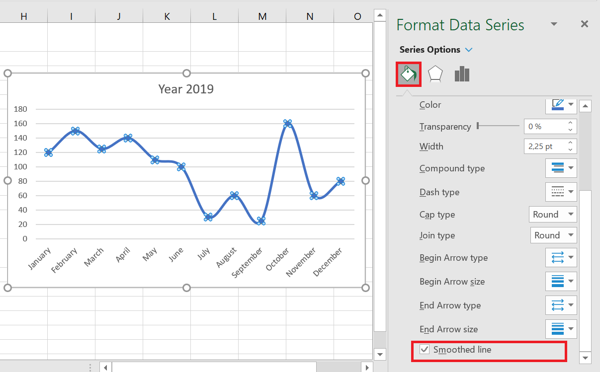
By default, the line chart in Excel is drawn with corners, which works well most of the time. However, if the standard line chart isn’t attractive enough for your presentation or printed documents, there’s an easy way to smooth the line corners. Here’s what you do:
1. Double-click the line you want to smooth.
2. In the Format Data Series pane, switch to the Fill & Line tab and select the Smooth Line check box.
For a multi-line chart, perform the above steps for each line individually.