
How to Create a Histogram in Excel
While everyone knows how easy it is to create a chart in Excel , creating a histogram usually raises many questions. In fact, in recent versions of Excel 2019, 2016, Excel 2013, and Excel 2010, creating a histogram takes only a few minutes and can be done in a variety of ways—using the Analysis ToolPak’s Histogram special tool, formulas, or a pivot table.
1 What is a histogram?
Have you ever created a bar or column chart to represent numerical data? A histogram is a specific use of a bar chart where each bar represents the frequency of items within a certain range. In other words, a histogram graphically displays the number of items in consecutive intervals without overlap.
For example, you can create a histogram to display the number of days with a temperature between 61-65, 66-70, 71-75, etc. degrees, the number of sales with amounts between $100-$199, $200-$299, $300-$399, the number of students with test scores between 41-60, 61-80, 81-100, etc.
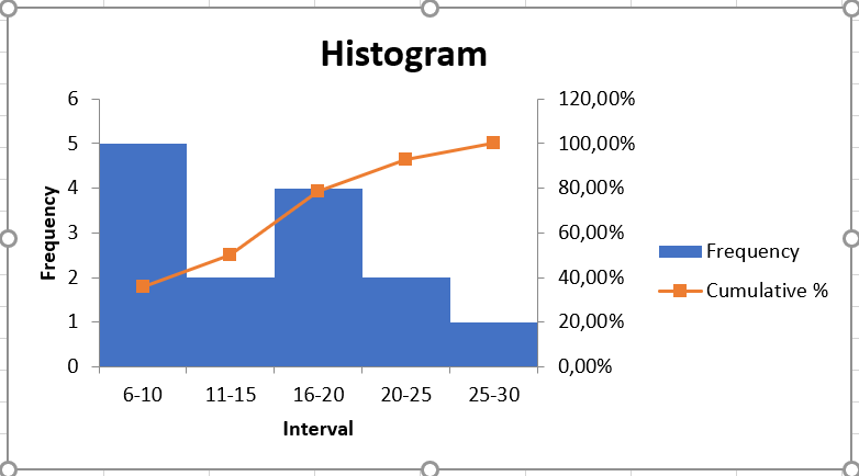
The following screenshot gives an idea of what an Excel histogram looks like:
2 Create a histogram in Excel using Analysis ToolPak
The Analysis ToolPak is a Microsoft Excel data analysis add-in, available in all modern versions of Excel starting with Excel 2007. However, this add-in is not automatically loaded when Excel starts, so you must load it first.
Load the Analysis ToolPak add-in
To add the Data Analysis add-in to your Excel, follow these steps:
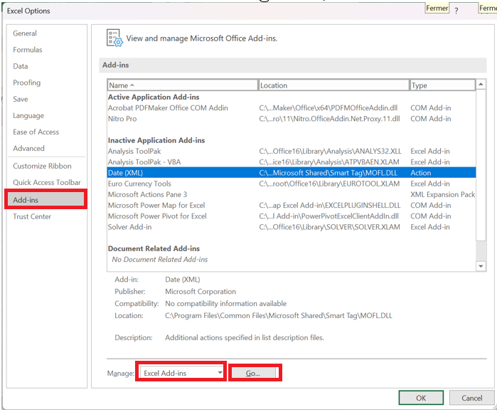
- In Excel 2010, Excel 2013, Excel 2016, and Excel 2019, click File / Options . In Excel 2007, click the Microsoft Office Button, and then click Excel Options .
- Excel Options dialog box , click Add-ins in the left sidebar, select Excel Add-ins in the Manage area , and then click the Go button .
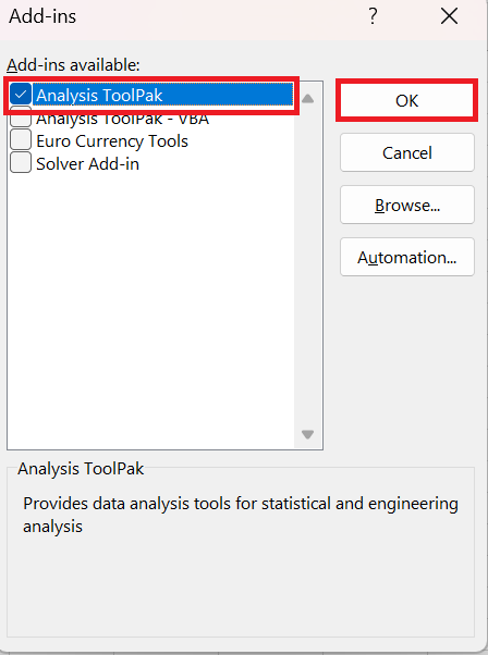
- Add-ins dialog box , select the Analysis ToolPak check box and click OK to close the dialog box.
If Excel displays a message stating that the Analysis ToolPak is not currently installed on your computer, click Yes to install it.
Now the Analysis ToolPak is loaded into your Excel and its command is available in the Analyze group on the Data tab .
Specify the bin range of the Excel histogram
Before creating a histogram, there is one more preparation to do: add the bins in a separate column.
Bins are numbers that represent the intervals into which you want to group the source data (input data). The intervals must be consecutive, non-overlapping, and generally the same size.
Histogram tool bins input data values based on the following logic:
- A value is included in a certain class if it is greater than the lowest limit and equal to or less than the largest limit for that class.
- If your input data contains values greater than the highest bin, all of these numbers will be included in the More category .
- If you do not specify the bin range, Excel will create a set of bins evenly distributed between the minimum and maximum values of your input data range.
Given the above, type the bin numbers you want to use in a separate column. The bins should be entered in ascending order, and your Excel histogram bin range should be limited to the input data range.
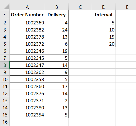
In this example, we have the order numbers in column A and the estimated delivery in column B. In our Excel histogram, we want to display the number of items delivered in 1-5 days, 6-10 days, 11-15 days, 16-20 days, and more than 20 days. So, in column D, we enter the bin range from 5 to 20 with an increment of 5, as shown in the screenshot below:
Create a Histogram Using Excel’s Analysis Tool
With the Analysis ToolPak enabled and the bins specified, follow these steps to create a histogram in your Excel sheet:
- Data tab , in the Analysis group , click the Analysis ToolPak button.

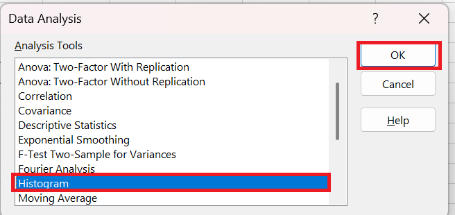
- In the Data Analysis dialog box , select Histogram and click OK.
- Histogram dialog window , do the following:
- Specify the input range and bin range.
To do this, you can place the cursor in the box and then simply select the corresponding range on your spreadsheet using the mouse. Alternatively, you can click the Collapse button  , select the range on the sheet, and then click the Collapse button
  to return to the Histogram dialog box.
If you included column headers when selecting the input data and bin range, check the Heading present box .
- Select output options .
To place the histogram on the same sheet, click Output Range , and then enter the top-left cell of the output table.
To paste the output table and histogram into a new sheet or workbook, select Insert New Worksheet or Create New Workbook , respectively .
Finally, choose one of the additional options:
- To present the data in the output table in descending order of frequency, check the Pareto (sorted histogram) box.
- To include a cumulative percentage line in your Excel histogram, select the Cumulative percentage box .
- To create an embedded histogram, check the Graphical representation box .
For this example, we have configured the following options:
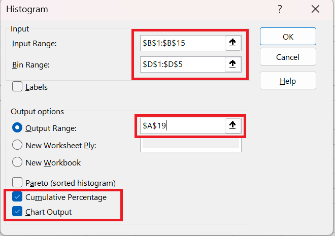
- And now click OK and examine the output table and histogram graph:
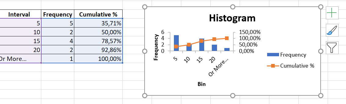
To improve the histogram, you can replace the default groups and frequency with more meaningful axis titles, customize the chart legend, and more. You can also use the design, layout, and format options in the chart tools to change how the histogram appears.
As you’ve just seen, it’s very easy to create a histogram in Excel using the Analysis ToolPak. However, this method has one important limitation: the built-in histogram chart is static, meaning you’ll have to create a new histogram every time the input data changes.
To create a histogram that can be updated automatically, you can either use Excel functions or create a pivot table .
3 How to Make a Histogram in Excel Using Formulas
Another way to create a histogram in Excel is to use the FREQUENCY or COUNTIFS function . The biggest advantage of this approach is that you won’t have to redo your histogram every time the input data changes. Like a regular Excel chart, your histogram updates automatically as soon as you change, add new input values, or delete existing values.
To begin, organize your source data in one column (column B in this example) and enter the bin numbers in another column (column D), as in the screenshot below:
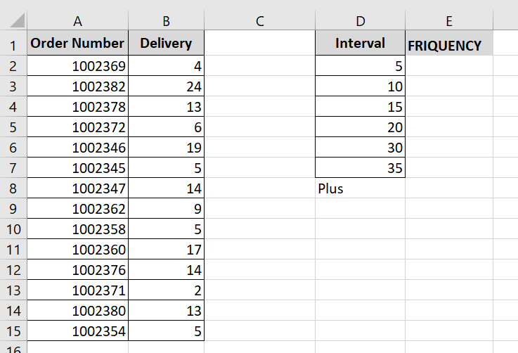
Now we will use a frequency or count formula to calculate the number of values falling within the specified ranges (bins), and then draw a histogram based on this summary data.
3.1 Creating a histogram using the FREQUENCY function
The most obvious function for creating a histogram in Excel is the FREQUENCY function, which returns the number of values in specific ranges, ignoring text values and empty cells.
The FREQUENCY function has the following syntax:
FREQUENCY( data_array; interval_matrix)
The FREQUENCY function syntax has the following arguments:
- data_array : Represents an array of values or a reference to the set of values whose frequencies you want to calculate. If the data_array argument contains no values, the FREQUENCY function returns an array of zeros.
- array_intervals : Represents an array of intervals or a reference to the intervals into which you want to group the values in the data_array argument. If the array_intervals argument contains no values, the FREQUENCY function returns the number of elements in the data_array argument.
In this example, data_array is B 2:B 40, interval_matrix is D2:D8, so we get the following formula:
= FREQUENCY (B2:B19; D2:D8)
Please keep in mind that the FREQUENCY function is a very specific function, so follow these rules to make it work properly:
- An Excel frequency formula must be entered as a multi-cell array formula. First, select a range of adjacent cells where you want to display the frequencies, then type the formula in the formula bar and press Ctrl + Shift + Enter to complete it.
- It is recommended to enter one more frequency formula than the number of bins. The extra cell is required to display the number of values above the highest bin. For clarity, you can label it » More » as in the following screenshot (but do not include this » More » cell in your interval_matrix argument !):
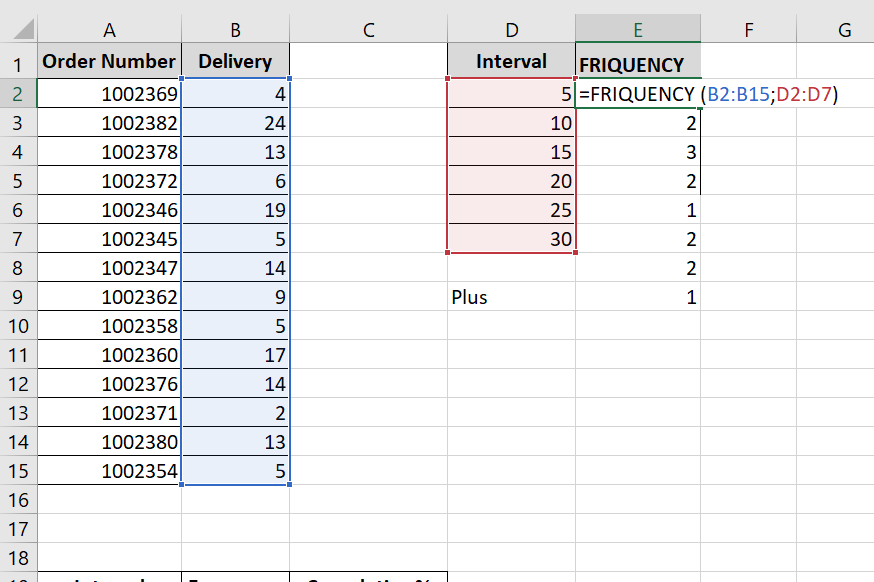
Like the Histogram option in the Analysis ToolPak, Excel’s FREQUENCY function returns values greater than a previous bin and less than or equal to a given bin. The last Frequency formula (in cell E9) returns the number of values greater than the highest bin (that is, the number of delivery days out of 35).
For ease of understanding, the following screenshot shows the classes (column D), the corresponding intervals (column C) and the calculated frequencies (column E):
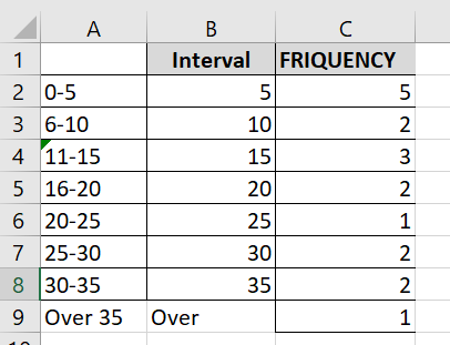
Because the Excel FREQUENCY function is an array function, you cannot edit, move, add, or delete the individual cells containing the formula. If you decide to change the number of bins, you will need to first delete the existing formula, then add or remove bins, select a new range of cells, and reenter the formula.
3.2 Create a histogram using the COUNTIFS function
Another function that can help you calculate frequency distributions to plot the histogram in Excel is the COUNTIFS function . And in this case, you will need to use 3 different formulas:
- The formula for the first cell – top bin (F2 in the screenshot below):
= COUNTIFS ($B$ 2:$ B$40 ; »<= »&$D2)
The formula counts the number of values in column B less than the smallest bin in cell D2, i.e. returns the number of items delivered within 1 to 5 days.
- The formula for the last cell – on the highest bin (F9 in the screenshot below):
= COUNTIFS ($B$ 2:$ B$100 ; »> »&$D8)
The formula counts the number of values in column B greater than the highest bin in D8.
- The formula for the remaining bins (cells F 3:F 8 in the screenshot below):
= COUNTIFS ($B$2:$B$40 ; »> »&$D2 ;$B$2:$B$40 ; « <= »&$D3)
The formula counts the number of values in column B that are greater than the bin in the row above and less than or equal to the bin in the same row.
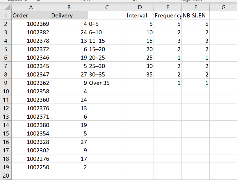
As you can see, the FREQUENCY and COUNTIFS functions return identical results:
Make a histogram based on the summary data
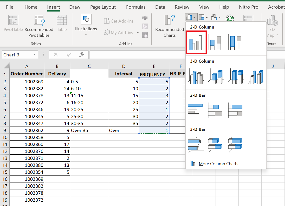
Now that you have a list of frequency distributions calculated with the FREQUENCY or COUNTIFS function, create a usual bar chart – select the frequencies, switch to the tab Insert and click the 2-D column chart in the Charts group :
The histogram will be immediately inserted into your sheet:
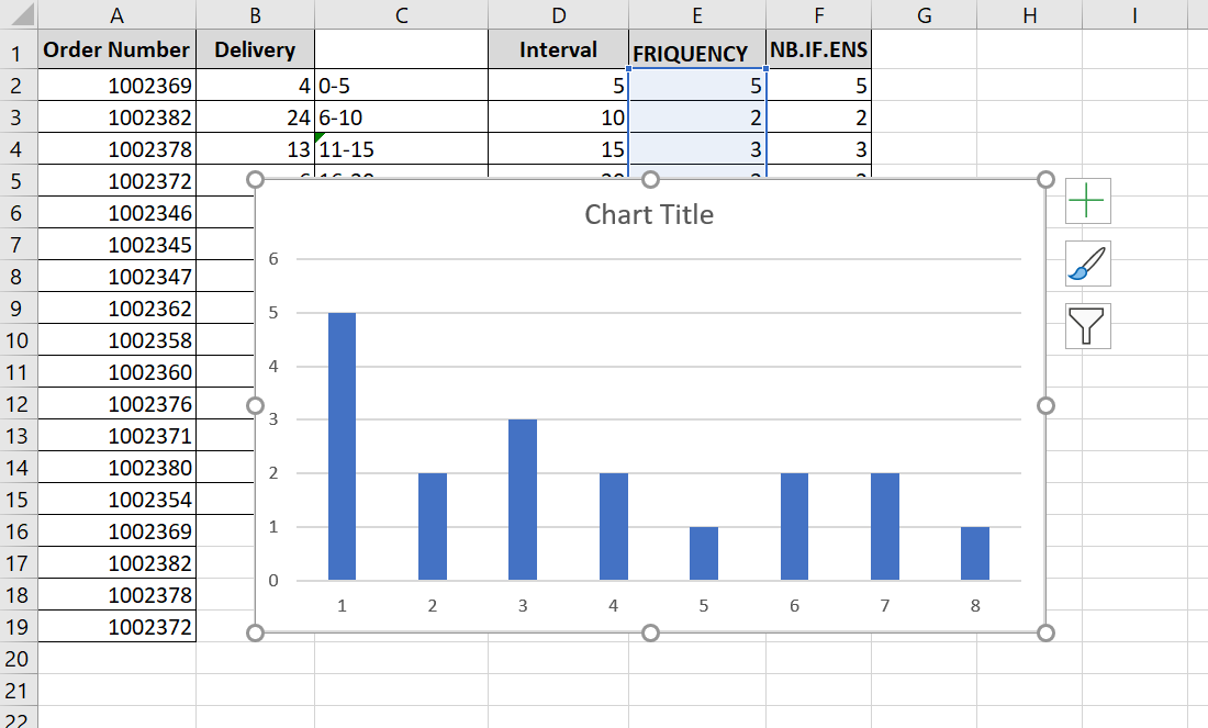
Generally speaking, you already have a histogram for your input data, although it certainly needs some improvement. More importantly, to make your Excel histogram easy to understand, you should replace the default horizontal axis labels represented by serial numbers with your bin numbers or ranges.
The easiest way is to type the ranges in a column to the left of the column with the frequency formula, select both columns – Ranges and Frequencies – and then create a bar chart. The ranges will automatically be used for the X-axis labels, as shown in the screenshot below:
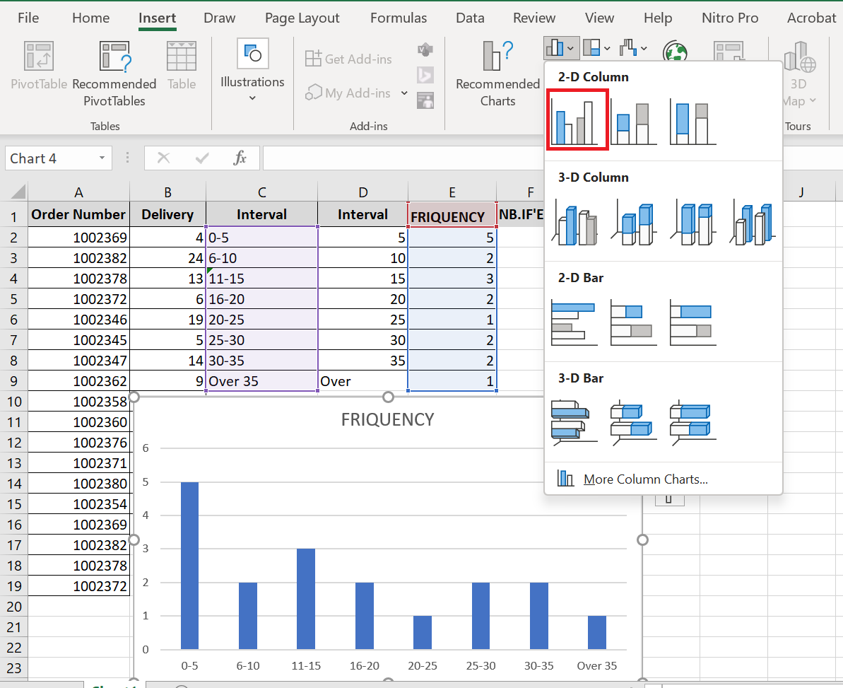
If Excel converts your intervals to dates (for example, 1-5 may be automatically converted to 05- Jan ) , type the intervals with a preceding apostrophe (‘) like ‘1-5 . If you want your Excel histogram labels to display bin numbers , type them with preceding apostrophes as well, for example ‘5 , ’10 , etc. The apostrophe simply converts the numbers to text and is invisible in the cells and on the histogram.
4 Customize and improve your histogram
Whether you’re creating a histogram using the Analysis ToolPak, Excel functions, or a PivotChart, you’ll often want to customize the default chart to your liking.
Change axis labels on an Excel histogram
When you create a histogram in Excel with the Analysis ToolPak, Excel adds horizontal axis labels based on the bin numbers you specify. But what if you want to display ranges instead of bin numbers on your Excel histogram? To do this, you need to change the horizontal axis labels by doing the following:
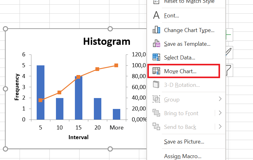
- Right-click the category labels on the X axis, then click Select Data…
- In the right pane, under Horizontal Axis Labels (Category ) , click the Edit button .
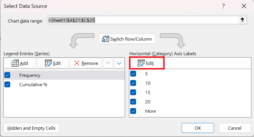
- In the Axis Label Range box, enter the labels you want to display, separated by commas. If you enter the intervals, enclose them in quotation marks as in the following screenshot:
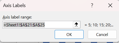
- Click OK.
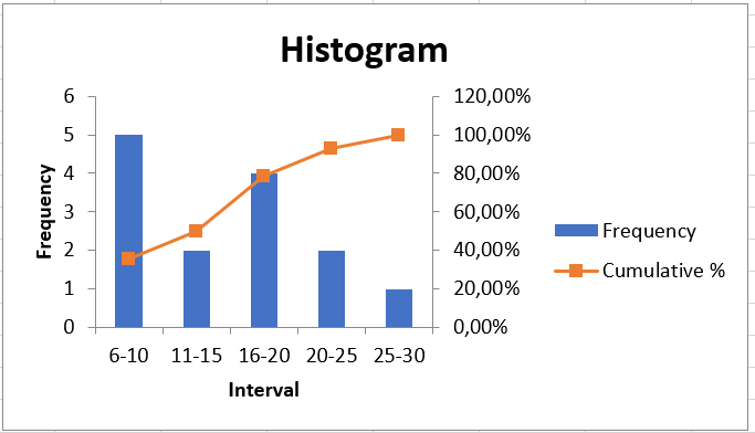
Remove spacing between bars
When creating a histogram in Excel, users often expect adjacent columns to touch each other, without any gaps. This is easy to fix. To eliminate gaps between bars, simply follow these steps:
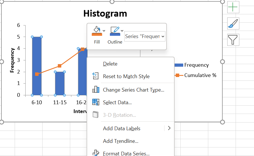
- Select the bars, right-click and choose Format Data Series…
- In the Format Data Series… pane , set the Gap Width to zero:
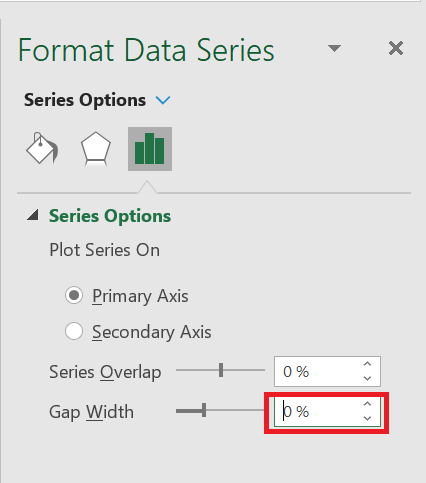
And there you have it, you have drawn an Excel histogram with touching bars.
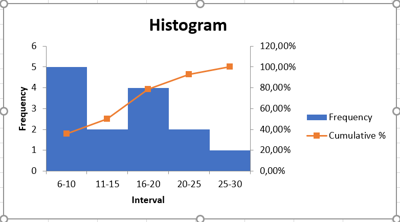
And then you can further beautify your Excel histogram by changing the chart title, axis titles, and changing the chart style or colors.