
How to Resize the graphics, Display data table and Add error bars
After creating your chart, for example, you want to change its size so that it occupies a specific location on your spreadsheet.
Three ways to resize your chart:
Start by activating your chart by clicking on it and proceed to resize it by choosing the method that suits you among the three described below:
Method 1
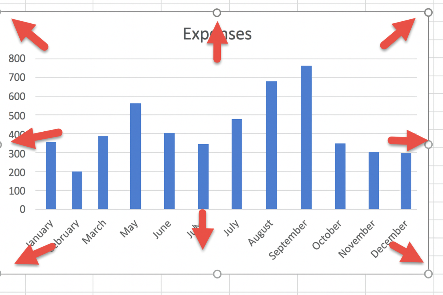
Click on one of the handles around your selected chart and drag in or out until you get the desired size.
Method 2
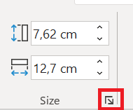
Use specific height and width measurements. If you want to set a custom height and width, click the Format tab on the ribbon, then manually enter your measurements in the Height and Width boxes in the Size group.

Method 3
Use the Format Graphics Area dialog box:
First, display this dialog box by following one of these steps:
Click the dialog box launcher in the Size group.
- Right-click the chart area and choose Format Chart Area.
3. Double-click the chart area .
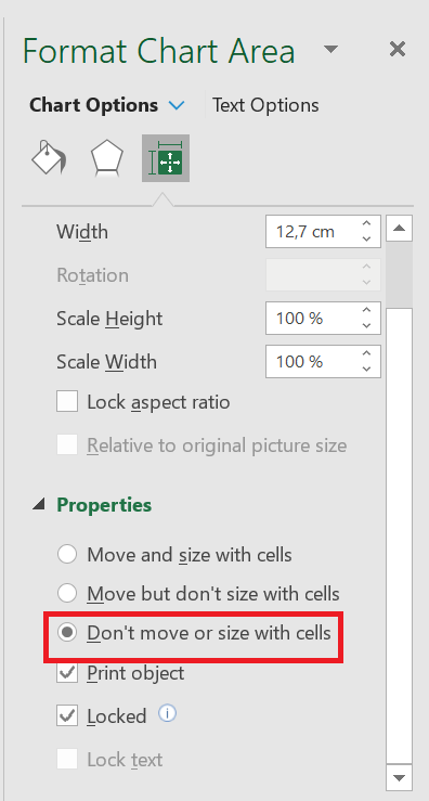
Format Graphics Area dialog box , click the small Size and Properties tab . In the Size box , enter your height and width values.
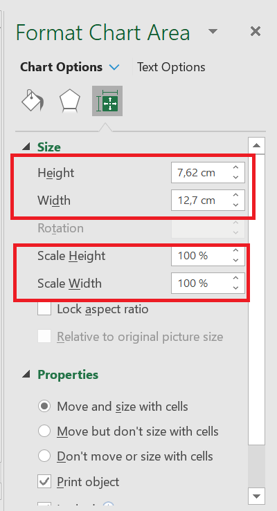
You can also use the two options Scale Height and Scale Width to change the size of your chart by a desired percentage rate.
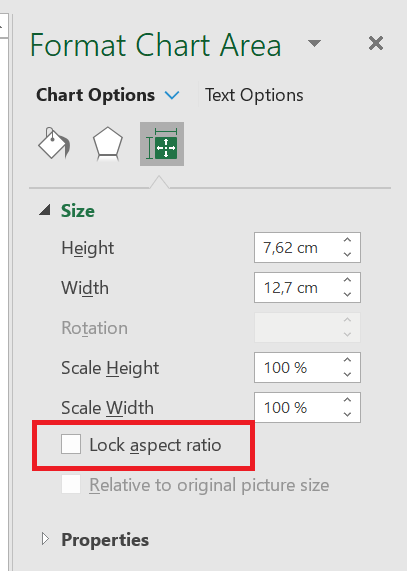
Maintain proportions
Check this box to maintain the resizing proportions between width and height.
Keep your chart size and position independent of cells:
When you change the size of the cells in your spreadsheet below your chart or when you hide or resize rows or columns, this will affect its size.
So, to keep the size of your chart independent of changes made to these cells (rows or columns), click Properties in the Format Chart Area dialog box and enable the Do not move or size with cells option.
11 Data table
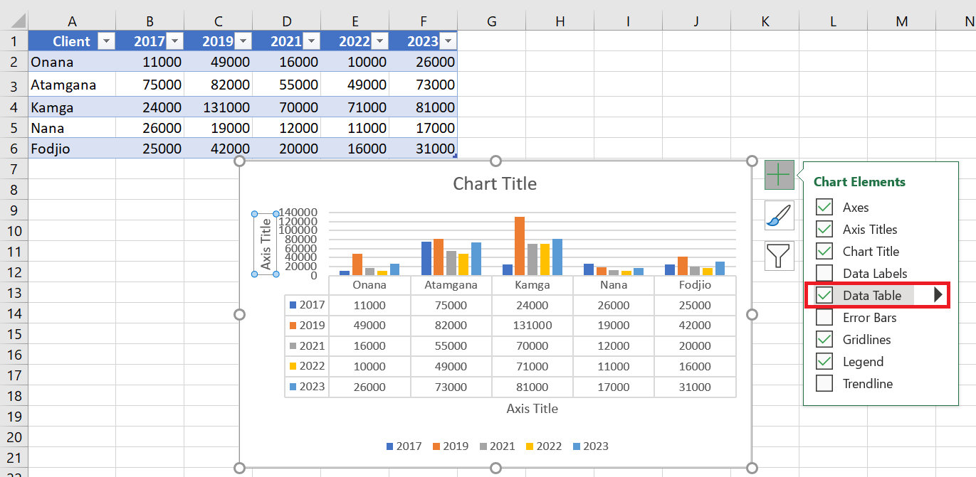
Data tables can be displayed in line, area, column, and bar charts. Follow the steps to insert a data table into your chart.
■ Click on the graph.
■ Click on the  icon Chart elements .
■ In the list, select Data Table . The data table appears below the chart. The horizontal axis is replaced by the data table header row.
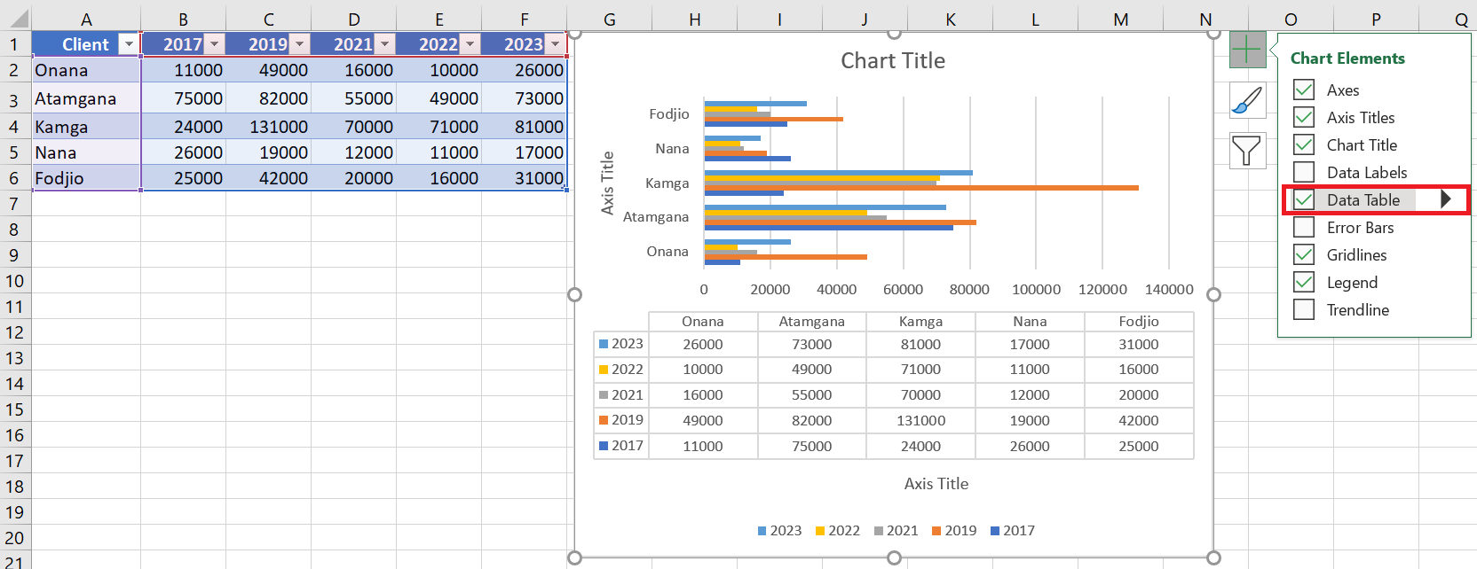
In bar charts, the data table does not replace a chart axis but is aligned with the chart.
12 Add error bars
Error bars graphically express the potential error amounts related to each data marker in a data set. For example, you might display potential positive and negative 5% errors in the results of a scientific experiment.
You can add error bars to a data series in 2D area, bar, column, line, xy (scatter), and bubble charts.
To add error bars, follow the steps below:
■ Click on the graph.
■ Click the Chart Elements icon . 
■ From the list, select Error Bars . Click the triangle icon  to see the available options for error bars.
■ Click More options… in the displayed list. A small window for adding series will open.
■ Select the series . Click OK.
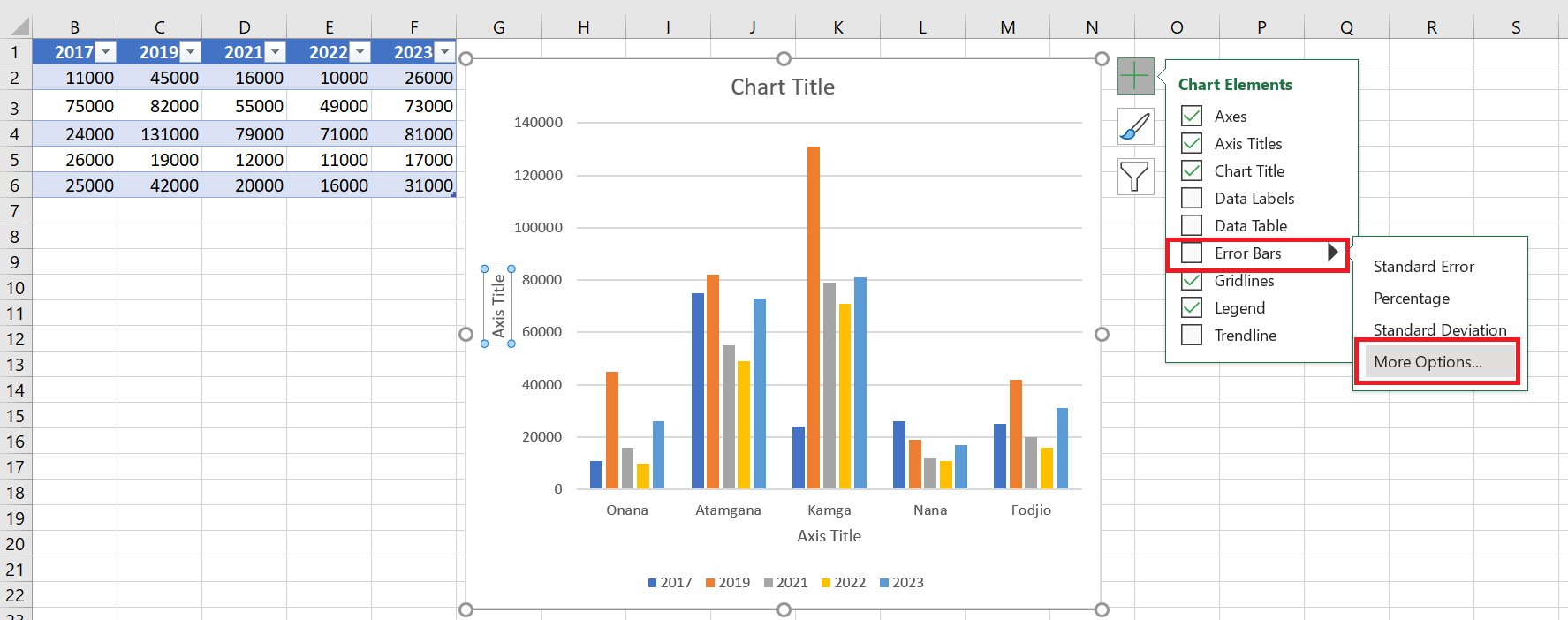
Error bars will appear for the selected series.
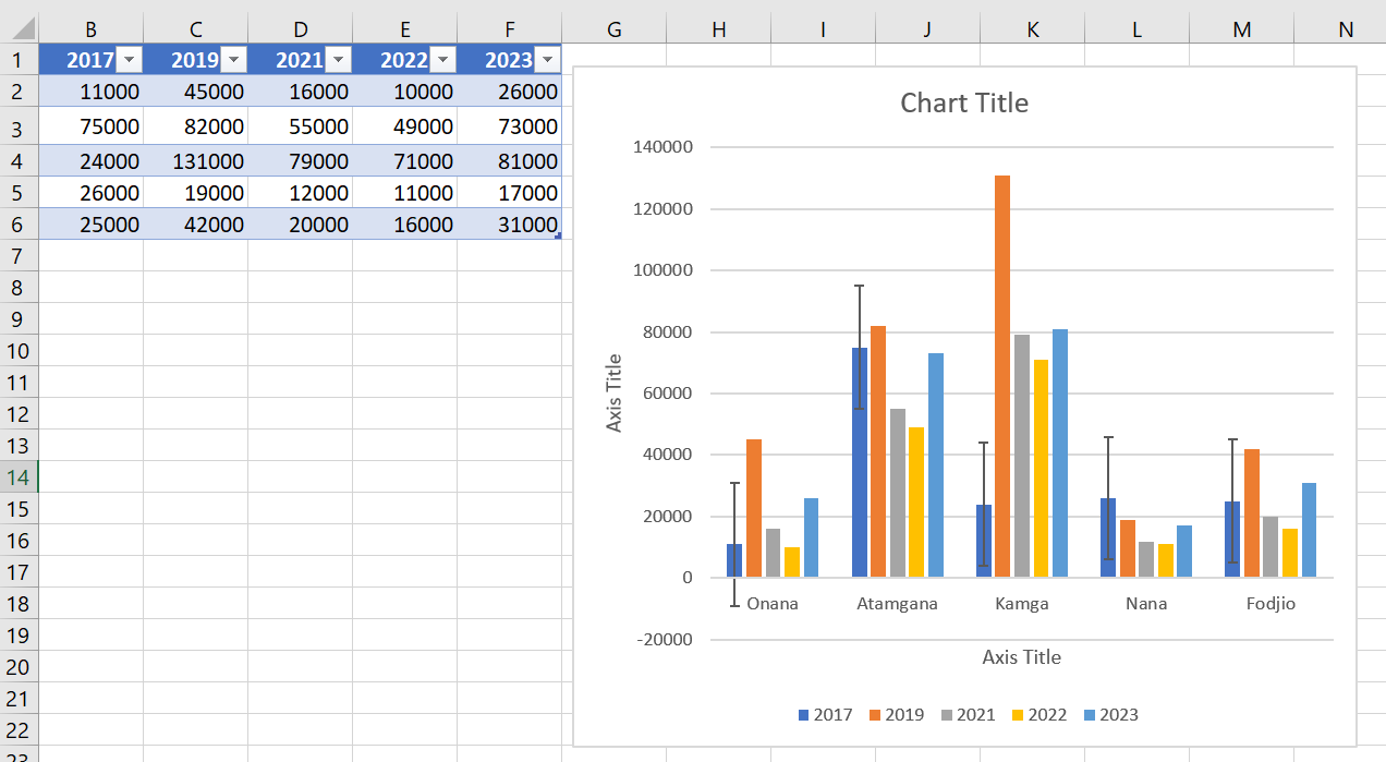
If you change the spreadsheet values associated with the series data points, the error bars are adjusted to reflect your changes.
For scatter and bubble charts, you can display error bars for X values, Y values, or both.