
POPULATION PYRAMID CHART
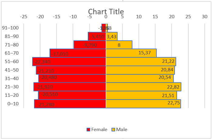
A population pyramid chart is a specific chart that helps us present and analyze the population of both sexes using age groups.
A population pyramid, also called a population chart, is a graphical illustration that shows the distribution of different age groups in a population, which forms the shape of a pyramid as the population increases. In Excel, we can create a population pyramid chart using a bar chart, as shown below.
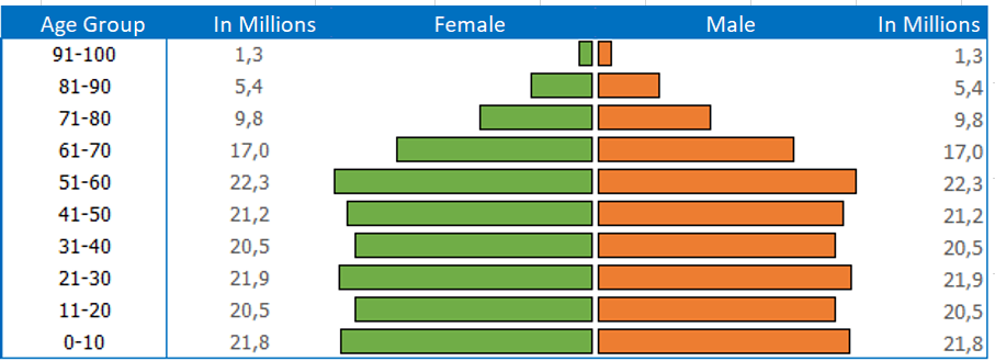
To create a pyramid chart, click on the Insert tab on the ribbon, then Insert Bar Chart, then do a little customization, that’s it.
But here’s the twist. I discovered that apart from this traditional method, we can also use two different methods. And today, in this article, I would like to share these three methods [exact steps] with you. So, let’s get started.
1 Simple Steps to Create a Population Pyramid Chart Using a Bar Chart
Before creating this graph, we need to prepare the data. A table with the total population, the female population in negative values, and the male population in positive values.
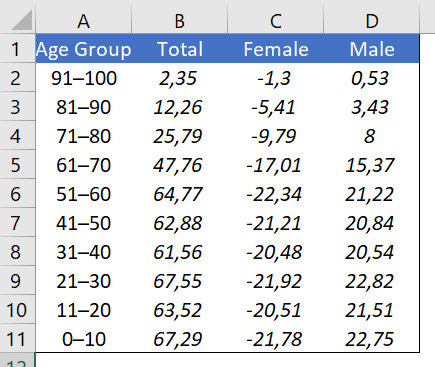
Note : The column for total population is not mandatory but make sure you have a negative female population.
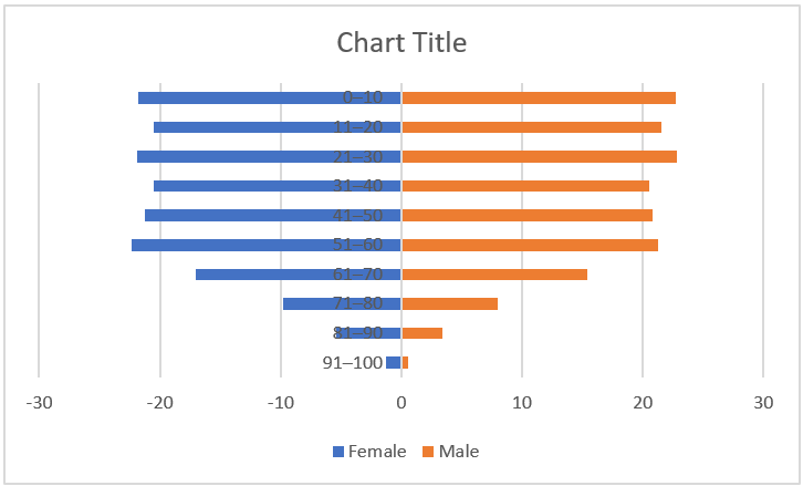
- First, we need to insert a bar chart. To do this, select the age group, female and male data columns and insert a bar chart from the Insert ➜ Charts ➜ 2D Bar ➜ Grouped Bar tab .
- Now we have a graph like below and further we need to customize it to create a population pyramid.
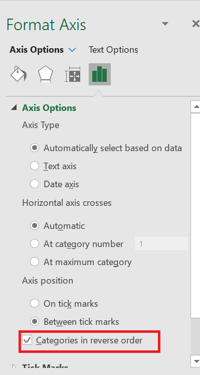
- From here we need to create a vertical axis in reverse order and go to Format Axis ➜ Axis Options ➜ Axis Position ➜ check « Abscissa in reverse order ».
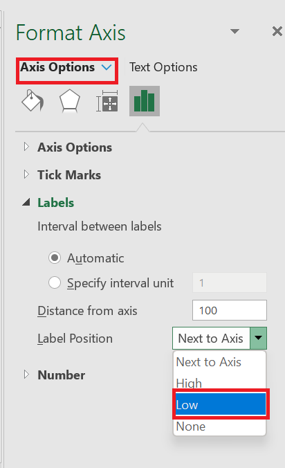
- After that, go to Format Axis ➜ Axis Options ➜ Labels ➜ change the label position to “ Bottom ” .
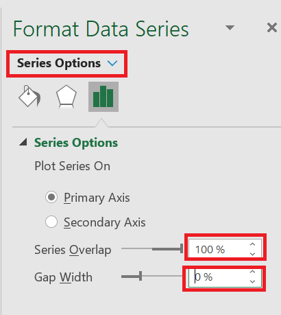
- Next, we need to change the series overlap to 100% and the range width to 0%. To do this, go to Format Axis ➜ Series Options.
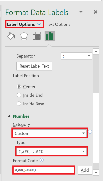
- Finally, we need to convert the negative data labels for the female data bar to positive. To do this, select the data labels and go to Format Data Labels ➜ Label Options ➜ Number and select Custom from the category and add in the format « ###0.00;###0.00 ».
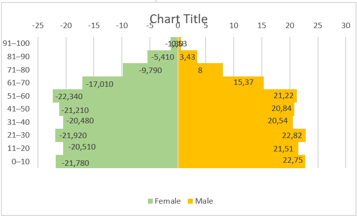
Our pyramid chart is ready to flip.
2 Use conditional formatting to easily create a pyramid chart
We can also create a pyramid chart using conditional formatting and here are the steps to do so.
- First, create a table with data on the male and female population with age groups.
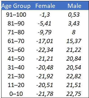
- male or female column and apply conditional formatting data bars from Home tab ➜ Styles ➜ Data Bars ➜ Other Rules .
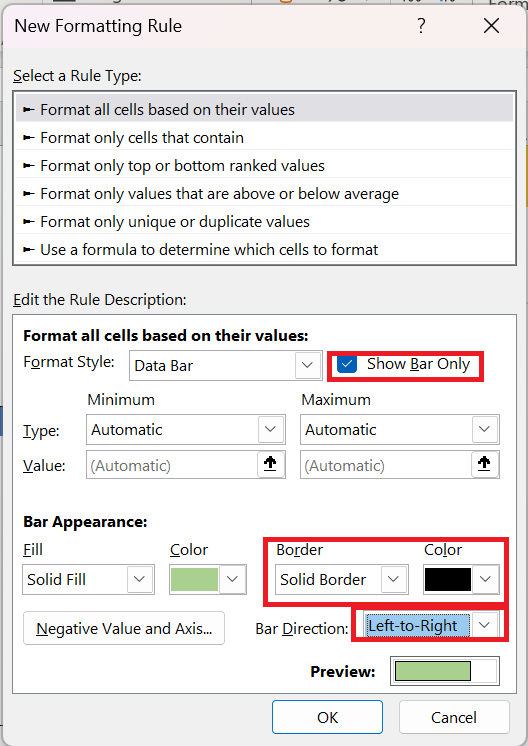
- After that, in the new formatting dialog box, check the « Show bar only » box, add a solid border and change the direction or orientation of the bar (female and male bars should be in the opposite direction).
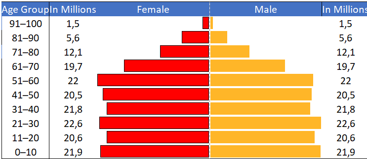
- Now select the second data column and add data bars to it in the same way, and you will get a pyramid chart like below.
- Finally, for a finishing touch, add two columns on both sides of the chart to add data labels.
3 Create a population pyramid chart in the cell
I’m a big fan of the REPT( ) function and the best thing is that you can use it to create a simple population pyramid.
- First, create a table like below.
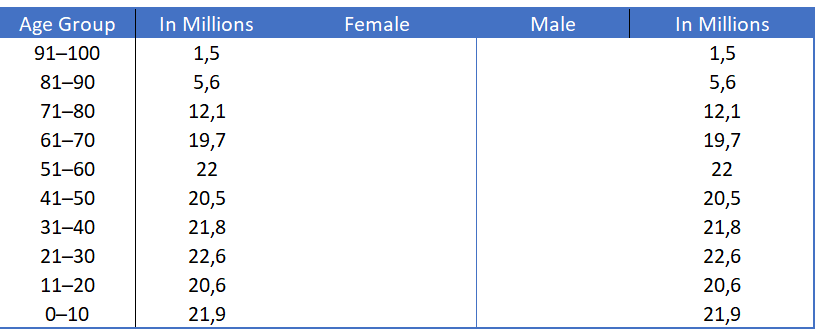
- Now add the formula below in the female and male columns and drag it down.
Female column := IFERROR(REPT(« | »;$F4*8); » »)
Male column: =IFERROR(REPT(« | « ;$ I4*8); » »)
- After that change the font style to Playbill (Font Size – 10) or you can also use Stencil (Font Size – 10).
- Finally, change the font color for both columns and align the female column to the right and the male column to the left.
The painting is ready.
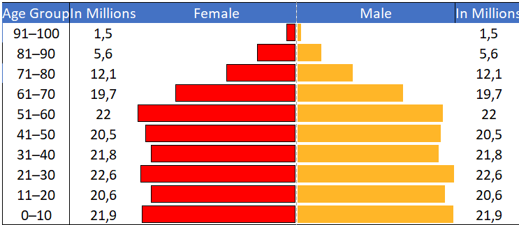
You might be wondering that a pyramid chart is only for demographic data, but the truth is you can use it for all kinds of data.