
TORNADO OR FUNNEL CHART
An Excel tornado chart or funnel chart is useful for those who want to analyze their data for better decision-making. Its best use is for sensitivity analysis, but you can also use it for comparison purposes. That’s why it’s on our list of advanced charts for Excel.
1 What is a Tornado or Funnel Chart?
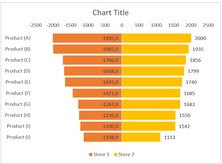
The Excel Tornado chart resembles a double-sided bar chart (resembling a tornado or funnel) in which you have two data bars opposite each other, making them easier to compare. As I mentioned, it’s a useful tool for sensitivity analysis, but you can also use it whenever you need to compare values.
2 Create a Funnel or Tornado Chart
In Excel, there is no default option to create a tornado chart, but you can use the default bar chart and customize it. In this article, we will learn how to create it.
Make sure to download this sample file to follow along. To create a funnel or tornado chart in Excel, you need to follow the steps below:
-
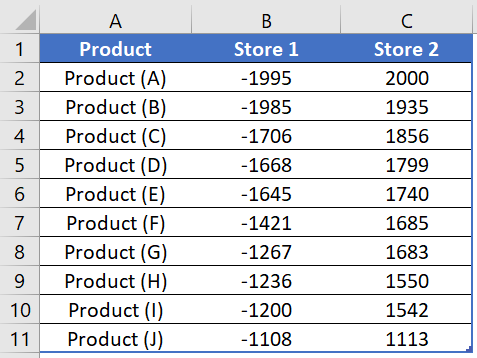
- First, you need to convert the data in Shop1 to a negative value. This will help you display the data bars in different directions. To do this, simply multiply it by -1.
-
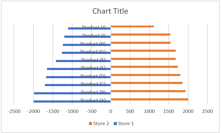
- After that, insert a bar chart using this data. Go to Insert tab ➜ Charts ➜ Bar Chart and with this, you will get a bar chart like below where you have two sides (one side is for positive values and the other is for negative values).
-
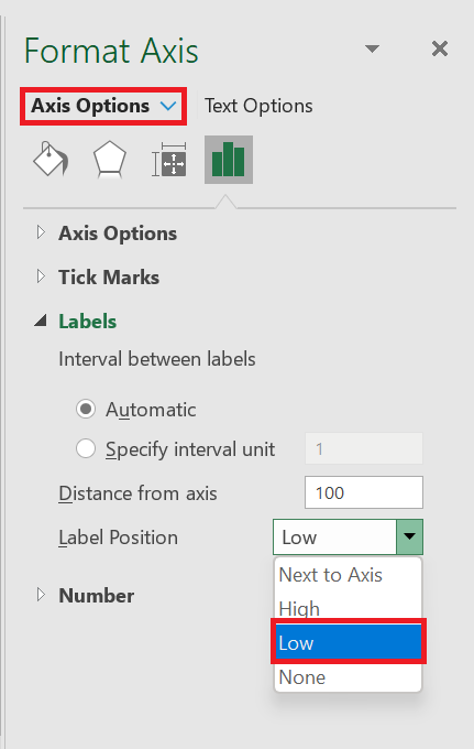
- From there, select the axis label and open the formatting options and in the formatting options, go to Axis options ➜ Labels ➜ Label position . Change the label position to » Bottom « .
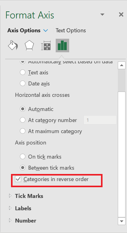
- Next, you need to change the axis position in reverse order. This will adjust the bars on both sides, and to do this, go to Axis Options ➜ Axis Position ➜ check « X-axis in reverse order ».
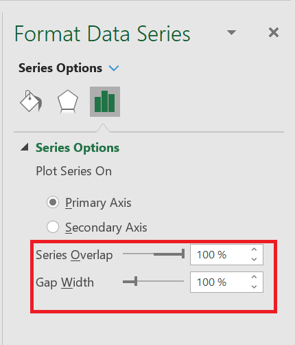
- Now you need to change the series gap and gap width. This will help streamline the data bars with each other and for this go to Series Options -> Change Series Overlap to 100% and Gap Width to 10%.
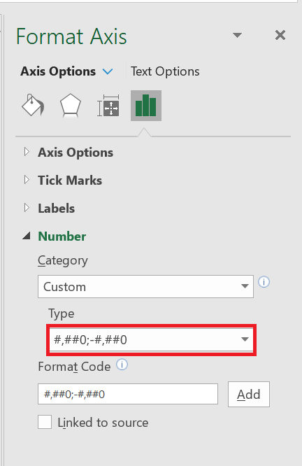
- to change the formatting of the numbers on the horizontal axis. And for that, go to Axis Options ➜ Number ➜ select Custom ➜ Paste the following format and click add.
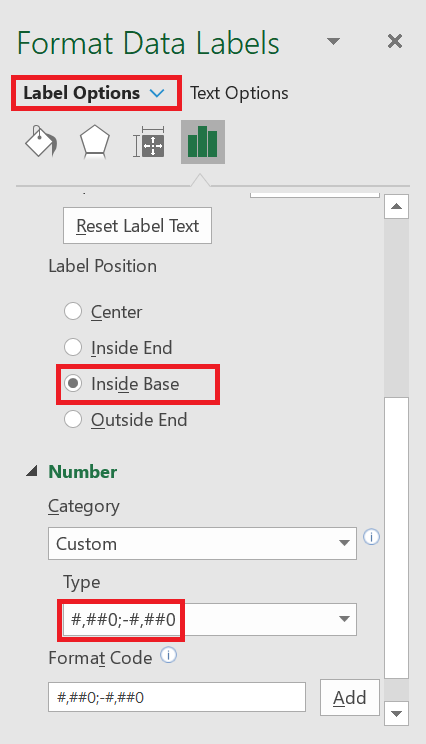
- Finally, just like the step above, you need to change the data label format for Shop 1 so that it does not display negative signs. Enable the data label then go to label option ➜ Number ➜ select customize ➜ paste the following format and click add.
- From there, select the axis label and open the formatting options and in the formatting options, go to Axis options ➜ Labels ➜ Label position . Change the label position to » Bottom « .
You now have your first tornado graph in your spreadsheet, like below.
You can also create a dynamic chart range for your chart so that you don’t have to update it again and again when you need to update the data.
3 Create a Funnel or Tornado Chart Using Conditional Formatting
Unlike how we used the method above, you can also use conditional formatting. To create a tornado chart with conditional formatting:
- You just need to plot your data as I have in the snapshot below. As you can see, you have data for both stores (Store 1 and Store 2) in the table.
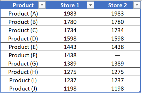
- So first, align the column of magazine 1 to the right and the column of magazine 2 to the left.
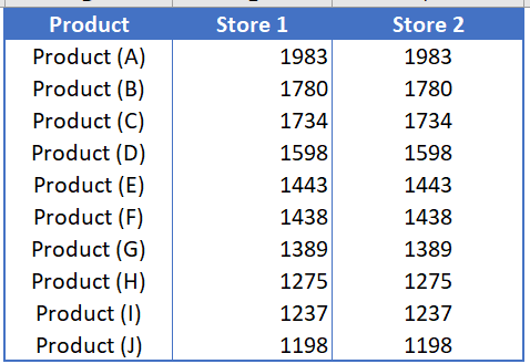
- The next thing is to create conditional formatting. You need to apply it to both columns one by one.
- From there, select the 1 column store and go to Home tab ➜ Styles ➜ Conditional Formatting ➜ Data Bars ➜ Other Rules .
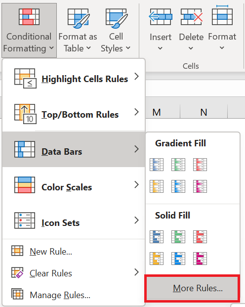
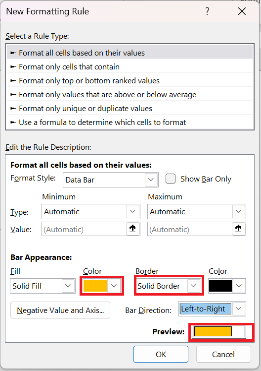
- In the « other rules » dialog box, you need to define the following items to create data bars:
- Color: Any color you want.
- Border: Solid (if desired)
- Orientation: right to left.
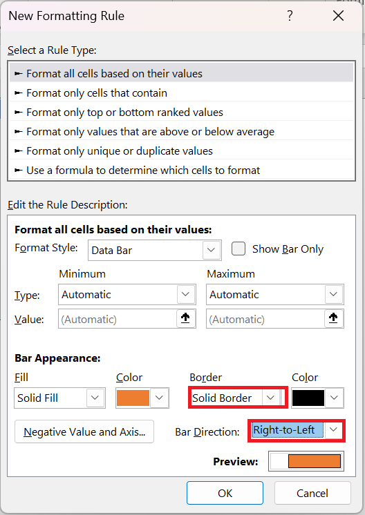
- After that, click OK to apply the data to the Store 1 column.
- The next thing you need to do is apply a bar to store 2 columns using the same method you used for the second one. Simply select the column and apply the data bars from the additional rules, using the settings below:
- Color: Any color you want
- Border: Solid (if desired)
- Orientation: left to right.
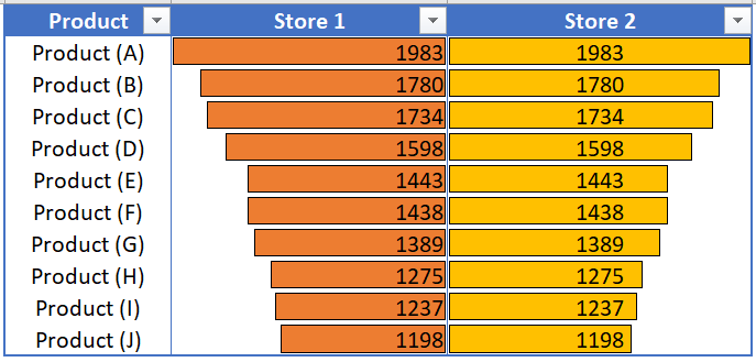
- At this point, you have a table containing a tornado chart to which you have applied data bars with conditional formatting.
4 Use the REPT( ) function to create a Tornado graph
But, there is one more thing we can try, and that is the REPT( ) function . To create a TORNADO chart with the REPT( ) function , you can follow the steps below:
-
-
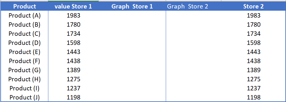
- First, you need to set up your data as we did in the snapshot below. Here, you have one column with product names and two columns for each store (one for values and the second for values).
-
-
-
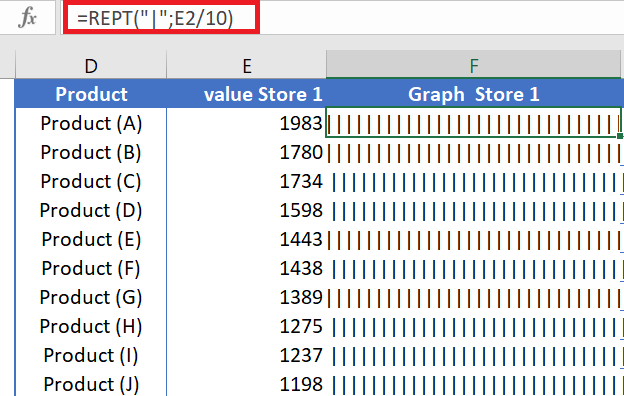
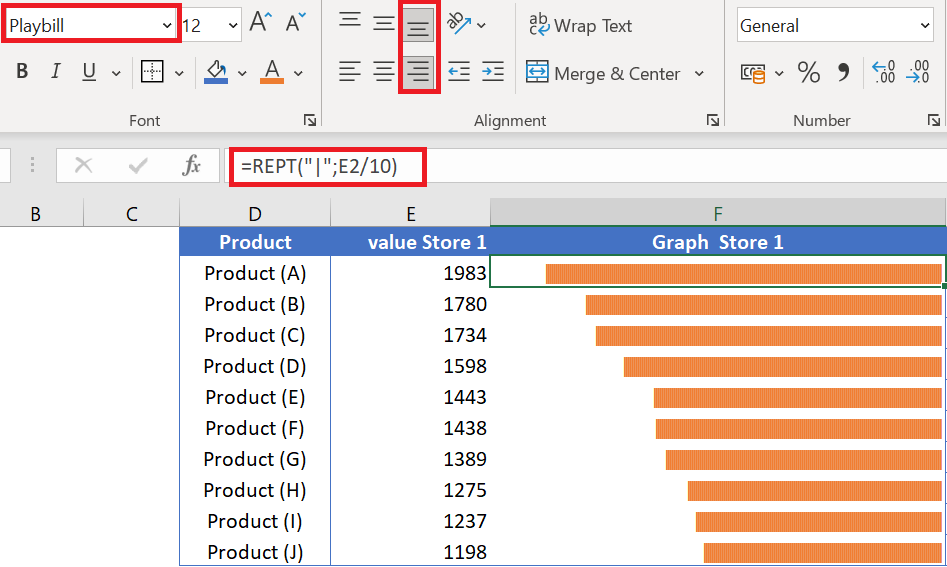
- From here we need to insert the REPT function in the data bar column of store 1 and for this insert the formula below in the first cell and drag it to the last cell . =REPT(« | »;E2/10)
-
-
-
- After that, select the entire column and change the following:
- The « Playbill » font (with this font you can have a data bar look).
- Change the column width to the largest data bar or larger.
- Change the font color to orange.
- Change text alignment from right to left.
-
- Next, you need to follow the same method to add data bars to the Store2 column and change the following:
- The font is » PlayBill » (with this font you can have a data bar look).
- Change the column width to the largest data bar or larger.
- Add a font color
- Change text alignment from left to right.
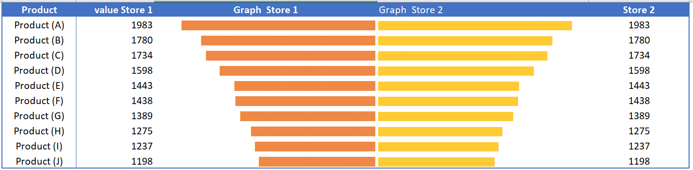
Some people call these tornado diagrams, a useful tool for comparative decision making. You can compare two different items or a single item for different time periods.