
BULLET CHART
Selecting a good chart type is one of the most difficult tasks.
The bullet chart is one of those advanced Excel charts that you should learn to draw better. It’s a perfect chart to use when you need to present a single target point against your achievements.
According to Wikipedia: A bullet chart is a variation of a bar chart developed by Stephen Few . Apparently inspired by the traditional thermometer charts and progress bars found in many dashboards, the bullet chart replaces the dashboard’s gauges and meters.
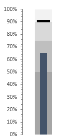
And in the article, I will share with you how to create a bullet chart in Excel in a few simple steps.
1 Components of a Bullet Chart
A bullet chart has three main components.
- Target Marker : A marker to represent the target. In the example above, I used 90% as the target. You can change the value as needed.
- Success bar : A single success bar to represent the actual value. This bar should be a solid color and slightly narrower than the color bars in the comparison range.
- Comparison Range : A comparison range of a color theme to use in the achievement bar background. The main idea behind using this range is to create a comparison for achievements, such as milestones.
2 Steps to Create a Bullet Chart
In the table below, you have three-part data that you can use to create a bullet chart. You can download this file to follow along.
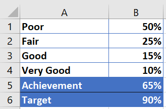
- The first four values are for the comparison range.
- The achievement value is for the achievement bar.
- The goal is for the target marker.
As I mentioned above, we have three main components in a bullet chart. So, you need to divide the whole process into several parts. The steps to create a bullet chart in Excel are a bit lengthy. But, once you understand the whole process, you will be able to create it in a few seconds.
3 Insert a column chart
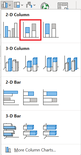
To create a bullet chart, you need to insert a 2-D column chart, a stacked column chart and here are the steps for that.
- First, select your data and insert a 2D histogram ( stacked histogram) from the insert tab.
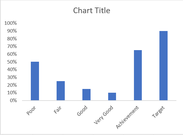
- You will get the six data values in your chart, like this.
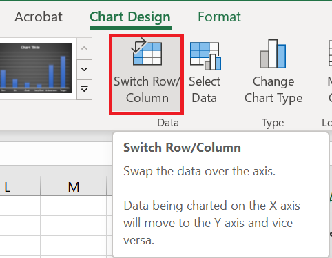
- After that, you need to swap the data in the chart. Select your chart and click » Swap Row/Column » in the Chart Creation tab of the ribbon.
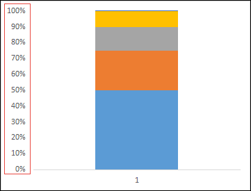
- Make sure you have maximum axis values equal to 100%.
- Now you have a table like below.
- Now let’s move on to the next step and create a target marker.
4 Make a target marker
Now you need to create a target marker that will look like a small horizontal line. Here are the steps.
-
-
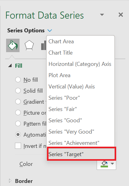
- First, you need to select your target bar . (But, the chart is totally messed up right now and it’s hard to select the target bar).
-
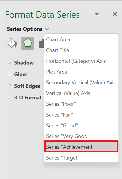
Here’s the trick: Select your chart and from the format options, use this drop-down menu to select the target value.
- Now go to the design tab and click on change chart type.
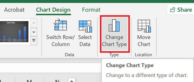
- Change the chart type for the target value to line chart with marker and check the corresponding secondary axis.
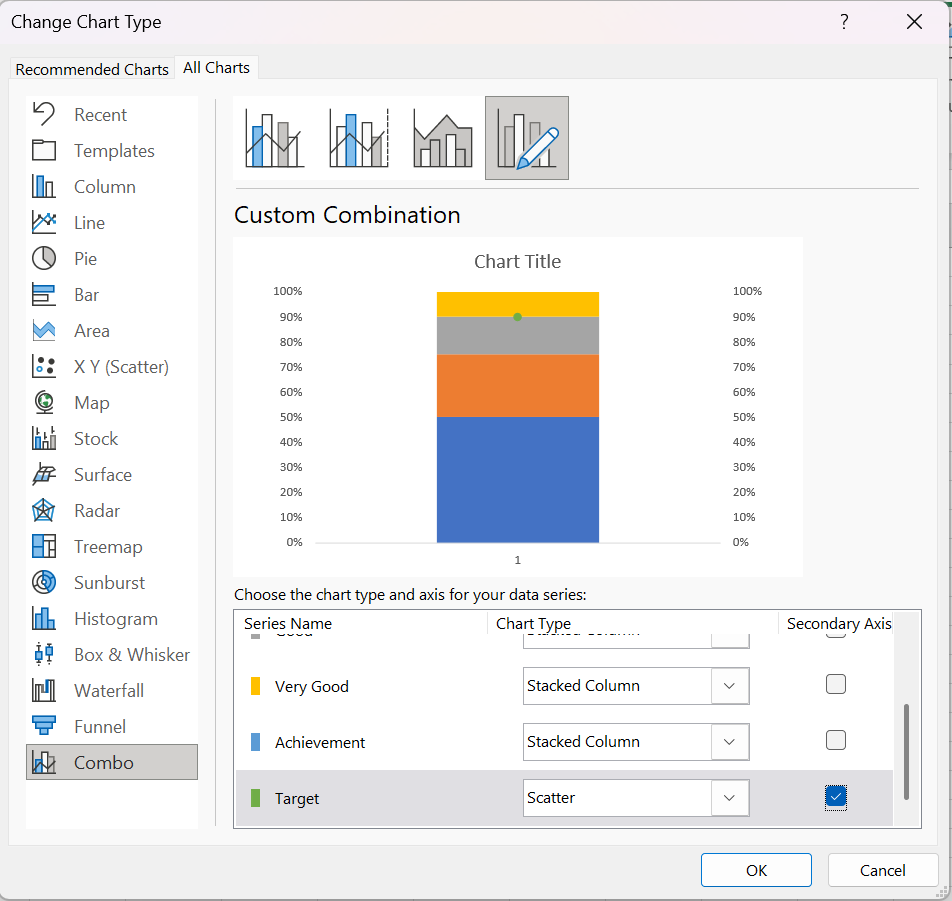
- At this point you have a small dot in your chart for the target.
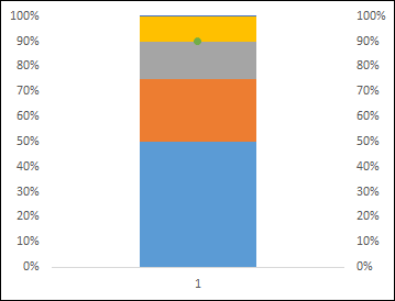
Now from here do the following things.
-
-
-
- Select this point and change the marker to a rectangular bar.
-
-
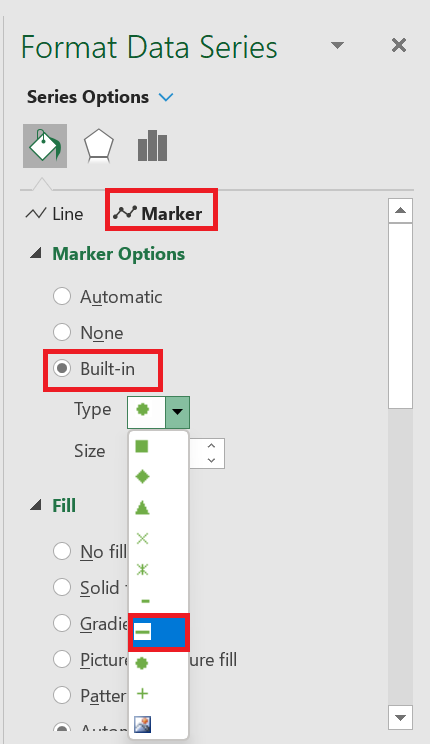
-
-
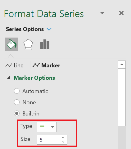
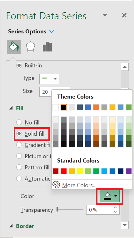
- Change the marker size to 20.
-
-
- Use a solid color for the fill (like black).
-
- No line for the border.
- Delete the secondary axis.
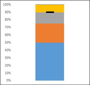
At this point you have a chart like above and next you need to make some changes to add an achievement bar.
5 Create an achievement bar
You need to create a success bar with a solid color to represent current success against the goal. Use the steps below.
- Select the achievement bar just as you selected the goal bar using the format options drop-down list.
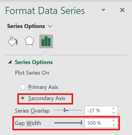
- Now go to series options and select secondary axis.
- Change the gap width to 500% for now.
- And, use a solid color for the achievement bar as a fill (like black or dark blue).
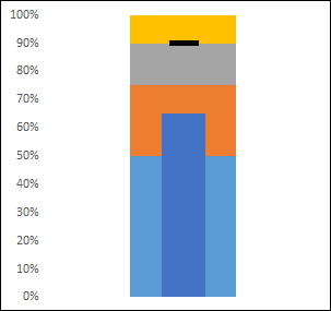
Your bullet chart is almost ready, all you need to do now is add a color theme for the comparison range.
6 Make a comparison range
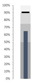
To create a comparison range, you need to select a color and use four different shades of it. All you have to do is select them one by one and apply a color. I used four different shades of gray here.
You can also add formatting to your chart if you need to. One thing I forgot to tell you is that once you’re done with it, make sure to change the gap with the comparison range to 500% and the achievement bar to 220%.
Congratulations ! Your bullet board is ready.
7 Additional Information
-
-
- Make sure your marker width is larger than the achievement bar. This way, when you have more achievements than the target marker, it will be displayed correctly.
- Always use solid colors for the achievement bar and target marker.
- Use different shades of single color for comparison range.
- You can also use the same technique to create a horizontal bullet chart. Simply replace the column chart with a bar chart.
-