WAFFLE GRAPHIC
There are many people who don’t like using a pie chart and they have their valid reasons for that.
If you are one of those people, let me introduce you to the WAFFLE CHART. You can also call it a square pie chart. And today, in this article, we will learn how to create a WAFFLE CHART in Excel.
1 What is a WAFFLE chart?
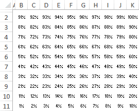
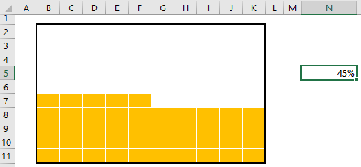
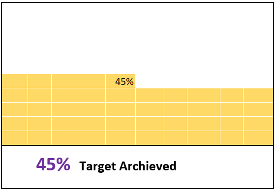
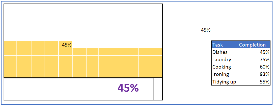
In Excel, a waffle chart is a set of grids (equal squares) that represent the entire chart. It works on a percentage basis, where one square represents one percent of the entire chart. Below is an example of a waffle chart I created in Excel. As mentioned, it has a total of 100 squares, and each square represents one percent of the total value.

2 Components of a Waffle Chart
And here are the main components of a waffle chart that you need to understand before creating it in Excel.
- 100-cell grid: You need a 100-cell square grid (10 X 10).
- Data Point: A data point from which we can take the percentage completion or percentage achievement.
- Data Label: A data label to show the percentage completion or percentage achievement.
So now it’s time to learn how to create it in Excel. Well, you can use a static or a dynamic one (depending on your needs). Let’s get started.
3 Steps to Create a Waffle Chart
The waffle chart is not included in Excel’s default chart list; in fact, it is one of the advanced Excel charts that you create yourself. Below are the steps to create a waffle chart in Excel:
- First, you need a grid of 100 cells (10 X 10) and the height and width of each cell must be the same. The overall grid of cells must be square and that is why it is called the square pie chart.
- After that, you need to enter values from 1% to 100% in the cells starting from the first cell of the last row of the grid. You can use the following formula to insert the percentage from 1% to 100% in the grid (all you have to do is enter this formula in the first cell of the last row and then copy this formula to the entire grid).
=(COLUMNS($A 10:A $10)+10*(ROWS($A10:A$10)-1))/100
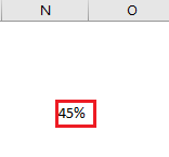
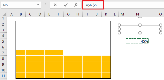
- Next, you need a cell for the data point where you can enter the completion or success percentage. You need to further link this cell in the waffle chart.
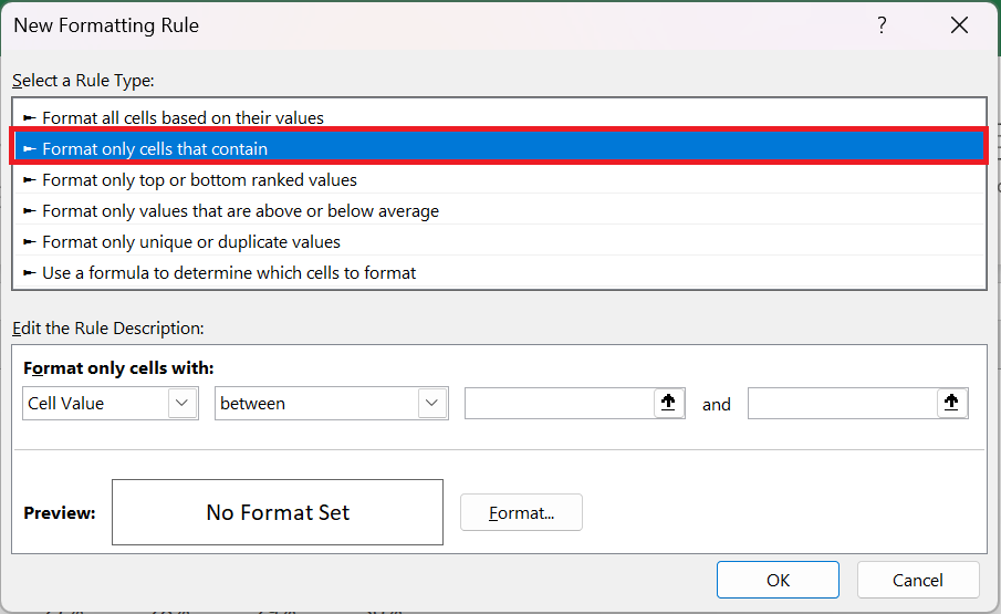
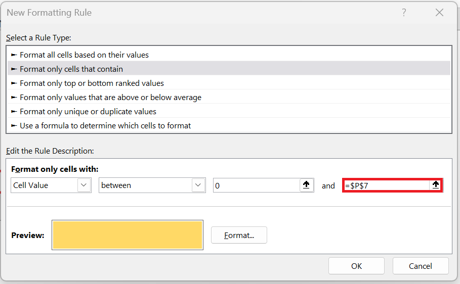
- Once you have created a data point, you then need to apply the conditional formatting rule on that grid and for that, please follow these simple steps to apply a rule.
- Select the entire grid and go to → Home tab in the Styles group select Conditional Formatting → New Rule .
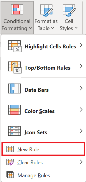
- In the new ruler window, select « Apply formatting only to cells that contain ».
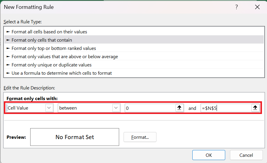
- Now in « format only cells with » specify the values 0 as minimum and $N$5 as maximum values.
- This rule will apply conditional formatting to cells with values between this range of values.
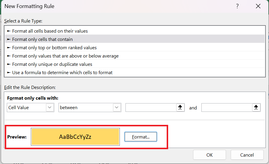
- Click the format button to specify a format to apply.
- Make sure to apply the same color for both font and cell color to hide fonts when the condition applies.
- From here you need to apply one last formatting touch and for this select the grid and do the following:
- Change the font color to white.
- Apply a white border to the grid cells.
- Apply a solid outer border to the black grid.
- After that you will get a waffle chart which is linked to a cell and when you change the data in that cell the chart will be automatically updated.
- Now you need to create a label for the chart and for this you need to insert a simple text box and connect it to the cell . Follow the steps below for this.
- Insert a text box into your spreadsheet from the Insert tab of the ribbon, select Text Box in the Text group.
- Now select the text box and click in the formula bar.
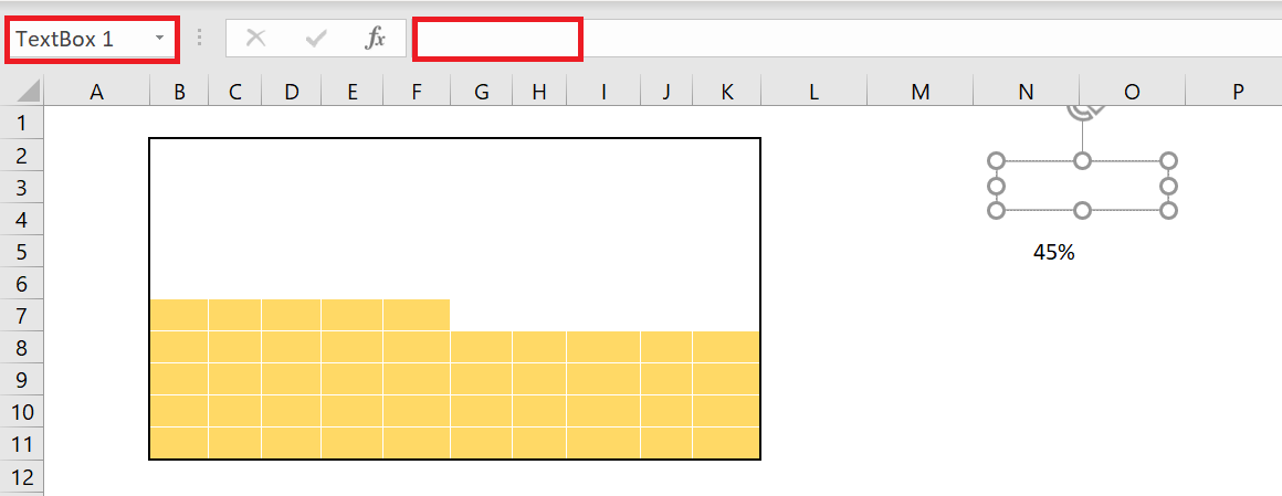
- Enter the cell reference of the data point cell and press Enter.
- Increase the font size and place the text box on your chart.
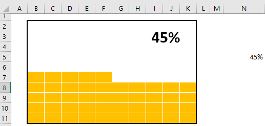
Now your waffle chart is ready and you can use it anywhere, but I want to add something more and I’m sure you’ll like it. In the chart below, besides the main label, we have a small label in the last square of the grid that can help the viewer instantly identify the value of the chart.
To add this label, we need to follow the steps below:
- First, select the entire chart grid , then click on the Home tab of the ribbon, in the Style group, click on Conditional Formatting and go to Highlight Cell Rules then click on Equal To .
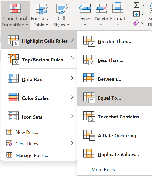
- Now in the equals dialog box, select the cell where we have our percentage value.
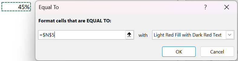
- After that, open “Custom Format” and go to the “Font” tab.
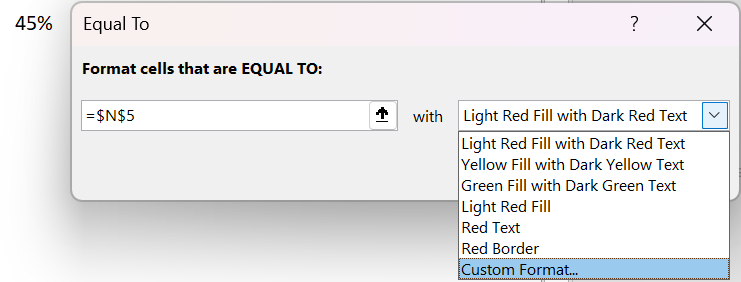
- From there, in the Font tab, select the font color « Black « , style « BOLD » and click OK.
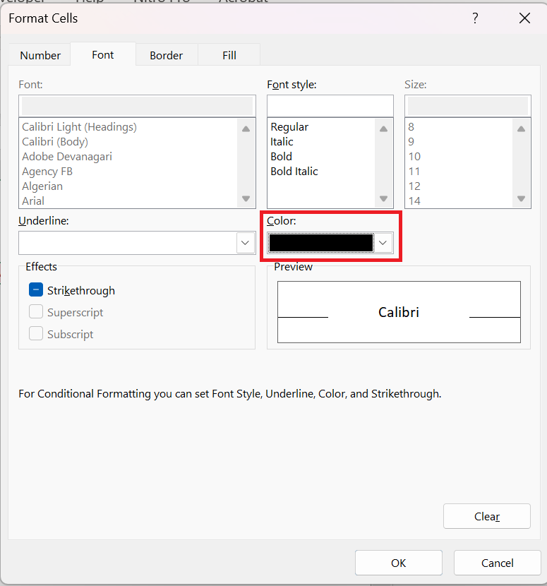
The moment you click OK, a small label (which is the cell value) is added in the last square.

Your first Excel waffle chart is ready to go
4 Steps to Create an INTERACTIVE Waffle Chart
At this point you know how to create a waffle chart
, but I have a lot of questions about how to make it an interactive chart.
If you think about it this way, one of the most important things you should have in an interactive chart is how you control it and you should be able to edit the data.
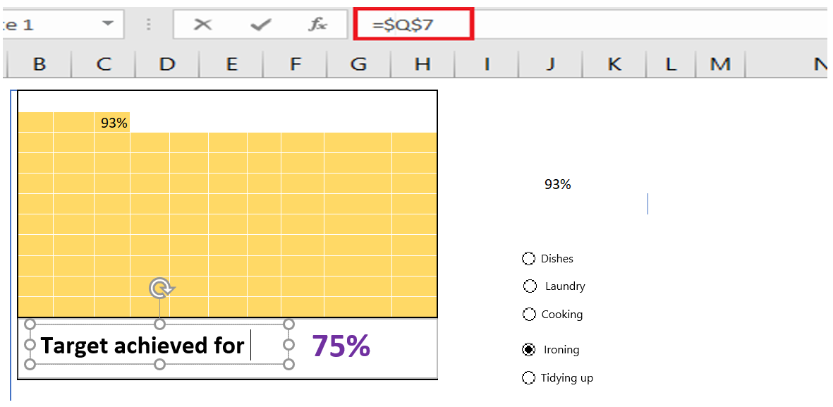
So in this section I would like to share with you the steps to create an interactive WAFFLE chart in which you can edit the data with the OPTION buttons.
So let’s make it INTERACTIVE .
-
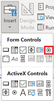
- First, you need to insert five buttons or radio buttons in the spreadsheet and for this, go to DEVELOPER tab ➜ Insert Radio Buttons.
-
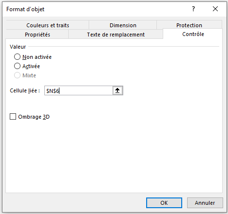
- After that, you need to connect these radio buttons to a cell . So, when you select a button, that cell can have a number that we can use to pull data from the main table.
- To do this, select all the option buttons and right-click, then select « Format Control » (you can also group all the option buttons together using the GROUP option).
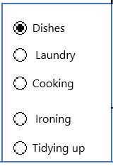
- Next, you need to name the five radio buttons according to the product names you have. Simply right-click and edit the text
- Now the next step is to create a formula and insert it into the completion cell so that when you select an option button it returns the value of that particular product.
- So this formula we need here would be like below :
=INDEX(P 8:P 12;N6)
- Enter the above formulas into the success cell. In this formula, P 8:P 12 is the range where you have task completion values and N6 is the cell that is connected with the option buttons.
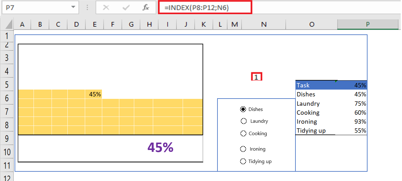
Note: It’s important to know that for this waffle chart, the changing cell is P7. I modified this cell for both conditional formatting used at the beginning.
- There is one more thing we need to do and that is create a dynamic label for the chart (at this point we have a data label that is connected to the completion cell but we need to make it dynamic).
- To do this, we need to enter the formula below in the cell next to the success cell.
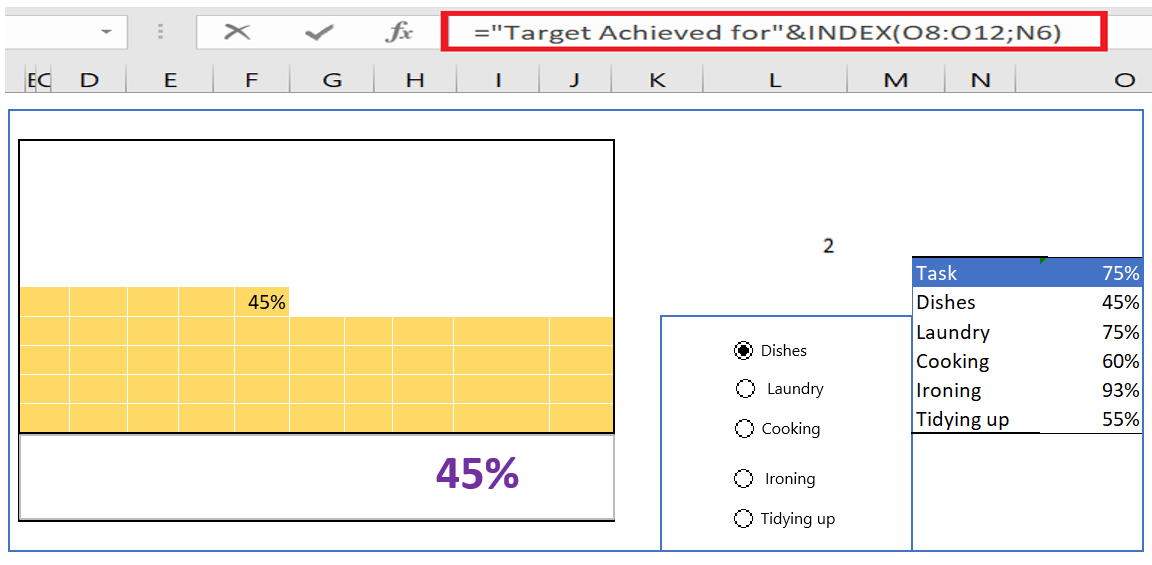
- After that insert a simple text box which you need to connect to the cell where you just added the above formula and for that select that text box and click on the formula bar and type the address of the cell where you have the formula .
You now have an INTERACTIVE TABLE in your spreadsheet that you can use and control with the option buttons.
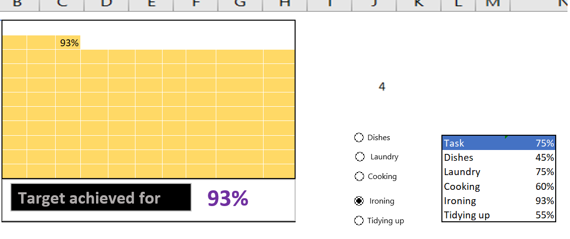
And in the future, if you want to update the data, you just need to add a new radio button and update the data ranges in the formulas.
6 Add an embossed chart to a dashboard
The WAFFLE chart looks good, but inserting it into a dashboard can sometimes be tricky. But, you don’t have to worry about it. The best way to add it is to create a linked image with Excel ‘s Camera tool or by using a special option. The advantage of using this technique is that you can change the size of the chart.
- Select your embossed chart (Grid).
- Copy cells using the keyboard shortcuts control + C.
- Go to your dashboard sheet and navigate to ➜ Home tab ➜ Clipboard ➜ Paste ➜ Linked Image .
Benefits
- It provides a quick overview of the progress of a project or the achievement of the objective.
- It looks good and you can easily use it in your dashboard.
- You can easily convey your message to the user without any additional explanation.
The disadvantages
- Using multiple data points in the waffle chart complicates things.
- You need to spend a few minutes to create an embossed graphic.
- You can only present data as a percentage.