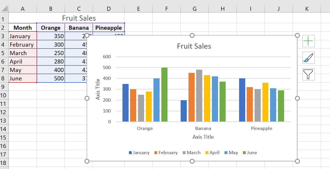
Customize Excel charts: Add chart title, axes, legend, data labels, and more.
After creating a chart in Excel, what’s the first thing you usually want to do with it? Make the chart look exactly how you imagined it in your mind!
In modern versions of Excel, customizing charts is easy and fun. Microsoft has really made a big effort to simplify the process and place customization options at your fingertips. And below, you’ll learn some quick ways to add and edit all the essential elements of Excel charts.
1 Three Ways to Customize Charts
You already know that you can access the main features of the chart in three ways:
- Select the chart and go to the Chart Tools tabs ( Chart Creation, Formatting ) on the Excel ribbon.
- Right-click the chart element you want to customize and choose the corresponding item from the context menu.
- Use the chart customization buttons that appear in the upper right corner of your Excel chart when you click on them.
You’ll find even more customization options in the Format Chart pane , which appears to the right of your worksheet when you click More Options… in the chart ‘s context menu or on the Chart Tools tabs on the ribbon.
NOTE ■■■■■■
Pour un accès immédiat aux options pertinentes du volet Format du graphique, double-cliquez sur l’élément correspondant dans le graphique.
2 How to Create and Customize a Chart Title
2.1 How to add a title to a chart
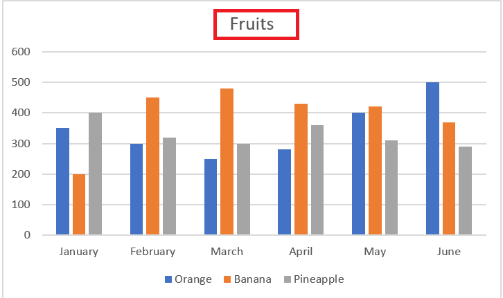
A chart is already inserted with the default Chart Title . To change the title text, simply check this box and enter your title:
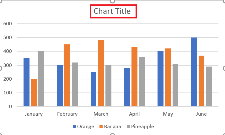
You can also link the chart title to a cell in the sheet, so that it is automatically updated whenever the cell you like is updated. If for some reason the title was not added automatically, click anywhere in the chart to display the Chart Tools tabs. are displayed. Click the Chart Design tab, then click Add Chart Element / Chart Title / Above Chart .
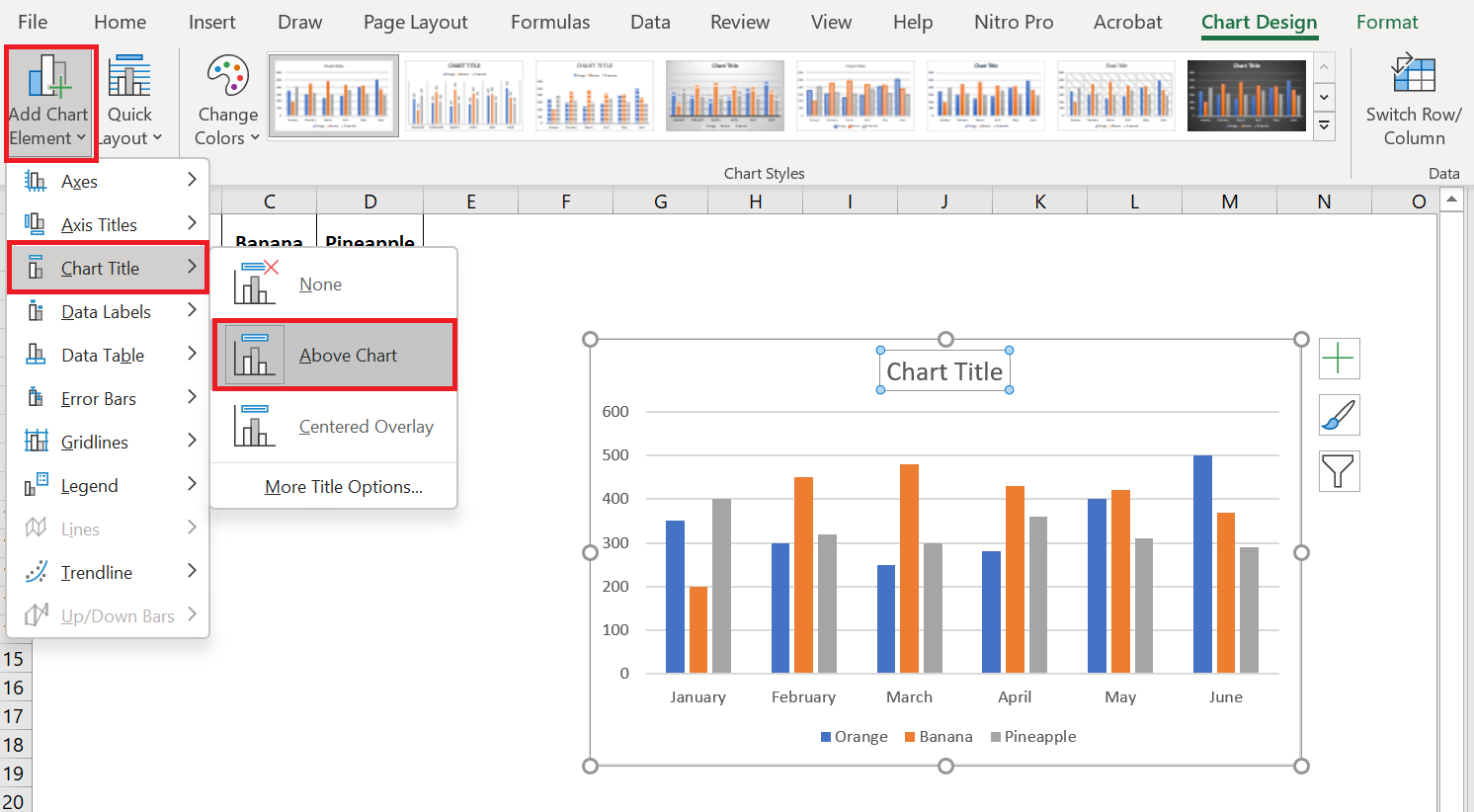
You can also click the Chart Elements button in the upper right corner of the chart and check the Chart Title box.
Additionally, you can click the arrow next to the chart title and choose one of the following options:
- Above chart – the default option that displays the title at the top of the chart area and changes the chart size.
- Centered Overlay – Overlays the title centered on the chart without resizing the chart.
For more options, go to Chart Creation / Add Chart Element / Chart Title / Other Title Options.
Or, you can click the Chart Elements button and click Chart Title > More Options…
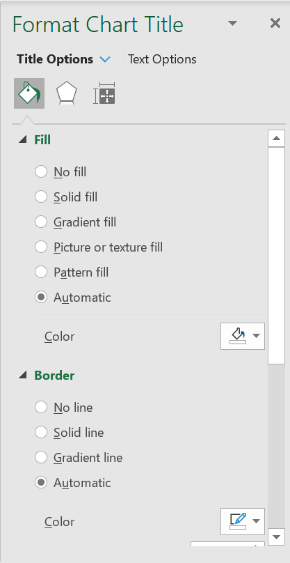
Clicking the More Options item (on the ribbon or in the context menu) opens the Highlight Chart Title pane on the right side of your spreadsheet, where you can select the formatting options you want.
2.2 Link the chart title to a cell in the spreadsheet
For most Excel chart types, the newly created chart is inserted with the default placeholder for the chart title. To add your own chart title, you can either select the title area and type the desired text, or link the chart title to a cell in the worksheet, such as the table header. In this case, your Excel chart title will be updated automatically whenever you edit the linked cell.
To link a chart title to a cell, do the following:
- Select the chart title.
- In your Excel sheet, type an equal sign (=) in the formula bar, click the cell that contains the required text, and press Enter.
In this example, we’re linking our Excel chart title to the merged cell A1. You can also select two or more cells, such as a few column headers, and the contents of all selected cells will appear in the chart title.
2.3 Move the title in the chart
If you want to move the title to another location in the chart, select it and drag it with the mouse:
2.4 Remove the chart title
If you don’t want any title in your Excel chart, you can remove it in two ways:
- On the Graphic Creation tab / Add a graphic element / Chart Title / None.
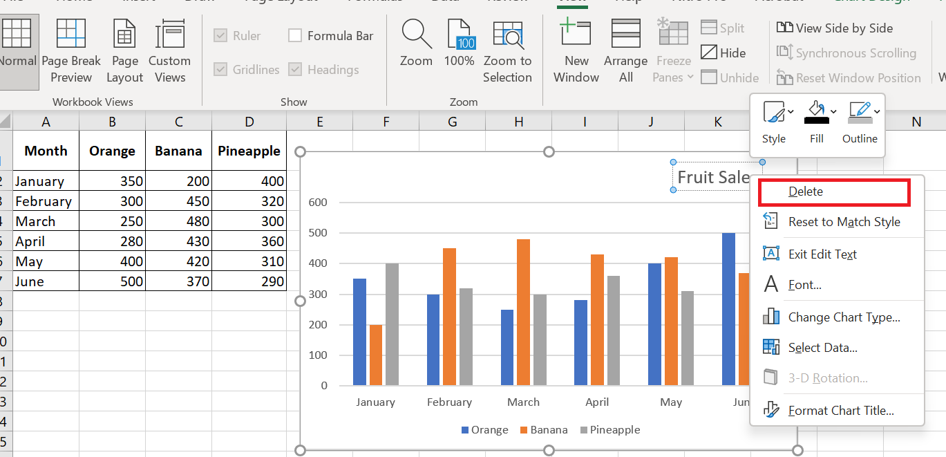
- On the chart, right-click the chart title and select Delete from the context menu.
2.5 Change the font and formatting of the chart title
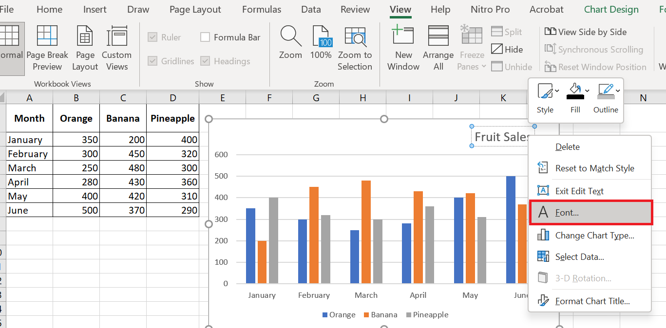
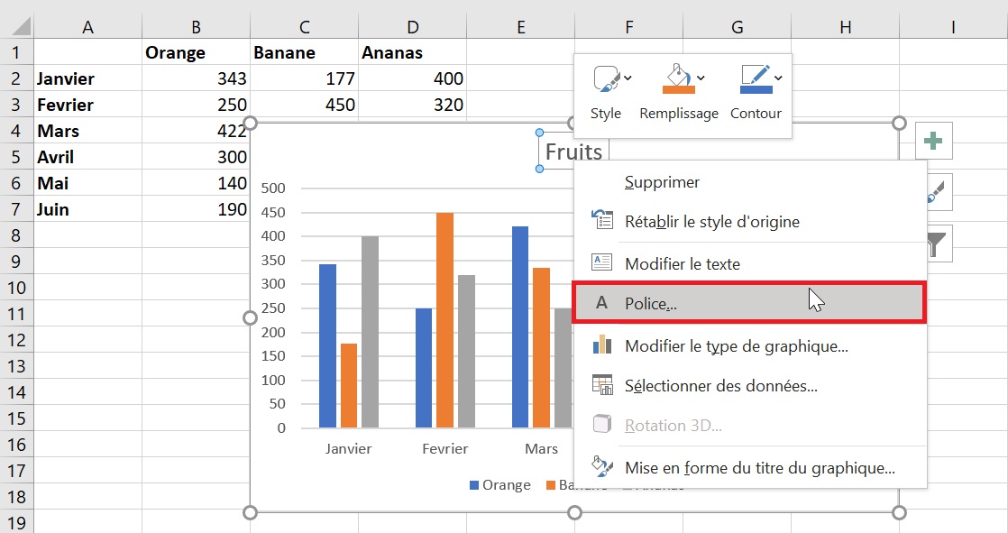
To change the chart title font in Excel, right-click the title and choose Font from the context menu. The Font dialog box will appear, where you can choose various formatting options.
For more formatting options , select the title on your chart, go to the Format tab on the ribbon, and play with different features. For example, here’s how to change your Excel chart title using the ribbon:
Similarly, you can change the formatting of other chart elements such as the axis titles , axis labels, and chart legend.
3 Customizing Axes in Charts
For most chart types, the vertical axis and horizontal axis are added automatically when you create a chart in Excel.
You can show or hide the chart axes by clicking the Chart Elements button ![]() , then clicking the arrow next to Axes , then checking the boxes for the axes you want to show and unchecking the boxes for the axes you want to hide.
, then clicking the arrow next to Axes , then checking the boxes for the axes you want to show and unchecking the boxes for the axes you want to hide.
For some chart types, such as combo charts , a secondary axis may be displayed.
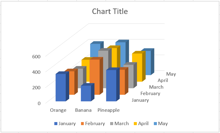
When creating 3D charts in Excel, you can make the depth axis appear :
You can also make various adjustments to how different axis elements are displayed in your Excel chart.
3.1 Adding axis titles to a chart
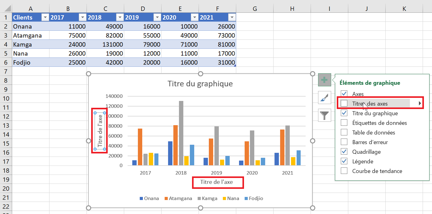
When creating charts in Excel, you can add titles to the horizontal and vertical axes to help your users understand what the chart data is about. To add axis titles, follow these steps:
- Click anywhere in your Excel chart, then click the Chart Elements button and select the Axis Titles check box . If you want to display the title for only one axis, horizontal or vertical, click the arrow next to Axis Titles and clear one of the check boxes:
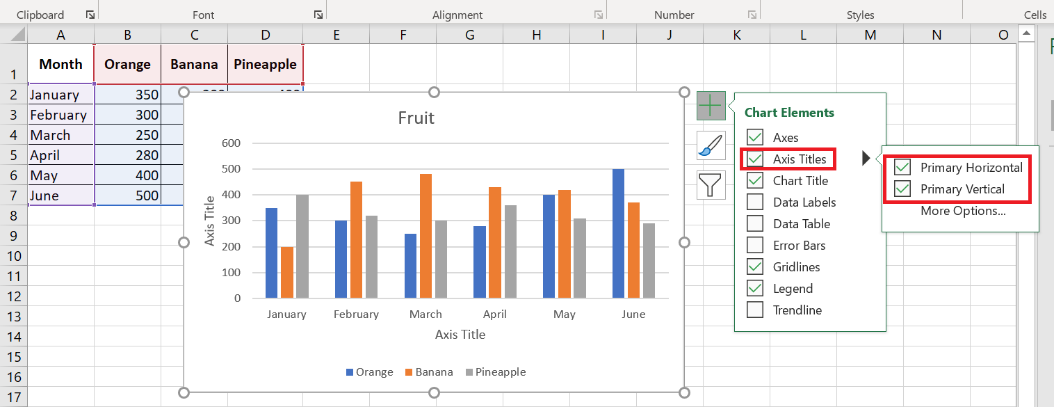
- Click the axis title area on the chart and enter the text.
To format the axis title, right-click it and select Format Axis Title from the context menu. The Format Axis Title pane will appear with many formatting options to choose from. You can also experiment with different formatting options on the Format tab of the ribbon.
As with chart titles , you can link an axis title to a cell in your worksheet so that it automatically updates whenever you change the corresponding cells in the sheet.
To link an axis title, select it, then type an equal sign (=) in the formula bar, click the cell you want to link the title to, and press Enter.
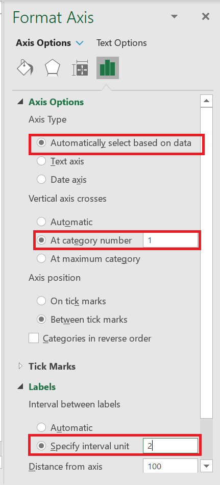
3.2 Changing the axis scale in the chart
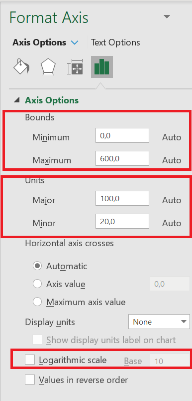
Microsoft Excel automatically determines the minimum and maximum scale values and scale interval for the vertical axis based on the data included in the chart. However, you can customize the vertical axis scale to better suit your needs.
1. Select the vertical axis in your chart and click the Chart Elements button ![]() .
.
2. Click the arrow next to Axis , and then click More options… This will bring up the Format Chart Title pane .
3. In the Format Chart Title pane , under Axis Options, click the value axis you want to change and do one of the following:
- To set the start or end point of the vertical axis, enter the corresponding numbers in the minimum or maximum
- To change the scale interval, enter your numbers in the major unit box or minor unit box.
- To reverse the order of the values, check the Values in reverse order box .
Because a horizontal axis displays text labels rather than numeric intervals, it has fewer scaling options that you can change. However, you can change the number of categories to display between the tick marks, the order of the categories, and the point where the two axes cross:
3.3 Changing the format of axis values
If you want the numbers on the value axis labels to appear as currency, percentage, time, or another format, right-click the axis labels and choose Format Axis from the shortcut menu. In the Format Axis pane , click Number and choose one of the available format options :
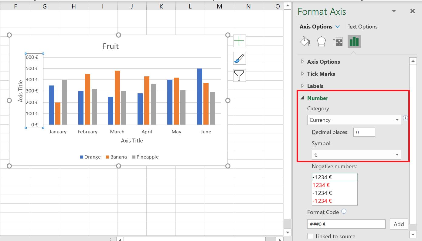
To revert to the original number formatting (the way numbers are formatted in your spreadsheet), select the Link to source box .
If you don’t see the Number section in the Format Axis pane , make sure you’ve selected a value axis (usually the vertical axis) in your Excel chart.
4 Customize data labels on charts
Chart elements add more description to your charts, making your data more meaningful and visually appealing. In this section, you’ll learn about chart elements.
Follow the steps below to insert the chart elements into your chart. When you click on the chart, three buttons appear in the upper right corner:
■ ![]() Chart elements
Chart elements
■ ![]() Chart styles and colors, and
Chart styles and colors, and
■ ![]() Chart filters
Chart filters
When you click on the Chart Elements icon ![]() . A list of available items is displayed:
. A list of available items is displayed:
- Axes
- Axis titles
- Chart titles
- Data labels
- Data table
- Error bars
- Grid
- Legend
- Trend line
- You can add, remove, or modify these chart elements.
- Hover over each of these chart elements to see a preview of how they are displayed. For example, select Axis Titles. The axis titles for both the horizontal and vertical axes appear and are highlighted.
- A triangle
 appears next to Axis Titles in the chart elements list.
 - Click this triangle
 to see options for axis titles.
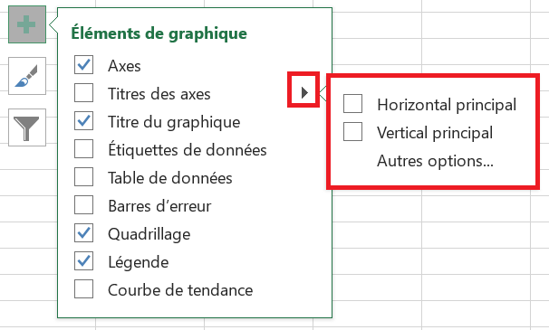
- Select/deselect the chart elements you want to display in your chart from the list.
4.1 Adding Data Labels to Charts
To make your Excel chart easier to understand, you can add data labels to display details about the data series. Depending on where you want to draw your users’ attention, you can add labels to a data series, all series, or individual data points.
- Click the data series you want to label. To add a label to a data point, click that data point after selecting the series.
- Right-click on the chart element and select the Data Labels option .
For example, here’s how we can add labels to one of the data series in our Excel chart:
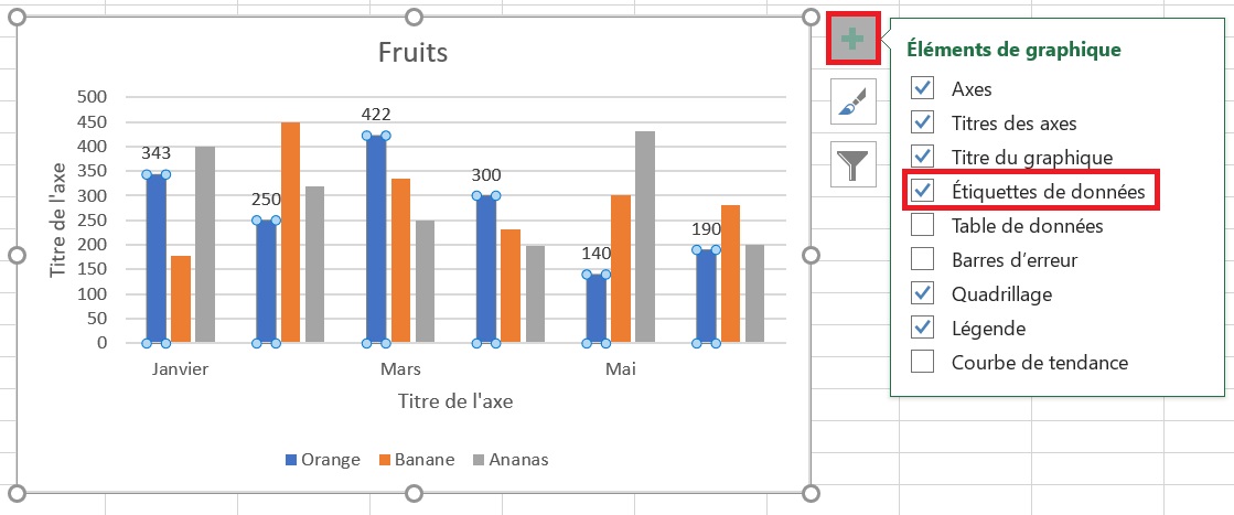
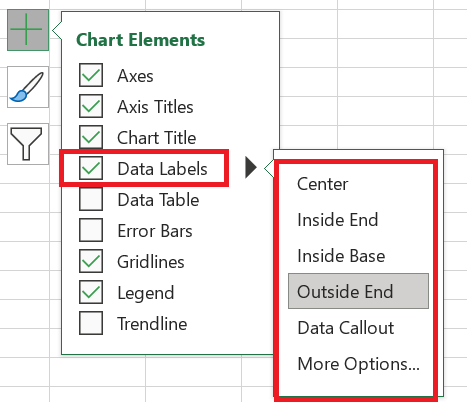
For specific chart types, such as pie charts, you can also choose where the labels appear . To do this, click the arrow next to Data Labels and choose the option you want. To display data labels inside text bubbles, click Data Legend .
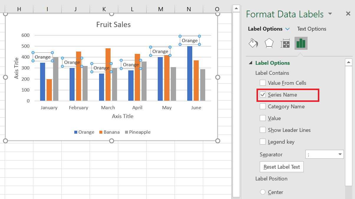
4.2 Modify the data displayed on the labels
To change what is displayed on your chart’s data labels, click the Chart Elements / Data Labels / More Options… button. This will bring up the Format Data Labels pane on the right side of your worksheet. Switch to the Label Options tab and select the desired option(s) under Label Contains :
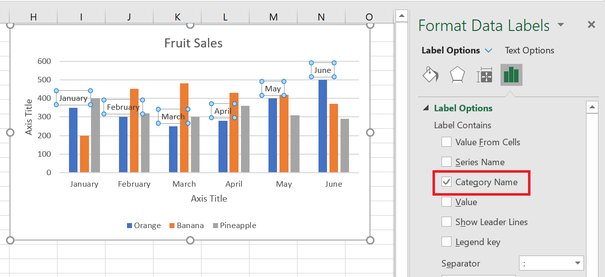
If you want to add your own text for a data point, click the label for that data point, then click it again so that only that label is selected. Select the label area with the existing text and enter the replacement text.
If you decide that too many data labels are cluttering your Excel chart, you can remove some or all of them by right-clicking the label(s) and selecting Delete from the context menu.
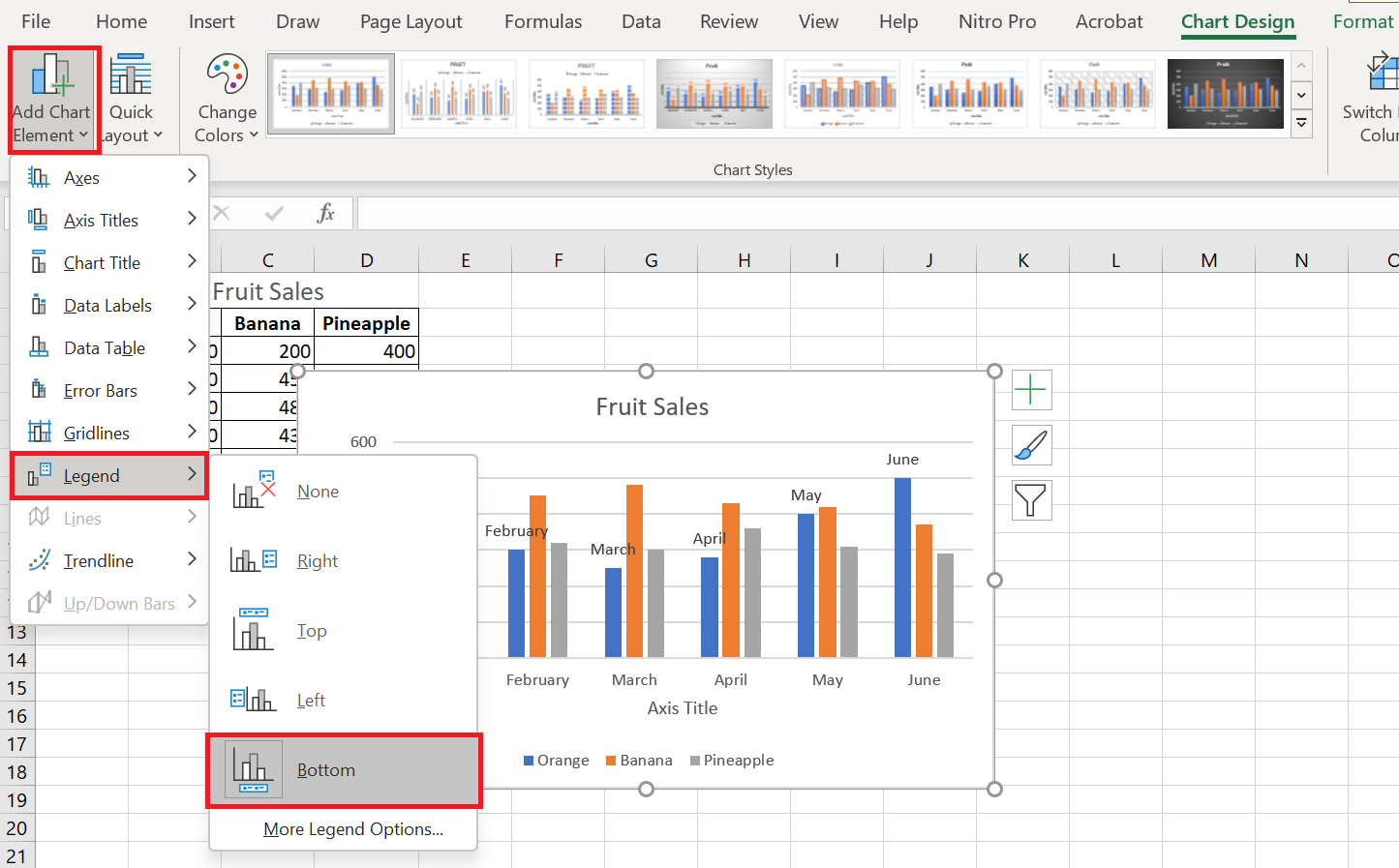
5 Move, format, or hide the chart legend
When you create a chart in Excel, the default legend appears at the bottom of the chart and to the right of the chart in Excel.
To hide the legend, click the Chart Elements button in the upper right corner of the chart and uncheck the Legend ![]() box .
box .
To move the chart legend to a different position, select the chart, go to the Chart Design tab , click Add Chart Element / Legend and choose where to move the legend. To remove the legend, select None .
Another way to move the legend is to double-click it in the chart, and then choose the desired legend position in the Format Legend pane under Legend Options .
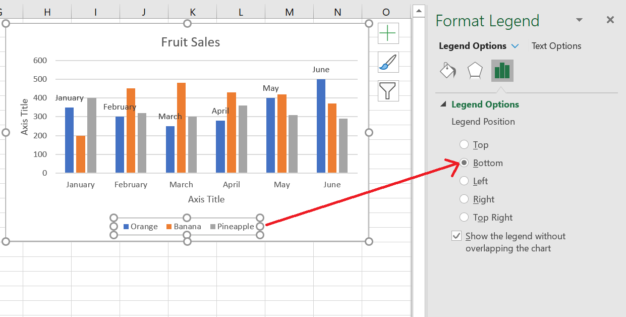
To change the formatting of the legend , you have many different options in the Fill & Line and Effects tabs of the Format Legend pane .
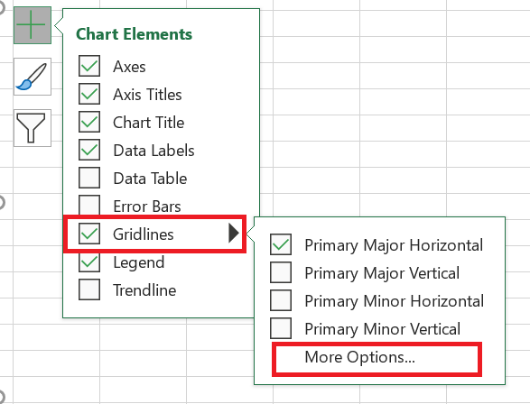
5 Show or hide the grid on the chart
In Excel 2013, 2016, and 2019, turning gridlines on or off takes just a few seconds. Simply click the Chart Elements button and select or clear the Gridlines check box .
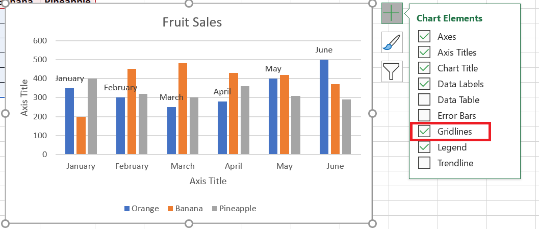
Microsoft Excel automatically determines the most appropriate gridline type for your chart type. For example, on a bar chart, the major vertical gridlines will be added, while selecting the Gridlines option on a column chart will add the major horizontal gridlines.
To change the grid type, click the arrow next to Grid, then choose the desired grid type from the list, or click More options… to open the pane with advanced primary grid options.
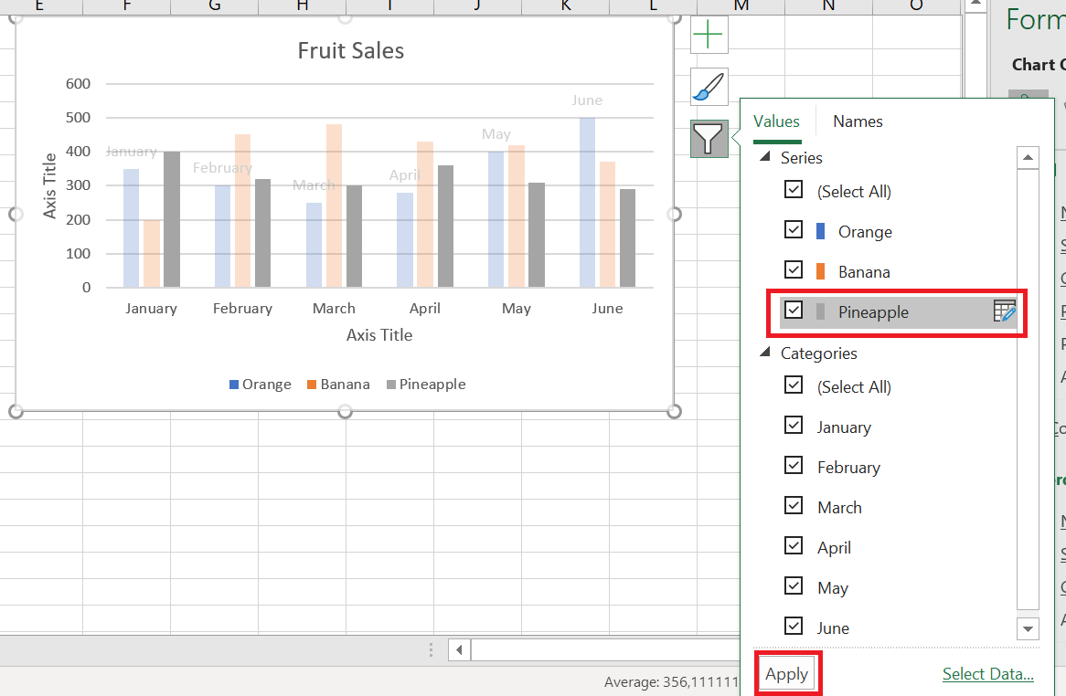
6 Hide and edit data series in charts
When you have a lot of data plotted in your chart, you may want to temporarily hide certain data series so you can focus only on the most relevant ones.
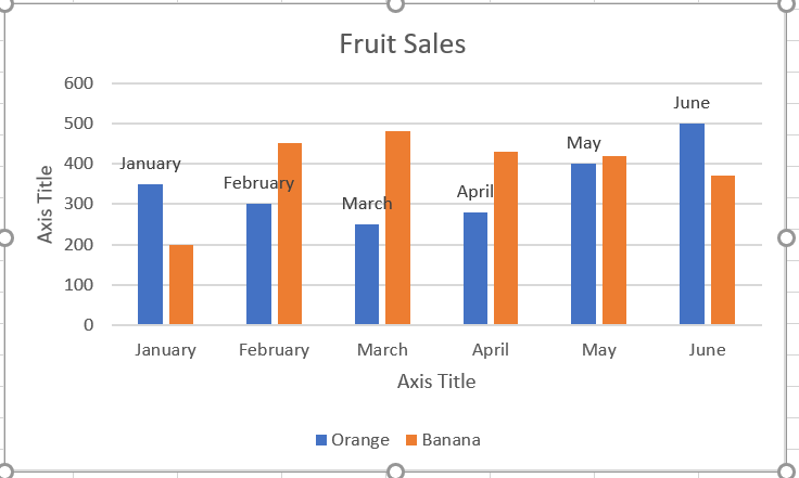
To do this, click the Chart Filters button ![]() to the right of the chart, uncheck the data series and/or categories you want to hide, and then click Apply .
to the right of the chart, uncheck the data series and/or categories you want to hide, and then click Apply .
To edit a data series , click the Edit Series button to the right of the data series. The Edit Series button appears as soon as you hover over a certain data series. This will also highlight the corresponding series on the chart, so you can clearly see exactly what element you are going to edit.
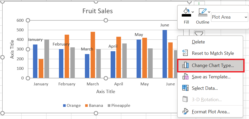
7 Change the chart type and style
If you decide that the newly created chart isn’t right for your data, you can easily replace it with another chart type . Simply select the existing chart, switch to the Insert tab , and choose a different chart type from the Charts group .
You can also right-click anywhere in the chart and select Change Chart Type… from the context menu.
To quickly change the style of the existing chart in Excel, click the Chart Styles button ![]() to the right of the chart and do
to the right of the chart and do
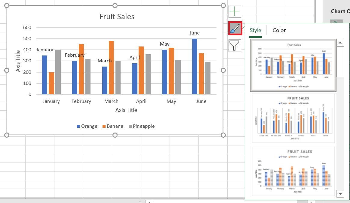
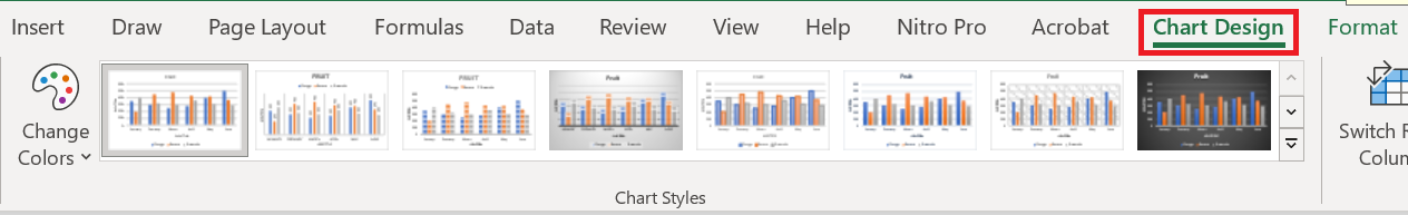
Or choose a different style from the Chart Styles group on the Chart Design tab :
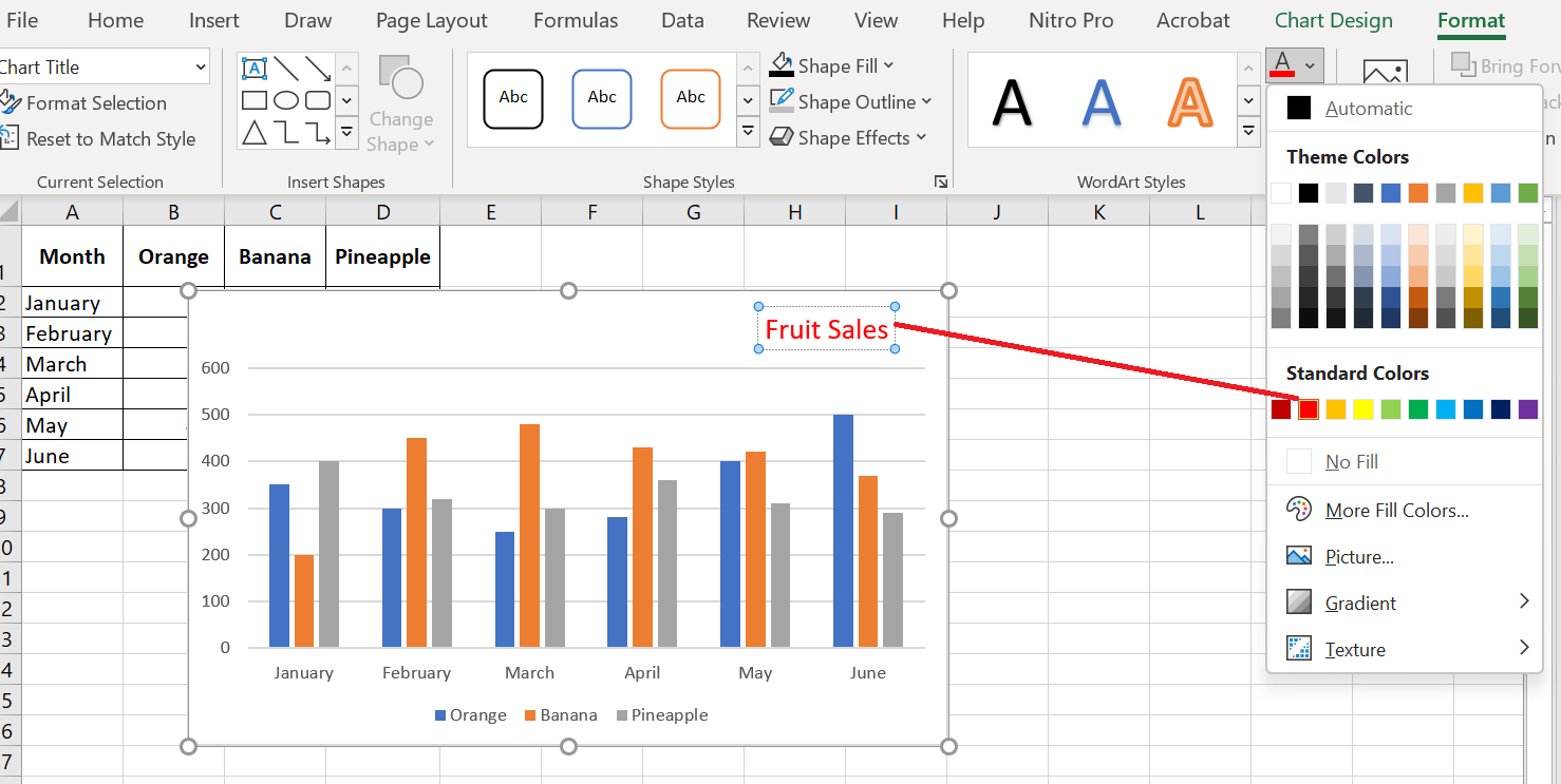
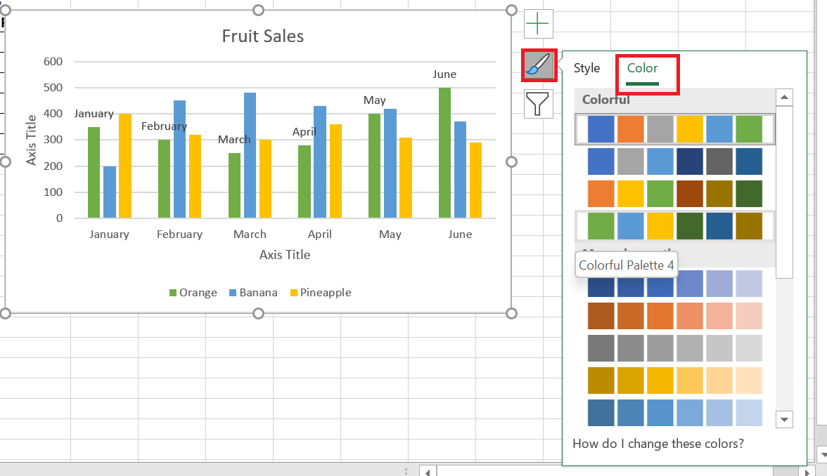
8 Change the chart colors
To change the color theme of your Excel chart, click the Chart Styles button, switch to the Color tab , and select one of the available color themes. Your choice will be immediately reflected in the chart, so you can decide if it will look good in new colors.
To choose the color for each data series individually, select the data series on the chart, go to the Format tab / Shape Styles group and click the Shape Fill button : 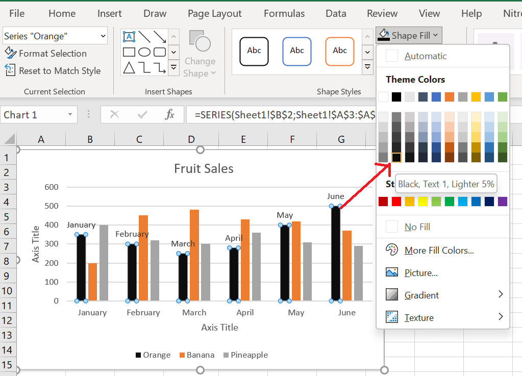
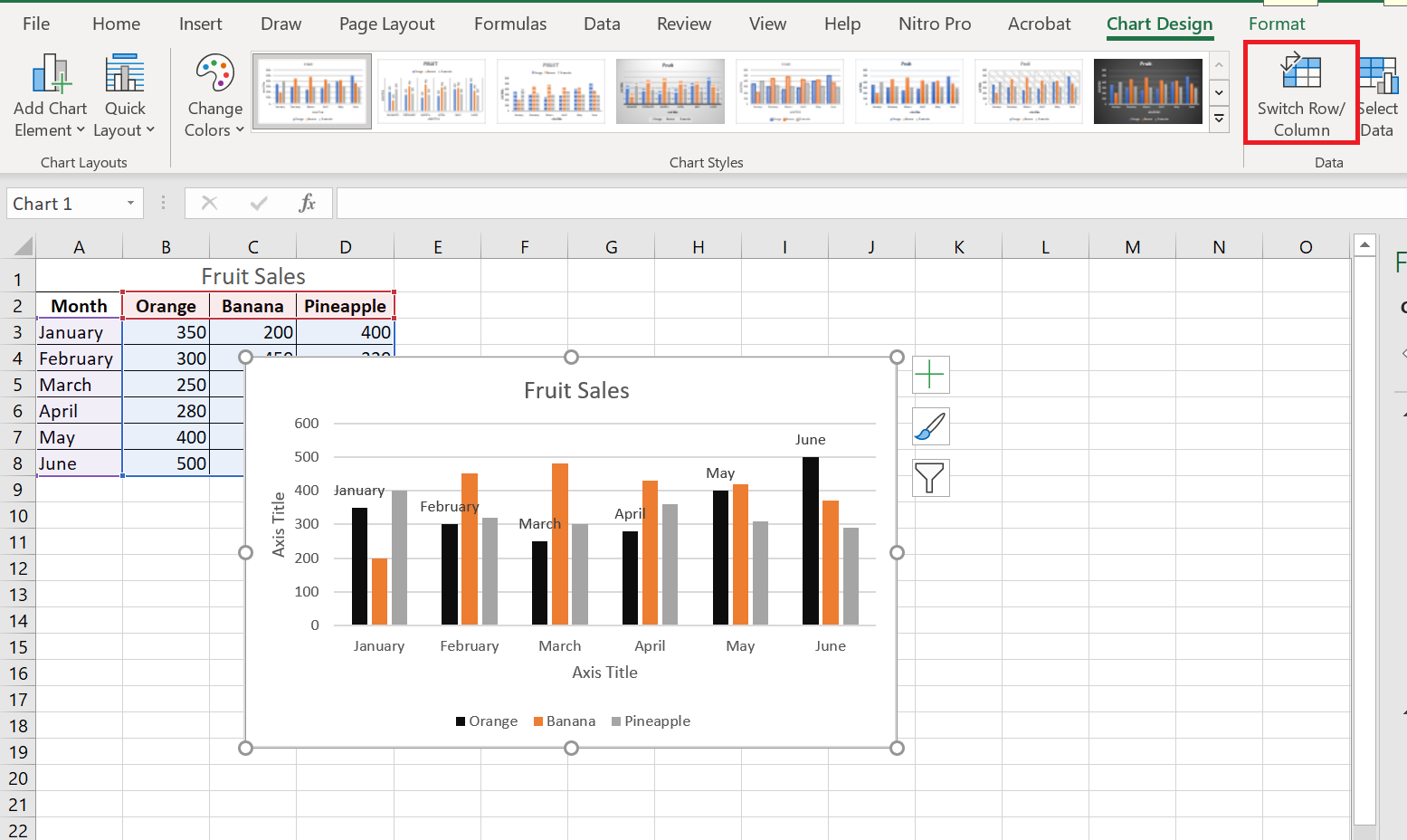
9 Swap the X and Y axes in the graph
When you create a chart in Excel, the orientation of the data series is automatically determined based on the number of rows and columns included in the chart. In other words, Microsoft Excel plots the selected rows and columns as it considers best.
If you’re not happy with the way your spreadsheet’s rows and columns are plotted by default, you can easily swap the vertical and horizontal axes. To do this, select the chart, go to the Design tab , and click the Switch Row/ Column button .
Result