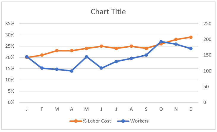
Trend with a Secondary Axis
In some trend components, you have series that have two different units of measurement. For example, the chart in the following figure shows a trend for the number of workers and a trend representing the percentage of labor cost.
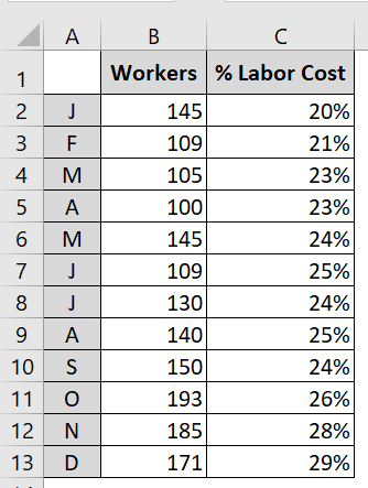
You often need to plot two different units of measurement, such as percentages.
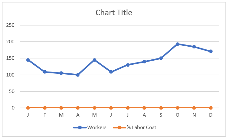
These are two different units of measurement that, when mapped, produce the unimpressive chart you see in the following figure. Because Excel constructs the vertical axis to accommodate the larger number, the percentage change in labor costs gets lost at the bottom of the chart. Even a logarithmic scale doesn’t help in this scenario. Since
the default vertical axis (or primary axis) doesn’t work for both series, the solution is to create another axis to accommodate the series that doesn’t fit on the primary axis. This other axis is the secondary axis.
The trends for the percentage of labor cost get lost at the bottom of the chart.
To place a data series on the secondary axis, follow these steps:
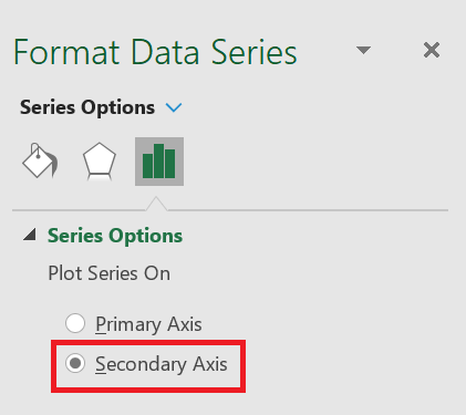
1. Right-click the data series in question and select Format Data Series from the menu that appears. This opens the
Format Data Series dialog box . 2. In the
Format Data Series dialog box , expand the Series Options section, and then click the Secondary Axis radio button.
Placing a Data Series on the Secondary Axis.
The following figure shows the newly added axis on the right side of the chart. All data series on the secondary axis have their vertical axis labels displayed on the right side.