After creating a chart, you may need to add a data series to the chart. A data series is a row or column of numbers entered into a spreadsheet and plotted on your chart, such as a list of company quarterly earnings.
Office charts are always associated with Excel spreadsheets, even if you created your chart in another program, such as Word. If your chart is on the same worksheet as the data you used to create the chart (also called the source data), you can quickly drag the pointer around the new data in the worksheet to add it to the chart. If your chart is on a separate sheet, you must use the Select Data Source dialog box to add a data series.
1 Quickly add data series
To quickly add a data series to a chart in the same worksheet:
-
- In the worksheet that contains your chart data, in the cells directly next to or below your existing source data for the chart, enter the new data series you want to add.
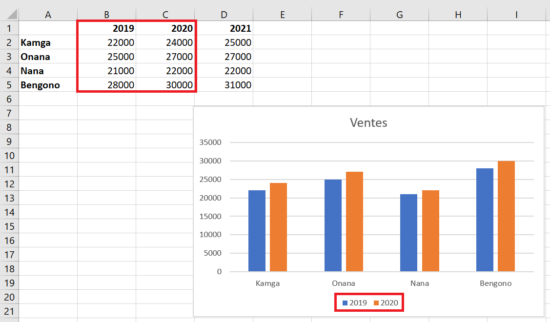
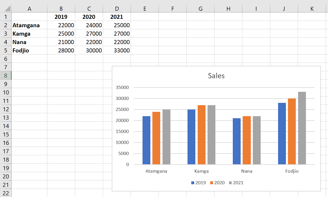
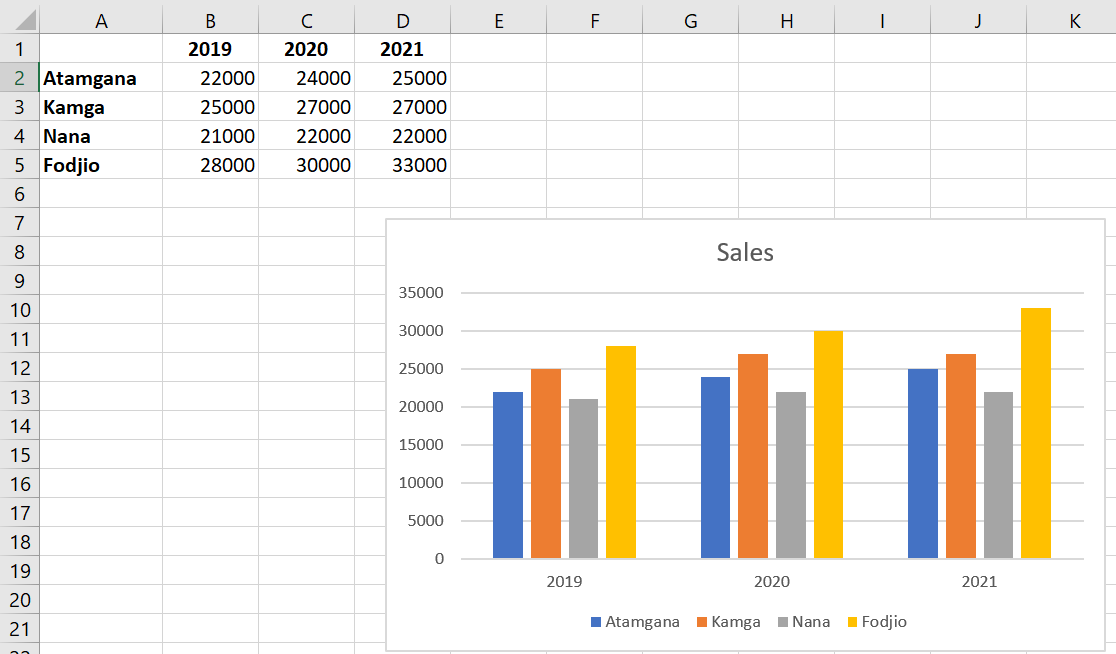
In this example, we have a chart that displays quarterly sales data for 2019 and 2020, and we’ve just added a new data series to the 2021 spreadsheet. Note that the chart doesn’t yet display the 2021 data series.
-
- Click anywhere on the chart.
The currently displayed source data is selected in the worksheet, along with the resizing handles.
You notice that the 2021 data series is not selected.
-
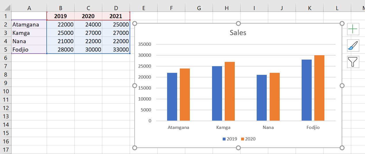
- In the spreadsheet, drag the sizing handles to include the new data.

The chart updates automatically and displays the new data series you added.
2 Other Methods for Adding Data Series
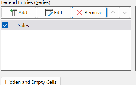
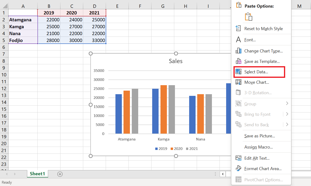
To add another data series to your chart, right-click the chart and select Select Data .
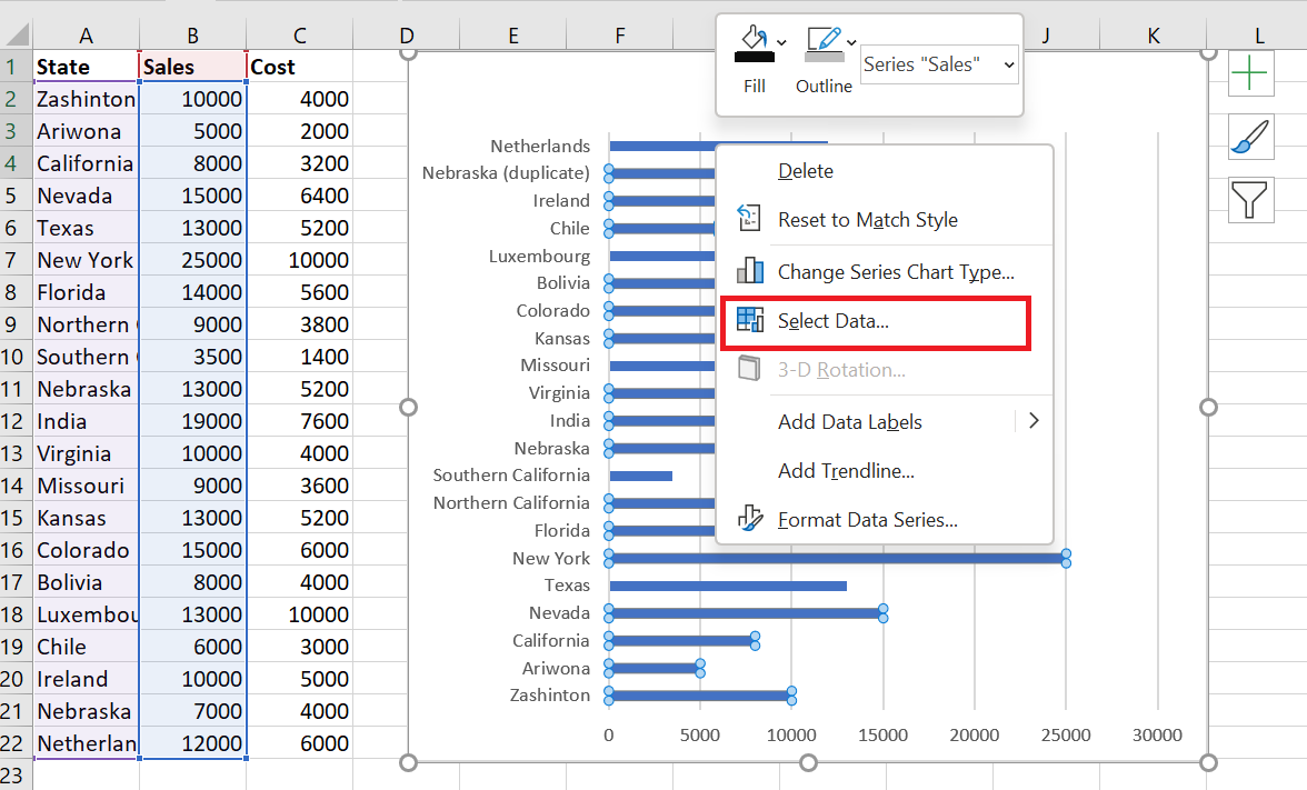
The following dialog box appears.
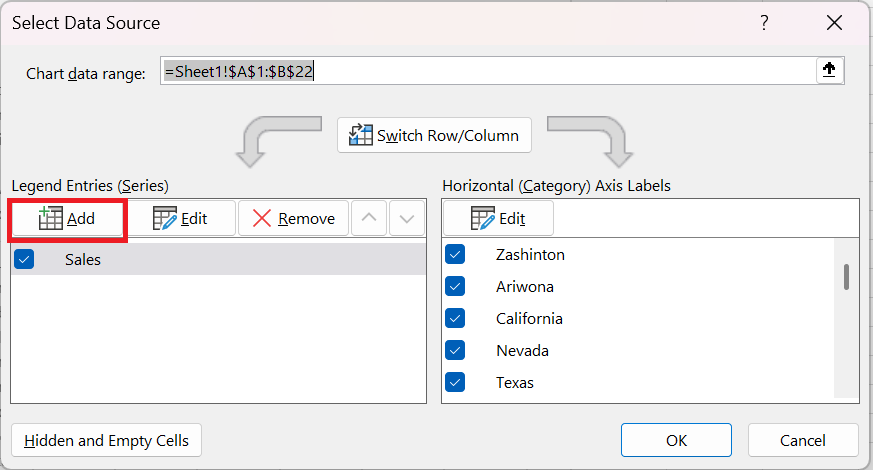
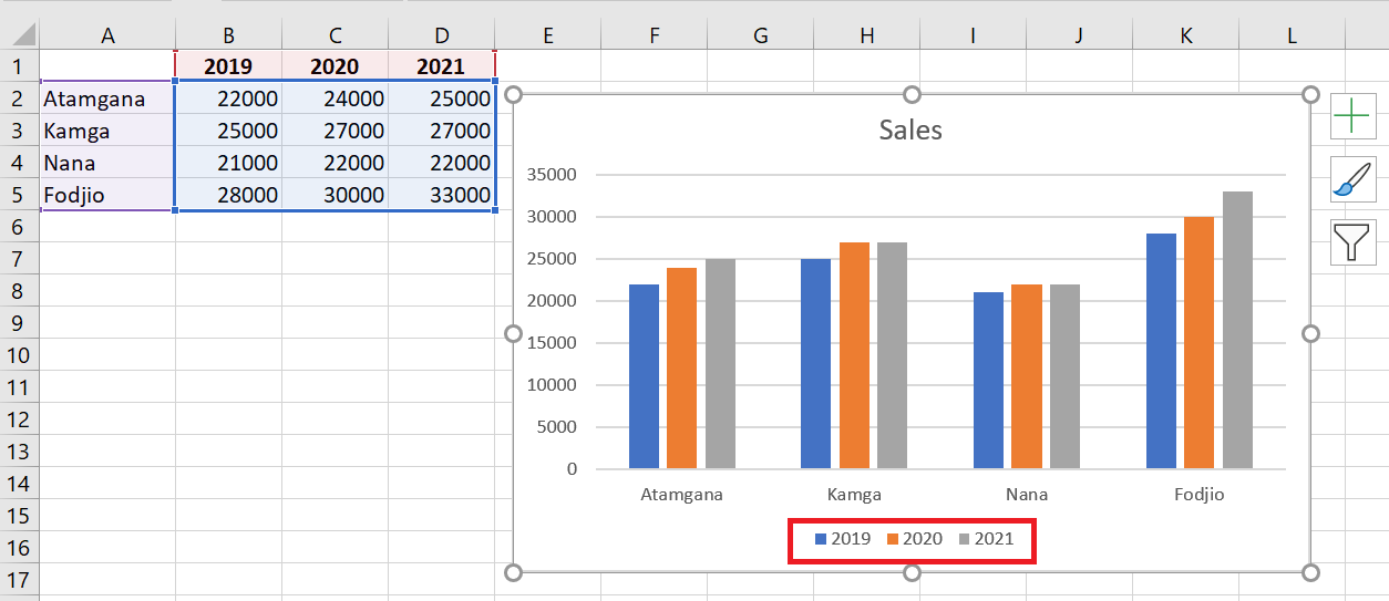
Click the Add button. The following window will open:
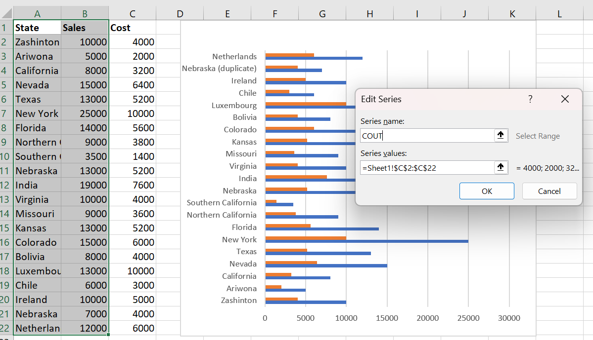
This allows you to select a new series name and a reference to the cells that contain the new series data. Click OK to update the chart:
3 Deleting data from a chart
To delete a data series, select it and then click the Delete button. For example, I’ll delete the data series I just added:
Then click ok to update the chart.
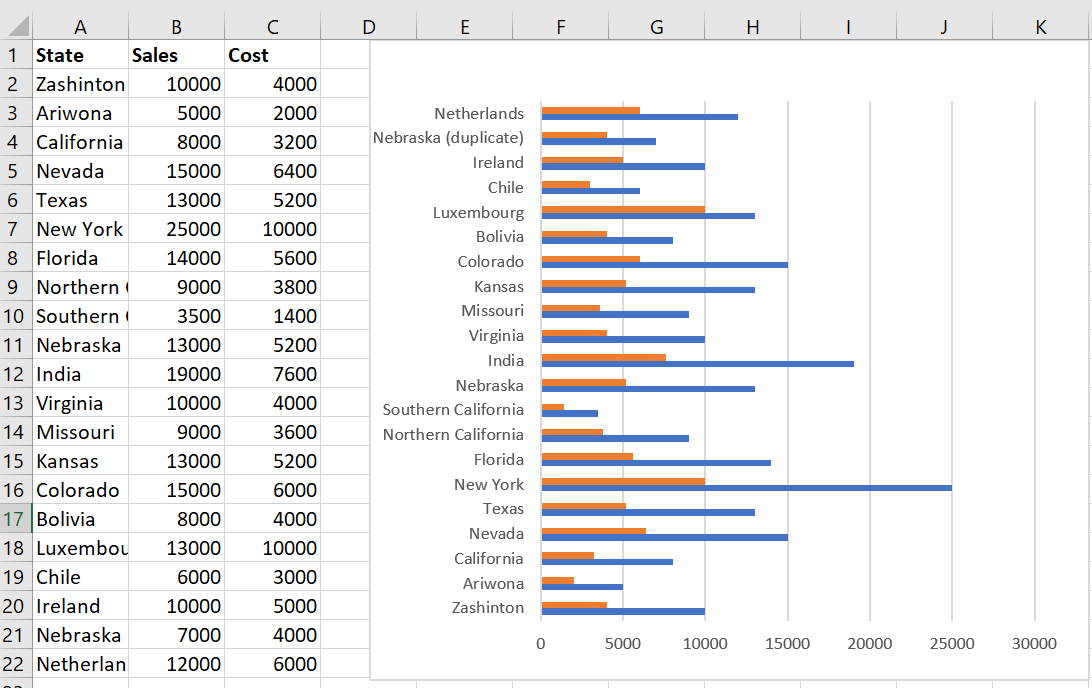
Note: I have added the cost data series for the rest of the tutorial.
4 Editing data in a chart
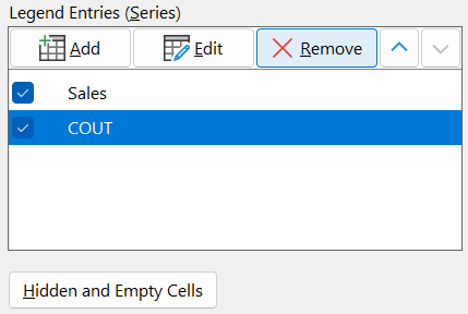
To change a different data series to your chart, right-click the chart and select Select Data .
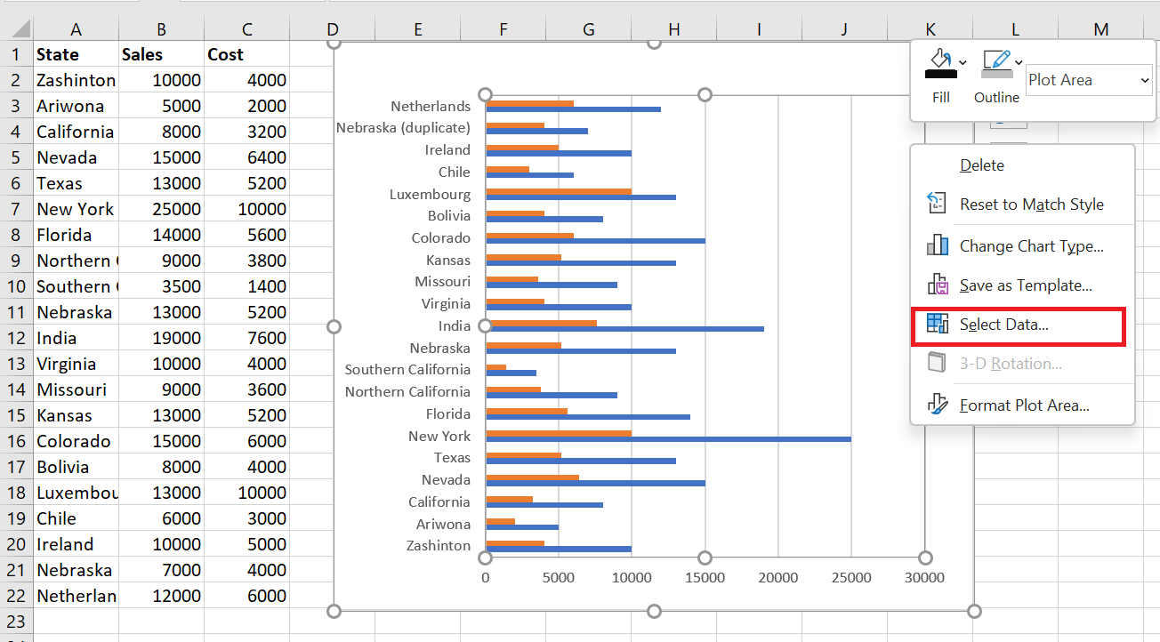
The following dialog box appears.
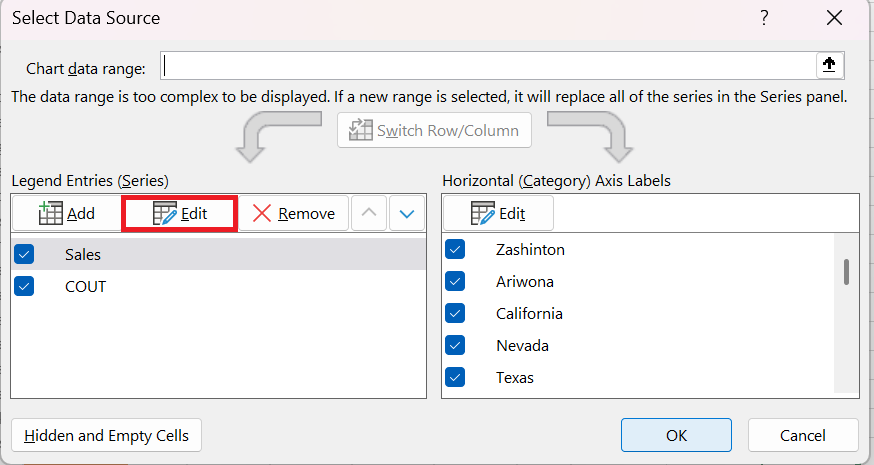
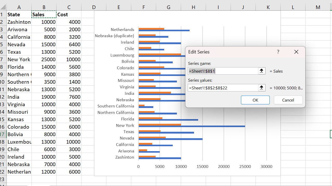
Click the Edit button. The following window will open, allowing you to modify the series name and the referenced data:
5 Move data series up/down
To move a series up or down, select it and then click the up/down arrows to reorder. So, for example, I’ll move the Costs data series up:
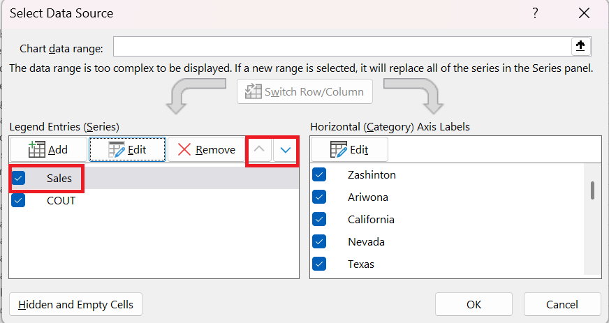
Then click ok to update the chart:
Notice how the bars have reversed.
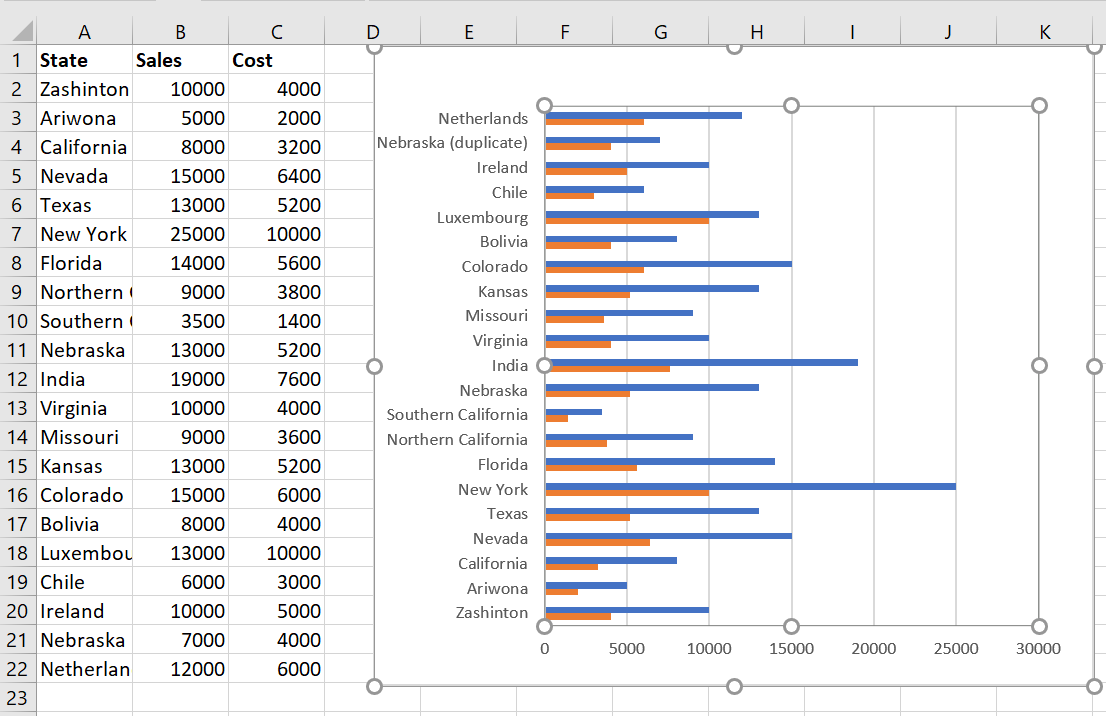
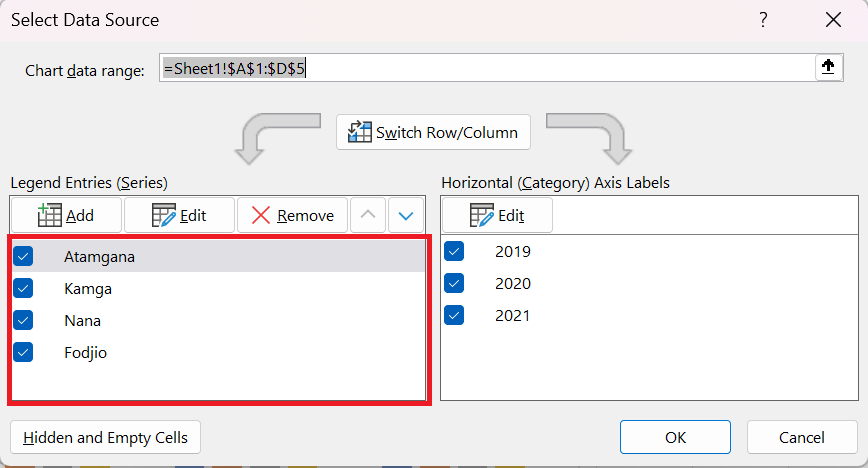
6 Switch between rows and columns in the source data
Swapping your data rows/columns can be useful if the data in a spreadsheet has a poor layout. It can also give you an alternative layout for your chart, which may be better depending on how you plan to use your chart. This feature allows you to swap your legend (series) entries with your horizontal axis (category) labels. This only works with 1 data series, so I’ve removed the costs for this example.
To change rows to columns in your chart, right-click on the chart and select Select Data .
This is what the Select Data Source window looks like:
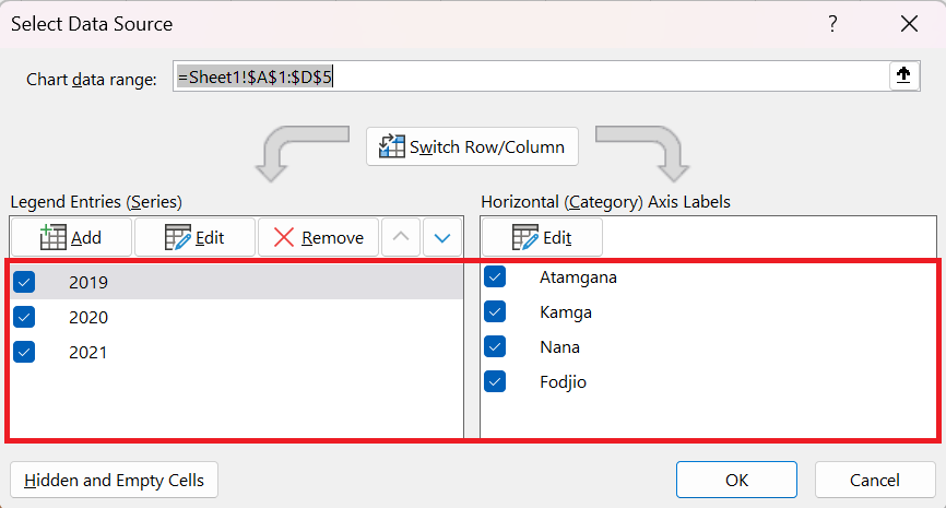
I then click the Swap Row/Column button and then OK to update the chart.
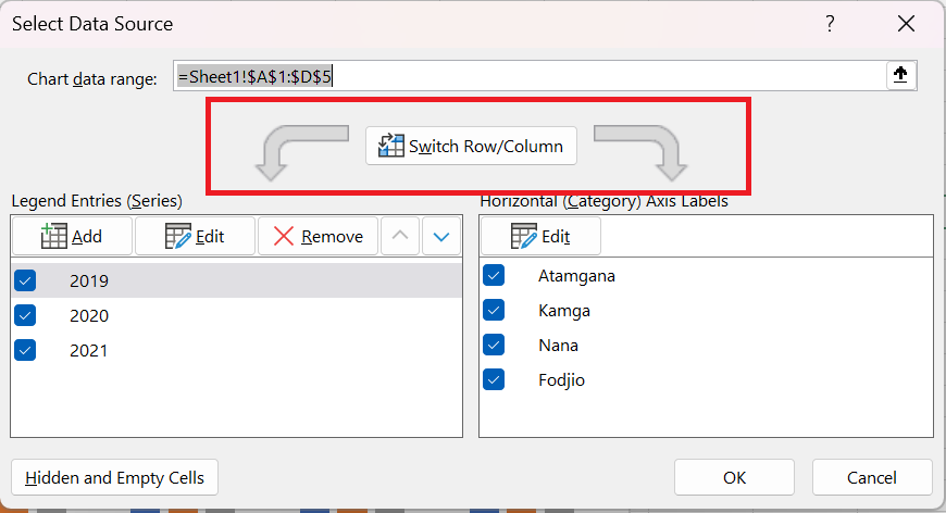
Notice how States is now my key and Sales is on my Y axis and the legend entries / horizontal axis labels are reversed:
Other methods
Another faster method is to:
- Click on the Chart Design tab
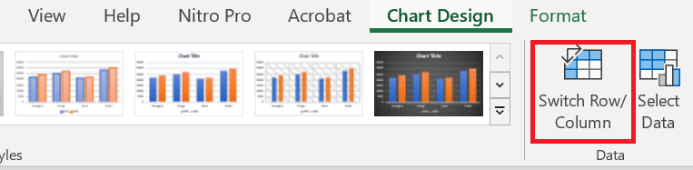
- Click the Swap Row/Column button
- The lines change to columns