
Add conditional colors to a chart
Let’s say you’re plotting actual and target sales for each month, and you want months that hit 90% of target or better to be blue, 75% of target or worse to be green, and other months to be red. The trick to creating this chart is to put the data for each color on a different row. To start, put the sales you want colored blue in row 19 by copying the formula =IF(F13/F14>F15;F13/F14; » ») from F19 to G19: M19. Then, to put the sales you want colored red in row 20, copy the formula =IF(AND(G13/G14>G16;G13/G14<= G15 )) ; G13/G14, » « ) from F20 to G 20: M20. Finally, place the sales for the months that should appear in green in row 21 by copying the formula =IF(COUNT(F 19:F 20)=0,F13/F14, » « ) from F21 to G21: M21. Now select the range E 18: M21 and create a column chart. You can easily change the colors of each data series as desired.
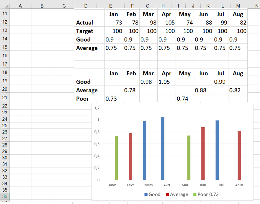
Blue indicates a good month, green a bad month, and red a bad month.