Creating a graph using the REPT function
The REPT function is one of Excel’s text functions. It is used to fill a cell with multiple instances of a text string. Its syntax is REPT(text;number_of_times) . The first argument is the text to repeat. The second argument is the number of times the text should be repeated.
In the following figure, column B shows Banana’s exports. The numbers range from 700 to 10. You create the bar charts in column C by repeating the | sign repeatedly. However, instead of displaying a 900-character row in cell C4, the repeat argument in cell B4 is 700 divided by 10. Therefore, cell C4 contains 90 vertical bars. Cell C20 contains one vertical bar. Even though 13 divided by 10 is 1.3, Excel only displays whole bars.
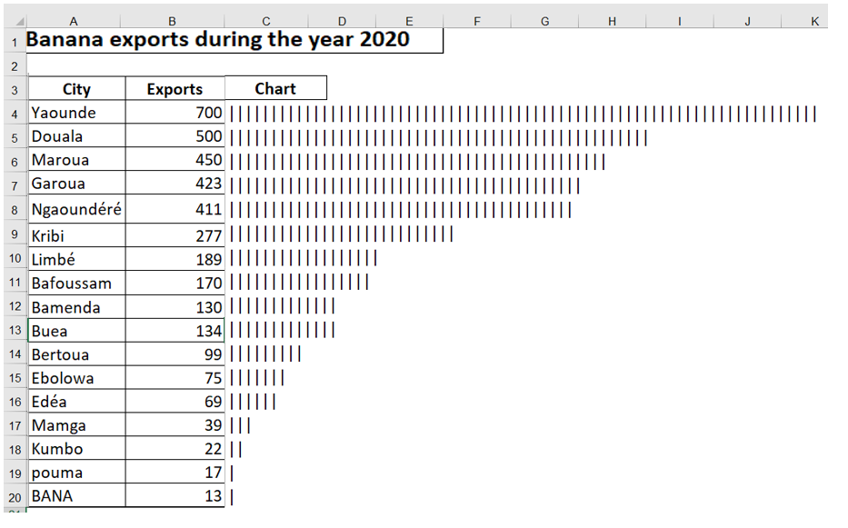
Figure 9.31 . Using the REPT function is a quick way to produce a bar chart directly in a spreadsheet. The trick is to use the appropriate scale factor.
The result of the REPT function can be left-justified or right-justified. In the following figure, the results in column E are right-justified, and the results in column G are left-justified to create a comparative histogram. The formulas on the right side of the chart use a REPT function concatenated with a space, then the value ( = B3 & » « &REPT(« | »;B3) ). The formulas on the left side of the chart concatenate the value, a space, and the REPT function.
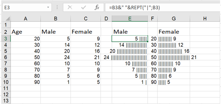
Here, pairs of REPT functions create a comparative histogram.