GRAPHIC PICTOGRAM
If you know how to present data in a clear and effective way, you can powerfully convey your message. One of my favorite things to do for this purpose is a pictogram. Creating a pictogram in Excel is quite simple and easy.

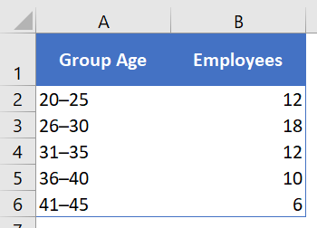
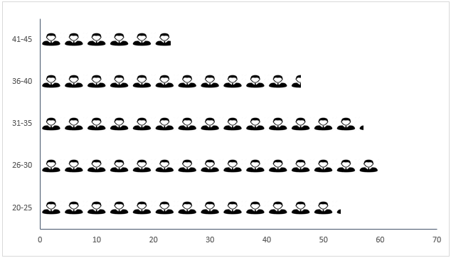
My idea is to present the number of employees of different age groups in a company.
1 Simple Steps to Create a Pictogram
We need to use the data below for this graph, you can download it here to follow . As I said, this is the total number of employees in a company by age and we don’t need to present these groups using this table.
But before we begin, we need an icon to use in this table and you can download it from a free icon site .
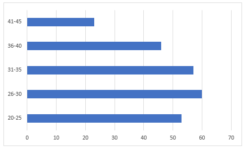
- First, simply select your data to create a bar chart. To do this, go to Insert ➜ Charts ➜ 2-D Clustered Bar Chart.
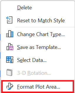
- After that, select the data bars in the chart and Right- click ➜ Format Data Series .
- From there, go to the “Fill” section and select the “Image or Texture Fill” option and once you do that, you will get an option to insert image.
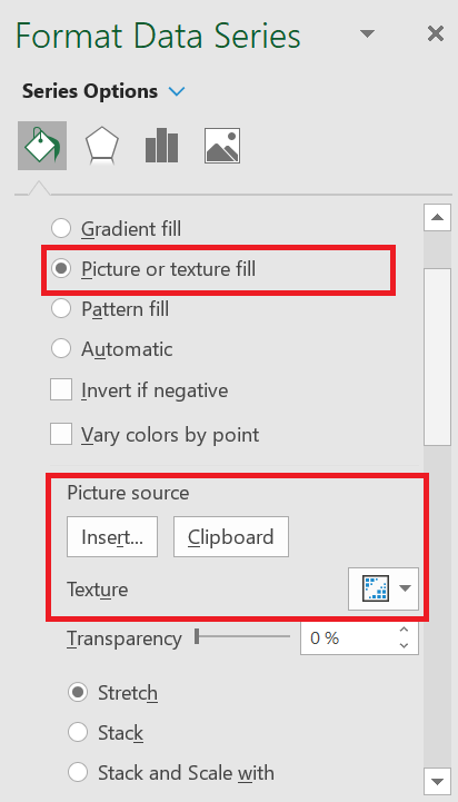
- Now it’s time to insert the image and we have three options for this. Click on the « insert » option and insert the image you downloaded .
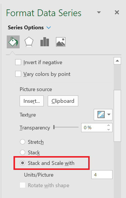
- Once you have inserted the image, you have three more options to display this image in the chart (Select the third option).
- Stretch – A single image will stretch in the data bar.
- Stack – You will get stacked images in the data bar.
- Stack and scale with – Images will be displayed according to the data.
Note: There is an option to specify the unit/image for the chart. You can use this if the values per bar in your chart are large (more than 20). The point is that the image icons will become smaller with more numbers and this option helps in this case.
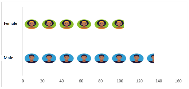
You can also use a different image for different bars, as I have used in the table below.
Select each data bar separately and insert an image one by one for all bars.
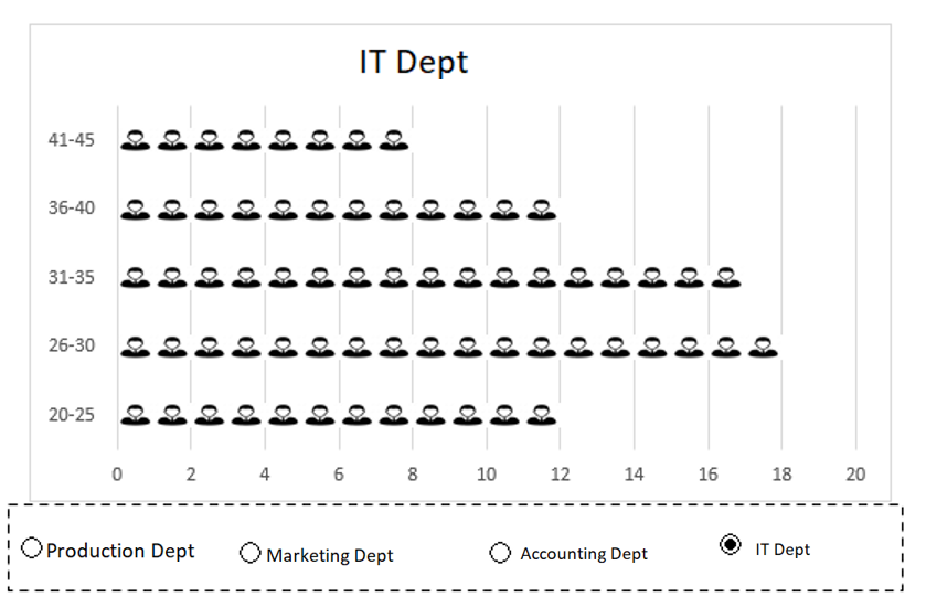
2 Dynamic pictogram
I always like to create interactive charts and this time I want to convert this PICTOGRAPH into a chart in which we can use the data dynamically.
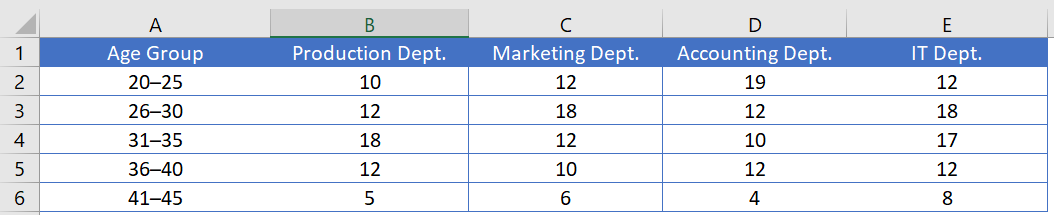
Look at the data below where we have the data of employees of the same company, but by department and here we need to create a dynamic chart that we can use with the option button.
You can download this file to follow along and now use the steps below to create a dynamic pictogram.
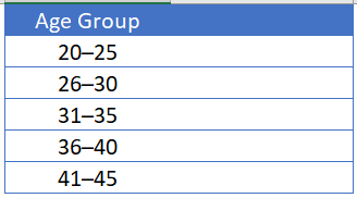
- First , create a different table with two columns, like I did below.
- Now, insert four radio buttons into your spreadsheet. To do this, go to the Developer tab ➜ Controls ➜ Insert ➜ Radio button .
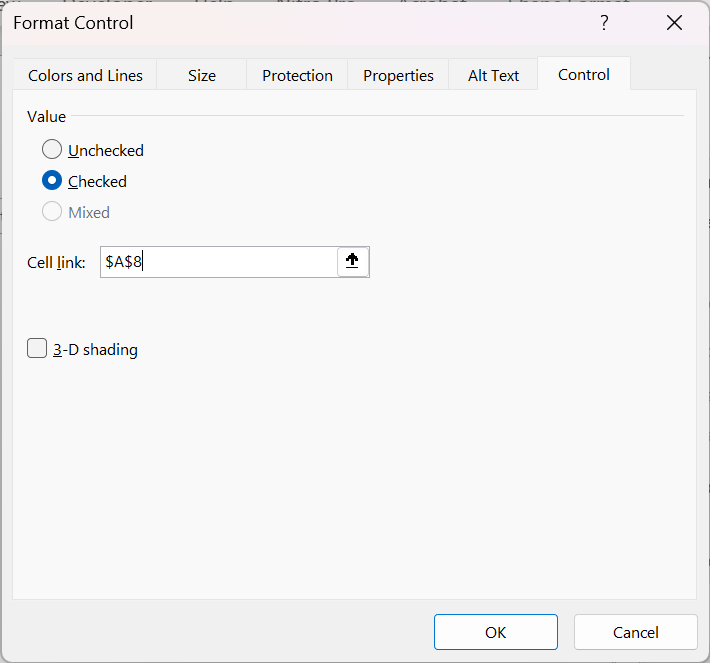
- After that, connect these radio buttons with a cell. In my case, I connect them with cell A8. To do this, right- click on the radio button and select Format Control. In the Format Control dialog box, in the Control option, select cell A8 in the Linked Cell box and click OK.
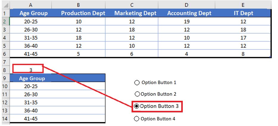
- Since we need to control the data (by department) with radio buttons, make sure to name all the buttons according to the department name.
- From there, insert the formula below in the first cell (header) through the last cell of the second column of the new table.
=VLOOKUP(A 9;Table 3[#All];$A$8+1;0)
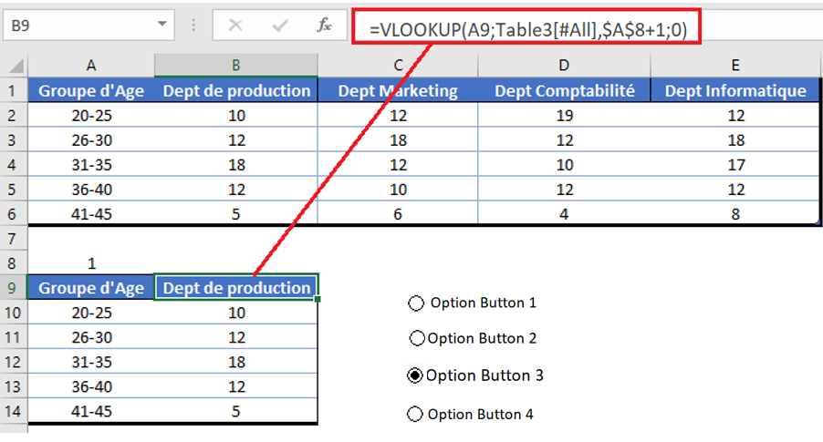
- At this point we have a dynamic table where we can get data using option buttons.
- Finally, select this table and insert a bar chart and convert it to a pictogram by following the steps you have learned.
The pictogram is part of my list of advanced Excel charts . The best thing I like about this chart is that we can use any type of image in it, there are no limitations regarding this.
And you don’t have to worry about the image you added, it stays there in the clipboard. I’m sure this table will help you present your data better.