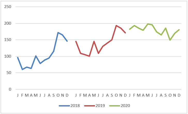
Comparative Trends
The following figure shows a chart that presents a side-by-side comparison of three periods. With this technique, you can display periods of different colors without breaking the continuity of the overall trend.
Here’s how to create this type of chart:
1. Structure your source data similarly to the structure shown in the following figure.
Notice that instead of placing all the data in one column, you are displaying the data in the respective years. This tells the chart to create three separate lines, taking into account the three colors.
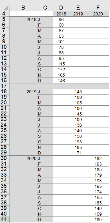
2. Select the entire table and create a line chart.
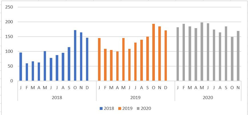
This step creates the chart shown earlier. 3. If you want to get fancy, click on the chart to select it, then right-click and select Change Chart Type from the context menu that opens.
4. When the Change Chart Type dialog box opens, select Stacked Column Tables.
As you can see in the following figure, the chart now shows the trends for each year in columns.
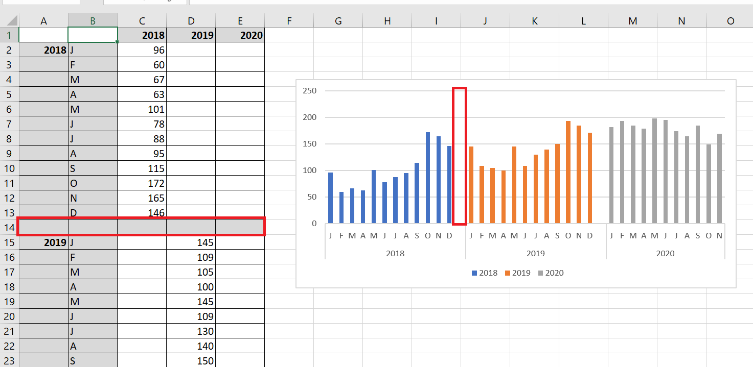
Do you want a gap between the years? Adding a gap in the source data (between each 12-month sequence) adds a gap in the chart, as shown in the following figure.
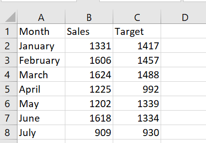
7 Create Combo Charts
You want to create a chart that shows actual and target sales for each month. The histogram in the following figure is created from the figure’s database. To create it, select the range A1 : C8 and, on the Insert tab, select Histogram and choose the first 2D column chart, shown in the following figure.
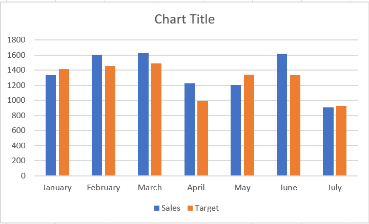
Using two columns makes it difficult to see the contrast between actual and target sales, so use a combination chart in which one series is plotted as a line and the other as a column.
To create a combination chart, follow these steps:
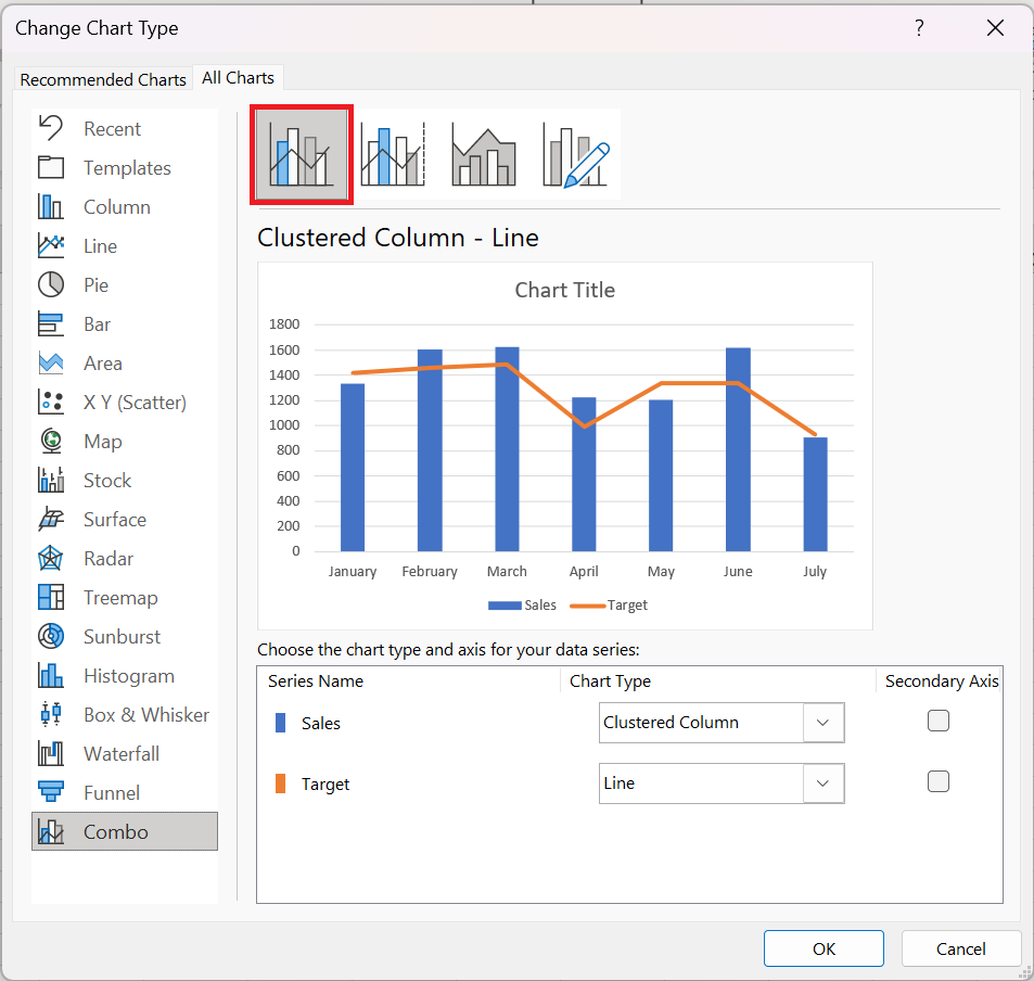
1. Right-click one of the series in the following figure and select Change Chart Type.
2. In the dialog box that appears, select Grouped Column – Row . This gives the combination graph shown in the following figure.
This technique works well with two time series.