
HEAT MAP GRAPH
Visuals are always easily understandable compared to values. Even in Excel, when using a chart (advanced or basic) it is easy for the user to understand.
But we can’t always go this route, because most of the time we need to present our data in tables or other report formats.
To deal with this kind of situation in Excel, I found that a map
Thermal is the best solution. It helps us present the data with a visual effect and without changing the actual structure of the data.
1 What is a heat map in Excel?
In Excel, a heat map is a presentation of data using a shade of color on each cell in the range in a comparative manner so that a user can easily understand it. It looks like a map with different colors ranging from dark to light to represent the weight of the value in the cell.
Below is an example of a simple heatmap where we have data by area and month and for each cell where we have a sales value, a color shade is applied to the cell.

And this color shade helps us quickly compare cell values with each other. The cell with the highest value has green as its cell color, and the cell with the lowest value has red, and all the cells in the middle have yellow.
All values between the highest and lowest values have a color shade based on their rank. But you can manually create a heatmap like this, because applying a color to a cell based on its values can be possible every time.
Now, the point is that you know what are the possible ways to create a heat map in Excel. And, if you ask me, there are more than three. We will see all the possible ways to create a heat map in Excel.
Note : When you print a heat map on paper, it looks really unpleasant, especially when using a black and white printer. All the shades are only black and white, which is not easy for anyone to understand.
2 Create a heat map using conditional formatting
If you don’t want to put in the extra effort and save time, you can create a simple heatmap using conditional formatting.

To create a heat map in Excel, you need to follow the steps below:
- First, select the data on which you want to apply a heat map (here you need to select all the cells where you have sales values)
- After that, go to the Home tab, in the Styles group click on Conditional Formatting.
- In the Conditional Formatting options, select the color shades or scales. (You can choose from twelve different types of color scales.)
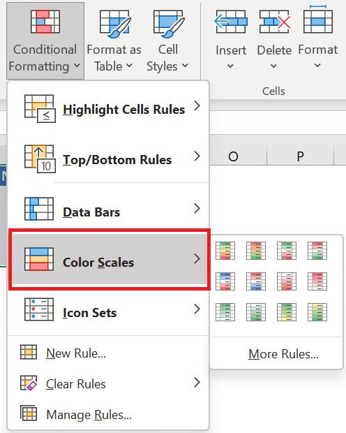
- Once you select an option, all the cells will get a color shade depending on the value they have and you will get a heat map like below

- And, if you want to hide the value and only show the shared color, you can use custom formatting for that.
- To do this, first select the heatmap data and open the formatting options (Ctrl + 1).
- Now in the number tab go to custom and enter ;;; and at the end click OK.
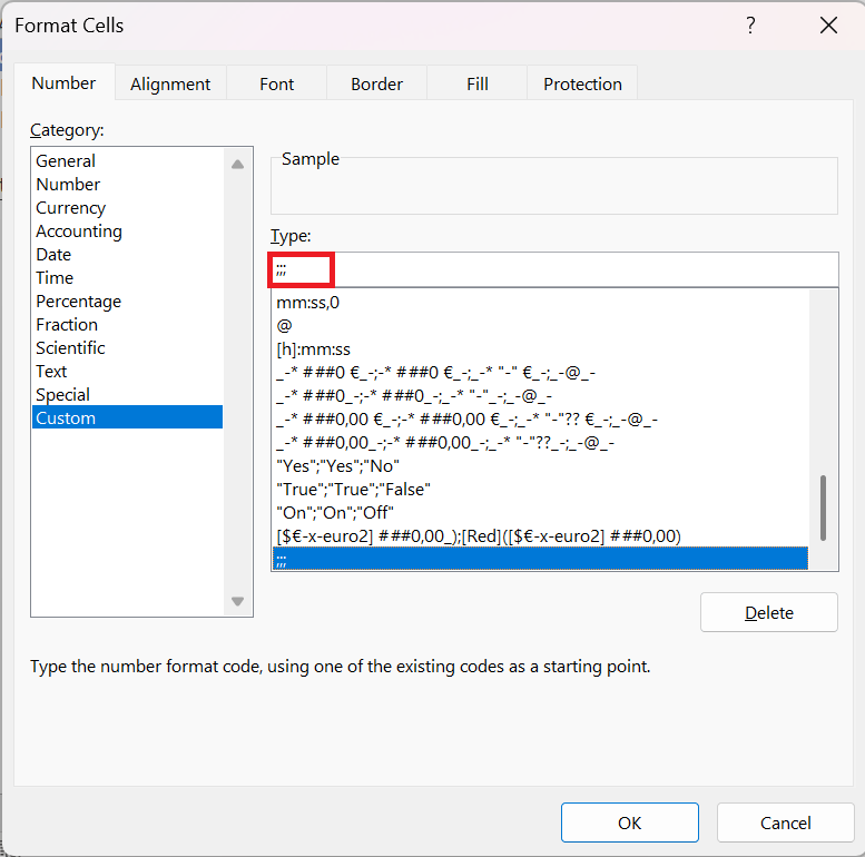
- Once you click OK, all the numbers in the cells will be hidden. Well, they are in the cells, but just hidden.

3 Steps to Add a Heatmap to a Pivot Table
You can also use a heat map in a pivot table by applying conditional formatting . Here are the steps to follow:
- Select one of the cells in the pivot table.
- Go to the Home tab, in the Styles group click Conditional Formatting.
- In the conditional formatting options, select color scales.

Also, if you want to hide numbers (which I don’t recommend), please follow these simple steps.
- Select one of the cells in the pivot table.
- Go to PivotTable Analysis tab ➜ Active Field ➜ Value Field Settings .
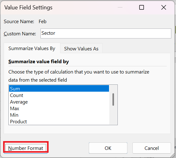
- Click on the number format.
- In the number tab, go to custom and enter ;;; as gender.e
- Click OK.
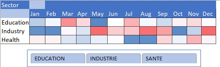
You can download this sample file to see how we can use a slicer with a dynamic heatmap table.
4 Steps to Create a Dynamic Heatmap
You can create a dynamic heatmap if you want to hide/show it according to your needs.
Below is the table we used to create a dynamic heat map.

And the following things we need to incorporate.
- Option to switch between heat map and numbers.
- Automatically updates table with heat map when new data is added.
Here’s how to do it:
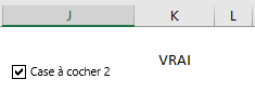
- Click the Developer tab on the ribbon, in the Controls group in Insert, insert a check box and rename it . Right-click the check box and select Format Control. select a cell in the linked cell box (K2 in our case)
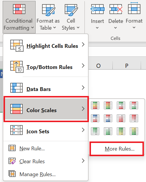
- Then select all the cells where you want to apply the formatting rule. Go to the Home tab, in the Styles group, click on Conditional Formatting.
- In the conditional formatting options, select the color shades then on another rule.
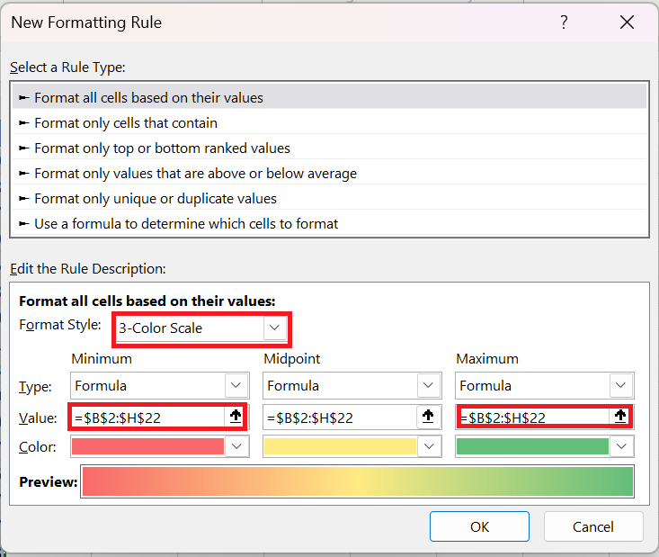
In the New Conditional Formatting Rule dialog box, in Formatting Style, select Three-Color Scale . In Type MINIMUM, MID, AND MAXIMUM, select Formula. In Value, enter the following formula :
MINIMUM: =IF($K$2= TRUE;MIN ($B$2:$H$25);FALSE)
MIDDLE: =IF($K$2= TRUE;AVERAGE ($B$2:$H$25);FALSE)
MAXIMUM: =IF($K$1= TRUE;MAX ($B$2:$H$25);FALSE)
Change the colors as you wish and click OK.
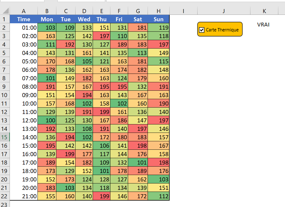
You now have a dynamic heatmap that you can control with a checkbox.
And if you want to hide the numbers when you check the box, you need to create a separate conditional formatting rule. Here’s how to do it:
- Open the New Conditional Formatting Rule dialog box.
- Select « Use a formula to determine which cells to format » and enter the formula below.
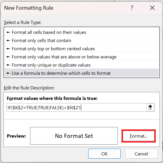
=IF($K$2= TRUE;TRUE ;FALSE)
- Now specify custom number formatting.

After applying all the above customizations, you will get a dynamic heatmap.
Imagine if you look at a large data set, it is really difficult to identify the lower values or the higher values, but if you have a heat map, it is easy to identify them.
You can use different color schemes to illustrate a heat map. And, if you can go the extra mile, a dynamic heat map is the best solution.