The need to create a line chart
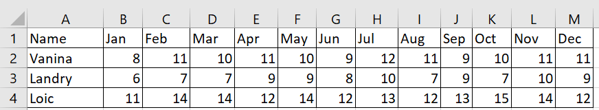
The first step in creating a chart is to determine the data you will graph. The following figure shows the data used to create the chart in this section.
In this format, it’s difficult to make assessments about how different real estate agents performed throughout the year. It’s difficult to compare results between months, let alone between real estate agents. However, by converting this data into a line graph, some comparisons become obvious to the viewer. In this case, the entire data set can be plotted graphically, and then the rows and columns swapped. When this is done, it immediately becomes clear that every time a real estate agent has a month off, they follow it with a good month of sales. 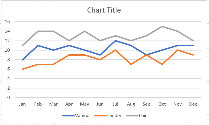
To create the line graph shown in the previous figure :
1 Select the sales data of the three real estate agents for the twelve months of the year.
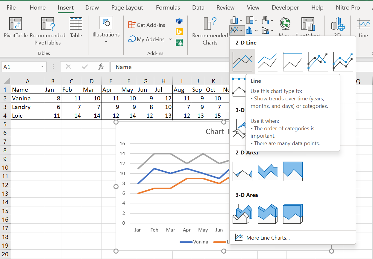
2 Click the Insert tab on the ribbon and select « Insert Line or Area Chart » in the Chart group.
3 From the drop-down menu, select Curve in the 2D Curve category, as shown in Figure 3.4