How to create a new chart
Creating a chart is quite simple:
1. Make sure your data is suitable for a chart.
2. Select the range that contains your data.
3. Select the Insert tab and select a chart type from the Charts group. These icons display drop-down lists that show subtypes. Excel creates the chart and places it in the center of the window.
There are three entry points for creating a chart:
■ Quick scan icon
■ Recommended graphics
■ Insert ribbon tab
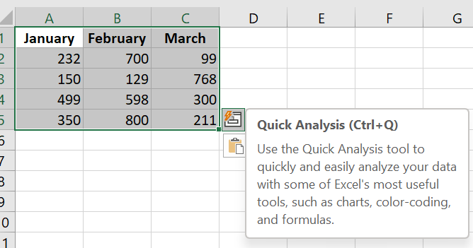
5.1 Creating a graph from the Quick Analysis icon
When you select a data range in Excel, the Quick Analysis icon appears below the data.
Select a data range and the Quick Analysis icon appears.
Click the Quick Analysis icon and a menu appears with choices for formatting, charts, totals, tables, and sparklines. Click the Charts menu and the Quick Analysis tool offers some recommended charts. Hover over any thumbnail to see a live preview of that chart.
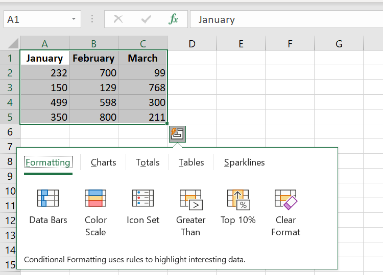
If none of the thumbnails offer what you want, you can click the More Charts icon at the end, which is equivalent to selecting the Recommended Charts icon.
It takes two clicks to get to the Charts section of the Quick Analysis tool, followed by several hovers to review and reject the various suggested charts, and then a third click to get to the Recommended charts. It seems easier to skip this whole process and start with the Recommended charts.
5.2 Inserting a Recommended Chart
You’ll probably prefer the Recommended Charts method for creating charts. The icon appears as a large icon in the Charts group on the Insert tab of the ribbon.
The Recommended Graphics icon
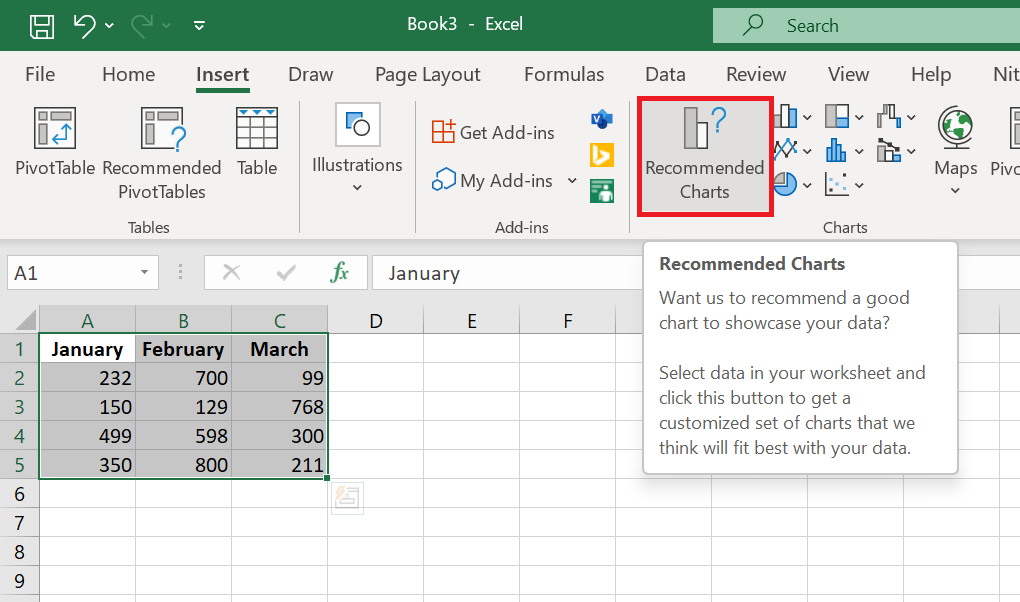
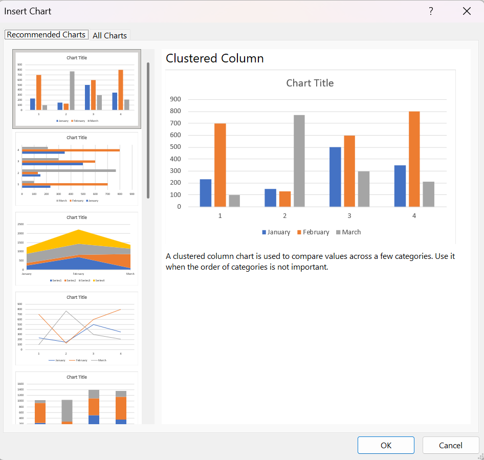
Select the data range and choose Recommended Charts. Excel displays the Insert Chart dialog box and starts on the Recommended Charts tab of the dialog box. Here, you can see all the thumbnails without having to hover over each one.
You can see thumbnails of each recommended chart.
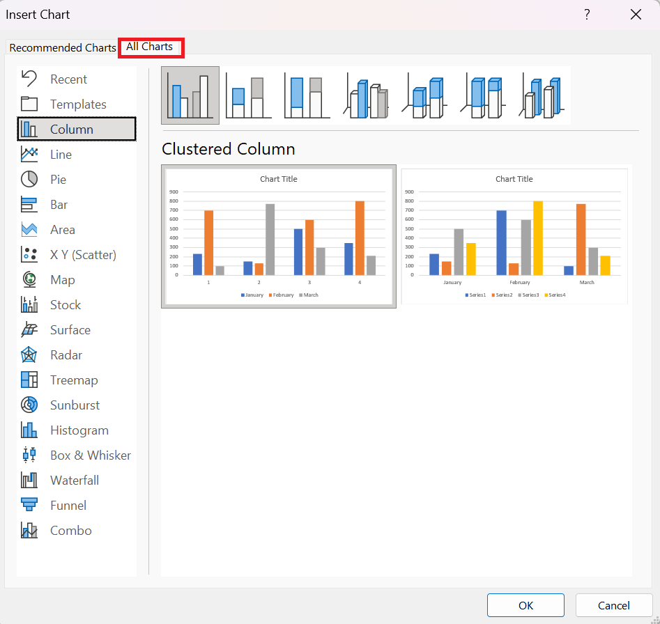
If none of the recommended charts suit you, click the All Charts tab in this dialog box to access the 73 built-in chart types. This tab is easier to use than the various icons in the Charts group on the ribbon. The left navigation panel offers all chart categories, even the Action and Area types, which are hidden on the ribbon. The seven thumbnails at the top offer seven chart types, and the two large thumbnails let you choose whether your series should be in rows or columns.
You can see thumbnails of each recommended chart .
Most chart categories provide thumbnail icons at the top of the dialog box. These icons generally represent four basic chart types:
■ Clustered: Each series gets a column, bar, or point starting from the x-axis of the chart. This chart type makes it easy to compare the performance of each series over time or across the axis.
■ Stacked: This shows how the three series add up to a total value. This is great for communicating total sales across the three regions, but terrible for seeing how Series 2 or Series 3 has changed over time.
■ 100% Stacked: The actual numbers in the cells are converted to percentages. Each column/bar/row adds up to 100%. This method is terrible for showing total sales and terrible for showing how each series has changed over time.
■ 3D Column—While the previous three elements are available in 3D versions, column and area charts offer a fourth 3D choice: 3D Column, where series are displayed from front to back. This works when the series in front is smaller than the series in the back. Often, however, elements in the back series are hidden by elements in the front series.
5.3 Creating a chart using other icons on the Insert tab
If you don’t choose the Recommended Chart icon, you can go directly to one of the other eight chart drop-down menus on the Insert tab of the ribbon.
The 11 chart categories grouped into eight icons.
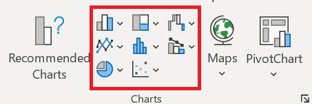
There really should be more icons than the eight displayed. Bubble charts have been moved to the Scatter Chart icon. Stock and Area charts are in the Radar Chart icon. Cone, Pyramid, and Cylinder charts have been removed from the Column Chart icon and moved to the Formatting task pane. There are no icons for Templates or Recents.
To access the Templates or Recent categories, you need to open the All Charts tab of the Insert Chart dialog box .
REMARQUE ■■■■■■
Vous pouvez créer un graphique avec une seule touche. Sélectionnez la plage à utiliser dans le graphique, puis appuyez sur Alt+F1 (pour un graphique incorporé) ou F11 (pour un graphique sur une feuille de graphique). Excel affiche le graphique des données sélectionnées en utilisant le type de graphique par défaut. Le type de graphique par défaut est un graphique à colonnes, mais vous pouvez le modifier. Pour modifier le type de graphique par défaut, sélectionnez n’importe quel graphique et choisissez Outils de graphique / Conception / Modifier le type de graphique. La boîte de dialogue Modifier le type de graphique s’affiche. Choisissez un type de graphique dans la liste de gauche, puis cliquez avec le bouton droit sur un graphique dans la rangée de vignettes et choisissez Définir comme graphique par défaut.
5.4 Trying other chart types
Although a clustered column chart seems to work well for this data, there’s no harm in checking out other chart types. Choose Chart Tools / Design / Change Chart Type / All Charts to experiment with other chart types. This command displays the Change Chart Type dialog box, shown in the following figure. The figure shows what the data would look like as a line chart.
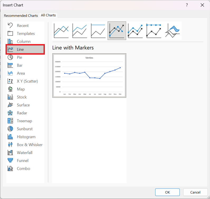
The main chart categories are listed on the left, and the subtypes are displayed as a horizontal row of icons. Select an icon, and the display shows how the chart will look in both data orientations. When you find a suitable chart type, click OK, and Excel modifies the chart. Note that this dialog box has a tab at the top that lets you access the chart types Excel recommends for the data.
NOTE ■■■■■■
Les styles affichés dans la galerie dépendent du thème du classeur. Lorsque vous choisissez Mise en page / Thèmes / Thèmes pour appliquer un thème différent, vous disposez d’une nouvelle sélection de styles et de couleurs de graphique conçus pour le thème sélectionné.
5.5 Working with graphics
This section covers some common chart modifications:
■ Resizing and moving graphics
■ Copying a chart
■ Delete a chart
■ Adding chart elements
■ Moving and deleting chart elements
■ Formatting chart elements
■ Printing graphics
Before you can edit a chart, it must be activated. To activate an embedded chart, click on it. This activates the chart and selects the item you click. To activate a chart on a chart sheet, simply click its sheet tab.
Resize a chart
If your chart is an embedded or inline chart, you can easily resize it with your mouse. Click the chart and round handles appear on the corners and edges of the chart. Move the mouse pointer to a corner and when the mouse pointer changes to a double arrow, click and drag to resize the chart.
Another way to resize a chart: When a chart is selected, choose Chart Tools / Format / Size and use the two controls to adjust the height and width of the chart. Use the double arrows or type the dimensions directly into the Height and Width controls.
Move a chart
To move an embedded chart to another location on a worksheet, click the chart and drag one of its borders. You can use standard copy and paste techniques to move an embedded chart. In fact, this is the only way to move a chart from one worksheet to another. Select the chart and choose Home / Clipboard / Cut (or press Ctrl+X). Then activate a cell near the desired location and choose Home / Clipboard / Paste (or press Ctrl+V). The new location can be in a different worksheet or even in a different workbook. If you paste the chart into a different workbook, the chart will be linked to the data in the original workbook.
To move an embedded chart to a chart sheet (or vice versa), select the chart and choose Chart Tools / Design / Location / Move Chart; the Move Chart dialog box appears. Choose New Sheet and give the chart sheet a name (or use the name suggested by Excel).
Copy a chart
To make an exact copy of an embedded chart on the same worksheet, click the chart border, hold down the Ctrl key, and drag. Release the mouse button and a new copy of the chart is created.
To make a copy of a chart sheet, use the same procedure, but drag the chart sheet tab.
You can also use standard copy-and-paste techniques to copy a chart. Select the chart (an embedded chart or a chart sheet) and choose Home / Clipboard / Copy (or press Ctrl+C).
Then activate a cell near the desired location and choose Home / Clipboard / Paste (or press Ctrl+V). The new location can be in another worksheet or even in another workbook.
If you paste the chart into another workbook, it will be linked to the data in the original workbook.
Delete a chart
To delete an embedded chart, press Ctrl and click on the chart (to select the chart as an object). Then press Delete. When the
With Ctrl held down, you can select multiple charts and then delete them all with a single press of the Delete key.
To delete a chart sheet, right-click its tab and choose Delete from the context menu. To delete multiple chart sheets, select them by pressing Ctrl while clicking the sheet tabs.
Adding chart elements
To add new elements to a chart (such as a title, legend, data labels, or gridlines), activate the chart and use the controls in the Chart Elements « + » icon, which appears to the right of the chart. Note that each element expands to reveal additional options.
You can also use the Add Chart Element control in the Chart Tools / Design / Chart Layouts tab.
Moving and deleting chart elements
Some chart elements can be moved: titles, legend, and data labels. To move a chart element, simply click on it to select it, then drag its border.
The easiest way to remove a chart element is to select it and then press Delete. You can also use the controls in the Chart Elements icon, which appears to the right of the chart.
Printing graphics
There’s nothing special about printing embedded charts; you print them the same way you print a worksheet. As long as you include the embedded chart in the range you want to print, Excel prints the chart as it appears on the screen. When printing a sheet with embedded charts, it’s a good idea to preview first (or use Page Layout view) to make sure your charts don’t span
multiple pages. If you created the chart on a chart sheet, Excel always prints the chart on a page by itself.
NOTE ■■■■■■
Si vous sélectionnez un graphique incorporé et choisissez Fichier / Imprimer, Excel imprime le graphique sur une page par lui-même et n’imprime pas la feuille de calcul.
If you don’t want a particular embedded graphic to appear on your printout, go to the Format Chart Area task pane and select the Size and Properties icon. Then, expand the Properties section and uncheck the Print Object box.