
Create a radar chart
Radar charts allow you to present data in a similar way to bar charts, with distinct data categories. However, the difference between radar charts is that they are circular rather than horizontal or vertical, allowing each data category to have its own axis. The term radar chart comes from the chart’s close resemblance to a radar screen, such as those found on airplanes, ships, and submarines. They are also called « spider paintings » because they also resemble a spider’s web.
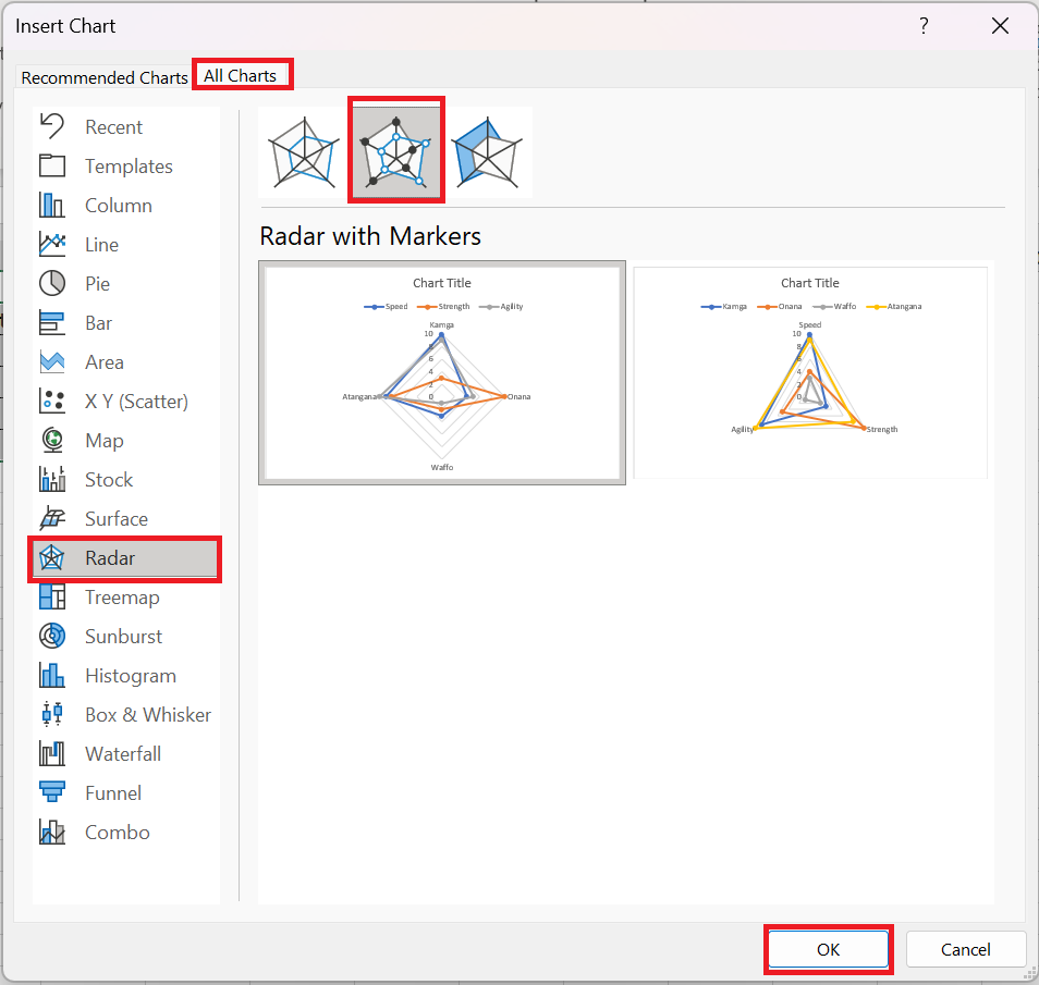
The spreadsheet summarizes four athletes in terms of strength, speed, and agility. Select the range C 2:F 6 and click Recommended Charts on the Insert tab . Select All Charts and click the radar chart icon and select Radar with Markers as shown in the following figure.
The center of the radar chart indicates a score of 0, and the further a marker is from the center, the better the score. The graph makes it easy to see, for example, that Waffo performs poorly on all measures and that Atangana performs well on all three measures.
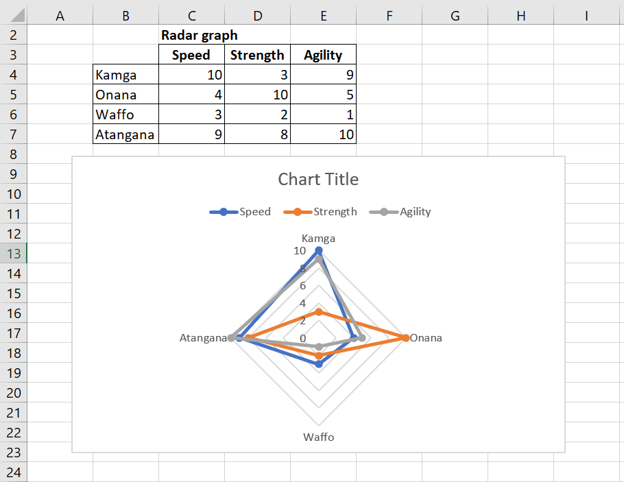
This is a radar chart with markers.