How to Create a Scatter Plot in Excel
When you examine two columns of quantitative data in your Excel spreadsheet, what do you see? Just two sets of numbers. Do you want to see how the two sets relate to each other? A scatter plot is the ideal chart choice for this.
1 What is a point cloud?
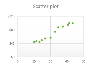
A scatter plot (also called an XY chart or scatter diagram ) is a two-dimensional graph that shows the relationship between two variables. In a scatter plot, the horizontal and vertical axes are value axes that plot numerical data. Typically, the independent variable is on the x-axis and the dependent variable is on the y-axis. The graph displays the values at the intersection of the x- and y-axes, combined into single data points.
The main purpose of a scatter plot is to show how strong the relationship, or correlation , is between two variables. The more data points fall along a straight line, the higher the correlation.
2 Organize the data for a scatter plot
With a variety of built-in chart templates provided by Excel, creating a scatter plot becomes a matter of a few clicks. But first, you need to properly organize your source data.
As already mentioned, a scatter plot displays two interdependent quantitative variables. So, you enter two sets of numerical data in two separate columns.
For ease of use, the independent variable should be in the left column because this column will be plotted on the x-axis. The dependent variable (the one affected by the independent variable) should be in the right column, and it will be plotted on the y-axis.
If your dependent column precedes the independent column and there is no way to change this in a spreadsheet, you can swap the x and y axes directly on a chart.
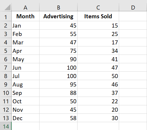
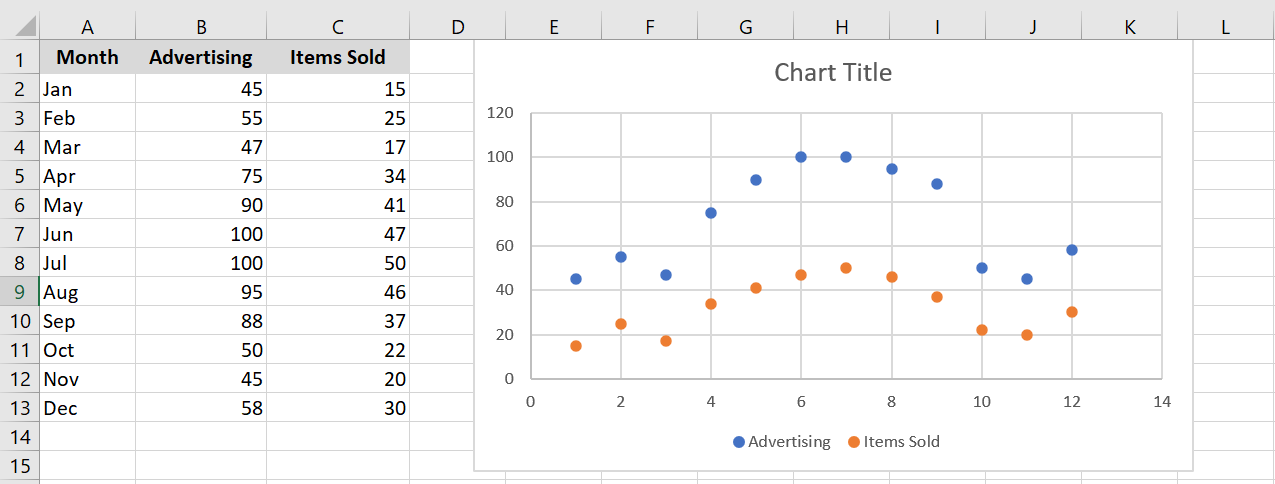
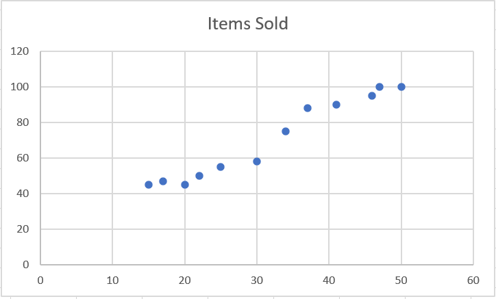
In our example, we will visualize the relationship between the advertising budget of a certain month (independent variable) and the number of items sold (dependent variable), so we organize the data accordingly:
3 How to create a point cloud?
With the source data properly organized, creating a scatter plot in Excel is a quick two-step process:
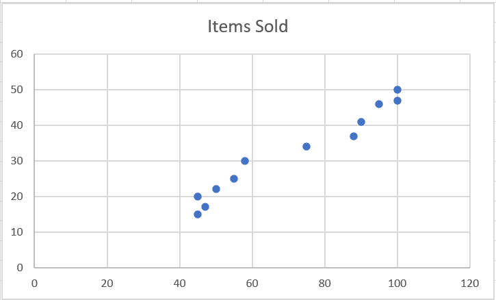
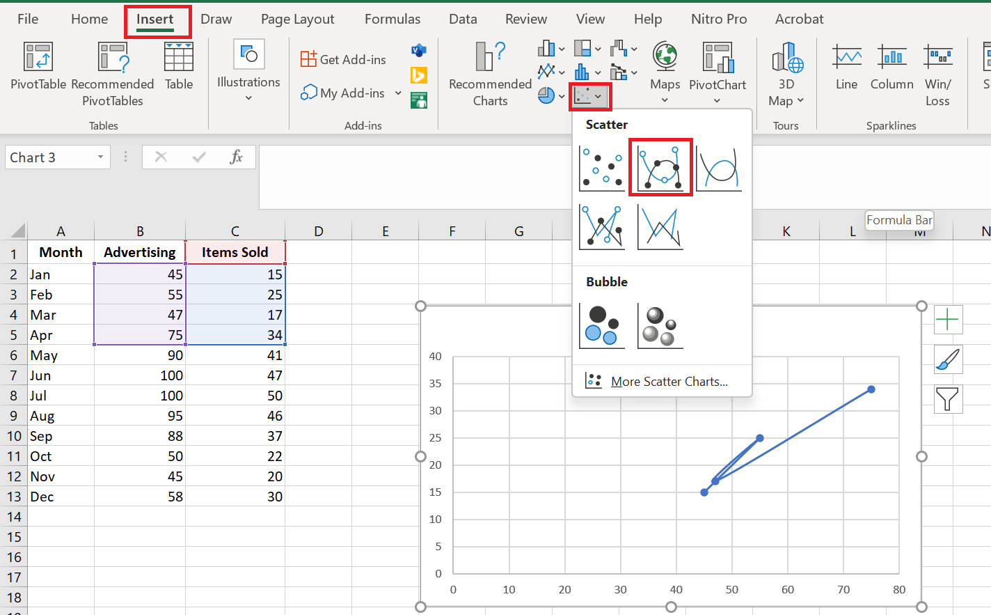
- Select two columns with numeric data, including the column headers. In our case, this is the range C 1:D 13. Do not select any other columns to avoid confusing Excel.
- Go to the Insert tab / Chart group , click the Scatter plot icon and select the desired template. To insert a classic scatter plot, click the first thumbnail:

The scatter plot will be immediately inserted into your spreadsheet:
You can customize some elements of your chart to make it look better and to make the correlation between the two variables clearer .
4 Types of Scatter Chart
Besides the classic scatter plot shown in the example above, a few additional models are available:
- Type with soft lines and markers
- Type with smooth lines
- Type with straight lines and markers
- Type with straight lines
Scatter plots with lines are best used when you have few data points. For example, here’s how you can represent the first four months’ data using a scatter plot with smooth lines and markers:
Excel XY plot templates can also plot each variable separately, presenting the same relationships in a different way. To do this, you need to select 3 columns with data – the leftmost column with text values (labels) and the two columns with numbers.
In our example, the blue dots represent the advertising cost and the orange dots represent the items sold:
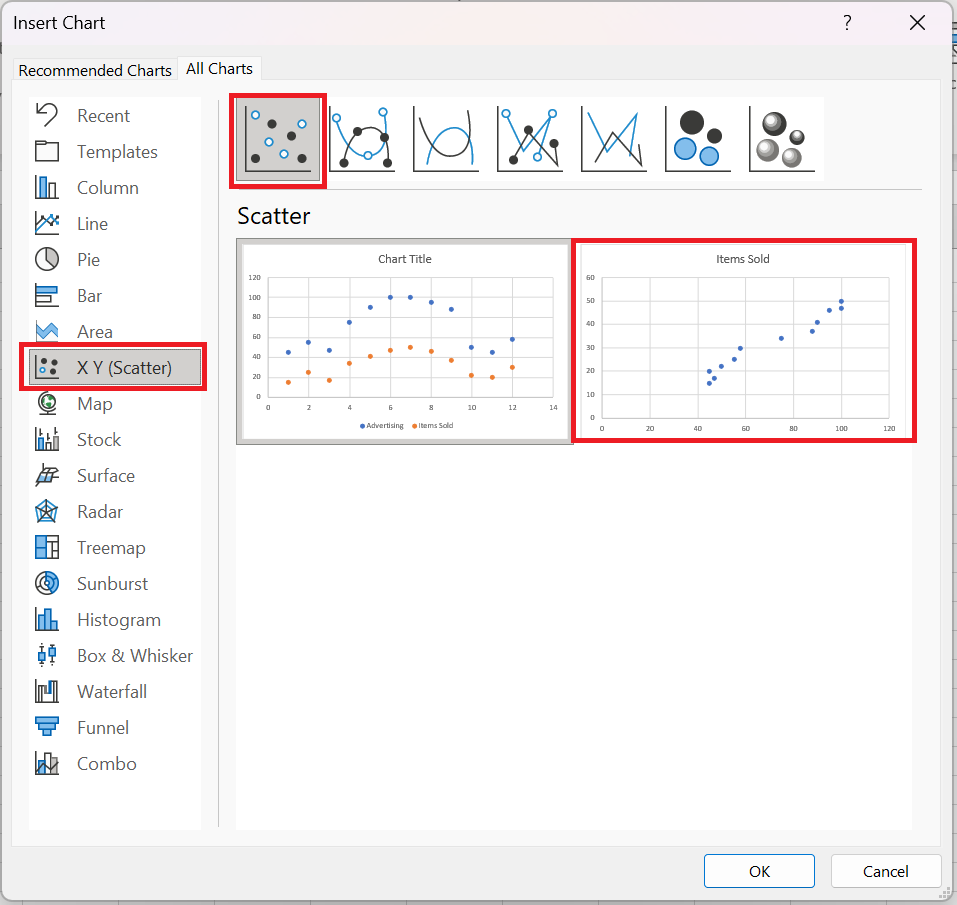
To view all available scatter plot types in one place, select your data, click the Scatterplot (X, Y) icon on the ribbon, and then click More Scatterplots. This will open the Insert Overlay Chart dialog box with the XY (scatter plot) type selected, and you switch between the different templates at the top to see which one provides the best graphical representation of your data:
5 Scatter plot and correlation
To correctly interpret the scatter plot, you need to understand how variables can be related to each other. Broadly speaking, there are three types of correlation:
Positive correlation – as variable x increases, variable y also increases. An example of a strong positive correlation is the amount of time students spend studying and their grades.
Negative correlation – as variable x increases, variable y decreases. Classes and dropout grades are negatively correlated – as the number of absences increases, exam grades decrease.
No correlation – there is no obvious relationship between the two variables; the points are scattered throughout the graph area. For example, student height and grades appear to have no correlation, as the former does not affect the latter in any way.
6 Customizing the XY point cloud
As with other chart types, almost every element of a scatter chart in Excel is customizable. You can easily change the chart title, add axis titles , hide gridlines, choose your own chart colors, and more.
6.1 A Adjust axis scale (reduce white space)
If your data points are clustered at the top, bottom, right, or left of the chart, you may want to clean up the extra white space. To reduce the space between the first data point and the vertical axis and/or between the last data point and the right edge of the chart, follow these steps:
- Right-click the x-axis, then click Format Axis…
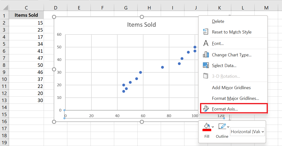
- In the Axis Formatting pane, set the desired minimum and maximum limits .
- Additionally, you can change the main units that control the spacing between grid lines.
The screenshot below shows my settings:
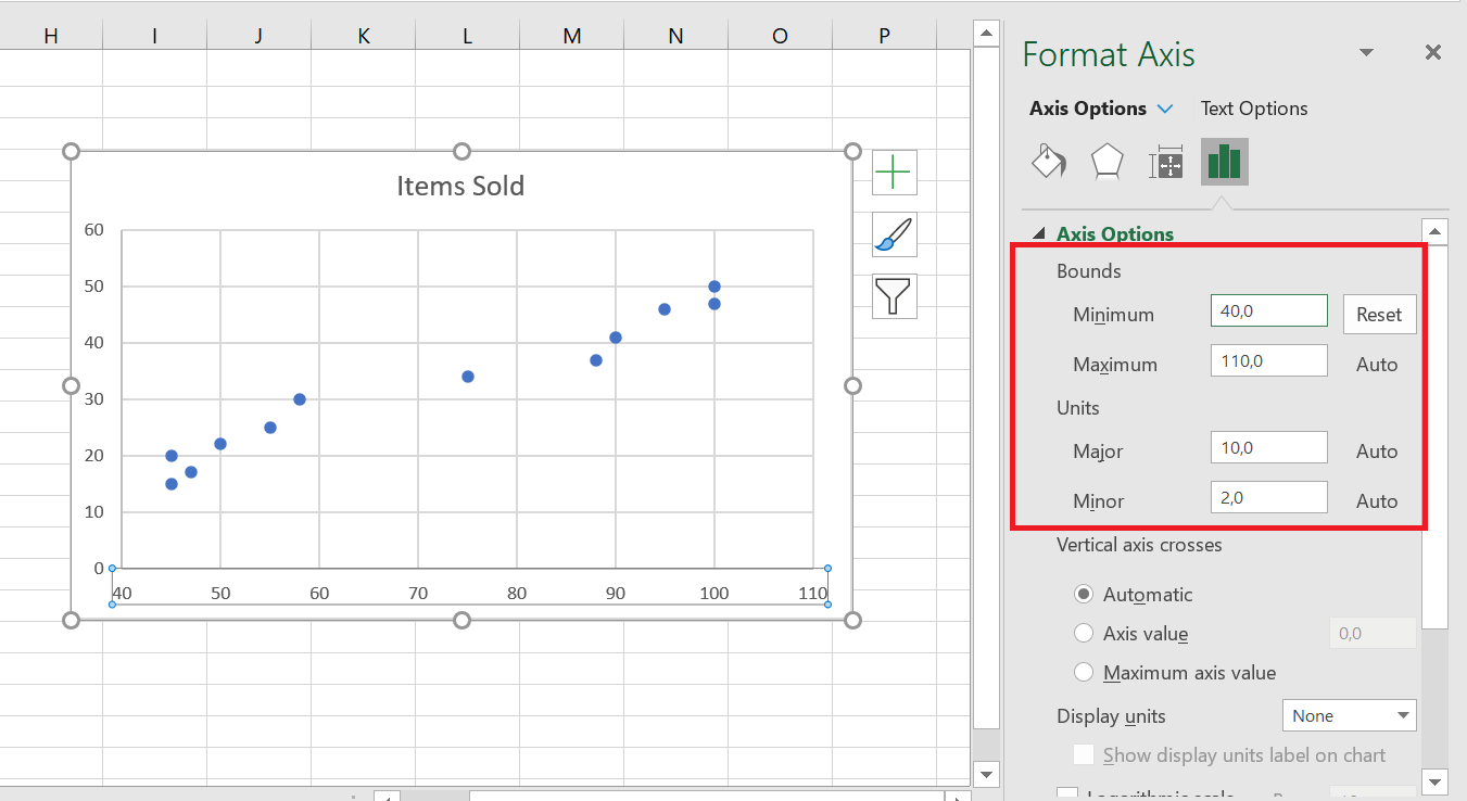
To remove the space between the data points and the top/bottom edges of the plot area, format the vertical y-axis in the same way.
6.2 Add labels to point cloud data points
When creating a scatter chart with a relatively small number of data points, you may want to label the points by name to make your visual more understandable. Here’s how to do this:
- Select the plot and click the Chart Elements button .
- Check the Data Labels box , click the small black arrow next to it, and then click More options…
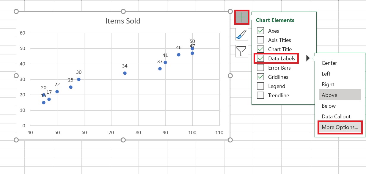
- In the Format Data Labels pane , switch to the Label Options tab (the last one) and configure your data labels like this:
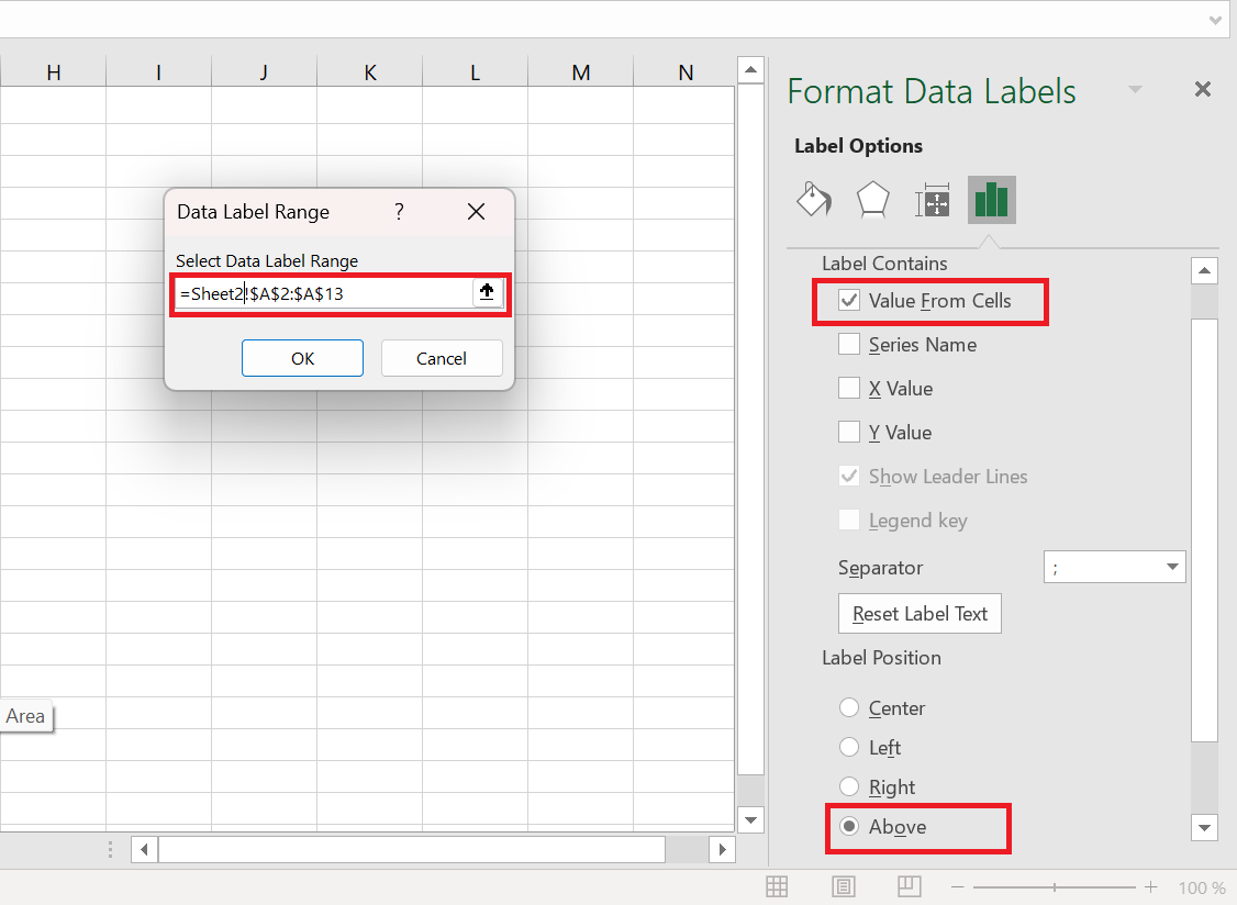
- Select the Value from cells box , then select the range from which you want to extract data labels (A 2:A 13 in our case).
- If you want to display only the names, uncheck the X Value and/or Y Value box to remove numeric values from the labels.
- Specify the position of the labels, Above the data points in our example.
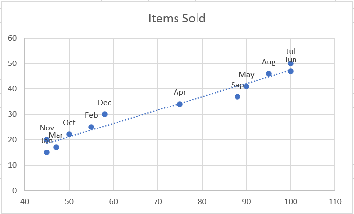
All data points in our Excel scatter plot are now labeled by name:
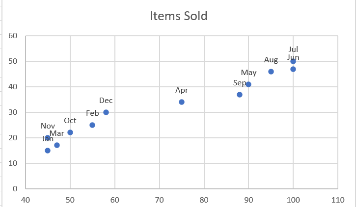
6.3 Repairing Overlapping Labels
When two or more data points are very close together, their labels can overlap, as is the case with the Jan and Mar labels in our scatter plot. To resolve this, click the labels, then click the overlapping label so that only that label is selected. Hover your mouse cursor over the selected label until the cursor changes to a four-sided arrow, then drag the label to the desired position.
As a result, you will have a nice Excel scatter plot with perfectly readable labels.
6.4 Add a trendline and equation
To better visualize the relationship between the two variables, you can plot a trend line in your Excel scatter chart, also known as a line of best fit .
To do this, right-click any data point and choose Add Trendline… from the context menu.
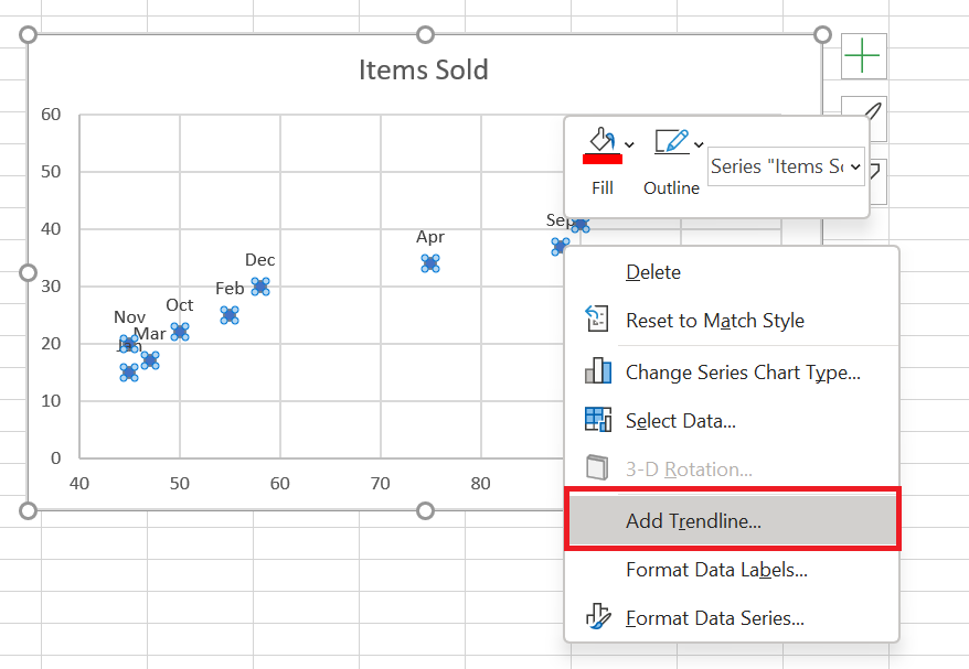
Excel will draw a line as close as possible to all the data points so that there are as many points above the line as below.
Additionally, you can display the trendline equation , which mathematically describes the relationship between the two variables. To do this, select the Show equation on chart check box in the Format Trendline pane , which should appear on the right side of your Excel window immediately after adding a trendline. The result of these manipulations will look like this:
What you see in the screenshot above is often called the linear regression graph .
6.5 Changing the X and Y axes in a scatter chart
As mentioned, a scatter plot typically displays the independent variable on the horizontal axis and the dependent variable on the vertical axis. If your chart is plotted differently, the easiest solution is to swap the source columns in your spreadsheet and then redraw the chart.
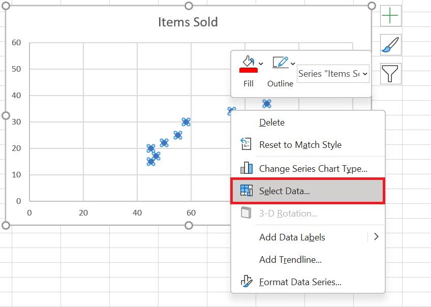
If for some reason reordering columns isn’t possible, you can switch the X and Y data series directly on a chart. Here’s how:
- Right-click any axis and click Select Data… from the context menu.
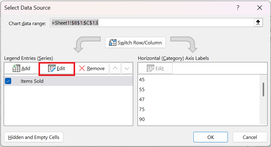
- Data Source dialog box , click the Edit button .
 3. Copy the values from Series X into the Series Y Values box and vice versa .
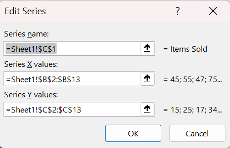
OK twice to close both windows.
As a result, your Excel scatter plot will undergo this transformation:
This is how you create a scatter plot in Excel.