STEP CHART
A step chart is perfect if you want to show changes that have occurred at irregular intervals. That’s why it’s on our list of advanced charts. It can help you show the trend as well as the actual time of a change. Essentially, a step chart is an extended version of a line chart.
Unlike the line chart, it doesn’t connect the data points using a short-distance line. In fact, it uses vertical and horizontal lines to connect the data points. Now, the bad news is: in Excel, there is no default option to create a step chart. But, you can use a few easy-to-follow steps to create one in no time.
So, today in this article, I would like to share with you a step-by-step process to create a step chart in Excel. And, you will also learn the difference between a line chart and a step chart which will help you select the best chart according to the situation.
1 Line Chart and Step Chart
Here we have some differences between a line chart and a step chart and these points will help you understand the importance of a step chart.
1. Exact time of variation
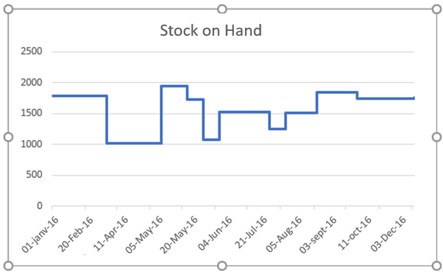
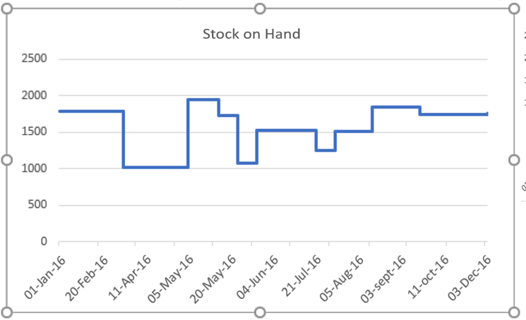
A step chart can help you show the exact time of a change. On the other hand, a line chart is more concerned with showing trends in change. Just look at the two charts below where we used stock data on hand.
Here, the line chart shows a decrease in inventory from February to March. And for the same period, in the step chart, you can see that the increase only occurred in April. In short, in a line chart, you can’t see the magnitude of a change, but in a step chart, you can see the magnitude of a change.
2. Real trend
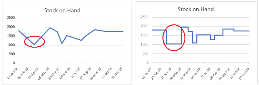
A step chart can help you show a true picture of a trend. On the other hand, a line chart can sometimes be misleading. Below, in both charts, you have a decrease in inventory in May, then a further increase in June.
But, if you look at both charts, you will see that the downward trend and then an increase is not clearly shown in the line chart. On the other hand, in the step chart, you can see that before the increase there is a constant period.
3. Constant periods
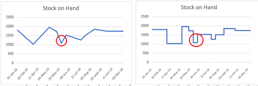
A line chart cannot display periods when values were constant. However, in a step chart, you can easily display the constant time period for the values. Look at both charts.
In the step chart, you can clearly see that there is always a constant period before any increase or decrease. But, in the line chart, you can only see the points where you have a decrease or an increase.
4. Actual number of changes
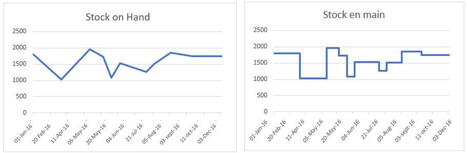
In both graphs below, an increase occurred between July and August, and then again between August and September. But, if you look at the line graph, you are not able to clearly see both changes.
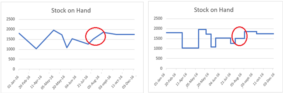
Now, if you come to the step chart, it clearly shows that you have two changes between July and September. I’m sure all the above points are enough to convince you to use a step chart instead of a line chart.
2 Simple Steps to Create a Step Chart
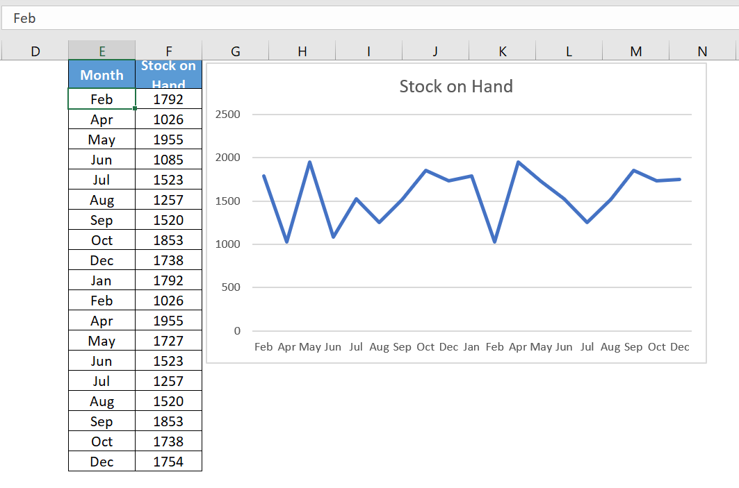
Now it is time to create a step chart and for that we need to use the data below here to create this chart.
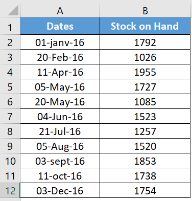
This is stock data on hand from different dates where increase and decrease occurred in stock.
You can download this file from here to follow along.
-
-
- First, you need to build data into a new table using the following method. Copy and paste the headings into new cells.
-
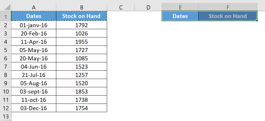
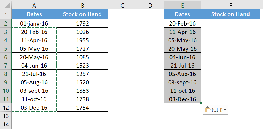
- Now from the original table select the dates from the second date (A3 to A12) and copy them.
- After that, go to your new table and paste the dates under the « Date » heading (towards E2).
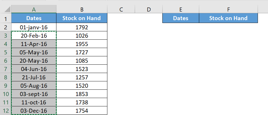
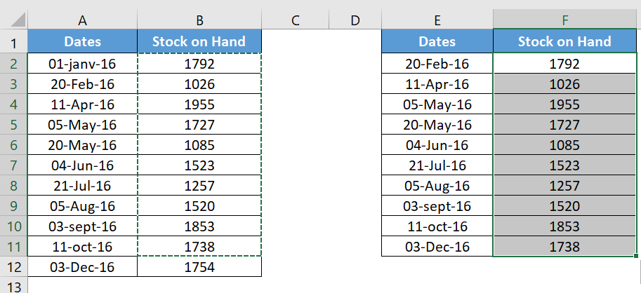
- Again, go to your original table and select the stock values from the first value to the second to last value (B2 to B11) and copy it.

- Now paste it under the « Stock on Hand » heading, alongside the dates (paste to F2).
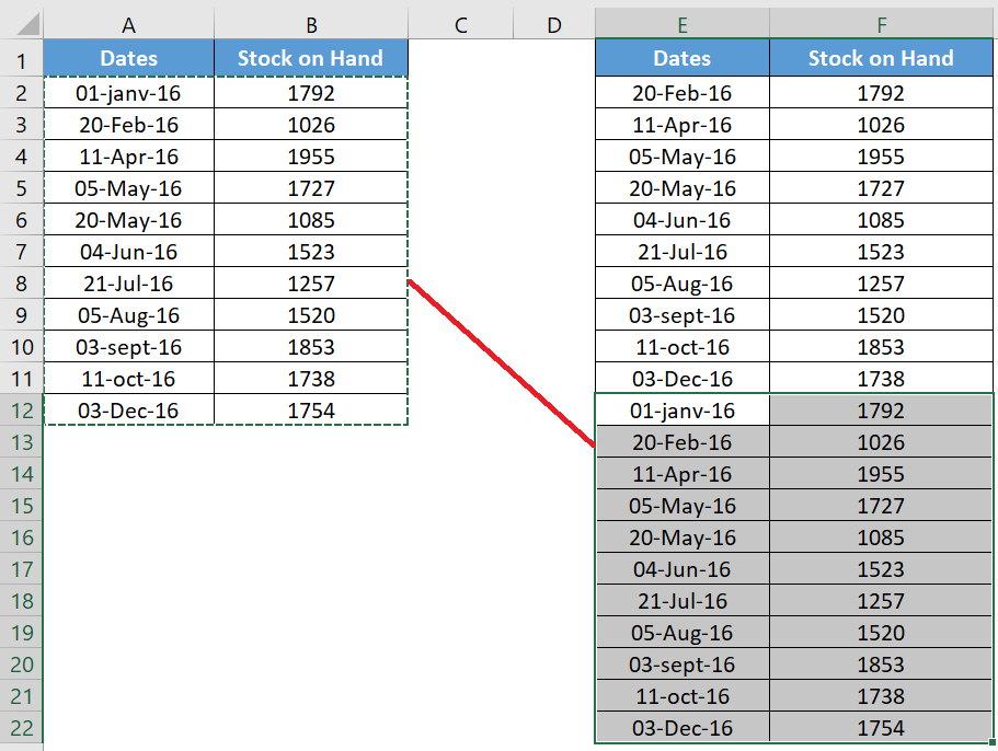
- After that, navigate to your original data table and copy it.
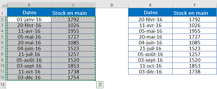
- Now paste it below the new table you just created and your data will look something like this.
- Finally, select this data table and create a line chart. Go to the Insert tab of the ribbon in the Charts group, select Line or Area Chart, then 2D Line Chart.
3 How does it work?
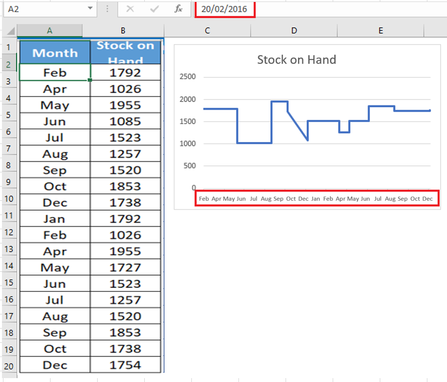
I’m sure you’re happy after creating your first step chart. But, it’s time to understand the whole concept you’ve used here. Let’s take an example with a small data set.
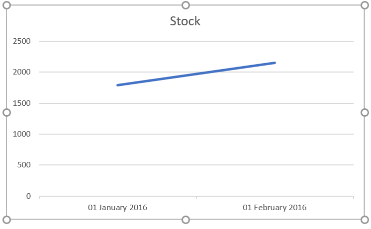
In the table below you have two dates, 01-Jan-2016 and 20-Feb-2016 and you have an inventory increase on 20-Feb-2016.
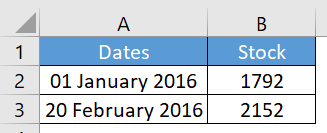
With this data, if you create a simple line chart, it will look like this.
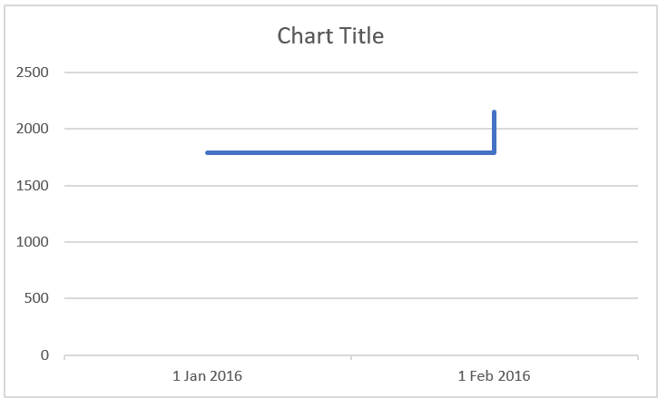
Now, step back a bit and remember what you learned earlier in this article. In a step chart, an increase will only be shown when it actually occurred. So, here, you need to show the change in February instead of a trendline from January to February.
To do this, you need to create a new entry for February 20, 2016, but with the stock value of January 1, 2016. This entry will help you display the line when the increase has not occurred. So, when you create a line chart with this data, it will become a step chart.
4 Create a step chart without dates
When creating a step chart for this article, I found that the line chart had a slight positive point over the step chart.
Think of it this way: most or almost every time you use a line chart to show trends, trends are always related to dates and other measures of time.
When creating a line chart, you can use months or years (without dates) up to the current time period. But when you try to create a step chart without dates, it will look something like below.
Here, instead of combining dates, Excel has separated the months into two different parts. First, January-December, and then second, January-December.
Now, it’s clear that you can’t create a step chart if you use text instead of dates. Well, I don’t want to say that because I have a solution for that. Whenever you have months or years, simply convert them to a date.
For example, instead of using Jan , Feb May, etc., use 01-Jan-2016, 01- Feb -2016, 01-May-2016 and get month from dates using custom formatting.
Like that.

And that just creates your milestone chart.
5 Create a Step Chart without Risers
In this chart, instead of a full step chart, you will only have the lines where the value is constant.
The best use for this chart is when your values increase or decrease after a constant period. For example, mortgage rates, bank interest rates, etc.
To create this chart, we need to construct the data the same way you did for a normal step chart. Download this sample data file to follow along.
- Copy and paste the titles into new cells.
- Now from the original table select the dates starting from the second date (A3 to A9) and copy it.
- After that, go to your new table and paste the dates under the « Date » heading (towards D2).
- Again, go to your original table and select the Rate values from the first value to the second to last value (B2 to B8) and copy it.
- Now paste it under the « Rates » heading, alongside the dates (paste at E2).
Step 2 : Now copy the dates from first to last and paste them below the new data table. Don’t worry about the empty cells for the rate.
Step 3: After that, copy your original data table again and paste it below the new data table. Here you have your data in three sets like this.
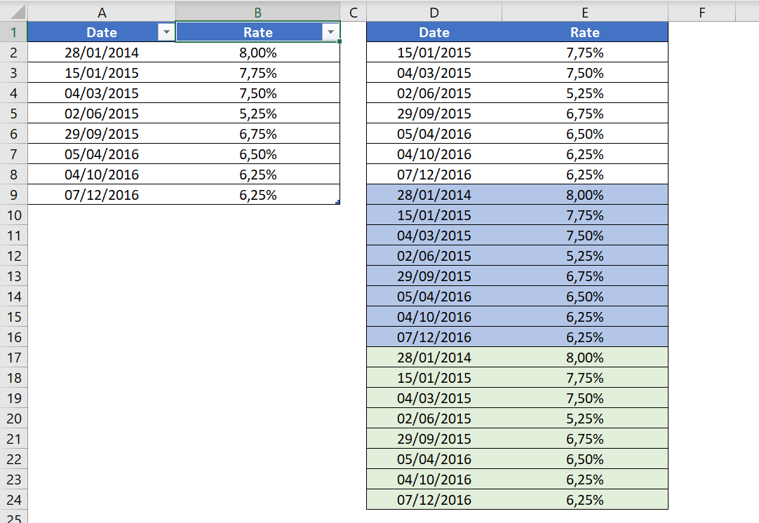
Step 4: Select the data and create a line chart with it.
As you learned above, a step chart is an advanced version of a line chart. It will show you not only trends, but also important information that is difficult to obtain with a line chart.
It may seem a bit tricky at first glance, but once you master the data construction, you can create it in seconds.