Highlighting Time Periods
Some trend components may contain specific time periods during which a special event occurred, causing an anomaly in the trend pattern. For example, you may have an unusually large spike or drop in the trend caused by an occurrence in your organization. Or perhaps you need to combine actual data with forecasts in your chart component. In such cases, it can be helpful to emphasize specific periods in your trend with special formatting.
Formatting Specific Periods
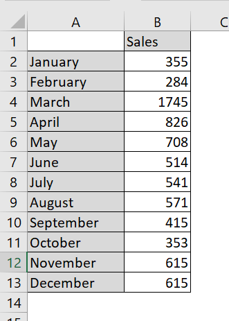
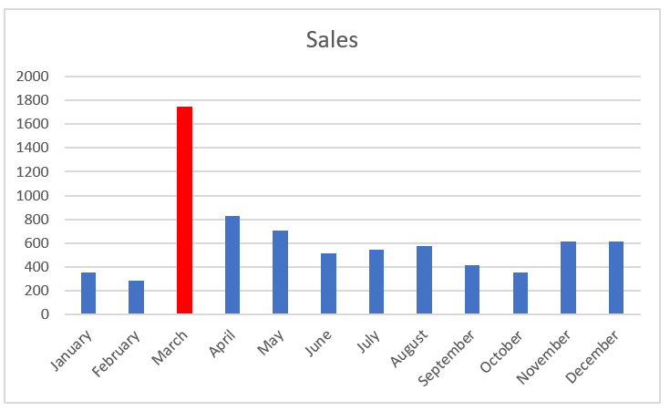
Imagine you just created the chart component shown in the following figure and you want to explain the spike in March. You could, of course, use a footnote somewhere, but that would force your audience to look elsewhere on your dashboard for an explanation.
Drawing attention to an anomaly directly on the chart helps give your audience context without having to look away from the chart.
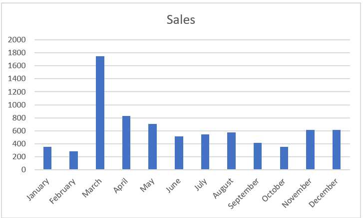
The spike in March is worth noting.
A simple solution is to format the March data point to appear in a different color, and then add a simple text box explaining the spike. To format a single data point:
1. Click the data point once.
This step places dots on all data points in the series.
2. Click the data point again to ensure Excel knows you’re formatting only that single data point.
The dots disappear from everything except the target data point.
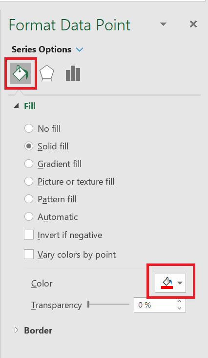
3. Right-click and select Format Data Point from the menu that appears. This step opens the
Format Data Point dialog box , shown in the following figure. The idea is to adjust the formatting properties of the data point as follows:
The Format Data Point dialog box is for a column chart. Different chart types have different options in the Format Data Point dialog box. However, the idea remains the same in that you can adjust the properties in the Data Point Formatting dialog box to change the formatting of a single data point.
The Format Data Point dialog box gives you formatting options for a single data point.
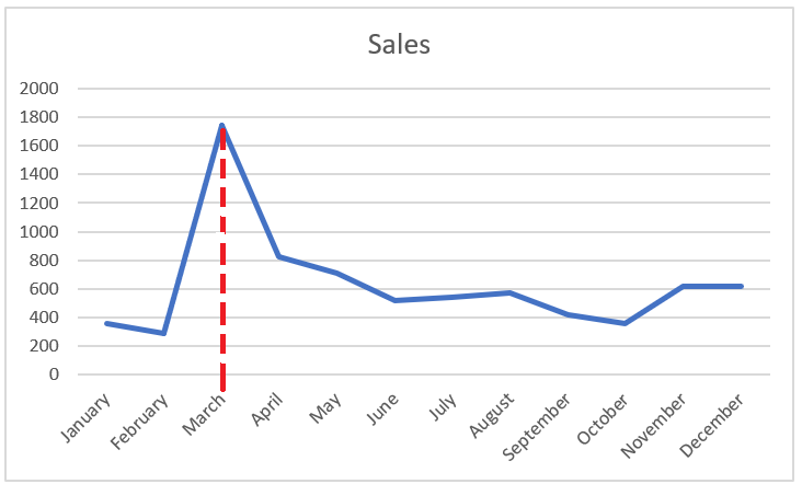
Once you change the fill color of the March data point and add a text box with some context, the chart explains the spike well, as shown in the following figure
The chart now draws attention to the spike in October and provides instant context via a text box.
To add a text box to a chart, click the Insert tab on the ribbon and select the Text Box icon. Then click the chart to create an empty text box that you can fill with your words.
Using Dividers to Mark Significant Events
Every now and then, a particular event permanently changes the paradigm of your data. A good example is a sales increase. The trend shown in the following figure was permanently affected by a sales increase implemented in March. As you can see, a divider line (along with labeling) provides a distinct indicator of rising prices, separating the old trend from the new.
Use a simple line to mark particular events along a trend.
While there are many ways to create this effect, you rarely need to find a more sophisticated solution than manually drawing a line yourself. To draw a dividing line inside a chart, follow these steps:
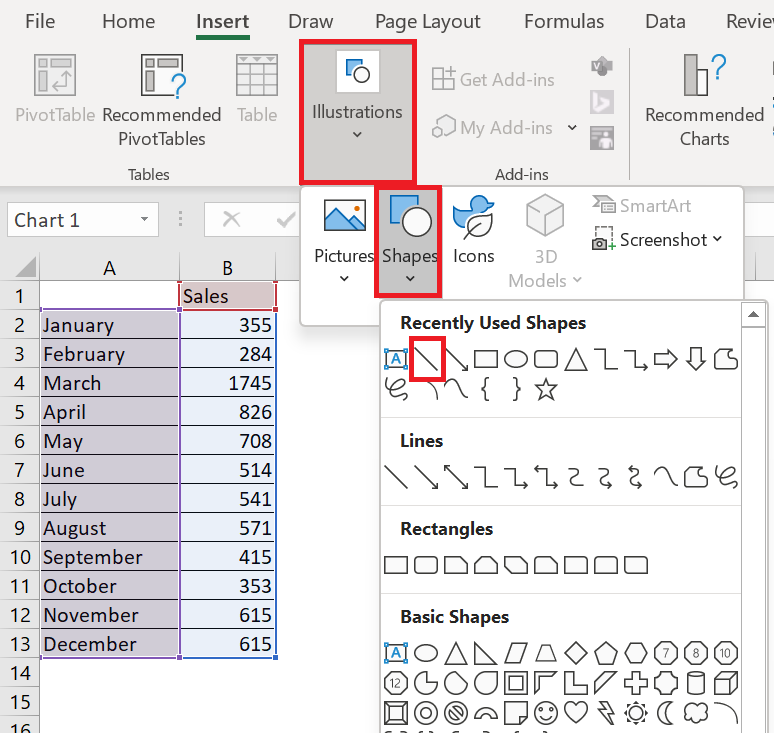
1. Click the chart to select it.
2. Click the Insert tab on the ribbon and click the Shapes button , located on the Illustration item .
3. Select the desired line shape, navigate to your chart, and draw the line where you want it.
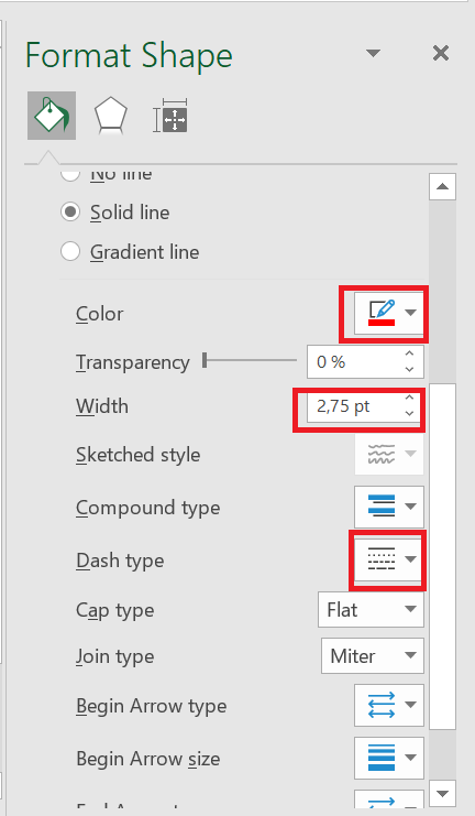
4. Right-click your new line and select Format Object from the menu that appears.
5. Use the Format Object dialog box to format your line’s color, thickness, and style.