How to Make a Gantt Chart in Excel
The Gantt chart is named after Henry Gantt, an American mechanical engineer and management consultant who invented this chart as early as the 1910s. A Gantt chart in Excel represents projects or tasks as cascading horizontal bar charts. A Gantt chart illustrates the project breakdown structure by displaying start and finish dates and various relationships between project activities, helping you track tasks against their planned time or predefined milestones.
1 How to Make a Gantt Chart
Unfortunately, Microsoft Excel doesn’t have a built-in Gantt chart template as an option. However, you can quickly create a Gantt chart in Excel using the bar chart feature and a little formatting.
Please follow the steps below carefully and you will create a simple Gantt chart in less than 3 minutes. You can simulate Gantt charts in any version of Excel in the same way.
1.1 Create a project table
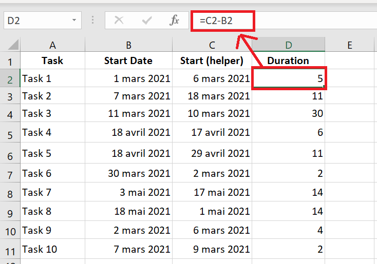
You start by entering your project data into an Excel spreadsheet. List each task as a separate row and structure your project plan by including the Start Date , End Date , and Duration , which is the number of days required to complete the tasks.
Start Date and Duration columns are needed to create an Excel Gantt chart. If you have both Start Dates and End Dates , you can use one of these simple formulas to calculate the duration , whichever works best for you:
Duration = End Date – Start Date
Duration = End Date – Start Date + 1
1.2 Create a standard Excel bar chart based on the start date
You start creating your Gantt chart in Excel by setting up a regular stacked bar chart.
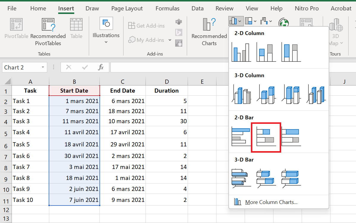
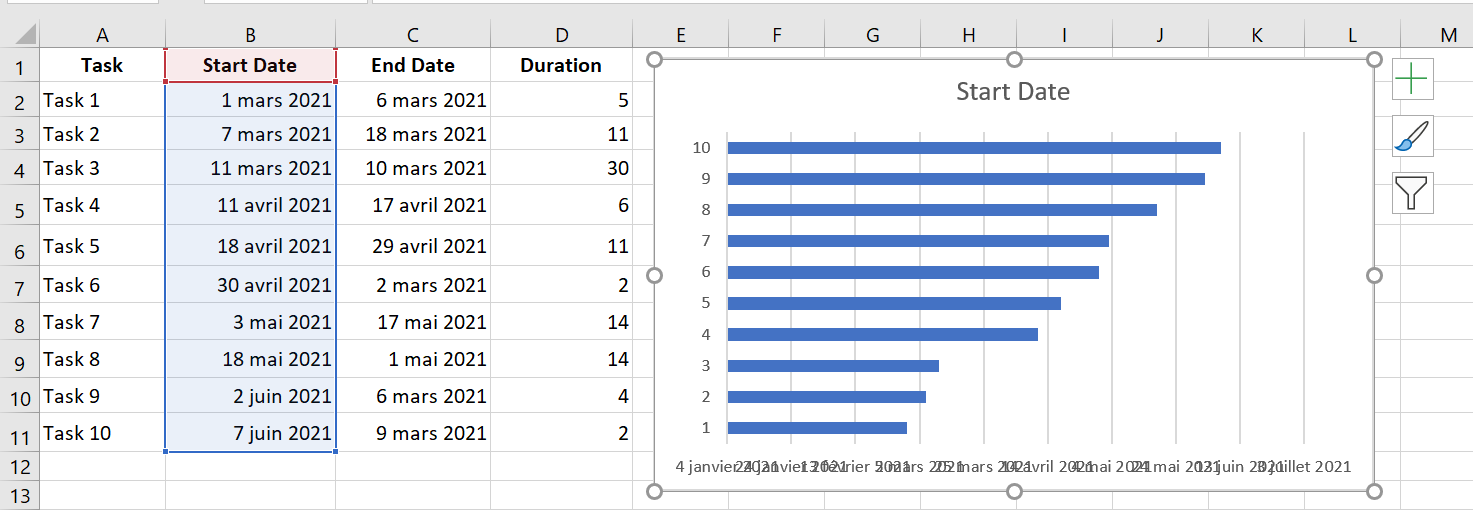
- Select a range of your start dates with the column header, which is B 1:B 11 in our case. Make sure you only select the cells containing data, not the entire column.
- Switch to the Insert tab / Charts group and click Bar .
- In the 2D Bars section , click Stacked Bars .
As a result, you will have the following stacked bar added to your spreadsheet:
1.3 Add duration data to the chart
Now you need to add an additional series to your future Excel Gantt chart.
- Right-click anywhere in the chart area and choose Select Data in the context menu.
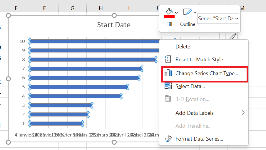
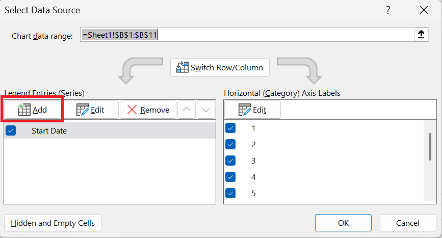
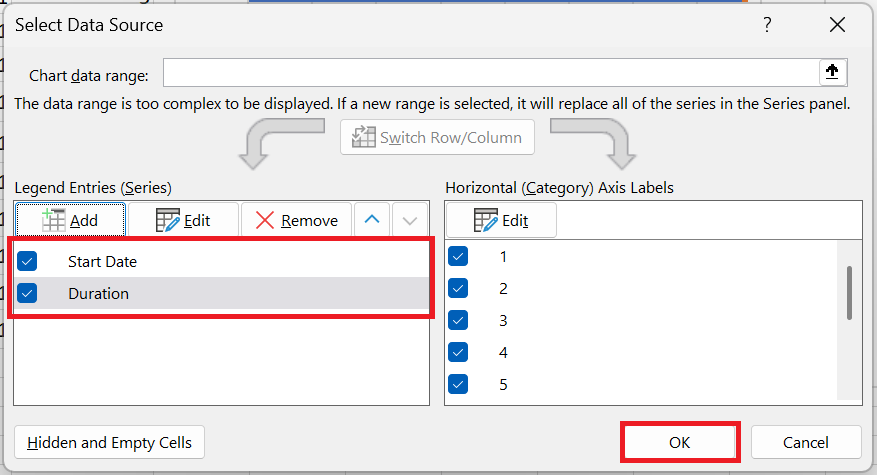
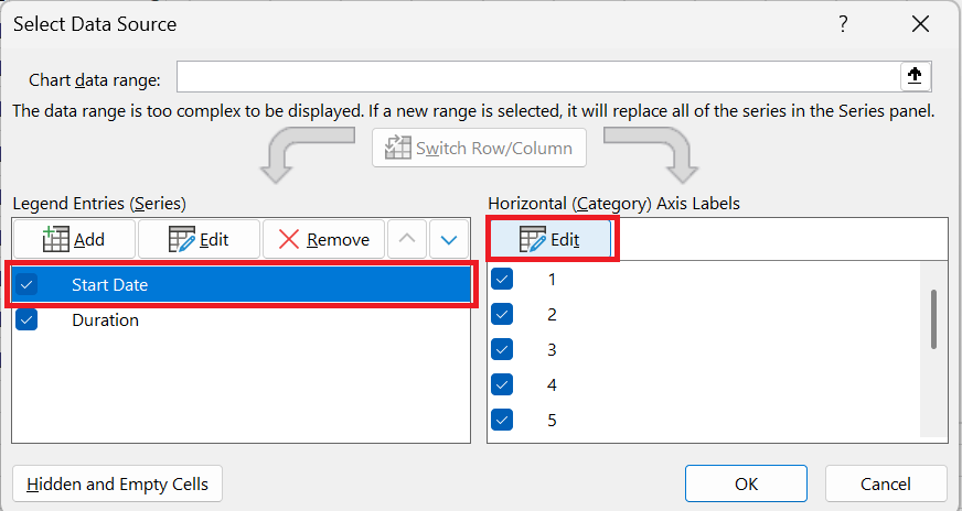
Select Data Source window will open. As you can see in the screenshot below, the start date is already added under Legend Entries (Series) . And you also need to add the duration there .
- Click the Add button to select more data (Duration) that you want to plot in the Gantt chart.
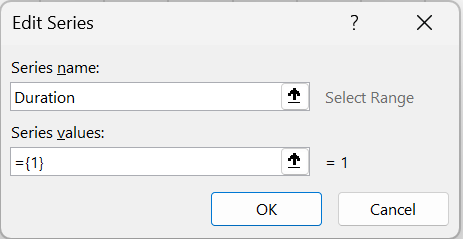
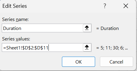
- Edit Series window opens and you do the following:
- In the Series Name field , type » Duration » or any other name you want. You can also place the mouse cursor in this field and click on the column header in your spreadsheet; the clicked header will be added as the series name for the Gantt chart.
- Click the range selection icon next to the
 Series Values field .
- Edit Series window will open. Select your project ‘s Duration data by clicking on the first Duration cell (D2 in our case) and dragging the mouse to the last duration (D11). Make sure you haven’t accidentally included the header or an empty cell.
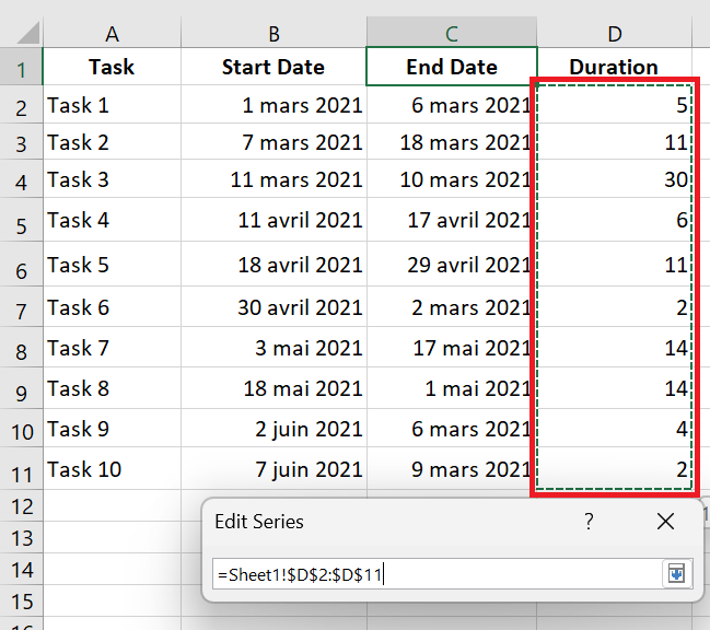
- Click the Minimize Dialog icon to exit this small window. This will return you to the previous Edit Series window with the series name and series values filled in, where you click OK.
- You are now back in the Select Data Source window with the start date and duration added under Legend Entries (Series). Simply click OK to have the duration data added to your Excel chart.
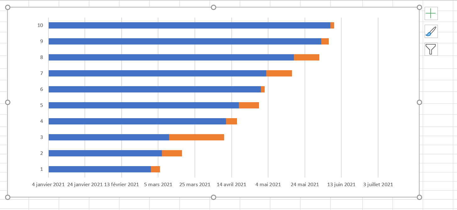
The resulting bar chart should look like this:
1.4 Add task descriptions to the Gantt chart
Now you need to replace the days on the left side of the chart with the task list.
- Right-click anywhere in the chart plot area (the area with blue and orange bars) and click Select Data to display the Select Data Source window again.
- Make sure the start date is selected in the left pane and click the Edit button in the right pane, under Horizontal Axis (Category) Labels .
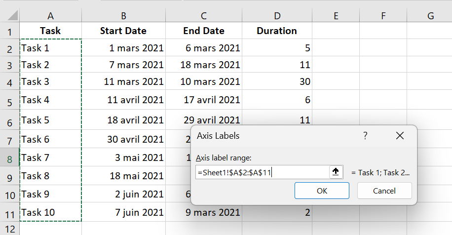
- axis label window opens and you select your tasks the same way you selected durations in the previous step – click the range selection icon
 , then click the first task in your table and drag the mouse to the last task. Remember that the column header should not be included. Once finished, exit the window by clicking the range selection icon again.
- OK twice to close open windows.
- Delete the chart label block by right-clicking it and selecting Delete from the context menu.
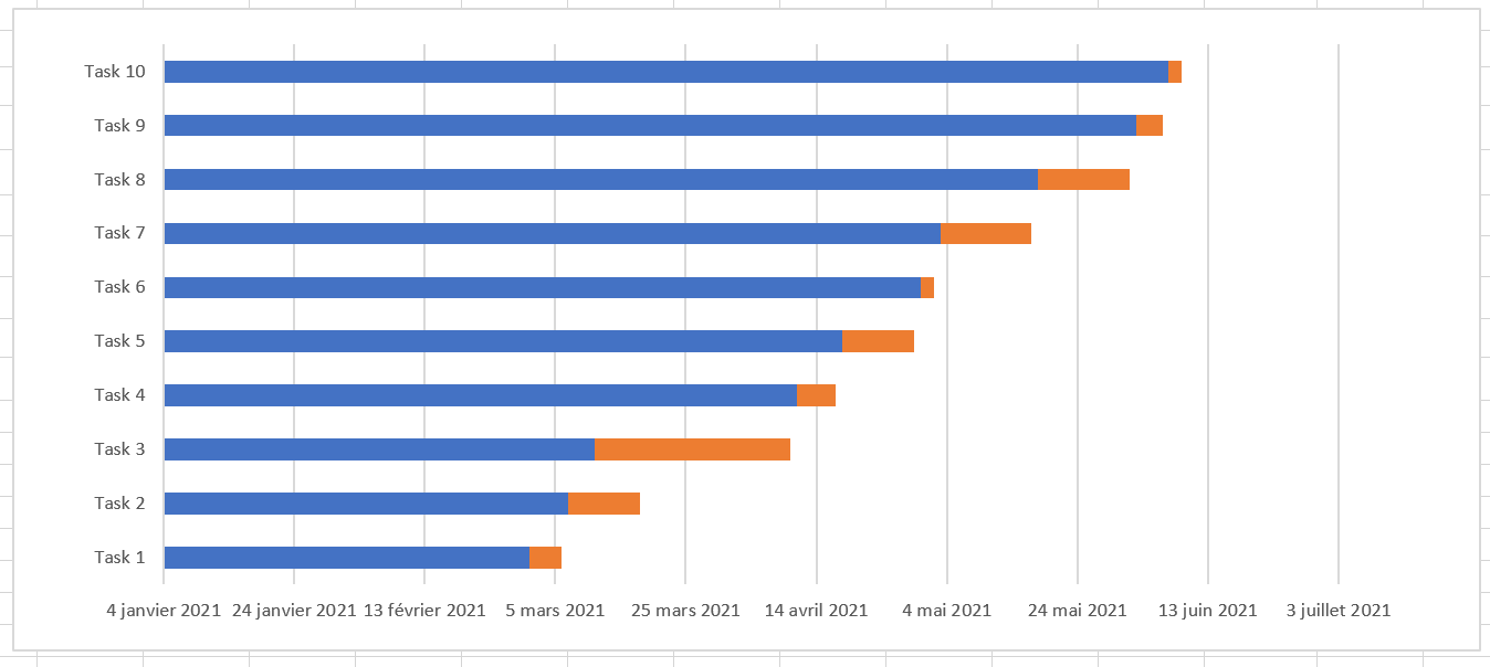
1.5 Convert the bar chart to a Gantt chart
What you have now is still a stacked bar chart. You need to add the appropriate formatting to make it look more like a Gantt chart. Our goal is to remove the blue bars so that only the orange parts representing the project tasks are visible. Technically, we won’t actually remove the blue bars, but rather make them transparent and therefore invisible.
- Click any blue bar in your Gantt chart to select them all, right-click, and choose Format Data Series from the context menu.
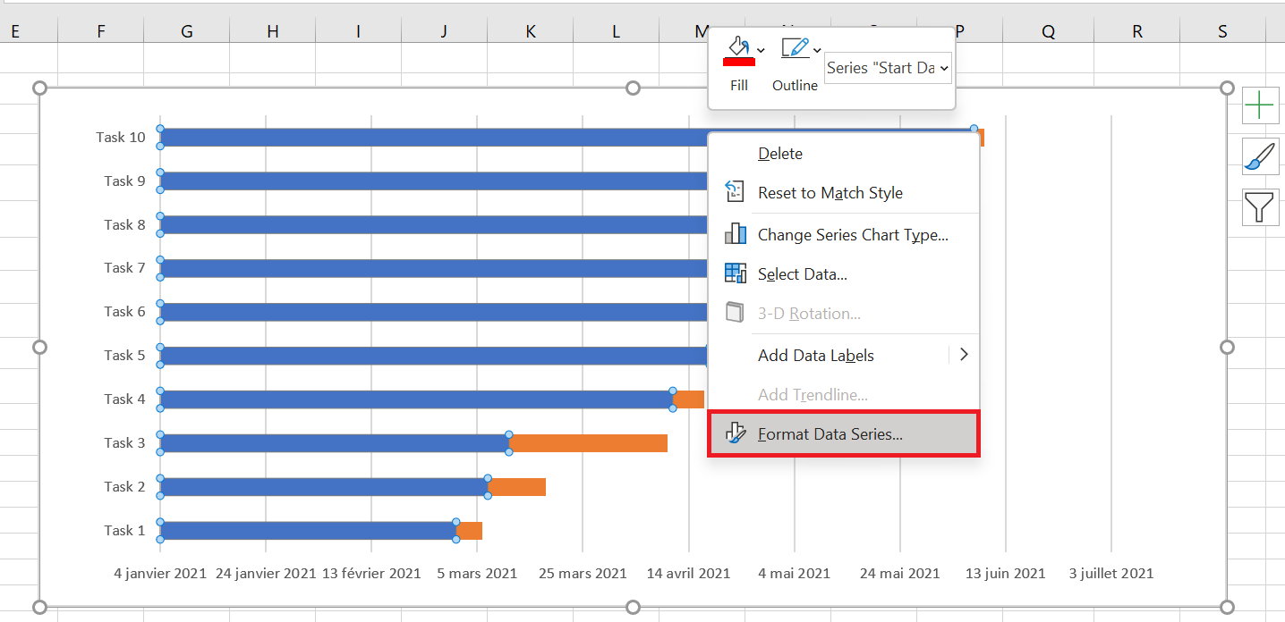
- Format Data Series window appears, and you do the following:
- Switch to the Fill tab and select No Fill .
- Border Color tab and select No Line .
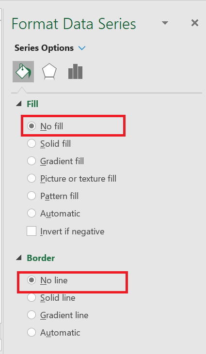
You don’t need to close the dialog box as you will use it again in the next step.
- As you’ve probably noticed, the tasks in your Excel Gantt chart are listed in reverse order . And now we’re going to fix that.
Click the task list on the left side of your Gantt chart to select them. This will display the Format Axis dialog box for you. Select the Reverse X-axis option under Axis Options , and then click the Close button to save all changes.
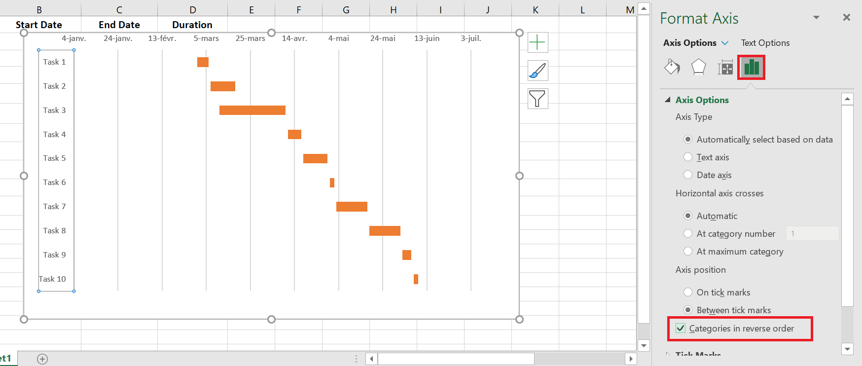
The results of the changes you just made are:
- Your tasks are organized in the correct order on a Gantt chart.
- Date markers are moved from the bottom to the top of the chart.
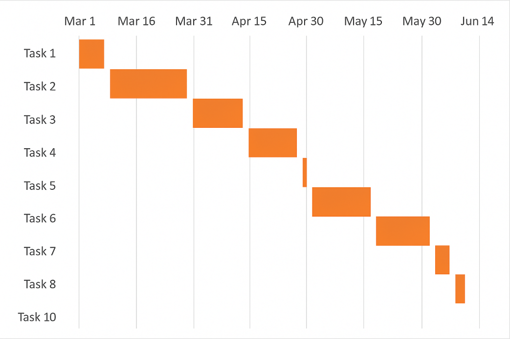
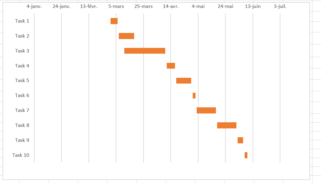
Your Excel chart is starting to look like a normal Gantt chart, isn’t it? For example, my Gantt chart now looks like this:
2 Improve your Gantt chart design
While your Excel Gantt chart is starting to take shape, you can add a few extra finishing touches to make it really sleek.
- Delete the empty space on the left side of the Gantt chart.
As you may recall, the blue start date bars originally resided at the top of your Excel Gantt chart. Now you can remove that white space to move your tasks a little closer to the left vertical axis.
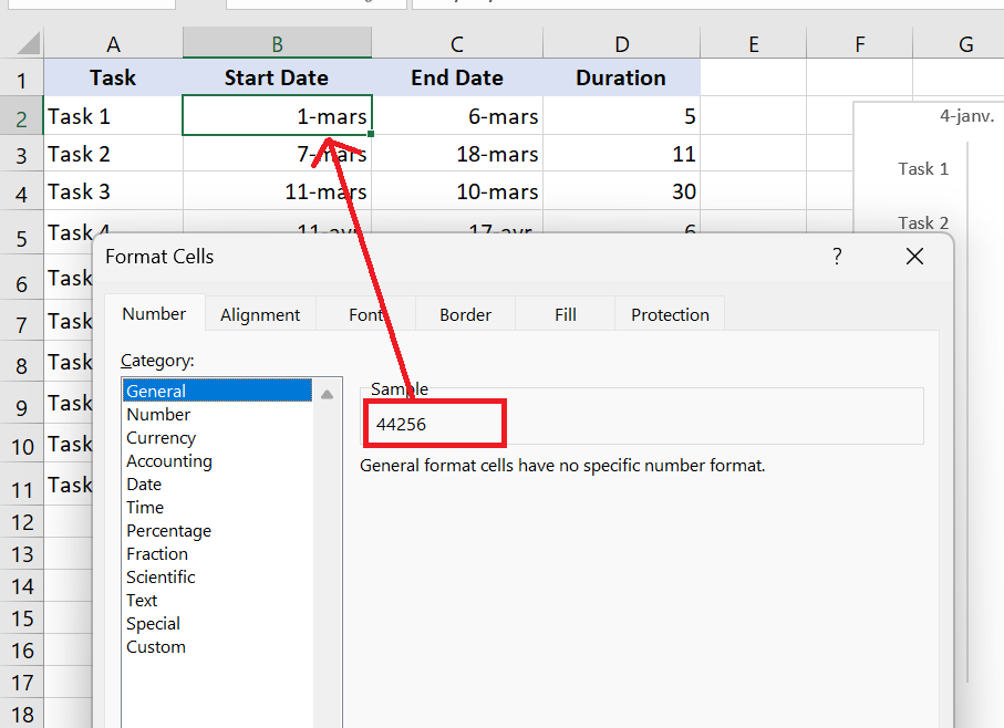
- Right-click the first starting date in your data table and select Format Cells / General . Note the number you see—it’s a numeric representation of the date, in my case 44256. As you probably know, Excel stores dates as numbers based on the number of days since January 1, 1900. Click Cancel, because you don’t actually want to make any changes here.
- Click any date above the task bars in your Gantt chart. One click will select all dates, right-click on it and choose Format Axis from the context menu.
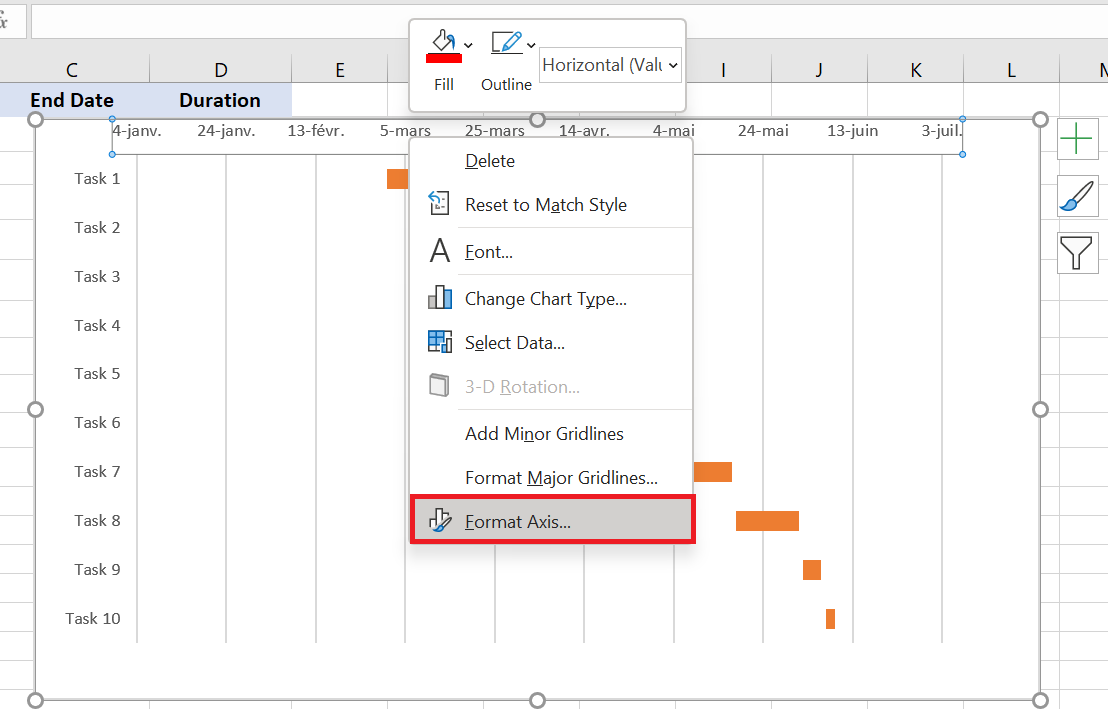
- Under Axis Options , change Minimum to Fixed and enter the number you recorded in the previous step .
- Adjust the number of dates on your Gantt chart.
Format Axis window you used in the previous step, also change the Major Unit and Minor Unit to Fixed , and then add the desired numbers for the date intervals. As a general rule, the shorter the time period in your project, the smaller the numbers you use. For example, if you want to display every other date, enter 2 in the Major Unit . You can see my settings in the screenshot below.
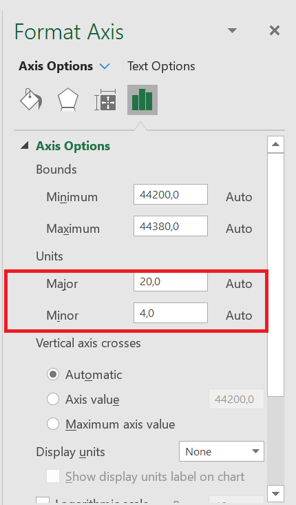
You can play with different settings until you get the result that suits you best. Don’t be afraid of doing something wrong, as you can always revert to the default settings by clicking Reset in Excel 2013 and later.
- Remove excess white space between the bars.
Compacting task bars will make your Gantt chart look even better.
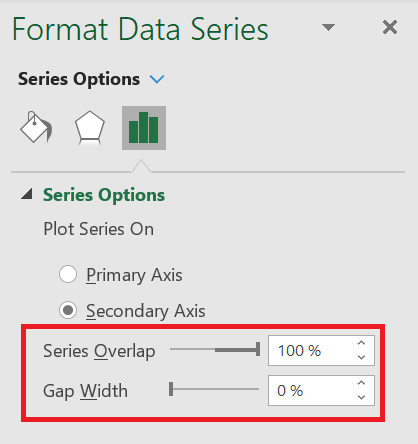
- Click on one of the orange bars to select them all, right-click and select Format Data Series .
- In the Format Data Series dialog box, set Series Overlap to 100% and Width of the interval on 0% (or close to 0%).
nice
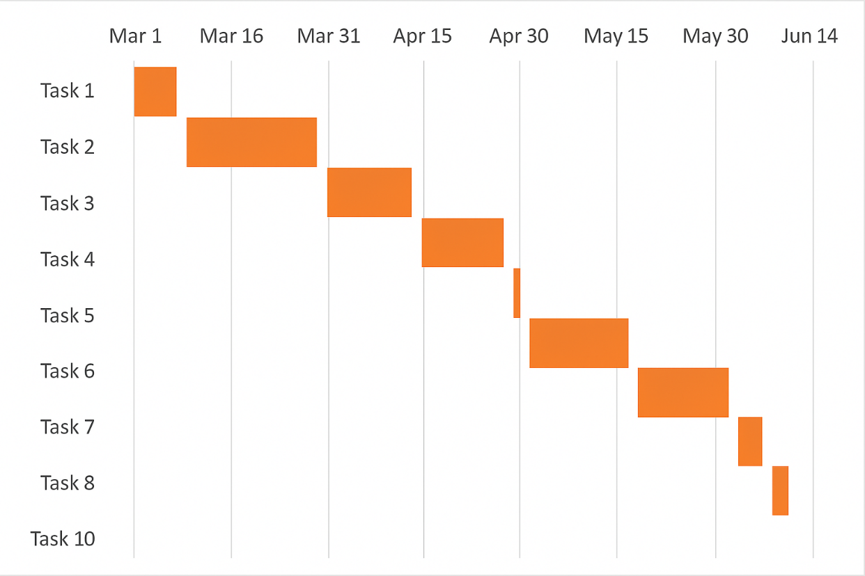 Excel Gantt chart :
Remember that although your Excel chart closely simulates a Gantt chart, it still retains the main characteristics of a standard Excel chart:
- Your Excel Gantt chart will resize as you add or delete tasks.
- You can change a start date or duration, the chart will reflect the changes and adjust automatically.
3 Excel Gantt Chart Templates
As you can see, creating a simple Gantt chart in Excel isn’t a big deal. But what if you want a more sophisticated Gantt chart with percentage complete shading for each task and a vertical milestone or checkpoint line? A faster and less stressful way would be to use an Excel Gantt chart template. Below is a quick overview of several project management Gantt chart templates for different versions of Microsoft Excel.
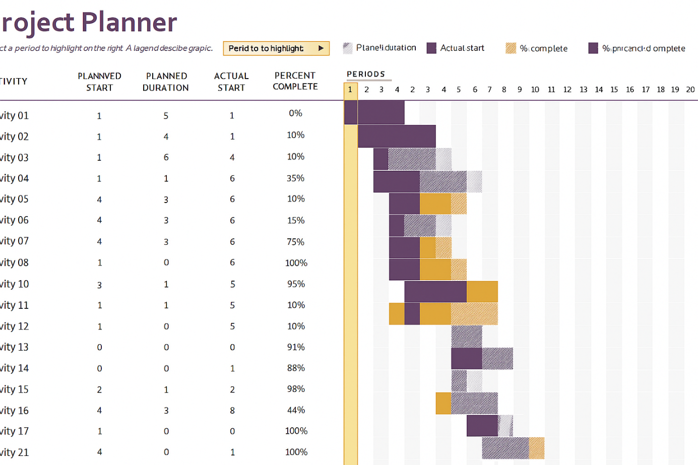
This Excel Gantt chart template, called Gantt Project Planner , is intended to track your project by different activities such as plan start and actual start , plan duration and actual duration , and percentage complete .
In Excel 2013 – 2021, simply go to File/New and type « Gantt » in the search box. This template requires no learning curve, just click on it and it’s ready to use.