PEOPLE GRAPH
I’ve always been fascinated by infographics and story-driven visuals. These kinds of things help me tell a story with data. A pictogram is a great example . But beyond that, there’s a chart in Excel that most of us aren’t aware of. This is called : People Graph

It was first introduced with Microsoft Excel 2013 to help people create infographics. In a people chart, instead of a column, bar, or line, we have icons to present the data. And it looks nice and professional.
1 Seven Steps to Inserting a People Chart
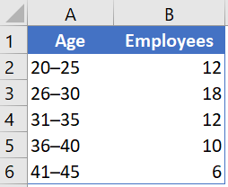
Creating a people chart in Excel is simple and easy; it only takes a few clicks. Here’s the data table I’m using.
-
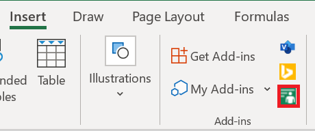
- First, go to Insert on the ribbon in the Add-in group and click on People graph, the little green button.
-
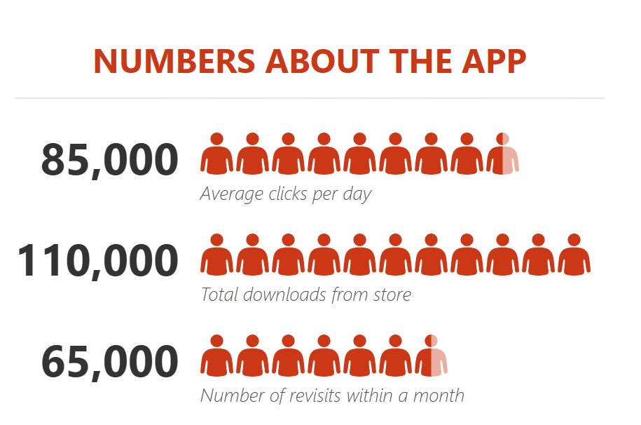
- It will insert a people chart with dummy data.
 3. Now your next step is to connect the data to the chart.
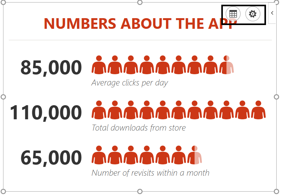
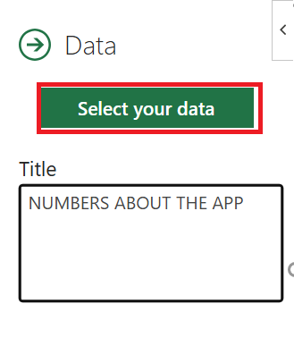
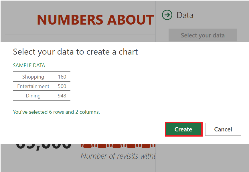
- Click the data icon, then click the button to select your data.
- Now select the data table( A1:B6) and click on the Create button.
- The last thing is to all a title for your chart.
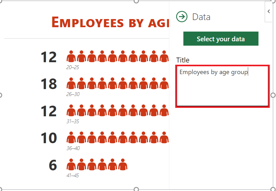
- Click the data icon again and replace the default title with the desired title.
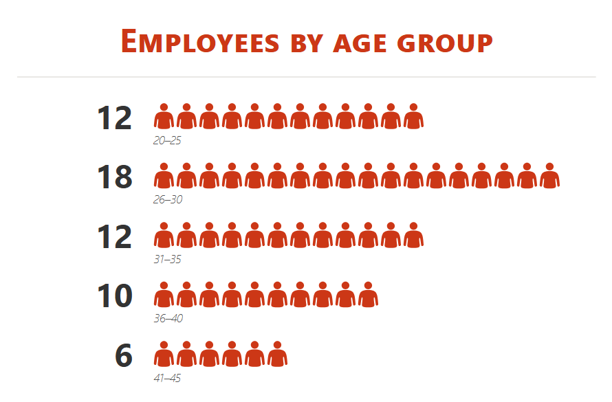
Congratulations ! Your first infographic is ready to tell its story.
2 Customization and other options
As I said, it’s easy to insert a people chart. But, there are a few customization options that can be done after that.
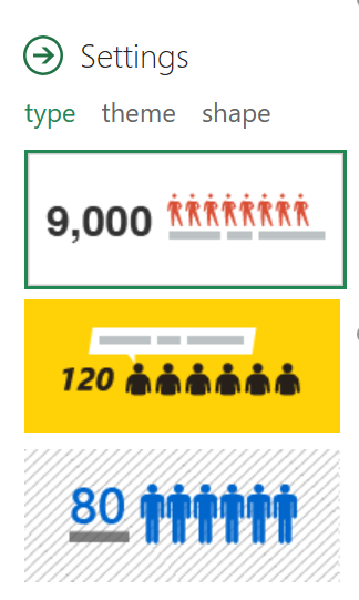
1. Chart type
There are 3 predefined chart types we can use. Click the parameter button and select the type you want.
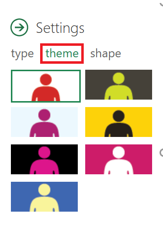
2. Theme
We can also use different themes for our chart. There are 7 predefined themes that we can use. Click the settings button and select the type you want.
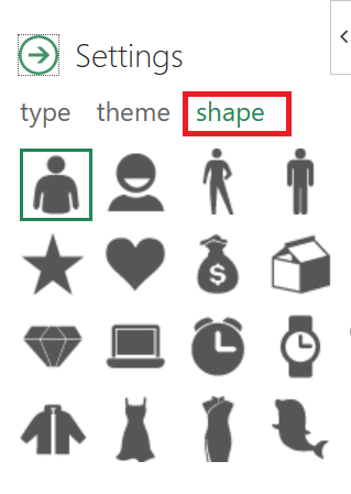
3. Shape (Icon)
We can’t use a single shape for all data types. That’s why there are 16 different shapes to choose from. Click the Settings button and select the shape you want.
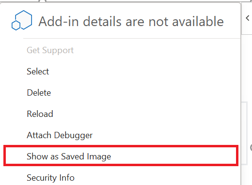
4. Save as image
There is an option to save it as an image. With this, we can use it further in PowerPoint, send it in an email, upload it to the web, etc.
5. More
- When updating a value in the source data, be sure to click once on the chart to update it.
- You can also paste it as an image into the spreadsheet by copy and paste.
Infographics are great for presenting data in a lively way. And I think creating a people chart in Excel is really fun.