Separate pre- and post-merger performance
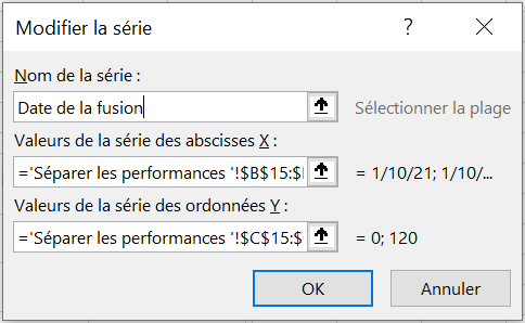
Let’s say your company merged with another company on January 10, 2021, and you’re calculating daily sales. You might want to insert a vertical line into your chart to indicate the merger date. If you draw the vertical line with the Excel Shapes function and the chart is moved, the line will be in the wrong place. To fix this, start by selecting the range E 10: F32 ; create a scatter plot with lines (third option). In the range B 15: C16 , enter the merger date and the lower and upper limits on the y-coordinates of your vertical line. In this case, the lower limit = 0 and the upper limit = 120. Copy the range B 15: C16 and right-click on your chart to select Paste Option , which will insert the vertical line on the date January 10.
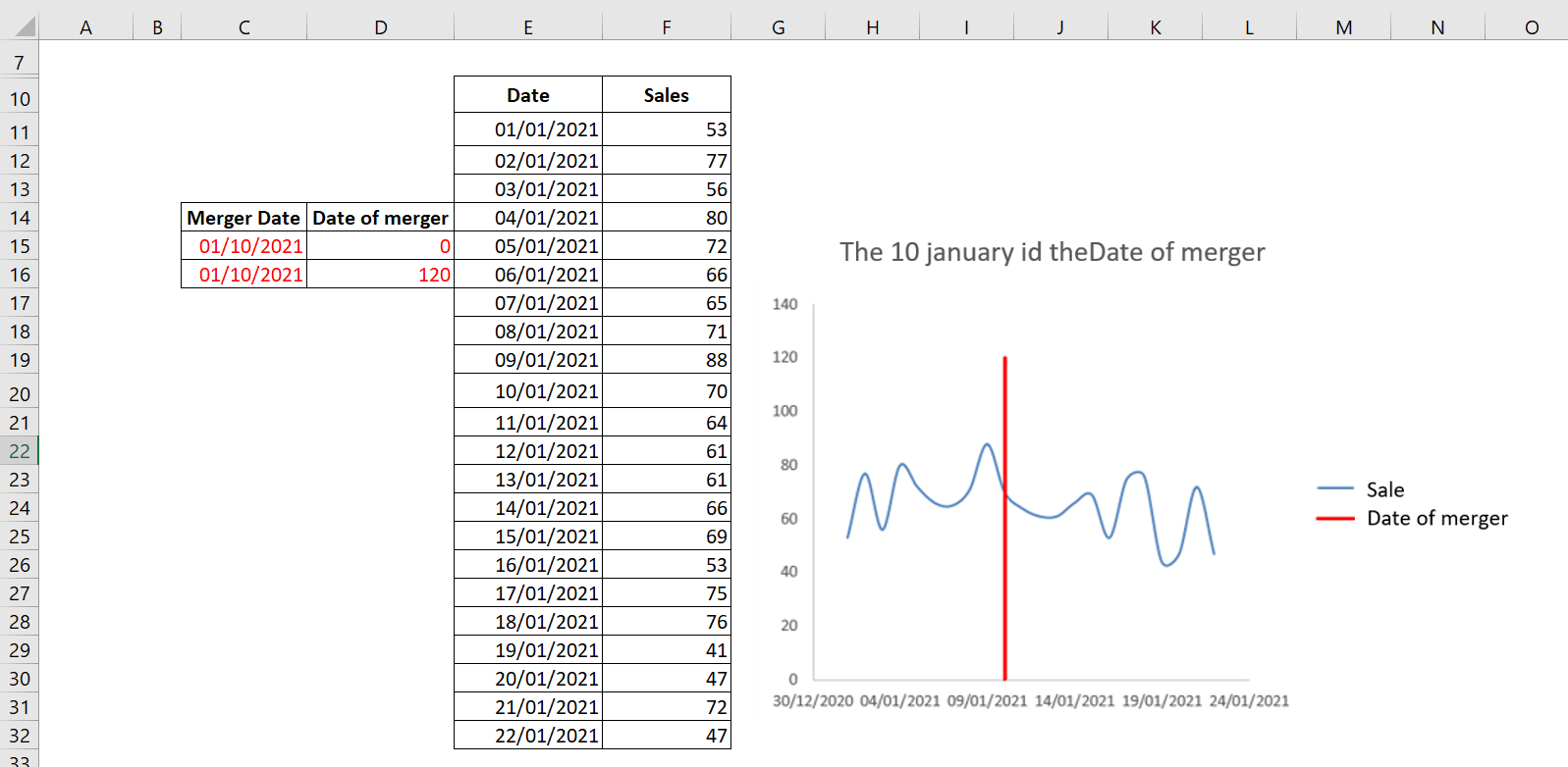
The vertical line indicates that January 10, 2021 was the merger date.
To change the legend to Merge Date , right-click the legend and select Select Data . A dialog box appears as shown in the following figure.
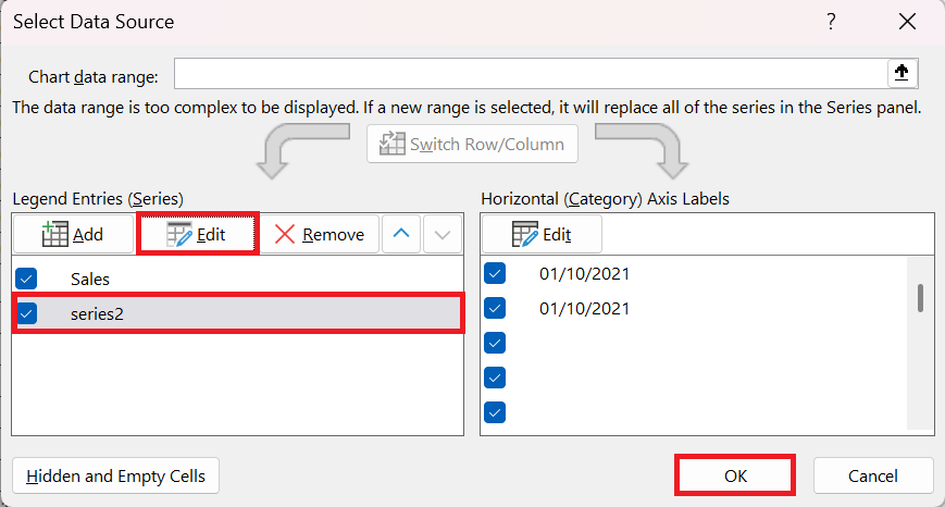
In this dialog box, select Series2 and click Edit to change the name Series2 to Merge Date , as shown in the following figure.