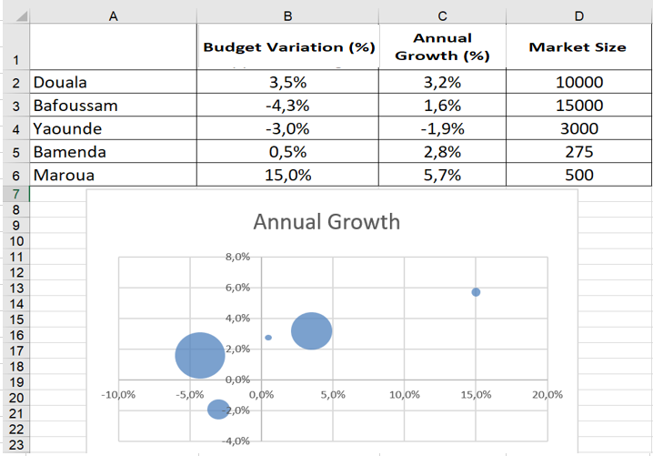
Use a bubble chart to summarize the variation of three variables
While a scatter plot shows you how two variables vary, a bubble chart allows you to visually summarize three variables. The Bubble worksheet contains, for several cities, the percentage change in sales from budget, the annual sales growth, and the market size for each city. To summarize this data in a bubble chart, select the range A1 :D6 , click Scatter Plot, and select Bubbles . After adding a data label for each bubble based on city (cell range A2 : A6) and placing the labels above each bubble, you end up with the bubble chart shown in the following figure. The areas of the bubbles are proportional to the market size of each country. For example, the Bafoussam bubble contains 50% more land area than the Douala bubble.