MILESTONE OR TIMELINE CHART
Keeping track of every step of a project is an important task. As you know, it’s just as important as executing each step. In fact, tracking makes execution easier.
In Excel, one of the simplest yet most powerful charts you can use to track your projects is a milestone chart . They also call it a timeline chart .
This is one of the experts’ favorite project management tools. It visually displays a timeline where you can specify key milestones, deliverables, and other checkpoints.
Milestones are tools used in project management to mark specific points along a project schedule.
The basic idea of a Milestone Chart is to track each step of your project on a timeline with its completion date and present it in a simple way.
We will see how to create a Milestone Chart in Excel in 3 steps.
1 Benefits of Using a Milestone Chart
Before we get into it, let me tell you about the main benefits of using a milestone chart.
■ It is easy to check the progress of the project with milestone chart
■ Easy for user to understand project planning.
■ You have all the important information in a single graph.
2 Steps to Create a Milestone Chart
I have divided the whole process into three steps to make it easier for you to understand.
1. Configure the data
You can easily configure your data for this chart. Make sure you organize your data as shown below.
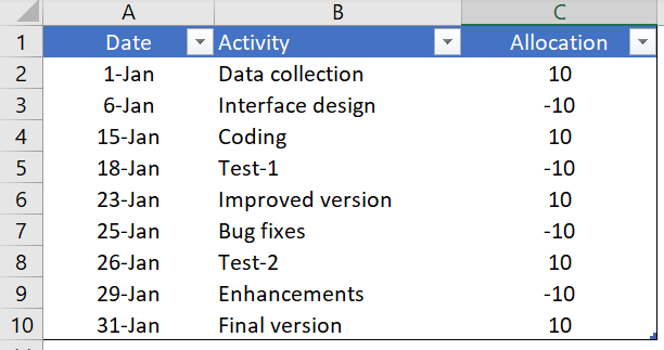
In this data table we have three columns.
- The first column is for the completion dates of the project milestones. And make sure that the format of this column must be in date format.
- The second column is for the activity name.
- The third column is only used to place activities in the timeline (top and bottom).
2. Insert a chart
Now the fun begins. Creating a timeline or milestone chart is a bit of a time-consuming process, but it’s worth it for this stunning chart.
Here are the steps.
- Select one of the cells from the data.
- Go to Insert tab ➜ Charts ➜ curve with markers.
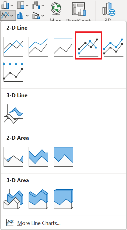
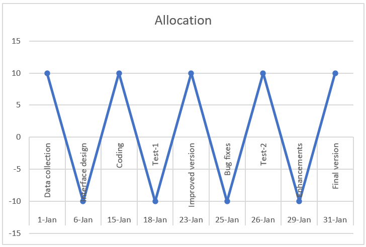
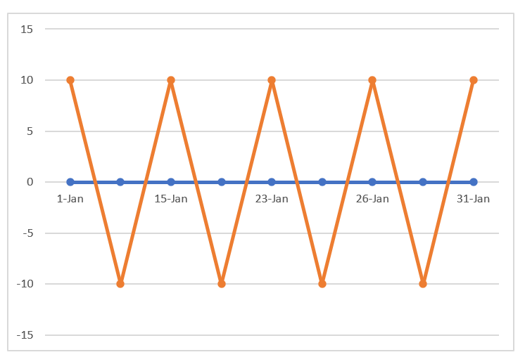
- We’ll get a table like this. But, that’s not what we want, we have to recreate it.
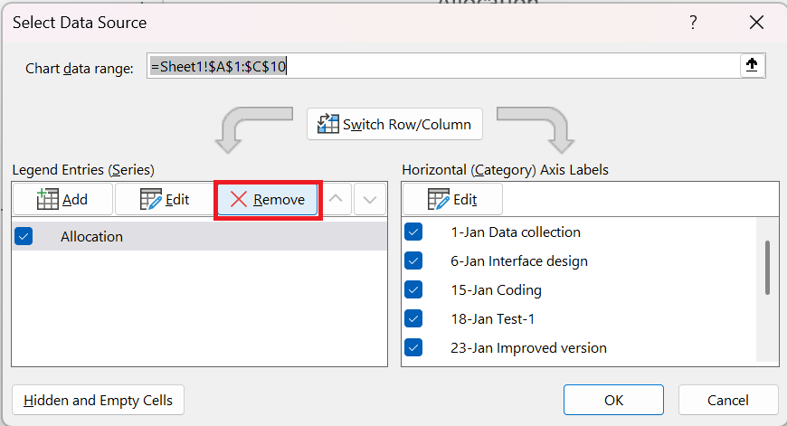
- So now right click on the chart and then go to « Select Data ».
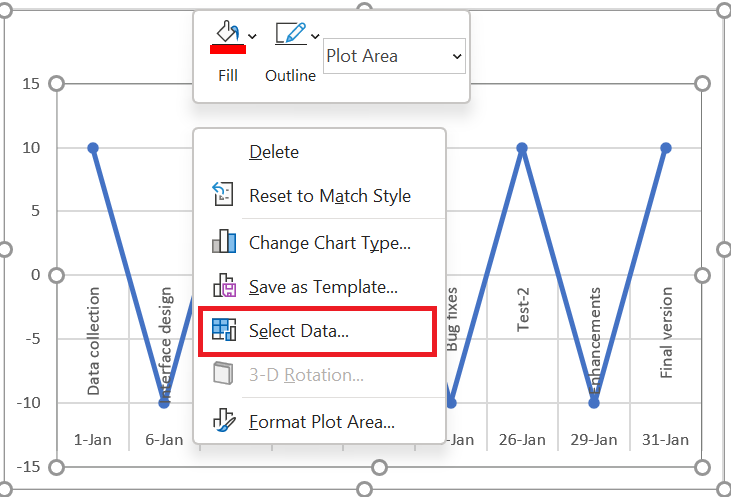
- In the Select Data Source window, simply remove the series from the legend entries.
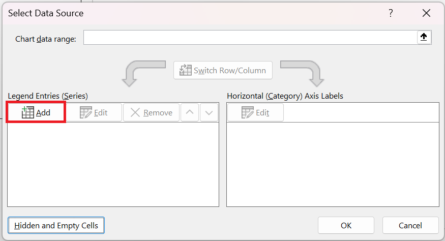
- Now our table is completely empty. So we need to reassign the series and axis labels.
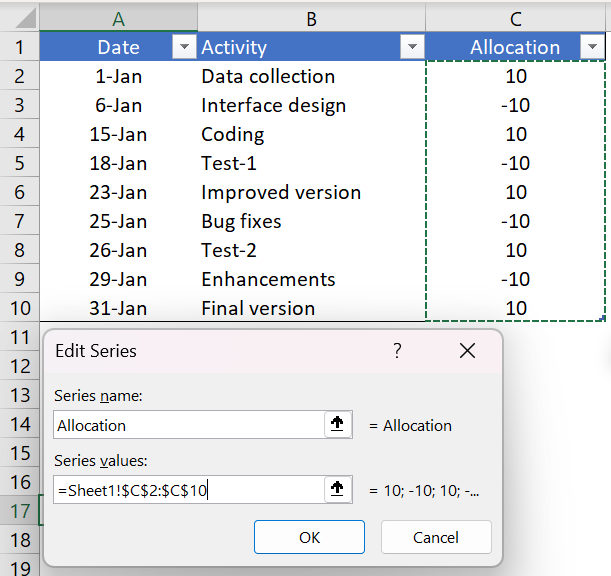
- Click « Add » from the legend entries
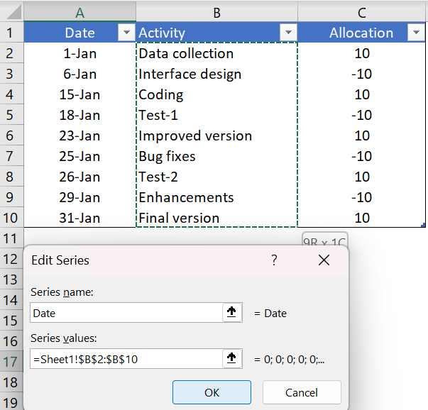
- In the series edit window, enter « Date » in the series name and select the activity column for the series values.
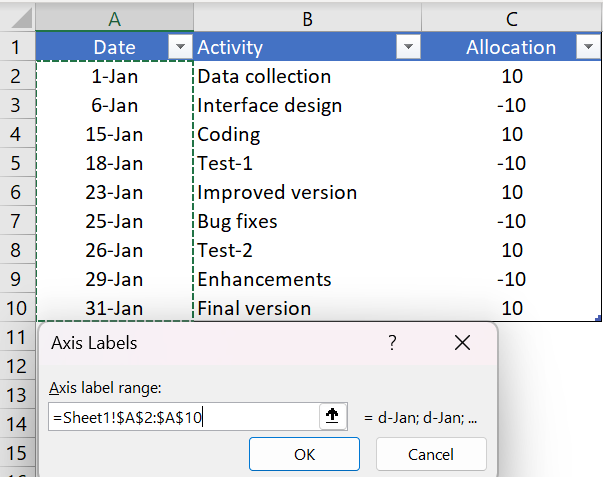
- After that, click edit in « Horizontal Axis Labels »
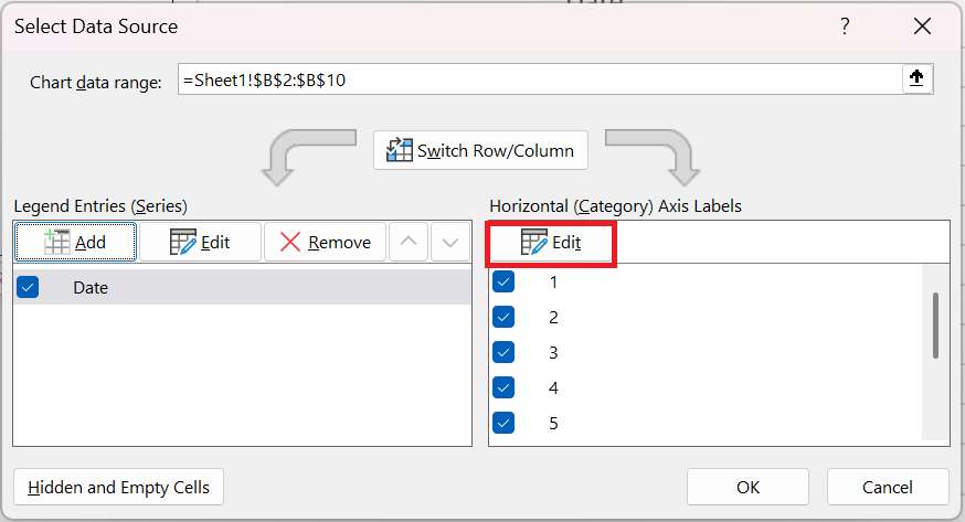
- and refer to the date column and click OK.
- Next, we need to insert another series. Click « Add » in the legend entries and name it « Placement » and refer the series values to the placement column.
- Now just click OK.
At this point, we have a chart that looks like a timeline. But we need a little formatting to make it a perfect Milestone Chart .
4 Final formatting
A little touch of formatting.
Just follow these simple steps.
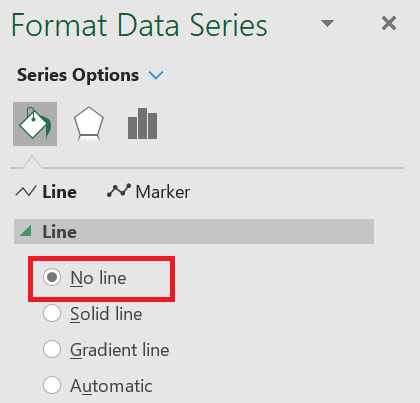
- Click on the line chart (the placement series) and open the formatting option.
- For the curve, use « No stroke ».
- With the same selection, go to Chart Design / Add Chart Element / Error Bars / More Error Bar Options tab.
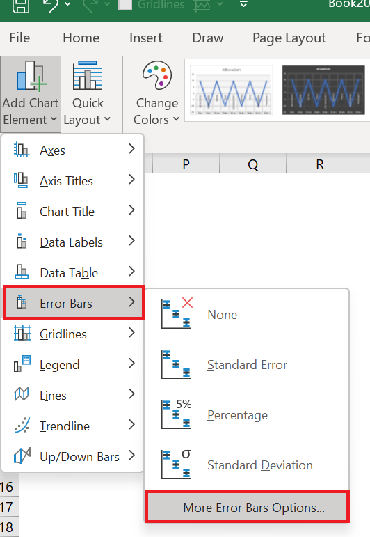
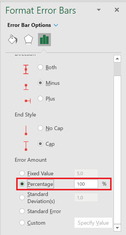
- Now, from the formatting options, select the direction « Minus » and the error value « Percent: 100% » for the error bars.
- After that, convert your line chart (series placement) to secondary axis and instantly remove the secondary axis.

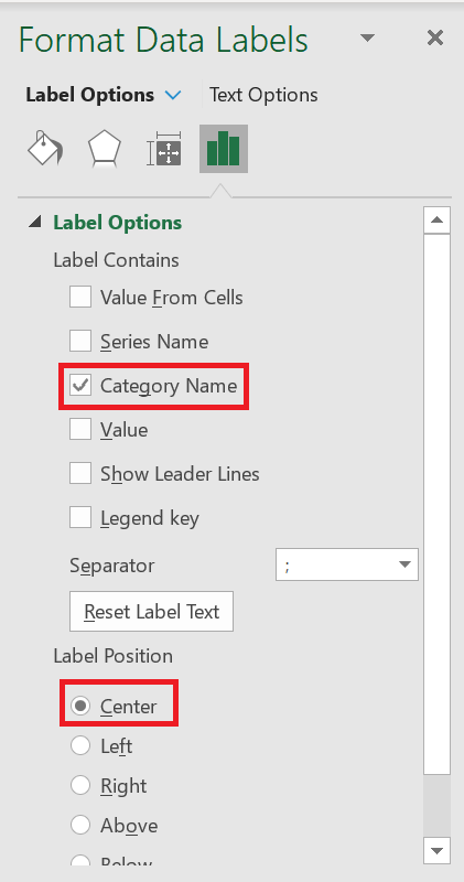
Now the last important thing you need to do is add the activity name for each step.
- First, add data labels.
- Now from the data label formatting options select « Category Name » and on position click center
- After that, select your chart and click on « Select Data ».
- Click on the “Placement” series.
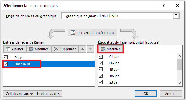 5. From the axis label, click edit and refer to the activity column.
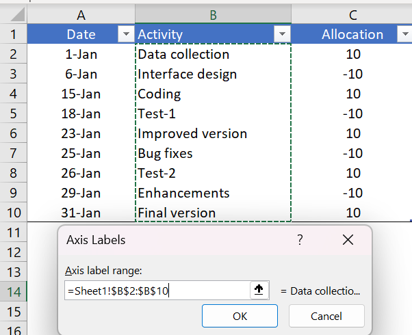
- Click OK.
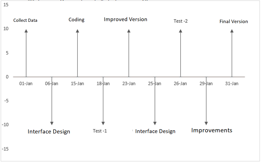
As I said, the Milestone Chart is easy for the end user to understand and allows you to track your project planning in a simple way. It seems a little tricky when you do it for the first time, but if you are an emerging project manager, it is worth giving it a try.