Sparklines in Excel: How to Create, Use, and Edit
Looking for a way to visualize a large amount of data in a small space? Sparklines are a quick and elegant solution. These microcharts are specifically designed to show data trends within a single cell.
1 What is a sparkline chart?
A sparkline is a small chart that resides in a single cell. The idea is to place a visual near the original data without taking up too much space, which is why sparklines are sometimes called « line charts. »
Sparklines can be used with any numeric data in a tabular format. Typical uses include visualizing temperature fluctuations, stock prices, periodic sales figures, and any other variations over time. You insert sparklines next to rows or columns of data and get a clear graphical presentation of a trend in each individual row or column.
Sparklines were introduced in Excel 2010 and are available in all later versions of Excel 2013, Excel 2016, Excel 2019, and Excel for Office 365. 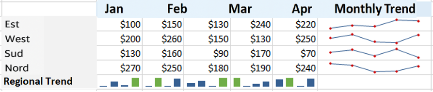
2 How to Insert Sparklines in Excel
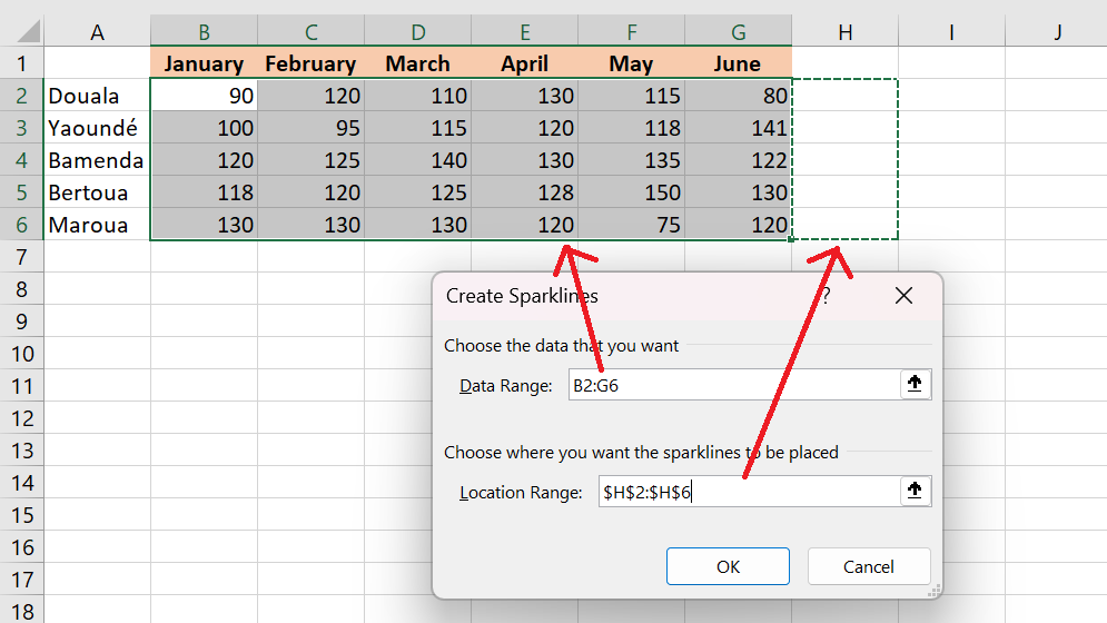
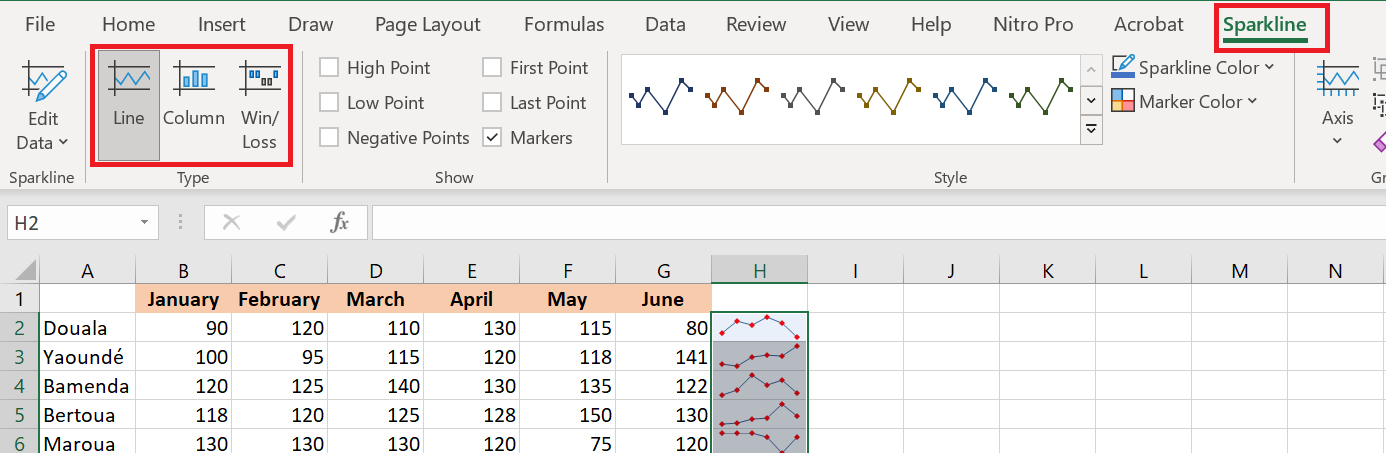
To create a sparkline chart in Excel, follow these steps:
- Select an empty cell where you want to add a sparkline, usually at the end of a row of data.
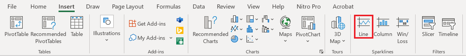
- Insert tab , in the Sparklines group , choose the type you want: Line , Histogram or Conclusions and Losses .
- Create Sparklines dialog window , place the cursor in the Data Range box and select the range of cells to include in a sparkline.
- Click OK .

There you have it—your very first mini chart appears in the selected cell. Want to see how the data changes in the other rows? Simply drag the fill handle to instantly create a similar sparkline for each row in your table. 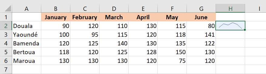
3 How to Add Sparklines to Multiple Cells
In the previous example, you already know one way to insert sparklines into multiple cells: add it to the first cell and copy it. Alternatively, you can create sparklines for all cells at once. The steps are exactly the same as those described above, except you select the entire range instead of a single cell.
Here are the detailed instructions for inserting sparklines into multiple cells:
- Select all the cells where you want to insert mini-charts.
- Insert tab and choose the type of sparkline you want.
- Create Sparklines dialog box , select all the source cells for the data range .
- Make sure Excel displays the correct range of locations where your sparkline should appear.
- Click OK .
4 Types of Sparkline
Microsoft Excel provides three types of sparkline charts: Line, Column, and Profit/Loss.
4.1 Line Sparkline
These sparklines look a lot like small, simple lines. Similar to a traditional Excel line chart , they can be drawn with or without markers. You’re free to change the line style as well as the color of the line and markers. We’ll see how to do all of this a little later, and in the meantime, we’ll show you an example of sparklines with markers: 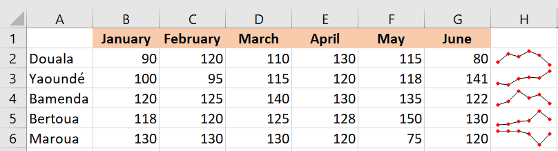
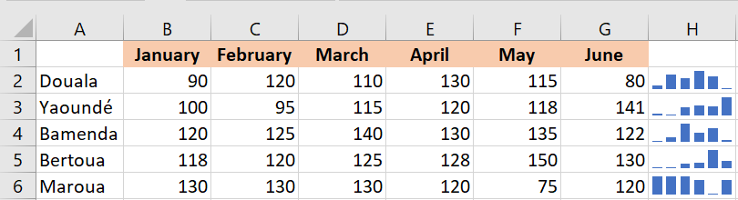
4.2 Column Sparkline
These tiny charts appear as vertical bars. As with a traditional column chart, positive data points are above the x-axis and negative data points are below the x-axis. Zero values are not displayed—a blank space is left at a zero data point. You can set any color for the positive and negative mini-columns, as well as highlight the largest and smallest points.
4.3 Sparkline of Conclusions and Losses
This type looks a lot like a column sparkline chart, except it doesn’t display the magnitude of a data point—all bars are the same size regardless of the original value. Positive values (gains) are plotted above the x-axis, and negative values (losses) are plotted below the x-axis.
You can think of a win/loss sparkline as a binary microchart, best used with values that can only have two states, such as True/False or 1/-1. For example, this works well for displaying game results, where 1s represent wins and -1s represent losses: 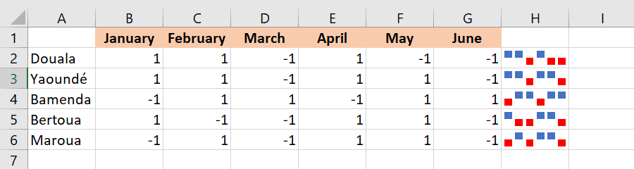
5 How to Change Sparklines in Excel
After creating a microchart in Excel, what’s the next thing you’d typically want to do? Customize it to your liking! All customizations are done on the Sparkline tab , which appears as soon as you select an existing sparkline in a sheet.
5.1 Change the sparkline type
To quickly change the type of an existing sparkline, follow these steps:
- Select one or more sparklines in your spreadsheet.
- Sparkline tab .
- In the Type group , choose the one you want.
5.2 Display markers and highlight specific data points
To make the most important points of the sparklines more visible, you can highlight them in a different color. Additionally, you can add markers for each data point. To do this, simply select the desired options on the Sparkline tab , in the Show group : 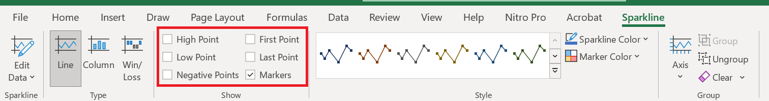
Here is a brief overview of the available options:
- High Point – Highlights the maximum value in a sparkline chart.
- Low Point – Highlights the minimum value in a sparkline chart.
- Negative Points – highlights all negative data points.
- First Point – Shades the first data point in a different color.
- Last Point – Changes the color of the last data point.
- Markers – Adds markers to each data point. This option is only available for linear sparklines.
5.3 Change the sparkline color, style, and line width
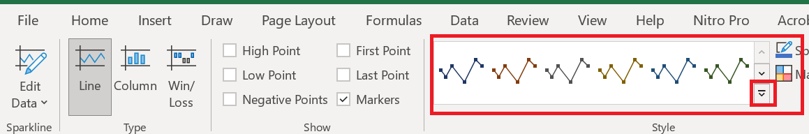
To change the appearance of your sparklines, use the style and color options located on the Sparkline tab , in the Style group :
- To use one of the predefined sparkline styles , simply select it from the gallery. To see all styles, click the Plus button in the lower right corner.
- If you don’t like the default Excel sparkline color , click the arrow next to Sparkline Color and choose your preferred color. To adjust the line width , click the Weights option and choose from the list of preset widths or set a custom Weight. The Weight option is only available for sparklines.
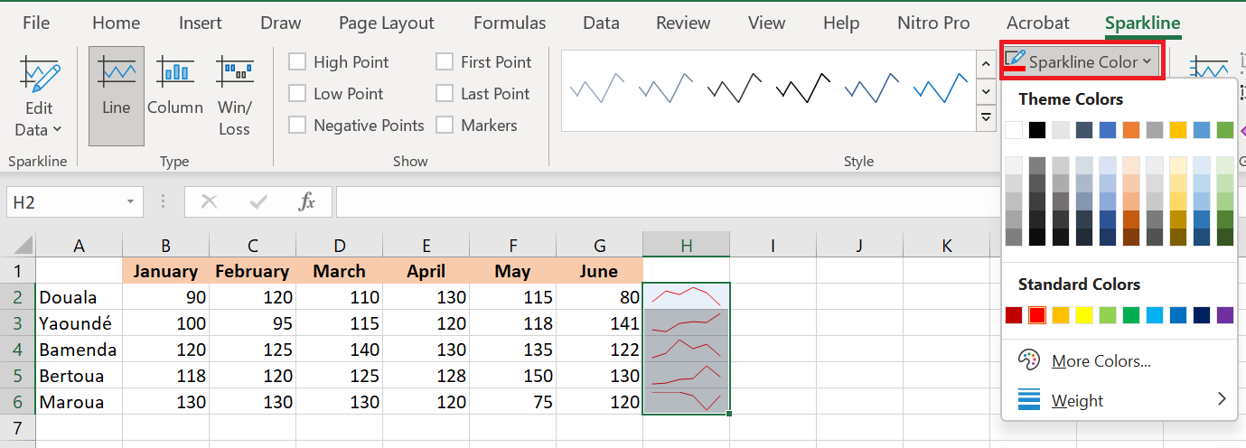
- To change the color of markers or specific data points, click the arrow next to Marker Color and select the item you want:

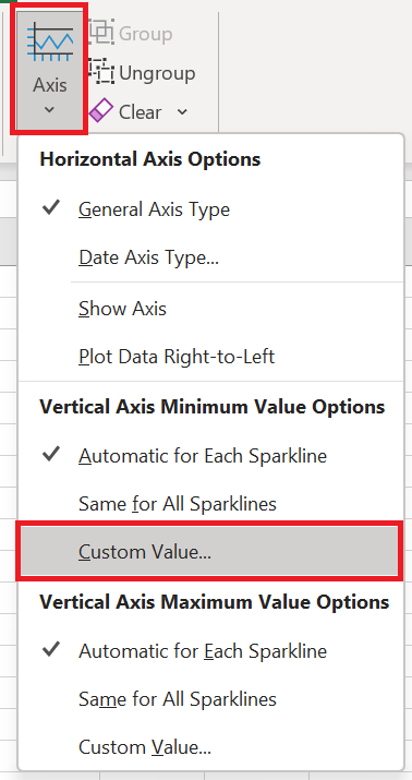
6 Customize the sparkline axis
Typically, Excel sparklines are drawn without axes or coordinates. However, you can display a horizontal axis if needed and make some other customizations. Details follow below.
6.1 How to change the axis start point
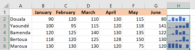
By default, Excel draws a sparkline chart this way—the smallest data point at the bottom and all other points relative to it. In some situations, however, this can be confusing, making the lowest data point appear close to zero and the variation between data points greater than it actually is. To solve this problem, you can make the vertical axis start at 0 or any other value you deem appropriate. To do this, follow these steps:
- Select your sparklines.
- Sparkline tab , click the Axis button .
- Under Vertical Axis Minimum Value Options , select Custom Value…
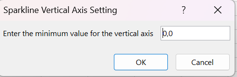
- In the dialog box that appears, enter 0 or another minimum value for the vertical axis that you deem appropriate.
- Click OK .
The image below shows the result: by forcing the sparkline to start at 0, we got a more realistic picture of the variation between data points:
Before
After 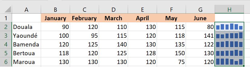
Be very careful with axis customizations when your data contains negative numbers – if you set the minimum y-axis value to 0, all negative values will disappear from a sparkline chart.
6.2 How to display the x-axis in a sparkline chart
To display a horizontal axis in your microchart, select it and then click Axis / Show Axis in the tab Sparkline . 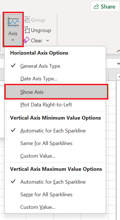
This works best when the data points fall on both sides of the x-axis, i.e. you have both positive and negative numbers: 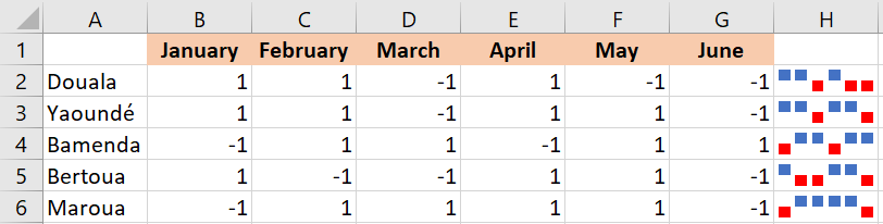
6.3 How to group and ungroup sparklines
When you insert multiple sparklines in Excel, grouping them gives you a big advantage: you can edit the entire group at once.
To group sparklines , here’s what you need to do:
- Select at least two mini-charts.
- Sparkline tab , click the Group button .

To ungroup sparklines , select them and click the Ungroup button .
Tips and notes:
- When you insert sparklines into multiple cells , Excel automatically groups them.
- Selecting a single sparkline in a group selects the entire group.
- Grouped sparklines are of the same type. If you group different types, say Line and Column, they will all be of the same type.
6.4 How to resize sparklines
Because Excel sparklines are background images in cells, they are automatically resized to fit the cell:
- To change the width of the sparklines, expand or shrink the column.
- To change the height of the sparklines, make the line bigger or shorter.
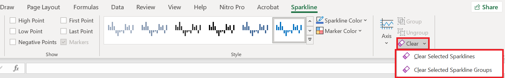
6.5 How to delete a sparkline chart
When you decide to delete a sparkline chart you no longer need, you might be surprised to find that pressing the Delete key has no effect.
Here are the steps to delete a sparkline chart in Excel:
- Select the sparkline(s) you want to delete.
- In the tab Sparkline , do one of the following:
- To delete only the selected sparklines, click the Clear button .
- To delete the entire group, click Clear / Clear Selected Sparkline Groups .