Votre panier est actuellement vide !
Étiquette : Excel diagram
How to Add Error Bars in Excel: Standard and Custom
Many of us are uncomfortable with uncertainty because it’s often associated with a lack of data, inefficient methods, or poor research approaches. The truth is, uncertainty isn’t a bad thing. In business, it prepares your company for the future. In medicine, it generates innovation and leads to technological breakthroughs. In science, uncertainty is the beginning of an investigation. And because scientists like to quantify things, they’ve found a way to quantify uncertainty. To do this, they calculate confidence intervals, or margins of error, and display them using something called error bars.
1 What are error bars?
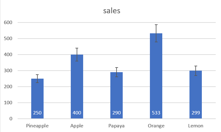
Error bars in Excel charts are a useful tool for representing data variability and measurement precision. In other words, error bars can show you how far the actual values may be from the reported values.
In Microsoft Excel, error bars can be inserted into bar, column, line, and area charts, XY (scatter) charts, and 2D bubble charts. Both vertical and horizontal error bars can be displayed in scatter and bubble charts .
You can set error bars as standard error, percentage, fixed value, or standard deviation. You can also set your own error amount and even provide an individual value for each error bar.
2 Add error bars
In Excel 2019, Excel 2016, and Excel 2013, inserting error bars is quick and easy:
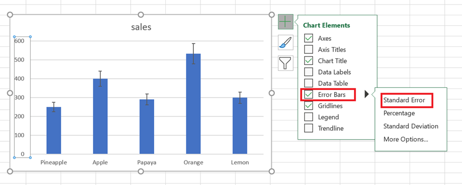
- Click anywhere in your chart.
- Click the Chart Elements button to the right of the chart.
- Click the arrow next to Error Bars and choose the desired option:
- Standard Error – Displays the standard error of the mean for all values, which shows how far the sample mean is likely to be from the population mean.
- Percentage – adds error bars with the default value of 5%, but you can set your own percentage by choosing More options .
- Standard Deviation – Shows the degree of variability in the data, i.e., how close it is to the mean. By default, bars are plotted with 1 standard deviation for all data points.
- Other options… – allows you to specify your own error bar amounts and create custom error bars.
Choosing More Options opens the Format Error Bars pane where you can:
- Set your own amounts for the fixed value , percentage , and standard deviation error bars .
- Choose the direction (positive, negative, or both) and the ending style (heading, no heading).
- Create custom error bars based on your own values.
- Change the appearance of error bars.
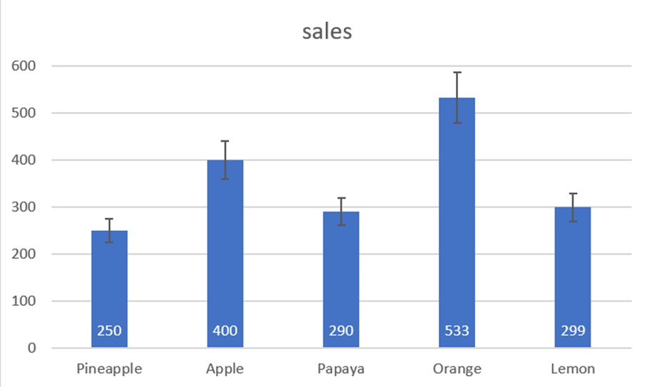
For example, let’s add 10% error bars to our chart. To do this, select Percentage and type 10 in the input box:

3 Add custom error bars
The standard error bars provided by Excel work fine in most situations. But if you want to display your own error bars, you can do that easily too.
To create custom error bars in Excel, follow these steps:
- Click the Chart Elements button .
- Click the arrow next to Error Bars , then click More Options…
- Format Error Bars pane , switch to the Error Bar Options tab (the last one). Under Margin of error , select Custom and click the Specify a value button .
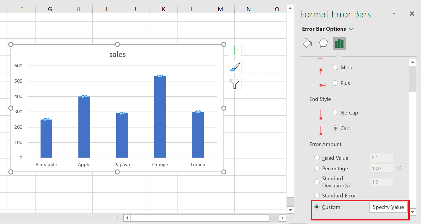
- Custom Error Bars dialog box appears with two fields, each containing an array element like ={ 1} . You can now enter your own values in the boxes (without equal signs or braces; Excel will add them automatically) and click OK .

If you don’t want to display positive or negative error bars, enter zero (0) in the corresponding box, but don’t uncheck the box completely. If you do this, Excel will think you simply forgot to enter a number and will keep the previous values in both boxes.
This method adds the same constant error values (positive and/or negative) to all data points in a series. But in many cases, you’ll want to put an individual error bar at each data point, and the following example shows how to do this.
4 create individual error bars (of different lengths)
When you use one of the built-in error bar options (standard error, percentage, or standard deviation), Excel applies one value to all data points. But in some situations, you may want to have your own error values calculated on individual points. In other words, you want to plot error bars of different lengths to reflect different errors for each data point on the chart.
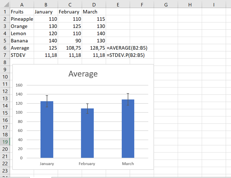
In this example, we’ll show you how to create individual standard deviation error bars. To start, enter all the error bar values (or formulas) into separate cells, usually in the same columns or rows as the original values. Then, tell Excel to graph the error bars based on these values.
Let’s say you have 3 columns with sales numbers. You calculated a mean (B 6:D 6) for each column and plotted these means in a graph. In addition, you found the standard deviation for each column (B 7:D 7) using the STDEV.PEARSON function . And now you want to display these numbers in your graph as standard deviation error bars. Here’s how:
- Click the Chart Elements / Error Bars buttonOther options .
- In the Format Error Bars pane , select Custom and click the Specify Value button .
- Custom Error Bars dialog box , delete the contents of the Positive error value box , place the mouse pointer in the box (or click the Collapse dialog icon next to it), and select a range in your worksheet (B7:D7).
- Do the same for the Negative Error Value box . If you don’t want to display negative error bars, type 0.
- Click OK .

Make sure to delete all the contents of the input boxes before selecting a range. Otherwise, the range will be added to the existing table as shown below, and you will end up with an error message:
={1} +Sheet1!$B$7:$D$7
It is quite difficult to spot this error because the boxes are narrow and you cannot see all the content.
If everything is done correctly, you will get individual error bars , proportional to the standard deviation values you calculated :
5 Add horizontal error bars
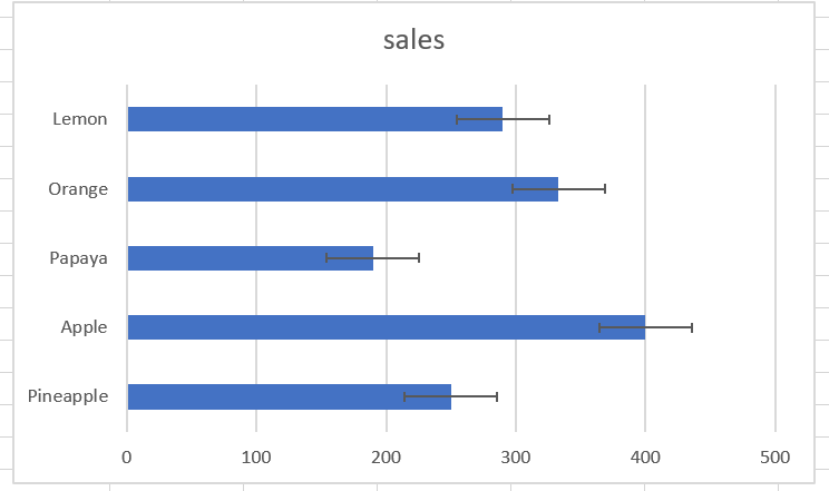
For most chart types, only vertical error bars are available. Horizontal error bars can be added to bar charts, XY scatter plots, and bubble charts.
For bar charts (not to be confused with column charts), horizontal error bars are the default and only available type. The screenshot below shows an example of a bar chart with error bars in Excel:
In bubble and scatter charts , error bars are inserted for the x (horizontal) and y (vertical) values.
If you want to insert only horizontal error bars, simply remove the vertical error bars from your chart. Here’s how:
- Add error bars to your chart as usual.
- Right-click any vertical error bar and choose Delete from the context menu.

This will remove the vertical error bars from all data points. You can now open the Format Error Bars pane (double-click one of the remaining error bars) and customize the horizontal error bars as desired.

6 Make error bars for a specific data series
Sometimes, adding error bars to all data series in a chart can make it look cluttered and messy. For example, in a combo chart, it often makes sense to place error bars on only one series. This can be done with the following steps:
- In your chart, select the data series to which you want to add error bars.
- Click the Chart Elements button .
- Click the arrow next to Error Bars and choose the type you want.
The screenshot below shows how to create error bars for the data series represented by a line:
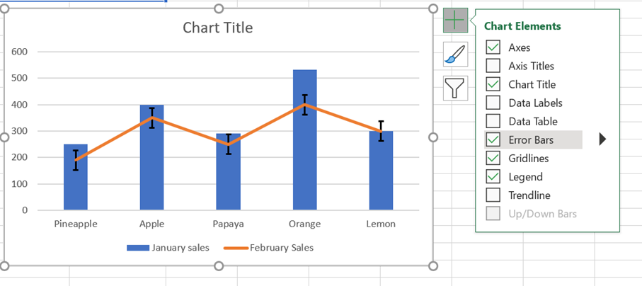
Therefore, standard error bars are only inserted for the estimated data series we selected.