Votre panier est actuellement vide !
Étiquette : userform
CheckBox and ToggleButton with Excel VBA
The CheckBox control allows the user to make a selection.
A checkbox usually has two states: checked and unchecked, but it can be configured to select from three alternatives.A CheckBox has the same main properties as an OptionButton — Value and Caption. In addition, the CheckBox has a unique property, TripleState, which enables the choice of three alternatives. The possible values of the TripleState property are:
- False – selection between two alternatives (True and False), i.e., the checkbox can only be in two states: checked or unchecked.
- True – selection between three alternatives (True, False, and Null), i.e., the checkbox can be checked, unchecked, or neutral.
The ToggleButton control provides the user with exactly the same functionality as a CheckBox, but visually it appears as a button.
The main event of both CheckBox and ToggleButton is the Change event.
CheckBox and Managing Chart Elements Display
Returning to the sales report of the company Almateus, let’s create a simple application that controls the appearance of a chart. Specifically:
- when the checkbox is checked, the chart will be displayed with a shadow;
- when the checkbox is unchecked, the chart will be displayed without a shadow.

Steps:
- On the worksheet, allocate the range B2:B7 for sales volumes and the range A2:A7 for the country names where these sales were made.
- Based on the range A2:B7, create a chart.
- Create a CheckBox and, using the Properties window, assign the property values shown in next Table.
- In the worksheet module Sheet1, type the required code.
Table. Property values set in the Properties window
Object Property Value CheckBox Name chkGraph Caption Show shadow on chart When the Show chart shadow checkbox is checked, the chart will be displayed with a shadow; when it is unchecked, the shadow will be removed.
All embedded charts belong to the ChartObjects collection. Since in our case there is only one chart, it can be identified by its number, which will naturally be 1.
The display of the shadow is controlled by the Shadow property of the Chart object.ToggleButton and Displaying Comments
We will also demonstrate the ToggleButton using the sales report of the company Almateus. In this project, comments will be included.
- When the ToggleButton is set (on), all comments will be displayed.
- When it is cleared (off), all comments and their indicators will be hidden.
- In addition, the ToggleButton caption will change from Comments displayed to Comments hidden.
Steps:
- On the worksheet, allocate the range B2:B7 for sales volumes and the range A2:A7 for country names.
- In some of the cells in the range B2:B7, insert comments using the New Comment button located in the Comments group on the Review tab of the ribbon.
- Create a ToggleButton and, using the Properties window, set its property values as shown in Table 4.13.
- In the worksheet module Sheet1, type the code (see file 10-DisplayComments.xlsm on the CD).
Table. Property values set in the Properties window
Object Property Value ToggleButton Name tglCom Caption Comments displayed When the ToggleButton is switched on, all comments are displayed.
When switched off, all comments and their indicators are hidden, and the button caption changes to Comments hidden.The display of comments and their indicators is controlled by the DisplayCommentIndicator property of the Application object.
OptionButton (Radio Button) with Excel VBA
The OptionButton control allows you to select one of several mutually exclusive alternatives. Option buttons are usually displayed in groups corresponding to the available choices. Grouping can be performed using either the Frame control or the GroupName property of the OptionButton object.
The main events of an option button are Click and Change.
The main property of an option button is Value, which returns or sets its state. If this property is set to True, the option button is selected; if False, it is cleared.Option Buttons and Sales Volumes
To demonstrate an example of using option buttons, let’s return to the sales report of the company Almateus. Suppose we need to compile a list of countries where sales volume is either the maximum or the minimum.

To solve this problem, perform the following steps:
- On the worksheet, allocate the range B2:B7 for sales volumes and the range A2:A7 for the names of the countries where these sales were made.
- In cell B8, enter the formula for calculating total sales: =SUM(B2:B7).
- Create two option buttons and, using the Properties window, set their property values as shown in next Table.
- In the worksheet module Sheet1, type the required code.
Table. Property values set in the Properties window
Object Property Value OptionButton Name optMax Caption Maximum Sales Volume OptionButton Name optMin Caption Minimum Sales Volume Selecting the Maximum Sales Volume or Minimum Sales Volume option button will determine the required sales volume and generate a list of the corresponding countries.
- The calculated sales volume is displayed in cell G1.
- The explanatory label is displayed in cell G2.
- Starting from cell G3, the compiled list of countries is output.
The countries with the corresponding sales volumes are found using the Find method of the Range object. All cells found with the Find method are combined into a single range. Based on this range, a new range containing the country names is created using the Offset method of the Range object, which is then copied to the specified location using the Copy method.
Important: The program automatically determines the range where the search should be performed. The only essential detail is that the code accounts for the fact that the first and last rows of column B contain not data but the table field header and the total sum. Therefore, these rows should not be considered. This is achieved by sequential application of the Resize and Offset methods.
Finally, the AutoFit method automatically adjusts the width of column G so that all displayed information fits properly.
Button (CommandButton) with Excel VBA
The CommandButton control is mainly used to initiate the execution of certain actions triggered by pressing the button—for example, starting or stopping a program, printing results, and so on.
Thus, the primary event associated with the button is the Click event.
The primary property of the button is the Caption property, which returns and sets the text displayed on the button’s surface.Button Menu
Let’s consider a business situation of creating a button menu. The workbook contains three worksheets. On the first sheet, there are two buttons with the names of the two other sheets. Clicking a button activates the corresponding worksheet. When clicking the second button, not only is the sheet activated, but the sheet also scrolls so that the specified cell is displayed in the top-left corner of the sheet window.
So, create a workbook with Sheet1, Sheet2, and Sheet3. On Sheet1, place two buttons.

Using the Properties window, assign their property values as shown in next Table.
Table. Property values set in the Properties window
Object Property Value Button Name cmdSheet2 Caption Sheet 2 Button Name cmdSheet3 Caption Sheet 3 In the module of Sheet1, type the required code. The project is ready. The activation of the sheet is done, of course, by the Activate method of the Worksheet object. Scrolling the sheet so that a specific cell (in this case, T30) is displayed in the top-left corner of the sheet window is accomplished with the ScrollColumn and ScrollRow properties of the Window object.
NOTE
To scroll the screen so that the desired range is displayed, you can also use the Show method of the Range object. For example:Cells(30, 20).Show
Navigation Using Hyperlinks
Navigation through the workbook can certainly be implemented using a button menu, but it can also be done in the classical way—without writing code—by means of hyperlinks.
In a workbook with three sheets (Sheet1, Sheet2, and Sheet3):
- Select Sheet1.
- In cell B1, type Sheet2.
- Click Insert Hyperlink in the Links group on the Insert tab of the ribbon.
- In the Insert Hyperlink dialog box, set the necessary parameters. The options Existing File or Web Page, Place in This Document, Create New Document, and Email Address indicate the destination of the hyperlink. The Text field sets the tooltip text. The Cell Reference field specifies the destination cell. The Or select a place in this document field provides a list of sheets and named ranges.
- In the dialog box, select Place in This Document, set Cell Reference to A1, then select Sheet2. Click OK.
- In cell B2, type Sheet3. Click Insert Hyperlink again. The Insert Hyperlink dialog box will appear.

- Select Place in This Document. In Cell Reference, enter T30. In the list, choose Sheet3. Click OK.
Button Scenario
Buttons allow not only navigation but also entering data into cells, thereby creating button-driven scenarios—for example, displaying the total sum of expenses or profits under different combinations of components.
As an example, let’s find the total sum a + b + c of three variables under two different sets of values shown in Table 4.6.
Table. Variable values
I II a 3 2 b 4 3 c 5 4 Steps:
- On the worksheet, assign cells B2, B3, B4 for variables a, b, c.
- In cell B5, enter the formula: =SUM(B2:B4).
- In the range D3:D5, enter the first set of values (3, 4, 5).
- In the range E3:E5, enter the second set of values (2, 3, 4).
- Create two buttons and assign property values using the Properties window as shown in next Table.
- In the module of Sheet1, type the required code (see file 4-Button Scenario.xlsm).
Table. Property values set in the Properties window
Object Property Value Button Name cmdVar1 Caption Variant 1 Button Name cmdVar2 Caption Variant 2 Clicking Variant 1 reads values from D3:D5 and writes them into B2:B4.
Clicking Variant 2 reads values from E3:E5 and writes them into B2:B4.The button scenario project is ready.

Button Scenario with Pictures and Custom Mouse Pointers
Buttons can be made more visually appealing by embedding pictures. Additionally, changing the mouse pointer displayed over the button (for example, from an arrow to a pointing hand) adds visual attractiveness.
The picture is loaded onto the button using the Picture property.
The PicturePosition property sets the layout of text and picture.
The MousePointer property sets the type of mouse pointer.Table. Valid values of the MousePointer property
Constant Value Description fmMousePointerDefault 00 Default fmMousePointerArrow 01 
fmMousePointerCross 02 
fmMousePointerIBeam 03 
fmMousePointerSizeNESW 06 
fmMousePointerSizeNS 07 
fmMousePointerSizeNWSE 08 
fmMousePointerSizeWE 09 
fmMousePointerUpArrow 10 
fmMousePointerHourglass 11 
fmMousePointerNoDrop 12 
fmMousePointerAppStarting 13 
fmMousePointerHelp 14 
fmMousePointerSizeAll 15 
fmMousePointerCustom 99 User-defined If MousePointer = fmMousePointerCustom, the cursor is based on a .cur file, referenced by the MouseIcon property. In VBA, Picture and MouseIcon values are set using the LoadPicture function with the file path as a parameter.
Example: Button Scenario for Entering Formulas
Now, instead of numbers, we’ll input formulas into worksheet cells for calculations—specifically x + y and x – y .
Steps:
- On the worksheet, assign cells B1 and B2 for variables x and y. Cell B3 will hold the formula entered from code.
- Either =B1+B2
- Or =B1-B2
- Create two buttons and assign properties as shown in next Table.

Table . Property values set in the Properties window
Object Property Value Button Name cmdSum Caption Sum Picture Link to image file (e.g., butterfly) PicturePosition fmPicturePositionRightCenter MousePointer fmMousePointerAppStarting Button Name cmdSub Caption Difference Picture Link to image file (e.g., butterfly) PicturePosition fmPicturePositionAboveCenter MousePointer fmMousePointerCustom MouseIcon Link to cursor file (e.g., Inodrop.cur in C:\Windows\Cursors) Clicking Sum enters the formula =B1+B2 in cell B3 and writes Sum in A3.
Clicking Difference enters the formula =B1-B2 in B3 and writes Difference in A3.Button Scenario for Entering Formulas
Private Sub cmdSum_Click()
    Range("B3").Formula = "=B1+B2"
    Range("A3").Value = "Sum"
End Sub

Private Sub cmdSub_Click()
    Range("B3").Formula = "=B1-B2"
    Range("A3").Value = "Difference"
End Sub
Interactive Button and Determining the Average Sales Volume
By handling the MouseDown and MouseUp events, you can make a button more interactive. We will demonstrate this with a simple application. Suppose we have some sales data for the company “Almateus,” which exports various rubber-technical products. To present the data more clearly in the sales volume table, you need to highlight in red the row with the maximum sales volume, and in yellow the rows where the sales volume is above average. The sales data constantly change, so you must create an application that automates the process of coloring the required rows.
To implement this example, perform the following steps.
- On the worksheet, allocate the range B2:B7 for sales volumes.
- In cell B8, enter the formula to calculate total sales: =SUM(B2:B7).
- Create a button and, using the Properties window, set its property values as shown in next Table.
- In the worksheet module Sheet1, type the code.
Table 4.10. Property values set in the Properties window
Object Property Value Button Name cmdRefresh Caption Refresh Pressing the Refresh button will trigger the recalculation and reformatting of the table.

The procedures handling the MouseDown and MouseUp events program different appearances of the button—namely the style, size, and color of the font (Font.Bold, Font.Size, and the button’s ForeColor), the background color (BackColor), and the rendering of a shadow (Shadow). Changing these button properties creates the effect of additional interactivity.
The table recalculation is performed in the DoRefresh procedure. The maximum and average values are obtained using worksheet functions encapsulated in the WorksheetFunction object. Cell color is set by the Interior.Color property. Fill removal is implemented by setting ColorIndex to xlColorIndexNone.
Exchanging Values Between Two Selected Cells
As a final example of working with buttons on a worksheet, consider a project that can swap values between any two selected cells. On the worksheet, create a button and, for example, enter the words Fire, Air, Water, Earth in cells A2, B22, H17, J3. In the worksheet module Sheet1, type the code (see file 7-Value Exchange.xlsm on the CD) that handles the button’s Click event. That’s all—now select any two of these cells and click the button, and their values will be swapped automatically. In addition, our program validates the selected area: it must consist of exactly two cells.
Your First Project with a Control with Excel VBA
Let’s create your first project with a control: we will place a button on the worksheet, and when clicked, it will display a dialog box with the greeting « Hello, World! ».
So, follow these steps:
- Click the Button control from the ActiveX Controls toolbar, which is accessed by clicking Insert in the Controls group on the Developer tab of the ribbon.
- Draw a Button control of the required size on the worksheet.
NOTE
The first created Button control will automatically display the caption CommandButton1. If you create a second button, it will display CommandButton2, and so on. The text displayed on the button surface is defined by the Caption property. In addition, VBA sets the value of the control’s Name property (i.e., its object name) by default. For the first created button, the Name property is set to CommandButton1, for the second to CommandButton2, etc.- Select the created button. Click the Properties button on the Developer tab in the Controls group. The Properties window will appear on the screen. In this window, set the Name property to cmdHello instead of the generic CommandButton1. Set the Caption property to Hello.
TIP
Assigning a meaningful Name value to a control makes the code easier to read, since the control’s name helps to recognize its purpose in the project.- Again select the created button. Click View Code on the Developer tab in the Controls group. As a result, the Visual Basic editor will open, and the code editor will automatically generate the first and last lines of the procedure handling the button’s Click event.
“Hello, World!” Code skeleton
Private Sub cmdHello_Click()
End Sub
- In the button’s Click event procedure, add the instruction that will display a dialog box with the greeting.
“Hello, World!”
Private Sub cmdHello_Click()
    MsgBox "Hello, World!", vbExclamation
End Sub

- Click Design Mode on the Developer tab in the Controls group to exit design mode.
The project is ready. Now you can test your created Hello button. Click it, and if a dialog box with the greeting appears, then everything is correct.
Common Properties of Controls
Controls have a large collection of properties that allow you to configure various object parameters, from its position and size to the text or picture displayed in it.
Table. Common Properties of Controls
Property Description AutoSize Specifies whether the control should automatically resize to fit all displayed content BackColor Sets the background color BackStyle Sets background transparency. Possible values: fmBackStyleTransparent or fmBackStyleOpaque BottomRightCell, TopLeftCell Return references to the cells located under the top-left and bottom-right corners of the control Caption Defines the text string displayed on the control ControlTipText Returns the tooltip text Enabled Determines whether the control is available to the user Font Returns the Font object to set font parameters ForeColor Sets the font color Height, Width Set the control’s height and width Left, Top Coordinates of the top-left corner of the control MouseIcon Assigns a custom mouse pointer MousePointer Specifies the type of mouse pointer Name Assigns the object’s name OldHeight, OldWidth Return the height and width of the button before resizing OldLeft, OldTop Return the coordinates of the button’s top-left corner before moving Parent Specifies a reference to the container object of this control Picture Sets the reference to a bitmap file used as the control’s background PicturePosition Sets the position of the picture relative to the caption. Possible values: fmPicturePositionLeftTop, fmPicturePositionLeftCenter, fmPicturePositionLeftBottom, fmPicturePositionRightTop, fmPicturePositionRightCenter, fmPicturePositionRightBottom, fmPicturePositionAboveLeft, fmPicturePositionAboveCenter, fmPicturePositionAboveRight, fmPicturePositionBelowLeft, fmPicturePositionBelowCenter, fmPicturePositionBelowRight, fmPicturePositionCenter PrintObject Determines whether the control should be printed Tag Sets a parameter used to identify the specific control TakeFocusOnClick Determines whether the control receives focus after being clicked Visible Sets the visibility of the control WordWrap Specifies whether words should wrap if they don’t fit on one line of the control Common Methods of Controls
Controls have several common methods that allow moving, positioning, and managing focus.
Table. Common Methods of Controls
Method Description Move Moves the control SetFocus Sets focus to the control BringToFront, SendToBack Place the control in the foreground or background ZOrder Places the control in front of or behind other controls, depending on the parameter value (fmTop or fmBottom) Common Events of Controls
Controls have a wide collection of procedures capable of intercepting and handling various system events and user actions, from mouse clicks to error detection.
Table. Common Events of Controls
Event Description BeforeDragOver Occurs when data is dragged over the control BeforeDropOrPaste Occurs before data is dropped or pasted Click Occurs when the user clicks the control DblClick Occurs when the user double-clicks the control Enter, Exit Occur when the control gains or loses focus Error Occurs when the control encounters an error but cannot pass the message KeyDown, KeyUp Occur when the user presses or releases any key while the control has focus KeyPress Occurs when the user presses any key except function keys, cursor control keys, or special keys while the control has focus MouseDown, MouseUp Occur when the user presses or releases any mouse button MouseMove Occurs when the user moves the mouse pointer over the control How to place a control on a worksheet and write code with Excel VBA
As noted earlier, controls are added to an Excel sheet using the Insert button located on the Developer tab in the Controls group.
Creating a control on a worksheet involves two stages: placing the control on the worksheet and configuring it.
Configuration means setting the control’s properties; in particular, you can link the control to certain worksheet cells, adjust the control’s appearance, and set other parameters.
You can associate a macro with a control that will run when a certain event occurs—for example, when clicking a button (for the Button/CommandButton control)—or you can provide a corresponding procedure written in VBA.
NOTE
In localized versions, the Button control has the same name on both the Form Controls and ActiveX Controls toolbars, but in the non-localized (English) version the names differ (Button vs CommandButton).To place a control on a worksheet, do the following:
- Click Insert on the ribbon’s Developer tab in the Controls group and, on the drop-down panel, select the appropriate control from one of the groups: Form Controls or ActiveX Controls. The mouse pointer will change to a crosshair.
- Move the pointer to the place on the worksheet where you want to position the control and click the left mouse button. The control will appear on the worksheet.
- Resize the control as desired by dragging the white squares—the control’s border handles (simply called “handles”).
If you need to choose one of the additional controls from a dialog:
- Click More Controls on the ActiveX Controls panel.
- In the list that appears, select the required control. The pointer will change to a crosshair.
- Move the pointer to the desired location on the worksheet and click the mouse. The control will appear on the worksheet.
- If necessary, change the control’s size.
A control is not anchored to a specific spot on the worksheet; it can be freely moved anywhere else. You can move an object with the mouse or the keyboard. The mouse is more convenient for moving longer distances.
To move a control with the mouse:
- Select the required control. To select an ActiveX control, click Design Mode in the Controls group on the Developer tab, and then click the control. The selected control has a border with handles.
- To select a control from Form Controls, move the pointer over it and click the left mouse button while holding down . The selected control has a thick gray border with handles.
- Drag the control to a new location with the mouse. Drag either by the control’s border or by its graphic surface. If you try to drag by the control’s caption, you may enter caption edit mode and won’t be able to drag it.
TIP
To select multiple controls, select each one while holding down +.To constrain movement strictly vertically or horizontally while dragging, hold . To snap the control to the worksheet grid while dragging, hold . You can combine these effects by holding both keys during the drag.
Moving a control with the keyboard is more convenient when you need precise positioning.
To move a control with the keyboard:
- Select the control you want to move.
- Move it using the arrow keys (←, →, ↑, ↓).
Sometimes you need to make several copies of the same control.
To copy a control:
- Select the required control.
- While holding down , drag the object to the location where you want the copy. When you release the mouse button, a copy of the object will appear at the specified location.
TIP
When copying, you can use and the same way as when moving controls.Various operations can be performed with controls: you can group them, send them to the back or bring them to the front, anchor them to objects, align them, etc. These actions are performed with controls the same way as with pictures, except for certain specifics during selection.
Controls are objects. Like any other objects, they have properties, methods, and events. Property values of controls can be set in code or during design time. To set properties at design time, select the control and click Properties on the Developer tab in the Controls group. The Properties window will appear.

The left side of this window lists the control’s properties, and the right side contains either input fields or drop-down lists to set those property values.
As mentioned earlier, you can associate a macro or a VBA procedure with a control to run when a particular event occurs. The code of the procedure that handles the control’s events is entered in the worksheet module where the control is located. To go to this module, select the control and click View Code on the Developer tab in the Controls group.
When you finish designing the control, don’t forget to exit Design Mode by clicking Design Mode again.
About the Controls Toolbar with Excel VBA
Controls are components of the Windows graphical interface. Examples of controls include buttons, input fields, lists, scroll bars, and other interface elements that allow you to enter a number, select a value, or perform some other action. Various controls can be placed on an Excel worksheet. Controls are available by clicking the Insert button located on the Developer tab of the ribbon in the Controls group.
It should be noted that when you click the Insert button, two groups of controls are available: Form Controls and ActiveX Controls.

The Form Controls group is mainly intended to ensure compatibility with documents created in earlier versions of Excel (prior to Excel 97) that used these corresponding controls. They have much fewer capabilities compared to the controls available in the ActiveX Controls group. Some of these controls cannot be used at all in the latest versions of Excel — such as the Text Box, Combo Box, and Drop-down List. However, they do offer some features not available in ActiveX controls, for example, they can be placed on chart sheets.
The ActiveX Controls group consists of independent components of various applications and can also be used in Excel. Table 4.1 provides a list of the main controls and the corresponding toolbar buttons.
Table. Controls from the Toolbar
Control Name Prefix Creating Button Text Box TextBox txt 
Label Label lbl 
Command Button CommandButton cmd 
List Box ListBox lst 
Combo Box ComboBox cbo 
Scroll Bar ScrollBar scr 
Spin Button SpinButton spn 
Option Button OptionButton opt 
Check Box CheckBox chk 
Toggle Button ToggleButton tgl 
Image Image img 
Other Controls More Controls — 
Customizing a UserForm or Custom Form, Excel VBA
UserForms have a variety of properties. You can display the Properties window for the UserForm by clicking on View / Properties Window, as shown in the following figure, or by clicking its Properties icon.
Accessing the Properties Window
Below the Project Explorer, you will see the Properties window, partially visible in the following figure.

UserForm Properties Window
For the first UserForm in the workbook, VBA assigns a default value of UserForm1 to its Name and Caption properties, as you can see in the previous figure. If you were to create a second UserForm, its default Name and Caption properties would be UserForm2, and so on. To distinguish between the Name and Caption properties, the following figure shows where the Name property has been changed to frmEmployees and the Caption property, which appears in the UserForm’s title bar, has been changed to Employees.

The Name Property of the UserForm Object

Adding Controls to a Custom Form or UserForm, Excel VBA
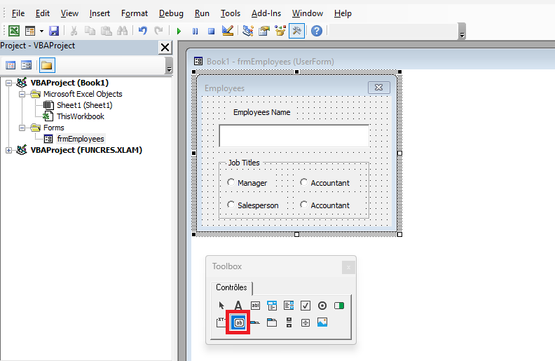
VBA supports these and other controls, which are accessible to you from the VBE toolbox. To display the toolbox so you can easily input the commands you want, you can click on the Toolbox icon or click View Toolbox, as shown in the following figure.
Displaying the Toolbox
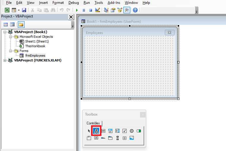
The controls you place on your UserForm depend on its purpose. If you want to design a simple form to collect information about your company’s employees, you will at least want to know the employees’ names and their job titles. It would be helpful to display a text box for entering the employee’s name, then a list of the company’s job titles so the user can easily select one. The following figure shows the toolbox with the mouse hovering over the Label control icon.

Overview of the Toolbox
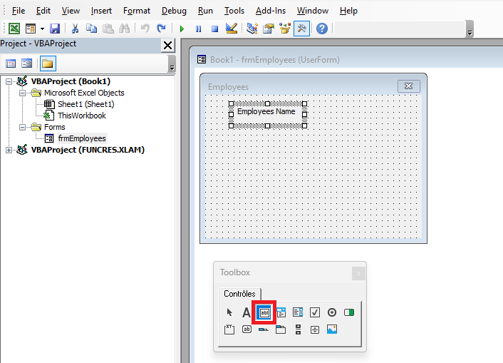
You place a control on your UserForm by drawing it on the design area of your UserForm. All you have to do is click the control icon in the Toolbox that you want to add to the UserForm and draw it just like you would draw a Shape object on a worksheet. The following figure shows a Label control that has just been drawn, displaying its default caption of “Label1.”
Label Control

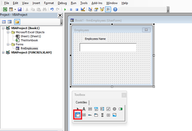
Note in this figure that the Caption property of the Label is selected in the Properties window, so a more meaningful caption can be added to the label. Since the label will be directly above the text box and the purpose of the text box is to enter an employee’s name, the label’s caption is changed to “Employee Name,” as shown in the following figure. Also note in the next figure that the TextBox icon is about to be selected in the toolbox as you prepare to draw a TextBox control on the UserForm beneath the label.
TextBox Control
After clicking the TextBox icon in the toolbox, you add a TextBox control by drawing it in the design area of the UserForm, just as you did when you added the Label control. The following figure shows the drawn TextBox, positioned beneath the label, and reasonably wide enough to accept and display a person’s name. Meanwhile, as shown in the next figure, the Frame icon is about to be selected to place a Frame control on your UserForm.
Frame Control
The following figure shows your Frame control that has just been drawn, with its default caption of “Frame1.” Frames are a good way to visually group other controls together by containment, usually with an underlying theme. In the case of this sample UserForm, the company’s job titles will be contained in such a way that the user can only select one.
Overview of the Frame Control
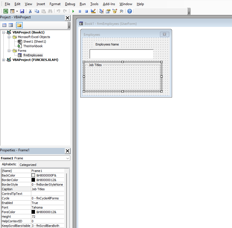
The Caption of a Frame control is an effective way to describe a Frame. In the previous figure, the Caption property of your new Frame is selected so you can change the default caption (“Frame1”) to a more useful description. In the next figure, the default caption “Frame1” has been replaced by “Job Titles.” Now that the frame caption has been taken care of, Figure 14.13 also shows that the OptionButton icon in the toolbox is about to be selected. Since an employee would only hold one job title, you can arrange a series of option buttons inside the frame to represent the different job titles in the company, where only one can be selected.
Option Buttons in the Frame
In the following figure, two CommandButtons have been added, completing the UserForm’s interface design. One of the CommandButtons is labeled “OK,” which is a common and intuitive caption allowing users to confirm their data entries. The other CommandButton is a “Cancel” button to allow users to completely exit the UserForm if they wish.
Adding Command Buttons

Add Watermark to Excel VBA
To add a watermark (or background image) to an Excel sheet using VBA, follow these steps:
Step 1: Prepare the watermark image
- Ensure the image you want to use as a watermark is ready and accessible on your computer.
Step 2: Add the VBA Code
- Open your Excel file.
- Press Alt + F11 to open the VBA editor.
- In the VBA editor, click Insert > Module to add a new module.
- Copy and paste the following code into the module:
Sub AddWatermark()
    Dim ws As Worksheet
    Dim img As Picture
    Dim imagePath As String
    ' Specify the full path of your image (example: C:\Users\Username\Documents\watermark.png)
    imagePath = "C:\Path\To\Your\Image.png"
    ' Select the active sheet
    Set ws = ActiveSheet
    ' Insert the image as a watermark (background)
    Set img = ws.Pictures.Insert(imagePath)
    ' Adjust image properties to fit the sheet and send it to the back
    With img
        .ShapeRange.LockAspectRatio = msoFalse
        .Width = ws.PageSetup.PageWidth
        .Height = ws.PageSetup.PageHeight
        .Top = 0
        .Left = 0
        .ZOrder msoSendToBack  ' Send the image to the back
        .TransparencyColor = RGB(255, 255, 255)  ' Optional: make the image's background transparent if applicable
    End With
End Sub
Step 3: Run the Code
- Modify the imagePath variable in the code to the actual path of your image.
- Close the VBA editor by pressing Alt + Q.
- To run the code, press Alt + F8, select AddWatermark, and click Run.
Code Explanation:
- The code inserts the specified image as a background on the active sheet and adjusts its size to cover the entire page.
- The ZOrder method sends the image to the back of the sheet, making it appear like a watermark.
- The TransparencyColor option is used to make the background of the image transparent if necessary.
Step 4: Save the File
- Once the image is added as a watermark, save your Excel file.
Note:
This watermark will only be visible within the Excel sheet view. It will not appear in printouts unless you modify the print settings (such as adding the image to the header or footer). If you want the watermark to also appear on printed pages, you can insert the image into the header or footer instead.
Add Controls to UserForm, Excel VBA
Here’s an example of VBA code that creates a UserForm containing a Label, a TextBox, and a CommandButton. I’ll also explain each part of the code to help you understand how it works.
Sub CreateUserForm()
    ' Declare a variable for the UserForm
    Dim myForm As Object
    Set myForm = CreateObject("Forms.UserForm.1")
    ' Add a Label
    Dim lbl As Object
    Set lbl = myForm.Controls.Add("Forms.Label.1", , True)
    lbl.Caption = "Enter your name:"
    lbl.Top = 10
    lbl.Left = 10
    lbl.Width = 200
    ' Add a TextBox
    Dim txt As Object
    Set txt = myForm.Controls.Add("Forms.TextBox.1", , True)
    txt.Top = 30
    txt.Left = 10
    txt.Width = 200
    ' Add a CommandButton
    Dim btn As Object
    Set btn = myForm.Controls.Add("Forms.CommandButton.1", , True)
    btn.Caption = "Submit"
    btn.Top = 60
    btn.Left = 10
    btn.Width = 100
    ' Add an event to the button (clicking the button will close the form)
    btn.OnClick = "btnClick"
    ' Show the UserForm
    myForm.Show
End Sub
Sub btnClick()
    MsgBox "You entered: " & ActiveSheet.TextBox1.Value
    ' Close the UserForm after the button is clicked
    Unload ActiveForm
End Sub
Explanation of the Code
- Creating the UserForm:
- The code starts by creating a UserForm object using the CreateObject(« Forms.UserForm.1 ») method.
- Adding a Label:
- A Label control is added to the UserForm using the Controls.Add method.
- The text to display is set with lbl.Caption = « Enter your name: ».
- The position and size of the label are set using the Top, Left, and Width properties.
- Adding a TextBox:
- Similarly, a TextBox control is added using Controls.Add(« Forms.TextBox.1 », , True).
- The TextBox allows the user to input a text, in this case, a name.
- Adding a CommandButton:
- A CommandButton control is added for the user to interact with.
- The button text is set with btn.Caption = « Submit ».
- The position and size of the button are defined as well.
- Handling the Button Click Event:
- The button has an OnClick event that runs a procedure (btnClick) when clicked.
- In the btnClick procedure, a message box displays the text entered in the TextBox, and then the UserForm is closed using Unload ActiveForm.
Conclusion
This code creates a simple form with a label, a text box, and a button. When the button is clicked, the text entered in the text box is displayed in a message box, and the form is closed. This type of form can be used in a user interface to collect information and perform actions based on user input.
- Creating the UserForm: