Votre panier est actuellement vide !
Catégorie : Excel diagram
How to Create a Scatter Plot in Excel
How to Create a Scatter Plot in Excel
When you examine two columns of quantitative data in your Excel spreadsheet, what do you see? Just two sets of numbers. Do you want to see how the two sets relate to each other? A scatter plot is the ideal chart choice for this.
1 What is a point cloud?
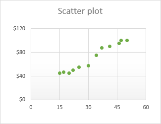
A scatter plot (also called an XY chart or scatter diagram ) is a two-dimensional graph that shows the relationship between two variables. In a scatter plot, the horizontal and vertical axes are value axes that plot numerical data. Typically, the independent variable is on the x-axis and the dependent variable is on the y-axis. The graph displays the values at the intersection of the x- and y-axes, combined into single data points.
The main purpose of a scatter plot is to show how strong the relationship, or correlation , is between two variables. The more data points fall along a straight line, the higher the correlation.
2 Organize the data for a scatter plot
With a variety of built-in chart templates provided by Excel, creating a scatter plot becomes a matter of a few clicks. But first, you need to properly organize your source data.
As already mentioned, a scatter plot displays two interdependent quantitative variables. So, you enter two sets of numerical data in two separate columns.
For ease of use, the independent variable should be in the left column because this column will be plotted on the x-axis. The dependent variable (the one affected by the independent variable) should be in the right column, and it will be plotted on the y-axis.
If your dependent column precedes the independent column and there is no way to change this in a spreadsheet, you can swap the x and y axes directly on a chart.
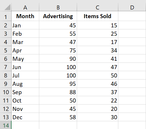
In our example, we will visualize the relationship between the advertising budget of a certain month (independent variable) and the number of items sold (dependent variable), so we organize the data accordingly:
3 How to create a point cloud?
With the source data properly organized, creating a scatter plot in Excel is a quick two-step process:
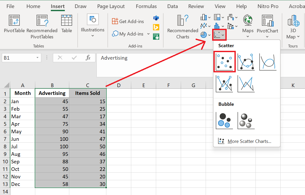
- Select two columns with numeric data, including the column headers. In our case, this is the range C 1:D 13. Do not select any other columns to avoid confusing Excel.
- Go to the Insert tab / Chart group , click the Scatter plot icon and select the desired template. To insert a classic scatter plot, click the first thumbnail:
The scatter plot will be immediately inserted into your spreadsheet:
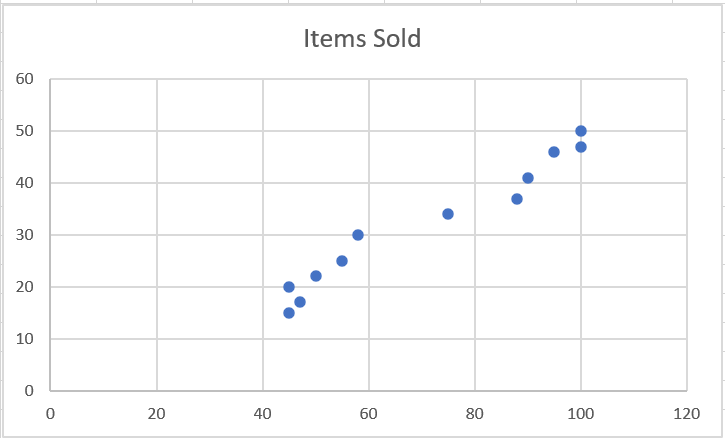
You can customize some elements of your chart to make it look better and to make the correlation between the two variables clearer .
4 Types of Scatter Chart
Besides the classic scatter plot shown in the example above, a few additional models are available:
- Type with soft lines and markers
- Type with smooth lines
- Type with straight lines and markers
- Type with straight lines
Scatter plots with lines are best used when you have few data points. For example, here’s how you can represent the first four months’ data using a scatter plot with smooth lines and markers:

Excel XY plot templates can also plot each variable separately, presenting the same relationships in a different way. To do this, you need to select 3 columns with data – the leftmost column with text values (labels) and the two columns with numbers.
In our example, the blue dots represent the advertising cost and the orange dots represent the items sold:
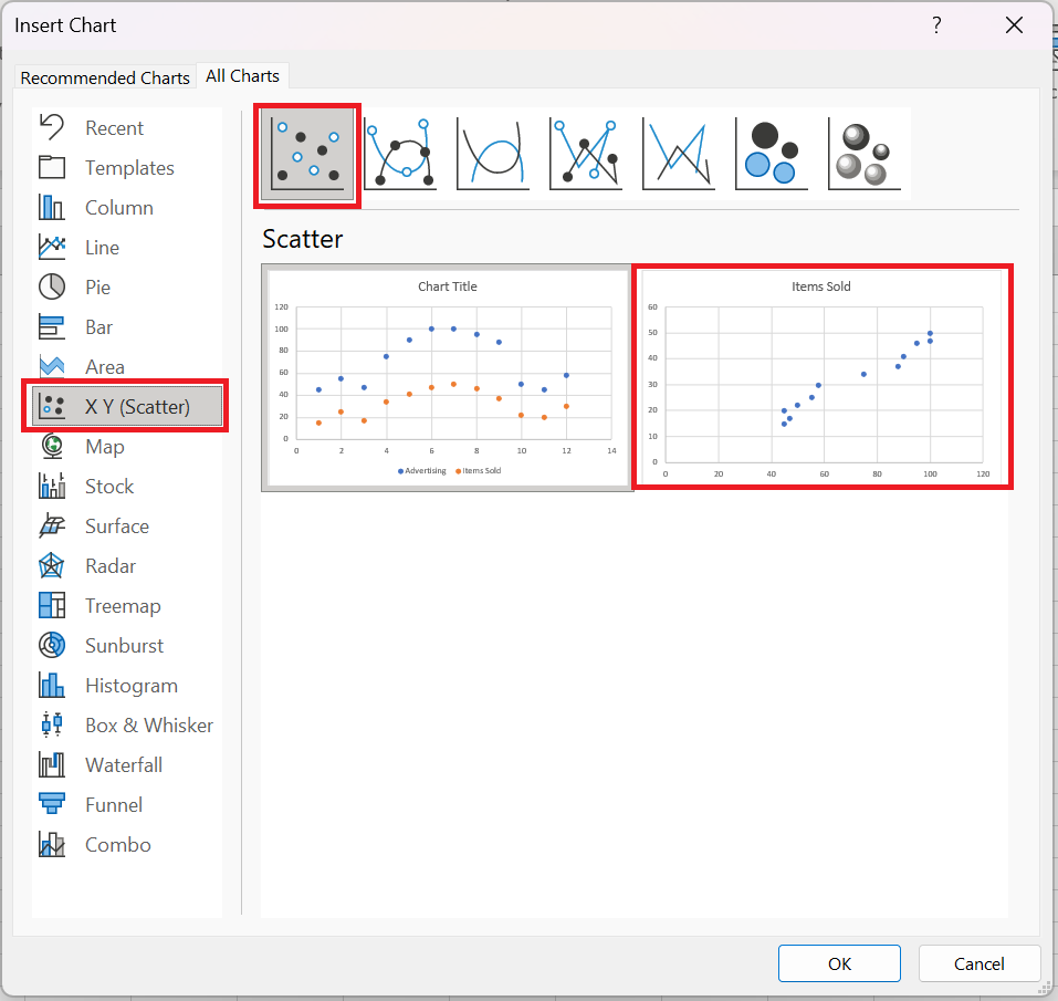
To view all available scatter plot types in one place, select your data, click the Scatterplot (X, Y) icon on the ribbon, and then click More Scatterplots. This will open the Insert Overlay Chart dialog box with the XY (scatter plot) type selected, and you switch between the different templates at the top to see which one provides the best graphical representation of your data:
5 Scatter plot and correlation
To correctly interpret the scatter plot, you need to understand how variables can be related to each other. Broadly speaking, there are three types of correlation:
Positive correlation – as variable x increases, variable y also increases. An example of a strong positive correlation is the amount of time students spend studying and their grades.
Negative correlation – as variable x increases, variable y decreases. Classes and dropout grades are negatively correlated – as the number of absences increases, exam grades decrease.
No correlation – there is no obvious relationship between the two variables; the points are scattered throughout the graph area. For example, student height and grades appear to have no correlation, as the former does not affect the latter in any way.
6 Customizing the XY point cloud
As with other chart types, almost every element of a scatter chart in Excel is customizable. You can easily change the chart title, add axis titles , hide gridlines, choose your own chart colors, and more.
6.1 A Adjust axis scale (reduce white space)
If your data points are clustered at the top, bottom, right, or left of the chart, you may want to clean up the extra white space. To reduce the space between the first data point and the vertical axis and/or between the last data point and the right edge of the chart, follow these steps:
- Right-click the x-axis, then click Format Axis…
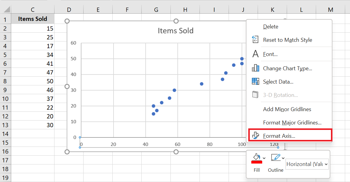
- In the Axis Formatting pane, set the desired minimum and maximum limits .
- Additionally, you can change the main units that control the spacing between grid lines.
The screenshot below shows my settings:

To remove the space between the data points and the top/bottom edges of the plot area, format the vertical y-axis in the same way.
6.2 Add labels to point cloud data points
When creating a scatter chart with a relatively small number of data points, you may want to label the points by name to make your visual more understandable. Here’s how to do this:
- Select the plot and click the Chart Elements button .
- Check the Data Labels box , click the small black arrow next to it, and then click More options…
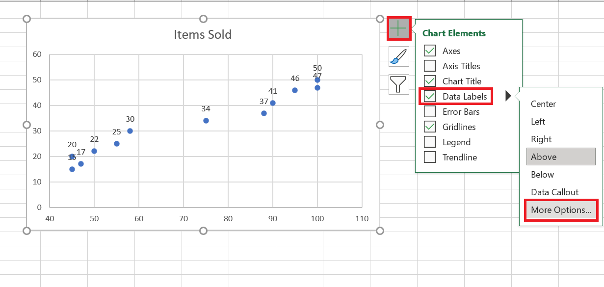
- In the Format Data Labels pane , switch to the Label Options tab (the last one) and configure your data labels like this:
- Select the Value from cells box , then select the range from which you want to extract data labels (A 2:A 13 in our case).
- If you want to display only the names, uncheck the X Value and/or Y Value box to remove numeric values from the labels.
- Specify the position of the labels, Above the data points in our example.
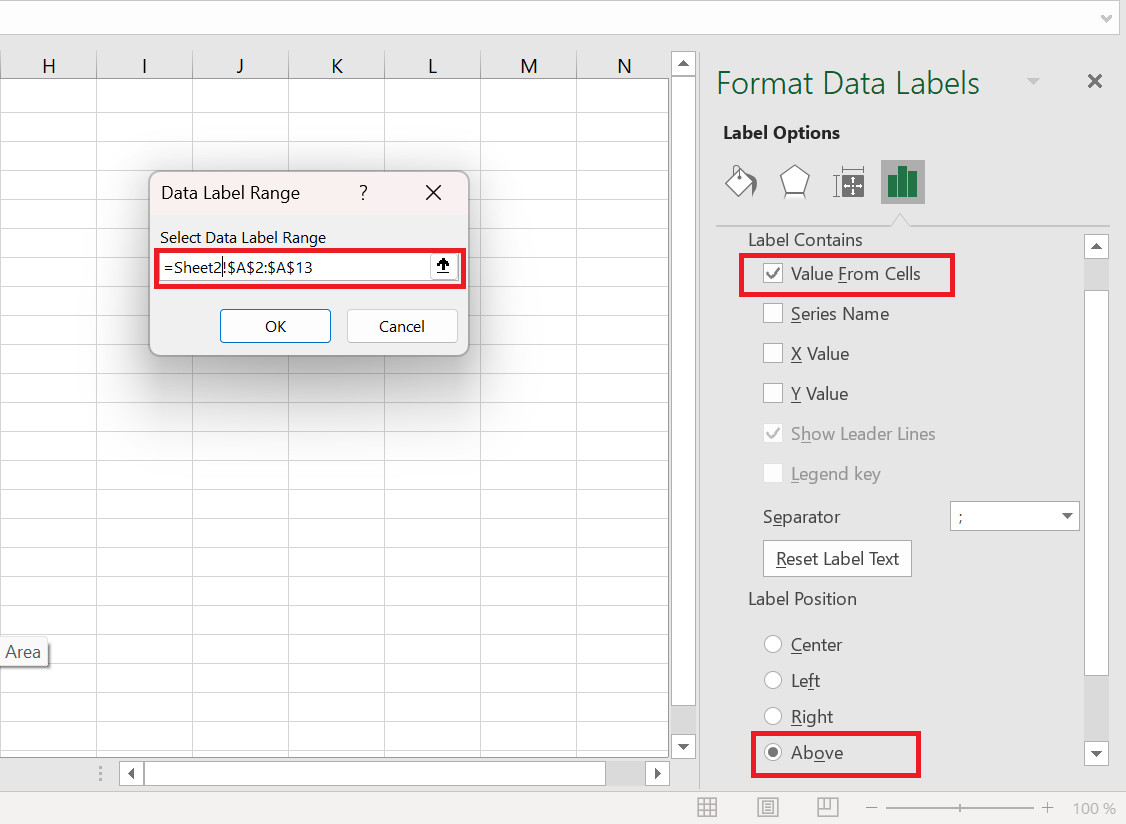
All data points in our Excel scatter plot are now labeled by name:
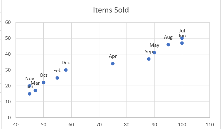
6.3 Repairing Overlapping Labels
When two or more data points are very close together, their labels can overlap, as is the case with the Jan and Mar labels in our scatter plot. To resolve this, click the labels, then click the overlapping label so that only that label is selected. Hover your mouse cursor over the selected label until the cursor changes to a four-sided arrow, then drag the label to the desired position.
As a result, you will have a nice Excel scatter plot with perfectly readable labels.
6.4 Add a trendline and equation
To better visualize the relationship between the two variables, you can plot a trend line in your Excel scatter chart, also known as a line of best fit .
To do this, right-click any data point and choose Add Trendline… from the context menu.
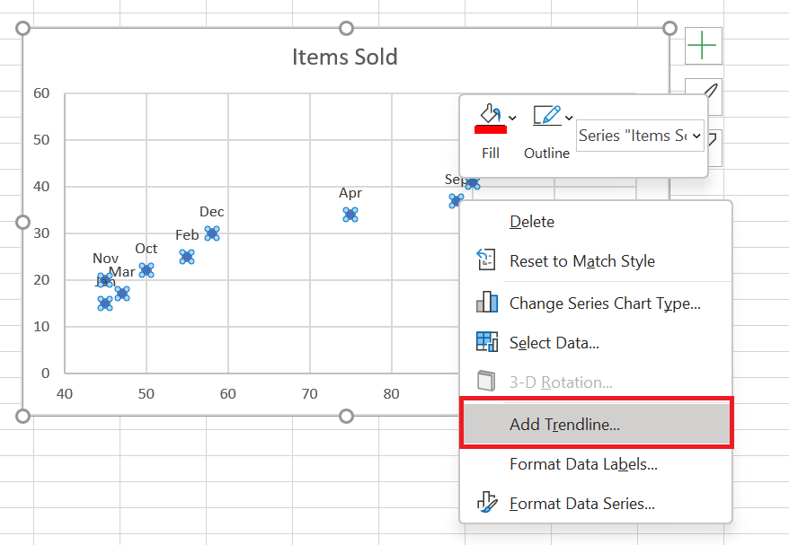
Excel will draw a line as close as possible to all the data points so that there are as many points above the line as below.
Additionally, you can display the trendline equation , which mathematically describes the relationship between the two variables. To do this, select the Show equation on chart check box in the Format Trendline pane , which should appear on the right side of your Excel window immediately after adding a trendline. The result of these manipulations will look like this:
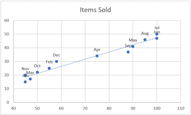
What you see in the screenshot above is often called the linear regression graph .
6.5 Changing the X and Y axes in a scatter chart
As mentioned, a scatter plot typically displays the independent variable on the horizontal axis and the dependent variable on the vertical axis. If your chart is plotted differently, the easiest solution is to swap the source columns in your spreadsheet and then redraw the chart.
If for some reason reordering columns isn’t possible, you can switch the X and Y data series directly on a chart. Here’s how:
- Right-click any axis and click Select Data… from the context menu.
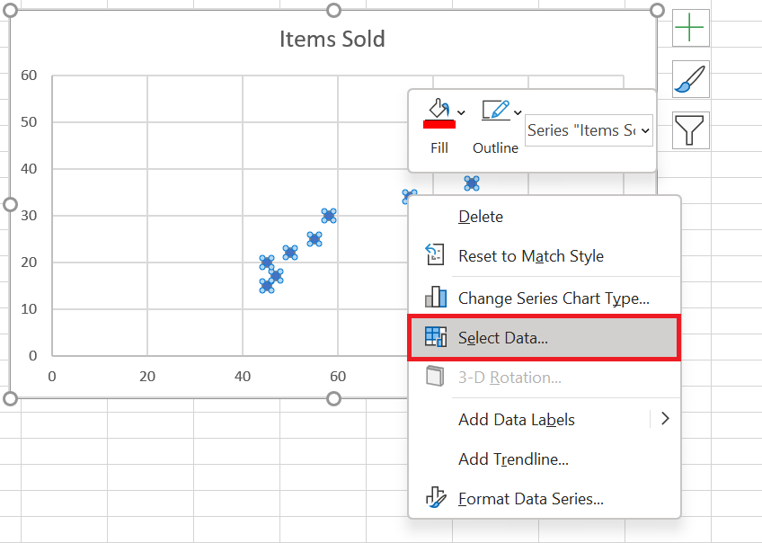
- Data Source dialog box , click the Edit button .
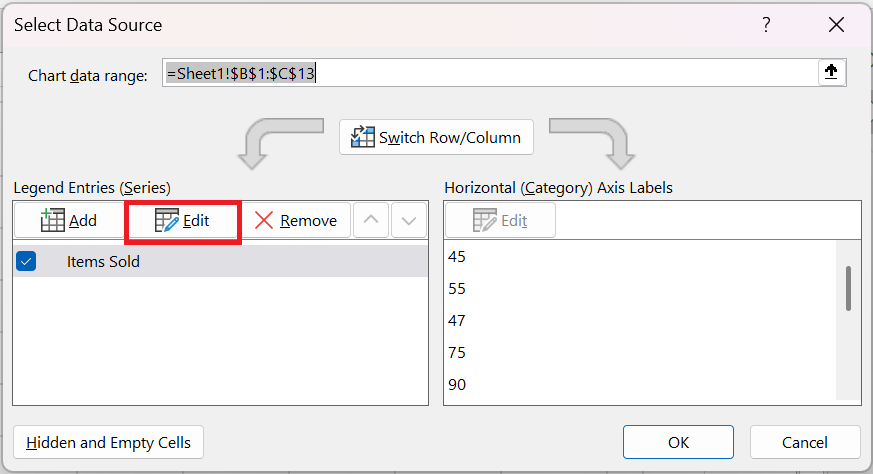 3. Copy the values from Series X into the Series Y Values box and vice versa .
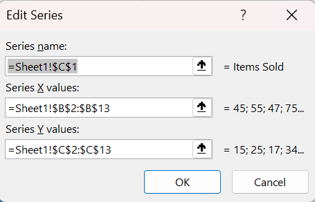
OK twice to close both windows.
As a result, your Excel scatter plot will undergo this transformation:
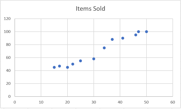
This is how you create a scatter plot in Excel.
How to Create a Histogram in Excel
How to Create a Histogram in Excel
While everyone knows how easy it is to create a chart in Excel , creating a histogram usually raises many questions. In fact, in recent versions of Excel 2019, 2016, Excel 2013, and Excel 2010, creating a histogram takes only a few minutes and can be done in a variety of ways—using the Analysis ToolPak’s Histogram special tool, formulas, or a pivot table.
1 What is a histogram?
Have you ever created a bar or column chart to represent numerical data? A histogram is a specific use of a bar chart where each bar represents the frequency of items within a certain range. In other words, a histogram graphically displays the number of items in consecutive intervals without overlap.
For example, you can create a histogram to display the number of days with a temperature between 61-65, 66-70, 71-75, etc. degrees, the number of sales with amounts between $100-$199, $200-$299, $300-$399, the number of students with test scores between 41-60, 61-80, 81-100, etc.
The following screenshot gives an idea of what an Excel histogram looks like:
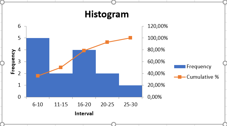
2 Create a histogram in Excel using Analysis ToolPak
The Analysis ToolPak is a Microsoft Excel data analysis add-in, available in all modern versions of Excel starting with Excel 2007. However, this add-in is not automatically loaded when Excel starts, so you must load it first.
Load the Analysis ToolPak add-in
To add the Data Analysis add-in to your Excel, follow these steps:
- In Excel 2010, Excel 2013, Excel 2016, and Excel 2019, click File / Options . In Excel 2007, click the Microsoft Office Button, and then click Excel Options .
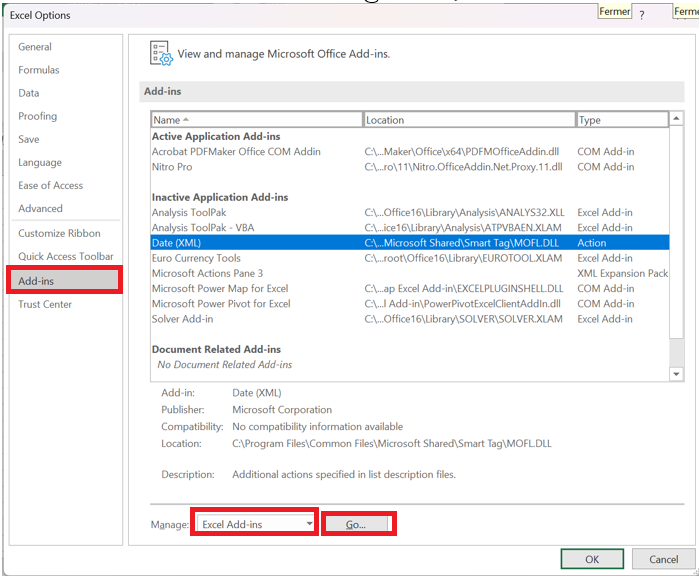
- Excel Options dialog box , click Add-ins in the left sidebar, select Excel Add-ins in the Manage area , and then click the Go button .
- Add-ins dialog box , select the Analysis ToolPak check box and click OK to close the dialog box.
If Excel displays a message stating that the Analysis ToolPak is not currently installed on your computer, click Yes to install it.
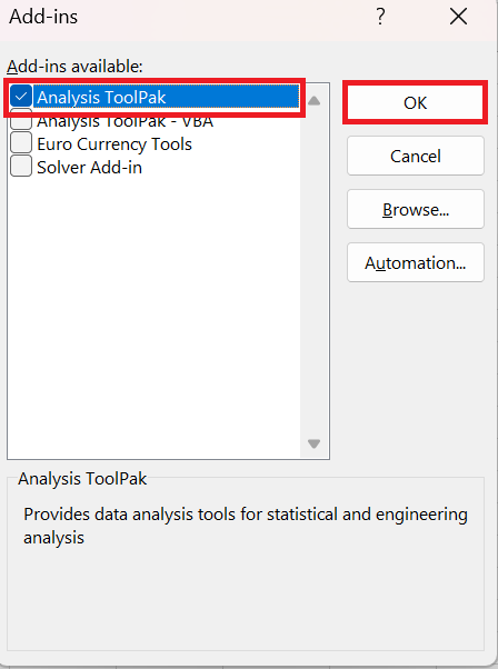
Now the Analysis ToolPak is loaded into your Excel and its command is available in the Analyze group on the Data tab .
Specify the bin range of the Excel histogram
Before creating a histogram, there is one more preparation to do: add the bins in a separate column.
Bins are numbers that represent the intervals into which you want to group the source data (input data). The intervals must be consecutive, non-overlapping, and generally the same size.
Histogram tool bins input data values based on the following logic:
- A value is included in a certain class if it is greater than the lowest limit and equal to or less than the largest limit for that class.
- If your input data contains values greater than the highest bin, all of these numbers will be included in the More category .
- If you do not specify the bin range, Excel will create a set of bins evenly distributed between the minimum and maximum values of your input data range.
Given the above, type the bin numbers you want to use in a separate column. The bins should be entered in ascending order, and your Excel histogram bin range should be limited to the input data range.
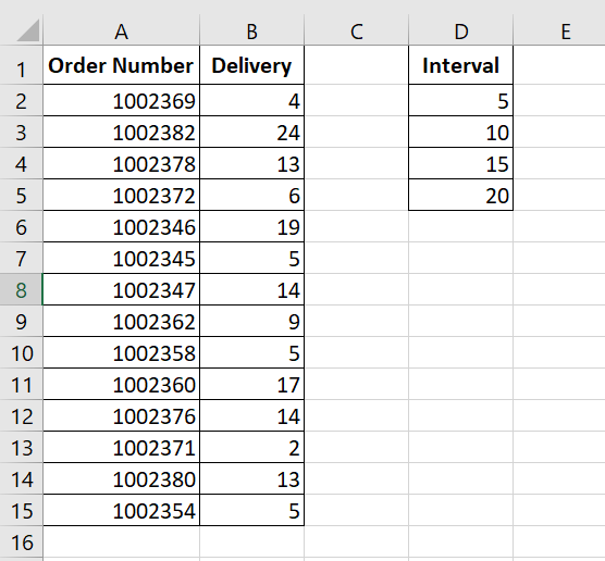
In this example, we have the order numbers in column A and the estimated delivery in column B. In our Excel histogram, we want to display the number of items delivered in 1-5 days, 6-10 days, 11-15 days, 16-20 days, and more than 20 days. So, in column D, we enter the bin range from 5 to 20 with an increment of 5, as shown in the screenshot below:
Create a Histogram Using Excel’s Analysis Tool
With the Analysis ToolPak enabled and the bins specified, follow these steps to create a histogram in your Excel sheet:
- Data tab , in the Analysis group , click the Analysis ToolPak button.

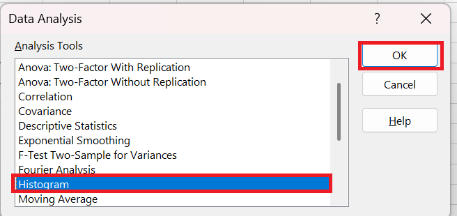
- In the Data Analysis dialog box , select Histogram and click OK.
- Histogram dialog window , do the following:
- Specify the input range and bin range.
To do this, you can place the cursor in the box and then simply select the corresponding range on your spreadsheet using the mouse. Alternatively, you can click the Collapse button
 , select the range on the sheet, and then click the Collapse button
  to return to the Histogram dialog box.
If you included column headers when selecting the input data and bin range, check the Heading present box .
- Select output options .
To place the histogram on the same sheet, click Output Range , and then enter the top-left cell of the output table.
To paste the output table and histogram into a new sheet or workbook, select Insert New Worksheet or Create New Workbook , respectively .
Finally, choose one of the additional options:
- To present the data in the output table in descending order of frequency, check the Pareto (sorted histogram) box.
- To include a cumulative percentage line in your Excel histogram, select the Cumulative percentage box .
- To create an embedded histogram, check the Graphical representation box .
For this example, we have configured the following options:
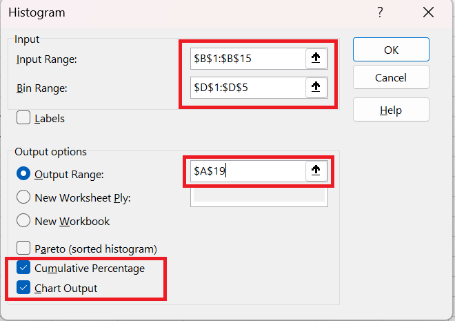
- And now click OK and examine the output table and histogram graph:
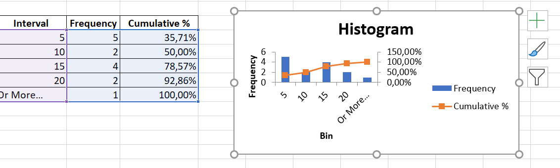
To improve the histogram, you can replace the default groups and frequency with more meaningful axis titles, customize the chart legend, and more. You can also use the design, layout, and format options in the chart tools to change how the histogram appears.
As you’ve just seen, it’s very easy to create a histogram in Excel using the Analysis ToolPak. However, this method has one important limitation: the built-in histogram chart is static, meaning you’ll have to create a new histogram every time the input data changes.
To create a histogram that can be updated automatically, you can either use Excel functions or create a pivot table .
3 How to Make a Histogram in Excel Using Formulas
Another way to create a histogram in Excel is to use the FREQUENCY or COUNTIFS function . The biggest advantage of this approach is that you won’t have to redo your histogram every time the input data changes. Like a regular Excel chart, your histogram updates automatically as soon as you change, add new input values, or delete existing values.
To begin, organize your source data in one column (column B in this example) and enter the bin numbers in another column (column D), as in the screenshot below:
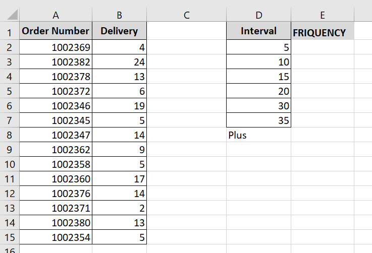
Now we will use a frequency or count formula to calculate the number of values falling within the specified ranges (bins), and then draw a histogram based on this summary data.
3.1 Creating a histogram using the FREQUENCY function
The most obvious function for creating a histogram in Excel is the FREQUENCY function, which returns the number of values in specific ranges, ignoring text values and empty cells.
The FREQUENCY function has the following syntax:
FREQUENCY( data_array; interval_matrix)
The FREQUENCY function syntax has the following arguments:
- data_array : Represents an array of values or a reference to the set of values whose frequencies you want to calculate. If the data_array argument contains no values, the FREQUENCY function returns an array of zeros.
- array_intervals : Represents an array of intervals or a reference to the intervals into which you want to group the values in the data_array argument. If the array_intervals argument contains no values, the FREQUENCY function returns the number of elements in the data_array argument.
In this example, data_array is B 2:B 40, interval_matrix is D2:D8, so we get the following formula:
= FREQUENCY (B2:B19; D2:D8)
Please keep in mind that the FREQUENCY function is a very specific function, so follow these rules to make it work properly:
- An Excel frequency formula must be entered as a multi-cell array formula. First, select a range of adjacent cells where you want to display the frequencies, then type the formula in the formula bar and press Ctrl + Shift + Enter to complete it.
- It is recommended to enter one more frequency formula than the number of bins. The extra cell is required to display the number of values above the highest bin. For clarity, you can label it » More » as in the following screenshot (but do not include this » More » cell in your interval_matrix argument !):
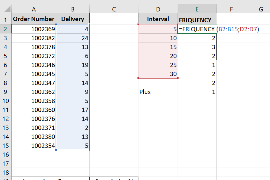
Like the Histogram option in the Analysis ToolPak, Excel’s FREQUENCY function returns values greater than a previous bin and less than or equal to a given bin. The last Frequency formula (in cell E9) returns the number of values greater than the highest bin (that is, the number of delivery days out of 35).
For ease of understanding, the following screenshot shows the classes (column D), the corresponding intervals (column C) and the calculated frequencies (column E):
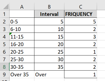
Because the Excel FREQUENCY function is an array function, you cannot edit, move, add, or delete the individual cells containing the formula. If you decide to change the number of bins, you will need to first delete the existing formula, then add or remove bins, select a new range of cells, and reenter the formula.
3.2 Create a histogram using the COUNTIFS function
Another function that can help you calculate frequency distributions to plot the histogram in Excel is the COUNTIFS function . And in this case, you will need to use 3 different formulas:
- The formula for the first cell – top bin (F2 in the screenshot below):
= COUNTIFS ($B$ 2:$ B$40 ; »<= »&$D2)
The formula counts the number of values in column B less than the smallest bin in cell D2, i.e. returns the number of items delivered within 1 to 5 days.
- The formula for the last cell – on the highest bin (F9 in the screenshot below):
= COUNTIFS ($B$ 2:$ B$100 ; »> »&$D8)
The formula counts the number of values in column B greater than the highest bin in D8.
- The formula for the remaining bins (cells F 3:F 8 in the screenshot below):
= COUNTIFS ($B$2:$B$40 ; »> »&$D2 ;$B$2:$B$40 ; « <= »&$D3)
The formula counts the number of values in column B that are greater than the bin in the row above and less than or equal to the bin in the same row.
As you can see, the FREQUENCY and COUNTIFS functions return identical results:
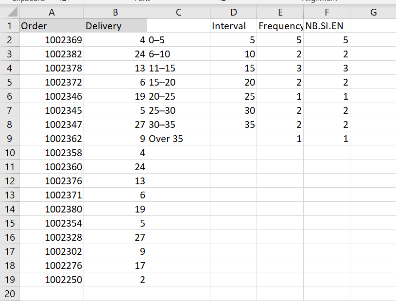
Make a histogram based on the summary data
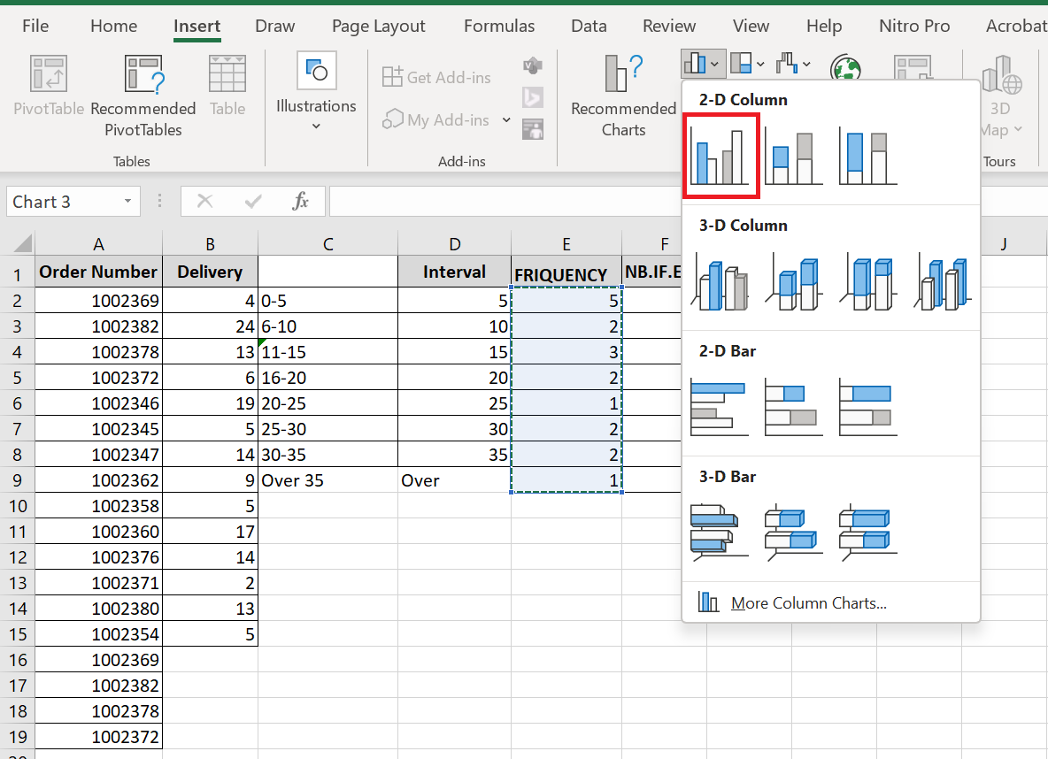
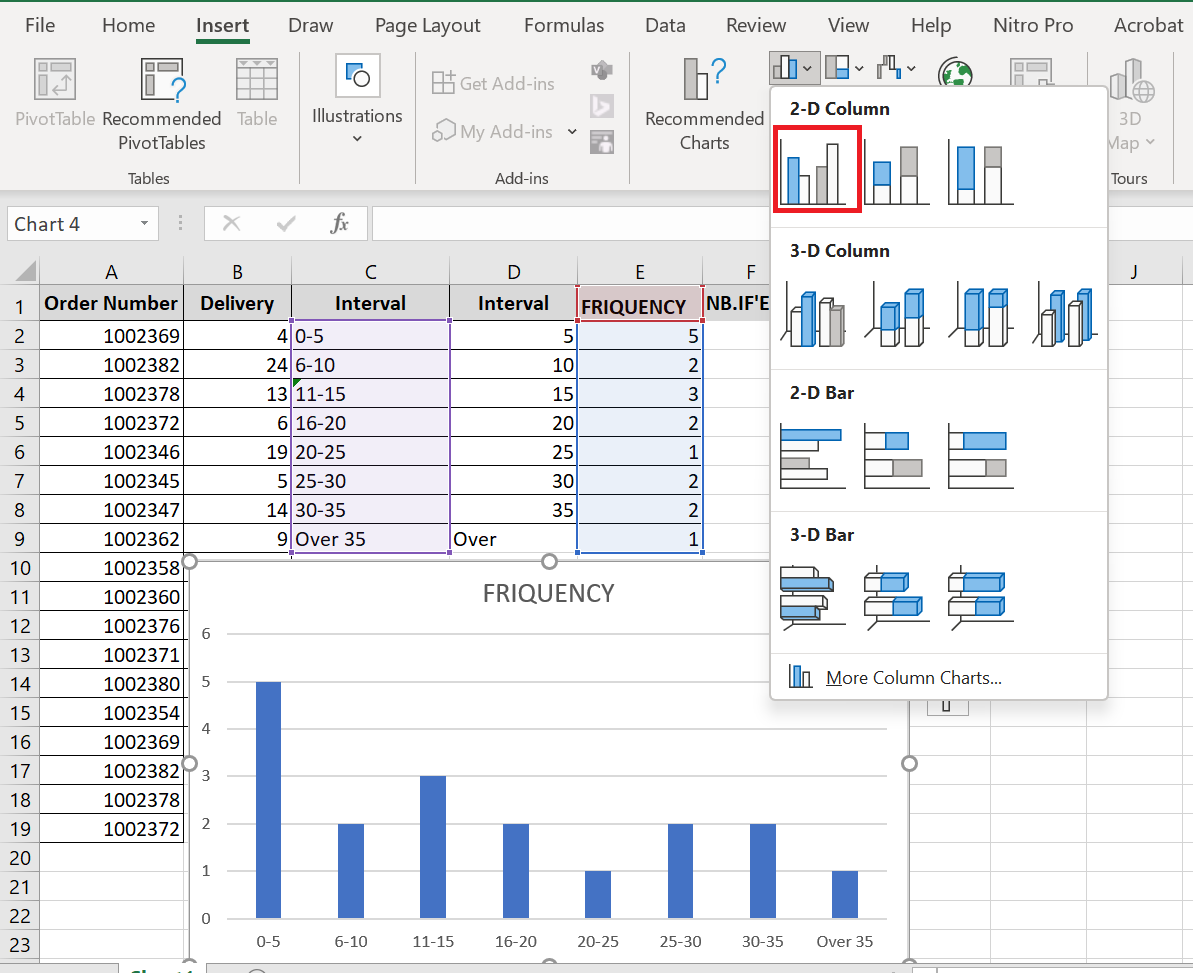
Now that you have a list of frequency distributions calculated with the FREQUENCY or COUNTIFS function, create a usual bar chart – select the frequencies, switch to the tab Insert and click the 2-D column chart in the Charts group :
The histogram will be immediately inserted into your sheet:
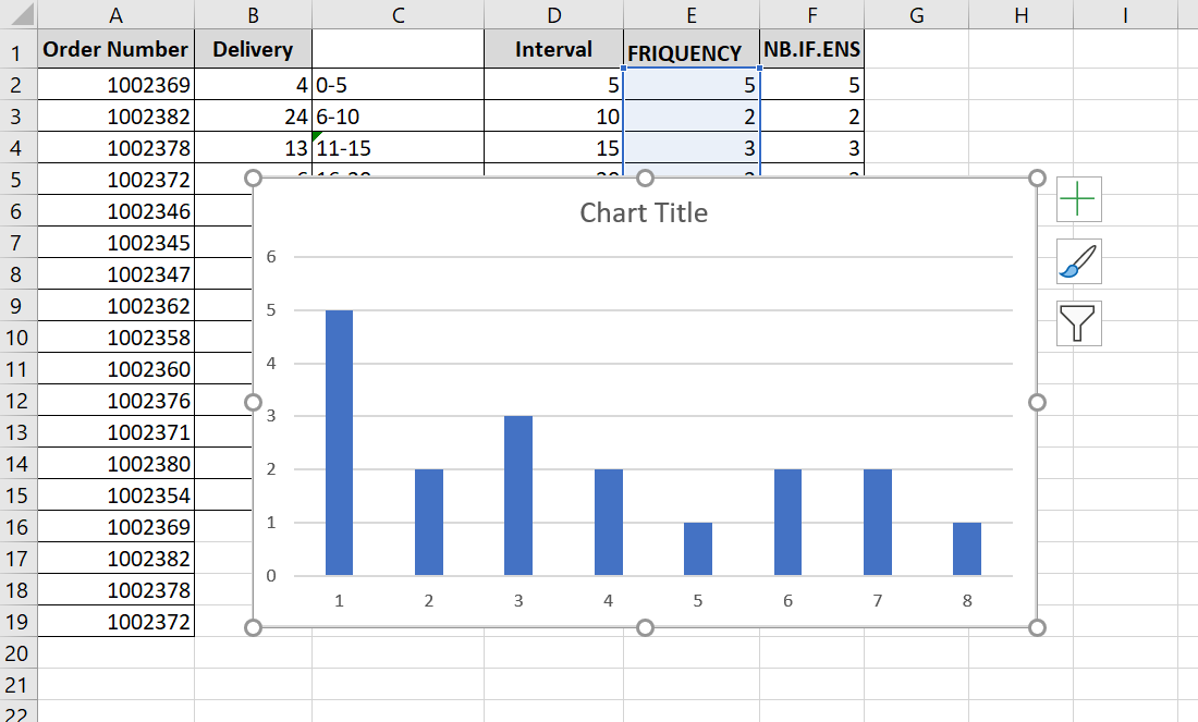
Generally speaking, you already have a histogram for your input data, although it certainly needs some improvement. More importantly, to make your Excel histogram easy to understand, you should replace the default horizontal axis labels represented by serial numbers with your bin numbers or ranges.
The easiest way is to type the ranges in a column to the left of the column with the frequency formula, select both columns – Ranges and Frequencies – and then create a bar chart. The ranges will automatically be used for the X-axis labels, as shown in the screenshot below:
If Excel converts your intervals to dates (for example, 1-5 may be automatically converted to 05- Jan ) , type the intervals with a preceding apostrophe (‘) like ‘1-5 . If you want your Excel histogram labels to display bin numbers , type them with preceding apostrophes as well, for example ‘5 , ’10 , etc. The apostrophe simply converts the numbers to text and is invisible in the cells and on the histogram.
4 Customize and improve your histogram
Whether you’re creating a histogram using the Analysis ToolPak, Excel functions, or a PivotChart, you’ll often want to customize the default chart to your liking.
Change axis labels on an Excel histogram
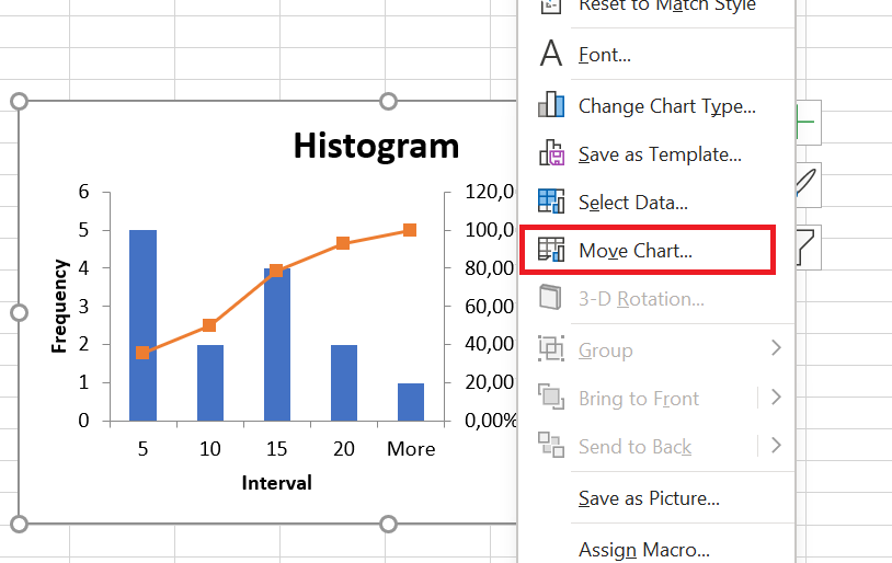
When you create a histogram in Excel with the Analysis ToolPak, Excel adds horizontal axis labels based on the bin numbers you specify. But what if you want to display ranges instead of bin numbers on your Excel histogram? To do this, you need to change the horizontal axis labels by doing the following:
- Right-click the category labels on the X axis, then click Select Data…
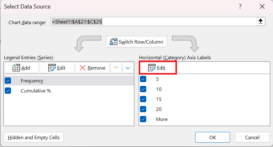
- In the right pane, under Horizontal Axis Labels (Category ) , click the Edit button .
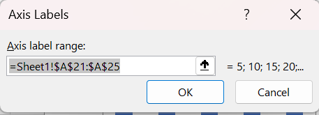
- In the Axis Label Range box, enter the labels you want to display, separated by commas. If you enter the intervals, enclose them in quotation marks as in the following screenshot:
- Click OK.
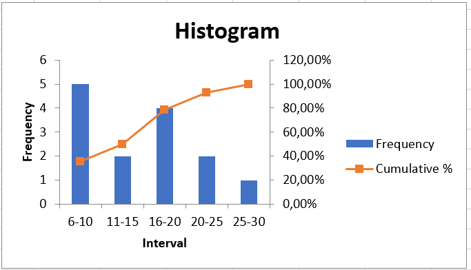
Remove spacing between bars
When creating a histogram in Excel, users often expect adjacent columns to touch each other, without any gaps. This is easy to fix. To eliminate gaps between bars, simply follow these steps:
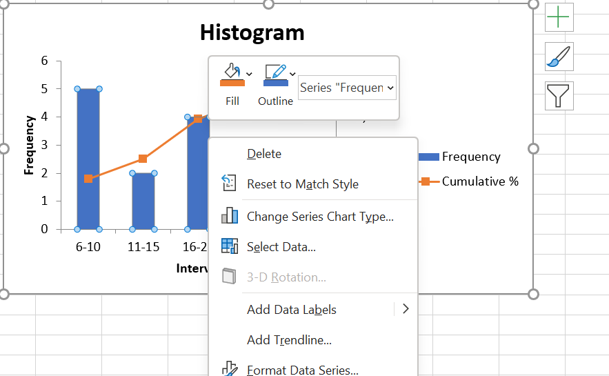
- Select the bars, right-click and choose Format Data Series…
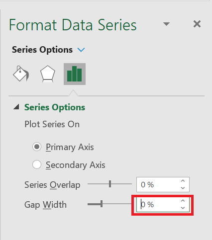
- In the Format Data Series… pane , set the Gap Width to zero:
And there you have it, you have drawn an Excel histogram with touching bars.
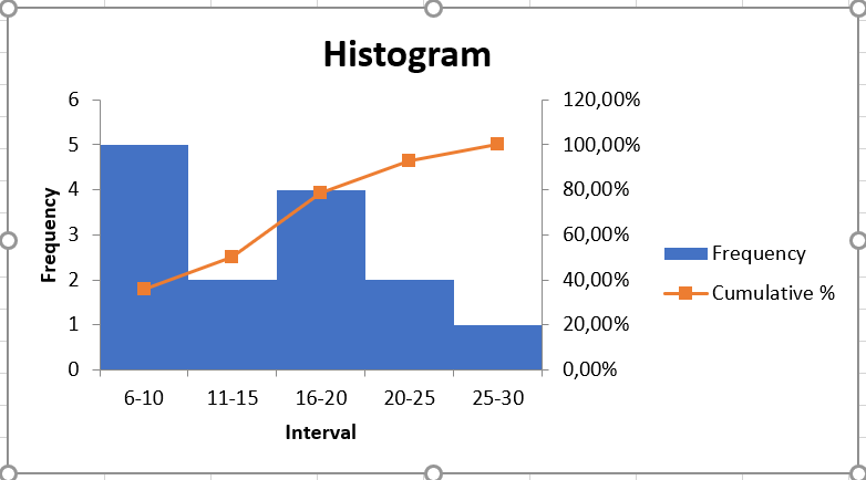
And then you can further beautify your Excel histogram by changing the chart title, axis titles, and changing the chart style or colors.
How to Create a Line Chart in Excel
How to Create a Line Chart in Excel
The line chart is one of the simplest and easiest charts to create in Excel. However, being simple doesn’t mean being worthless. Line charts are very popular in statistics and science because they clearly show trends and are easy to plot.
So, let’s take a look at how to create a line chart in Excel, when it’s particularly effective, and how it can help you understand complex data sets.
Excel Line Chart
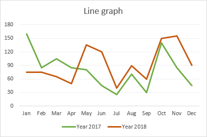
A line chart is a visual that displays a series of data points connected by a straight line. It is commonly used to visually represent quantitative data over a period of time.
Independent values, such as time intervals, are plotted on the horizontal x-axis, while dependent values, such as prices, sales, and others, go on the vertical y-axis. Negative values, if any, are plotted below the x-axis. Downward-sloping and upward-sloping lines on the graph reveal trends in your data set: an upward slope indicates increasing values, and a downward slope indicates decreasing values.
When to Use a Line Chart
Line charts work well in the following situations:
1. Good visualization of trends and changes. Of all the Excel chart varieties, a line chart is best suited to show how different things change over time.
2. Easy to create and read. If you’re looking for a simple and intuitively clear way to visualize large, complex data, a line chart is the right choice.
3. Show relationships between multiple data sets. A multi-line chart can help you reveal relationships between two or more variables.
When Not to Use a Line Chart
There are a few cases in which a line chart is not suitable:
1. Not suitable for large data sets. Line charts are best used for small data sets with fewer than 50 values. More values would make your chart more difficult to read.
2. Ideal for continuous data. If you have discrete data in separate columns, use a bar chart.
3. Not suitable for percentages and proportions. To display data as a percentage of the whole, you’re better off using a pie chart or a stacked column chart.
4. Not recommended for schedules. While line charts are great for showing trends over a period of time, a visual view of planned projects over time is best achieved with a Gantt chart.
How to Create a Line Chart in Excel
To create a line chart in Excel 2019, 2016, 2013, 2010, and earlier, follow these steps:
1. Set up your data
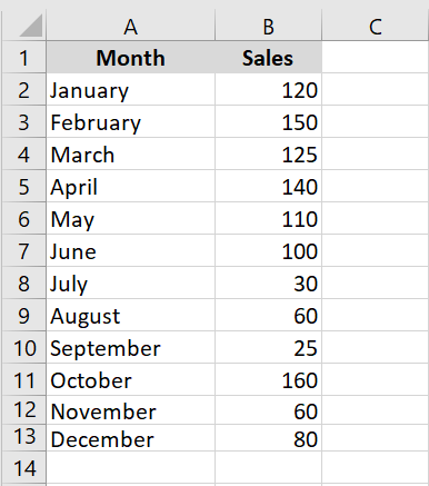
A line chart requires two axes, so your table must contain at least two columns: the time intervals in the leftmost column and the dependent values in the rightmost column(s).
In this example, we’ll create a single-line chart, so our sample dataset has the following two columns:
1. Select the data to include in the chart
In most situations, selecting a single cell is enough for Excel to automatically select the entire table. If you only want to plot a portion of your data, select that portion and make sure to include the column headers in the selection.
2. Insert a line chart
Once the source data is selected, go to the Insert tab / Charts group, click the Insert Line or Area Chart icon, and choose one of the available chart types.
When you hover over a chart template, Excel will show you a description of the chart and its preview. To insert the chosen chart type into your worksheet, simply click on its template.
In the screenshot below, we’re inserting the 2D line chart:

How to Plot Multiple Lines in Excel
To plot a multi-line chart, follow the same steps as for creating a single-line chart. However, your table must contain at least three columns of data: time intervals in the left column and observations (numeric values) in the right columns. Each data series will be plotted individually.
With the source data highlighted, go to the Insert tab, click the Insert Line or Area Chart icon, and then click 2D Line or another chart type of your choice:

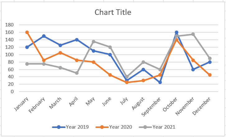
A multi-line chart is immediately inserted into your spreadsheet and you can now compare sales trends for different years.

When creating a multi-line chart, try to limit the number of lines to 3-4, as more lines will make your chart cluttered and difficult to read.
Types of Excel Line Charts
In Microsoft Excel, the following types of line charts are available:
• Line. The classic 2D line chart shown above. Depending on the number of columns in your data set, Excel will draw a single-line or multi-line chart.
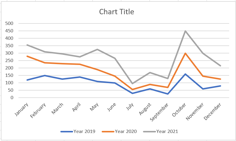
• Stacked Line. This chart is designed to show how parts of a whole change over time. The lines in this chart are cumulative, meaning that each additional data series is added to the first, so the top line is the total of all the lines below it. Therefore, the lines never cross.
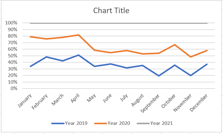
• Stacked 100% Line. This is similar to a stacked line chart, except the y-axis displays percentages rather than absolute values. The top line always represents a total of 100% and crosses the top of the chart. This type is typically used to visualize a part-to-whole contribution over time.
• Line with markers. The marked version of the line chart with indicators at each data point. Marked versions of the Stacked Line and 100% Stacked Line charts are also available.
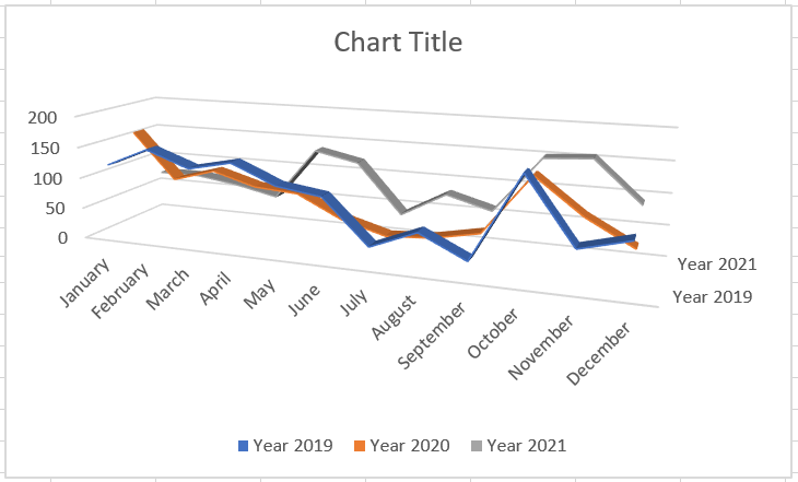
• 3-D Line. A three-dimensional variation of the basic line graph.
How to Customize and Improve an Excel Line Chart
The default line chart created by Excel already looks great, but there’s always room for improvement. To give your chart a unique and professional look, it makes sense to start with common customizations such as:
• Adding, editing, or formatting the chart title.
• Moving or hiding the chart legend.
• Changing the axis scale or choosing a different number format for axis values.
• Showing or hiding chart gridlines.
• Changing the chart style and colors.
How to Show and Hide Lines in a Chart
When creating a chart with multiple lines, you may not want to display all the lines at once. Therefore, you can use one of the following methods to hide or delete irrelevant lines:
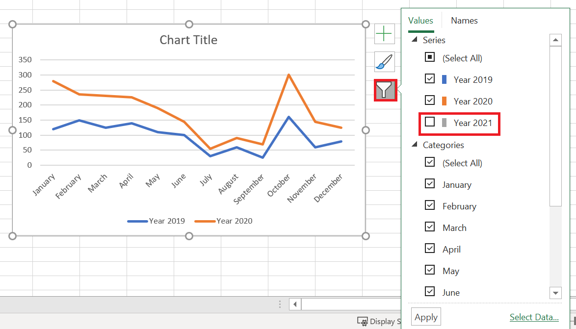
1. Hide columns. In your spreadsheet, right-click a column you don’t want to plot in the chart and click Hide. Once the column is hidden, the corresponding row will immediately disappear from the chart. As soon as you unhide the column, the row will immediately return.
2. Hide rows in the chart. If you don’t want to distort the source data, click the Chart Filters button on the right side of the chart, uncheck the data series you want to hide, and click Apply:
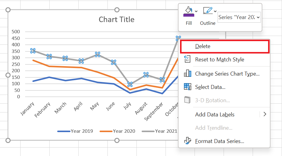
1. Delete a line. To permanently delete a certain line from the chart, right-click on it and select Delete from the context menu.
Changing Data Markers in a Line Chart
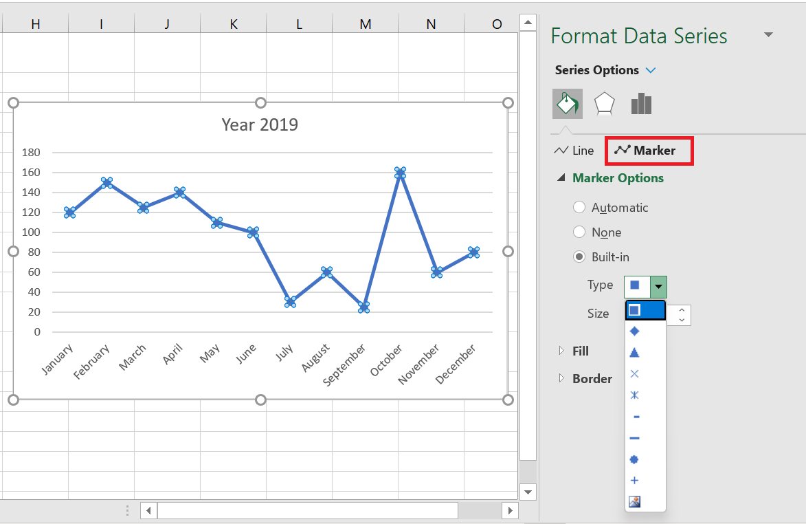
When creating a line chart with markers, Excel uses the Circle marker type by default, which, in my humble opinion, is the best choice. If this marker option doesn’t fit well with your chart design, you can choose another one:
1. In your chart, double-click the line. This will select the line and open the Format Data Series pane on the right side of the Excel window.
2. In the Format Data Series pane, switch to the Fill & Line tab, click Marker, expand Marker Options, select the Built-in radio button, and choose the desired marker type in the Type box.
3. Optionally, enlarge or reduce the markers using the Size box.
Changing the Color and Appearance of a Line
If the default line colors don’t seem very appealing to you, here’s how you can change them:
1. Double-click the line you want to recolor.
2. In the Format Data Series pane, switch to the Fill & Line tab, click the Color drop-down list, and choose a new color for the line.
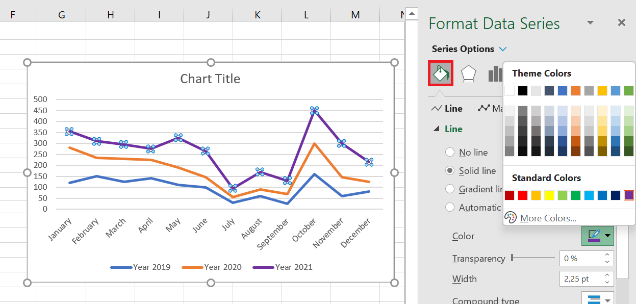
If the standard color palette isn’t sufficient for your needs, click More Colors… and then choose the RGB color of your choice.
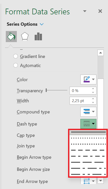
In this pane, you can also change the line type, transparency, dash type, arrow type, and more. For example, to use a dotted line in your chart, click the Dash Type drop-down list and choose the desired pattern:
Even more formatting options are available in the Chart Tools tabs (Chart Design and Format), which are activated when you select the chart or its element.
Smooth Line Chart Corners
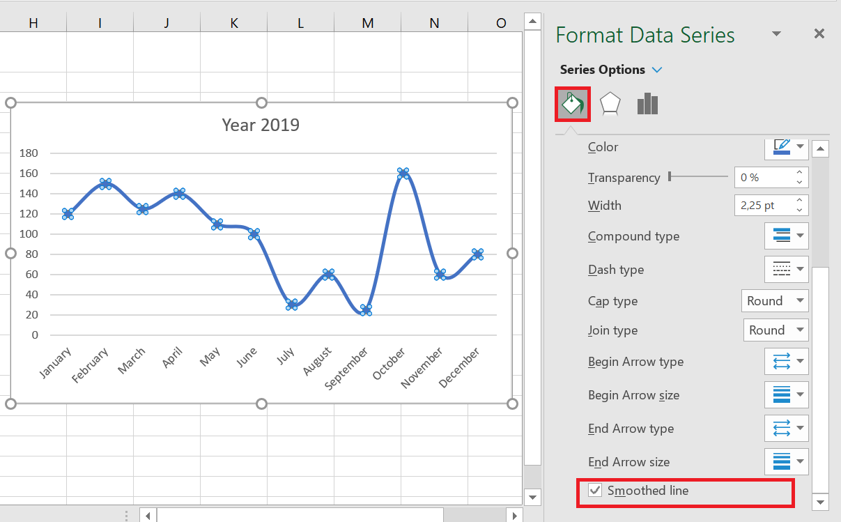
By default, the line chart in Excel is drawn with corners, which works well most of the time. However, if the standard line chart isn’t attractive enough for your presentation or printed documents, there’s an easy way to smooth the line corners. Here’s what you do:
1. Double-click the line you want to smooth.
2. In the Format Data Series pane, switch to the Fill & Line tab and select the Smooth Line check box.
For a multi-line chart, perform the above steps for each line individually.
How to Create a Waterfall Chart in Excel
How to Create a Waterfall Chart in Excel
Microsoft Excel offers many predefined chart types, including column, line, pie, bar, radar, and more. In this section, we’ll go beyond basic chart creation and take a closer look at a special chart type: the waterfall chart in Excel. You’ll learn what a waterfall chart is and how useful it can be.
1 What is a waterfall chart?
Let’s first look at what a simple waterfall chart should look like and when it can be useful.
A waterfall chart is actually a special type of Excel column chart. It is normally used to demonstrate how the starting position increases or decreases through a series of changes.
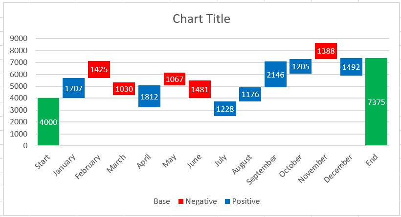
The first and last columns of a typical waterfall chart represent the total values. The middle columns appear to float and show a positive or negative change from one period to the next, culminating in the final total value. Typically, these columns are color-coded to distinguish between positive and negative values.
A waterfall chart is also known as an Excel bridge chart because the floating columns form a bridge connecting the endpoints.
These charts are very useful for analytical purposes. Whether you need to evaluate a company’s profits or product revenue, conduct an inventory or sales analysis, or simply show how the number of your Facebook friends has changed over the past year, a waterfall chart in Excel is exactly what you need.
2 How to Create an Excel Bridge Table
Don’t waste your time searching for a waterfall chart type in Excel—you won’t find it there. The problem is that Excel doesn’t have a built-in waterfall chart template. However, you can easily create your own version by carefully organizing your data and using a standard Excel stacked column chart type.
Let’s create a simple example table with positive and negative values to better understand things. We’ll use sales figures as an example. If you look at the table below, you’ll see that sales increase in some months and decrease in others compared to the starting position.
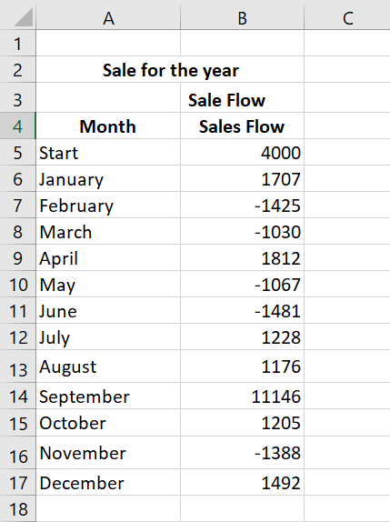
The Excel bridge chart will be an ideal way to visualize sales flow over twelve months. But if you now apply a stacked column chart template to these particular values, you won’t get anything resembling a waterfall chart. The first thing to do is carefully rearrange your data.
Step 1: Reorganize the data table
You start by inserting three additional columns into your Excel spreadsheet. Let’s call them Base, Negative, and Positive. The Base column will be a calculated amount that is used as the starting point for the Negative and Rise series in the chart. Any negative numbers in the Sales Flow column will be placed in the Negative column , and any positive numbers will be in the Positive column .
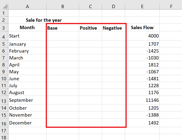
We’ve also added the End row at the bottom of the Month list to calculate the sales amount for the entire year. Now move on to the next step and fill in these columns with the necessary values.
Step 2. Insert formulas
The best way to complete the table is to enter special formulas in the first cells of the corresponding columns, and then copy them to the adjacent cells using the fill handle.
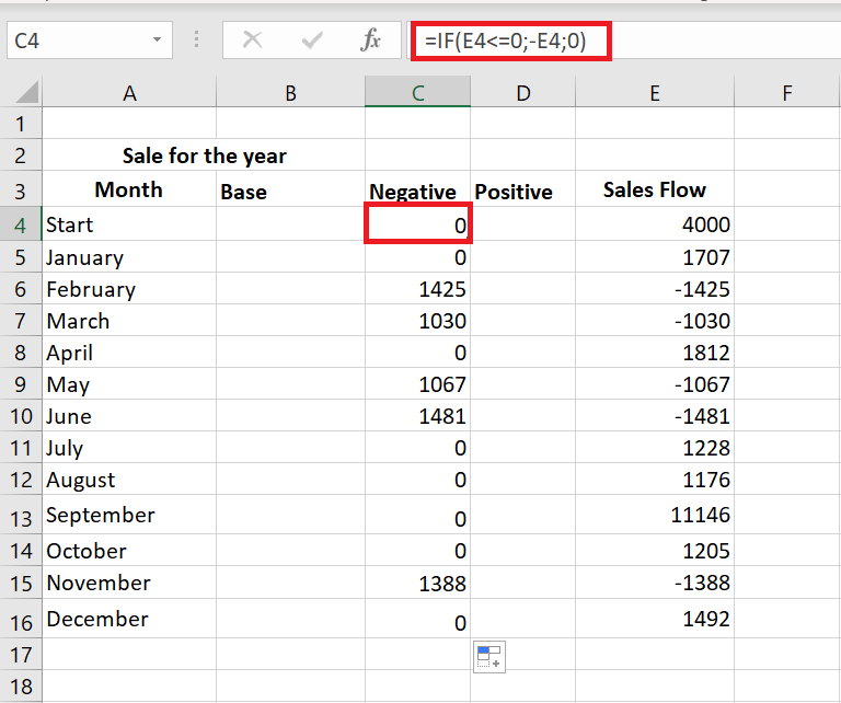
- Select cell C4 in the Negative column and enter the following formula : = IF(E4<=0; -E4;0)
The formula indicates that if the value in cell E4 is less than or equal to zero, the negative number will be displayed as positive and the positive number will be displayed as zero.
If you want all values in a waterfall chart to be greater than zero, you must enter a minus sign ( – ) before the second cell reference (E4) in the formula. And two minuses will make a plus.
- Copy the formula to the end of the table.
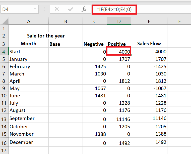
- Click on cell D4 and type =IF(E4>0, E4, 0).
This means that if the value in cell E4 is greater than zero, all positive numbers will be displayed as positive and negative numbers as zero.
- Use the fill handle to copy this formula down the column.
- Insert the last formula =B4+D4-C5 into cell B5 and copy it; include the end row.
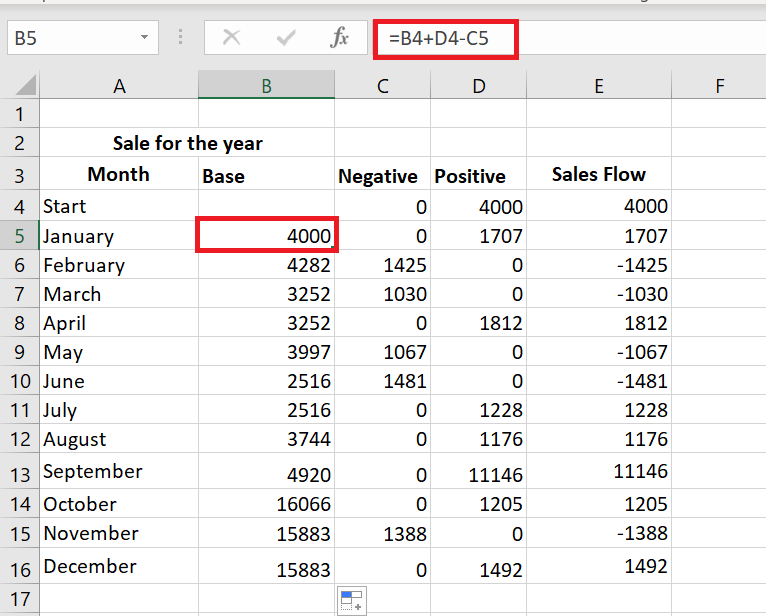
This formula calculates the base values that will support the rises and falls at the appropriate height.
Step 3. Create a standard stacked column chart
Your data is now well organized and you are ready to create the chart itself.
- Select your data, including column and row headers, exclude the Sales Flow column.
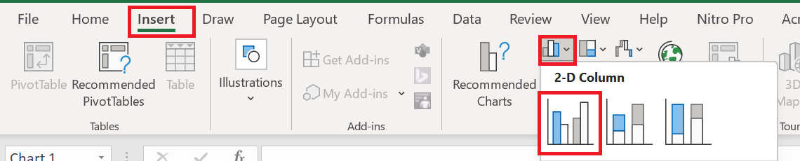
- Charts group on the Insert tab .
- Click on the icon Insert a column chart and choose Stacked Column from the drop-down list.
The chart appears in the spreadsheet, but it hardly looks like a waterfall chart. Continue to the next step and turn the stacked column chart into an Excel waterfall chart.
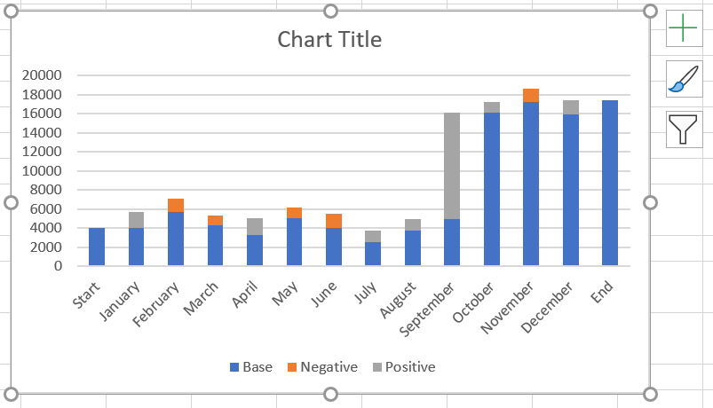
Step 4. Transform the column chart into a waterfall chart
Now’s the time to learn the secret. Simply make the Base series invisible to create a waterfall chart from a stacked column.
- Click on the base series to select them, right-click and choose the Format Data Series… option from the context menu.
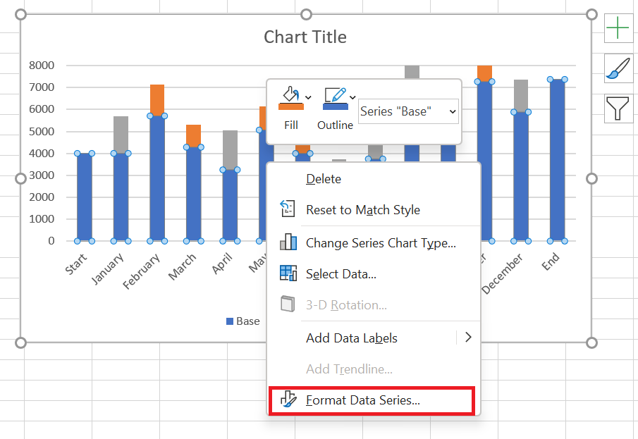
Format Data Series pane appears immediately to the right of your worksheet.
- Click the Fill & Stroke icon.
- Select No Fill in the Fill section and No Line in the Border section .
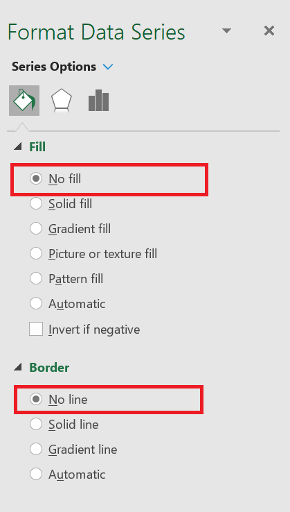
When the blue columns become invisible, simply remove Base from the chart legend to completely hide all Base series traces.

Step 5. Format the Excel bridge chart
First we’ll make the flying bricks brighter and highlight the start and end values in the graph:
- Select the Fall series in the chart and go to the Formatting tab.
- Click Shape Fill in the Shape Styles group .
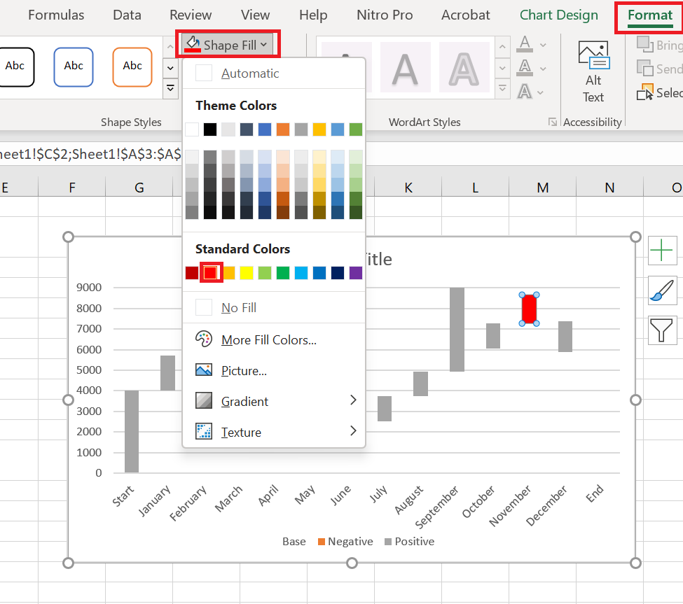
- Choose the color you want from the drop-down menu.
You can also experiment with column outlines or add special effects to them. Simply use the Shape Outline and Shape Effects options on the Formatting tab to make changes.
Next, you should do the same trick with the Positive series. As for the Start and End columns, you need to color-code them individually, but they must be the same color.
When you’re done, the graph should look like the one below:
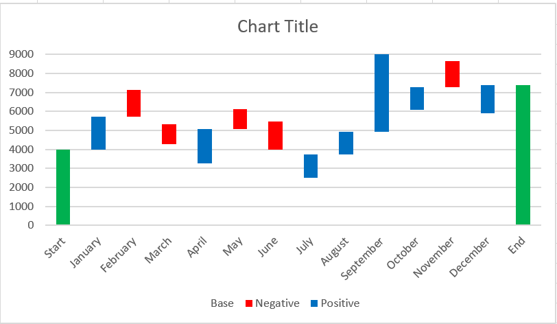
You can also change the color and outline of the chart columns by opening the Format Data Series pane or choosing the Fill or Outline options from the context menu.
Then you can remove the excess white space between the columns to make them closer together:
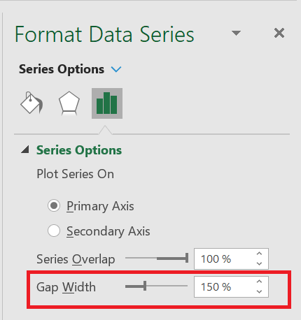
- Double-click one of the chart columns to display the Format Data Point pane .
- Change the gap width to something smaller, like 15% . Close the pane.
Now the holes in the bridge table are filled.
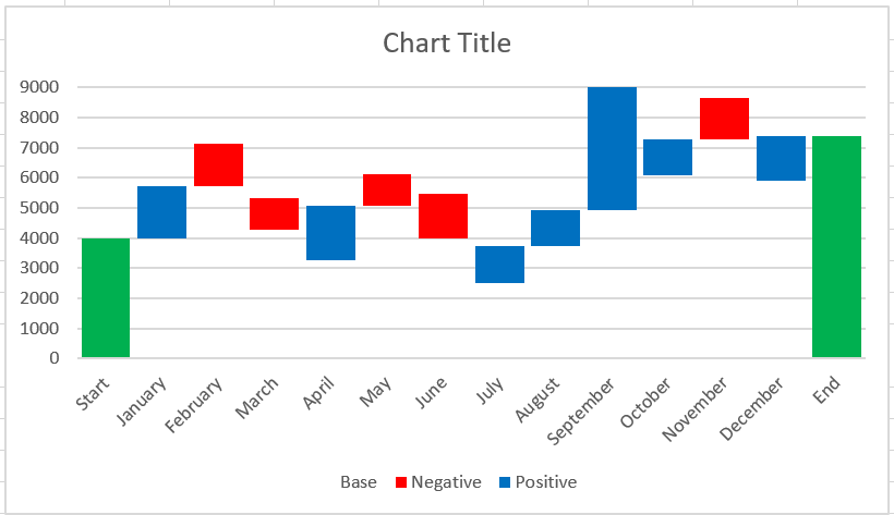
When you look at the waterfall chart above, some of the flying bricks appear to be the same size. However, when you refer to the data table, you will see that the values represented are different. For more accurate analysis, I would recommend adding data labels to the columns.
- Select the series you want to label.
- Right click and choose the option Add data labels from the context menu.
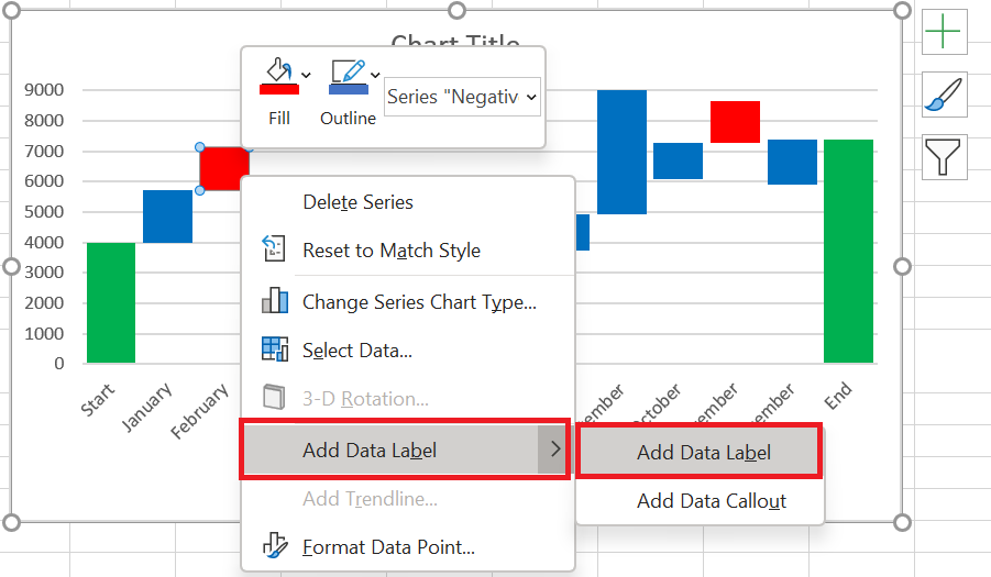
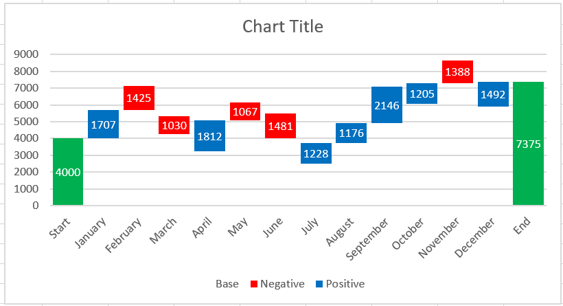
Repeat the process for the other series. You can also adjust the label position, text font, and color to make the numbers more readable.
If there is an apparent difference in column sizes and the details are not important, you can omit the data labels, but then you should add a Y axis for better interpretation of the data.
When you’re done labeling the columns, simply delete unnecessary elements such as zero values and the legend. You can also change the default chart title to a more descriptive one.
Add-ins for creating waterfall charts
As you can see, manually creating a waterfall chart in Excel 2016-2010 isn’t difficult at all. However, if you don’t want to bother rearranging your data, you can use special add-ins that can do all the work for you.
Jon Peltier suggests using his Peltier Technical Chart utility to automatically create waterfall charts and other custom charts from raw data. You can choose to create a standard waterfall chart or a stacked waterfall chart. There’s no need to enter any formulas; simply select your data, click the Waterfall Chart command on the ribbon, set a few options, click OK, and your Excel bridge chart is ready. In addition to custom charts, the add-in provides you with various charts, data, and general tools to make your work in Excel easier.

You can even create a waterfall chart online and receive it as an Excel file via email. This is possible thanks to a great online waterfall chart service. All you have to do is submit your data, specify your email address, and wait less than a minute while your chart is generated. Then check your inbox. The waterfall chart is sent to you in an Excel file. You can then edit the title, labels, colors, etc. just like in any other Excel chart. However, you cannot edit the numerical data. In this case, you will have to recreate a chart. You must also follow certain rules for submitting your data if you want your waterfall chart to look as expected.
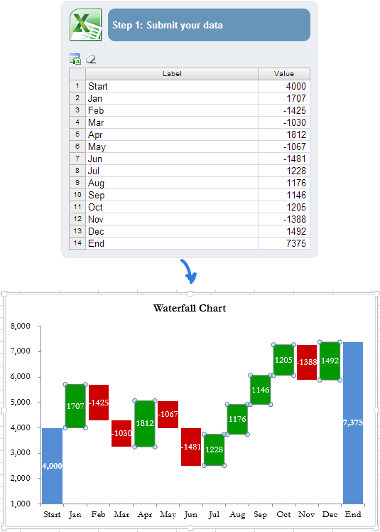
The more complex a chart you want to create, the more complex formulas you’ll need to enter when rearranging your data. And the chance of errors increases. In this situation, the Waterfall Chart Creator add-in for Microsoft Excel can help you save time and effort. With this add-in, you can create, edit, and update multiple waterfall charts at once. It lets you specify colors, a solid or gradient fill, display values and position, and offers many other options. You can also customize the default settings and colors for new charts.
You now have a collection of waterfall charts in Excel. I hope it won’t be a problem for you to manually create your own version of a waterfall chart. If not, you can take advantage of Excel waterfall chart add-ins.
How to Create a Pareto Chart in Excel
How to Create a Pareto Chart in Excel
In a perfect world, everything would be in harmony—every job would pay the same price, every taxpayer would receive the same tax benefits, every player would be equally important to a team. But our world isn’t perfect, and the relationships between inputs and outputs aren’t equal. Want to know the main causes you should devote the most effort to? This is what the Pareto Principle, or the law of the few, is all about.
1 Pareto Analysis in Excel
Pareto analysis is based on the Pareto Principle, named after Italian economist Vilfredo Pareto. This principle states that for many events, approximately 80% of the effects come from 20% of the causes. This is why the Pareto Principle is sometimes called the 80/20 rule.
Here are some practical examples of the Pareto principle:
- In economics, the richest 20% of the world’s population control about 80% of global income.
- In medicine, 20% of patients use 80% of healthcare resources.
- In software, 20% of bugs cause 80% of errors and crashes.
To identify the most important factors you need to focus on, you can draw a Pareto chart in your Excel spreadsheet.
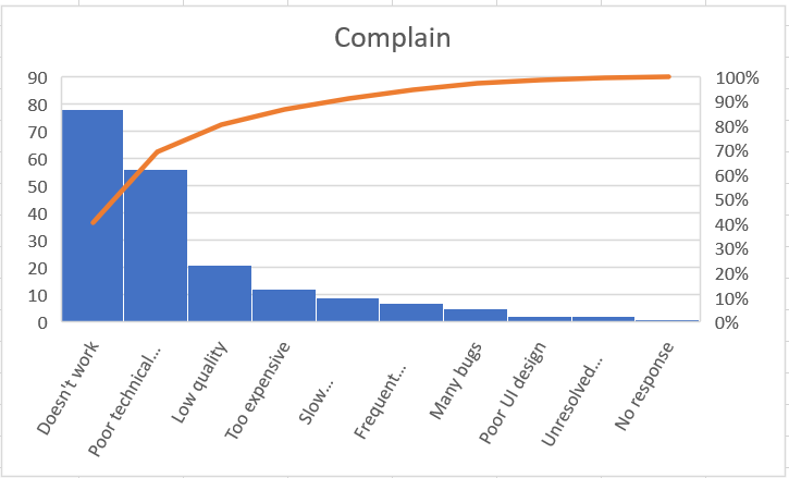
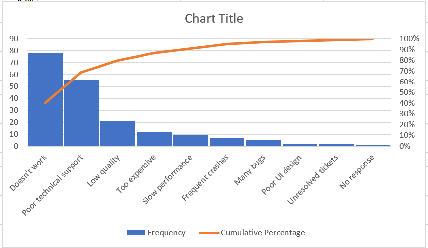
A Pareto chart is a graph based on the Pareto principle. In Microsoft Excel, it’s a sorted histogram that contains both vertical bars and a horizontal line. The bars, plotted in descending order, represent the relative frequency of values, and the line represents the cumulative total percentage.
Here’s what a typical Excel Pareto chart looks like:
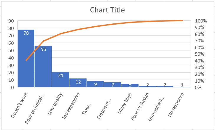
As you can see, a Pareto chart highlights the main elements of a data set and shows the relative importance of each element to the total. Below are detailed instructions on how to create a Pareto chart in different versions of Excel.
2 How to Make a Pareto Chart in Excel 2016 or 2019
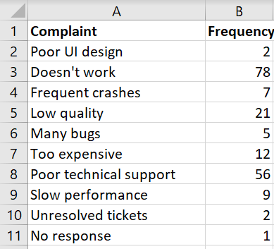
Drawing a Pareto chart in Excel 2016 or 2019 is easy because it has a built-in Pareto chart type. All you need is a list of items (issues, factors, categories, etc.) in one column and their number (frequency) in another column.
As an example, we will perform a Pareto analysis of typical user complaints about software based on this dataset:
To create a Pareto chart in Excel, please follow these simple steps:
- Select your table. In most cases, you only need to select a single cell and Excel will automatically select the entire table.
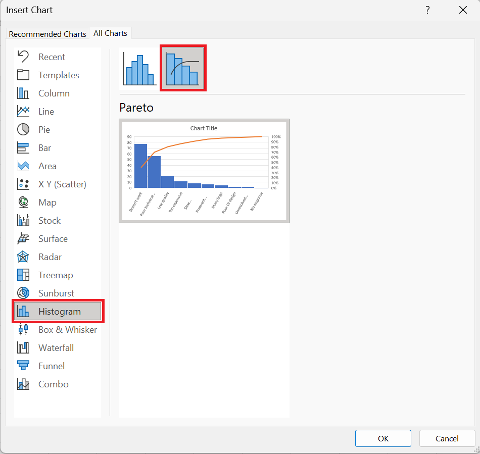
- Insert tab , in the Charts group , click Recommended Charts.
- All Charts tab , select Histogram in the left pane, and click the Pareto tile .
- Click OK .
That’s all there is to it! The Pareto chart is immediately inserted into a spreadsheet. The only improvement you’d probably want to make is adding/editing the chart title:
3 Customizing the Pareto Chart
The Pareto chart created by Excel is fully customizable. You can change the colors and style, show or hide data labels, and more.
3.1 Design the Pareto chart as you wish
Click anywhere in your Pareto chart to bring up the chart tools on the ribbon. Switch to the Chart Design tab and experiment with different chart styles and colors:

3.2 Show or hide data labels
to display the bar values, click the Chart Elements button on the right side of the chart, check the Data Labels box , and choose where you want to place the labels:
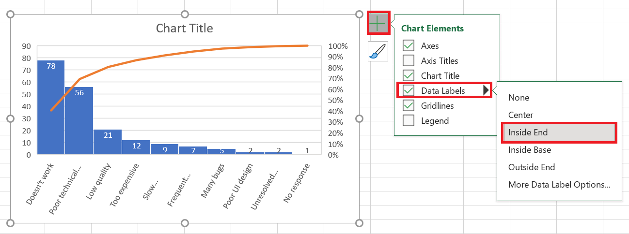
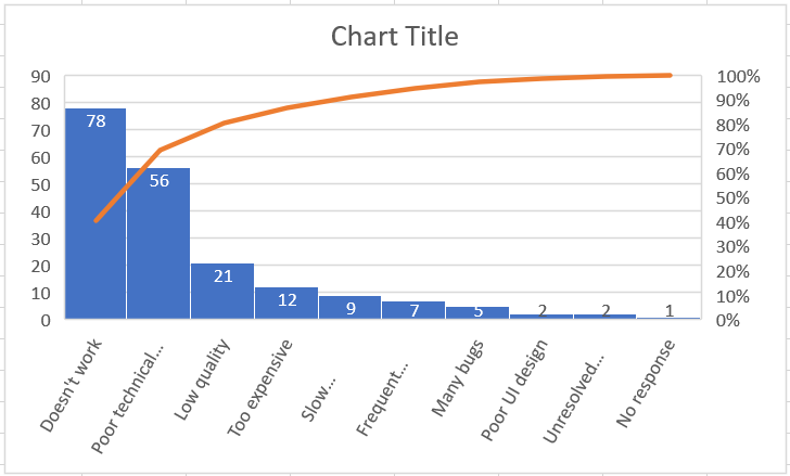
displaying the same values has become superfluous and you can hide it. To do this, click the Chart Elements button again , then click the small arrow next to Axes and uncheck the Main Vertical Axis box .
The resulting Pareto chart will look like this:
4 Create a Pareto Chart in Excel 2013
Excel 2013 doesn’t have a predefined Pareto chart option, so we’ll use the Combination chart type, which is closest to what we need. This will require a few extra steps because all the manipulations Excel 2016 or 2019 performs behind the scenes will have to be done manually.
4.1 Organizing Data for Pareto Analysis
Configure your dataset as explained below:
1. Calculate the cumulative total percentage
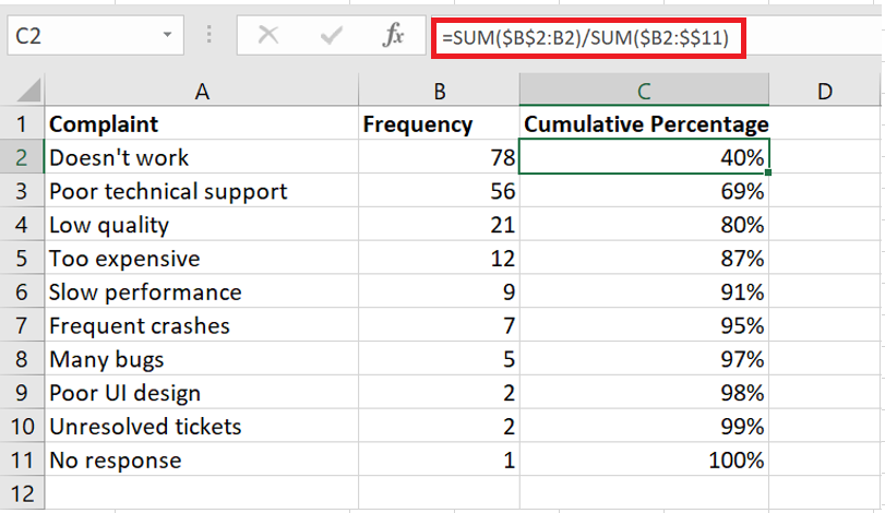
Add an additional column to your dataset and enter the cumulative total percentage formula here:
=SUM($B$ 2:B 2)/SUM($B$2:$B$11)
Where B2 is the first and B11 is the last cell with data in the Frequency column .
In the dividend, you put a cumulative sum formula that adds the numbers in the current cell and all cells above it. Then you divide the part by the total to get percentages.
Enter the above formula in the first cell, then copy it down the column. To display the results as percentages, set the column format to Percent . If you want the percentages to be displayed as integers, reduce the number of decimal places to zero.
2. Sort by number in descending order
Because the bars in a Pareto chart should be plotted in descending order, arrange the values in the Number column from highest to lowest. To do this, select any cell and click A-Z on the Data tab , in the Sort & Filter group . If Excel prompts you to expand the selection, do so to keep the rows together when sorting.
At this point, your source data should look like this:
4.2 Drawing a Pareto chart
With properly organized source data, creating a Pareto chart is as easy as 1-2-3. Literally, just 3 steps:
- Select your table or any cell within it.
- Insert tab , in the Charts group , click Recommended Charts .
- All Charts tab , select Combo Chart on the left side, and make the following changes:
- For the Frequency series , select Clustered Histogram (default type).
- line type and check the Secondary Axis box .
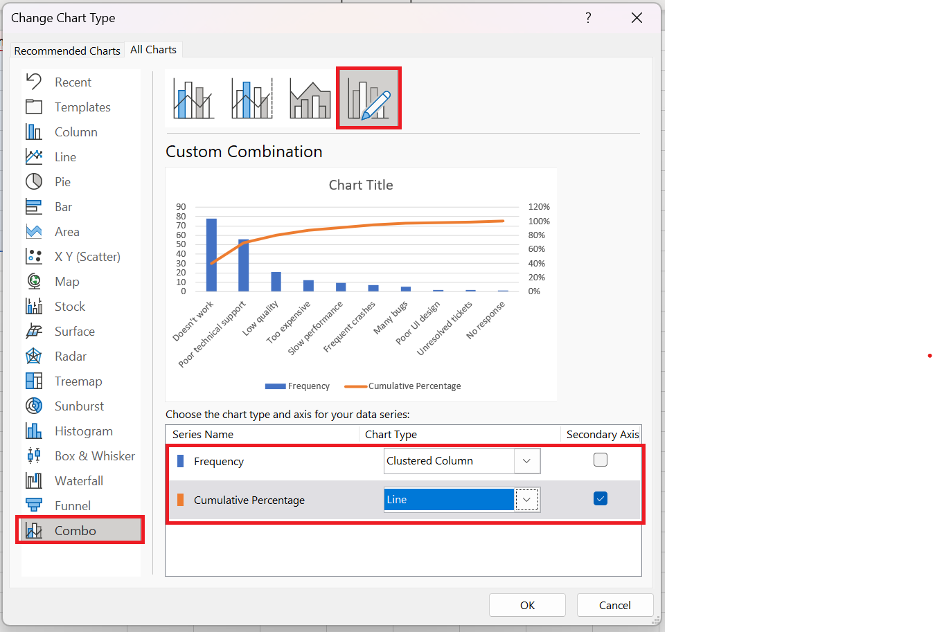
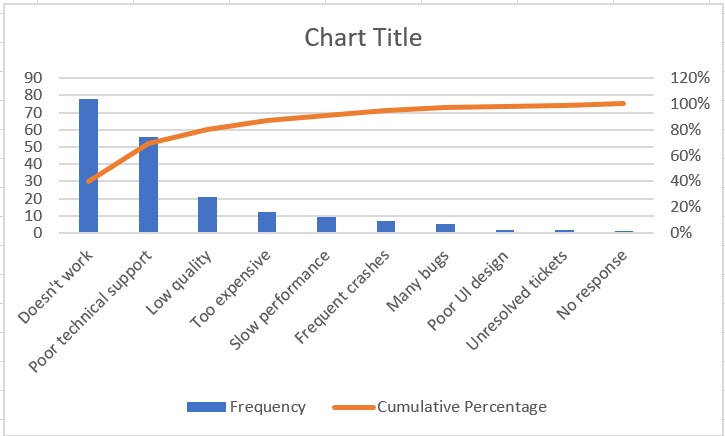
The chart that Excel inserts into your spreadsheet will look like this:
4.3 Improving the Pareto chart
Your chart already looks a lot like a Pareto chart, but you might want to improve a few things:
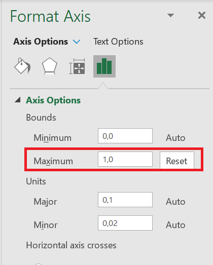
1. Set the maximum percentage value to 100%
By default, Excel has set the maximum value of the secondary vertical axis to 120% when we want it to be 100%.
To change this, right-click the percentage values on the Y axis on the right side, and choose Format Axis. In the Format Axis pane , under Limits , set the Maximum to 1.0 :
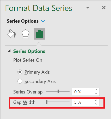
2. Remove the extra spacing between the bars
In a classic Pareto chart, the bars are plotted closer together than in a combo chart. To resolve this problem, right-click the bars and choose Format Data Series. In the Format Data Series pane , set the width and the interval desired, let’s say 5 %:
Finally, change the chart title and optionally hide the chart legend.
What you have now looks like a perfect Excel Pareto chart:
5 How to Draw a Pareto Chart in Excel 2010
Excel 2010 doesn’t have a Pareto or Combo chart type, but that doesn’t mean you can’t draw a Pareto chart in earlier versions of Excel. Sure, it’ll be a bit more work, but it’ll also be more fun 🙂 So, let’s get started.
- Organize your data as explained previously: sort by number in descending order and calculate the cumulative total percentage.
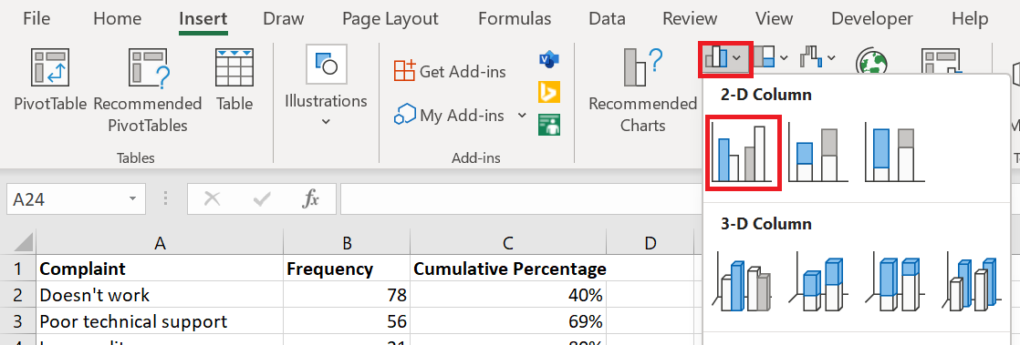
- Select your table, go to the Insert tab / Charts group and choose the 2D Clustered Column chart type.
This will insert a column chart with 2 data series ( Frequency and Cumulative Percentage ) .
- Right-click on the Percentage bars Cumulative , then click Change Chart Series Type . (This can be the trickiest part because the bars are very small. Try hovering your mouse over the bars until you see the » Cumulative Percent » series index , then right-click.)
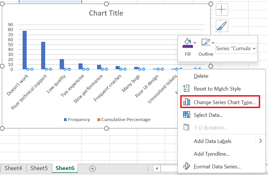 Chart Type dialog box , choose a line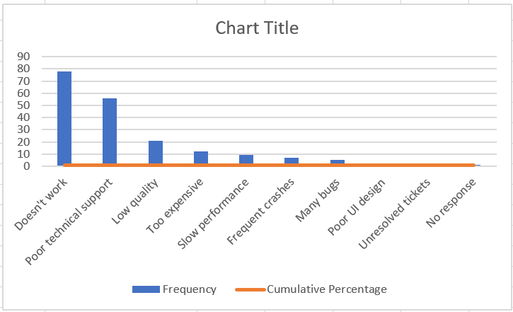
- At this point, you have a bar chart with a flat line along the horizontal axis. To give it a curve, you need to add a secondary vertical axis to the right. To do this, right-click the Cumulative Percentage line , then click Format Data Series …
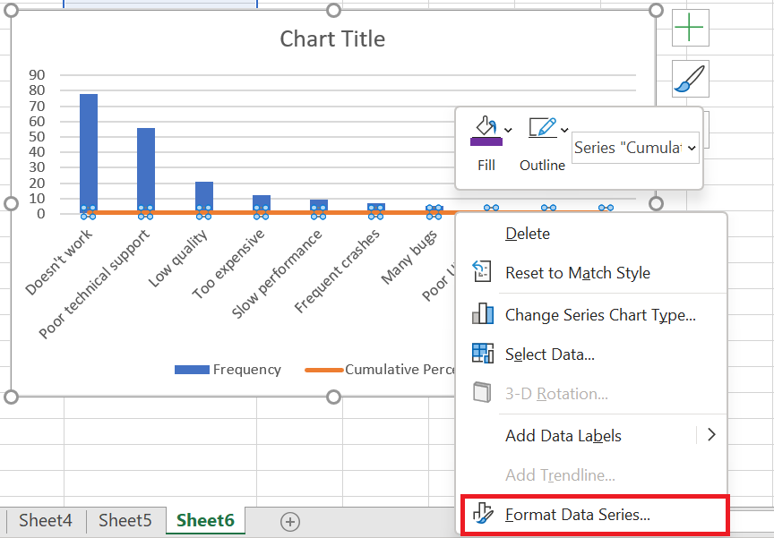
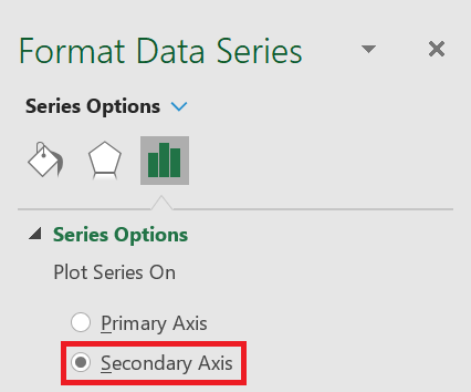
- Data Series dialog box , choose Secondary Axis under Series Options and close the dialog box:
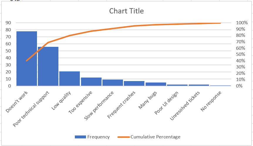
- Add the finishing touches: Set the maximum value of the secondary vertical axis to 100%, widen the bars, and optionally hide the legend. The steps are basically the same as in Excel 2013 described above.
There you have it, your Pareto chart in Excel 2010 is ready:
That’s how to create a Pareto chart in Excel. If you’d like to learn more about other types of charts, I encourage you to check out the resources below.
How to Create a Pie Chart in Excel
How to Create a Pie Chart in Excel
Pie charts, or circular charts , as they are also called, are a common way to show how individual amounts or percentages contribute to the total. In such charts, the entire pie represents 100% of the whole, while the pie slices represent portions of the whole.
People love pie charts , while visualization experts hate them, and the main scientific reason for this is that the human eye is unable to compare angles accurately.
But if we can’t stop making pie charts , why don’t we learn how to do it properly? A pie chart can be difficult to draw by hand, with tricky percentages presenting an additional challenge. However, in Microsoft Excel, you can create a pie chart in a minute or two. And then, you might want to invest a few more minutes customizing the charts to give your Excel pie chart a sophisticated, professional look.
1 How to Create a Pie Chart
Creating a pie chart in Excel is extremely simple and only takes a few clicks. The key is to properly organize the source data in your spreadsheet and choose the most appropriate pie chart type.
1. Prepare the source data for the pie chart.
Unlike other charts, pie charts require you to organize the source data in a column or row . This is because only one data series can be plotted in a pie chart.
You can also include a column or row with category names, which must be the first column or row in the selection. The category names will appear in the pie chart legend and/or data labels.
In general, here are some characteristics of a pie chart :
- Only one data series is plotted in the chart.
- All data values are greater than zero.
- There are no empty rows or columns.
- There are no more than 7 to 9 data categories, as too many sectors can clutter your chart and make it difficult to understand.
We will create a pie chart from the following data:
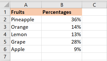
2. Insert a pie chart into the current worksheet.
Once you’ve properly organized your source data, select it, go to the Insert tab , and choose the type of chart you want. In this example, we’re creating the most common 2D pie chart:
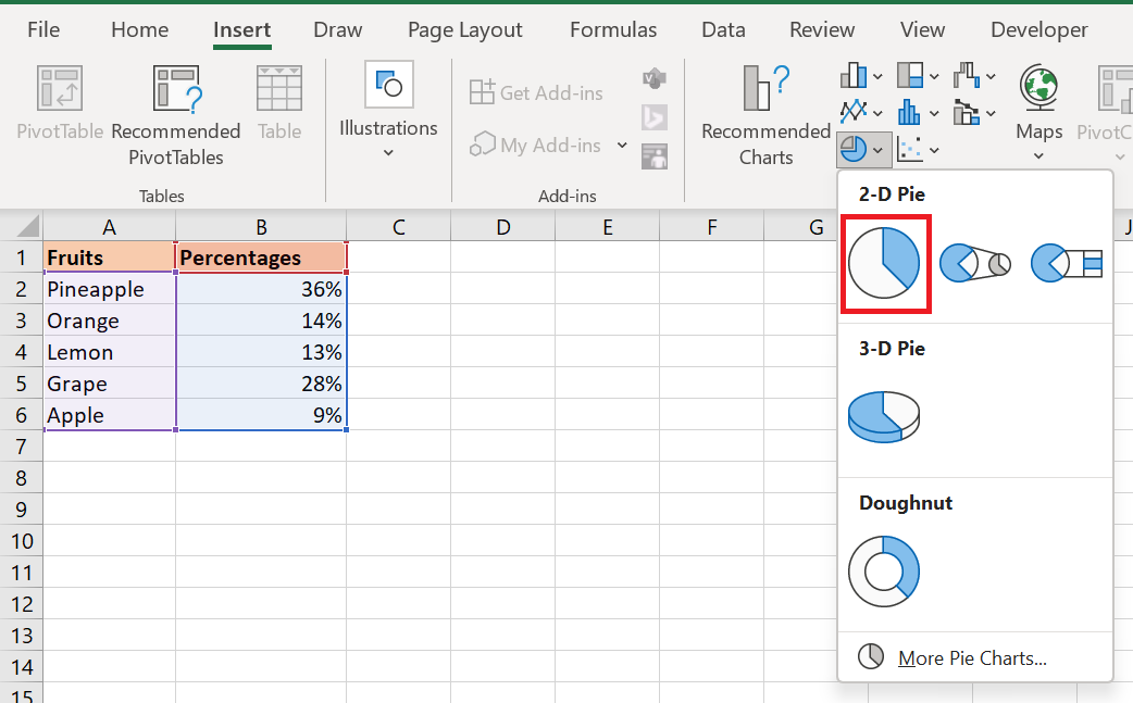
Include column or row headers in the selection if you want the value column/row header to automatically appear in your pie chart title.
3. Choose the pie chart style (optional).
Once the new pie chart is inserted into your spreadsheet, you can go to the Chart Design tab / Charts group and try out different pie chart styles to choose the one that best suits your data.

The default pie chart (Style 1) inserted into an Excel spreadsheet looks like this:
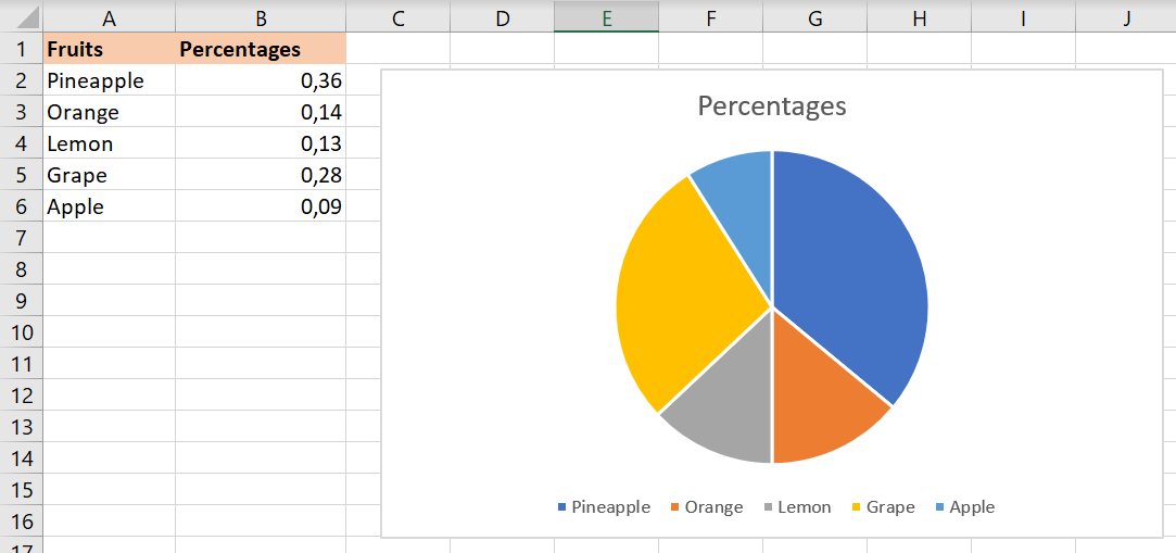
This pie chart looks a bit plain and could definitely use some improvements, such as adding a chart title, data labels, and perhaps some more attractive colors. We’ll talk about all of these things a little later, and now let’s take a quick look at the types of pie charts available in Excel.
2 How to Create Different Types of Pie Charts
When creating a pie chart in Excel, you can choose one of the following subtypes:
- 2D Pie Chart
- 3D Pie Chart
- Pie and bar chart
- Donut chart
7.2.1 Excel 2D Pie Charts
This is the standard and most popular Excel pie chart that you would probably use most often. It is created by clicking the 2D pie chart icon in the Insert / Graphics group .
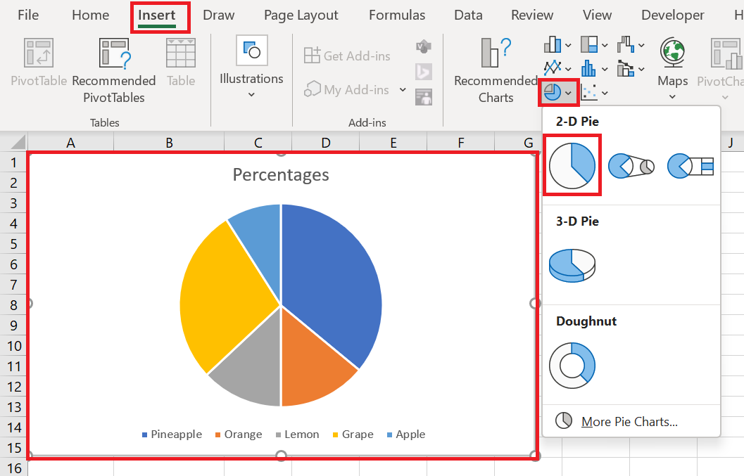
Excel 3D Pie Charts
A 3D pie chart is similar to a 2D pie chart, but it displays data on a third depth (perspective) axis.
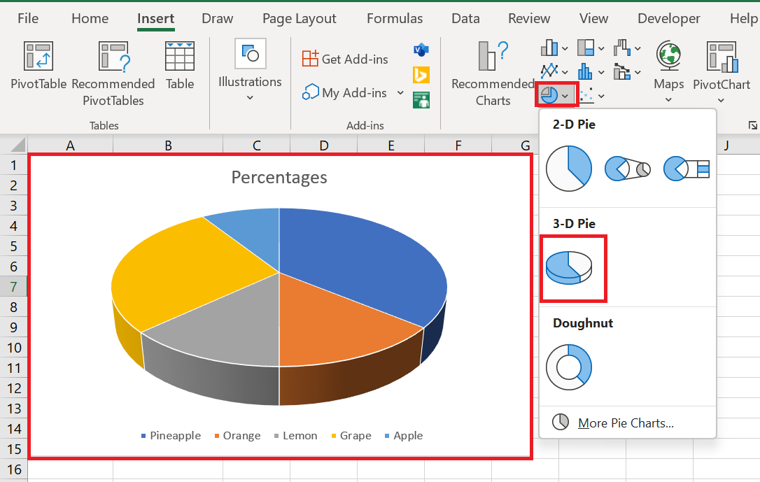
When you create 3D pie charts in Excel, you have access to additional features such as 3D rotation and perspective .
2.2 Pie and Bar Charts
If your Excel pie chart has too many small slices, you may want to create a pie chart and display small slices on an additional pie, which is a slice of the main pie.
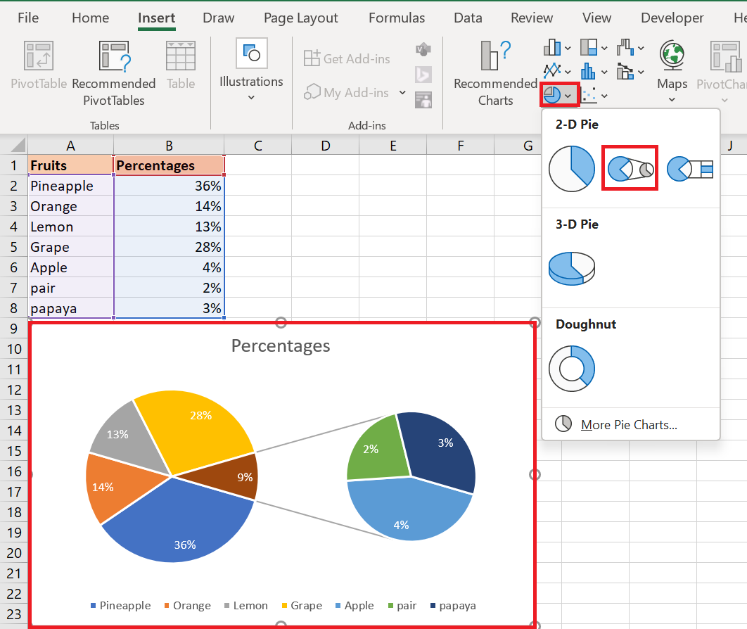
The pie bar chart is very similar to the pie chart, except that the selected slices are displayed on a secondary bar chart.
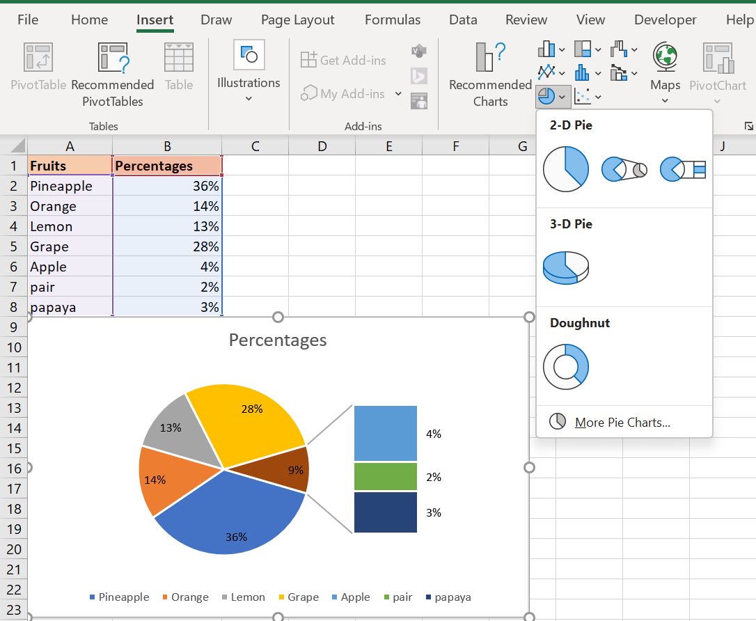
When you create a pie chart in Excel, the last 3 data categories are moved to the second chart by default (even if they are the largest categories!). And because the default choice doesn’t always work well, you can either:
- Sort your spreadsheet’s source data in descending order so that the worst-performing items end up in the secondary chart, or
- Choose the data categories to move to the second chart.
2.3 Choosing Data Categories for the Secondary Chart
To manually choose which data categories to move to the secondary chart, follow these steps:
- Right-click any slice in your pie chart and select Format Data Series… from the context menu.
- In the Format Data Series pane , under Series Options , select one of the following options from the Separate series by drop-down list :
- Position – allows you to select the number of categories to move to the second chart.
- Value – allows you to specify a threshold (minimum value) below which data categories are moved to the additional chart.
- Percentage Value – this is like Value, but here you specify the percentage threshold.
- Custom – allows you to manually select any slice of the pie chart in your spreadsheet, and then specify whether you want to place it in the primary or secondary chart.
In most cases, setting the percentage threshold is the most reasonable choice, but it all depends on your source data and personal preferences. The following screenshot illustrates splitting the data series by percentage value :
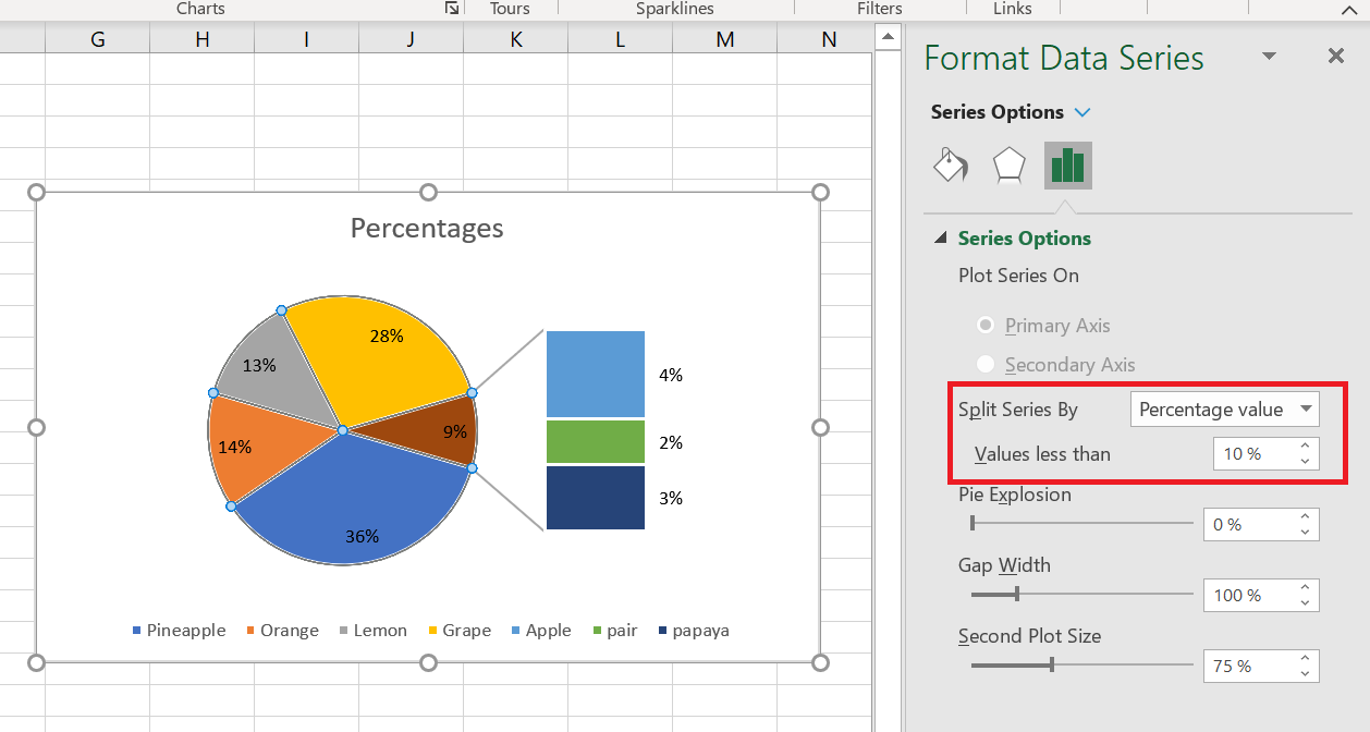
Additionally, you can configure the following settings:
- Change the gap between two charts . The number under Gap Width represents the gap width as a percentage of the secondary chart width. To change the gap, drag the slider or type the number directly into the percentage box.
- Change the size of the secondary chart . This is controlled by the number below the Secondary Plot Size box , which represents the size of the secondary chart as a percentage of the primary chart’s size. Drag the slider to make the secondary chart larger or smaller, or type the desired number in the percentage box.
2.4 Donut Charts
If you have multiple data series related to each other, you can use a doughnut chart instead of a pie chart. However, doughnut charts make it difficult to estimate the proportions between items in different series, so it makes sense to use other chart types, such as a bar chart or a column chart, instead.
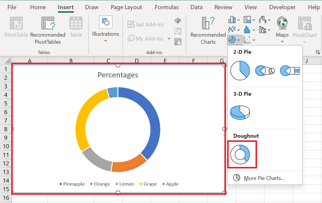
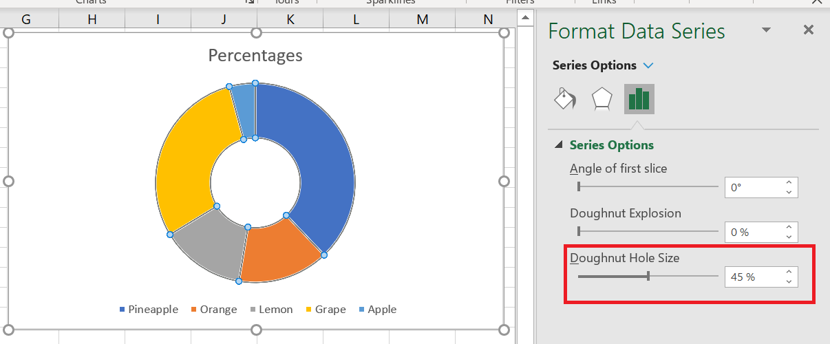
2.5 Changing the size of holes in a doughnut chart
When creating donut charts in Excel, the first thing you might want to change is the size of the hole. And you can easily do this by doing the following:
- Right-click any data series in your donut chart and select the Format Data Series option from the context menu.
- In the Format Data Series pane, go to the Series Options tab and resize the hole by moving the slider under Donut Thickness or by entering an appropriate percentage directly in the box.
3 Customizing and Enhancing Pie Charts
If you’re creating a pie chart in Excel just to get a quick overview of certain trends in your data, the default chart may be sufficient. But if you need a beautiful chart for a presentation or similar purposes, you might want to make some improvements and add some finishing touches.
3.1 How to label a pie chart
Adding data labels makes Excel pie charts easier to understand. Without labels, it would be difficult to deduce the exact percentage of each slice. Depending on what you want to highlight on your pie chart, you can add labels to the entire data series or to individual data points.
Adding Data Labels to Excel Pie Charts
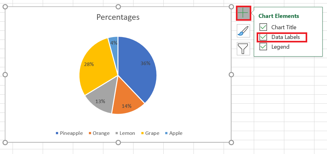
In this pie chart example, we’ll add labels to all the data points. To do this, click the Chart Elements button in the top
 right corner of your pie chart and select the Data Labels option .
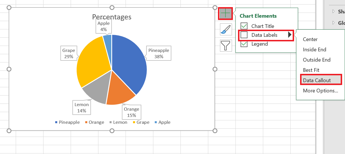
Additionally, you may want to change the label placement for Excel pie charts by clicking the arrow next to Data Labels . Compared to other Excel charts, pie charts offer the widest range of label placements:
If you want to display data labels inside bubble shapes , select Data Legend :
If you chose to place the labels inside the slices, the default black text may be difficult to read on dark slices like the dark blue slice in the pie chart above. For better readability, you can change the font color of the labels to white (click on the labels, go to the Formatting / Text Fill tab ).
Displaying data categories on data labels
If your Excel pie chart has more than three slices, you may want to label them directly rather than forcing your users to go back and forth between the legend and the chart to figure out what each slice is about.
The quickest way to do this is to choose one of the predefined chart layouts in the Chart Design tab / Chart Styles group / Quick Layout . Layouts 1 and 4 are the ones with data category labels:
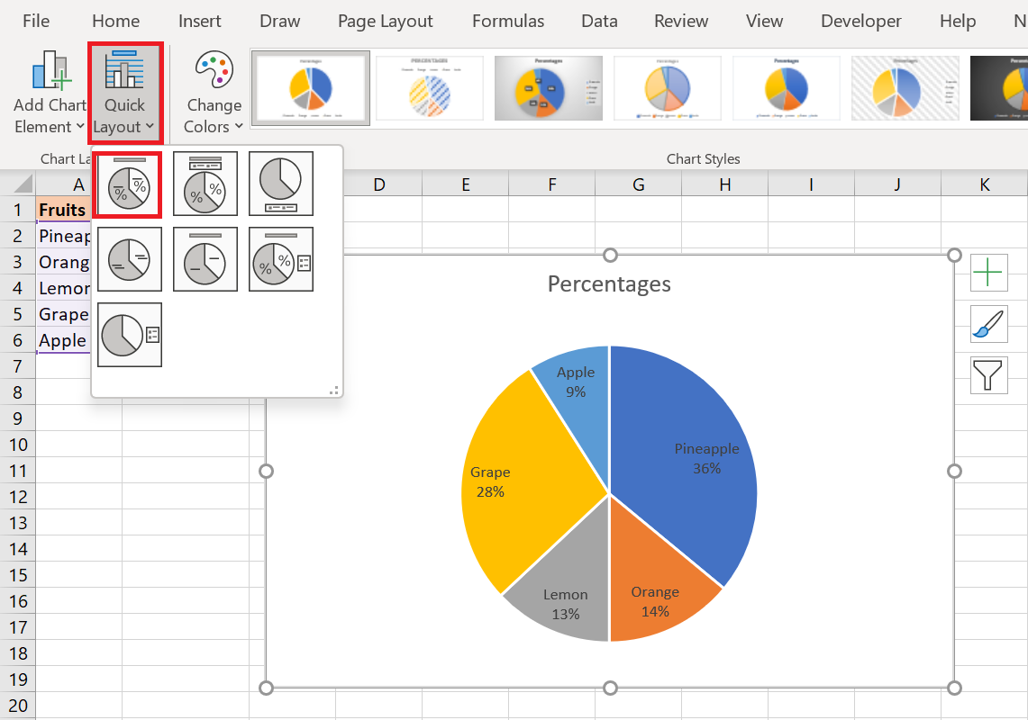
For more options, click the Chart Elements button ( green cross) in the upper-right corner of your pie chart, click the arrow next to Data Labels , and choose More Options… from the context menu. This will open the Format Data Labels pane on the right side of your worksheet. Switch to the Label Options tab and select the Category Name check box .
Additionally, the following options may be helpful to you:
- Under Label Contains, select the data to display on the labels ( Category Name and Value in this example).
- Separator drop-down list , select how to separate the data displayed on the labels ( New line in this example).
- Under Label Position , choose where to place the data labels ( Outer end in this pie chart example).
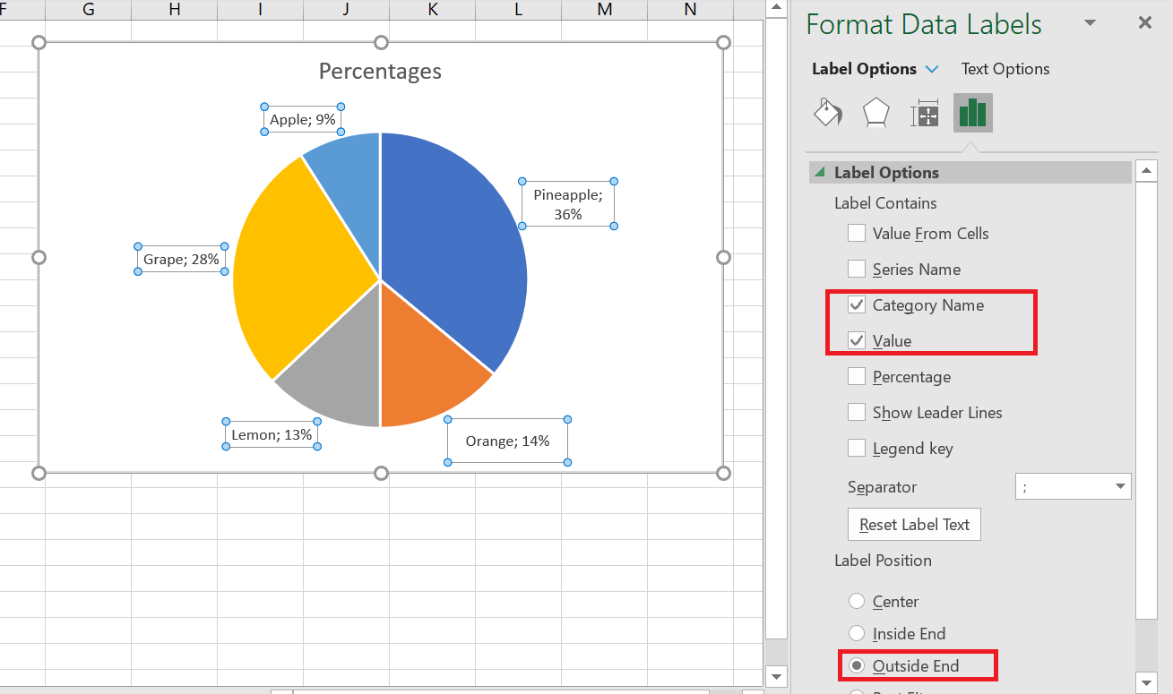
Now that you have added the data labels to your Excel pie chart, the legend has become redundant and you can remove it by clicking the Chart Elements button and unchecking the Legend box .
3.2 Displaying percentages on a pie chart
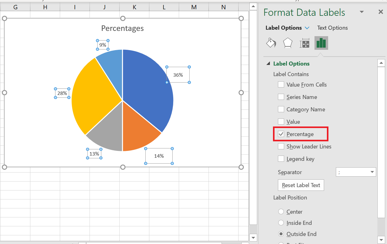
When the source data plotted in your pie chart is percentages , % will automatically appear on the data labels as soon as you enable the option Data Labels under Chart Elements , or select the Value option in the Format Data Labels pane , as shown in the pie chart example above.
If your source data is numbers , you can configure the data labels to display the original values or percentages, or both.
- Right-click any slice in your chart and select Format Data Labels… from the context menu.
- In the Format Data Labels pane , select the Value or Percent box , or both, as in the following example. Percentages will be calculated automatically by Excel, with the entire chart representing 100%.
4 Explode a pie chart or extract individual slices
To highlight individual values in your Excel pie chart, you can « explode » it , that is, move all the slices away from the center of the chart. You can also emphasize individual slices by removing them from the rest of the pie chart.
Exploded pie charts in Excel can be displayed in 2D and 3D formats, and you can also explode doughnut charts:
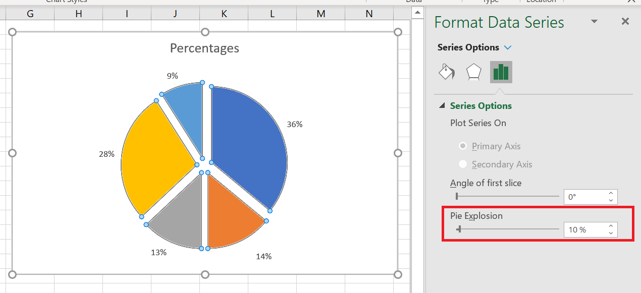
4.1 Explode the entire pie chart
The quickest way to explode the entire pie chart in Excel is to click on it so that all the slices are selected , then drag them out of the center of the chart using the mouse.
For more precise control over the separation of the pie charts, proceed as follows:
- Right-click any slice in your Excel pie chart and select Format Data Series from the context menu.
- In the Format Data Series pane , switch to the Series Options tab and drag the Slice Break slider to increase or decrease the gaps between slices. Or, type the desired number directly into the percentage box:
4.2 Extract a single slice from a pie chart
To draw your users’ attention to a certain slice of a pie chart, you can remove it from the rest of the chart.
And again, the quickest way to remove an individual slice is to select it and drag it out of the center with the mouse. To select a single slice, click on it, then click again so that only that slice is selected.
You can also select the slice you want to move, right-click it, and select Format Data Series from the context menu. Then, go to Series Options in the Format Data Series pane and set the desired point explosion:
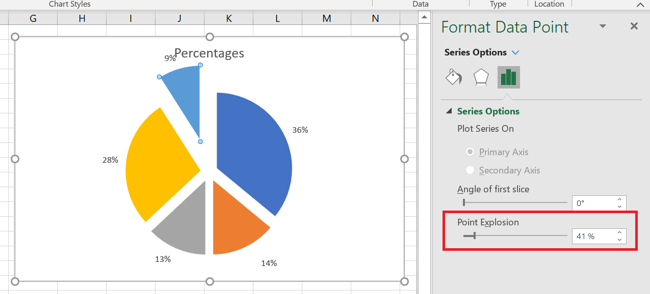
If you want to remove multiple slices, you will need to repeat the process for each slice individually, as shown in the screenshot above. It is not possible to extract a group of slices in an Excel pie chart; you can explode the entire sector or one slice at a time.
5 Rotate a Pie Chart
When creating a pie chart in Excel, the plot order of data categories is determined by the order of the data in your worksheet. However, you can rotate your chart within 360 degrees of the circle for different perspectives. Typically, Excel pie charts look best with the smallest slices in the foreground.
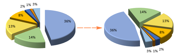
To pivot a pie chart in Excel, follow these steps:
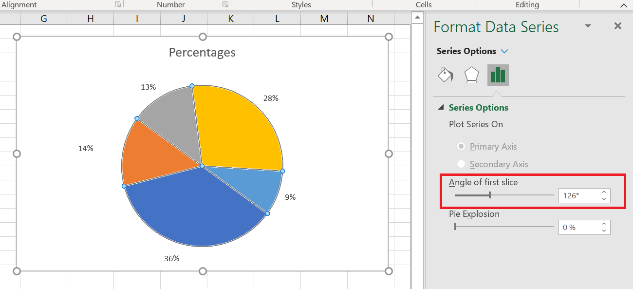
- Right-click any slice of your pie chart and click Format Data Series .
- In the Format Data Series pane , under Series Options , drag the First slice angle slider away from zero to rotate the pie clockwise. Or, type the number you want directly into the box.
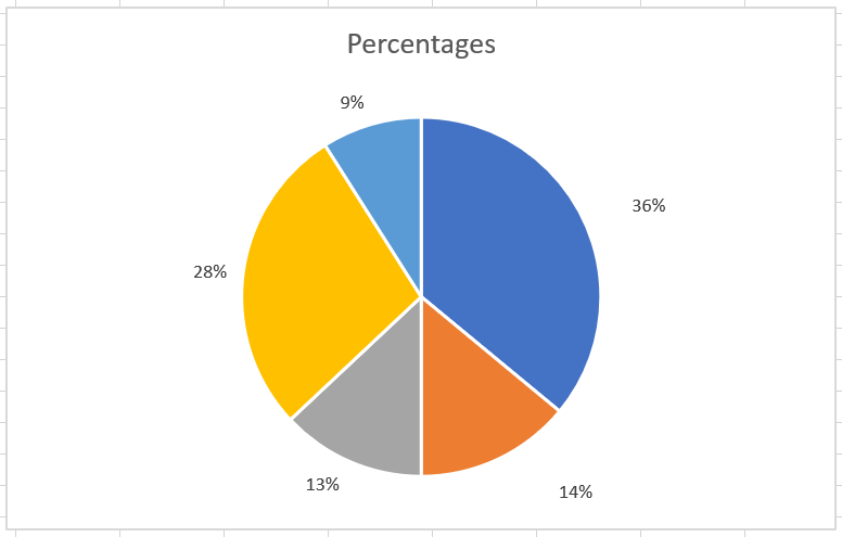
6 3D Rotation Options for 3D Pie Charts
For 3D pie charts in Excel, more rotation options are available. To access 3D rotation functions, right-click any slice and select 3D Rotate … from the context menu.
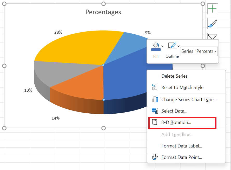
This will bring up the Format Chart Area pane, where you can configure the following 3D rotation options :
- Horizontal rotation in X rotation
- Vertical rotation in Y rotation
- The degree of perspective (the field of view on the map) in the perspective
Excel pie charts can be rotated around the horizontal and vertical axes, but not around the depth axis (Z axis). Therefore, you cannot specify a rotation degree in the Rotate Z box.
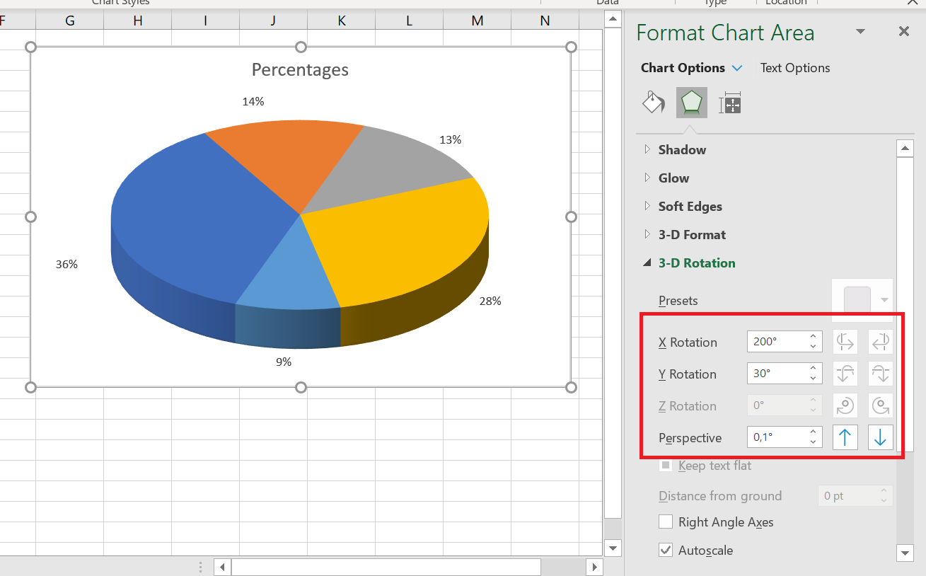
When you click the up and down arrows in the rotation boxes, your Excel pie chart will immediately rotate to reflect the changes. So you can continue clicking the arrows to move the pie in small increments until it’s in the correct position.
7 Change the colors of the pie chart
If you’re not entirely happy with the default colors of your Excel pie chart, you can either:
- Change the color theme
- Choose colors for individual slices
To choose a different color theme for your Excel pie chart, click the Chart Styles button, go to the
 Color tab , and select the desired color theme.
You can also click anywhere in your pie chart to activate the Chart Tools tabs on the ribbon, go to the Chart Design tab / Chart Styles group and click the Change Colors button :
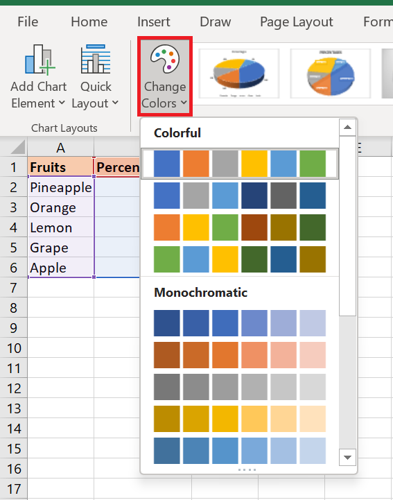
Choose colors for each slice individually
As you can see in the screenshot above, the choice of color themes for Excel charts is quite limited, and if you want to create a stylish and attractive pie chart, you can choose each slice color individually. For example, if you’ve chosen to place data labels inside the slices, black text can be difficult to read on dark colors.
To change the color of a certain slice, click on that slice, then click it again so that only that slice is selected. Go to the Format tab , click Shape Fill , and choose the color you want:
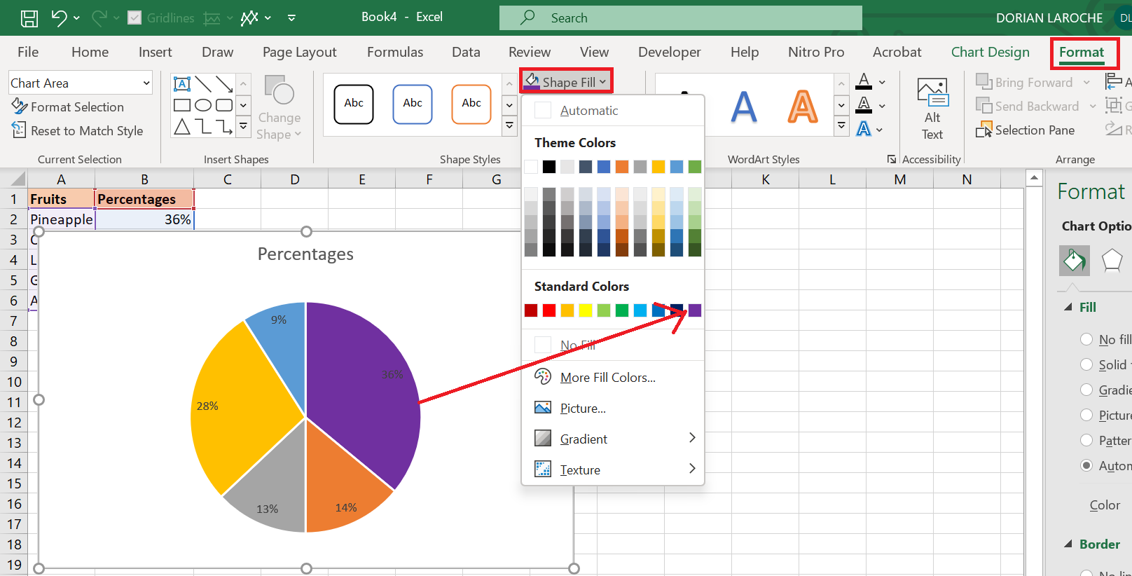
If your pie chart has many small slices, you can « gray out » them by selecting gray colors for these small, irrelevant slices.
How to Create a Bar Chart in Excel
How to Create a Bar Chart in Excel
Along with pie charts, bar charts are one of the most commonly used chart types. They are simple to create and easy to understand. What type of data are bar charts best suited for? Any numerical data you want to compare, such as numbers, percentages, temperatures, frequencies, or other measurements. Typically, you create a bar chart to compare individual values in different data categories. A specific type of bar chart called a Gantt chart is often used in project management programs. A bar chart is a graph that displays different data categories with rectangular bars, where the length of the bars is proportional to the size of the data category they represent. Bar charts can be drawn vertically or horizontally.
1 How to make a bar graph
Creating a bar chart in Excel is as easy as it gets. Simply select the data you want to plot in your chart, go to the Insert tab / Charts group on the ribbon, and then click the type of bar chart you want to insert.
In this example, we create the standard 2D bar chart:
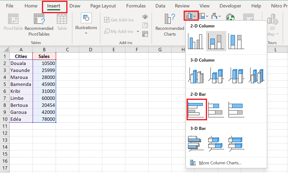
The default 2D clustered bar chart inserted into your Excel spreadsheet will look like this:
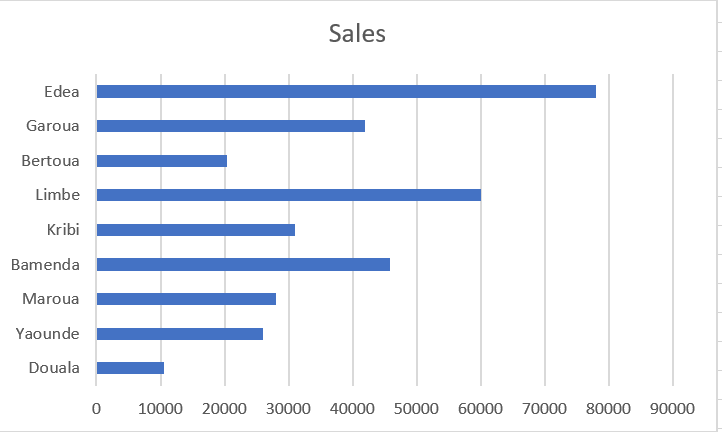
The Excel bar chart above displays one data series because our source data only contains one column of numbers.
If your source data has two or more columns of numeric values, your Excel bar chart will contain multiple data series , each shaded a different color:
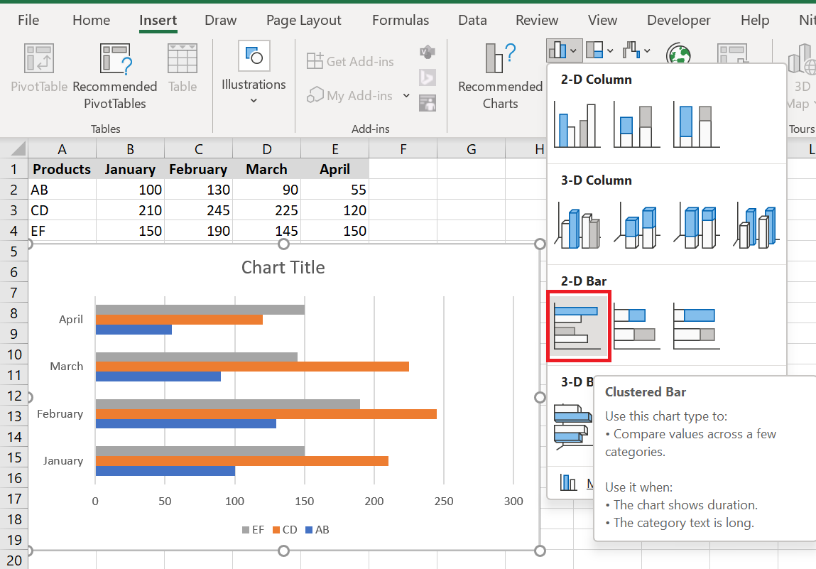
2 Show all available bar chart types
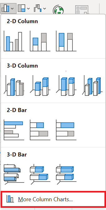
To see all the bar chart types available in Excel, click the More column charts… link and choose one of the bar chart subtypes displayed at the top of the Insert Chart window :
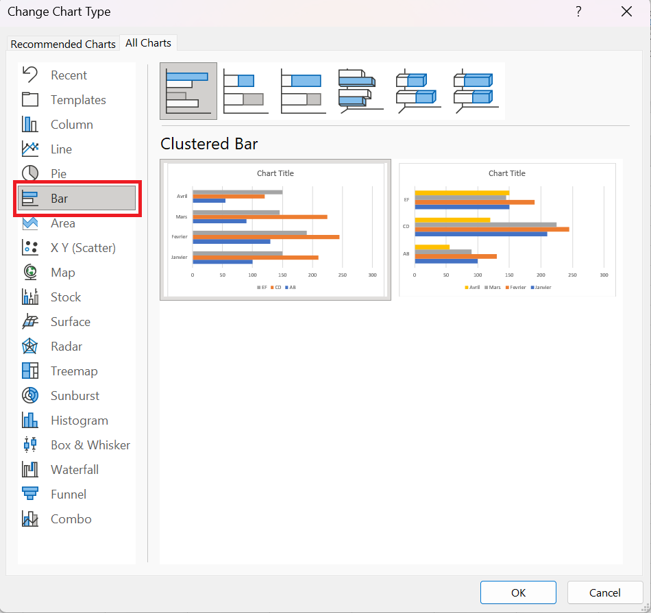
3 Choose the layout and style of the bar chart
If you are not completely satisfied with the default layout or style of the bar chart inserted in your Excel sheet, select it to activate the Chart Tools tabs on the ribbon. After that, go to the Create Chart and do one of the following:
- Try different bar chart layouts by clicking the Quick Layout button in the Chart Layouts group , or
- Experiment with different bar chart styles in the Chart Styles group .

When creating a bar chart in Excel, you can choose one of the following bar chart subtypes.
Clustered bar charts
A clustered bar chart in Excel (2D or 3-D) compares values across data categories. In a clustered bar chart, categories are typically arranged along the vertical axis (Y-axis) and values along the horizontal axis (X-axis). A 3-D clustered bar chart does not feature a third axis , but rather presents horizontal rectangles in a 3-D format.
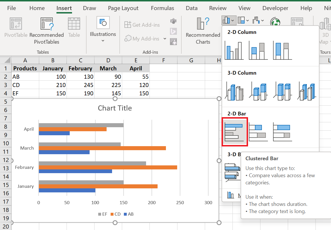
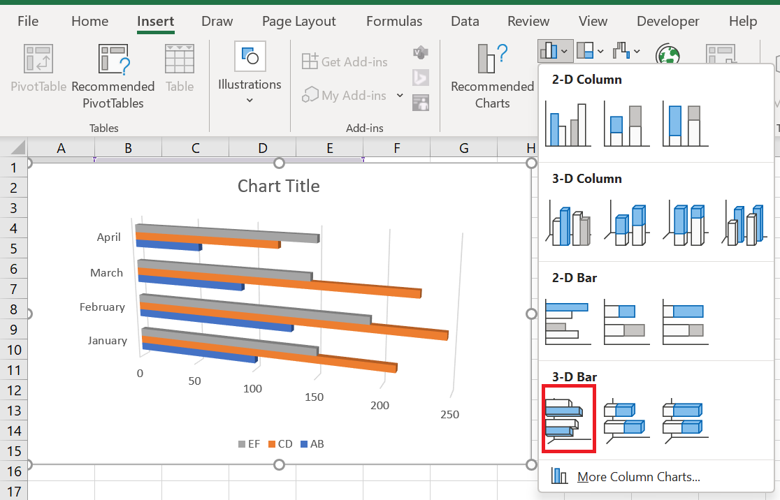
Stacked bar charts
A stacked bar chart in Excel shows the proportion of individual items to the whole. In addition to grouped bar charts, a stacked bar chart can be drawn in 2D and 3D formats:
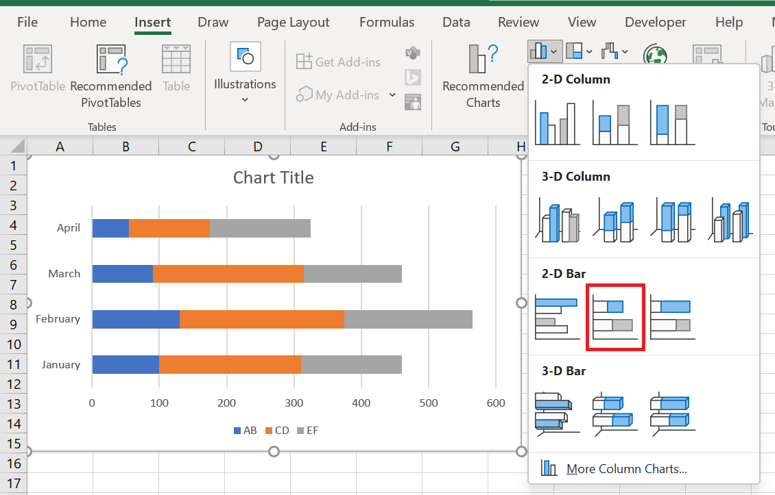
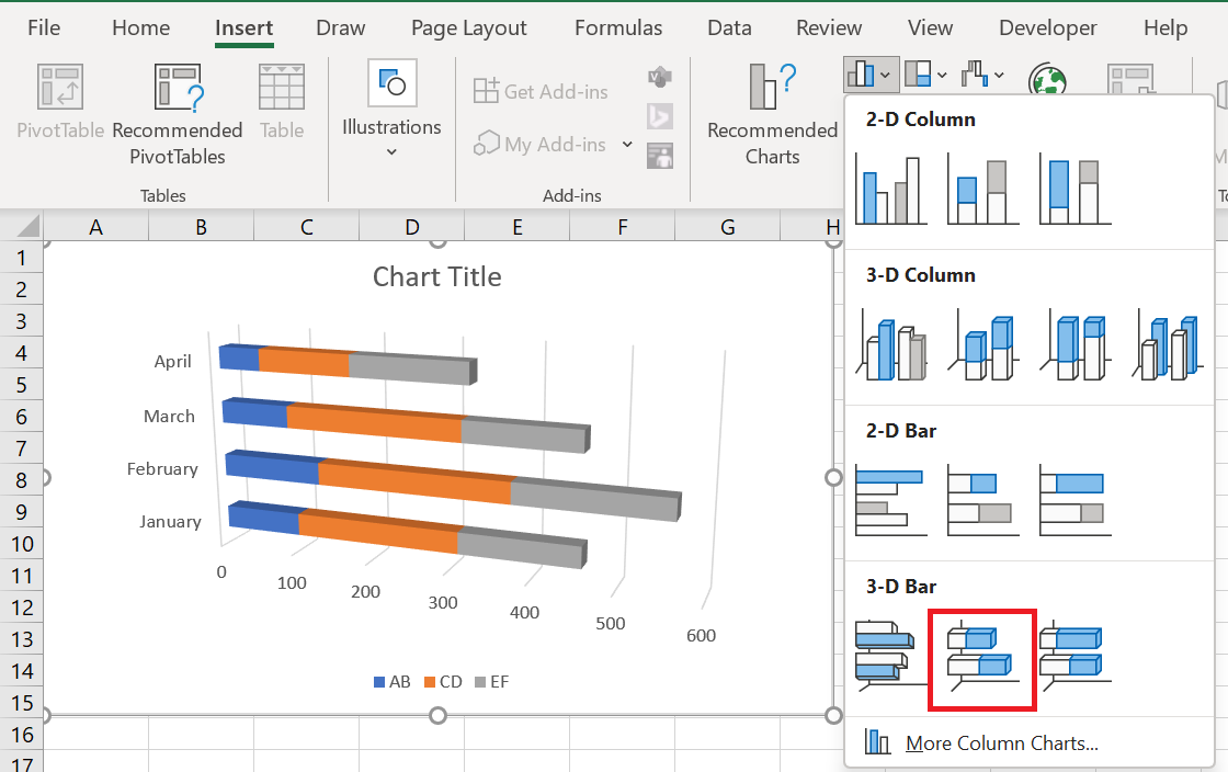
100% Stacked Bar Charts
This type of bar chart is similar to the type above, but it displays the percentage contribution of each value to a total in each data category.
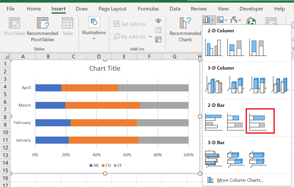
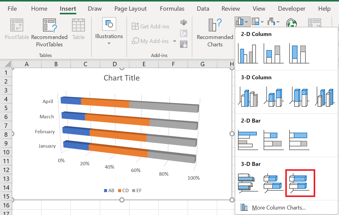
Cylinder, cone, and pyramid graphs
Like standard rectangular Excel bar charts, cone, cylinder, and pyramid charts are available in clustered, stacked, and 100 % stacked types. The only difference is that these chart types represent data series as cylinders, cones, and pyramids instead of bars.

In Excel 2010 and earlier, you can create a cylinder, cone, or pyramid chart in the usual way, by selecting the corresponding chart type in the Charts group on the Insert tab .
When creating a bar chart in Excel 2013, Excel 2016, or Excel 2019, you won’t find the cylinder, cone, or pyramid chart types in the Charts group on the ribbon. According to Microsoft, these chart types were removed because there were too many chart choices in earlier versions of Excel, making it difficult for the user to choose the right chart type. And yet, there is a way to draw a cylinder, cone, or pyramid chart in modern versions of Excel; it just takes a few extra steps.
4 Creating a Cylinder, Cone, and Pyramid Chart in Excel 2013, 2016, and 2019
To create a cylinder, cone, or pyramid chart in Excel 2019, 2016, and 2013, create a 3D bar chart of your preferred type (grouped, stacked, or 100% stacked) in the usual way, and then change the shape type as follows:
- Select all the bars on your chart, right-click them, and choose Format Data Series… from the context menu. Or, simply double-click the bars.
- In the Format Data Series… pane , under Series Options , select the desired column shape .
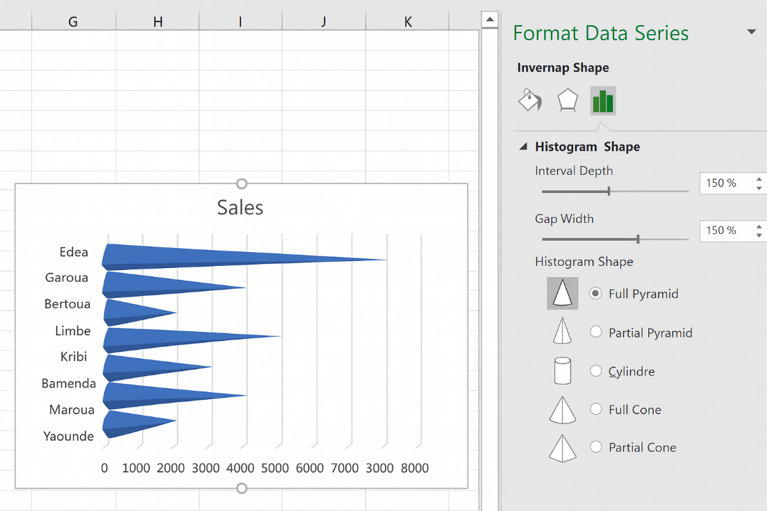
If you have multiple data series plotted in your Excel bar chart, you may need to repeat the steps above for each series.
5 Customizing Bar Charts
Like other Excel chart types, bar charts allow for a lot of customization when it comes to the chart title, axes, data labels, and more.
5.1 Change bar width and bar spacing
When you create a bar chart in Excel, the default settings are such that there is plenty of space between the bars. To widen the bars and bring them closer together, follow these steps. The same method can be used to narrow the bars and increase the spacing between them. In 2D bar charts, the bars can even overlap.
- In your Excel bar chart, right-click any data series (the bars) and choose Format Data Series… from the context menu.
- In the Format Data Series pane , under Series Options , do one of the following.
- In 2D and 3D bar charts, to change the bar width and the spacing between data categories, drag the Gap Width slider or enter a percentage between 0 and 500 in the box. The lower the value, the smaller the gap between bars and the thicker the bars, and vice versa.
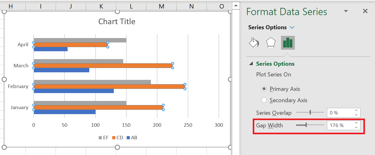
- In 2D bar charts, to change the spacing between data series within a data category , drag the Series Overlap slider or enter a percentage between -100 and 100 in the box. The higher the value, the more the bars overlap. A negative number will result in spacing between data series as in the following screenshot:
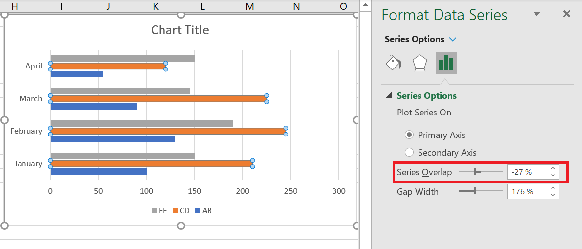
5.2 Create Excel bar charts with negative values
When creating a bar chart in Excel, the source values don’t have to be greater than zero. Typically, Excel has no problem displaying negative numbers on a standard bar chart, but the default chart inserted into your spreadsheet may leave a lot to be desired in terms of layout and formatting:
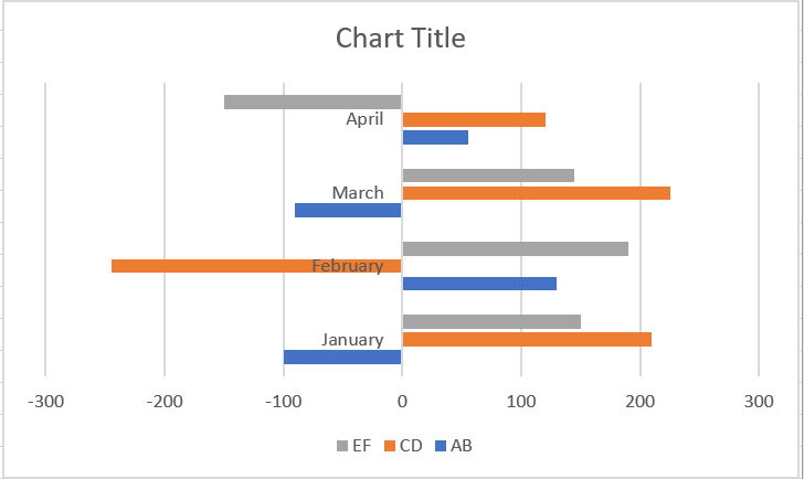
To make the bar chart above look better, you can firstly move the vertical axis labels to the left so they don’t cover the negative bars, and secondly, you can consider using different colors for the negative values.
5.2 Editing Vertical Axis Labels
To format the vertical axis, right-click one of its labels and select Format Axis… from the context menu (or simply double-click the axis labels). This will bring up the Format Axis pane on the right side of your spreadsheet.
In the pane, navigate to the tab Axis Options (rightmost), expand the Labels
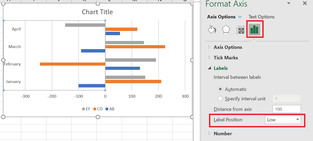 node and set the Label Position to Low :
5.3 Changing the fill color of negative values
If you want to draw attention to negative values in your Excel bar chart, changing the fill color of negative bars would make them stand out.
If your Excel bar chart contains only one data series, you can shade negative values in standard red. If your bar chart contains multiple data series, then you will need to shade negative values in each series with a different color. For example, you can keep the original colors for positive values and use lighter shades of the same colors for negative values.
To change the color of negative bars, do the following:
- Right-click any bar in the data series whose color you want to change (the orange bars in this example) and select Format Data Series… from the context menu.
- In the Format Data Series… pane , on the Fill & Line tab , select the Invert if negative check box .
- As soon as you check the Invert if negative box , you should see two fill color options, the first for positive values and the second for negative values.
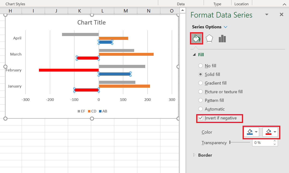
If the second fill area is not displayed, click the small black arrow in the only color option you see and choose the color you want for positive values (you can select the same color as the one applied by default). Once this is done, the second color option for negative values will appear.
6 Sorting Data on Bar Charts
When you create a bar chart in Excel, by default, the data categories appear in reverse order on the chart. That is, if you sort the data from A to Z on the worksheet, your Excel bar chart will display them ZA. Why does Excel always place data categories backwards in bar charts? No one knows. But we know how to fix this problem.
The easiest way to reverse the order of data categories on a bar chart is to reverse sort on the sheet.
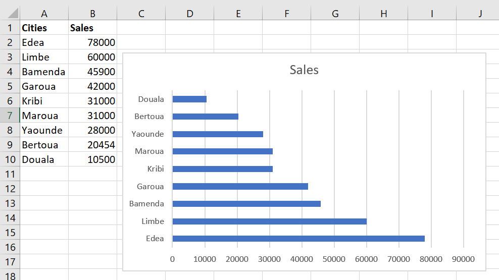
Let’s use some simple data to illustrate this. In a spreadsheet, we have a list of 9 cities sorted in descending order of sales, from highest to lowest. On the bar chart, however, the data appears in ascending order, from lowest to highest:
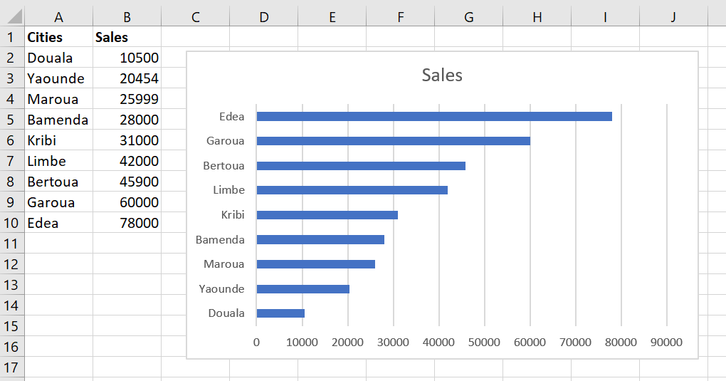
To sort your Excel bar chart from top to bottom, simply arrange the source data in reverse order, i.e. from smallest to largest:
If sorting the data on the sheet is not an option, the following section explains how to change the sort order on an Excel bar chart without sorting the data source.
Sort an Excel bar chart descending/ascending without sorting the source data
If the sort order of your spreadsheet is important and can’t be changed, let’s make the chart bars appear in exactly the same order. It’s easy and only requires selecting a few checkbox options.
- On your Excel bar chart, right-click one of the vertical axis labels and select Format Axis… from the context menu. Or, simply double-click the vertical axis labels to bring up the Format Axis pane .
- In the Format Axis pane , under Axis Options , select the following options:
- Under Horizontal Axis Crossings , check the At Most category
- Under Axis Position , check the categories in reverse order
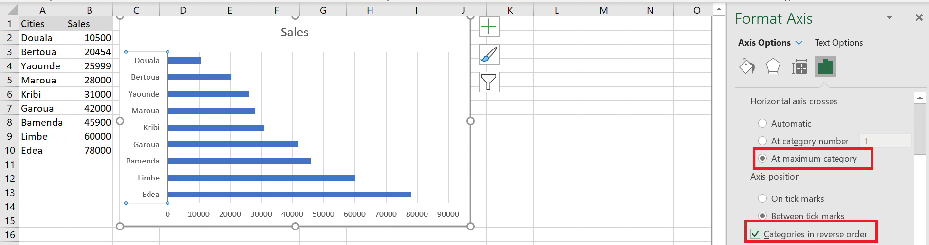
Your Excel bar chart will be immediately sorted in the same way as the data source, in descending or ascending order. As soon as you change the sort order on the sheet, the bar chart will be automatically resorted.
7 Changing the Order of Data Series in a Bar Chart
If your Excel bar chart contains multiple data series, they are also plotted backward by default. For example, note the reverse order of regions on the worksheet and on the bar chart :
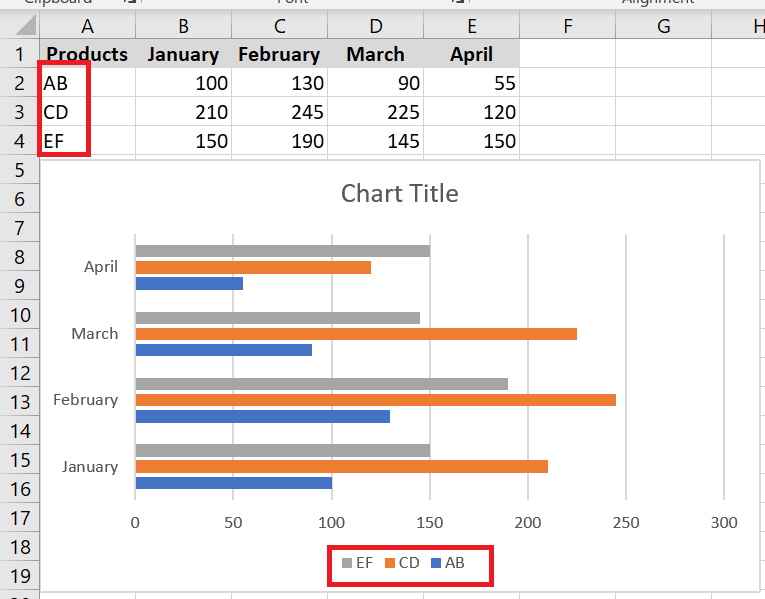
To arrange the data series on the bar chart in the same order as they appear on the worksheet, you can select the At most category and Categories in reverse order options, as shown in the previous example. This will also change the plot order of the data categories, as shown in the following screenshot:
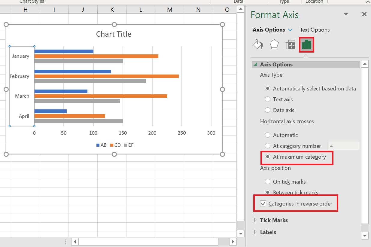
If you want to arrange the data series on the bar chart in a different order than the data on the worksheet, you can do so using:
- Select Data Source Dialog Box
- Data Series Formulas
Change the order of data series using the dialog box
This method allows you to change the plotting order of each individual data series on a bar chart and maintain the original data arrangement on the worksheet.
- Select the chart to activate the Chart Tools tabs on the ribbon. Go to the Chart Design tab / Data group , and then click the Select Data button .
Or, click the Chart Filters button to the right of the chart, then click the Select Data… link at the bottom.
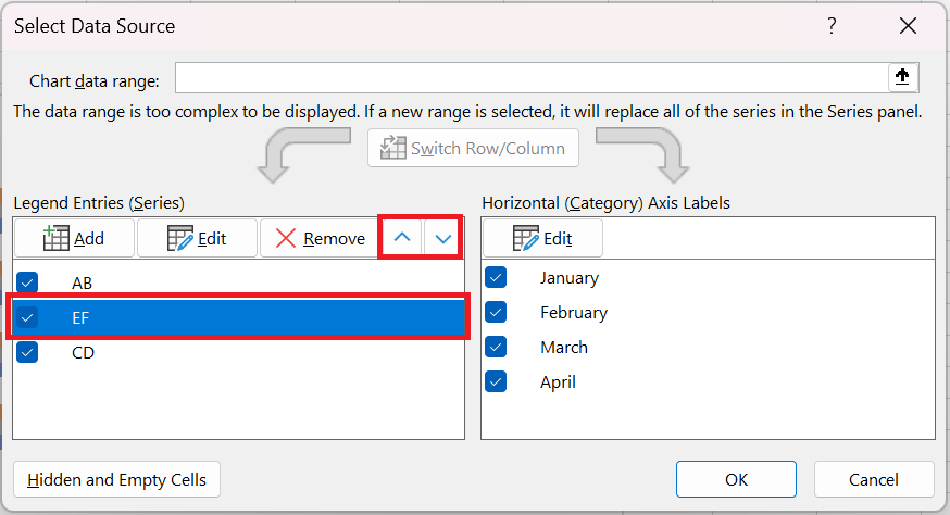
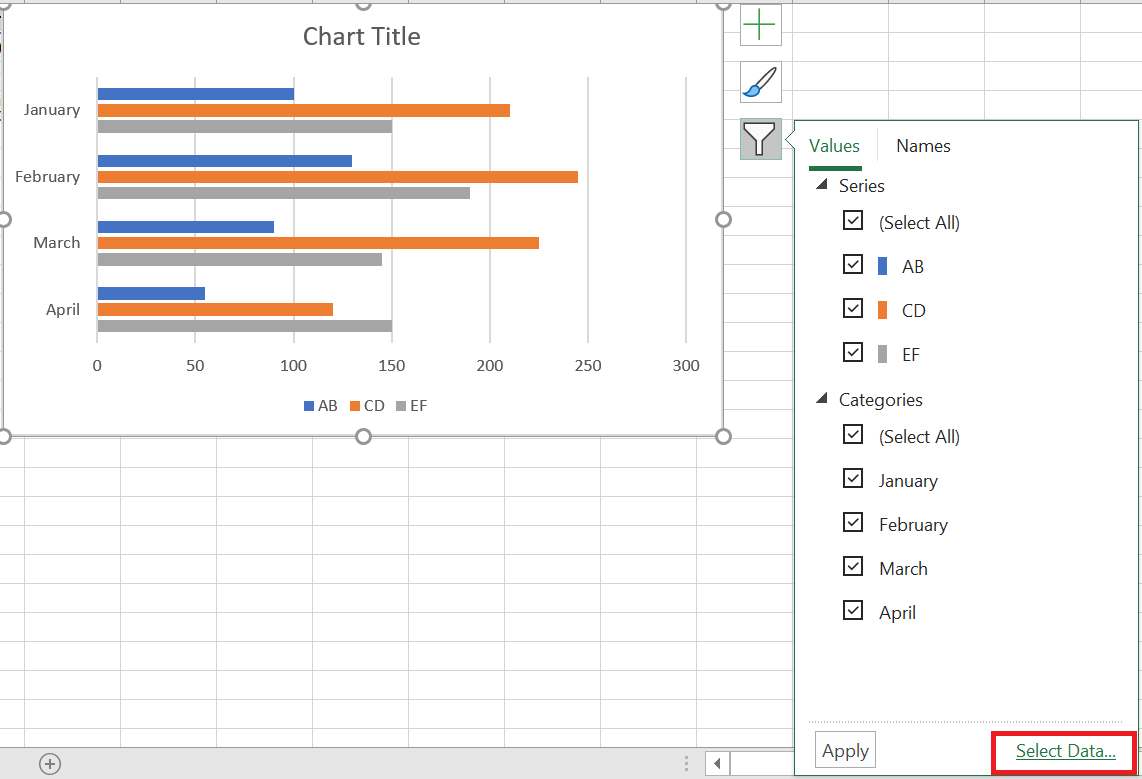 Data Source dialog box , select the data series whose plot order you want to change and move it up or down using the arrow
corresponding :
How to Add Error Bars in Excel: Standard and Custom
Many of us are uncomfortable with uncertainty because it’s often associated with a lack of data, inefficient methods, or poor research approaches. The truth is, uncertainty isn’t a bad thing. In business, it prepares your company for the future. In medicine, it generates innovation and leads to technological breakthroughs. In science, uncertainty is the beginning of an investigation. And because scientists like to quantify things, they’ve found a way to quantify uncertainty. To do this, they calculate confidence intervals, or margins of error, and display them using something called error bars.
1 What are error bars?
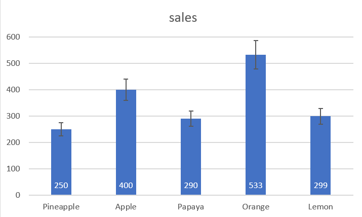
Error bars in Excel charts are a useful tool for representing data variability and measurement precision. In other words, error bars can show you how far the actual values may be from the reported values.
In Microsoft Excel, error bars can be inserted into bar, column, line, and area charts, XY (scatter) charts, and 2D bubble charts. Both vertical and horizontal error bars can be displayed in scatter and bubble charts .
You can set error bars as standard error, percentage, fixed value, or standard deviation. You can also set your own error amount and even provide an individual value for each error bar.
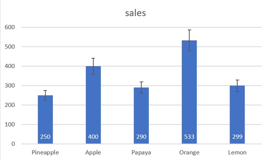
2 Add error bars
In Excel 2019, Excel 2016, and Excel 2013, inserting error bars is quick and easy:
- Click anywhere in your chart.
- Click the Chart Elements button to the right of the chart.
- Click the arrow next to Error Bars and choose the desired option:
- Standard Error – Displays the standard error of the mean for all values, which shows how far the sample mean is likely to be from the population mean.
- Percentage – adds error bars with the default value of 5%, but you can set your own percentage by choosing More options .
- Standard Deviation – Shows the degree of variability in the data, i.e., how close it is to the mean. By default, bars are plotted with 1 standard deviation for all data points.
- Other options… – allows you to specify your own error bar amounts and create custom error bars.
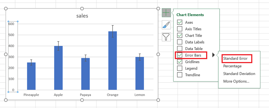
Choosing More Options opens the Format Error Bars pane where you can:
- Set your own amounts for the fixed value , percentage , and standard deviation error bars .
- Choose the direction (positive, negative, or both) and the ending style (heading, no heading).
- Create custom error bars based on your own values.
- Change the appearance of error bars.
For example, let’s add 10% error bars to our chart. To do this, select Percentage and type 10 in the input box:

3 Add custom error bars
The standard error bars provided by Excel work fine in most situations. But if you want to display your own error bars, you can do that easily too.
To create custom error bars in Excel, follow these steps:
- Click the Chart Elements button .
- Click the arrow next to Error Bars , then click More Options…
- Format Error Bars pane , switch to the Error Bar Options tab (the last one). Under Margin of error , select Custom and click the Specify a value button .
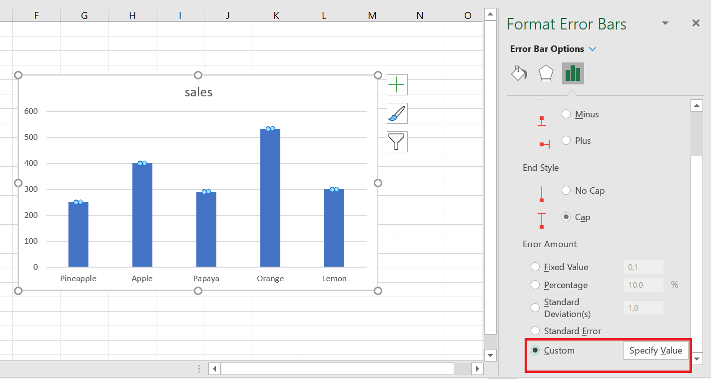
- Custom Error Bars dialog box appears with two fields, each containing an array element like ={ 1} . You can now enter your own values in the boxes (without equal signs or braces; Excel will add them automatically) and click OK .

If you don’t want to display positive or negative error bars, enter zero (0) in the corresponding box, but don’t uncheck the box completely. If you do this, Excel will think you simply forgot to enter a number and will keep the previous values in both boxes.
This method adds the same constant error values (positive and/or negative) to all data points in a series. But in many cases, you’ll want to put an individual error bar at each data point, and the following example shows how to do this.
4 create individual error bars (of different lengths)
When you use one of the built-in error bar options (standard error, percentage, or standard deviation), Excel applies one value to all data points. But in some situations, you may want to have your own error values calculated on individual points. In other words, you want to plot error bars of different lengths to reflect different errors for each data point on the chart.
In this example, we’ll show you how to create individual standard deviation error bars. To start, enter all the error bar values (or formulas) into separate cells, usually in the same columns or rows as the original values. Then, tell Excel to graph the error bars based on these values.
Let’s say you have 3 columns with sales numbers. You calculated a mean (B 6:D 6) for each column and plotted these means in a graph. In addition, you found the standard deviation for each column (B 7:D 7) using the STDEV.PEARSON function . And now you want to display these numbers in your graph as standard deviation error bars. Here’s how:
- Click the Chart Elements / Error Bars buttonOther options .
- In the Format Error Bars pane , select Custom and click the Specify Value button .
- Custom Error Bars dialog box , delete the contents of the Positive error value box , place the mouse pointer in the box (or click the Collapse dialog icon next to it), and select a range in your worksheet (B7:D7).
- Do the same for the Negative Error Value box . If you don’t want to display negative error bars, type 0.
- Click OK .

Make sure to delete all the contents of the input boxes before selecting a range. Otherwise, the range will be added to the existing table as shown below, and you will end up with an error message:
={1} +Sheet1!$B$7:$D$7
It is quite difficult to spot this error because the boxes are narrow and you cannot see all the content.
If everything is done correctly, you will get individual error bars , proportional to the standard deviation values you calculated :
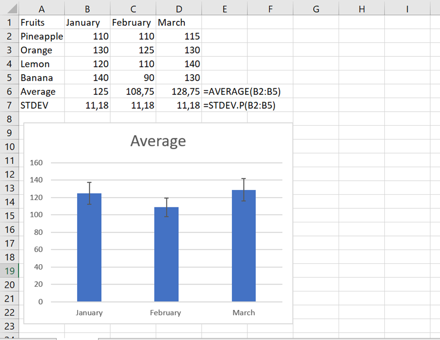
5 Add horizontal error bars
For most chart types, only vertical error bars are available. Horizontal error bars can be added to bar charts, XY scatter plots, and bubble charts.
For bar charts (not to be confused with column charts), horizontal error bars are the default and only available type. The screenshot below shows an example of a bar chart with error bars in Excel:
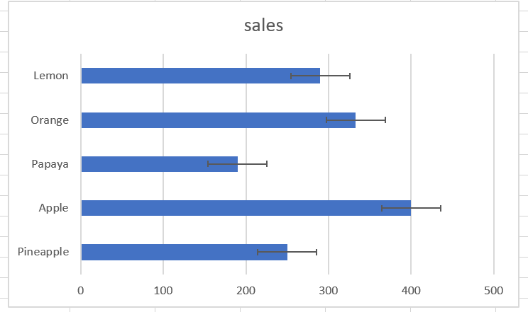
In bubble and scatter charts , error bars are inserted for the x (horizontal) and y (vertical) values.
If you want to insert only horizontal error bars, simply remove the vertical error bars from your chart. Here’s how:
- Add error bars to your chart as usual.
- Right-click any vertical error bar and choose Delete from the context menu.

This will remove the vertical error bars from all data points. You can now open the Format Error Bars pane (double-click one of the remaining error bars) and customize the horizontal error bars as desired.

6 Make error bars for a specific data series
Sometimes, adding error bars to all data series in a chart can make it look cluttered and messy. For example, in a combo chart, it often makes sense to place error bars on only one series. This can be done with the following steps:
- In your chart, select the data series to which you want to add error bars.
- Click the Chart Elements button .
- Click the arrow next to Error Bars and choose the type you want.
The screenshot below shows how to create error bars for the data series represented by a line:
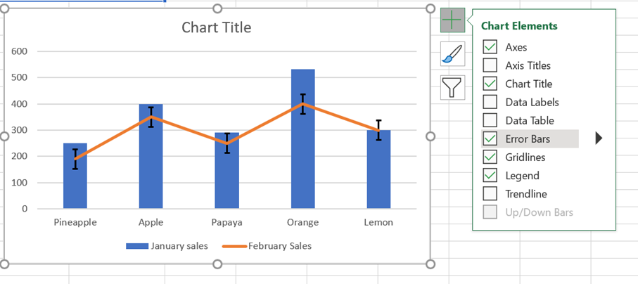
Therefore, standard error bars are only inserted for the estimated data series we selected.