Votre panier est actuellement vide !
Catégorie : Excel diagram
HOW TU CREATE A MILESTONE OR TIMELINE CHART
MILESTONE OR TIMELINE CHART
Keeping track of every step of a project is an important task. As you know, it’s just as important as executing each step. In fact, tracking makes execution easier.
In Excel, one of the simplest yet most powerful charts you can use to track your projects is a milestone chart . They also call it a timeline chart .
This is one of the experts’ favorite project management tools. It visually displays a timeline where you can specify key milestones, deliverables, and other checkpoints.
Milestones are tools used in project management to mark specific points along a project schedule.
The basic idea of a Milestone Chart is to track each step of your project on a timeline with its completion date and present it in a simple way.
We will see how to create a Milestone Chart in Excel in 3 steps.
1 Benefits of Using a Milestone Chart
Before we get into it, let me tell you about the main benefits of using a milestone chart.
■ It is easy to check the progress of the project with milestone chart
■ Easy for user to understand project planning.
■ You have all the important information in a single graph.
2 Steps to Create a Milestone Chart
I have divided the whole process into three steps to make it easier for you to understand.
1. Configure the data
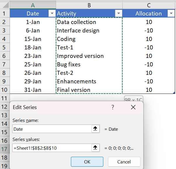
You can easily configure your data for this chart. Make sure you organize your data as shown below.
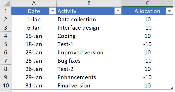
In this data table we have three columns.
- The first column is for the completion dates of the project milestones. And make sure that the format of this column must be in date format.
- The second column is for the activity name.
- The third column is only used to place activities in the timeline (top and bottom).
2. Insert a chart
Now the fun begins. Creating a timeline or milestone chart is a bit of a time-consuming process, but it’s worth it for this stunning chart.
Here are the steps.
- Select one of the cells from the data.
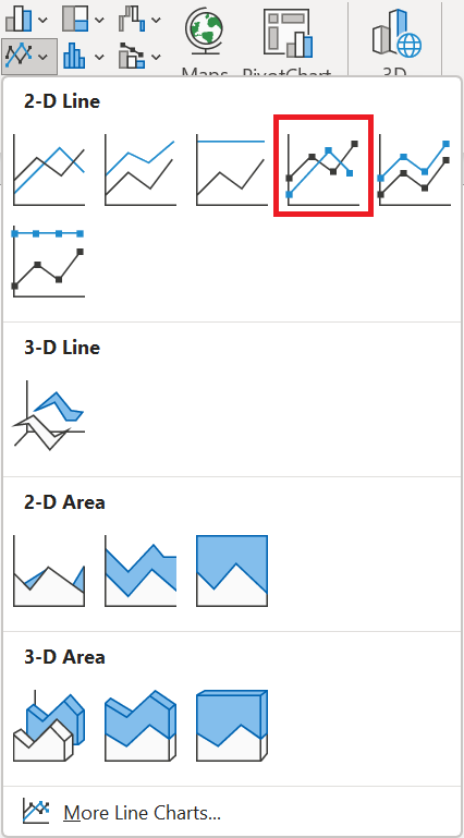
- Go to Insert tab ➜ Charts ➜ curve with markers.
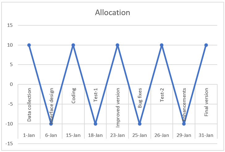
- We’ll get a table like this. But, that’s not what we want, we have to recreate it.
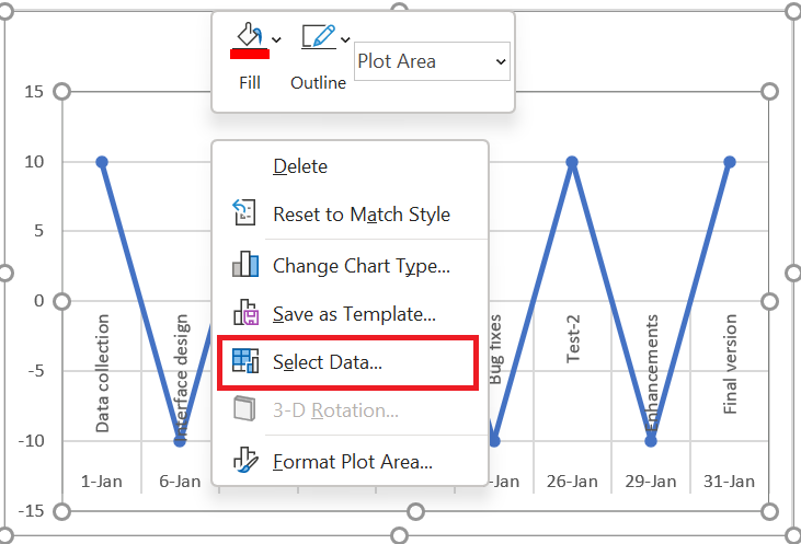
- So now right click on the chart and then go to « Select Data ».
- In the Select Data Source window, simply remove the series from the legend entries.
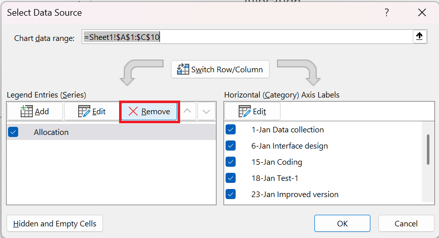
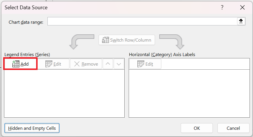
- Now our table is completely empty. So we need to reassign the series and axis labels.
- Click « Add » from the legend entries
- In the series edit window, enter « Date » in the series name and select the activity column for the series values.
- After that, click edit in « Horizontal Axis Labels »
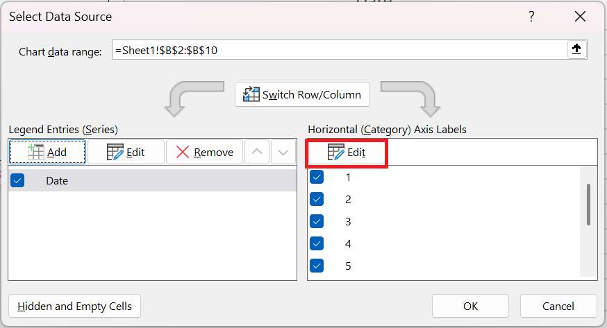
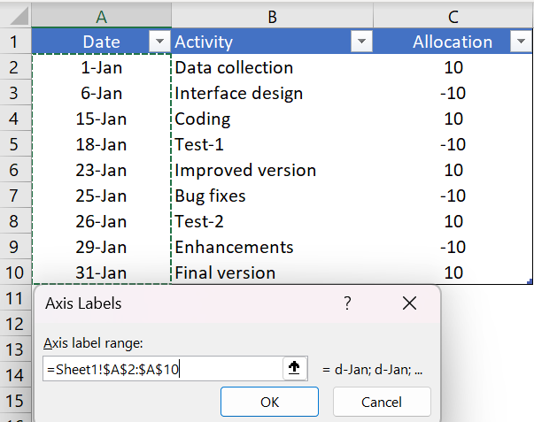
- and refer to the date column and click OK.
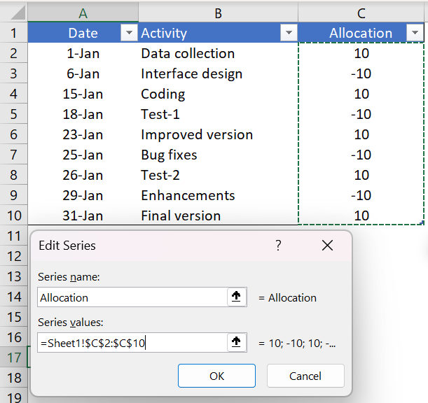
- Next, we need to insert another series. Click « Add » in the legend entries and name it « Placement » and refer the series values to the placement column.
- Now just click OK.
At this point, we have a chart that looks like a timeline. But we need a little formatting to make it a perfect Milestone Chart .
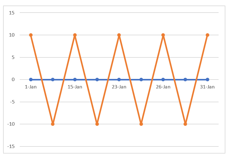
4 Final formatting
A little touch of formatting.
Just follow these simple steps.
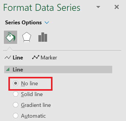
- Click on the line chart (the placement series) and open the formatting option.
- For the curve, use « No stroke ».
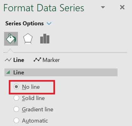
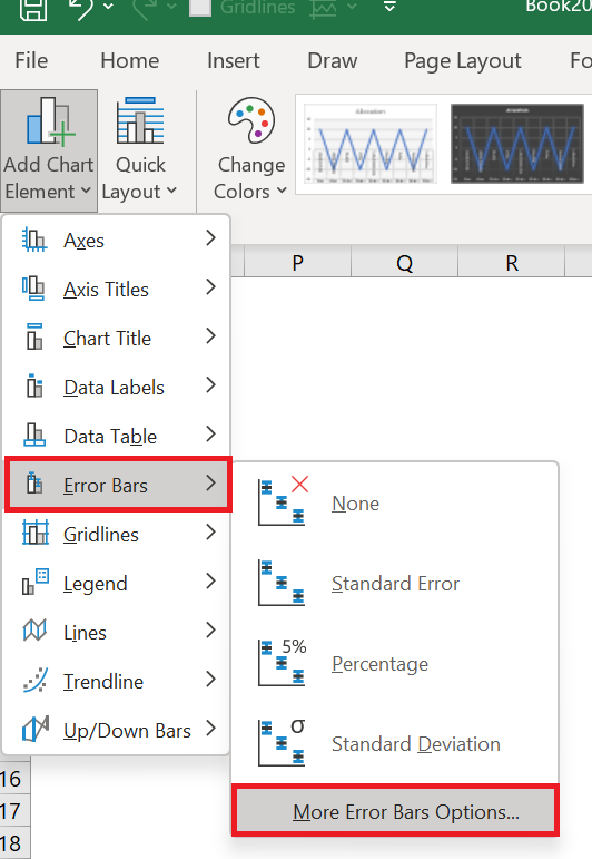
- With the same selection, go to Chart Design / Add Chart Element / Error Bars / More Error Bar Options tab.
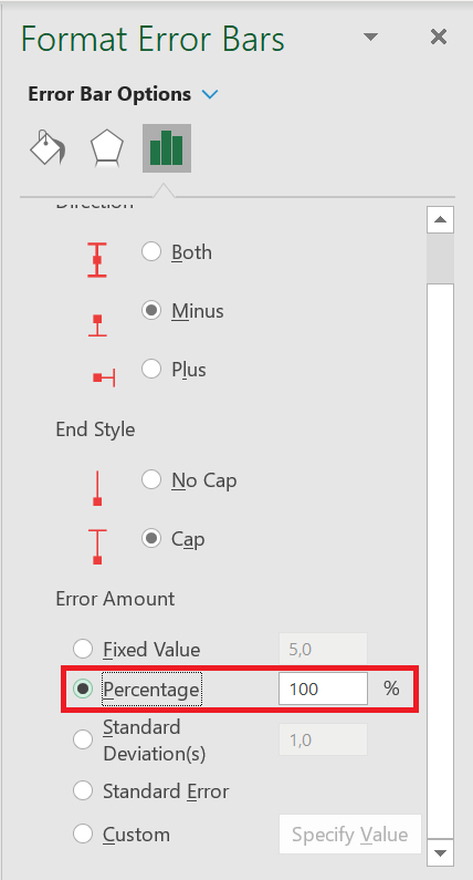
- Now, from the formatting options, select the direction « Minus » and the error value « Percent: 100% » for the error bars.
- After that, convert your line chart (series placement) to secondary axis and instantly remove the secondary axis.
Now the last important thing you need to do is add the activity name for each step.
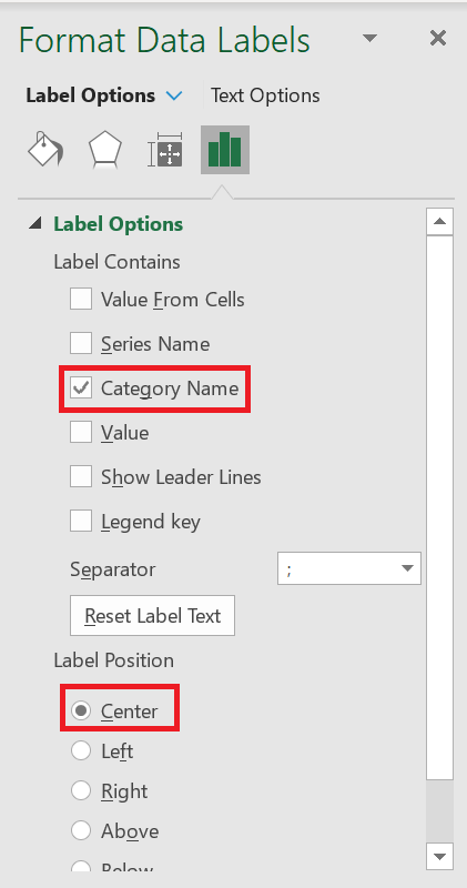
- First, add data labels.
- Now from the data label formatting options select « Category Name » and on position click center
- After that, select your chart and click on « Select Data ».
- Click on the “Placement” series.
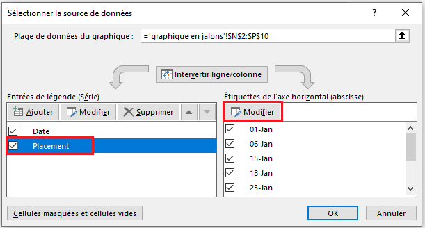 5. From the axis label, click edit and refer to the activity column.
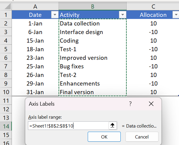
- Click OK.
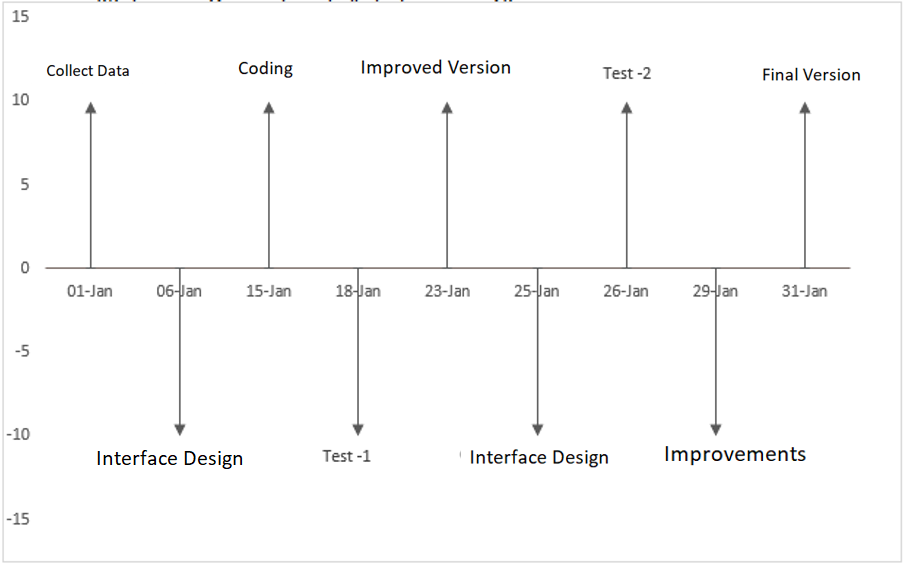
As I said, the Milestone Chart is easy for the end user to understand and allows you to track your project planning in a simple way. It seems a little tricky when you do it for the first time, but if you are an emerging project manager, it is worth giving it a try.
HOW TO CREATE STEP CHART
STEP CHART
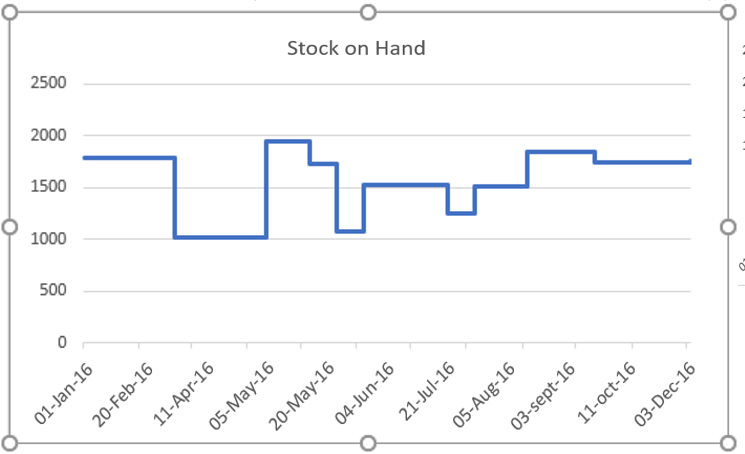
A step chart is perfect if you want to show changes that have occurred at irregular intervals. That’s why it’s on our list of advanced charts. It can help you show the trend as well as the actual time of a change. Essentially, a step chart is an extended version of a line chart.
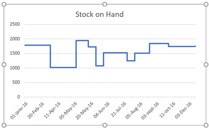
Unlike the line chart, it doesn’t connect the data points using a short-distance line. In fact, it uses vertical and horizontal lines to connect the data points. Now, the bad news is: in Excel, there is no default option to create a step chart. But, you can use a few easy-to-follow steps to create one in no time.
So, today in this article, I would like to share with you a step-by-step process to create a step chart in Excel. And, you will also learn the difference between a line chart and a step chart which will help you select the best chart according to the situation.
1 Line Chart and Step Chart
Here we have some differences between a line chart and a step chart and these points will help you understand the importance of a step chart.
1. Exact time of variation
A step chart can help you show the exact time of a change. On the other hand, a line chart is more concerned with showing trends in change. Just look at the two charts below where we used stock data on hand.
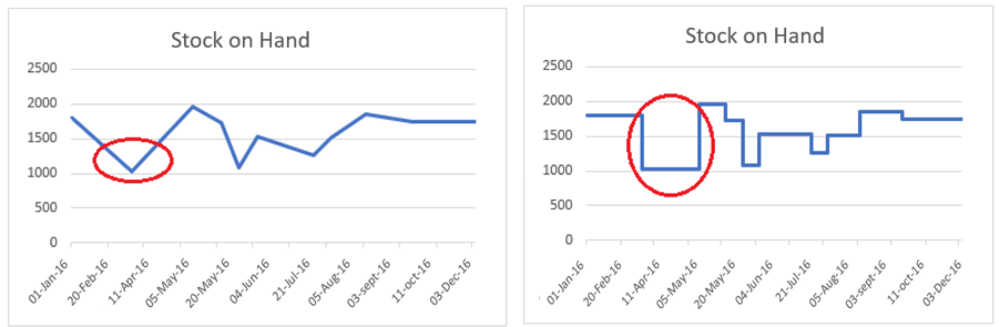
Here, the line chart shows a decrease in inventory from February to March. And for the same period, in the step chart, you can see that the increase only occurred in April. In short, in a line chart, you can’t see the magnitude of a change, but in a step chart, you can see the magnitude of a change.
2. Real trend
A step chart can help you show a true picture of a trend. On the other hand, a line chart can sometimes be misleading. Below, in both charts, you have a decrease in inventory in May, then a further increase in June.
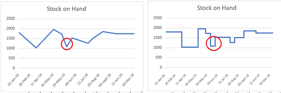
But, if you look at both charts, you will see that the downward trend and then an increase is not clearly shown in the line chart. On the other hand, in the step chart, you can see that before the increase there is a constant period.
3. Constant periods
A line chart cannot display periods when values were constant. However, in a step chart, you can easily display the constant time period for the values. Look at both charts.
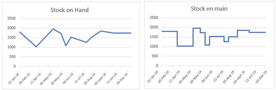
In the step chart, you can clearly see that there is always a constant period before any increase or decrease. But, in the line chart, you can only see the points where you have a decrease or an increase.
4. Actual number of changes
In both graphs below, an increase occurred between July and August, and then again between August and September. But, if you look at the line graph, you are not able to clearly see both changes.
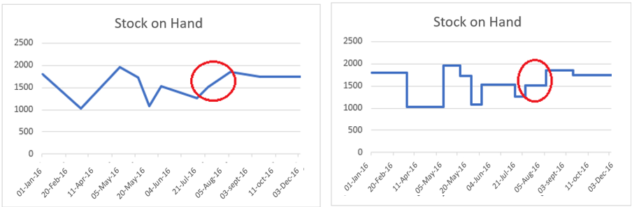
Now, if you come to the step chart, it clearly shows that you have two changes between July and September. I’m sure all the above points are enough to convince you to use a step chart instead of a line chart.
2 Simple Steps to Create a Step Chart
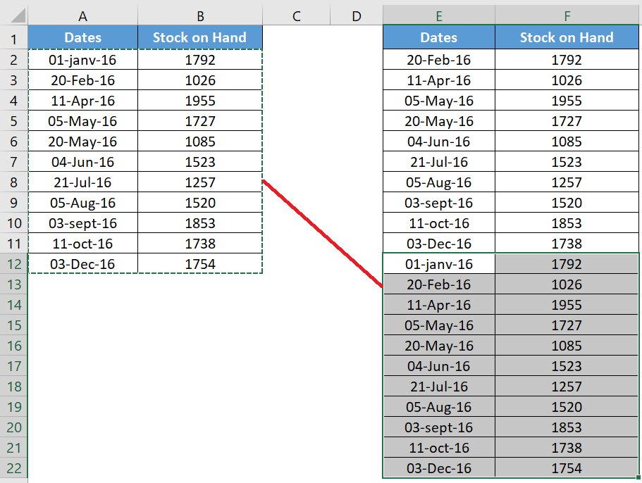
Now it is time to create a step chart and for that we need to use the data below here to create this chart.
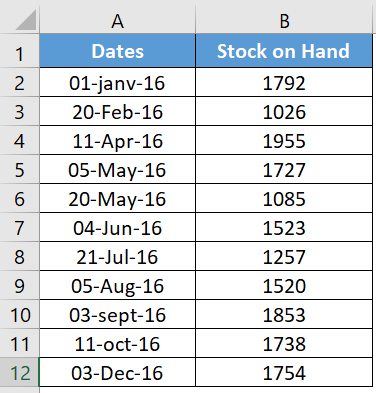
This is stock data on hand from different dates where increase and decrease occurred in stock.
You can download this file from here to follow along.
-
-
- First, you need to build data into a new table using the following method. Copy and paste the headings into new cells.
-
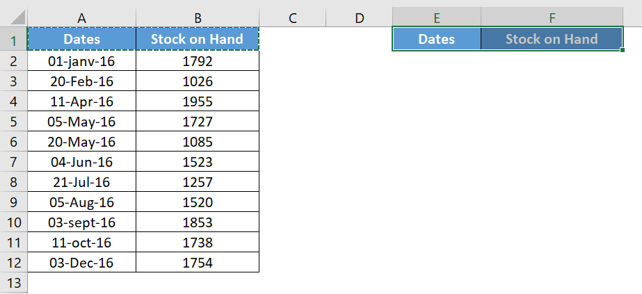
- Now from the original table select the dates from the second date (A3 to A12) and copy them.
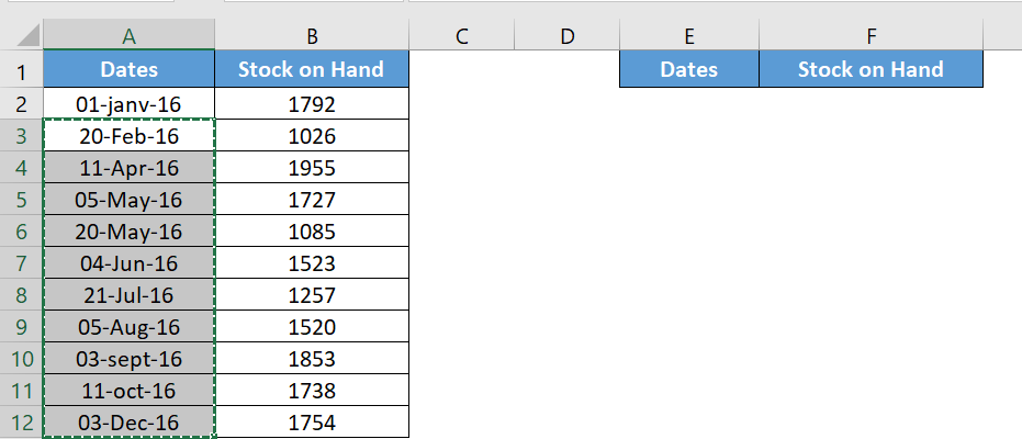
- After that, go to your new table and paste the dates under the « Date » heading (towards E2).
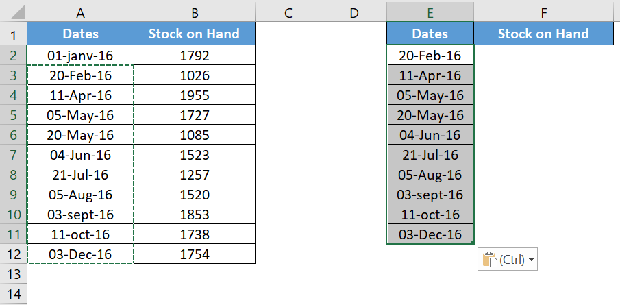
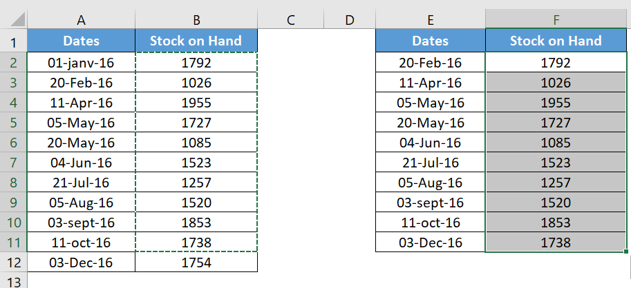
- Again, go to your original table and select the stock values from the first value to the second to last value (B2 to B11) and copy it.
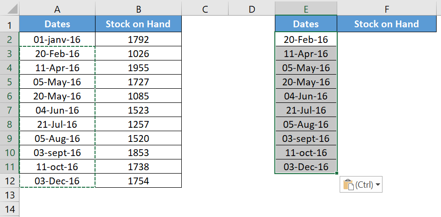
- Now paste it under the « Stock on Hand » heading, alongside the dates (paste to F2).
- After that, navigate to your original data table and copy it.
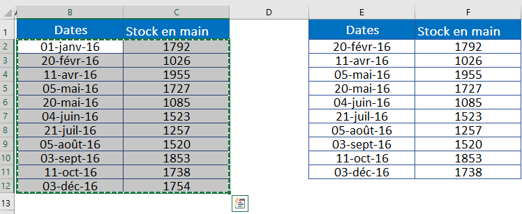
- Now paste it below the new table you just created and your data will look something like this.
- Finally, select this data table and create a line chart. Go to the Insert tab of the ribbon in the Charts group, select Line or Area Chart, then 2D Line Chart.
3 How does it work?
I’m sure you’re happy after creating your first step chart. But, it’s time to understand the whole concept you’ve used here. Let’s take an example with a small data set.
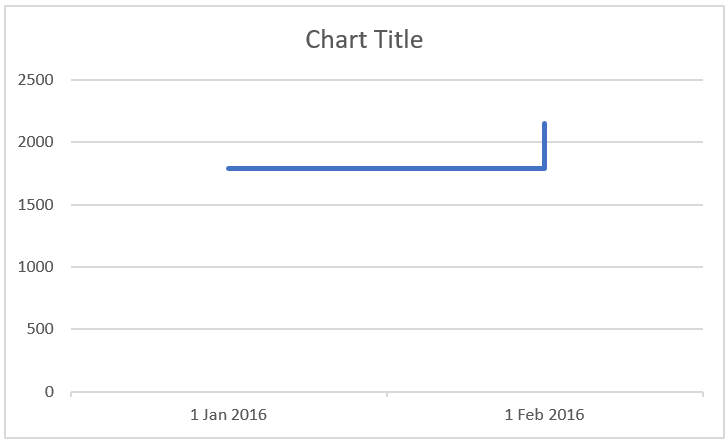
In the table below you have two dates, 01-Jan-2016 and 20-Feb-2016 and you have an inventory increase on 20-Feb-2016.
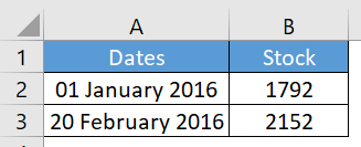
With this data, if you create a simple line chart, it will look like this.
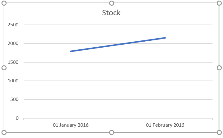
Now, step back a bit and remember what you learned earlier in this article. In a step chart, an increase will only be shown when it actually occurred. So, here, you need to show the change in February instead of a trendline from January to February.
To do this, you need to create a new entry for February 20, 2016, but with the stock value of January 1, 2016. This entry will help you display the line when the increase has not occurred. So, when you create a line chart with this data, it will become a step chart.
4 Create a step chart without dates
When creating a step chart for this article, I found that the line chart had a slight positive point over the step chart.
Think of it this way: most or almost every time you use a line chart to show trends, trends are always related to dates and other measures of time.
When creating a line chart, you can use months or years (without dates) up to the current time period. But when you try to create a step chart without dates, it will look something like below.
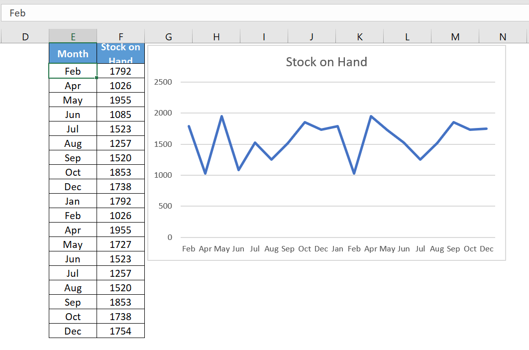
Here, instead of combining dates, Excel has separated the months into two different parts. First, January-December, and then second, January-December.
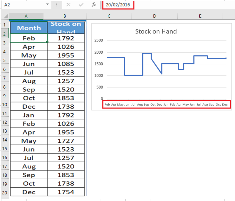
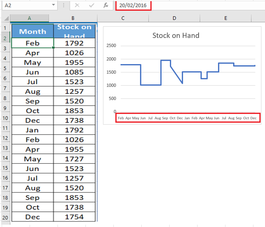
Now, it’s clear that you can’t create a step chart if you use text instead of dates. Well, I don’t want to say that because I have a solution for that. Whenever you have months or years, simply convert them to a date.
For example, instead of using Jan , Feb May, etc., use 01-Jan-2016, 01- Feb -2016, 01-May-2016 and get month from dates using custom formatting.
Like that.
And that just creates your milestone chart.
5 Create a Step Chart without Risers
In this chart, instead of a full step chart, you will only have the lines where the value is constant.
The best use for this chart is when your values increase or decrease after a constant period. For example, mortgage rates, bank interest rates, etc.
To create this chart, we need to construct the data the same way you did for a normal step chart. Download this sample data file to follow along.
- Copy and paste the titles into new cells.
- Now from the original table select the dates starting from the second date (A3 to A9) and copy it.
- After that, go to your new table and paste the dates under the « Date » heading (towards D2).
- Again, go to your original table and select the Rate values from the first value to the second to last value (B2 to B8) and copy it.
- Now paste it under the « Rates » heading, alongside the dates (paste at E2).
Step 2 : Now copy the dates from first to last and paste them below the new data table. Don’t worry about the empty cells for the rate.
Step 3: After that, copy your original data table again and paste it below the new data table. Here you have your data in three sets like this.
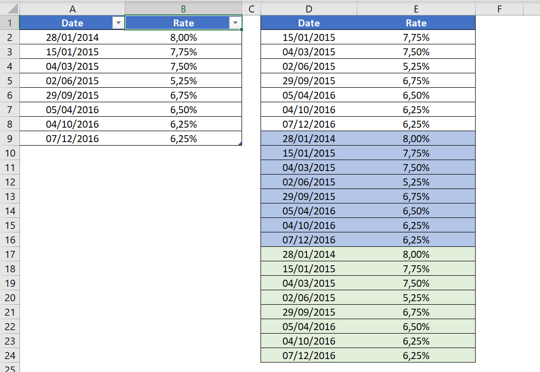
Step 4: Select the data and create a line chart with it.
As you learned above, a step chart is an advanced version of a line chart. It will show you not only trends, but also important information that is difficult to obtain with a line chart.
It may seem a bit tricky at first glance, but once you master the data construction, you can create it in seconds.
-
HOW TO ADD ADDITIONAL DATA SERIES
After creating a chart, you may need to add a data series to the chart. A data series is a row or column of numbers entered into a spreadsheet and plotted on your chart, such as a list of company quarterly earnings.
Office charts are always associated with Excel spreadsheets, even if you created your chart in another program, such as Word. If your chart is on the same worksheet as the data you used to create the chart (also called the source data), you can quickly drag the pointer around the new data in the worksheet to add it to the chart. If your chart is on a separate sheet, you must use the Select Data Source dialog box to add a data series.
1 Quickly add data series
To quickly add a data series to a chart in the same worksheet:
-
- In the worksheet that contains your chart data, in the cells directly next to or below your existing source data for the chart, enter the new data series you want to add.
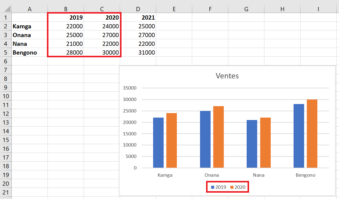
In this example, we have a chart that displays quarterly sales data for 2019 and 2020, and we’ve just added a new data series to the 2021 spreadsheet. Note that the chart doesn’t yet display the 2021 data series.
-
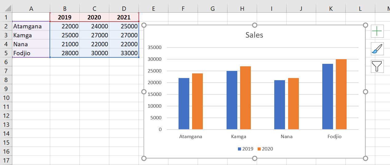
- Click anywhere on the chart.
The currently displayed source data is selected in the worksheet, along with the resizing handles.
You notice that the 2021 data series is not selected.
-
- In the spreadsheet, drag the sizing handles to include the new data.
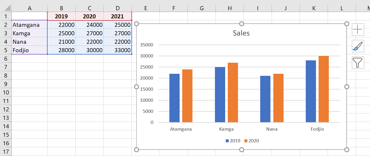
The chart updates automatically and displays the new data series you added.
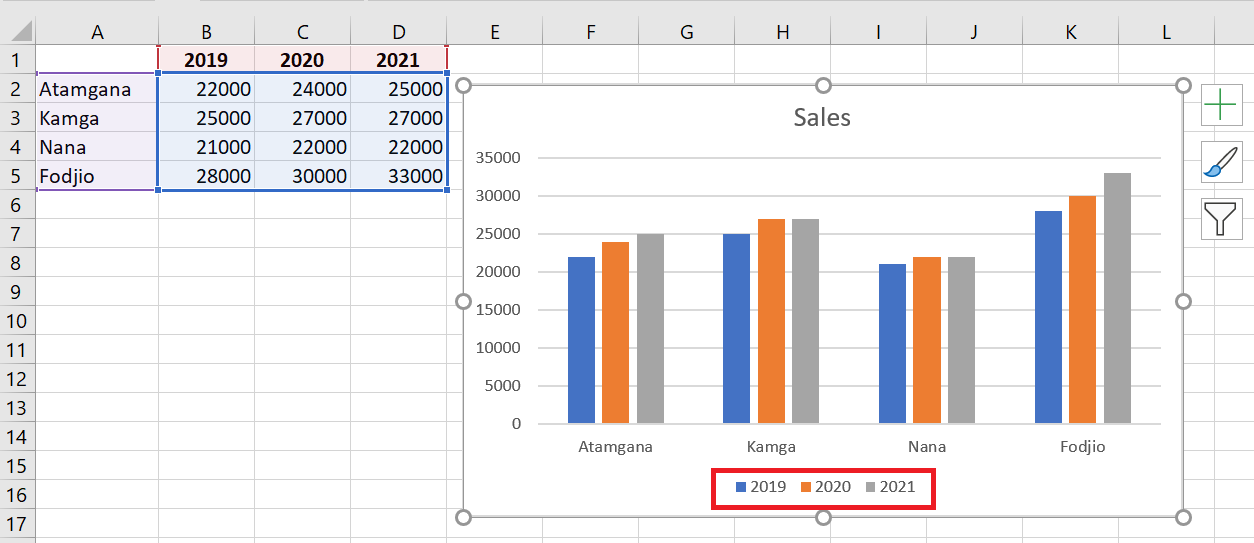
2 Other Methods for Adding Data Series
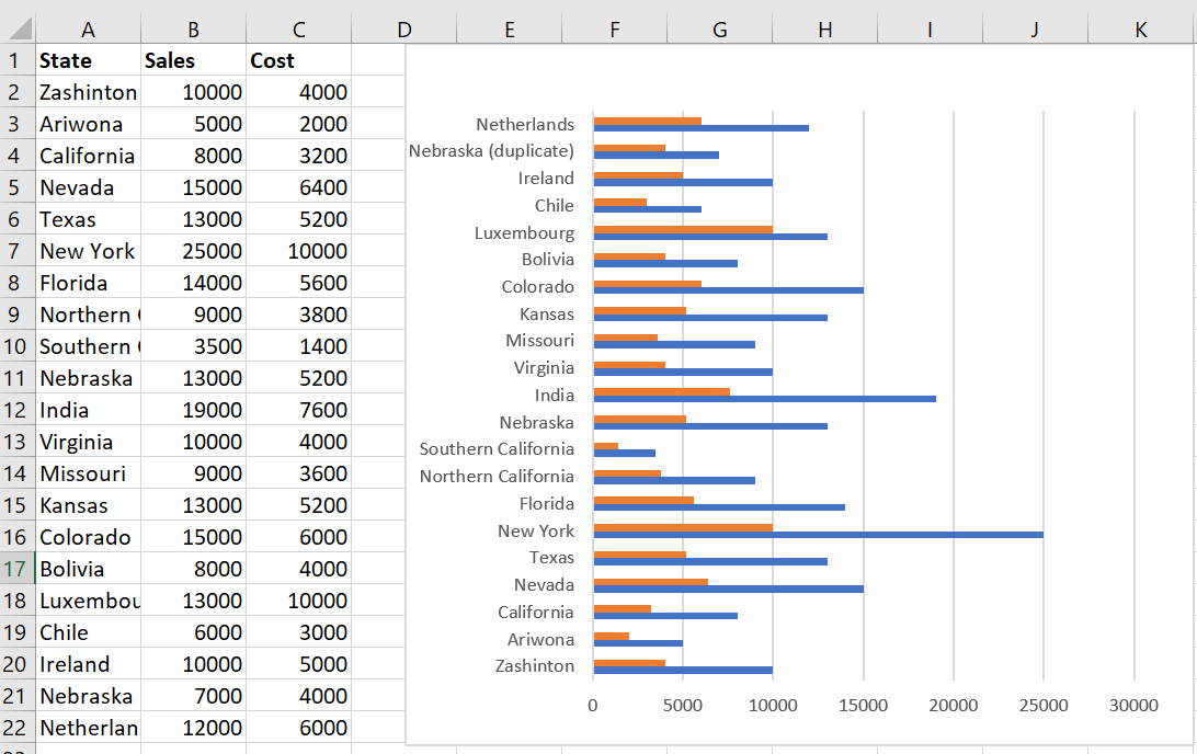
To add another data series to your chart, right-click the chart and select Select Data .
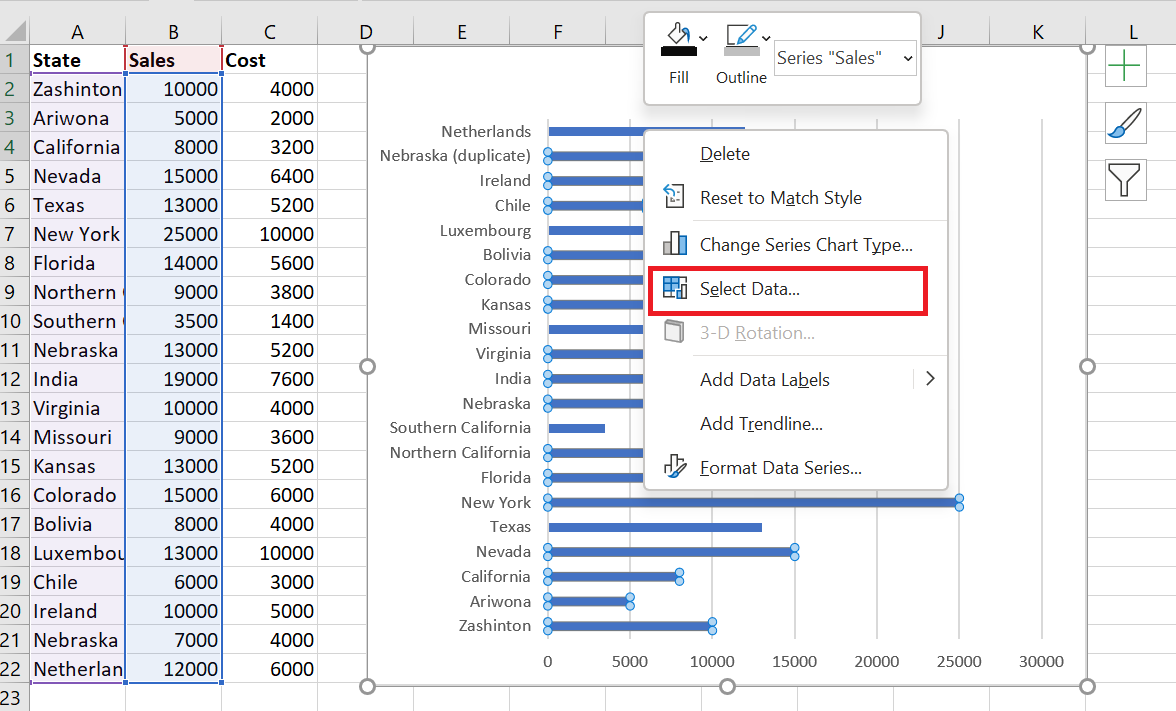
The following dialog box appears.
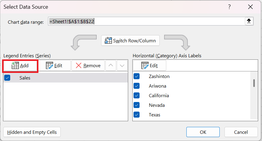
Click the Add button. The following window will open:
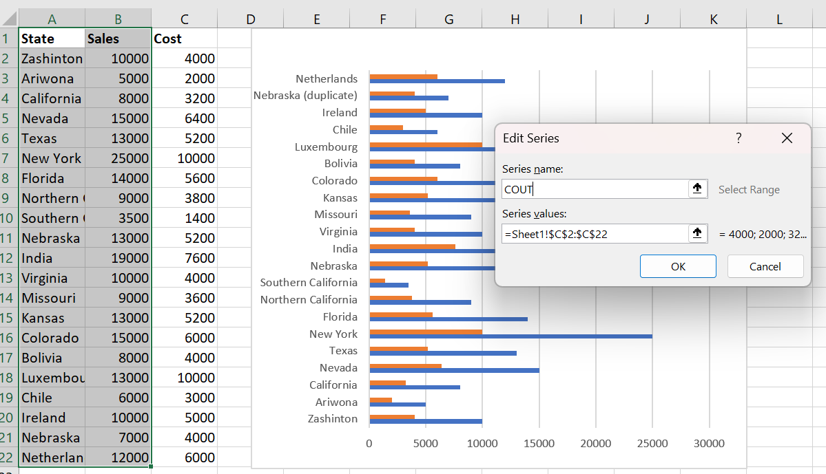
This allows you to select a new series name and a reference to the cells that contain the new series data. Click OK to update the chart:
3 Deleting data from a chart
To delete a data series, select it and then click the Delete button. For example, I’ll delete the data series I just added:
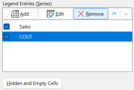
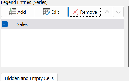
Then click ok to update the chart.
Note: I have added the cost data series for the rest of the tutorial.
4 Editing data in a chart
To change a different data series to your chart, right-click the chart and select Select Data .
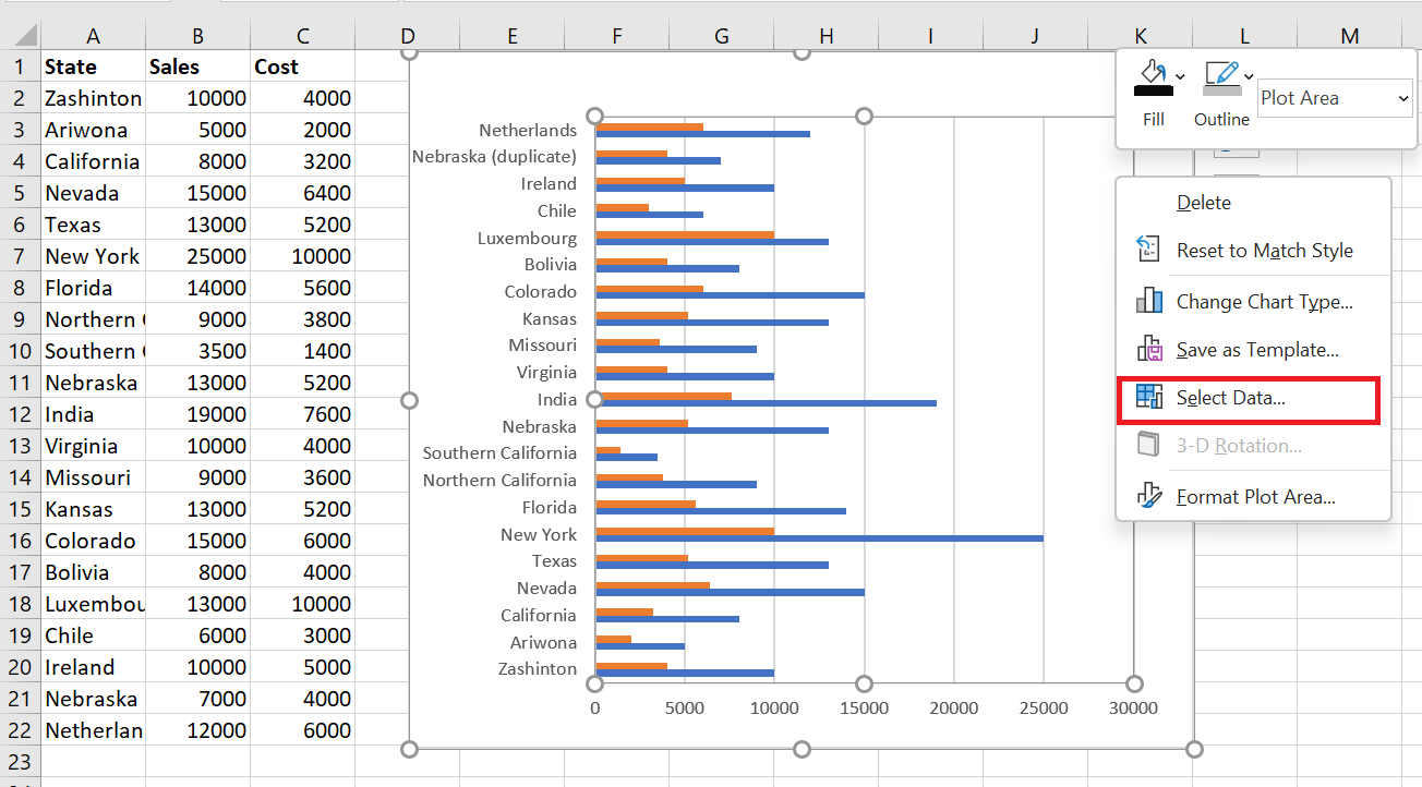
The following dialog box appears.
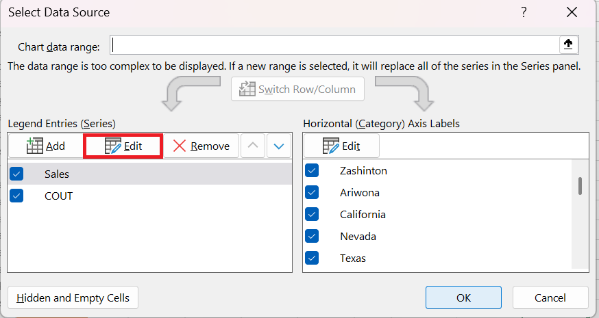
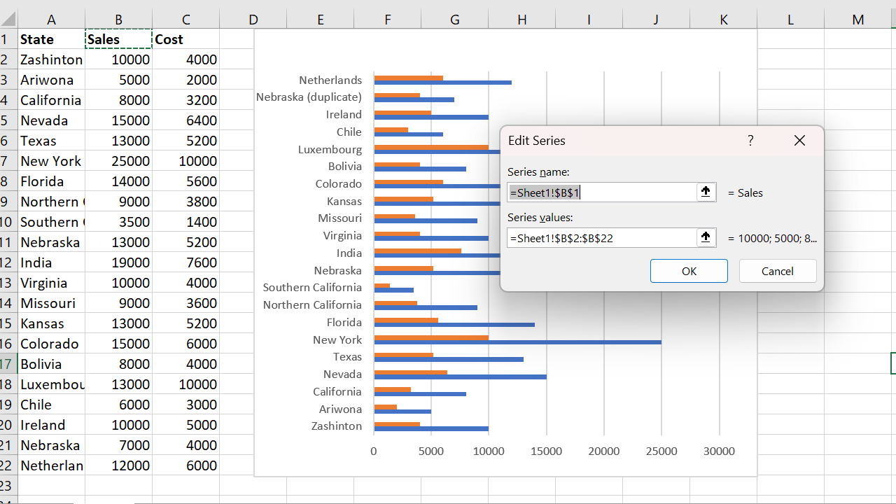
Click the Edit button. The following window will open, allowing you to modify the series name and the referenced data:
5 Move data series up/down
To move a series up or down, select it and then click the up/down arrows to reorder. So, for example, I’ll move the Costs data series up:
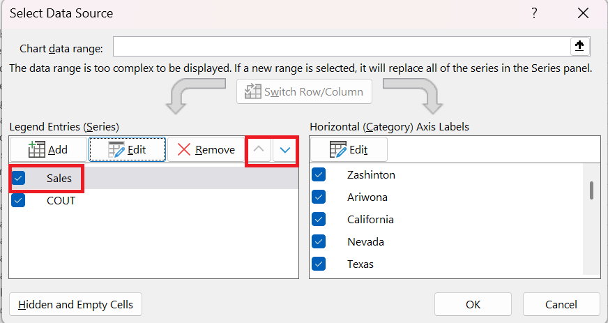
Then click ok to update the chart:
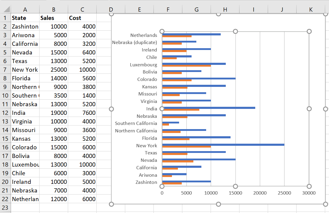
Notice how the bars have reversed.
6 Switch between rows and columns in the source data
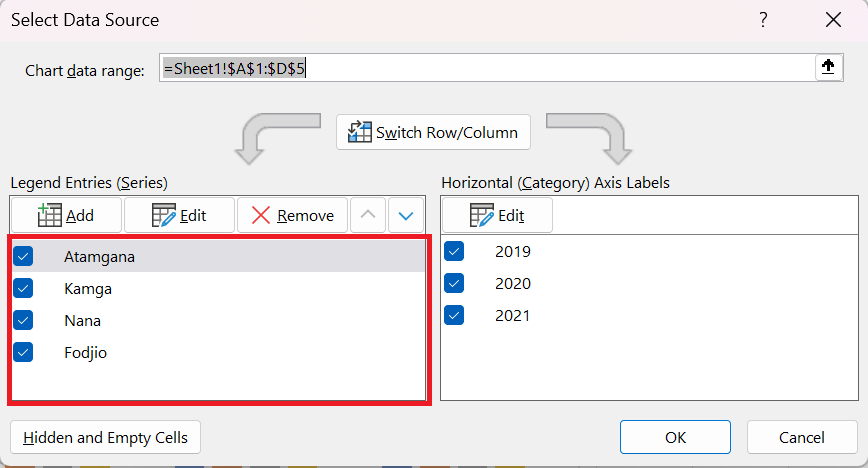
Swapping your data rows/columns can be useful if the data in a spreadsheet has a poor layout. It can also give you an alternative layout for your chart, which may be better depending on how you plan to use your chart. This feature allows you to swap your legend (series) entries with your horizontal axis (category) labels. This only works with 1 data series, so I’ve removed the costs for this example.
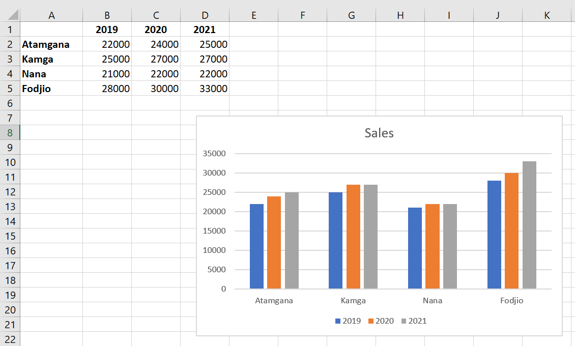
To change rows to columns in your chart, right-click on the chart and select Select Data .
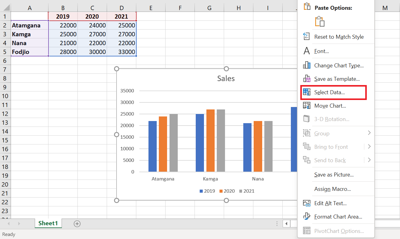
This is what the Select Data Source window looks like:
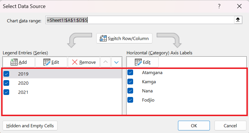
I then click the Swap Row/Column button and then OK to update the chart.
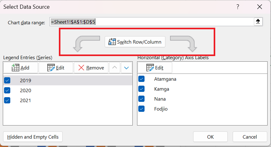
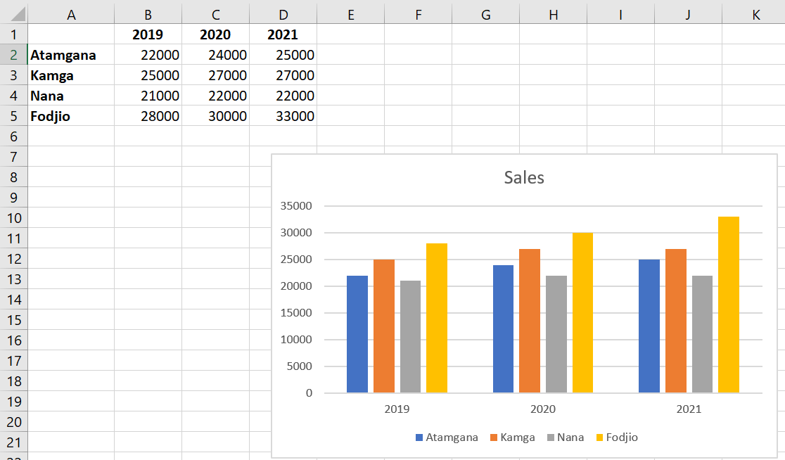
Notice how States is now my key and Sales is on my Y axis and the legend entries / horizontal axis labels are reversed:
Other methods
Another faster method is to:
- Click on the Chart Design tab
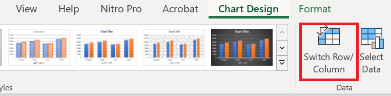
- Click the Swap Row/Column button
- The lines change to columns
-
How to Resize the graphics, Display data table and Add error bars
How to Resize the graphics, Display data table and Add error bars
After creating your chart, for example, you want to change its size so that it occupies a specific location on your spreadsheet.
Three ways to resize your chart:
Start by activating your chart by clicking on it and proceed to resize it by choosing the method that suits you among the three described below:
Method 1
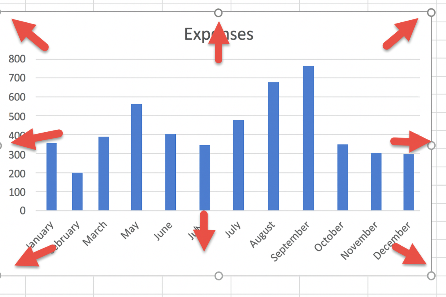
Click on one of the handles around your selected chart and drag in or out until you get the desired size.
Method 2
Use specific height and width measurements. If you want to set a custom height and width, click the Format tab on the ribbon, then manually enter your measurements in the Height and Width boxes in the Size group.

Method 3
Use the Format Graphics Area dialog box:
First, display this dialog box by following one of these steps:
Click the dialog box launcher in the Size group.
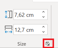
- Right-click the chart area and choose Format Chart Area.
3. Double-click the chart area .
Format Graphics Area dialog box , click the small Size and Properties tab . In the Size box , enter your height and width values.
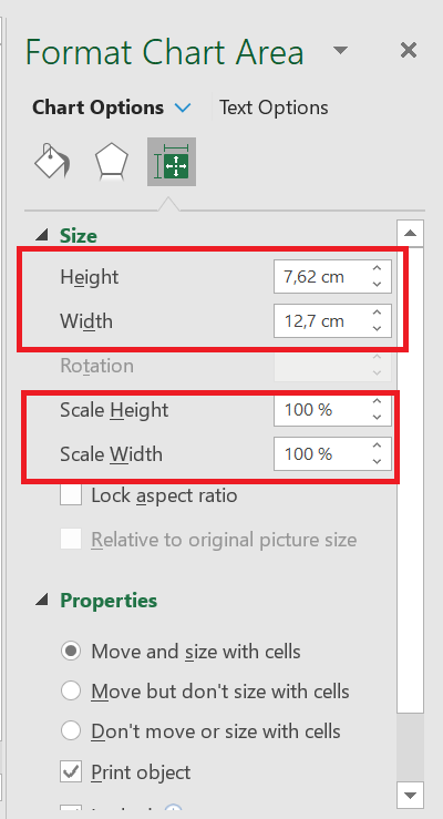
You can also use the two options Scale Height and Scale Width to change the size of your chart by a desired percentage rate.
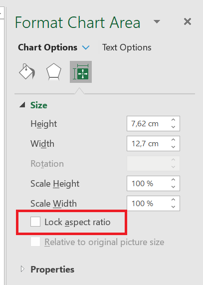
Maintain proportions
Check this box to maintain the resizing proportions between width and height.
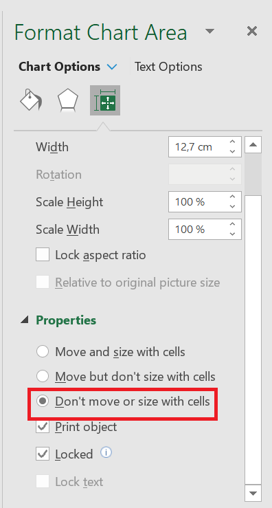
Keep your chart size and position independent of cells:
When you change the size of the cells in your spreadsheet below your chart or when you hide or resize rows or columns, this will affect its size.
So, to keep the size of your chart independent of changes made to these cells (rows or columns), click Properties in the Format Chart Area dialog box and enable the Do not move or size with cells option.
11 Data table
Data tables can be displayed in line, area, column, and bar charts. Follow the steps to insert a data table into your chart.
■ Click on the graph.
■ Click on the
 icon Chart elements .
■ In the list, select Data Table . The data table appears below the chart. The horizontal axis is replaced by the data table header row.
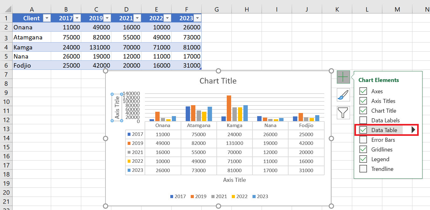
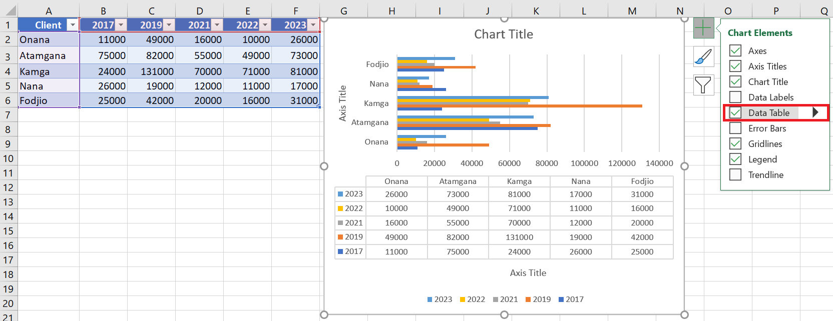
In bar charts, the data table does not replace a chart axis but is aligned with the chart.
12 Add error bars
Error bars graphically express the potential error amounts related to each data marker in a data set. For example, you might display potential positive and negative 5% errors in the results of a scientific experiment.
You can add error bars to a data series in 2D area, bar, column, line, xy (scatter), and bubble charts.
To add error bars, follow the steps below:
■ Click on the graph.
■ Click the Chart Elements icon .

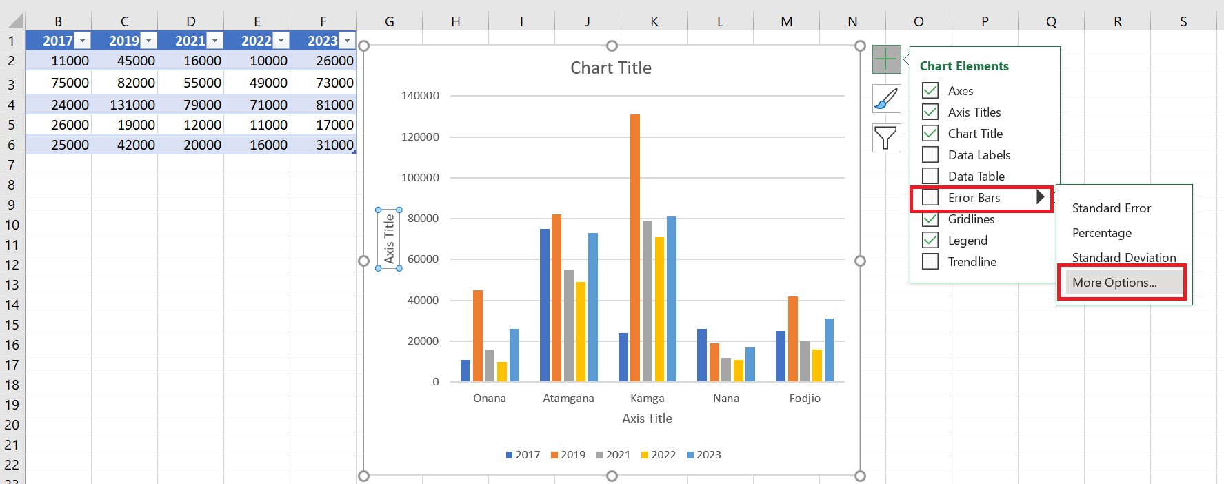
■ From the list, select Error Bars . Click the triangle icon
 to see the available options for error bars.
■ Click More options… in the displayed list. A small window for adding series will open.
■ Select the series . Click OK.
Error bars will appear for the selected series.
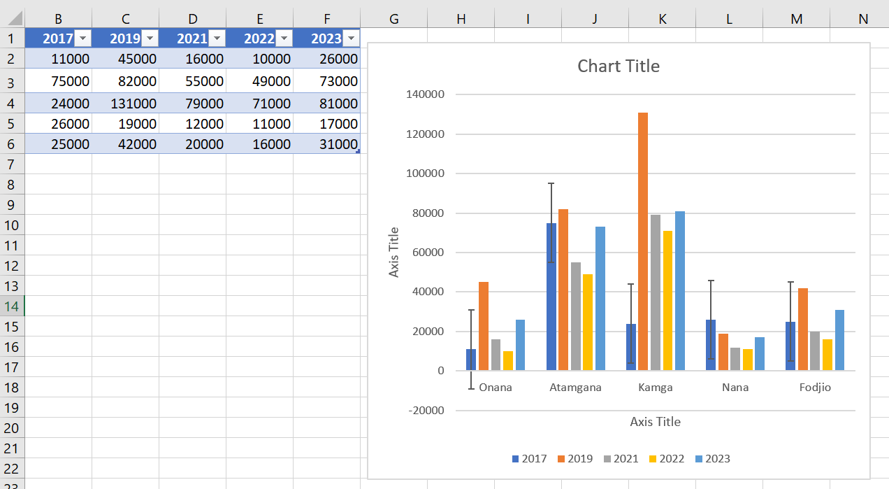
If you change the spreadsheet values associated with the series data points, the error bars are adjusted to reflect your changes.
For scatter and bubble charts, you can display error bars for X values, Y values, or both.
How to create a new chart
How to create a new chart
Creating a chart is quite simple:
1. Make sure your data is suitable for a chart.
2. Select the range that contains your data.
3. Select the Insert tab and select a chart type from the Charts group. These icons display drop-down lists that show subtypes. Excel creates the chart and places it in the center of the window.
There are three entry points for creating a chart:
■ Quick scan icon
■ Recommended graphics
■ Insert ribbon tab
5.1 Creating a graph from the Quick Analysis icon
When you select a data range in Excel, the Quick Analysis icon appears below the data.
Select a data range and the Quick Analysis icon appears.
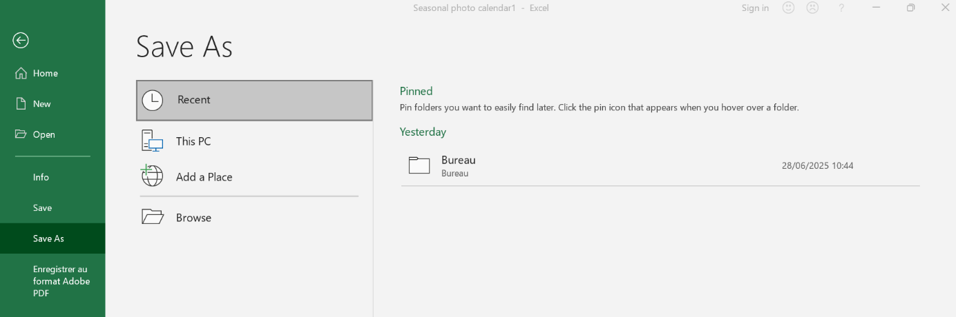
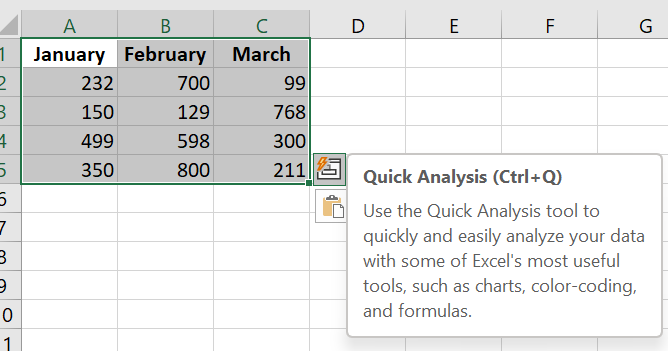
Click the Quick Analysis icon and a menu appears with choices for formatting, charts, totals, tables, and sparklines. Click the Charts menu and the Quick Analysis tool offers some recommended charts. Hover over any thumbnail to see a live preview of that chart.
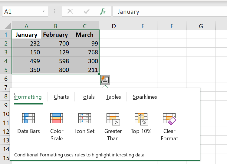
If none of the thumbnails offer what you want, you can click the More Charts icon at the end, which is equivalent to selecting the Recommended Charts icon.
It takes two clicks to get to the Charts section of the Quick Analysis tool, followed by several hovers to review and reject the various suggested charts, and then a third click to get to the Recommended charts. It seems easier to skip this whole process and start with the Recommended charts.
5.2 Inserting a Recommended Chart
You’ll probably prefer the Recommended Charts method for creating charts. The icon appears as a large icon in the Charts group on the Insert tab of the ribbon.
The Recommended Graphics icon
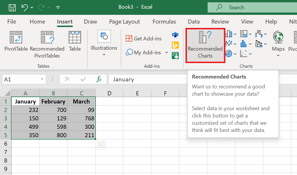
Select the data range and choose Recommended Charts. Excel displays the Insert Chart dialog box and starts on the Recommended Charts tab of the dialog box. Here, you can see all the thumbnails without having to hover over each one.
You can see thumbnails of each recommended chart.
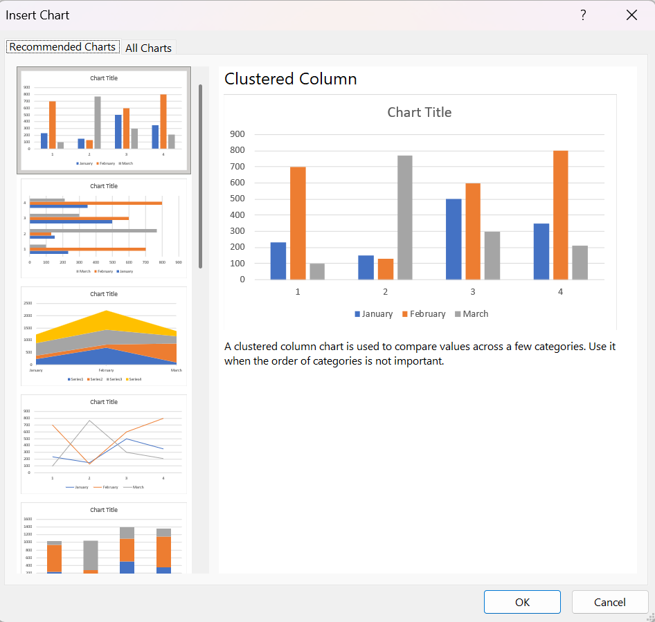
If none of the recommended charts suit you, click the All Charts tab in this dialog box to access the 73 built-in chart types. This tab is easier to use than the various icons in the Charts group on the ribbon. The left navigation panel offers all chart categories, even the Action and Area types, which are hidden on the ribbon. The seven thumbnails at the top offer seven chart types, and the two large thumbnails let you choose whether your series should be in rows or columns.
You can see thumbnails of each recommended chart .
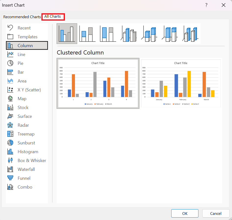
Most chart categories provide thumbnail icons at the top of the dialog box. These icons generally represent four basic chart types:
■ Clustered: Each series gets a column, bar, or point starting from the x-axis of the chart. This chart type makes it easy to compare the performance of each series over time or across the axis.
■ Stacked: This shows how the three series add up to a total value. This is great for communicating total sales across the three regions, but terrible for seeing how Series 2 or Series 3 has changed over time.
■ 100% Stacked: The actual numbers in the cells are converted to percentages. Each column/bar/row adds up to 100%. This method is terrible for showing total sales and terrible for showing how each series has changed over time.
■ 3D Column—While the previous three elements are available in 3D versions, column and area charts offer a fourth 3D choice: 3D Column, where series are displayed from front to back. This works when the series in front is smaller than the series in the back. Often, however, elements in the back series are hidden by elements in the front series.
5.3 Creating a chart using other icons on the Insert tab
If you don’t choose the Recommended Chart icon, you can go directly to one of the other eight chart drop-down menus on the Insert tab of the ribbon.
The 11 chart categories grouped into eight icons.
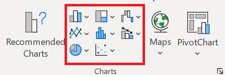
There really should be more icons than the eight displayed. Bubble charts have been moved to the Scatter Chart icon. Stock and Area charts are in the Radar Chart icon. Cone, Pyramid, and Cylinder charts have been removed from the Column Chart icon and moved to the Formatting task pane. There are no icons for Templates or Recents.
To access the Templates or Recent categories, you need to open the All Charts tab of the Insert Chart dialog box .
REMARQUE ■■■■■■
Vous pouvez créer un graphique avec une seule touche. Sélectionnez la plage à utiliser dans le graphique, puis appuyez sur Alt+F1 (pour un graphique incorporé) ou F11 (pour un graphique sur une feuille de graphique). Excel affiche le graphique des données sélectionnées en utilisant le type de graphique par défaut. Le type de graphique par défaut est un graphique à colonnes, mais vous pouvez le modifier. Pour modifier le type de graphique par défaut, sélectionnez n’importe quel graphique et choisissez Outils de graphique / Conception / Modifier le type de graphique. La boîte de dialogue Modifier le type de graphique s’affiche. Choisissez un type de graphique dans la liste de gauche, puis cliquez avec le bouton droit sur un graphique dans la rangée de vignettes et choisissez Définir comme graphique par défaut.
5.4 Trying other chart types
Although a clustered column chart seems to work well for this data, there’s no harm in checking out other chart types. Choose Chart Tools / Design / Change Chart Type / All Charts to experiment with other chart types. This command displays the Change Chart Type dialog box, shown in the following figure. The figure shows what the data would look like as a line chart.
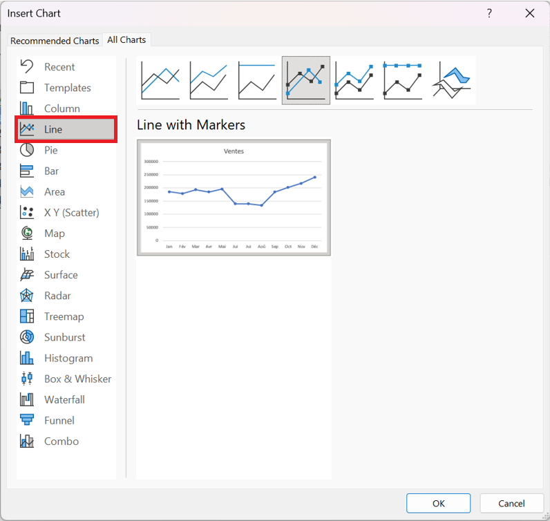
The main chart categories are listed on the left, and the subtypes are displayed as a horizontal row of icons. Select an icon, and the display shows how the chart will look in both data orientations. When you find a suitable chart type, click OK, and Excel modifies the chart. Note that this dialog box has a tab at the top that lets you access the chart types Excel recommends for the data.
NOTE ■■■■■■
Les styles affichés dans la galerie dépendent du thème du classeur. Lorsque vous choisissez Mise en page / Thèmes / Thèmes pour appliquer un thème différent, vous disposez d’une nouvelle sélection de styles et de couleurs de graphique conçus pour le thème sélectionné.
5.5 Working with graphics
This section covers some common chart modifications:
■ Resizing and moving graphics
■ Copying a chart
■ Delete a chart
■ Adding chart elements
■ Moving and deleting chart elements
■ Formatting chart elements
■ Printing graphics
Before you can edit a chart, it must be activated. To activate an embedded chart, click on it. This activates the chart and selects the item you click. To activate a chart on a chart sheet, simply click its sheet tab.
Resize a chart
If your chart is an embedded or inline chart, you can easily resize it with your mouse. Click the chart and round handles appear on the corners and edges of the chart. Move the mouse pointer to a corner and when the mouse pointer changes to a double arrow, click and drag to resize the chart.
Another way to resize a chart: When a chart is selected, choose Chart Tools / Format / Size and use the two controls to adjust the height and width of the chart. Use the double arrows or type the dimensions directly into the Height and Width controls.
Move a chart
To move an embedded chart to another location on a worksheet, click the chart and drag one of its borders. You can use standard copy and paste techniques to move an embedded chart. In fact, this is the only way to move a chart from one worksheet to another. Select the chart and choose Home / Clipboard / Cut (or press Ctrl+X). Then activate a cell near the desired location and choose Home / Clipboard / Paste (or press Ctrl+V). The new location can be in a different worksheet or even in a different workbook. If you paste the chart into a different workbook, the chart will be linked to the data in the original workbook.
To move an embedded chart to a chart sheet (or vice versa), select the chart and choose Chart Tools / Design / Location / Move Chart; the Move Chart dialog box appears. Choose New Sheet and give the chart sheet a name (or use the name suggested by Excel).
Copy a chart
To make an exact copy of an embedded chart on the same worksheet, click the chart border, hold down the Ctrl key, and drag. Release the mouse button and a new copy of the chart is created.
To make a copy of a chart sheet, use the same procedure, but drag the chart sheet tab.
You can also use standard copy-and-paste techniques to copy a chart. Select the chart (an embedded chart or a chart sheet) and choose Home / Clipboard / Copy (or press Ctrl+C).
Then activate a cell near the desired location and choose Home / Clipboard / Paste (or press Ctrl+V). The new location can be in another worksheet or even in another workbook.
If you paste the chart into another workbook, it will be linked to the data in the original workbook.
Delete a chart
To delete an embedded chart, press Ctrl and click on the chart (to select the chart as an object). Then press Delete. When the
With Ctrl held down, you can select multiple charts and then delete them all with a single press of the Delete key.
To delete a chart sheet, right-click its tab and choose Delete from the context menu. To delete multiple chart sheets, select them by pressing Ctrl while clicking the sheet tabs.
Adding chart elements
To add new elements to a chart (such as a title, legend, data labels, or gridlines), activate the chart and use the controls in the Chart Elements « + » icon, which appears to the right of the chart. Note that each element expands to reveal additional options.
You can also use the Add Chart Element control in the Chart Tools / Design / Chart Layouts tab.
Moving and deleting chart elements
Some chart elements can be moved: titles, legend, and data labels. To move a chart element, simply click on it to select it, then drag its border.
The easiest way to remove a chart element is to select it and then press Delete. You can also use the controls in the Chart Elements icon, which appears to the right of the chart.
Printing graphics
There’s nothing special about printing embedded charts; you print them the same way you print a worksheet. As long as you include the embedded chart in the range you want to print, Excel prints the chart as it appears on the screen. When printing a sheet with embedded charts, it’s a good idea to preview first (or use Page Layout view) to make sure your charts don’t span
multiple pages. If you created the chart on a chart sheet, Excel always prints the chart on a page by itself.
NOTE ■■■■■■
Si vous sélectionnez un graphique incorporé et choisissez Fichier / Imprimer, Excel imprime le graphique sur une page par lui-même et n’imprime pas la feuille de calcul.
If you don’t want a particular embedded graphic to appear on your printout, go to the Format Chart Area task pane and select the Size and Properties icon. Then, expand the Properties section and uncheck the Print Object box.
Sparklines in Excel: How to Create, Use, and Edit
Sparklines in Excel: How to Create, Use, and Edit
Looking for a way to visualize a large amount of data in a small space? Sparklines are a quick and elegant solution. These microcharts are specifically designed to show data trends within a single cell.
1 What is a sparkline chart?
A sparkline is a small chart that resides in a single cell. The idea is to place a visual near the original data without taking up too much space, which is why sparklines are sometimes called « line charts. »
Sparklines can be used with any numeric data in a tabular format. Typical uses include visualizing temperature fluctuations, stock prices, periodic sales figures, and any other variations over time. You insert sparklines next to rows or columns of data and get a clear graphical presentation of a trend in each individual row or column.
Sparklines were introduced in Excel 2010 and are available in all later versions of Excel 2013, Excel 2016, Excel 2019, and Excel for Office 365.
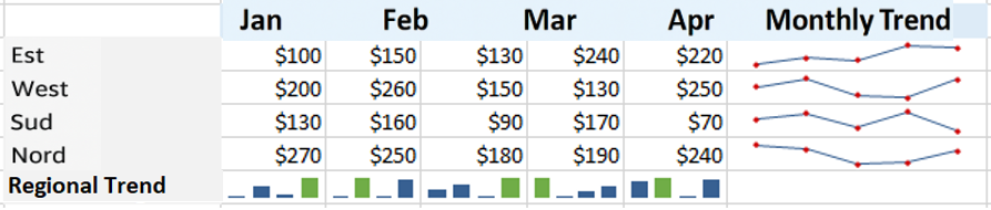
2 How to Insert Sparklines in Excel
To create a sparkline chart in Excel, follow these steps:
- Select an empty cell where you want to add a sparkline, usually at the end of a row of data.
- Insert tab , in the Sparklines group , choose the type you want: Line , Histogram or Conclusions and Losses .

- Create Sparklines dialog window , place the cursor in the Data Range box and select the range of cells to include in a sparkline.
- Click OK .

There you have it—your very first mini chart appears in the selected cell. Want to see how the data changes in the other rows? Simply drag the fill handle to instantly create a similar sparkline for each row in your table.
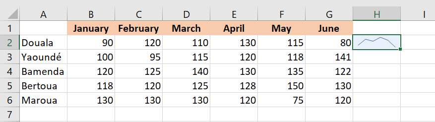
3 How to Add Sparklines to Multiple Cells
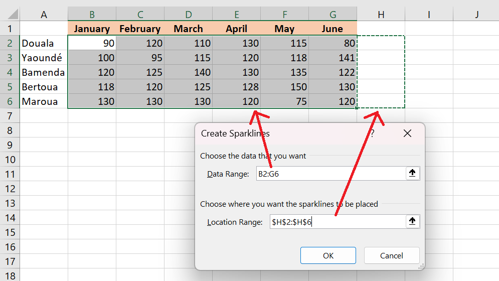
In the previous example, you already know one way to insert sparklines into multiple cells: add it to the first cell and copy it. Alternatively, you can create sparklines for all cells at once. The steps are exactly the same as those described above, except you select the entire range instead of a single cell.
Here are the detailed instructions for inserting sparklines into multiple cells:
- Select all the cells where you want to insert mini-charts.
- Insert tab and choose the type of sparkline you want.
- Create Sparklines dialog box , select all the source cells for the data range .
- Make sure Excel displays the correct range of locations where your sparkline should appear.
- Click OK .
4 Types of Sparkline
Microsoft Excel provides three types of sparkline charts: Line, Column, and Profit/Loss.
4.1 Line Sparkline
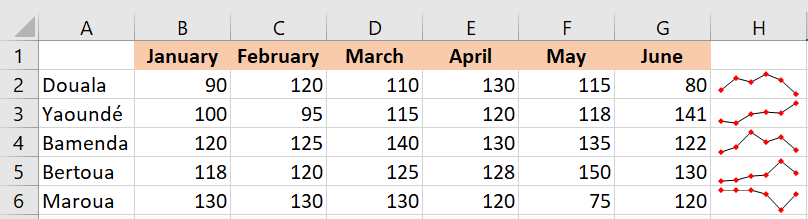
These sparklines look a lot like small, simple lines. Similar to a traditional Excel line chart , they can be drawn with or without markers. You’re free to change the line style as well as the color of the line and markers. We’ll see how to do all of this a little later, and in the meantime, we’ll show you an example of sparklines with markers:
4.2 Column Sparkline
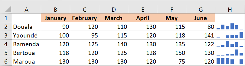
These tiny charts appear as vertical bars. As with a traditional column chart, positive data points are above the x-axis and negative data points are below the x-axis. Zero values are not displayed—a blank space is left at a zero data point. You can set any color for the positive and negative mini-columns, as well as highlight the largest and smallest points.
4.3 Sparkline of Conclusions and Losses
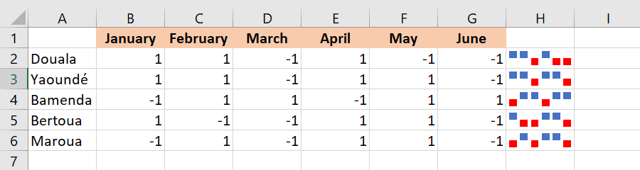
This type looks a lot like a column sparkline chart, except it doesn’t display the magnitude of a data point—all bars are the same size regardless of the original value. Positive values (gains) are plotted above the x-axis, and negative values (losses) are plotted below the x-axis.
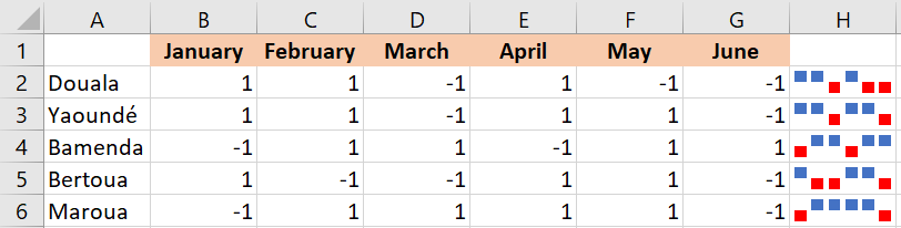
You can think of a win/loss sparkline as a binary microchart, best used with values that can only have two states, such as True/False or 1/-1. For example, this works well for displaying game results, where 1s represent wins and -1s represent losses:
5 How to Change Sparklines in Excel
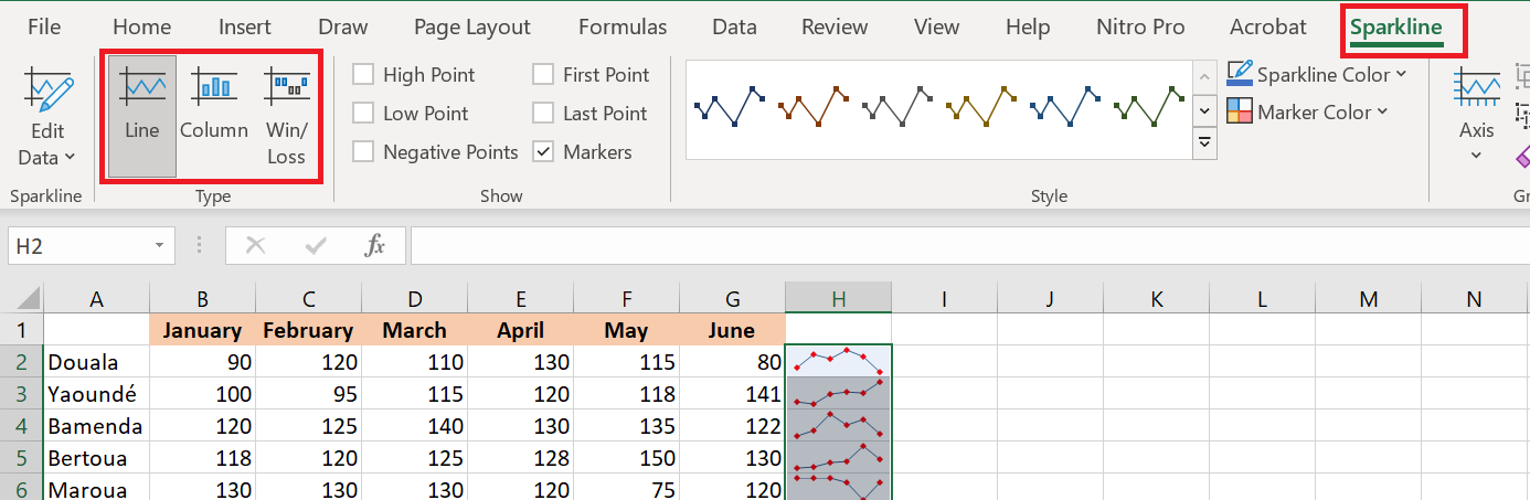
After creating a microchart in Excel, what’s the next thing you’d typically want to do? Customize it to your liking! All customizations are done on the Sparkline tab , which appears as soon as you select an existing sparkline in a sheet.
5.1 Change the sparkline type
To quickly change the type of an existing sparkline, follow these steps:
- Select one or more sparklines in your spreadsheet.
- Sparkline tab .
- In the Type group , choose the one you want.
5.2 Display markers and highlight specific data points
To make the most important points of the sparklines more visible, you can highlight them in a different color. Additionally, you can add markers for each data point. To do this, simply select the desired options on the Sparkline tab , in the Show group :

Here is a brief overview of the available options:
- High Point – Highlights the maximum value in a sparkline chart.
- Low Point – Highlights the minimum value in a sparkline chart.
- Negative Points – highlights all negative data points.
- First Point – Shades the first data point in a different color.
- Last Point – Changes the color of the last data point.
- Markers – Adds markers to each data point. This option is only available for linear sparklines.
5.3 Change the sparkline color, style, and line width
To change the appearance of your sparklines, use the style and color options located on the Sparkline tab , in the Style group :
- To use one of the predefined sparkline styles , simply select it from the gallery. To see all styles, click the Plus button in the lower right corner.

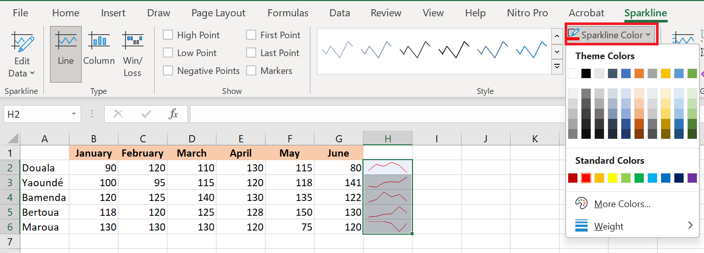
- If you don’t like the default Excel sparkline color , click the arrow next to Sparkline Color and choose your preferred color. To adjust the line width , click the Weights option and choose from the list of preset widths or set a custom Weight. The Weight option is only available for sparklines.
- To change the color of markers or specific data points, click the arrow next to Marker Color and select the item you want:

6 Customize the sparkline axis
Typically, Excel sparklines are drawn without axes or coordinates. However, you can display a horizontal axis if needed and make some other customizations. Details follow below.
6.1 How to change the axis start point
By default, Excel draws a sparkline chart this way—the smallest data point at the bottom and all other points relative to it. In some situations, however, this can be confusing, making the lowest data point appear close to zero and the variation between data points greater than it actually is. To solve this problem, you can make the vertical axis start at 0 or any other value you deem appropriate. To do this, follow these steps:
- Select your sparklines.
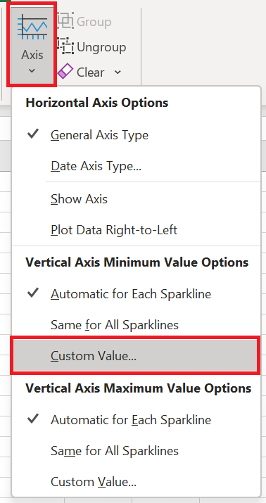
- Sparkline tab , click the Axis button .
- Under Vertical Axis Minimum Value Options , select Custom Value…
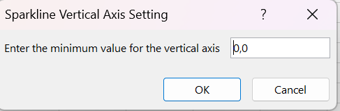
- In the dialog box that appears, enter 0 or another minimum value for the vertical axis that you deem appropriate.
- Click OK .
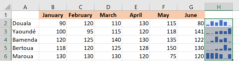
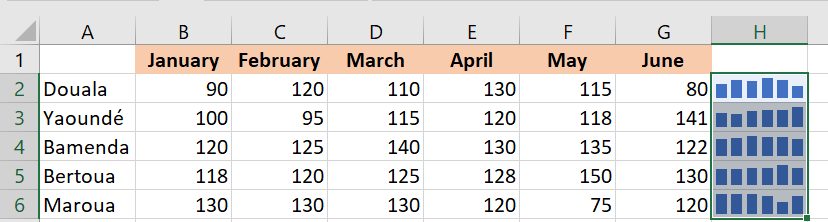
The image below shows the result: by forcing the sparkline to start at 0, we got a more realistic picture of the variation between data points:
Before
After
Be very careful with axis customizations when your data contains negative numbers – if you set the minimum y-axis value to 0, all negative values will disappear from a sparkline chart.
6.2 How to display the x-axis in a sparkline chart
To display a horizontal axis in your microchart, select it and then click Axis / Show Axis in the tab Sparkline .
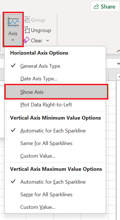
This works best when the data points fall on both sides of the x-axis, i.e. you have both positive and negative numbers:
6.3 How to group and ungroup sparklines
When you insert multiple sparklines in Excel, grouping them gives you a big advantage: you can edit the entire group at once.
To group sparklines , here’s what you need to do:
- Select at least two mini-charts.
- Sparkline tab , click the Group button .

To ungroup sparklines , select them and click the Ungroup button .
Tips and notes:
- When you insert sparklines into multiple cells , Excel automatically groups them.
- Selecting a single sparkline in a group selects the entire group.
- Grouped sparklines are of the same type. If you group different types, say Line and Column, they will all be of the same type.
6.4 How to resize sparklines
Because Excel sparklines are background images in cells, they are automatically resized to fit the cell:
- To change the width of the sparklines, expand or shrink the column.
- To change the height of the sparklines, make the line bigger or shorter.

6.5 How to delete a sparkline chart
When you decide to delete a sparkline chart you no longer need, you might be surprised to find that pressing the Delete key has no effect.
Here are the steps to delete a sparkline chart in Excel:
- Select the sparkline(s) you want to delete.
- In the tab Sparkline , do one of the following:
- To delete only the selected sparklines, click the Clear button .
- To delete the entire group, click Clear / Clear Selected Sparkline Groups .

Customize Excel charts; Add chart title, axes, legend, data labels, and more.
Customize Excel charts: Add chart title, axes, legend, data labels, and more.
After creating a chart in Excel, what’s the first thing you usually want to do with it? Make the chart look exactly how you imagined it in your mind!
In modern versions of Excel, customizing charts is easy and fun. Microsoft has really made a big effort to simplify the process and place customization options at your fingertips. And below, you’ll learn some quick ways to add and edit all the essential elements of Excel charts.
1 Three Ways to Customize Charts
You already know that you can access the main features of the chart in three ways:
- Select the chart and go to the Chart Tools tabs ( Chart Creation, Formatting ) on the Excel ribbon.
- Right-click the chart element you want to customize and choose the corresponding item from the context menu.
- Use the chart customization buttons that appear in the upper right corner of your Excel chart when you click on them.
You’ll find even more customization options in the Format Chart pane , which appears to the right of your worksheet when you click More Options… in the chart ‘s context menu or on the Chart Tools tabs on the ribbon.
NOTE ■■■■■■
Pour un accès immédiat aux options pertinentes du volet Format du graphique, double-cliquez sur l’élément correspondant dans le graphique.
2 How to Create and Customize a Chart Title
2.1 How to add a title to a chart
A chart is already inserted with the default Chart Title . To change the title text, simply check this box and enter your title:
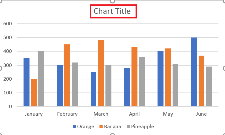
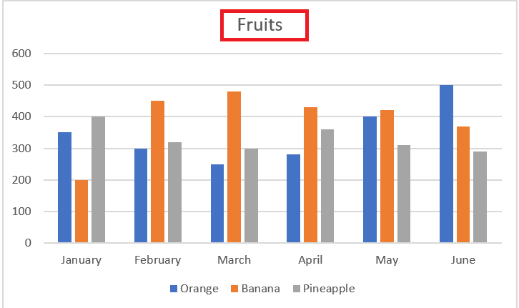
You can also link the chart title to a cell in the sheet, so that it is automatically updated whenever the cell you like is updated. If for some reason the title was not added automatically, click anywhere in the chart to display the Chart Tools tabs. are displayed. Click the Chart Design tab, then click Add Chart Element / Chart Title / Above Chart .
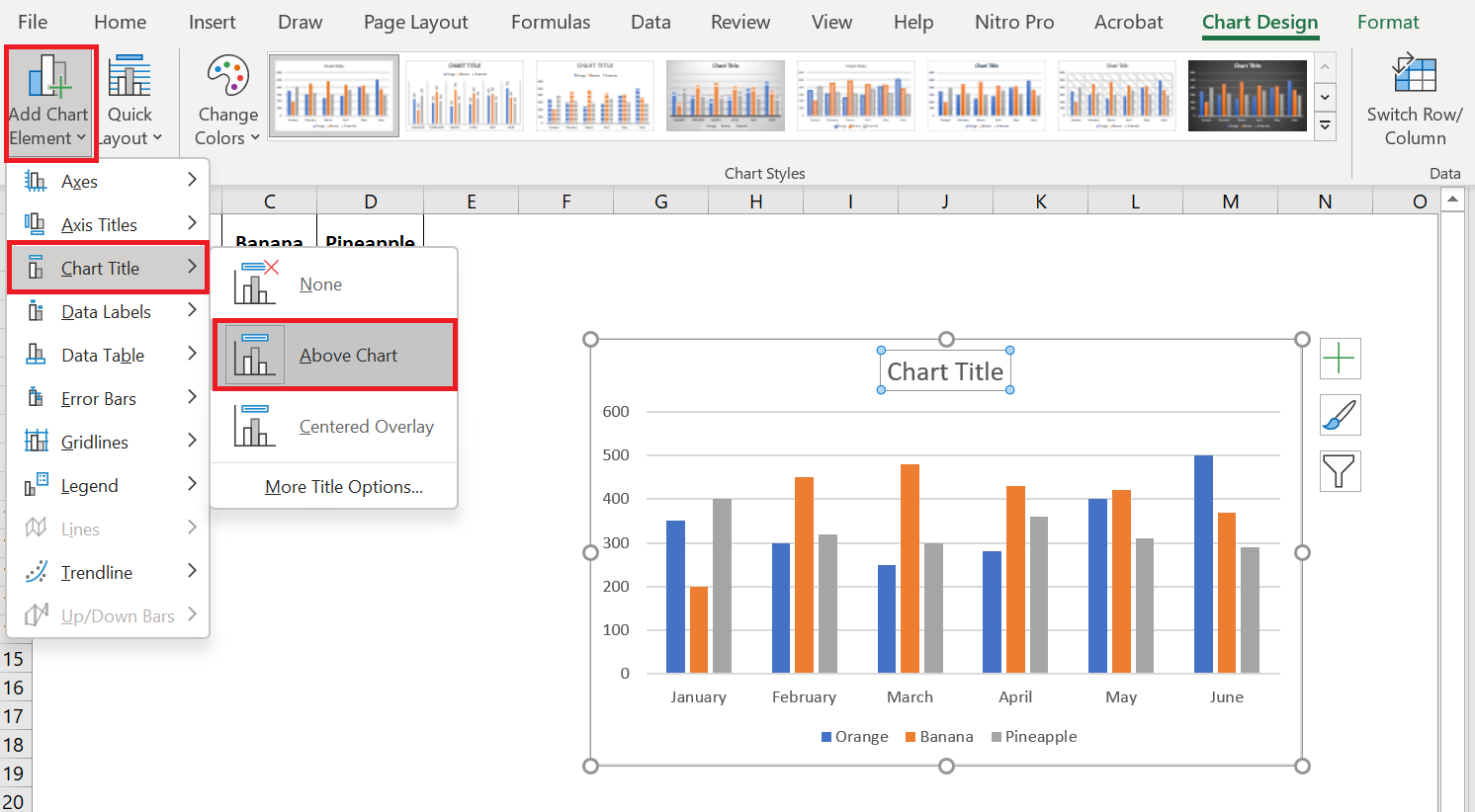
You can also click the Chart Elements button in the upper right corner of the chart and check the Chart Title box.
Additionally, you can click the arrow next to the chart title and choose one of the following options:
- Above chart – the default option that displays the title at the top of the chart area and changes the chart size.
- Centered Overlay – Overlays the title centered on the chart without resizing the chart.
For more options, go to Chart Creation / Add Chart Element / Chart Title / Other Title Options.
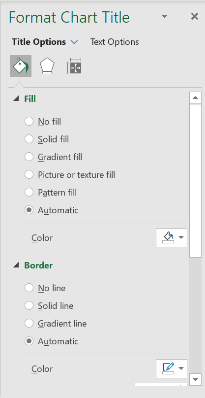
Or, you can click the Chart Elements button and click Chart Title > More Options…
Clicking the More Options item (on the ribbon or in the context menu) opens the Highlight Chart Title pane on the right side of your spreadsheet, where you can select the formatting options you want.
2.2 Link the chart title to a cell in the spreadsheet
For most Excel chart types, the newly created chart is inserted with the default placeholder for the chart title. To add your own chart title, you can either select the title area and type the desired text, or link the chart title to a cell in the worksheet, such as the table header. In this case, your Excel chart title will be updated automatically whenever you edit the linked cell.
To link a chart title to a cell, do the following:
- Select the chart title.
- In your Excel sheet, type an equal sign (=) in the formula bar, click the cell that contains the required text, and press Enter.
In this example, we’re linking our Excel chart title to the merged cell A1. You can also select two or more cells, such as a few column headers, and the contents of all selected cells will appear in the chart title.
2.3 Move the title in the chart
If you want to move the title to another location in the chart, select it and drag it with the mouse:
2.4 Remove the chart title
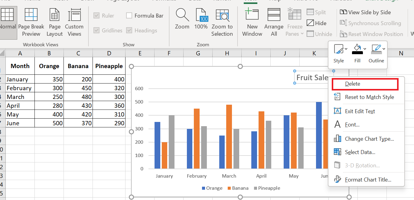
If you don’t want any title in your Excel chart, you can remove it in two ways:
- On the Graphic Creation tab / Add a graphic element / Chart Title / None.
- On the chart, right-click the chart title and select Delete from the context menu.
2.5 Change the font and formatting of the chart title
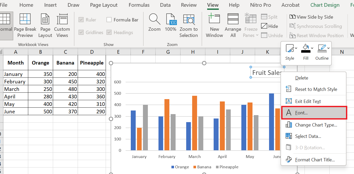
To change the chart title font in Excel, right-click the title and choose Font from the context menu. The Font dialog box will appear, where you can choose various formatting options.
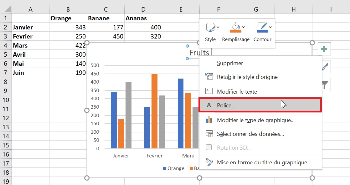
For more formatting options , select the title on your chart, go to the Format tab on the ribbon, and play with different features. For example, here’s how to change your Excel chart title using the ribbon:
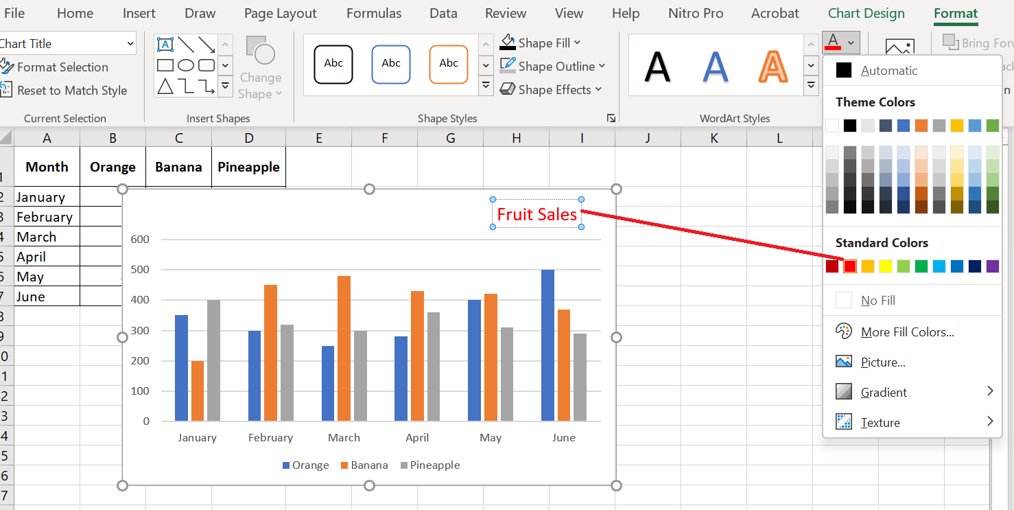
Similarly, you can change the formatting of other chart elements such as the axis titles , axis labels, and chart legend.
3 Customizing Axes in Charts
For most chart types, the vertical axis and horizontal axis are added automatically when you create a chart in Excel.
You can show or hide the chart axes by clicking the Chart Elements button
 , then clicking the arrow next to Axes , then checking the boxes for the axes you want to show and unchecking the boxes for the axes you want to hide.
For some chart types, such as combo charts , a secondary axis may be displayed.
When creating 3D charts in Excel, you can make the depth axis appear :
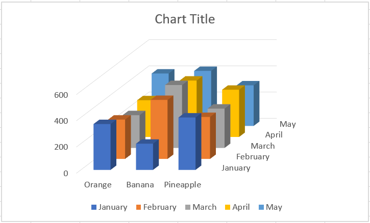
You can also make various adjustments to how different axis elements are displayed in your Excel chart.
3.1 Adding axis titles to a chart
When creating charts in Excel, you can add titles to the horizontal and vertical axes to help your users understand what the chart data is about. To add axis titles, follow these steps:
- Click anywhere in your Excel chart, then click the Chart Elements button and select the Axis Titles check box . If you want to display the title for only one axis, horizontal or vertical, click the arrow next to Axis Titles and clear one of the check boxes:
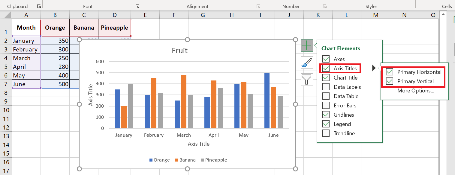
- Click the axis title area on the chart and enter the text.
To format the axis title, right-click it and select Format Axis Title from the context menu. The Format Axis Title pane will appear with many formatting options to choose from. You can also experiment with different formatting options on the Format tab of the ribbon.
As with chart titles , you can link an axis title to a cell in your worksheet so that it automatically updates whenever you change the corresponding cells in the sheet.
To link an axis title, select it, then type an equal sign (=) in the formula bar, click the cell you want to link the title to, and press Enter.
3.2 Changing the axis scale in the chart
Microsoft Excel automatically determines the minimum and maximum scale values and scale interval for the vertical axis based on the data included in the chart. However, you can customize the vertical axis scale to better suit your needs.
1. Select the vertical axis in your chart and click the Chart Elements button
 .
.2. Click the arrow next to Axis , and then click More options… This will bring up the Format Chart Title pane .
3. In the Format Chart Title pane , under Axis Options, click the value axis you want to change and do one of the following:
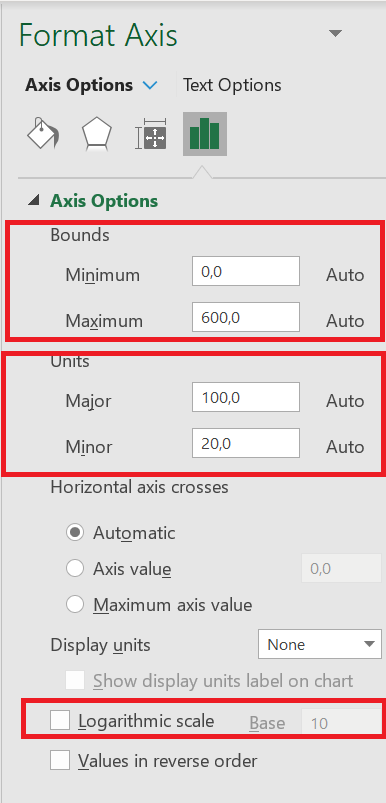
- To set the start or end point of the vertical axis, enter the corresponding numbers in the minimum or maximum
- To change the scale interval, enter your numbers in the major unit box or minor unit box.
- To reverse the order of the values, check the Values in reverse order box .
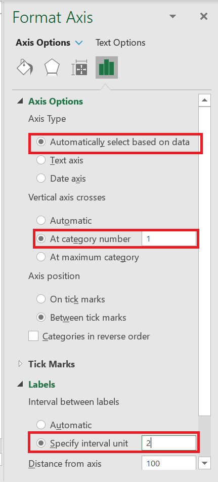
Because a horizontal axis displays text labels rather than numeric intervals, it has fewer scaling options that you can change. However, you can change the number of categories to display between the tick marks, the order of the categories, and the point where the two axes cross:
3.3 Changing the format of axis values
If you want the numbers on the value axis labels to appear as currency, percentage, time, or another format, right-click the axis labels and choose Format Axis from the shortcut menu. In the Format Axis pane , click Number and choose one of the available format options :

To revert to the original number formatting (the way numbers are formatted in your spreadsheet), select the Link to source box .
If you don’t see the Number section in the Format Axis pane , make sure you’ve selected a value axis (usually the vertical axis) in your Excel chart.
4 Customize data labels on charts
Chart elements add more description to your charts, making your data more meaningful and visually appealing. In this section, you’ll learn about chart elements.
Follow the steps below to insert the chart elements into your chart. When you click on the chart, three buttons appear in the upper right corner:
■
 Chart elements
■
 Chart styles and colors, and
■
 Chart filters
When you click on the Chart Elements icon
 . A list of available items is displayed:
- Axes
- Axis titles
- Chart titles
- Data labels
- Data table
- Error bars
- Grid
- Legend
- Trend line
- You can add, remove, or modify these chart elements.
- Hover over each of these chart elements to see a preview of how they are displayed. For example, select Axis Titles. The axis titles for both the horizontal and vertical axes appear and are highlighted.
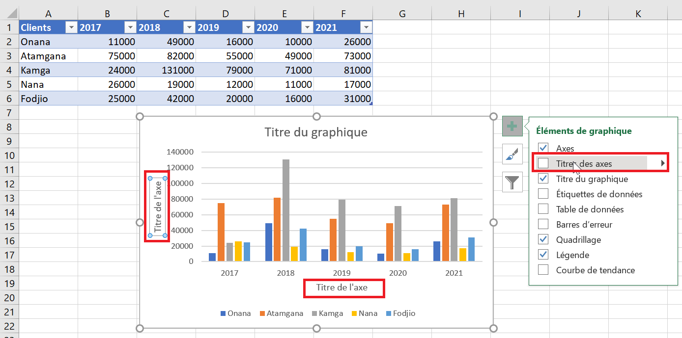
- A triangle
 appears next to Axis Titles in the chart elements list.
 - Click this triangle
 to see options for axis titles.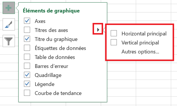
- Select/deselect the chart elements you want to display in your chart from the list.
4.1 Adding Data Labels to Charts
To make your Excel chart easier to understand, you can add data labels to display details about the data series. Depending on where you want to draw your users’ attention, you can add labels to a data series, all series, or individual data points.
- Click the data series you want to label. To add a label to a data point, click that data point after selecting the series.
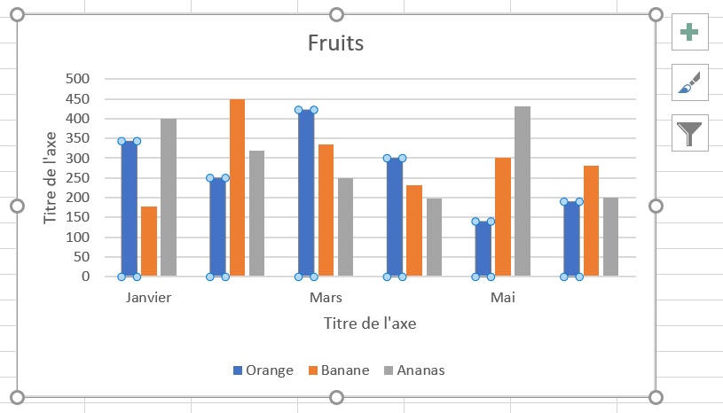
- Right-click on the chart element and select the Data Labels option .
For example, here’s how we can add labels to one of the data series in our Excel chart:
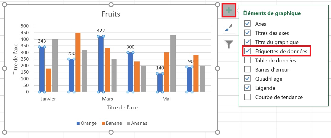
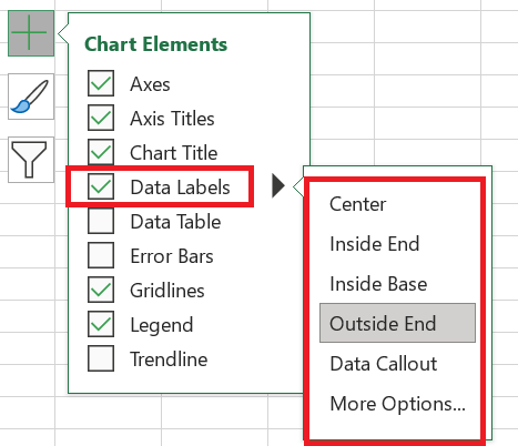
For specific chart types, such as pie charts, you can also choose where the labels appear . To do this, click the arrow next to Data Labels and choose the option you want. To display data labels inside text bubbles, click Data Legend .
4.2 Modify the data displayed on the labels
To change what is displayed on your chart’s data labels, click the Chart Elements / Data Labels / More Options… button. This will bring up the Format Data Labels pane on the right side of your worksheet. Switch to the Label Options tab and select the desired option(s) under Label Contains :
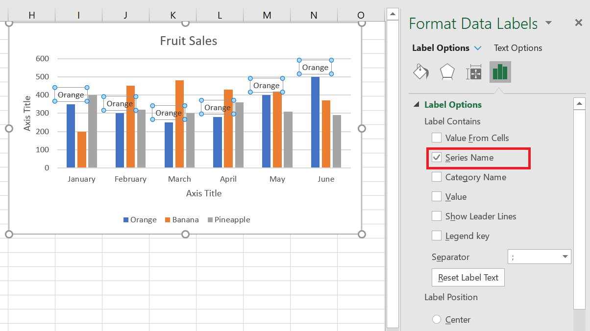
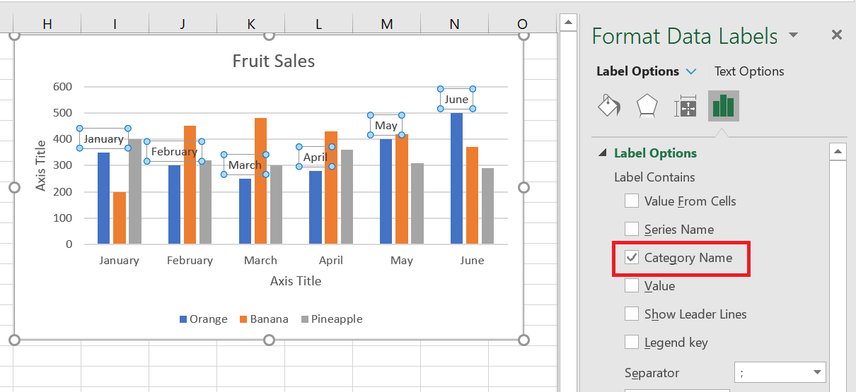
If you want to add your own text for a data point, click the label for that data point, then click it again so that only that label is selected. Select the label area with the existing text and enter the replacement text.
If you decide that too many data labels are cluttering your Excel chart, you can remove some or all of them by right-clicking the label(s) and selecting Delete from the context menu.
5 Move, format, or hide the chart legend
When you create a chart in Excel, the default legend appears at the bottom of the chart and to the right of the chart in Excel.
To hide the legend, click the Chart Elements button in the upper right corner of the chart and uncheck the Legend
 box .
box .To move the chart legend to a different position, select the chart, go to the Chart Design tab , click Add Chart Element / Legend and choose where to move the legend. To remove the legend, select None .
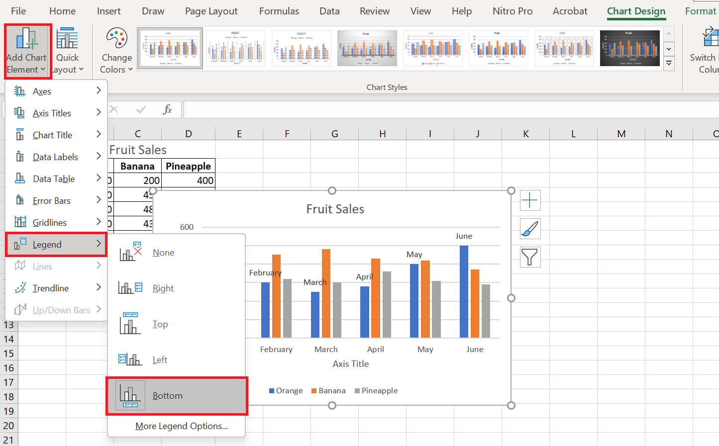
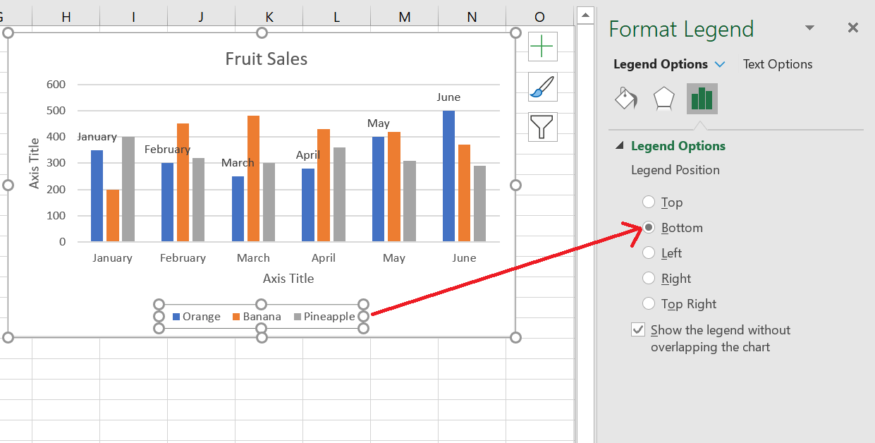
Another way to move the legend is to double-click it in the chart, and then choose the desired legend position in the Format Legend pane under Legend Options .
To change the formatting of the legend , you have many different options in the Fill & Line and Effects tabs of the Format Legend pane .
5 Show or hide the grid on the chart
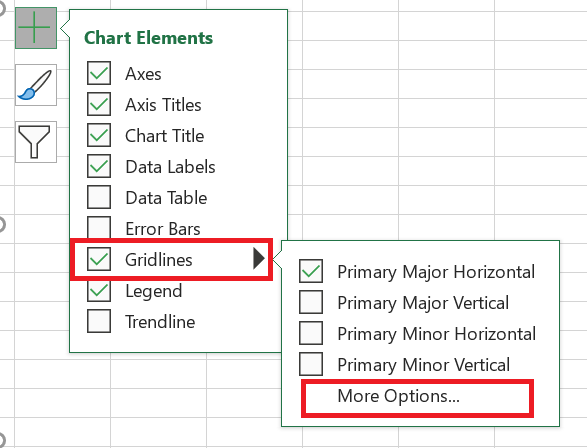
In Excel 2013, 2016, and 2019, turning gridlines on or off takes just a few seconds. Simply click the Chart Elements button and select or clear the Gridlines check box .
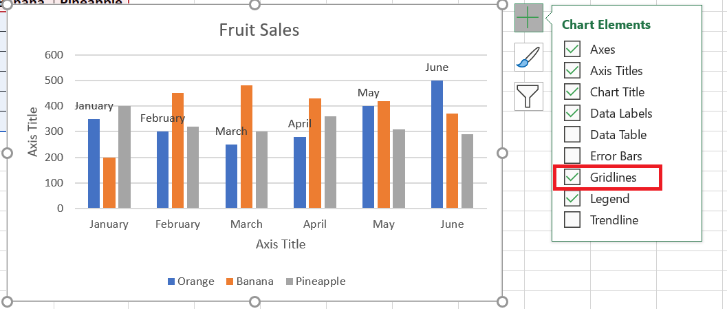
Microsoft Excel automatically determines the most appropriate gridline type for your chart type. For example, on a bar chart, the major vertical gridlines will be added, while selecting the Gridlines option on a column chart will add the major horizontal gridlines.
To change the grid type, click the arrow next to Grid, then choose the desired grid type from the list, or click More options… to open the pane with advanced primary grid options.
6 Hide and edit data series in charts
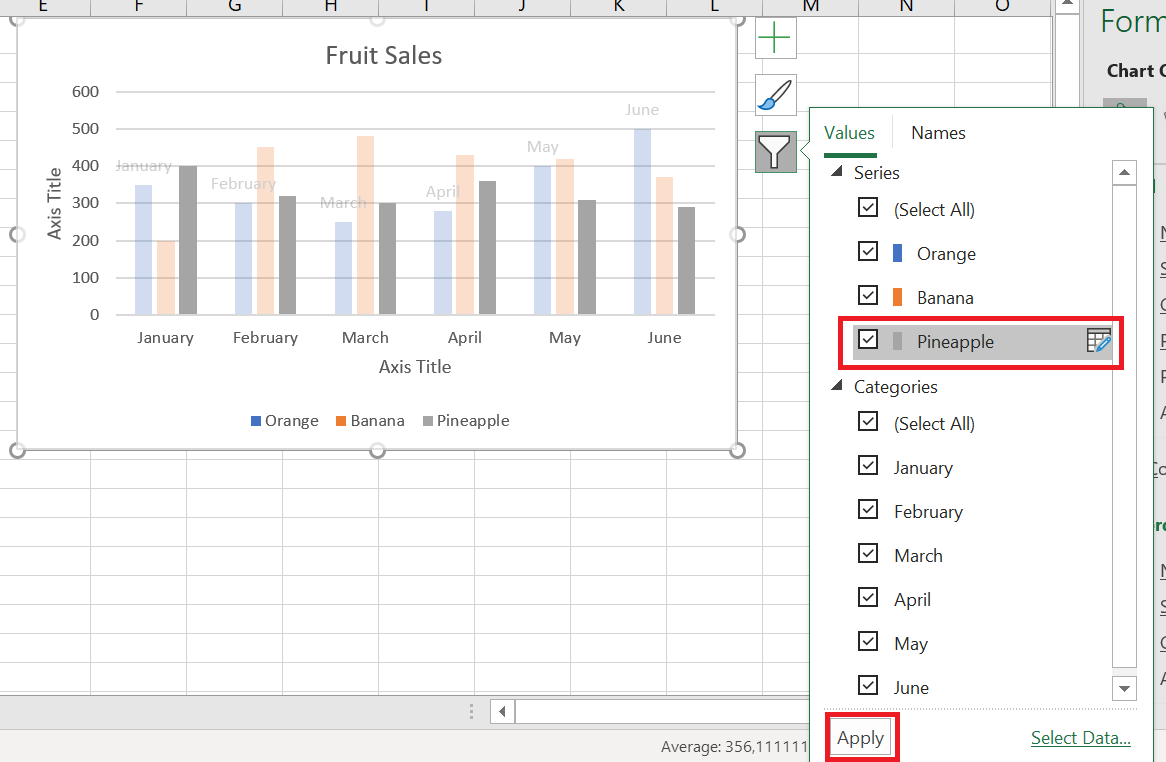
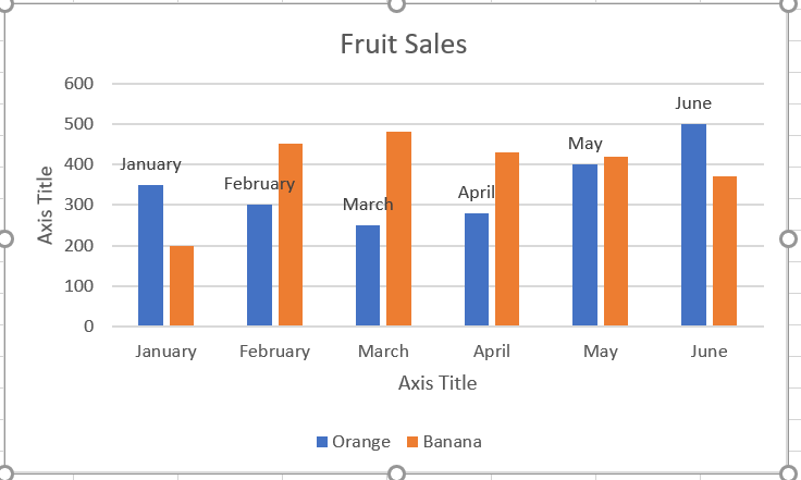
When you have a lot of data plotted in your chart, you may want to temporarily hide certain data series so you can focus only on the most relevant ones.
To do this, click the Chart Filters button
 to the right of the chart, uncheck the data series and/or categories you want to hide, and then click Apply .
To edit a data series , click the Edit Series button to the right of the data series. The Edit Series button appears as soon as you hover over a certain data series. This will also highlight the corresponding series on the chart, so you can clearly see exactly what element you are going to edit.
7 Change the chart type and style
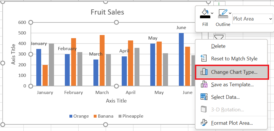
If you decide that the newly created chart isn’t right for your data, you can easily replace it with another chart type . Simply select the existing chart, switch to the Insert tab , and choose a different chart type from the Charts group .
You can also right-click anywhere in the chart and select Change Chart Type… from the context menu.
To quickly change the style of the existing chart in Excel, click the Chart Styles button
 to the right of the chart and do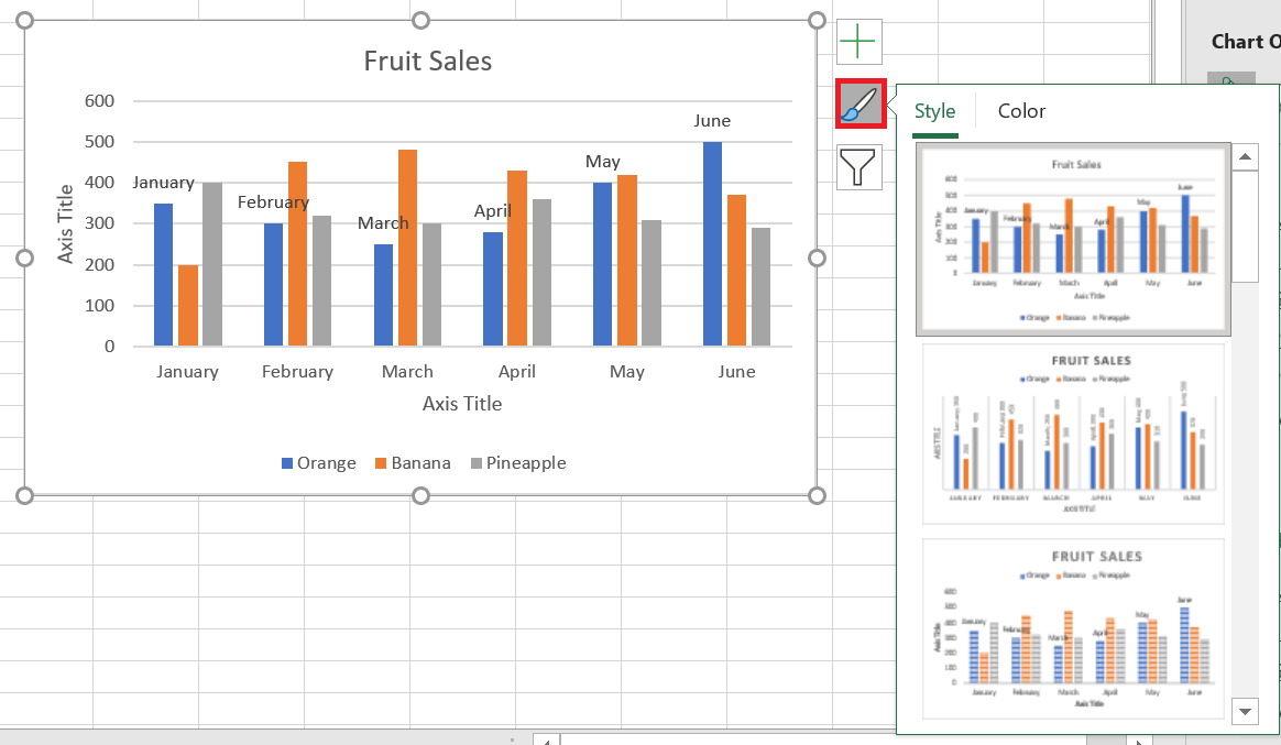
Or choose a different style from the Chart Styles group on the Chart Design tab :

8 Change the chart colors
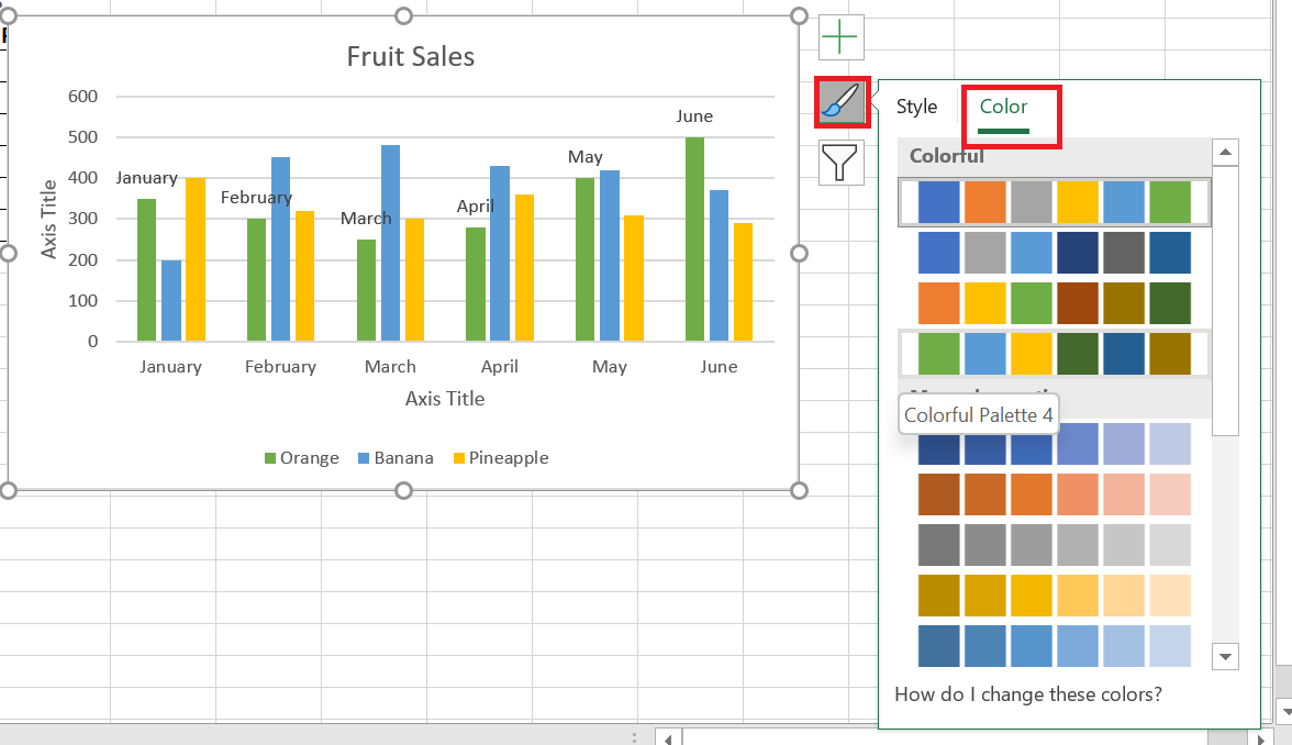
To change the color theme of your Excel chart, click the Chart Styles button, switch to the Color tab , and select one of the available color themes. Your choice will be immediately reflected in the chart, so you can decide if it will look good in new colors.
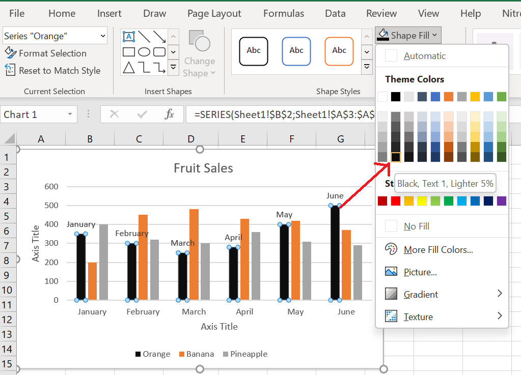
To choose the color for each data series individually, select the data series on the chart, go to the Format tab / Shape Styles group and click the Shape Fill button :
9 Swap the X and Y axes in the graph
When you create a chart in Excel, the orientation of the data series is automatically determined based on the number of rows and columns included in the chart. In other words, Microsoft Excel plots the selected rows and columns as it considers best.
If you’re not happy with the way your spreadsheet’s rows and columns are plotted by default, you can easily swap the vertical and horizontal axes. To do this, select the chart, go to the Design tab , and click the Switch Row/ Column button .
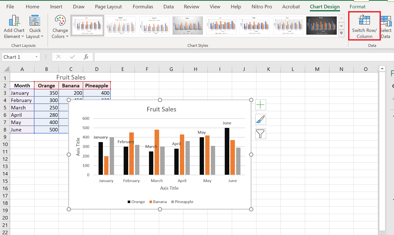
Result
How to Create a Scatter Plot in Excel
How to Create a Scatter Plot in Excel
When you examine two columns of quantitative data in your Excel spreadsheet, what do you see? Just two sets of numbers. Do you want to see how the two sets relate to each other? A scatter plot is the ideal chart choice for this.
1 What is a point cloud?
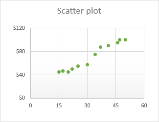
A scatter plot (also called an XY chart or scatter diagram ) is a two-dimensional graph that shows the relationship between two variables. In a scatter plot, the horizontal and vertical axes are value axes that plot numerical data. Typically, the independent variable is on the x-axis and the dependent variable is on the y-axis. The graph displays the values at the intersection of the x- and y-axes, combined into single data points.
The main purpose of a scatter plot is to show how strong the relationship, or correlation , is between two variables. The more data points fall along a straight line, the higher the correlation.
2 Organize the data for a scatter plot
With a variety of built-in chart templates provided by Excel, creating a scatter plot becomes a matter of a few clicks. But first, you need to properly organize your source data.
As already mentioned, a scatter plot displays two interdependent quantitative variables. So, you enter two sets of numerical data in two separate columns.
For ease of use, the independent variable should be in the left column because this column will be plotted on the x-axis. The dependent variable (the one affected by the independent variable) should be in the right column, and it will be plotted on the y-axis.
If your dependent column precedes the independent column and there is no way to change this in a spreadsheet, you can swap the x and y axes directly on a chart.
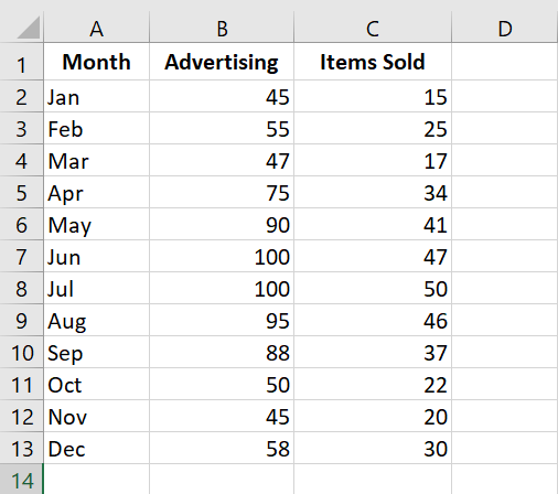
In our example, we will visualize the relationship between the advertising budget of a certain month (independent variable) and the number of items sold (dependent variable), so we organize the data accordingly:
3 How to create a point cloud?
With the source data properly organized, creating a scatter plot in Excel is a quick two-step process:
- Select two columns with numeric data, including the column headers. In our case, this is the range C 1:D 13. Do not select any other columns to avoid confusing Excel.
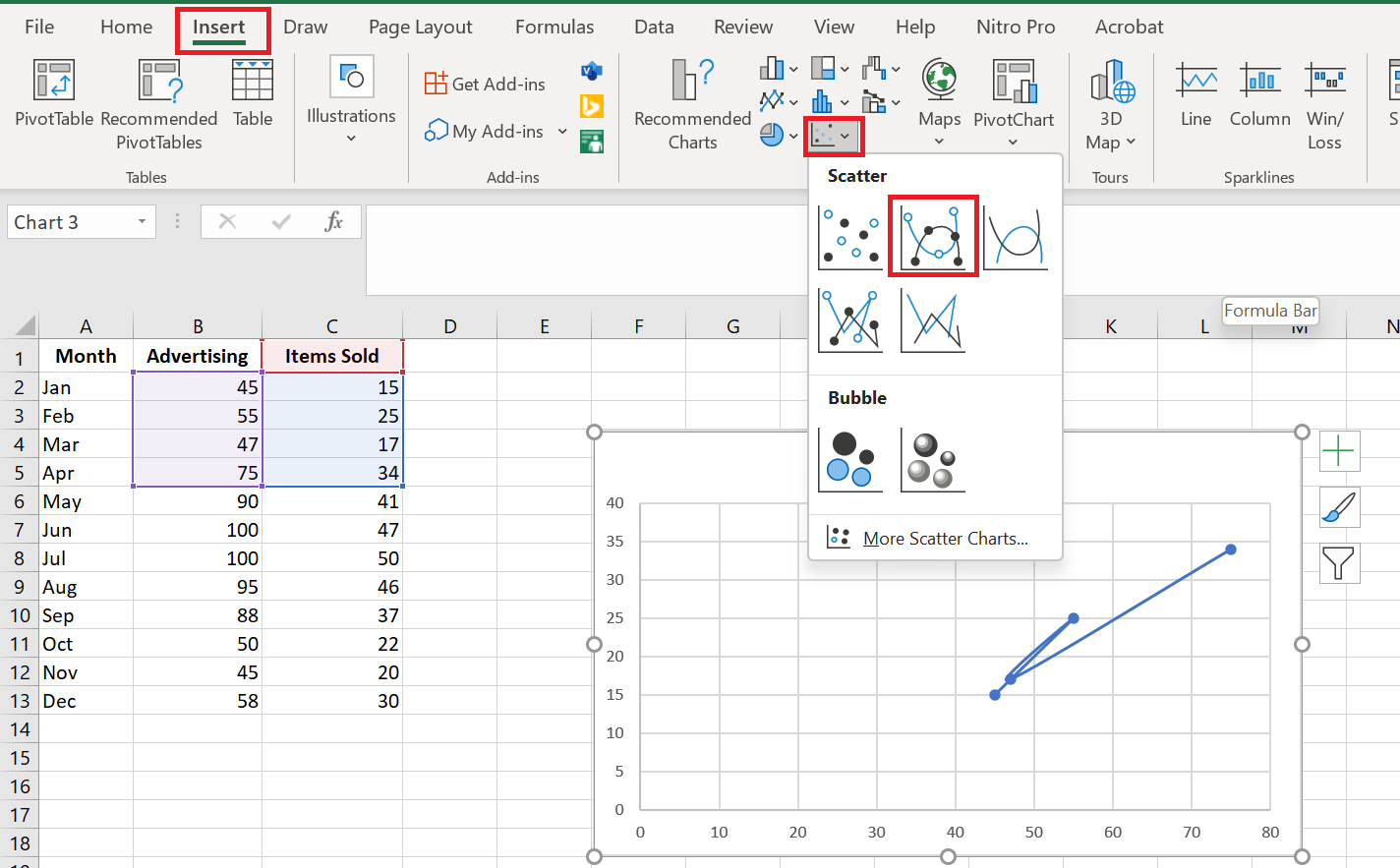
- Go to the Insert tab / Chart group , click the Scatter plot icon and select the desired template. To insert a classic scatter plot, click the first thumbnail:

The scatter plot will be immediately inserted into your spreadsheet:
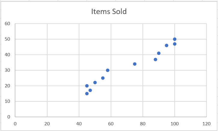
You can customize some elements of your chart to make it look better and to make the correlation between the two variables clearer .
4 Types of Scatter Chart
Besides the classic scatter plot shown in the example above, a few additional models are available:
- Type with soft lines and markers
- Type with smooth lines
- Type with straight lines and markers
- Type with straight lines
Scatter plots with lines are best used when you have few data points. For example, here’s how you can represent the first four months’ data using a scatter plot with smooth lines and markers:
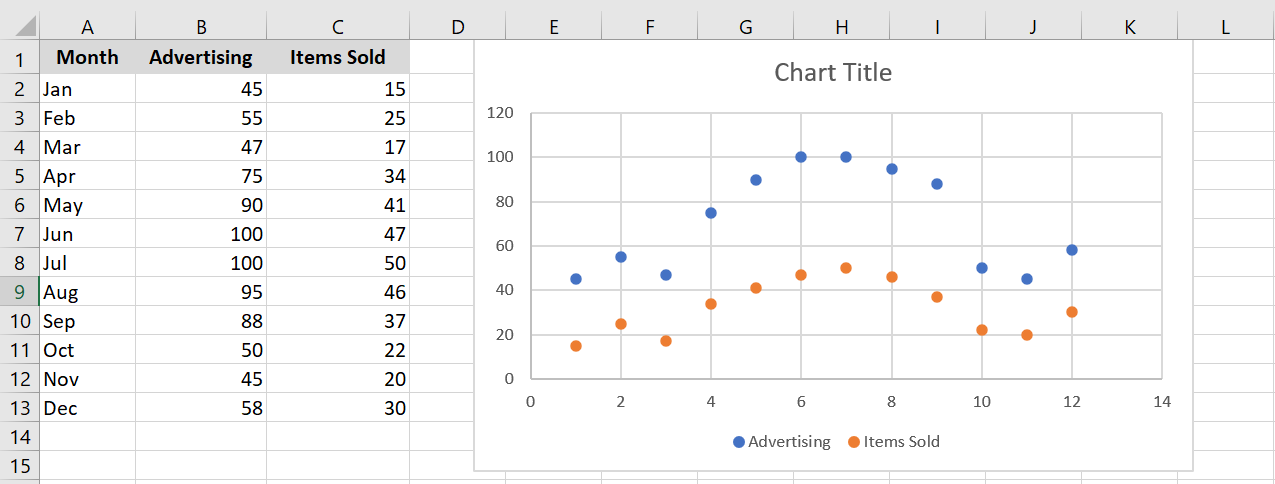
Excel XY plot templates can also plot each variable separately, presenting the same relationships in a different way. To do this, you need to select 3 columns with data – the leftmost column with text values (labels) and the two columns with numbers.
In our example, the blue dots represent the advertising cost and the orange dots represent the items sold:
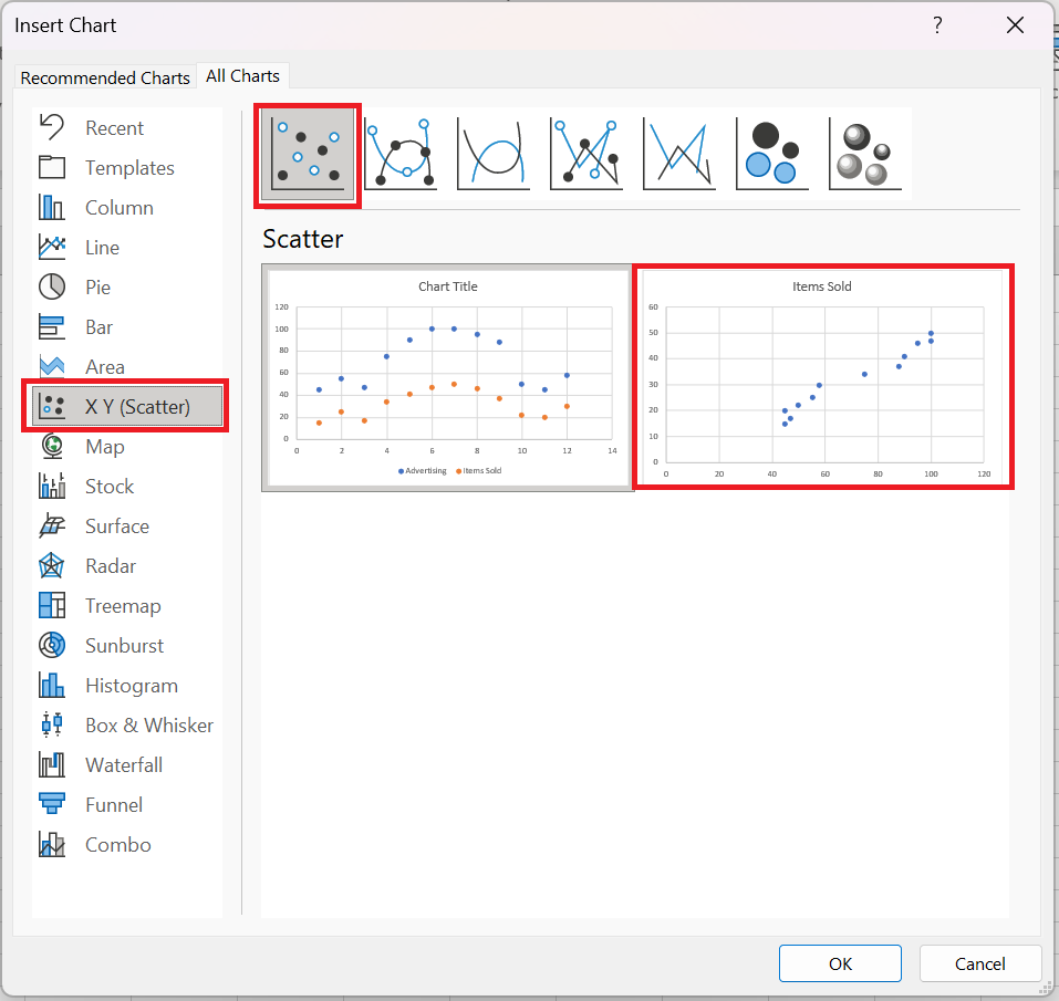
To view all available scatter plot types in one place, select your data, click the Scatterplot (X, Y) icon on the ribbon, and then click More Scatterplots. This will open the Insert Overlay Chart dialog box with the XY (scatter plot) type selected, and you switch between the different templates at the top to see which one provides the best graphical representation of your data:
5 Scatter plot and correlation
To correctly interpret the scatter plot, you need to understand how variables can be related to each other. Broadly speaking, there are three types of correlation:
Positive correlation – as variable x increases, variable y also increases. An example of a strong positive correlation is the amount of time students spend studying and their grades.
Negative correlation – as variable x increases, variable y decreases. Classes and dropout grades are negatively correlated – as the number of absences increases, exam grades decrease.
No correlation – there is no obvious relationship between the two variables; the points are scattered throughout the graph area. For example, student height and grades appear to have no correlation, as the former does not affect the latter in any way.
6 Customizing the XY point cloud
As with other chart types, almost every element of a scatter chart in Excel is customizable. You can easily change the chart title, add axis titles , hide gridlines, choose your own chart colors, and more.
6.1 A Adjust axis scale (reduce white space)
If your data points are clustered at the top, bottom, right, or left of the chart, you may want to clean up the extra white space. To reduce the space between the first data point and the vertical axis and/or between the last data point and the right edge of the chart, follow these steps:
- Right-click the x-axis, then click Format Axis…
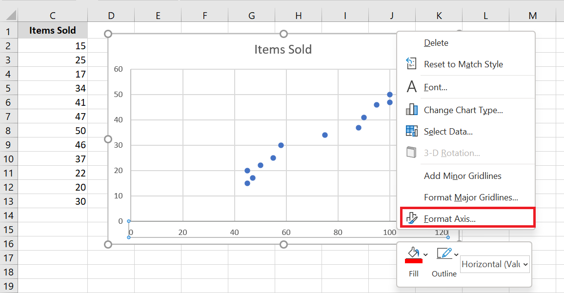
- In the Axis Formatting pane, set the desired minimum and maximum limits .
- Additionally, you can change the main units that control the spacing between grid lines.
The screenshot below shows my settings:
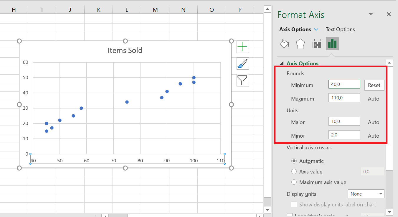
To remove the space between the data points and the top/bottom edges of the plot area, format the vertical y-axis in the same way.
6.2 Add labels to point cloud data points
When creating a scatter chart with a relatively small number of data points, you may want to label the points by name to make your visual more understandable. Here’s how to do this:
- Select the plot and click the Chart Elements button .
- Check the Data Labels box , click the small black arrow next to it, and then click More options…
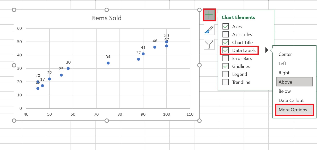
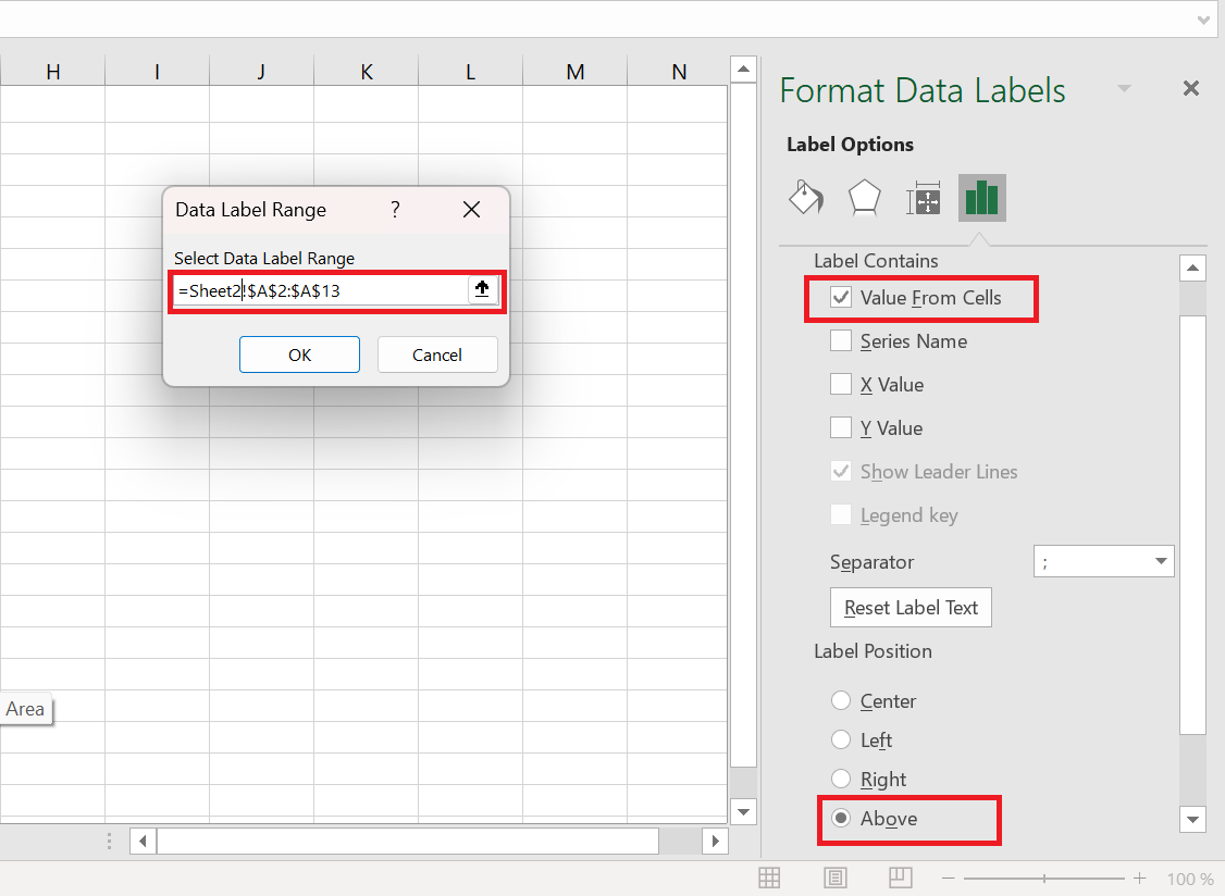
- In the Format Data Labels pane , switch to the Label Options tab (the last one) and configure your data labels like this:
- Select the Value from cells box , then select the range from which you want to extract data labels (A 2:A 13 in our case).
- If you want to display only the names, uncheck the X Value and/or Y Value box to remove numeric values from the labels.
- Specify the position of the labels, Above the data points in our example.
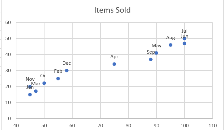
All data points in our Excel scatter plot are now labeled by name:
6.3 Repairing Overlapping Labels
When two or more data points are very close together, their labels can overlap, as is the case with the Jan and Mar labels in our scatter plot. To resolve this, click the labels, then click the overlapping label so that only that label is selected. Hover your mouse cursor over the selected label until the cursor changes to a four-sided arrow, then drag the label to the desired position.
As a result, you will have a nice Excel scatter plot with perfectly readable labels.
6.4 Add a trendline and equation
To better visualize the relationship between the two variables, you can plot a trend line in your Excel scatter chart, also known as a line of best fit .
To do this, right-click any data point and choose Add Trendline… from the context menu.
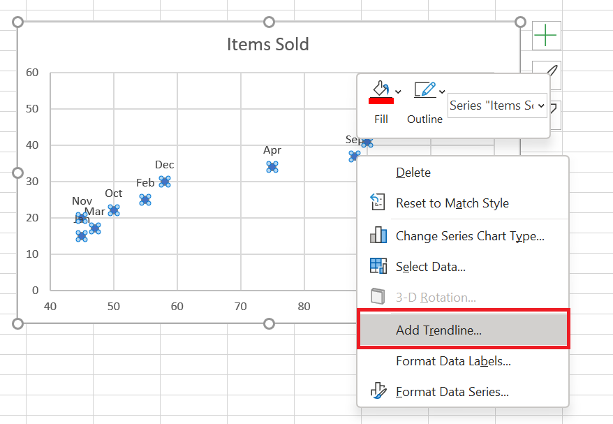
Excel will draw a line as close as possible to all the data points so that there are as many points above the line as below.
Additionally, you can display the trendline equation , which mathematically describes the relationship between the two variables. To do this, select the Show equation on chart check box in the Format Trendline pane , which should appear on the right side of your Excel window immediately after adding a trendline. The result of these manipulations will look like this:
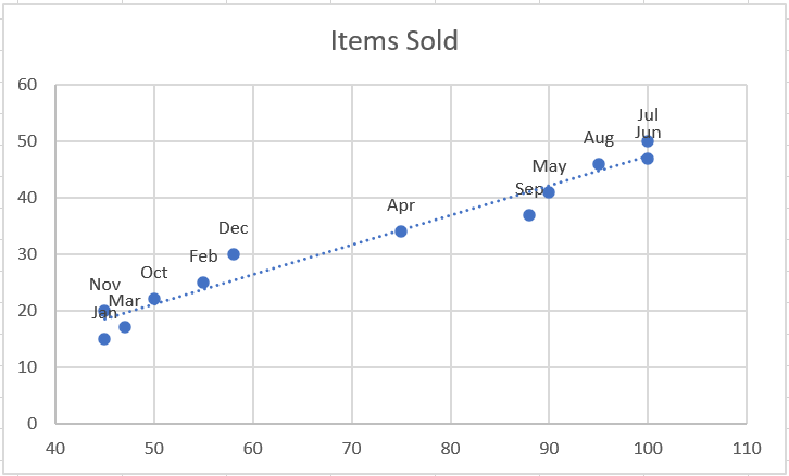
What you see in the screenshot above is often called the linear regression graph .
6.5 Changing the X and Y axes in a scatter chart
As mentioned, a scatter plot typically displays the independent variable on the horizontal axis and the dependent variable on the vertical axis. If your chart is plotted differently, the easiest solution is to swap the source columns in your spreadsheet and then redraw the chart.
If for some reason reordering columns isn’t possible, you can switch the X and Y data series directly on a chart. Here’s how:
- Right-click any axis and click Select Data… from the context menu.
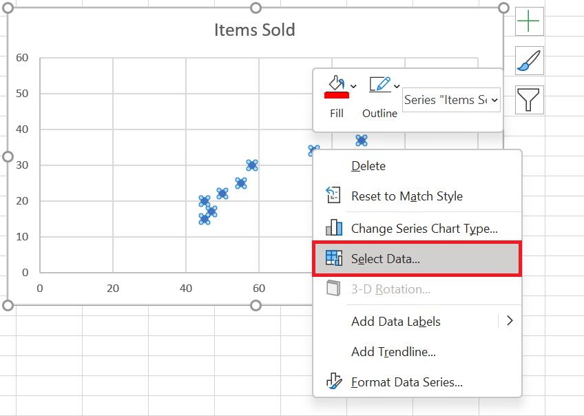
- Data Source dialog box , click the Edit button .
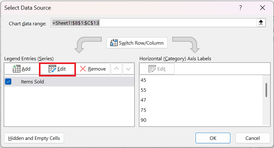 3. Copy the values from Series X into the Series Y Values box and vice versa .
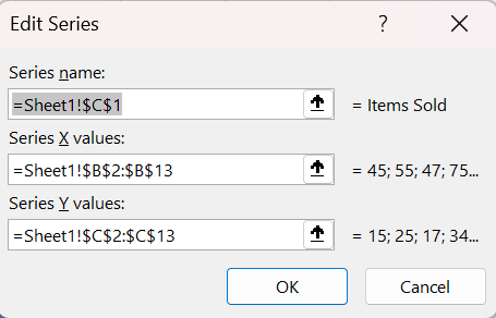
OK twice to close both windows.
As a result, your Excel scatter plot will undergo this transformation:
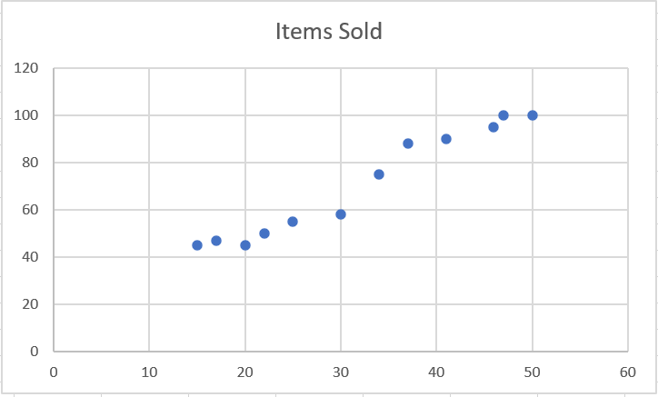
This is how you create a scatter plot in Excel.
How to Use Conditional Formatting in Excel
How to Use Conditional Formatting in Excel
Conditional formatting in Excel is a very powerful feature when it comes to applying different formats to data that meets certain conditions. It can help you highlight the most important information in your spreadsheets and identify discrepancies in cell values at a glance.
At the same time, conditional formatting is often considered one of the most complex and obscure Excel functions, especially by beginners. If you also feel intimidated by this feature, don’t! In fact, conditional formatting in Excel is very simple and easy to use, and you’ll be sure to master it in just 5 minutes once you finish reading this short tutorial.
1 The Basics of Conditional Formatting
Similar to regular cell formats, you use conditional formatting in Excel to format your data in different ways by changing the fill color, font color, and border styles of cells. The difference is that conditional formatting is more flexible, allowing you to format only data that meets certain criteria or conditions.
You can apply conditional formatting to one or more cells, rows, columns, or the entire table based on the cell’s contents or the value of another cell. To do this, create rules (conditions) in which you define when and how selected cells should be formatted.
To begin, let’s see where you can find the conditional formatting feature in different versions of Excel. And the good news is that in all modern versions of Excel, conditional formatting resides in the same location, in the Home tab / Styles group , click Conditional Formatting .

This figure shows the conditional formatting command.
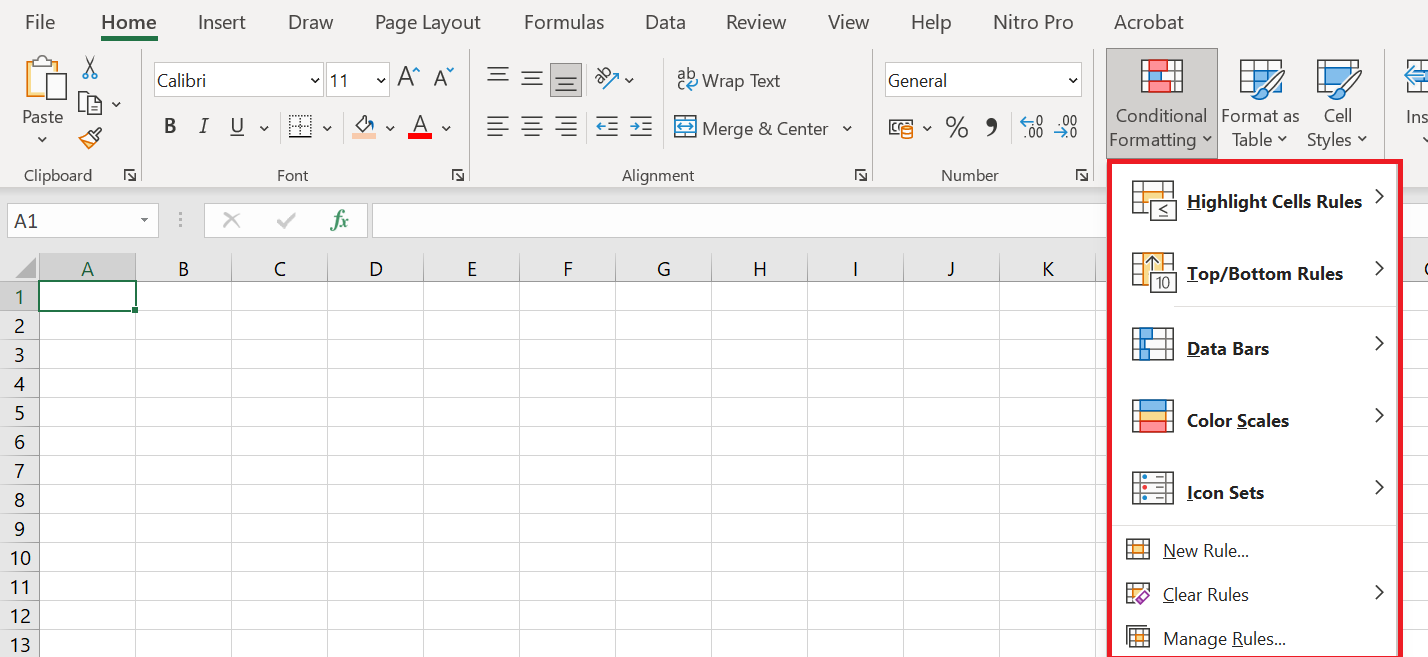
Here is a brief explanation of each option:
■ Cell Highlighting Rules: These rules allow you to assign a format to cells whose content meets one of the following criteria:
• Are in a specific numeric range
• Match a specific text string
• Are within a specific date range (relative to the current date)
• Occur multiple times (or only once) in the selected range
■ High/Low Range Value Rules : Use these rules to assign a format to any of the following:
• N largest or smallest values in a range. For example, N = 10 will highlight the 10 largest or 10 smallest values in a range.
• Upper or lower percentage of numbers in a range.
• Numbers greater than or less than the average of all numbers in a range.
■ Data bars, color scales, and icon sets : Use these formats to easily identify large, small, or intermediate values within the selected range. Larger data bars are associated with larger numbers. With color scales, for example, you can make smaller values appear red and larger values appear blue, with a smooth transition applied as the values in the range change from small to large. With icon sets, you can use up to five symbols to identify different ranges of values. For example, you can display an arrow pointing up to indicate a large value, pointing right to indicate an intermediate value, and pointing down to indicate a small value.
■ New rule : Use this rule to create your own formula to determine whether a cell should have a specific format. For example, if a cell exceeds the value of the cell above it, you can color the cell green. If the cell is the fifth largest value in its column, you can color the cell red, and so on.
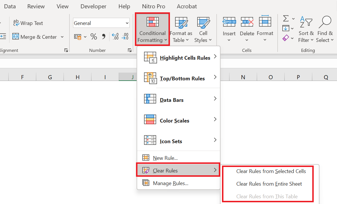
■ Clear Rules : Use these rules to remove all conditional formats you’ve created for a selected range or the entire worksheet.
■ Manage Rules : Use these rules to view, edit, and delete conditional formatting rules ; create new rules; or change the order in which Excel applies the conditional formatting rules you’ve defined.
2 Create conditional formatting rules
To truly take advantage of the capabilities of conditional formatting in Excel, you need to learn how to create different types of rules. This will help you understand the project you’re currently working on.
Conditional formatting rules in Excel define 2 key elements:
- Which cells should conditional formatting be applied to, and
- What conditions must be met.
We’ll show you how to apply conditional formatting in Excel. However, the options are essentially the same in all versions of Excel, so you’ll have no trouble following along no matter which version you have installed on your computer.
- In your Excel spreadsheet, select the cells you want to format.
For this example, we’ve created a small table listing monthly crude oil prices. What we want is to highlight every price drop, that is, all cells with negative numbers in the Change column , so we select cells C2 : C9.
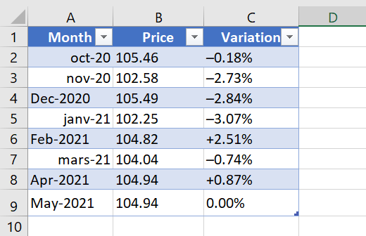
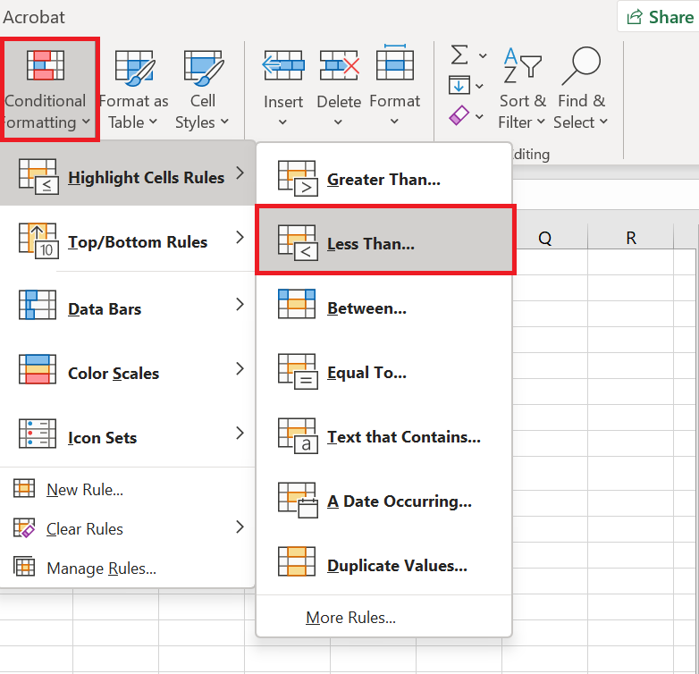
Go to the tab Home / Styles group and click Conditional Formatting . You’ll see several different formatting rules, including data bars, color scales, and icon sets.
- Since we need to apply conditional formatting only to numbers less than 0, we choose Highlight Cell Rules / Less than …
Of course, you can go ahead with any other type of rule more appropriate for your data, such as:
-
- Format values greater than, less than, or equal to
- Highlight text containing specified words or characters
- Highlight duplicates
- Format specific dates
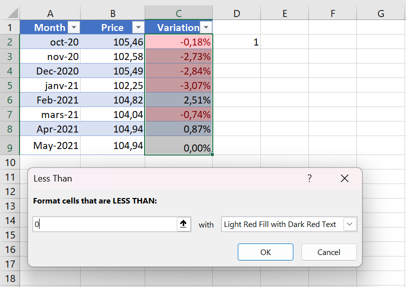
- Enter the value in the box on the right side of the window under » Format cells less than « , in our case we type 0. As soon as you enter the value, Microsoft Excel will highlight the cells in the selected range that match your condition.
- Select the desired format from the drop-down list. You can choose one of the predefined formats or click Custom Format … to configure your own formatting.
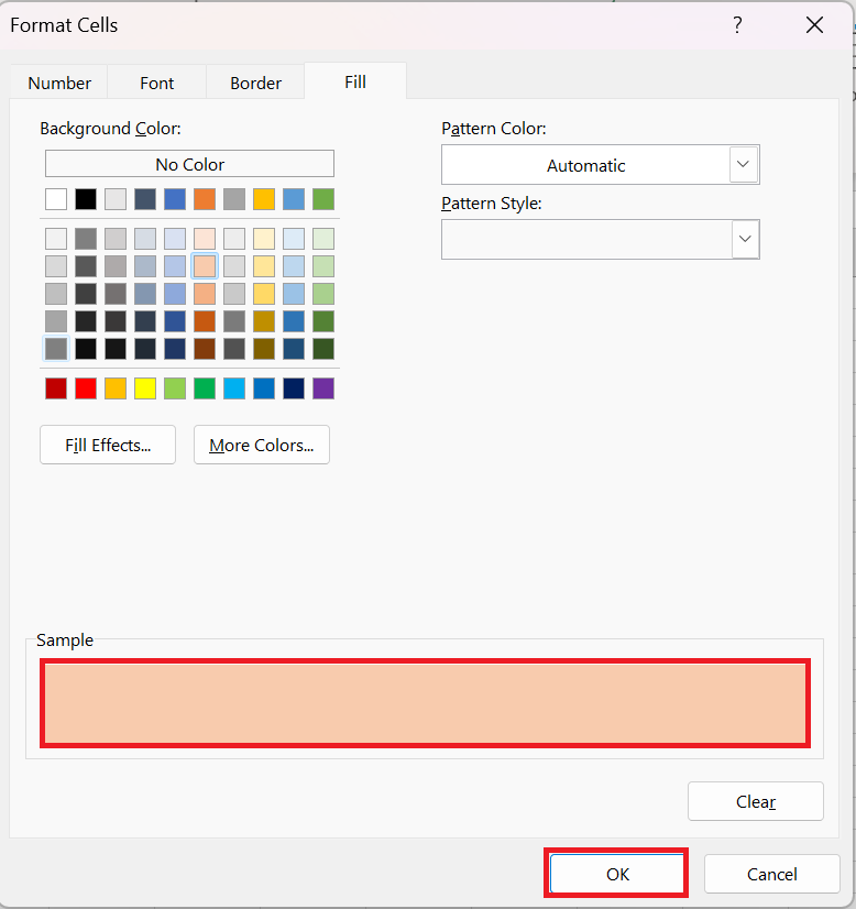
- In the Format Cells window, switch between the Font, Border, and Fill tabs to choose the font style, border style, and background color, respectively. In the Font and Fill tabs, you’ll immediately see a preview of your custom format. When finished, click the OK button at the bottom of the window.
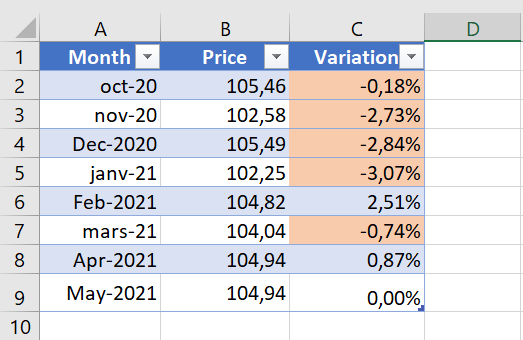
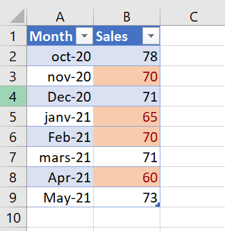
As you can see in the screenshot below, our new conditional formatting rule works correctly – it shades all cells with a negative price change.
3 Creating a Conditional Formatting Rule from Scratch
If none of the ready-made formatting rules meet your needs, you can create one from scratch.
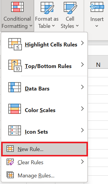
- Select the cells you want to apply the conditional format to and click Conditional Formatting / New Rule .
- New Formatting Rule dialog box opens and you select the type of rule you want. For example, let’s choose » Apply formatting only to cells that contain » and choose to format the values in cells between 60 and 70 .
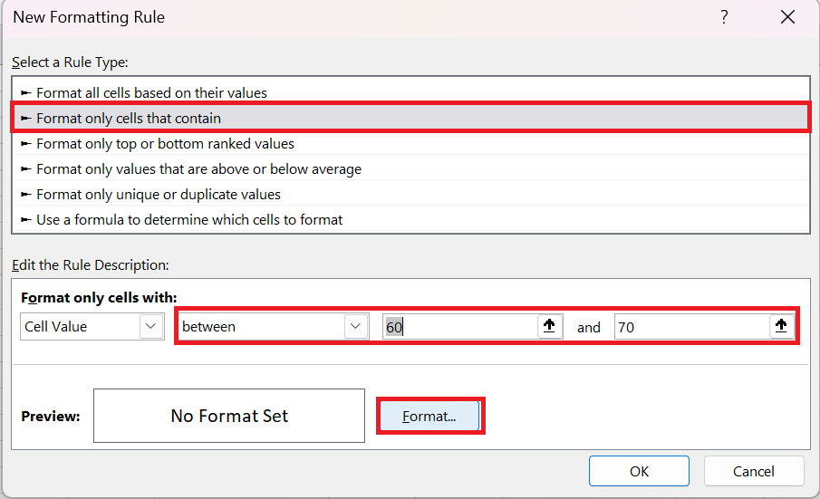
- Click the Format… button and configure your formatting exactly as we did in the previous example.
- OK twice to close any open windows and your conditional formatting is complete!
4 Conditional formatting based on cell value
In the previous two examples, we created the formatting rules by entering the numbers. However, in some cases, it makes more sense to base your conditional formatting on a specific cell value. The advantage of this approach is that, no matter how that cell’s value changes in the future, your conditional formatting will automatically adjust and reflect the changed data.
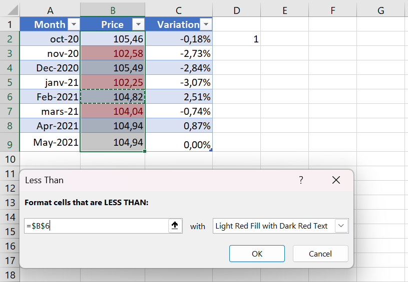
For example, let’s take the « Oil Price » example again, but this time highlight all prices in column B that are higher than the February price.
You create the rule in the same way by selecting Conditional Formatting / Highlight Cell Rules / Greater Than… But instead of typing a number in step 4, you select cell B6 by clicking the range selection icon as you usually do in Excel. As a result, the prices are formatted as you see in the screenshot below.
This is the simplest example of Excel conditional formatting based on another cell. Other, more complex scenarios may require the use of formulas. This is how you perform conditional formatting in Excel. Hopefully, these very simple rules we just created were helpful in understanding the general approach.
5 Apply multiple conditional formatting rules to a cell/table
When using conditional formatting in Excel, you’re not limited to a single rule per cell. You can apply as many rules as your project logic requires.
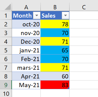
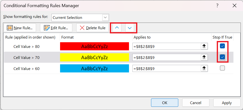
For example, let’s create 3 rules for the sales table that will shade sales above 60 in yellow, above 70 in orange, and above 80 in red.
You already know how to create Excel conditional formatting rules of this type – by clicking Conditional Formatting / Highlight Cell Rules / Greater Than . However, for the rules to work properly, you also need to set their priority like this:
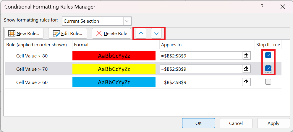
- Click Conditional Formatting / Manage Rules… to display the Rules Manager .
- Click on the rule that should be applied first to select it and move it up using the up arrow . Do the same for the second priority rule.
- Check the Break if true box for the first 2 rules because you do not want the other rules to be applied when the first condition is met.
6 Using « Break if true » in conditional formatting rules
We have already used the Stop if true option in the example above to stop processing other rules when the first condition is met. This use is very obvious and straightforward. Now let’s consider two examples where the use of this function is not so obvious, but also very useful.
Example 1: Show only certain elements of the icon set
Let’s say you added the following icon set to your sales report.
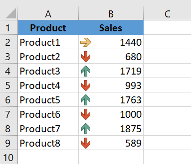
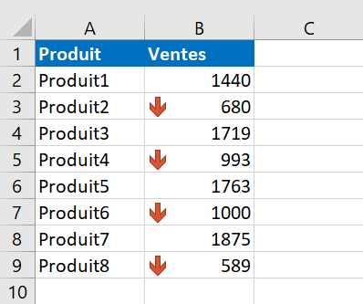
It looks nice, but a bit cluttered with graphics. So, our goal is to keep only the red downward arrows to draw attention to products with below-average performance and get rid of all the other icons. Let’s see how you can do this:
- Create a new conditional formatting rule by clicking Conditional Formatting / New Rule / Apply Formatting only to cells that contain .
- Now you need to configure the rule so that it only applies to values above the average. To do this, use the formula = AVERAGE( ) , as shown in the screenshot below.
You can still select a range of cells in Excel using the standard range selection icon
 or manually enter the range in parentheses. If you choose the latter, remember to use absolute cell references with the $ sign.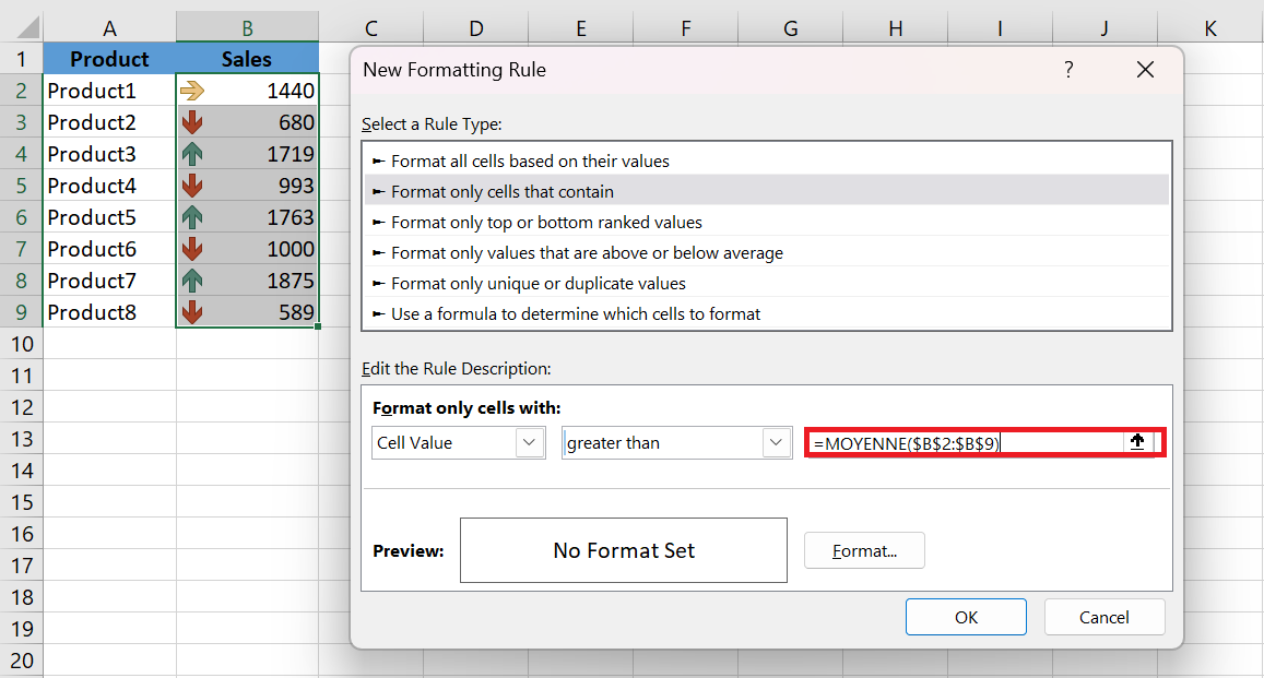
- Click OK without setting a format.
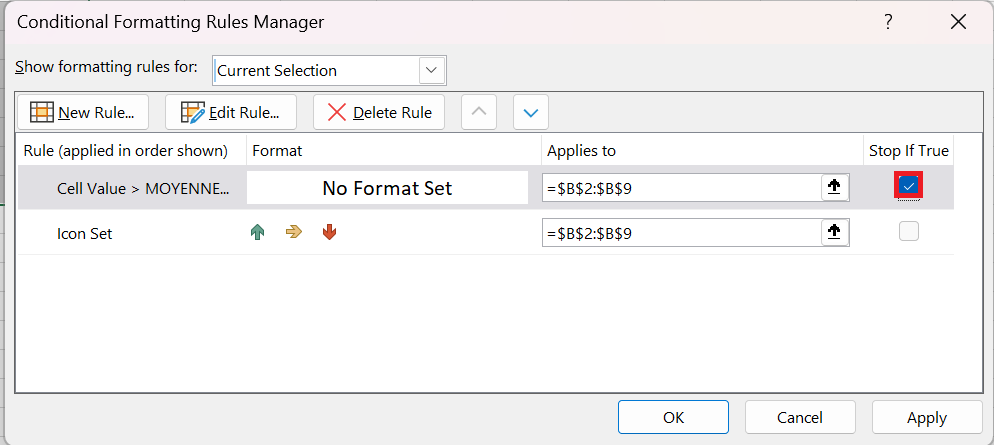
- Click on Conditional Formatting / Manage Rules… and check the Break if True box for the rule you just created. And… see the result in the screenshot below : )
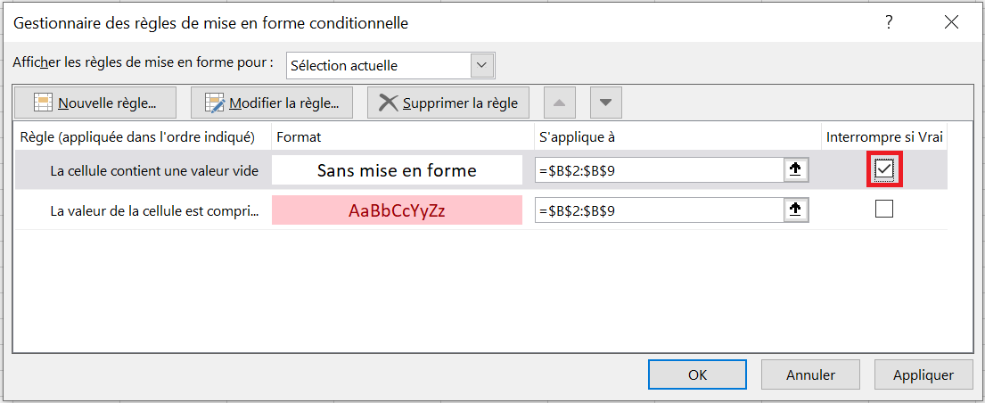
Example 2. Remove conditional formatting from empty cells
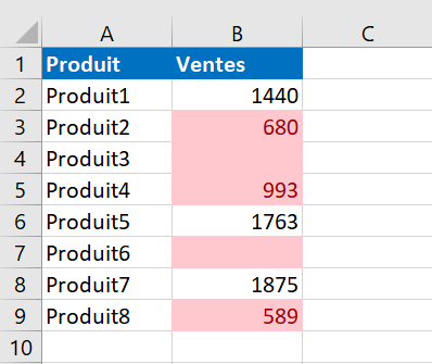
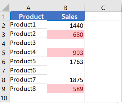
Let’s say you created the « Between » rule to highlight cell values between $0 and $1,000, as you can see in the screenshot below. But the problem is that empty cells are also highlighted.
To solve this problem, you create an additional rule of the type » Apply formatting only to cells that contain « . In the New Formatting Rule dialog box , select Cells
empty in the drop-down list.
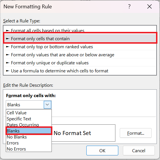
And again, you just click OK without setting any format.
Finally, open the Conditional Formatting Rules Manager and check the Stop if true box next to the « Empty » rule.
The result is exactly as you would expect.
6 Edit conditional formatting rules
If you looked closely at the screenshot above, you probably noticed the Edit Rule… button there. So, if you want to edit an existing formatting rule, follow these steps:
- Select any cell to which the rule applies and click Conditional Formatting / Manage Rules…
- Formatting Rules Manager dialog box , click the rule you want to edit, and then click the Edit Rule… button.
- Make the required changes in the Edit Formatting Rule window and click OK to save the changes.
Edit Formatting Rule window looks very similar to the New Formatting Rule dialog box you used when creating the rule, so you won’t have any trouble with it.
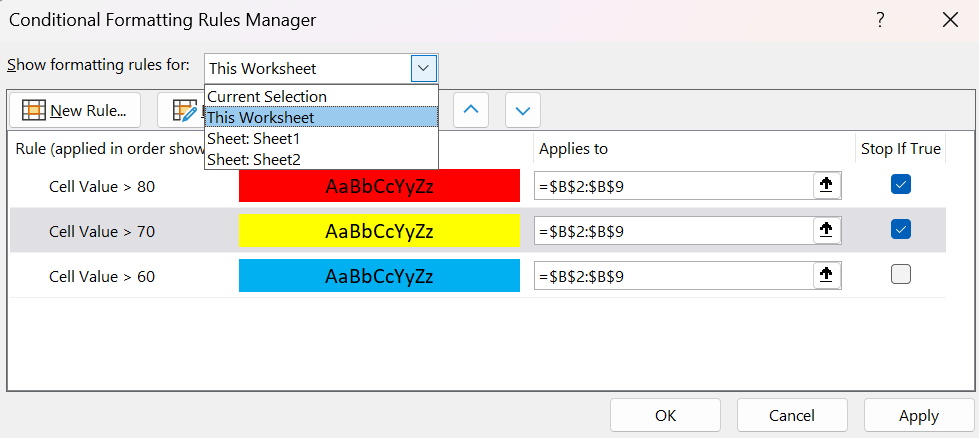
If you don’t see the rule you want to edit, select This worksheet from the » Show formatting rules for » drop-down list to display a list of all the rules in your worksheet.
7 Copy conditional formatting
If you want to apply the conditional format you created earlier to other data in your spreadsheet, you won’t need to create the rule from scratch. Simply use Format Painter to copy the existing conditional formatting to the new data set.
- Click any cell with the conditional formatting you want to copy.
- Click Home / Format Painter . This will change the mouse pointer to a paintbrush.
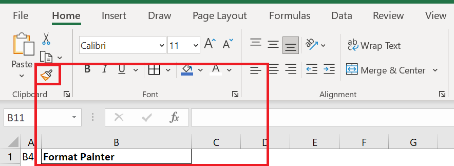
You can double-click Format Painter if you want to paste conditional formatting into multiple different cell ranges.
- To paste conditional formatting, click the first cell and drag the brush to the last cell in the range you want to format.
- When finished, press Esc to stop using the brush.
If you created the conditional formatting rule using a formula, you may need to adjust the cell references in the formula after copying the conditional formatting.
8 Delete conditional formatting rules
To delete a rule, you can either:
- Open the Conditional Manager Rules Manager (as you remember, you open it via Conditional Formatting / Manage Rules …) , select the rule and click the Delete Rule button.
- Select the cell range, click Conditional Formatting / Clear Rules and choose one of the available options.
How to Make a Gantt Chart in Excel
How to Make a Gantt Chart in Excel
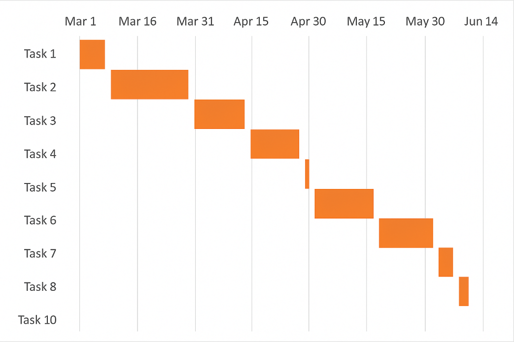
The Gantt chart is named after Henry Gantt, an American mechanical engineer and management consultant who invented this chart as early as the 1910s. A Gantt chart in Excel represents projects or tasks as cascading horizontal bar charts. A Gantt chart illustrates the project breakdown structure by displaying start and finish dates and various relationships between project activities, helping you track tasks against their planned time or predefined milestones.
1 How to Make a Gantt Chart
Unfortunately, Microsoft Excel doesn’t have a built-in Gantt chart template as an option. However, you can quickly create a Gantt chart in Excel using the bar chart feature and a little formatting.
Please follow the steps below carefully and you will create a simple Gantt chart in less than 3 minutes. You can simulate Gantt charts in any version of Excel in the same way.
1.1 Create a project table
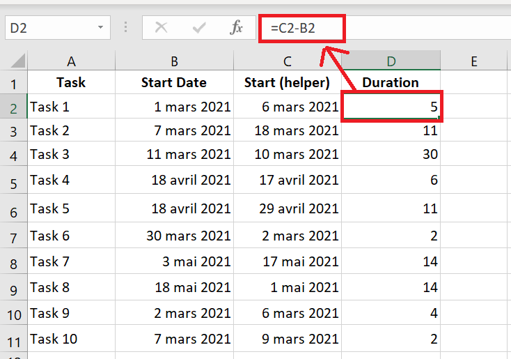
You start by entering your project data into an Excel spreadsheet. List each task as a separate row and structure your project plan by including the Start Date , End Date , and Duration , which is the number of days required to complete the tasks.
Start Date and Duration columns are needed to create an Excel Gantt chart. If you have both Start Dates and End Dates , you can use one of these simple formulas to calculate the duration , whichever works best for you:
Duration = End Date – Start Date
Duration = End Date – Start Date + 1
1.2 Create a standard Excel bar chart based on the start date
You start creating your Gantt chart in Excel by setting up a regular stacked bar chart.
- Select a range of your start dates with the column header, which is B 1:B 11 in our case. Make sure you only select the cells containing data, not the entire column.
- Switch to the Insert tab / Charts group and click Bar .
- In the 2D Bars section , click Stacked Bars .
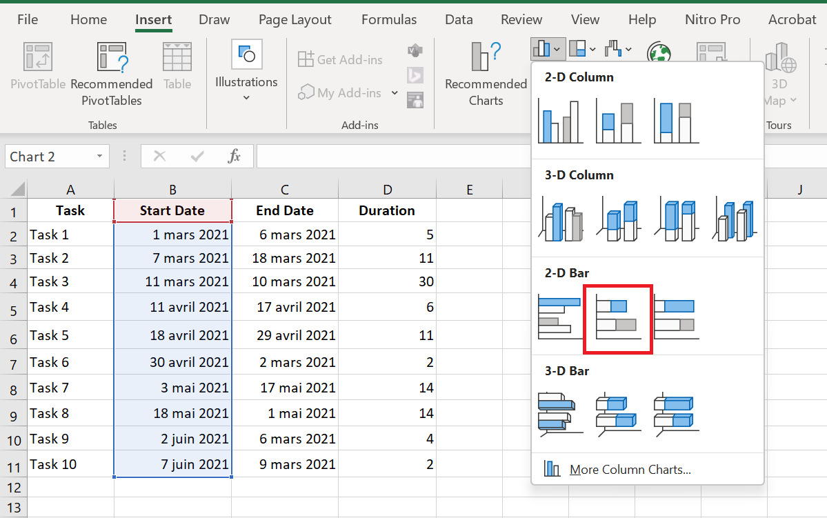
As a result, you will have the following stacked bar added to your spreadsheet:
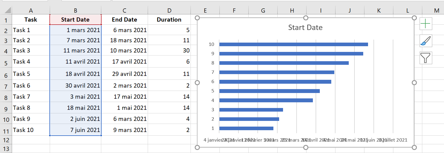
1.3 Add duration data to the chart
Now you need to add an additional series to your future Excel Gantt chart.
- Right-click anywhere in the chart area and choose Select Data in the context menu.
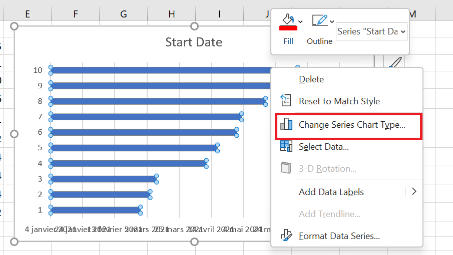
Select Data Source window will open. As you can see in the screenshot below, the start date is already added under Legend Entries (Series) . And you also need to add the duration there .
- Click the Add button to select more data (Duration) that you want to plot in the Gantt chart.
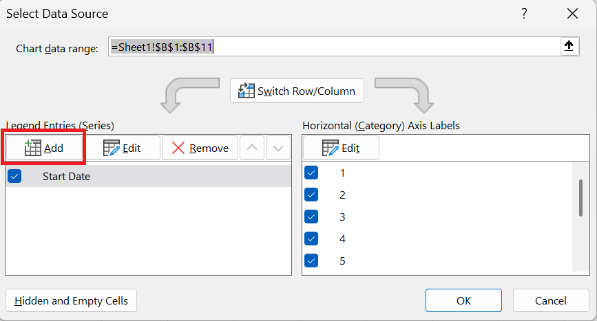
- Edit Series window opens and you do the following:
- In the Series Name field , type » Duration » or any other name you want. You can also place the mouse cursor in this field and click on the column header in your spreadsheet; the clicked header will be added as the series name for the Gantt chart.
- Click the range selection icon next to the
 Series Values field .
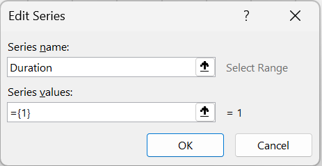
- Edit Series window will open. Select your project ‘s Duration data by clicking on the first Duration cell (D2 in our case) and dragging the mouse to the last duration (D11). Make sure you haven’t accidentally included the header or an empty cell.
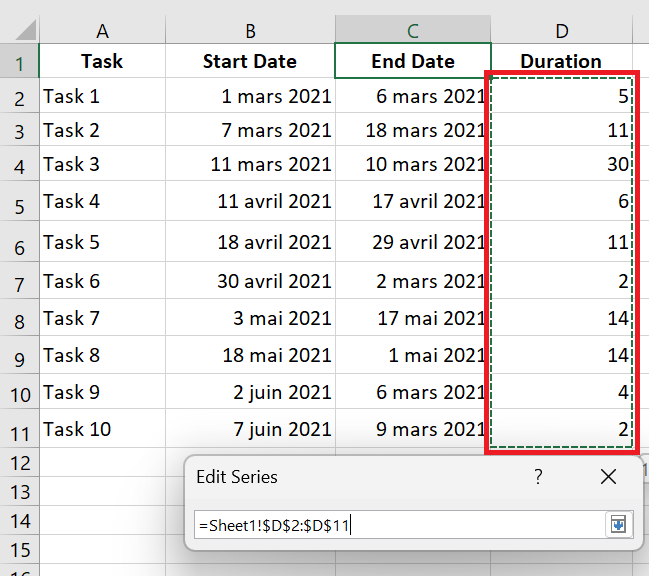
- Click the Minimize Dialog icon to exit this small window. This will return you to the previous Edit Series window with the series name and series values filled in, where you click OK.
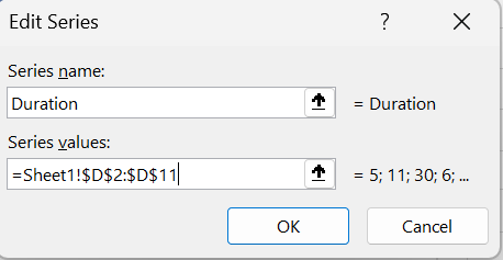
- You are now back in the Select Data Source window with the start date and duration added under Legend Entries (Series). Simply click OK to have the duration data added to your Excel chart.
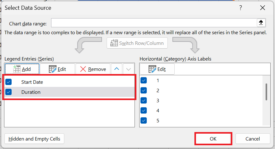
The resulting bar chart should look like this:
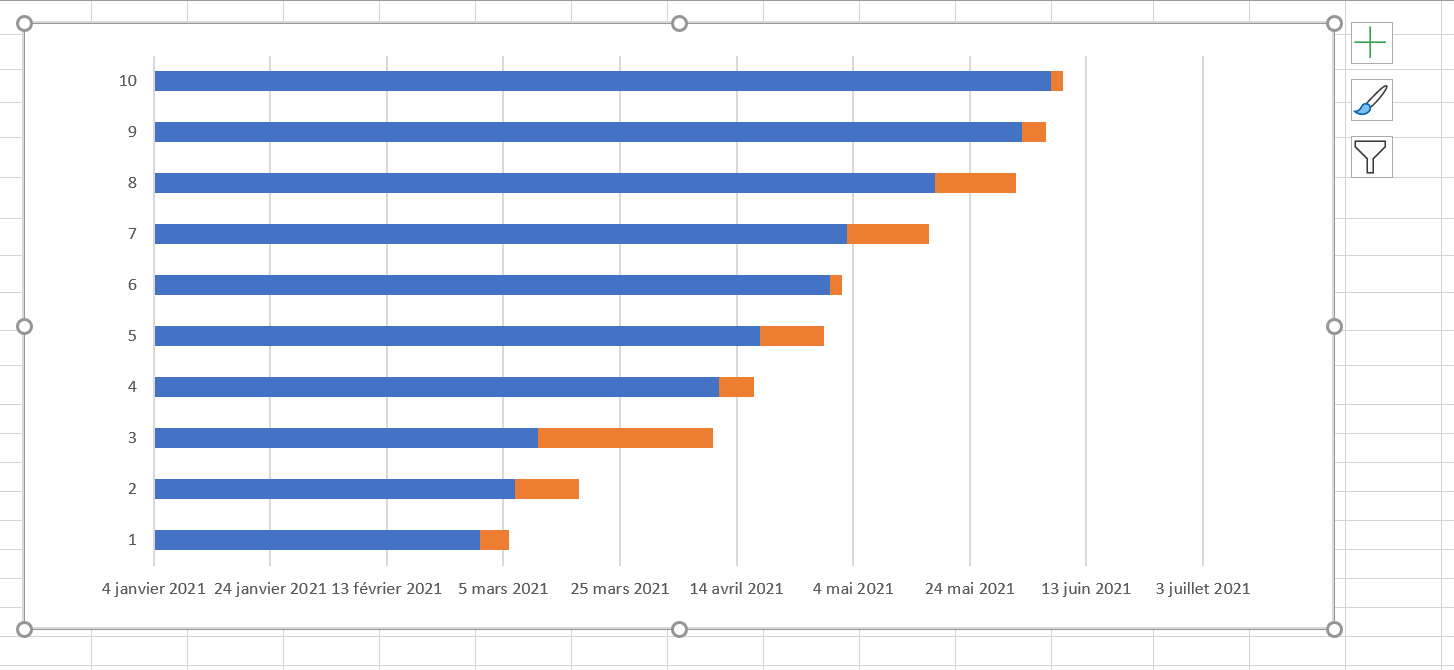
1.4 Add task descriptions to the Gantt chart
Now you need to replace the days on the left side of the chart with the task list.
- Right-click anywhere in the chart plot area (the area with blue and orange bars) and click Select Data to display the Select Data Source window again.
- Make sure the start date is selected in the left pane and click the Edit button in the right pane, under Horizontal Axis (Category) Labels .
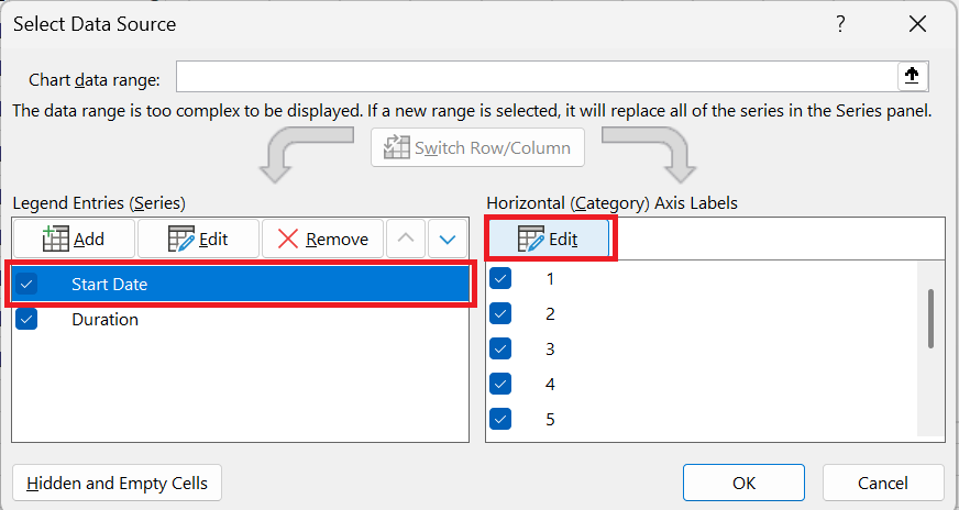
- axis label window opens and you select your tasks the same way you selected durations in the previous step – click the range selection icon
 , then click the first task in your table and drag the mouse to the last task. Remember that the column header should not be included. Once finished, exit the window by clicking the range selection icon again.
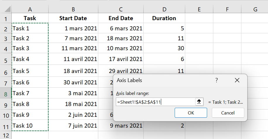
- OK twice to close open windows.
- Delete the chart label block by right-clicking it and selecting Delete from the context menu.
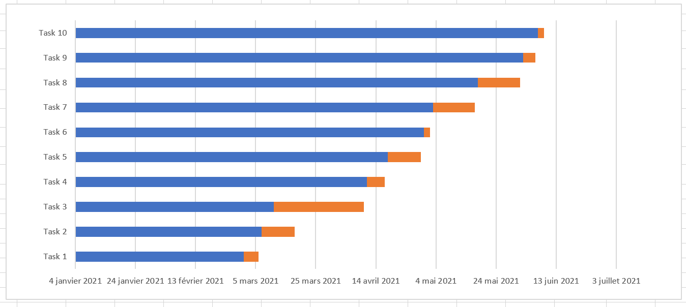
1.5 Convert the bar chart to a Gantt chart
What you have now is still a stacked bar chart. You need to add the appropriate formatting to make it look more like a Gantt chart. Our goal is to remove the blue bars so that only the orange parts representing the project tasks are visible. Technically, we won’t actually remove the blue bars, but rather make them transparent and therefore invisible.
- Click any blue bar in your Gantt chart to select them all, right-click, and choose Format Data Series from the context menu.
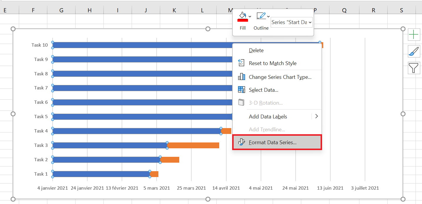
- Format Data Series window appears, and you do the following:
- Switch to the Fill tab and select No Fill .
- Border Color tab and select No Line .
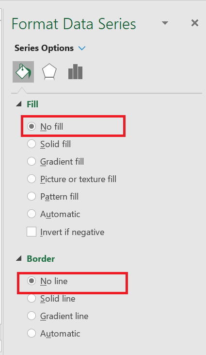
You don’t need to close the dialog box as you will use it again in the next step.
- As you’ve probably noticed, the tasks in your Excel Gantt chart are listed in reverse order . And now we’re going to fix that.
Click the task list on the left side of your Gantt chart to select them. This will display the Format Axis dialog box for you. Select the Reverse X-axis option under Axis Options , and then click the Close button to save all changes.
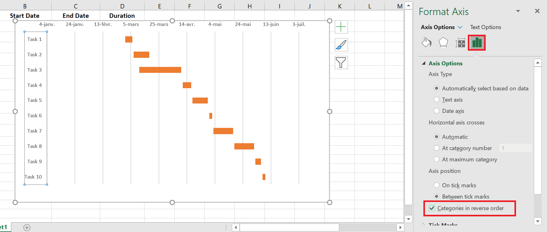
The results of the changes you just made are:
- Your tasks are organized in the correct order on a Gantt chart.
- Date markers are moved from the bottom to the top of the chart.
Your Excel chart is starting to look like a normal Gantt chart, isn’t it? For example, my Gantt chart now looks like this:
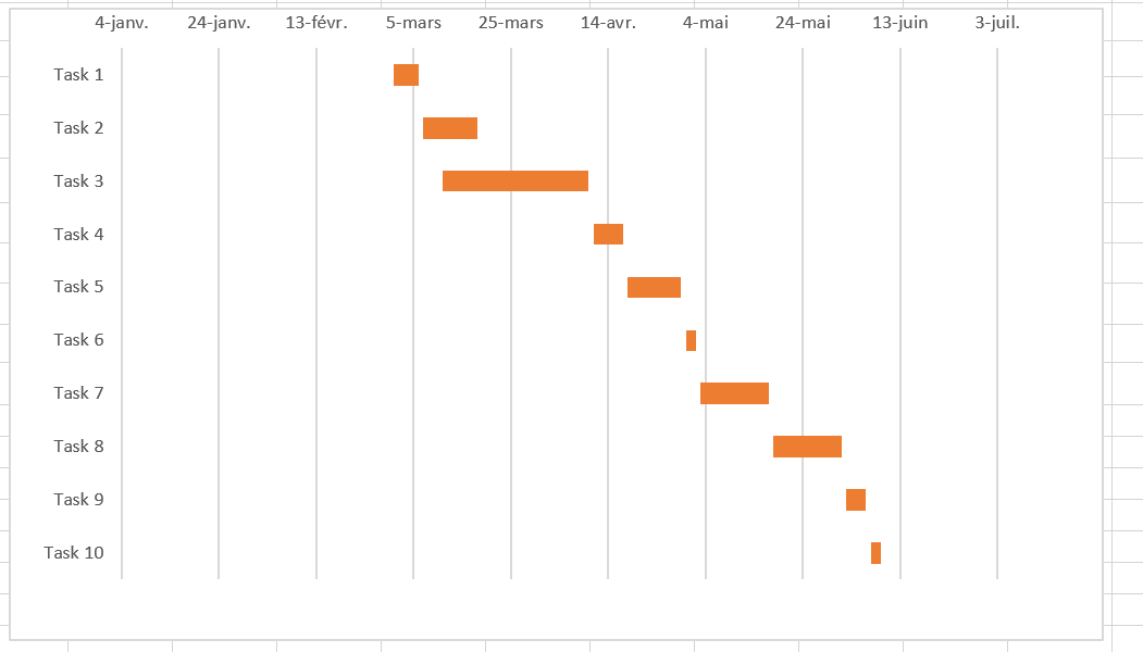
2 Improve your Gantt chart design
While your Excel Gantt chart is starting to take shape, you can add a few extra finishing touches to make it really sleek.
- Delete the empty space on the left side of the Gantt chart.
As you may recall, the blue start date bars originally resided at the top of your Excel Gantt chart. Now you can remove that white space to move your tasks a little closer to the left vertical axis.
- Right-click the first starting date in your data table and select Format Cells / General . Note the number you see—it’s a numeric representation of the date, in my case 44256. As you probably know, Excel stores dates as numbers based on the number of days since January 1, 1900. Click Cancel, because you don’t actually want to make any changes here.
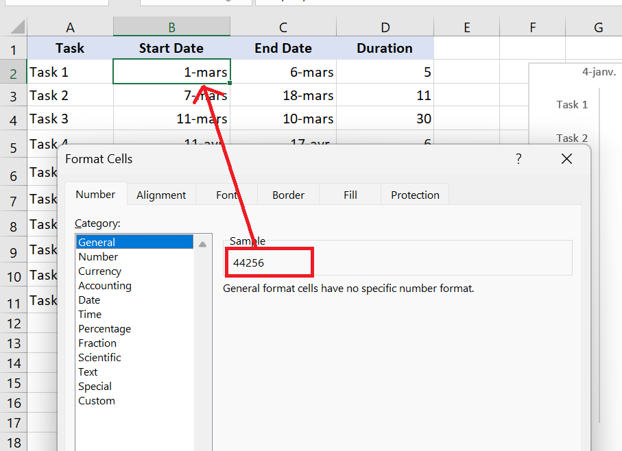
- Click any date above the task bars in your Gantt chart. One click will select all dates, right-click on it and choose Format Axis from the context menu.
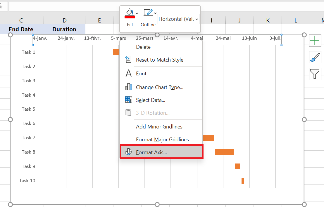
- Under Axis Options , change Minimum to Fixed and enter the number you recorded in the previous step .
- Adjust the number of dates on your Gantt chart.
Format Axis window you used in the previous step, also change the Major Unit and Minor Unit to Fixed , and then add the desired numbers for the date intervals. As a general rule, the shorter the time period in your project, the smaller the numbers you use. For example, if you want to display every other date, enter 2 in the Major Unit . You can see my settings in the screenshot below.
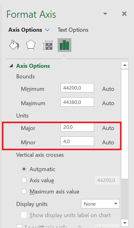
You can play with different settings until you get the result that suits you best. Don’t be afraid of doing something wrong, as you can always revert to the default settings by clicking Reset in Excel 2013 and later.
- Remove excess white space between the bars.
Compacting task bars will make your Gantt chart look even better.
- Click on one of the orange bars to select them all, right-click and select Format Data Series .
- In the Format Data Series dialog box, set Series Overlap to 100% and Width of the interval on 0% (or close to 0%).
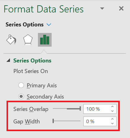
nice
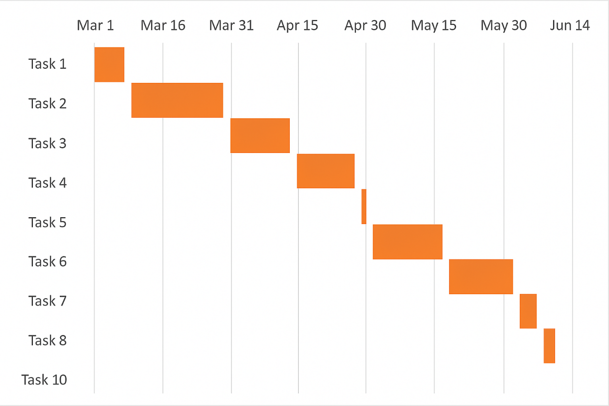 Excel Gantt chart :
Remember that although your Excel chart closely simulates a Gantt chart, it still retains the main characteristics of a standard Excel chart:
- Your Excel Gantt chart will resize as you add or delete tasks.
- You can change a start date or duration, the chart will reflect the changes and adjust automatically.
3 Excel Gantt Chart Templates
As you can see, creating a simple Gantt chart in Excel isn’t a big deal. But what if you want a more sophisticated Gantt chart with percentage complete shading for each task and a vertical milestone or checkpoint line? A faster and less stressful way would be to use an Excel Gantt chart template. Below is a quick overview of several project management Gantt chart templates for different versions of Microsoft Excel.
This Excel Gantt chart template, called Gantt Project Planner , is intended to track your project by different activities such as plan start and actual start , plan duration and actual duration , and percentage complete .
In Excel 2013 – 2021, simply go to File/New and type « Gantt » in the search box. This template requires no learning curve, just click on it and it’s ready to use.