Votre panier est actuellement vide !
Catégorie : Excel diagram
How to Highlight Time Periods
Highlighting Time Periods
Some trend components may contain specific time periods during which a special event occurred, causing an anomaly in the trend pattern. For example, you may have an unusually large spike or drop in the trend caused by an occurrence in your organization. Or perhaps you need to combine actual data with forecasts in your chart component. In such cases, it can be helpful to emphasize specific periods in your trend with special formatting.
Formatting Specific Periods
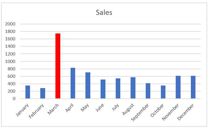
Imagine you just created the chart component shown in the following figure and you want to explain the spike in March. You could, of course, use a footnote somewhere, but that would force your audience to look elsewhere on your dashboard for an explanation.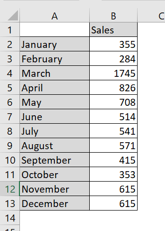
Drawing attention to an anomaly directly on the chart helps give your audience context without having to look away from the chart.
The spike in March is worth noting.
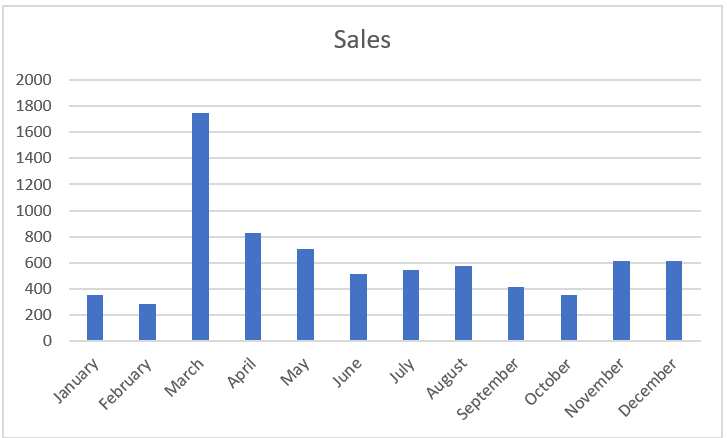
A simple solution is to format the March data point to appear in a different color, and then add a simple text box explaining the spike. To format a single data point:
1. Click the data point once.
This step places dots on all data points in the series.
2. Click the data point again to ensure Excel knows you’re formatting only that single data point.
The dots disappear from everything except the target data point.
3. Right-click and select Format Data Point from the menu that appears. This step opens the
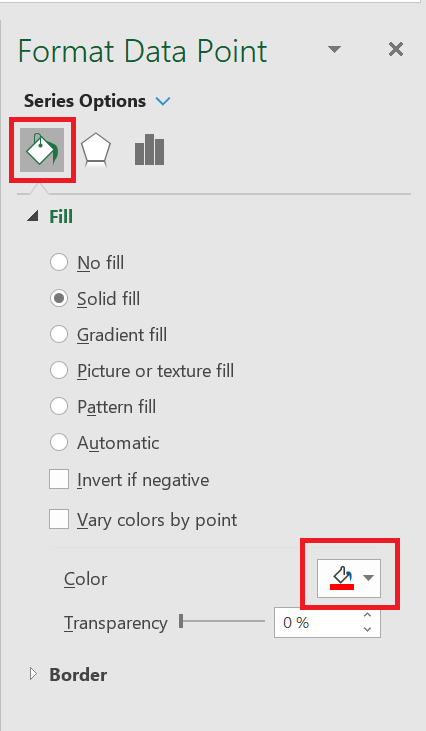
Format Data Point dialog box , shown in the following figure. The idea is to adjust the formatting properties of the data point as follows:
The Format Data Point dialog box is for a column chart. Different chart types have different options in the Format Data Point dialog box. However, the idea remains the same in that you can adjust the properties in the Data Point Formatting dialog box to change the formatting of a single data point.
The Format Data Point dialog box gives you formatting options for a single data point.
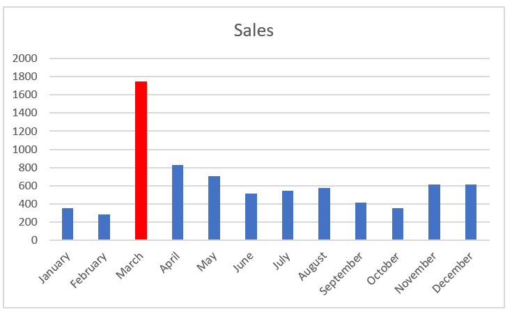
Once you change the fill color of the March data point and add a text box with some context, the chart explains the spike well, as shown in the following figure
The chart now draws attention to the spike in October and provides instant context via a text box.
To add a text box to a chart, click the Insert tab on the ribbon and select the Text Box icon. Then click the chart to create an empty text box that you can fill with your words.
Using Dividers to Mark Significant Events
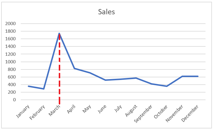
Every now and then, a particular event permanently changes the paradigm of your data. A good example is a sales increase. The trend shown in the following figure was permanently affected by a sales increase implemented in March. As you can see, a divider line (along with labeling) provides a distinct indicator of rising prices, separating the old trend from the new.
Use a simple line to mark particular events along a trend.
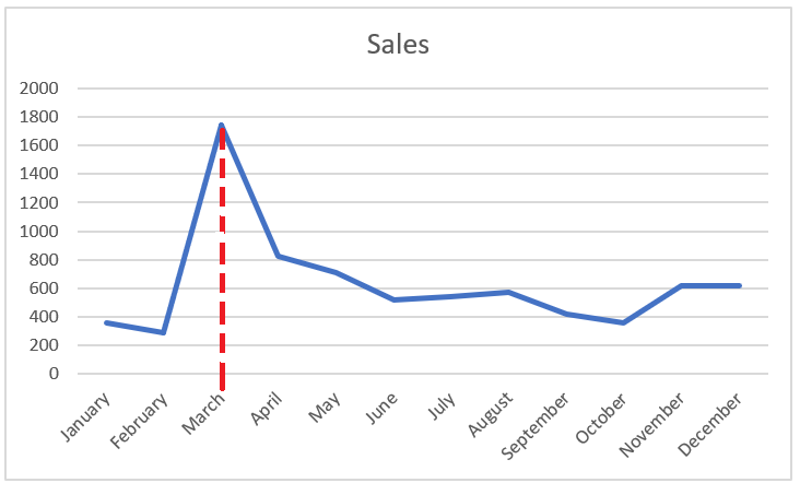
While there are many ways to create this effect, you rarely need to find a more sophisticated solution than manually drawing a line yourself. To draw a dividing line inside a chart, follow these steps:
1. Click the chart to select it.
2. Click the Insert tab on the ribbon and click the Shapes button , located on the Illustration item .
3. Select the desired line shape, navigate to your chart, and draw the line where you want it.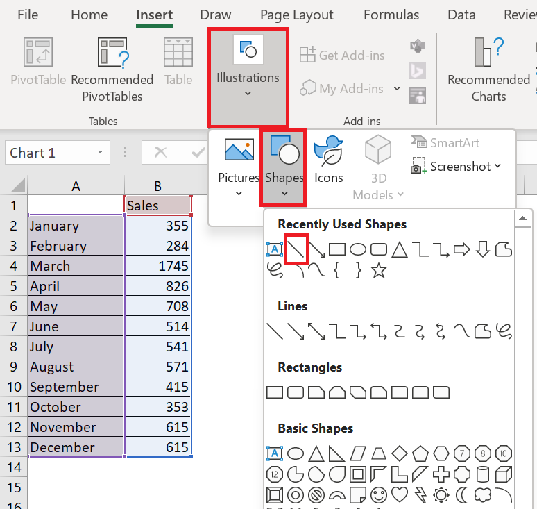
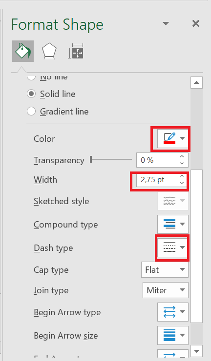
4. Right-click your new line and select Format Object from the menu that appears.
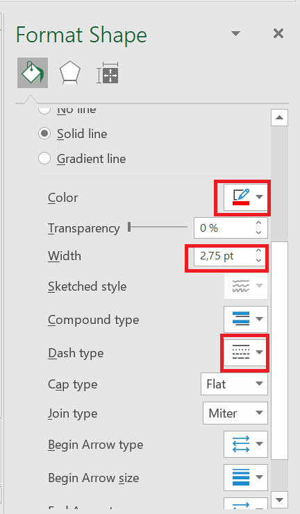
5. Use the Format Object dialog box to format your line’s color, thickness, and style.
SOME TRENDING OPTIONS
SOME TRENDING OPTIONS
1 Representing forecasts in your components
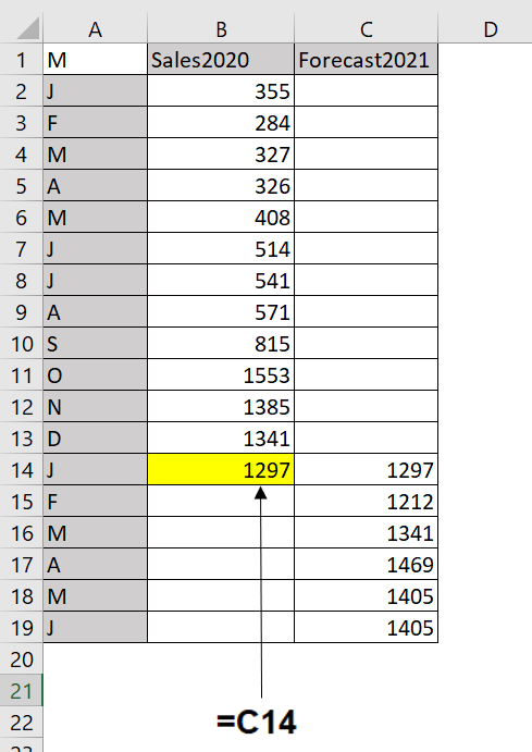
You are often asked to display actual data and forecast data as a single trend component. When showing both sets, you need to make sure your audience can clearly distinguish where the data ends and the forecast begins.The best way to achieve this effect is to start with a data structure similar to the one shown in the figure. As you can see, sales and forecasts are in separate columns. So, when you chart, you end up with two separate data series. Also note that the value in cell B14 is actually a formula referencing C14. This value is used to ensure a continuous trend line when the two data series are grouped together.
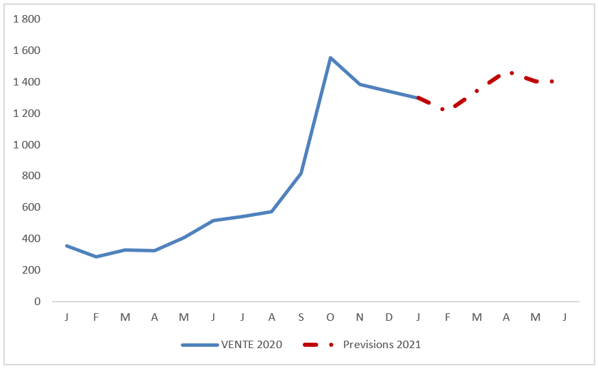
Start with a table that places your actual data and forecasts in separate columns.
Once you have the data set structured correctly, you can create a line chart. At this point, you can apply special formatting to the 2021 Forecast data series by following these steps:1. Click the data series representing the 2021 forecast.
This step places points on all data points in the series. 2. Right-click and select Format Data Series from the menu that appears. This step opens the
Format Data Series dialog box .
3. In this dialog box, you can adjust the properties to format the color, weight, and style of the series.2 Highlighting Time Periods
Some trend components may contain specific time periods during which a special event occurred, causing an anomaly in the trend pattern. For example, you may have an unusually large spike or drop in the trend caused by an occurrence in your organization. Or perhaps you need to combine actual data with forecasts in your chart component. In such cases, it can be helpful to emphasize specific periods in your trend with special formatting.
Formatting Specific Periods
Imagine you just created the chart component shown in the following figure and you want to explain the spike in March. You could, of course, use a footnote somewhere, but that would force your audience to look elsewhere on your dashboard for an explanation.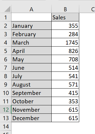
Drawing attention to an anomaly directly on the chart helps give your audience context without having to look away from the chart.
The spike in March is worth noting.
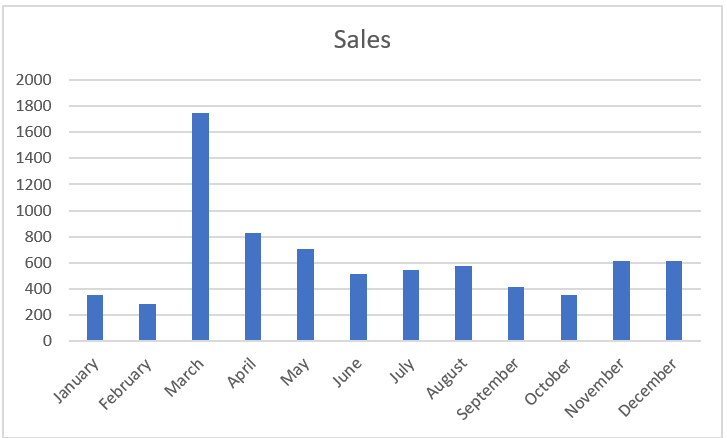
A simple solution is to format the March data point to appear in a different color, and then add a simple text box explaining the spike. To format a single data point:
1. Click the data point once.
This step places dots on all data points in the series.
2. Click the data point again to ensure Excel knows you’re formatting only that single data point.
The dots disappear from everything except the target data point.
3. Right-click and select Format Data Point from the menu that appears. This step opens the
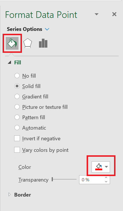
Format Data Point dialog box , shown in the following figure. The idea is to adjust the formatting properties of the data point as follows:
The Format Data Point dialog box is for a column chart. Different chart types have different options in the Format Data Point dialog box. However, the idea remains the same in that you can adjust the properties in the Data Point Formatting dialog box to change the formatting of a single data point.
The Format Data Point dialog box gives you formatting options for a single data point.
Once you change the fill color of the March data point and add a text box with some context, the chart explains the spike well, as shown in the following figure
The chart now draws attention to the spike in October and provides instant context via a text box.
To add a text box to a chart, click the Insert tab on the ribbon and select the Text Box icon. Then click the chart to create an empty text box that you can fill with your words.
Using Dividers to Mark Significant Events
Every now and then, a particular event permanently changes the paradigm of your data. A good example is a sales increase. The trend shown in the following figure was permanently affected by a sales increase implemented in March. As you can see, a divider line (along with labeling) provides a distinct indicator of rising prices, separating the old trend from the new.
Use a simple line to mark particular events along a trend.
While there are many ways to create this effect, you rarely need to find a more sophisticated solution than manually drawing a line yourself. To draw a dividing line inside a chart, follow these steps:
1. Click the chart to select it.
2. Click the Insert tab on the ribbon and click the Shapes button , located on the Illustration item .
3. Select the desired line shape, navigate to your chart, and draw the line where you want it.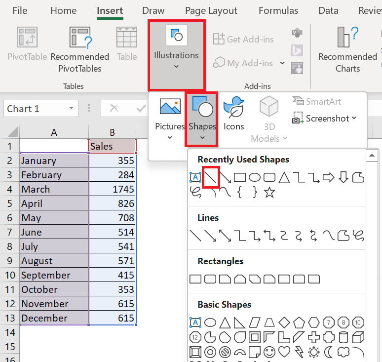
4. Right-click your new line and select Format Object from the menu that appears.
5. Use the Format Object dialog box to format your line’s color, thickness, and style.
3 Separate pre- and post-merger performance
Let’s say your company merged with another company on January 10, 2021, and you’re calculating daily sales. You might want to insert a vertical line into your chart to indicate the merger date. If you draw the vertical line with the Excel Shapes function and the chart is moved, the line will be in the wrong place. To fix this, start by selecting the range E 10: F32 ; create a scatter plot with lines (third option). In the range B 15: C16 , enter the merger date and the lower and upper limits on the y-coordinates of your vertical line. In this case, the lower limit = 0 and the upper limit = 120. Copy the range B 15: C16 and right-click on your chart to select Paste Option , which will insert the vertical line on the date January 10.
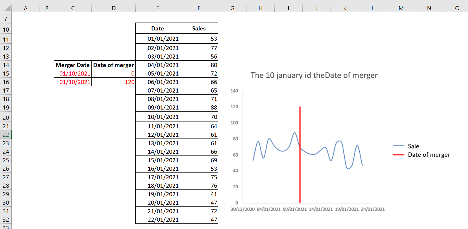
The vertical line indicates that January 10, 2021 was the merger date.
To change the legend to Merge Date , right-click the legend and select Select Data . A dialog box appears as shown in the following figure.
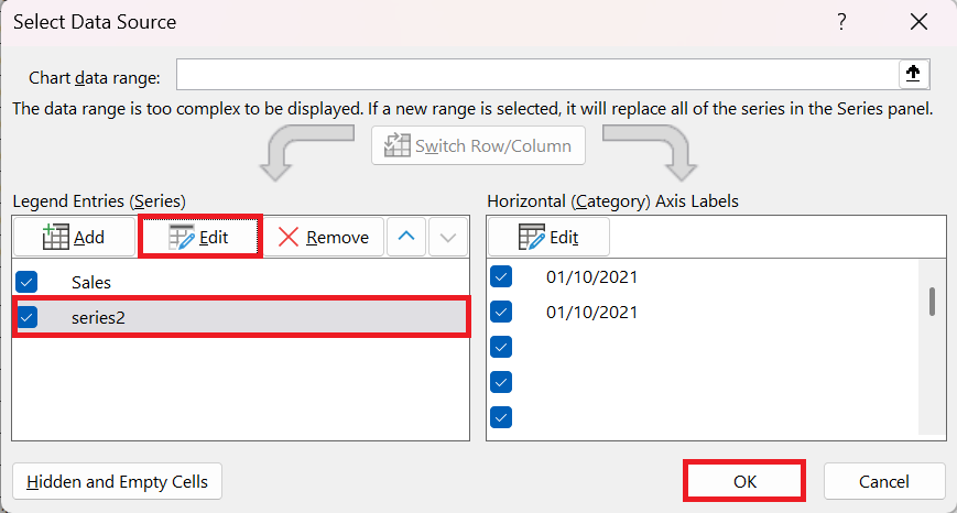
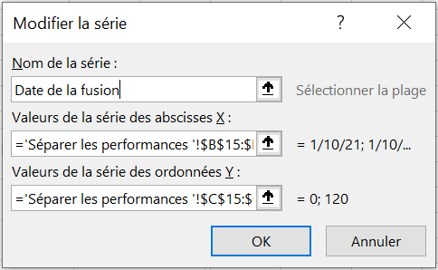
In this dialog box, select Series2 and click Edit to change the name Series2 to Merge Date , as shown in the following figure.
4 Trend with a Secondary Axis
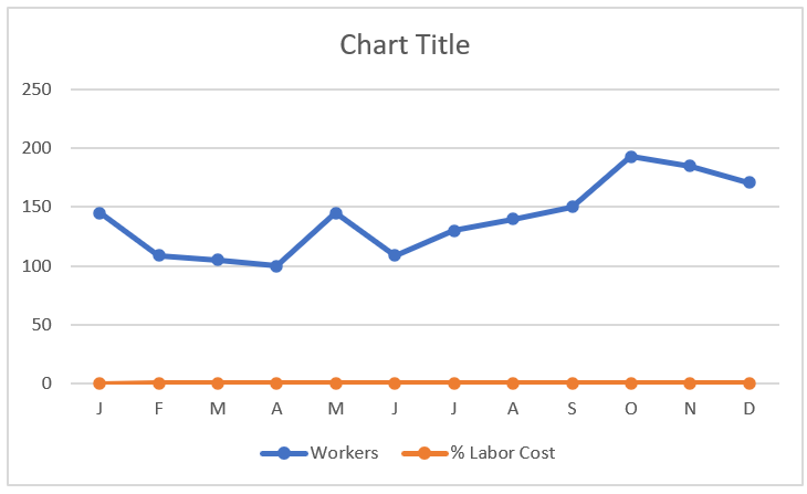
In some trend components, you have series that have two different units of measurement. For example, the chart in the following figure shows a trend for the number of workers and a trend representing the percentage of labor cost.
You often need to plot two different units of measurement, such as percentages.
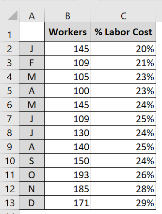
These are two different units of measurement that, when mapped, produce the unimpressive chart you see in the following figure. Because Excel constructs the vertical axis to accommodate the larger number, the percentage change in labor costs gets lost at the bottom of the chart. Even a logarithmic scale doesn’t help in this scenario. Since
the default vertical axis (or primary axis) doesn’t work for both series, the solution is to create another axis to accommodate the series that doesn’t fit on the primary axis. This other axis is the secondary axis.
The trends for the percentage of labor cost get lost at the bottom of the chart.
To place a data series on the secondary axis, follow these steps:
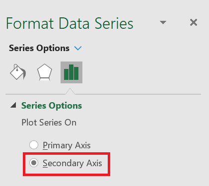
1. Right-click the data series in question and select Format Data Series from the menu that appears. This opens the
Format Data Series dialog box . 2. In the
Format Data Series dialog box , expand the Series Options section, and then click the Secondary Axis radio button.
Placing a Data Series on the Secondary Axis.
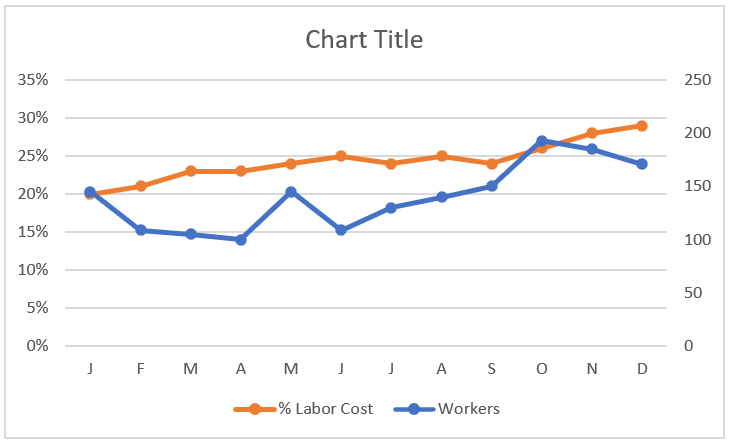
The following figure shows the newly added axis on the right side of the chart. All data series on the secondary axis have their vertical axis labels displayed on the right side.
5 Create a bar chart to check if the inventory is within a set range
Often, you need to track a quantity (inventory, cash, number of accidents) and you want to know if the quantity remains between historical upper and lower limits. A bar chart provides a useful tool for monitoring the evolution of a process over time. The following figure shows an example of a bar chart.
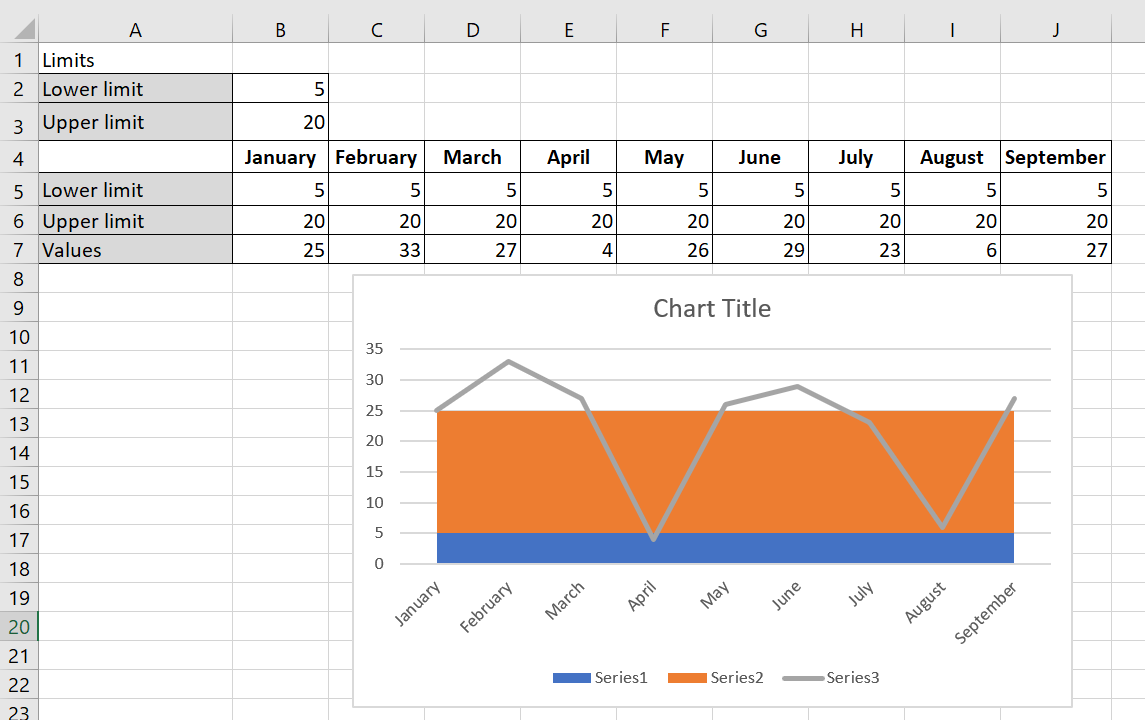
A bar chart summarizes inventory levels.
To create the bar chart, follow these steps:
1. You entered your lower limit on inventory (5) in B2 and your upper limit (25) on inventory in B3.
2. In line 5, you enter the lower limit for each month by copying the formula = $B$2 from B5 to C 5:J 5.
3. Copying the formula = $B $3 – $B$2 from B6 to C 6:J 6 calculates the upper limit – lower limit, as shown in the following figure.
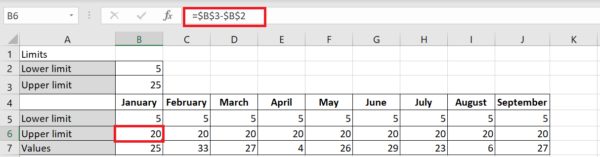
Name this row Upper Limit , as this row will be used to generate the row representing your upper inventory limit of 25 units.
4. Select the range B 5: J7 and select a stacked area chart (the second 2D area option), from the Insert tab of the ribbon.
Values data series on the chart that appears, right-click Change Chart Type Data Series and choose the first Line chart option, as shown in the following figure.
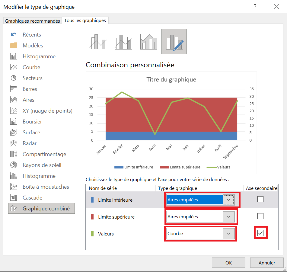
6. Add a secondary axis to the Values series, which you would later remove from the chart.
7. Right-click the Upper Limit and Lower Limit series and select Stacked Areas. Click OK to close the dialog box.
8 On the chart that appears, right-click the Lower Bounds data series and select Format Data Series . In the dialog box that appears, click the Fill category and select No Fill.
Your bar chart shows that you are having great difficulty maintaining inventory levels between your desired lower and upper limits.
6 Comparative Trends
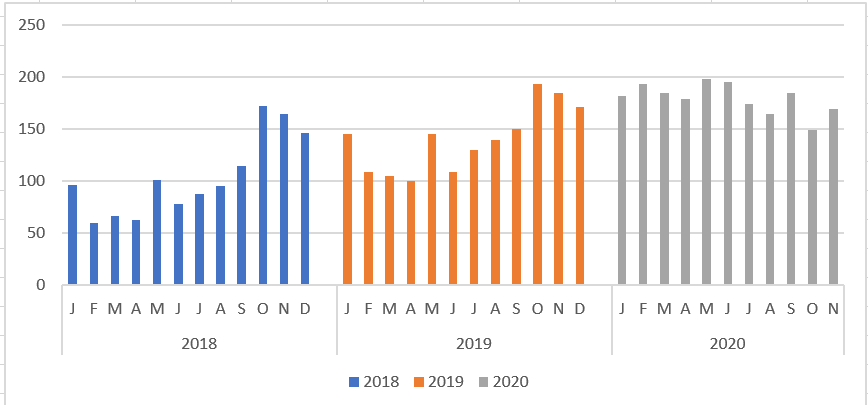
The following figure shows a chart that presents a side-by-side comparison of three periods. With this technique, you can display periods of different colors without breaking the continuity of the overall trend.
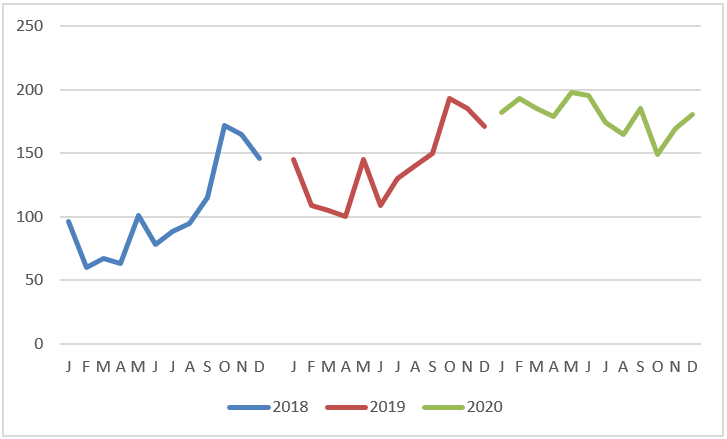
Here’s how to create this type of chart:
1. Structure your source data similarly to the structure shown in the following figure.
Notice that instead of placing all the data in one column, you are displaying the data in the respective years. This tells the chart to create three separate lines, taking into account the three colors.
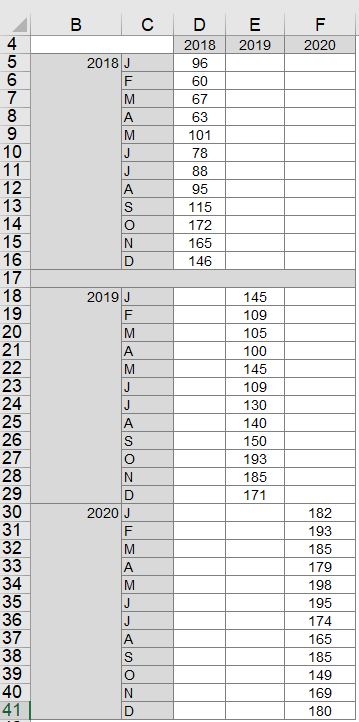
2. Select the entire table and create a line chart.
This step creates the chart shown earlier. 3. If you want to get fancy, click on the chart to select it, then right-click and select Change Chart Type from the context menu that opens.
4. When the Change Chart Type dialog box opens, select Stacked Column Tables.
As you can see in the following figure, the chart now shows the trends for each year in columns.
Do you want a gap between the years? Adding a gap in the source data (between each 12-month sequence) adds a gap in the chart, as shown in the following figure.
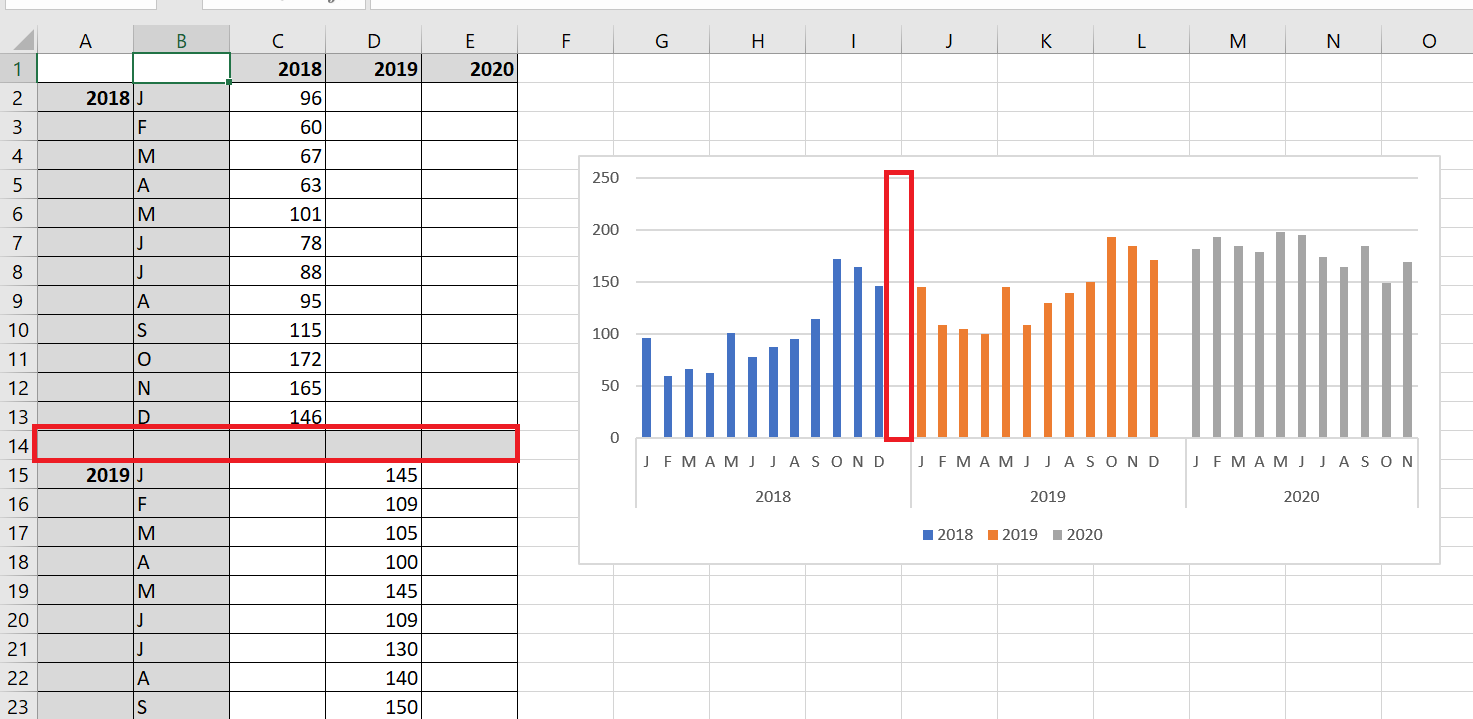
7 Create Combo Charts
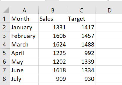
You want to create a chart that shows actual and target sales for each month. The histogram in the following figure is created from the figure’s database. To create it, select the range A1 : C8 and, on the Insert tab, select Histogram and choose the first 2D column chart, shown in the following figure.
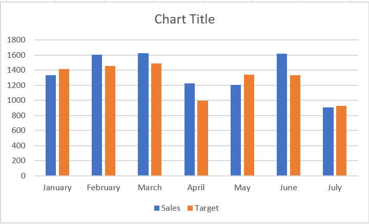
Using two columns makes it difficult to see the contrast between actual and target sales, so use a combination chart in which one series is plotted as a line and the other as a column.
To create a combination chart, follow these steps:
1. Right-click one of the series in the following figure and select Change Chart Type.2. In the dialog box that appears, select Grouped Column – Row . This gives the combination graph shown in the following figure.
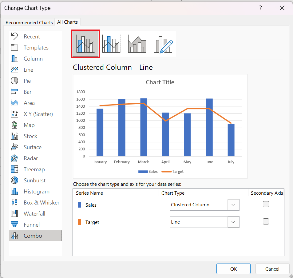
This technique works well with two time series.8 The importance of the logarithmic scale
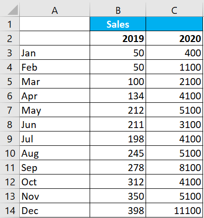
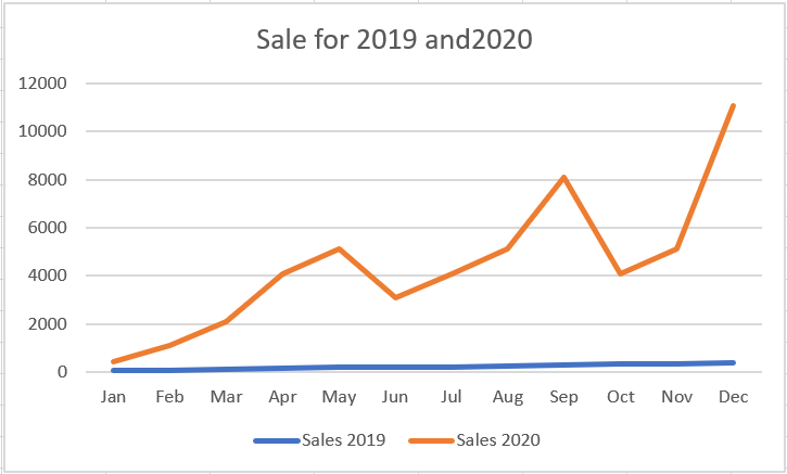
In some situations, your trends may start with very small numbers and end with very large numbers. In these cases, you end up with graphs that don’t accurately represent the actual trend. In the following figure, for example, you see the unit trends for 2019 and 2020. As you can see from the source data, 2019 started with a modest 50 units. As the months went by, the monthly unit count increased to 11,100 units by December 2010.
Because the two years are on different scales, it is difficult to discern a comparative trend for the two years.
The solution is to use a logarithmic scale instead of a standard linear scale. A logarithmic scale allows the axis to jump from 1 to 10; to 100 to 1000; and so on without changing the spacing between the axis points. In other words, the distance between 1 and 10 is the same as the distance between 100 and 1000. The following figure shows the same graph as the previous figure, but on a logarithmic scale. Notice that the trends for both years are now clear and accurately represented.
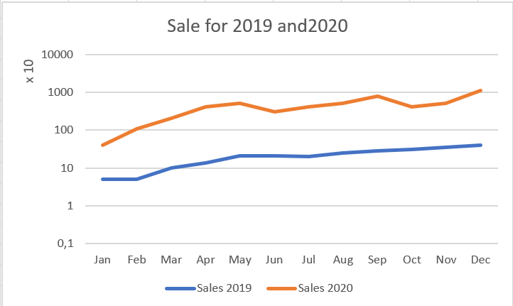
To change the vertical axis of a chart to logarithmic scaling, follow these steps:
1. Right-click the vertical axis and choose Format Axis from the menu that appears. The
Format Axis dialog box appears.
2. Expand the Axis Options section and select the Logarithmic Scale check box , as shown in the following figure.
Logarithmic scales only work with positive numbers.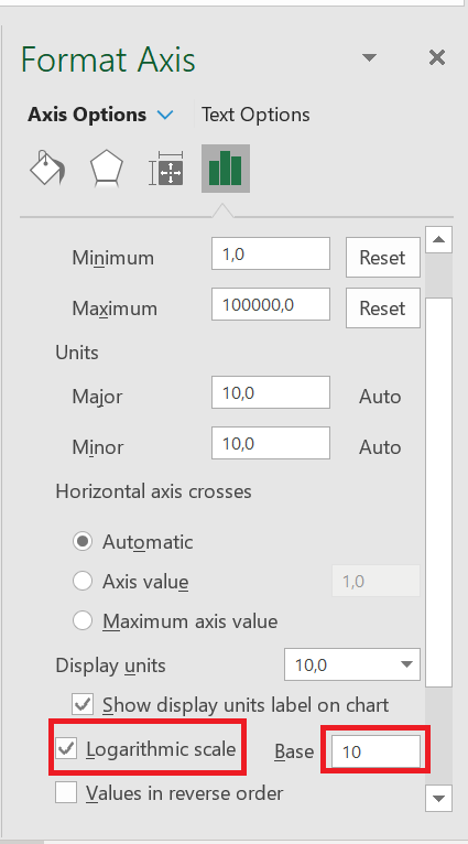
9 Reset the vertical axis to zero
The vertical axis on a trend chart should normally start at zero. In these situations (negative values or fractions), it’s usually best to keep Excel’s default scaling. However, if you only have positive whole numbers, make sure the vertical axis starts at zero.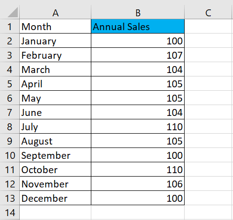
Indeed, the vertical scale of a chart can have a significant impact on the representation of a trend. For example, compare the two charts shown in the following figure. Both charts contain the same data. The only difference is that in the upper chart, I did nothing to correct the vertical scale assigned by Excel (it starts at 96), but in the lower chart, I corrected the scale so that it starts at zero.
Figure: Vertical scales should always start at zero.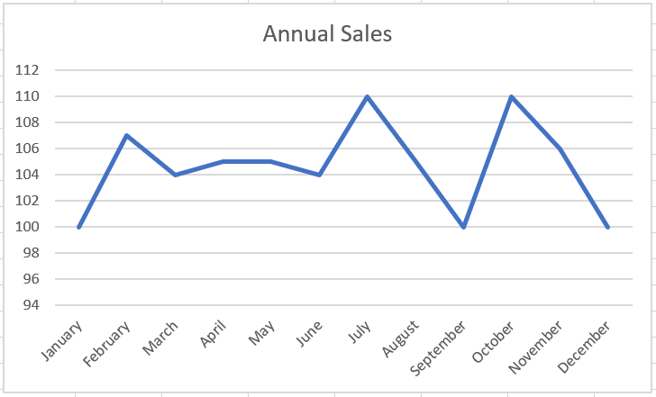
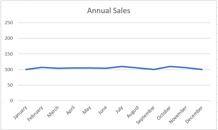
Now, you might think the top chart is more accurate because it shows the ups and downs of the trend. However, if you look at the numbers closely, you’ll see that the units represented have increased from 100 to 110 in 12 months. This isn’t exactly a significant change, and there’s no doubt that such a picture is unjustifiable. In truth, the trend is relatively flat, but the chart shows that the trend is upward.The lower graph more accurately reflects the true nature of the trend. I achieved this effect by locking the Minimum value on the vertical axis to zero.
To adjust the scale of the vertical axis, follow these simple steps:
1. Right-click the vertical axis and choose « Format Axis » from the menu that appears.
The Format Axis dialog box appears.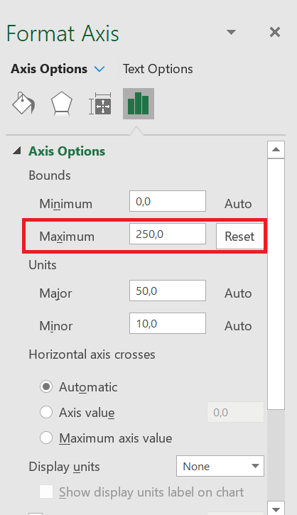
2. In the Format Axis dialog box, expand the Axis Options section and set the value in the Minimum box to 0.
3. Set the value in the Maximum box to 250 (double the actual value). This ensures that the trend line is placed in the middle of the chart.
4. Click Close to apply your changes.
Many would argue that the lower chart obscures small-scale trends that may be important. In other words, a difference of 7 units can be significant in some companies.HOW TO CREAT A WAFFLE GRAPHIC
WAFFLE GRAPHIC
There are many people who don’t like using a pie chart and they have their valid reasons for that.
If you are one of those people, let me introduce you to the WAFFLE CHART. You can also call it a square pie chart. And today, in this article, we will learn how to create a WAFFLE CHART in Excel.
1 What is a WAFFLE chart?
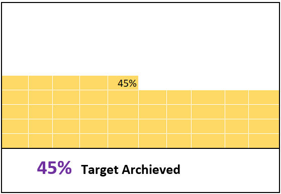
In Excel, a waffle chart is a set of grids (equal squares) that represent the entire chart. It works on a percentage basis, where one square represents one percent of the entire chart. Below is an example of a waffle chart I created in Excel. As mentioned, it has a total of 100 squares, and each square represents one percent of the total value.
2 Components of a Waffle Chart
And here are the main components of a waffle chart that you need to understand before creating it in Excel.
- 100-cell grid: You need a 100-cell square grid (10 X 10).
- Data Point: A data point from which we can take the percentage completion or percentage achievement.
- Data Label: A data label to show the percentage completion or percentage achievement.
So now it’s time to learn how to create it in Excel. Well, you can use a static or a dynamic one (depending on your needs). Let’s get started.
3 Steps to Create a Waffle Chart
The waffle chart is not included in Excel’s default chart list; in fact, it is one of the advanced Excel charts that you create yourself. Below are the steps to create a waffle chart in Excel:
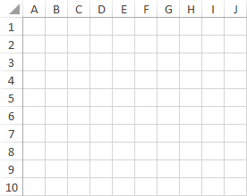
- First, you need a grid of 100 cells (10 X 10) and the height and width of each cell must be the same. The overall grid of cells must be square and that is why it is called the square pie chart.
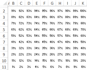
- After that, you need to enter values from 1% to 100% in the cells starting from the first cell of the last row of the grid. You can use the following formula to insert the percentage from 1% to 100% in the grid (all you have to do is enter this formula in the first cell of the last row and then copy this formula to the entire grid).
=(COLUMNS($A 10:A $10)+10*(ROWS($A10:A$10)-1))/100
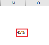
- Next, you need a cell for the data point where you can enter the completion or success percentage. You need to further link this cell in the waffle chart.
- Once you have created a data point, you then need to apply the conditional formatting rule on that grid and for that, please follow these simple steps to apply a rule.
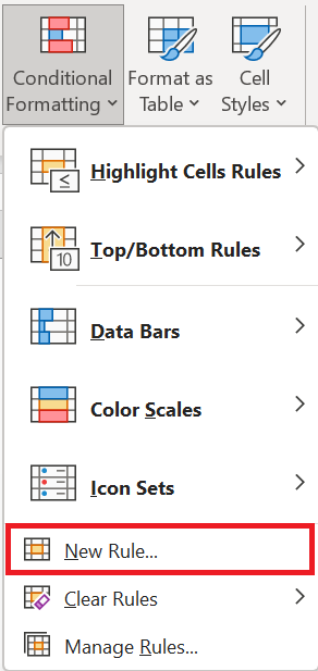
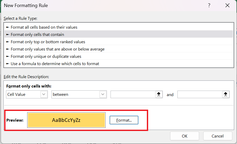
- Select the entire grid and go to → Home tab in the Styles group select Conditional Formatting → New Rule .
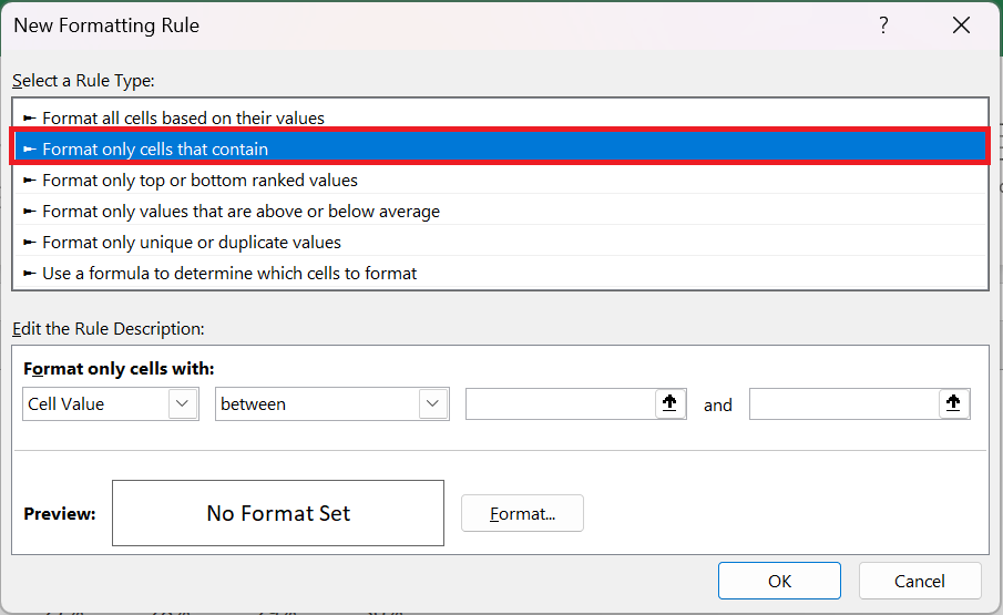
- In the new ruler window, select « Apply formatting only to cells that contain ».
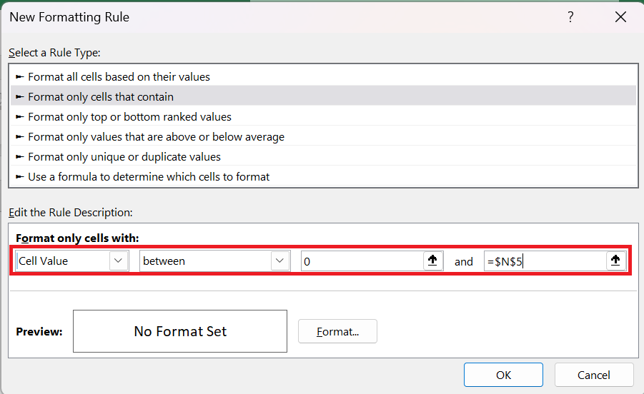
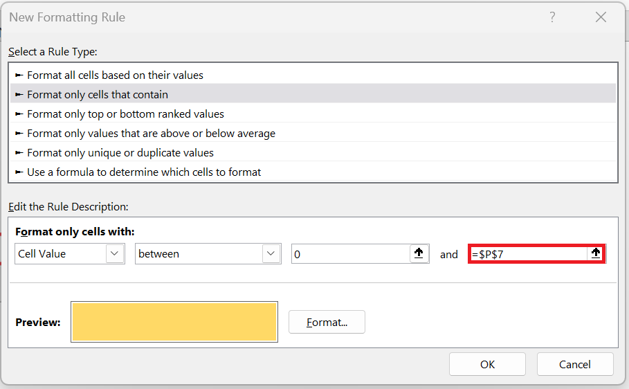
- Now in « format only cells with » specify the values 0 as minimum and $N$5 as maximum values.
- This rule will apply conditional formatting to cells with values between this range of values.
- Click the format button to specify a format to apply.
- Make sure to apply the same color for both font and cell color to hide fonts when the condition applies.
- From here you need to apply one last formatting touch and for this select the grid and do the following:
- Change the font color to white.
- Apply a white border to the grid cells.
- Apply a solid outer border to the black grid.
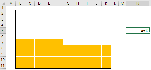
- After that you will get a waffle chart which is linked to a cell and when you change the data in that cell the chart will be automatically updated.
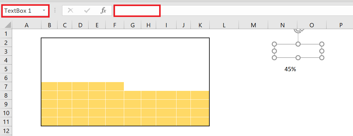
- Now you need to create a label for the chart and for this you need to insert a simple text box and connect it to the cell . Follow the steps below for this.
- Insert a text box into your spreadsheet from the Insert tab of the ribbon, select Text Box in the Text group.
- Now select the text box and click in the formula bar.
- Enter the cell reference of the data point cell and press Enter.
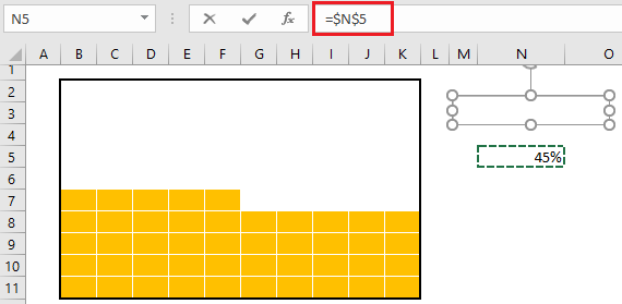
- Increase the font size and place the text box on your chart.
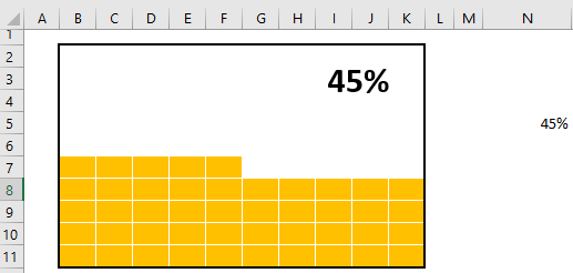
Now your waffle chart is ready and you can use it anywhere, but I want to add something more and I’m sure you’ll like it. In the chart below, besides the main label, we have a small label in the last square of the grid that can help the viewer instantly identify the value of the chart.
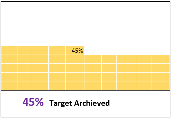
To add this label, we need to follow the steps below:
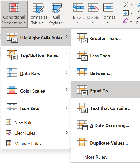
- First, select the entire chart grid , then click on the Home tab of the ribbon, in the Style group, click on Conditional Formatting and go to Highlight Cell Rules then click on Equal To .
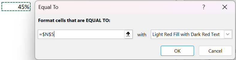
- Now in the equals dialog box, select the cell where we have our percentage value.
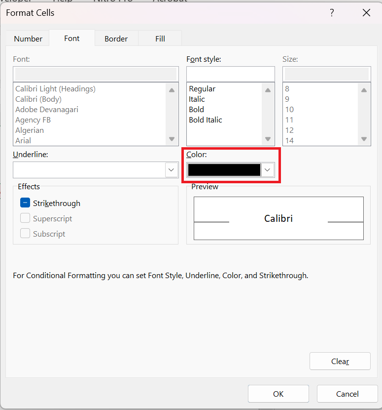
- After that, open “Custom Format” and go to the “Font” tab.
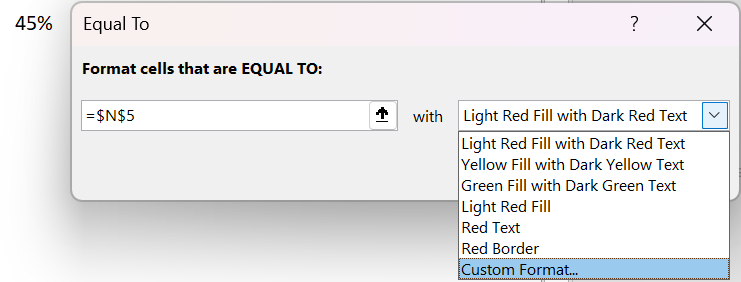
- From there, in the Font tab, select the font color « Black « , style « BOLD » and click OK.
The moment you click OK, a small label (which is the cell value) is added in the last square.
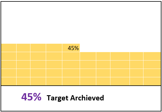
Your first Excel waffle chart is ready to go
4 Steps to Create an INTERACTIVE Waffle Chart
At this point you know how to create a waffle chart
, but I have a lot of questions about how to make it an interactive chart.
If you think about it this way, one of the most important things you should have in an interactive chart is how you control it and you should be able to edit the data.
So in this section I would like to share with you the steps to create an interactive WAFFLE chart in which you can edit the data with the OPTION buttons.
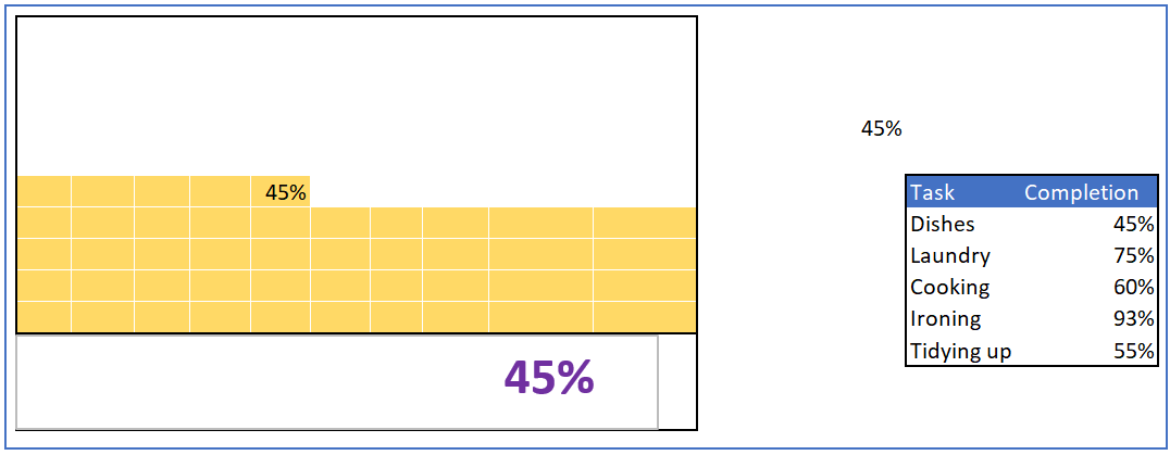
So let’s make it INTERACTIVE .
-
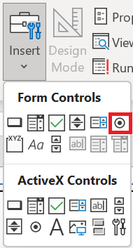
- First, you need to insert five buttons or radio buttons in the spreadsheet and for this, go to DEVELOPER tab ➜ Insert Radio Buttons.
-
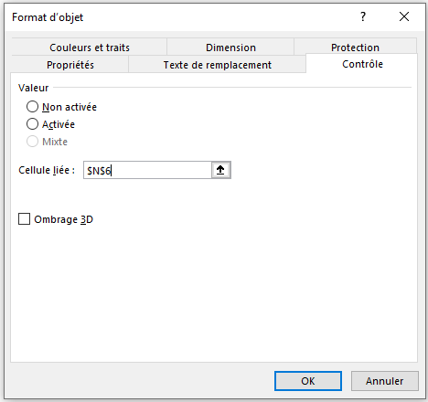
- After that, you need to connect these radio buttons to a cell . So, when you select a button, that cell can have a number that we can use to pull data from the main table.
- To do this, select all the option buttons and right-click, then select « Format Control » (you can also group all the option buttons together using the GROUP option).
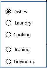
- Next, you need to name the five radio buttons according to the product names you have. Simply right-click and edit the text
- Now the next step is to create a formula and insert it into the completion cell so that when you select an option button it returns the value of that particular product.
- So this formula we need here would be like below :
=INDEX(P 8:P 12;N6)
- Enter the above formulas into the success cell. In this formula, P 8:P 12 is the range where you have task completion values and N6 is the cell that is connected with the option buttons.
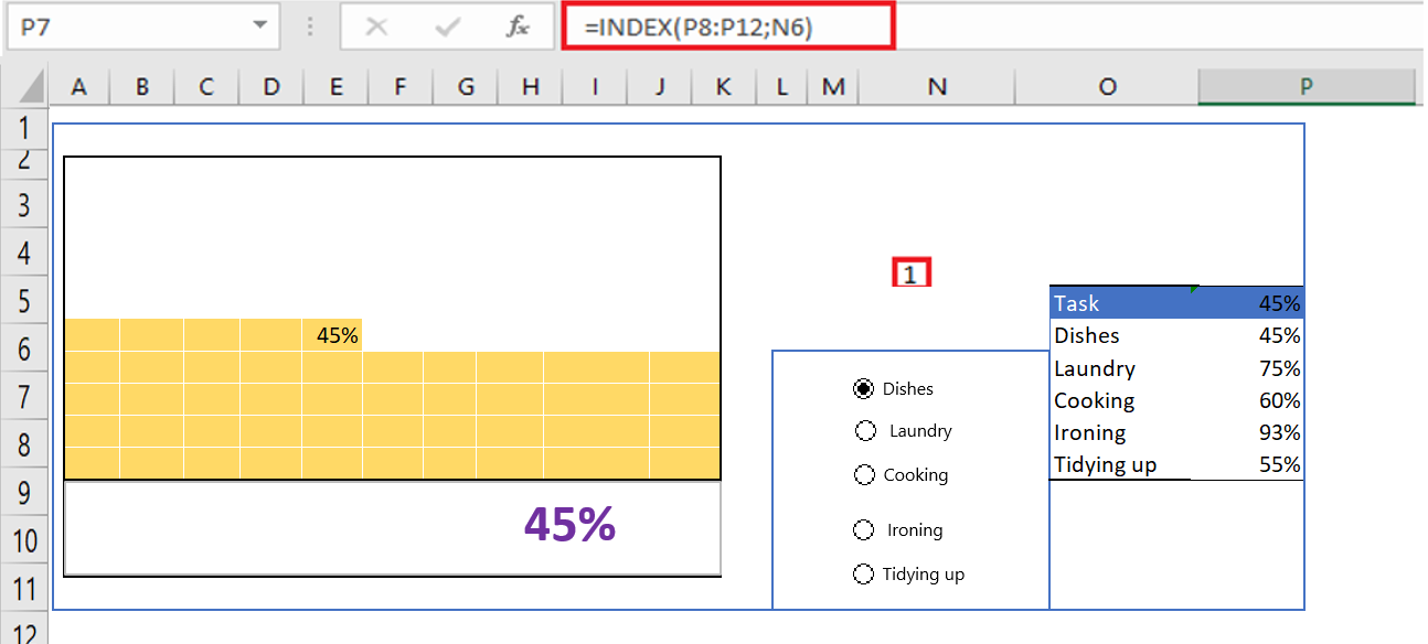
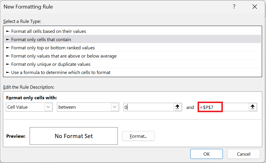
Note: It’s important to know that for this waffle chart, the changing cell is P7. I modified this cell for both conditional formatting used at the beginning.
- There is one more thing we need to do and that is create a dynamic label for the chart (at this point we have a data label that is connected to the completion cell but we need to make it dynamic).
- To do this, we need to enter the formula below in the cell next to the success cell.
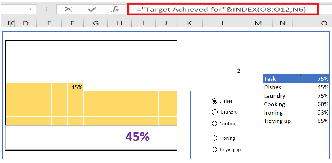
- After that insert a simple text box which you need to connect to the cell where you just added the above formula and for that select that text box and click on the formula bar and type the address of the cell where you have the formula .
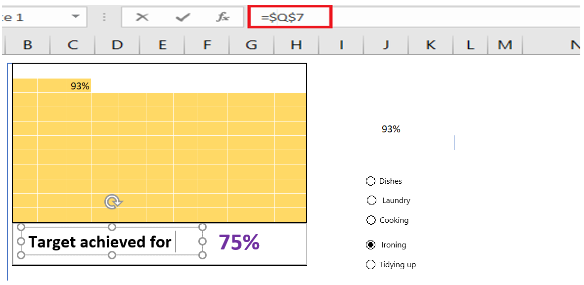
You now have an INTERACTIVE TABLE in your spreadsheet that you can use and control with the option buttons.
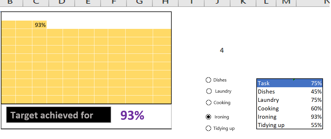
And in the future, if you want to update the data, you just need to add a new radio button and update the data ranges in the formulas.
6 Add an embossed chart to a dashboard
The WAFFLE chart looks good, but inserting it into a dashboard can sometimes be tricky. But, you don’t have to worry about it. The best way to add it is to create a linked image with Excel ‘s Camera tool or by using a special option. The advantage of using this technique is that you can change the size of the chart.
- Select your embossed chart (Grid).
- Copy cells using the keyboard shortcuts control + C.
- Go to your dashboard sheet and navigate to ➜ Home tab ➜ Clipboard ➜ Paste ➜ Linked Image .
Benefits
- It provides a quick overview of the progress of a project or the achievement of the objective.
- It looks good and you can easily use it in your dashboard.
- You can easily convey your message to the user without any additional explanation.
The disadvantages
- Using multiple data points in the waffle chart complicates things.
- You need to spend a few minutes to create an embossed graphic.
- You can only present data as a percentage.
HOW TO CREATE A HEAT MAP GRAPH
HEAT MAP GRAPH
Visuals are always easily understandable compared to values. Even in Excel, when using a chart (advanced or basic) it is easy for the user to understand.
But we can’t always go this route, because most of the time we need to present our data in tables or other report formats.
To deal with this kind of situation in Excel, I found that a map
Thermal is the best solution. It helps us present the data with a visual effect and without changing the actual structure of the data.
1 What is a heat map in Excel?
In Excel, a heat map is a presentation of data using a shade of color on each cell in the range in a comparative manner so that a user can easily understand it. It looks like a map with different colors ranging from dark to light to represent the weight of the value in the cell.
Below is an example of a simple heatmap where we have data by area and month and for each cell where we have a sales value, a color shade is applied to the cell.

And this color shade helps us quickly compare cell values with each other. The cell with the highest value has green as its cell color, and the cell with the lowest value has red, and all the cells in the middle have yellow.
All values between the highest and lowest values have a color shade based on their rank. But you can manually create a heatmap like this, because applying a color to a cell based on its values can be possible every time.
Now, the point is that you know what are the possible ways to create a heat map in Excel. And, if you ask me, there are more than three. We will see all the possible ways to create a heat map in Excel.
Note : When you print a heat map on paper, it looks really unpleasant, especially when using a black and white printer. All the shades are only black and white, which is not easy for anyone to understand.
2 Create a heat map using conditional formatting
If you don’t want to put in the extra effort and save time, you can create a simple heatmap using conditional formatting.

To create a heat map in Excel, you need to follow the steps below:
- First, select the data on which you want to apply a heat map (here you need to select all the cells where you have sales values)
- After that, go to the Home tab, in the Styles group click on Conditional Formatting.
- In the Conditional Formatting options, select the color shades or scales. (You can choose from twelve different types of color scales.)
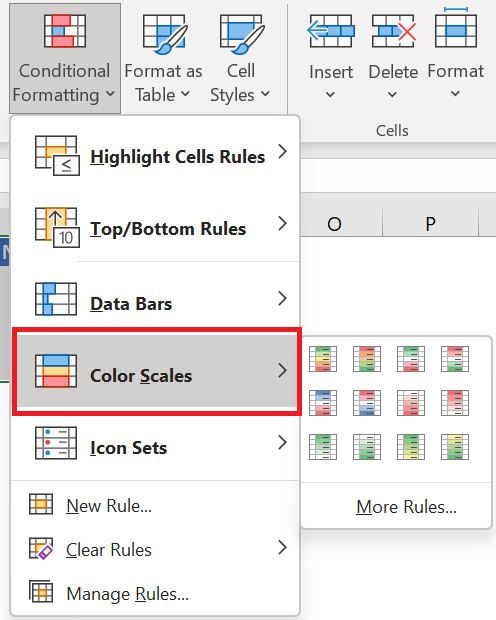
- Once you select an option, all the cells will get a color shade depending on the value they have and you will get a heat map like below

- And, if you want to hide the value and only show the shared color, you can use custom formatting for that.
- To do this, first select the heatmap data and open the formatting options (Ctrl + 1).
- Now in the number tab go to custom and enter ;;; and at the end click OK.
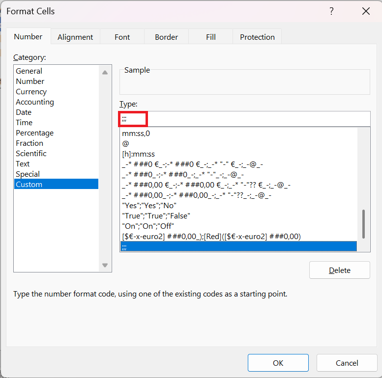
- Once you click OK, all the numbers in the cells will be hidden. Well, they are in the cells, but just hidden.

3 Steps to Add a Heatmap to a Pivot Table
You can also use a heat map in a pivot table by applying conditional formatting . Here are the steps to follow:
- Select one of the cells in the pivot table.
- Go to the Home tab, in the Styles group click Conditional Formatting.
- In the conditional formatting options, select color scales.

Also, if you want to hide numbers (which I don’t recommend), please follow these simple steps.
- Select one of the cells in the pivot table.
- Go to PivotTable Analysis tab ➜ Active Field ➜ Value Field Settings .
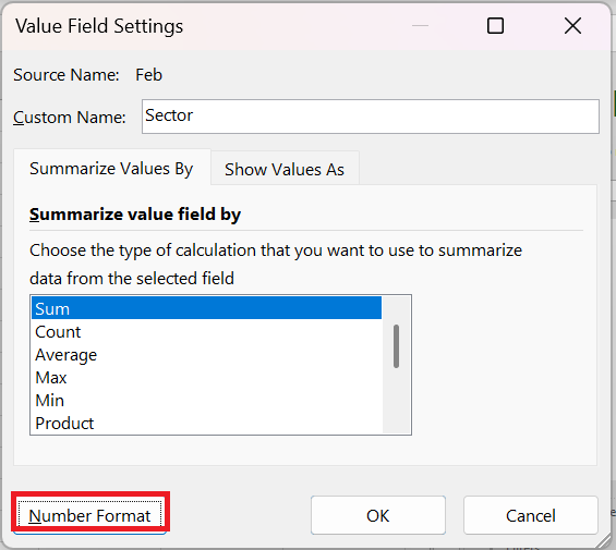
- Click on the number format.
- In the number tab, go to custom and enter ;;; as gender.e
- Click OK.
You can download this sample file to see how we can use a slicer with a dynamic heatmap table.
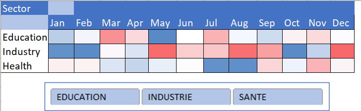
4 Steps to Create a Dynamic Heatmap
You can create a dynamic heatmap if you want to hide/show it according to your needs.
Below is the table we used to create a dynamic heat map.

And the following things we need to incorporate.
- Option to switch between heat map and numbers.
- Automatically updates table with heat map when new data is added.
Here’s how to do it:
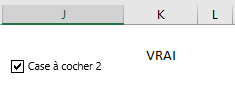
- Click the Developer tab on the ribbon, in the Controls group in Insert, insert a check box and rename it . Right-click the check box and select Format Control. select a cell in the linked cell box (K2 in our case)
- Then select all the cells where you want to apply the formatting rule. Go to the Home tab, in the Styles group, click on Conditional Formatting.
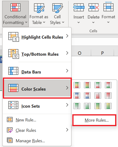
- In the conditional formatting options, select the color shades then on another rule.
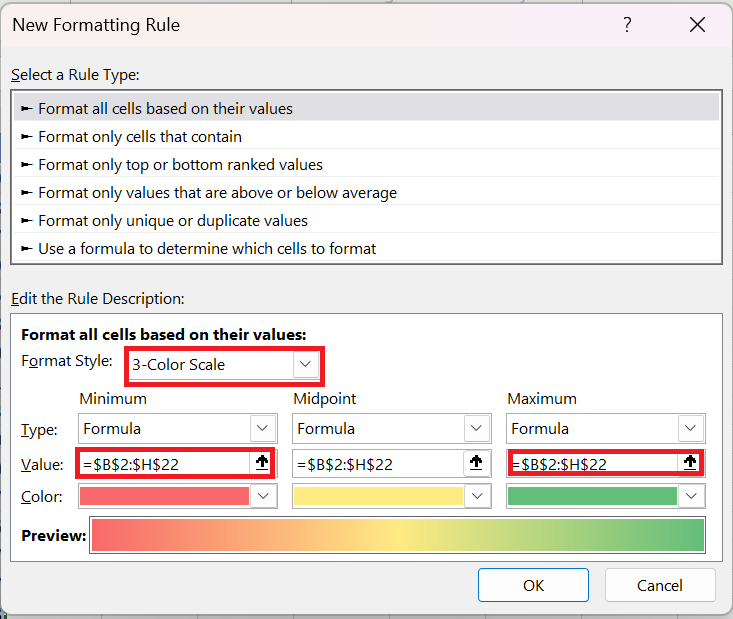
In the New Conditional Formatting Rule dialog box, in Formatting Style, select Three-Color Scale . In Type MINIMUM, MID, AND MAXIMUM, select Formula. In Value, enter the following formula :
MINIMUM: =IF($K$2= TRUE;MIN ($B$2:$H$25);FALSE)
MIDDLE: =IF($K$2= TRUE;AVERAGE ($B$2:$H$25);FALSE)
MAXIMUM: =IF($K$1= TRUE;MAX ($B$2:$H$25);FALSE)
Change the colors as you wish and click OK.
You now have a dynamic heatmap that you can control with a checkbox.
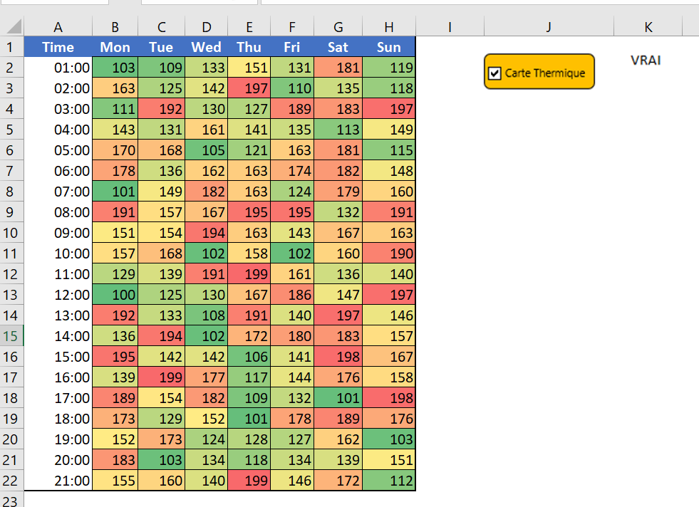
And if you want to hide the numbers when you check the box, you need to create a separate conditional formatting rule. Here’s how to do it:
- Open the New Conditional Formatting Rule dialog box.
- Select « Use a formula to determine which cells to format » and enter the formula below.
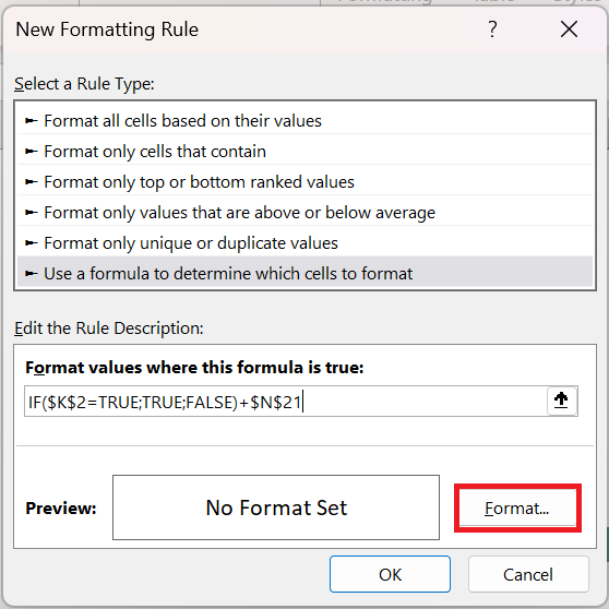
=IF($K$2= TRUE;TRUE ;FALSE)
- Now specify custom number formatting.

After applying all the above customizations, you will get a dynamic heatmap.
Imagine if you look at a large data set, it is really difficult to identify the lower values or the higher values, but if you have a heat map, it is easy to identify them.
You can use different color schemes to illustrate a heat map. And, if you can go the extra mile, a dynamic heat map is the best solution.
HOW TO CREAT A THERMOMETER CHART
THERMOMETER CHART
Sometimes you need to track a goal and its achievement. For this, it is important to have the right chart. This chart must be able to present your data in a understandable way. And it should be easy to create. I believe the thermometer chart is one of the best charts for a point target. It’s simple to create and easy for a user to understand.
1 What is a thermometer chart?
The thermometer chart resembles a thermometer. The filled area increases as success increases. Excel doesn’t have a default option to create a thermometer chart, but you can create one by following simple steps.
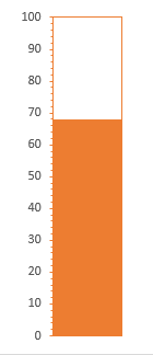
For this, in this article, I have shared simple steps to create a thermometer chart in Excel.
2 Steps to Create a Thermometer Chart
To create a thermometer chart in Excel, you need to follow the steps below :
- First, make sure you have data in the format below , where the target is 100 (as a percentage) and the achievement is 68% of the target.
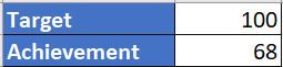
- After that, select the entire data and go to Insert tab ➜ Charts ➜ Column Chart or 2D Column Chart and insert this chart.
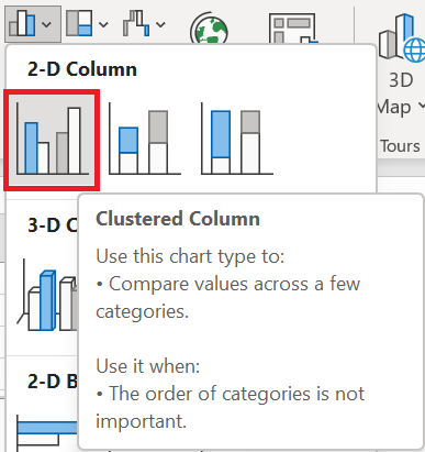
- From there, right-click on your chart and click « Select Data » .
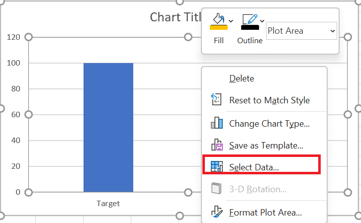
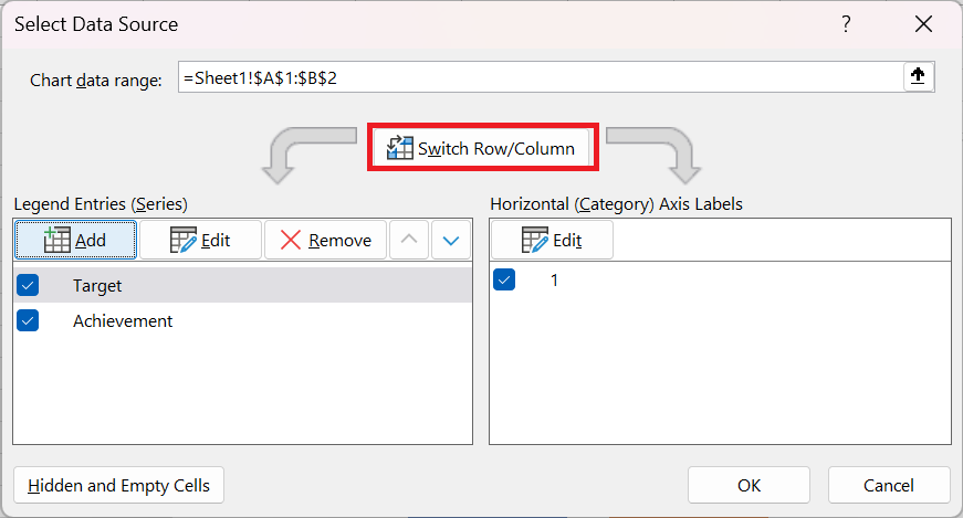
- Now in the data selection window, click on « Switch or Swap Row/Column » and click OK.
- Then right click on the achievement data bar and open « Format Data Series » .
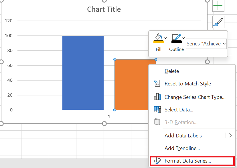 6. And now go to « Series Options » and select « Secondary Axis » to convert the achievement bar to a secondary axis chart .
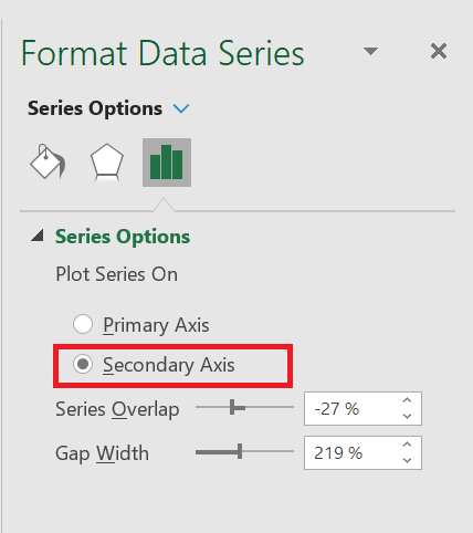
- At this point, you have two data bars (overlapping) with different axis. But you need to make their axis values the same .
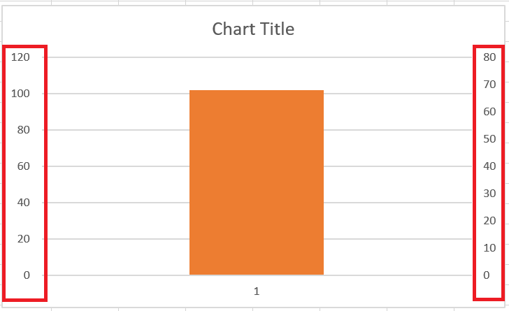
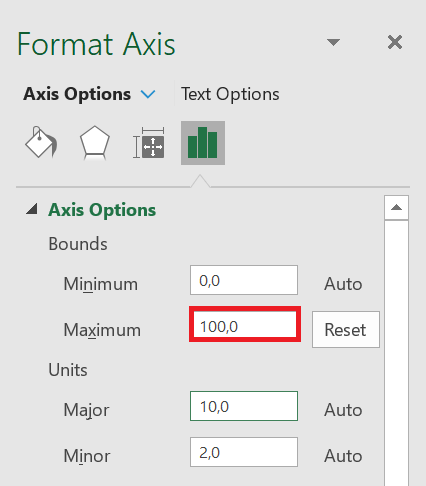
- Now from here right click on the first axis and select « Format Axis » and add the maximum value « 100 » or whatever maximum target values you have. Do the same with the secondary axis.
- At this point your thermometer chart is almost ready, the only thing you need to do is a little formatting for the finishing touches.
- For the target bar, use no fill for the color and a solid color border.
- Use the same color for the achievement bar ( fill and border) that you used for the target bar border.
- Delete the chart title, horizontal axis, and right vertical axis.
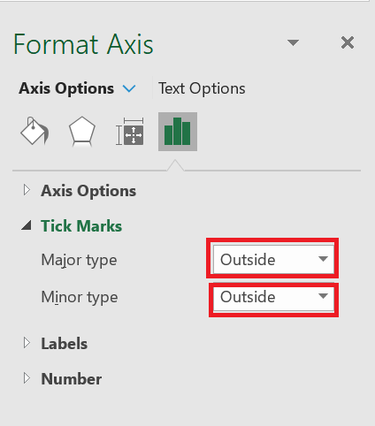
- Select the left axis, right-click and select axis format, in axis options click on graduation, on primary and secondary type click outside.
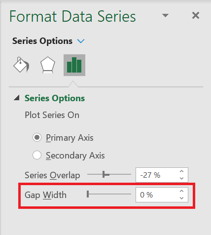
- Finally, make sure you set « interval width » for both data bars (target and achievement) to « 0% », you have the bar width based on the chart width.
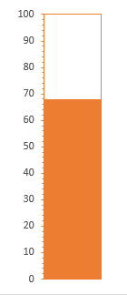
Your thermometer chart is ready to rock. You can also add a shape below your chart to make it look like a real thermometer.
3 Dynamic thermometer graph with different colors
Value Color Up to 40 Red < 70 and 40 YELLOW > 70 Green I used different colors for different levels.
So, let’s begin
-
- Enter the following data into your spreadsheet.
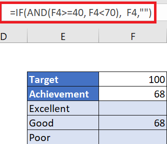
-
- Enter the target value (I’m using 100 here) and in the achievement cell, insert the actual achievement value.
- After that, we need to insert three simple formulas into the rest of the three cells (these formulas will display the realization value if it falls within their range).
- From Excellent: =IF(F4>= 70;F 4; » »)
- For good: =IF(AND(F4>=40 ;F4 <70);F4; » »)
- For Bad: = IF( F4<40 ; F4 ; « »)
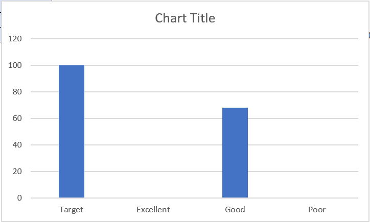
- Now select the target cells, excellent, good and bad and insert a histogram.
- At this point we have a chart like below with four bars but two of them have no value.
- After that, change « swap or Swap row/column ».
- Now we need to change three bars (Excellent, Good, and Bad) in the secondary axis. This is a bit tricky because you can’t easily select the bars that have a zero value, but I have a good solution for this.
- Select your chart ➜ Right-click ➜ Format Chart Area.
- Click the chart options drop-down menu and select « Excellent » Series.
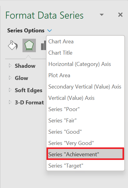
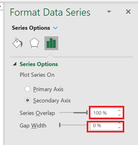
- Final touch:
- Match the axis unit values for both axes.
- Remove the chart title.
- Delete the secondary vertical axis and the horizontal axis.
- Add graduations.
Here is your thermometer chart.
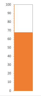
Creating a basic thermometer chart in Excel is simple. And, if you want to create this color-changing thermometer chart, you need a few extra steps, I hope you don’t mind.
HOW TO CREAT A BULLET CHART
BULLET CHART
Selecting a good chart type is one of the most difficult tasks.
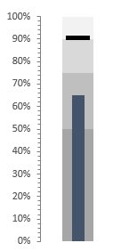
The bullet chart is one of those advanced Excel charts that you should learn to draw better. It’s a perfect chart to use when you need to present a single target point against your achievements.
According to Wikipedia: A bullet chart is a variation of a bar chart developed by Stephen Few . Apparently inspired by the traditional thermometer charts and progress bars found in many dashboards, the bullet chart replaces the dashboard’s gauges and meters.
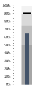
And in the article, I will share with you how to create a bullet chart in Excel in a few simple steps.
1 Components of a Bullet Chart
A bullet chart has three main components.
- Target Marker : A marker to represent the target. In the example above, I used 90% as the target. You can change the value as needed.
- Success bar : A single success bar to represent the actual value. This bar should be a solid color and slightly narrower than the color bars in the comparison range.
- Comparison Range : A comparison range of a color theme to use in the achievement bar background. The main idea behind using this range is to create a comparison for achievements, such as milestones.
2 Steps to Create a Bullet Chart
In the table below, you have three-part data that you can use to create a bullet chart. You can download this file to follow along.
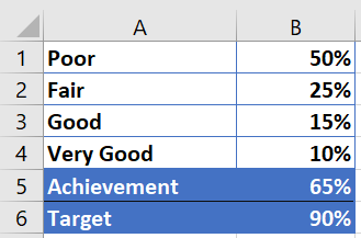
- The first four values are for the comparison range.
- The achievement value is for the achievement bar.
- The goal is for the target marker.
As I mentioned above, we have three main components in a bullet chart. So, you need to divide the whole process into several parts. The steps to create a bullet chart in Excel are a bit lengthy. But, once you understand the whole process, you will be able to create it in a few seconds.
3 Insert a column chart
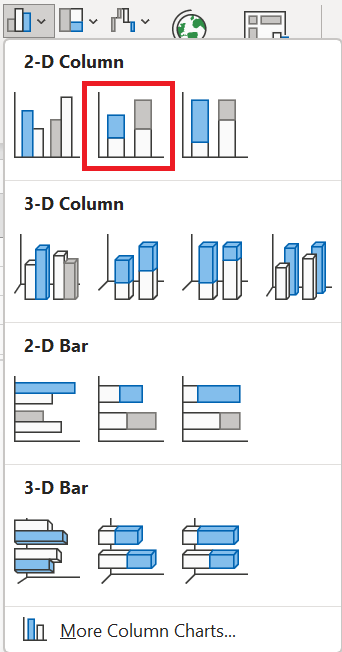
To create a bullet chart, you need to insert a 2-D column chart, a stacked column chart and here are the steps for that.
- First, select your data and insert a 2D histogram ( stacked histogram) from the insert tab.
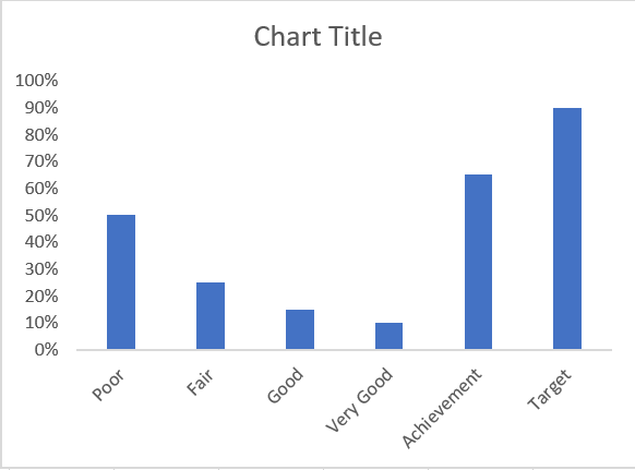
- You will get the six data values in your chart, like this.
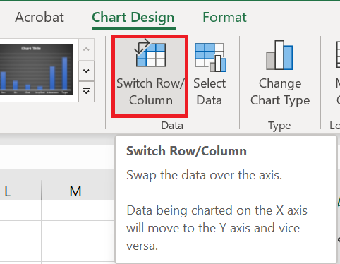
- After that, you need to swap the data in the chart. Select your chart and click » Swap Row/Column » in the Chart Creation tab of the ribbon.
- Make sure you have maximum axis values equal to 100%.
- Now you have a table like below.
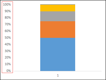
- Now let’s move on to the next step and create a target marker.
4 Make a target marker
Now you need to create a target marker that will look like a small horizontal line. Here are the steps.
-
-
- First, you need to select your target bar . (But, the chart is totally messed up right now and it’s hard to select the target bar).
-
Here’s the trick: Select your chart and from the format options, use this drop-down menu to select the target value.
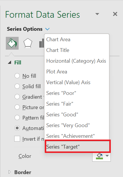
- Now go to the design tab and click on change chart type.
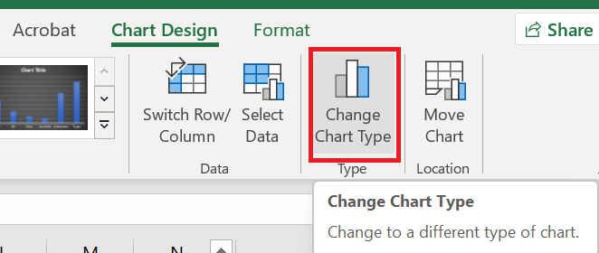
- Change the chart type for the target value to line chart with marker and check the corresponding secondary axis.
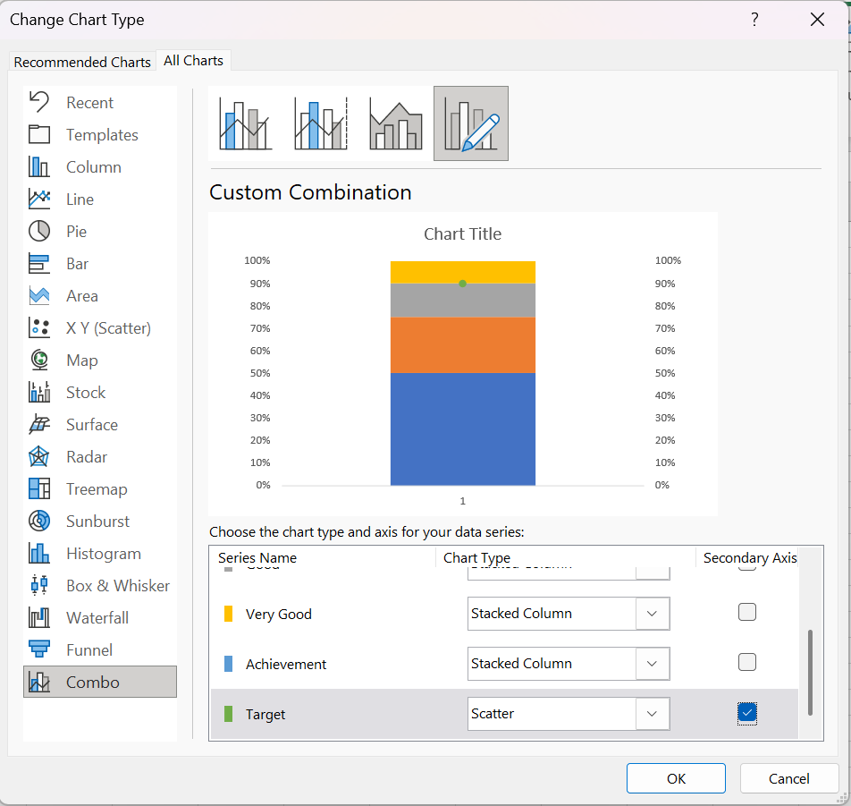
- At this point you have a small dot in your chart for the target.
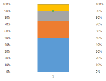
Now from here do the following things.
-
-
-
- Select this point and change the marker to a rectangular bar.
-
-
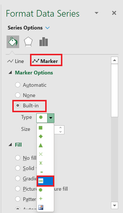
-
-
- Change the marker size to 20.
-
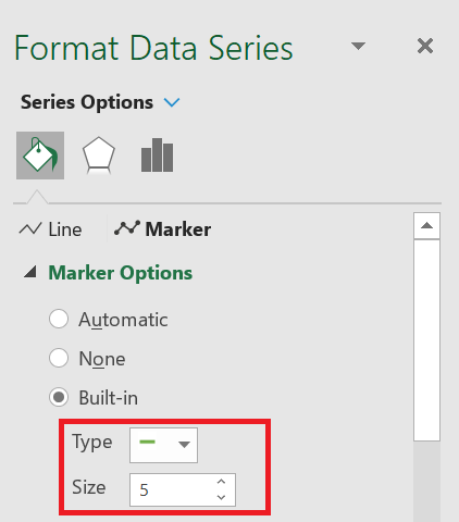
-
- Use a solid color for the fill (like black).
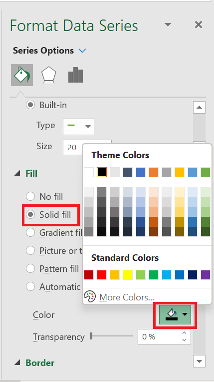
-
- No line for the border.
- Delete the secondary axis.
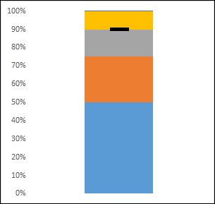
At this point you have a chart like above and next you need to make some changes to add an achievement bar.
5 Create an achievement bar
You need to create a success bar with a solid color to represent current success against the goal. Use the steps below.
- Select the achievement bar just as you selected the goal bar using the format options drop-down list.
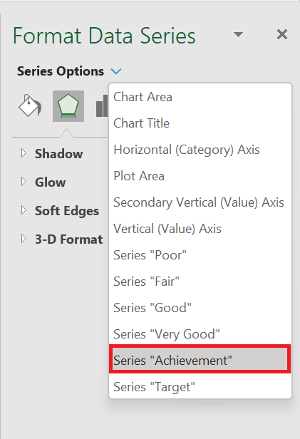
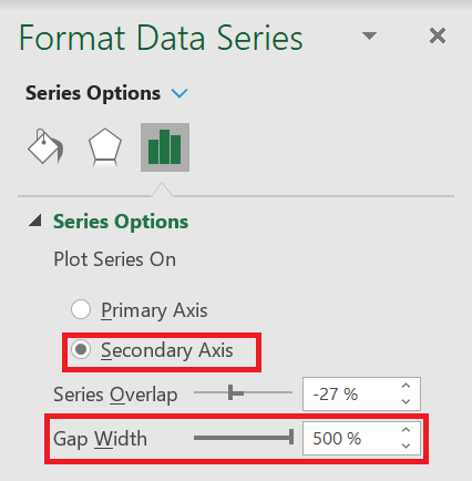
- Now go to series options and select secondary axis.
- Change the gap width to 500% for now.
- And, use a solid color for the achievement bar as a fill (like black or dark blue).
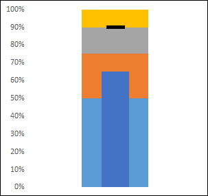
Your bullet chart is almost ready, all you need to do now is add a color theme for the comparison range.
6 Make a comparison range
To create a comparison range, you need to select a color and use four different shades of it. All you have to do is select them one by one and apply a color. I used four different shades of gray here.
You can also add formatting to your chart if you need to. One thing I forgot to tell you is that once you’re done with it, make sure to change the gap with the comparison range to 500% and the achievement bar to 220%.
Congratulations ! Your bullet board is ready.
7 Additional Information
-
-
- Make sure your marker width is larger than the achievement bar. This way, when you have more achievements than the target marker, it will be displayed correctly.
- Always use solid colors for the achievement bar and target marker.
- Use different shades of single color for comparison range.
- You can also use the same technique to create a horizontal bullet chart. Simply replace the column chart with a bar chart.
-
HOW TO CREAT A GRAPHIC PICTOGRAM
GRAPHIC PICTOGRAM
If you know how to present data in a clear and effective way, you can powerfully convey your message. One of my favorite things to do for this purpose is a pictogram. Creating a pictogram in Excel is quite simple and easy.
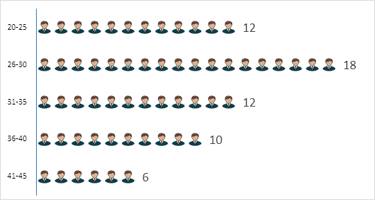
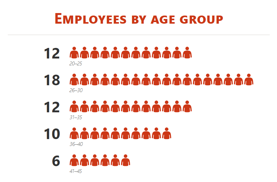
My idea is to present the number of employees of different age groups in a company.
1 Simple Steps to Create a Pictogram
We need to use the data below for this graph, you can download it here to follow . As I said, this is the total number of employees in a company by age and we don’t need to present these groups using this table.

But before we begin, we need an icon to use in this table and you can download it from a free icon site .
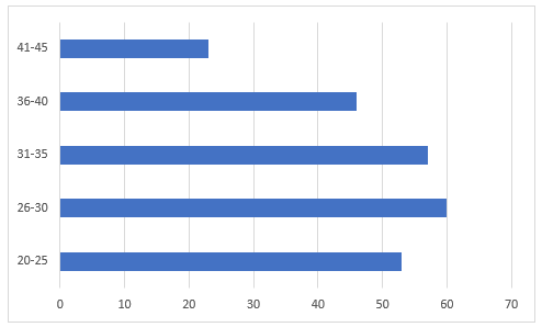
- First, simply select your data to create a bar chart. To do this, go to Insert ➜ Charts ➜ 2-D Clustered Bar Chart.
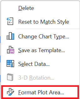
- After that, select the data bars in the chart and Right- click ➜ Format Data Series .
- From there, go to the “Fill” section and select the “Image or Texture Fill” option and once you do that, you will get an option to insert image.
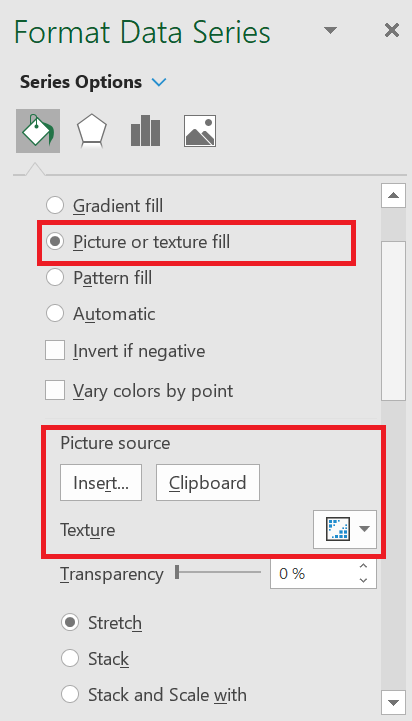
- Now it’s time to insert the image and we have three options for this. Click on the « insert » option and insert the image you downloaded .
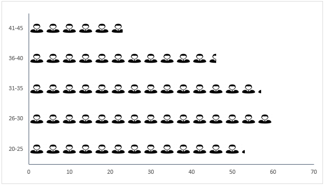
- Once you have inserted the image, you have three more options to display this image in the chart (Select the third option).
- Stretch – A single image will stretch in the data bar.
- Stack – You will get stacked images in the data bar.
- Stack and scale with – Images will be displayed according to the data.
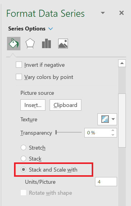
Note: There is an option to specify the unit/image for the chart. You can use this if the values per bar in your chart are large (more than 20). The point is that the image icons will become smaller with more numbers and this option helps in this case.
You can also use a different image for different bars, as I have used in the table below.
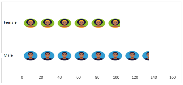
Select each data bar separately and insert an image one by one for all bars.
2 Dynamic pictogram
I always like to create interactive charts and this time I want to convert this PICTOGRAPH into a chart in which we can use the data dynamically.
Look at the data below where we have the data of employees of the same company, but by department and here we need to create a dynamic chart that we can use with the option button.
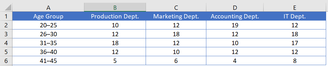
You can download this file to follow along and now use the steps below to create a dynamic pictogram.
- First , create a different table with two columns, like I did below.
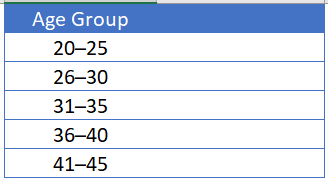
- Now, insert four radio buttons into your spreadsheet. To do this, go to the Developer tab ➜ Controls ➜ Insert ➜ Radio button .
- After that, connect these radio buttons with a cell. In my case, I connect them with cell A8. To do this, right- click on the radio button and select Format Control. In the Format Control dialog box, in the Control option, select cell A8 in the Linked Cell box and click OK.
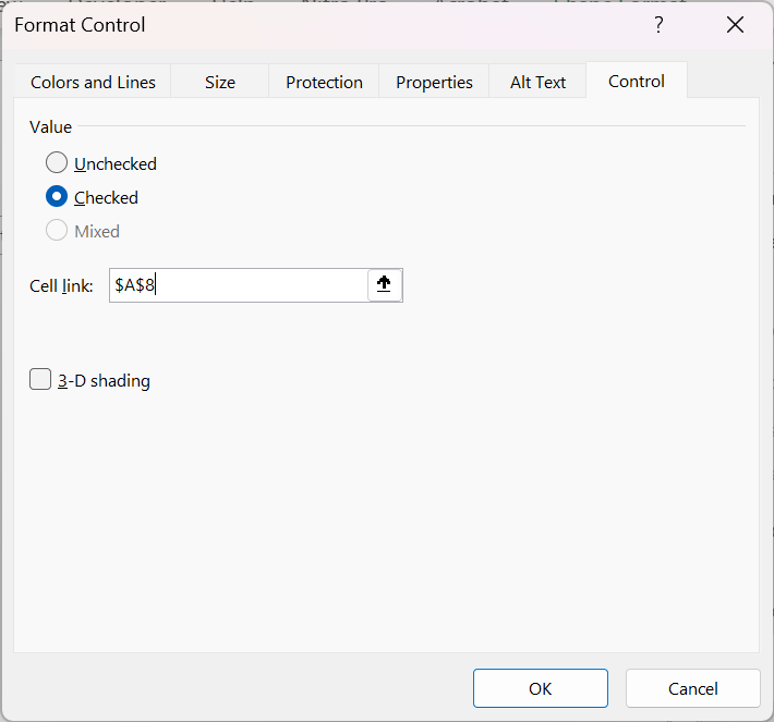
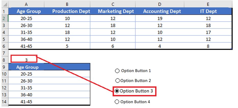
- Since we need to control the data (by department) with radio buttons, make sure to name all the buttons according to the department name.
- From there, insert the formula below in the first cell (header) through the last cell of the second column of the new table.
=VLOOKUP(A 9;Table 3[#All];$A$8+1;0)
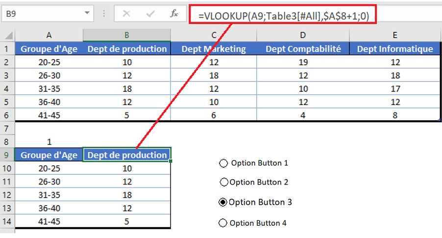
- At this point we have a dynamic table where we can get data using option buttons.
- Finally, select this table and insert a bar chart and convert it to a pictogram by following the steps you have learned.
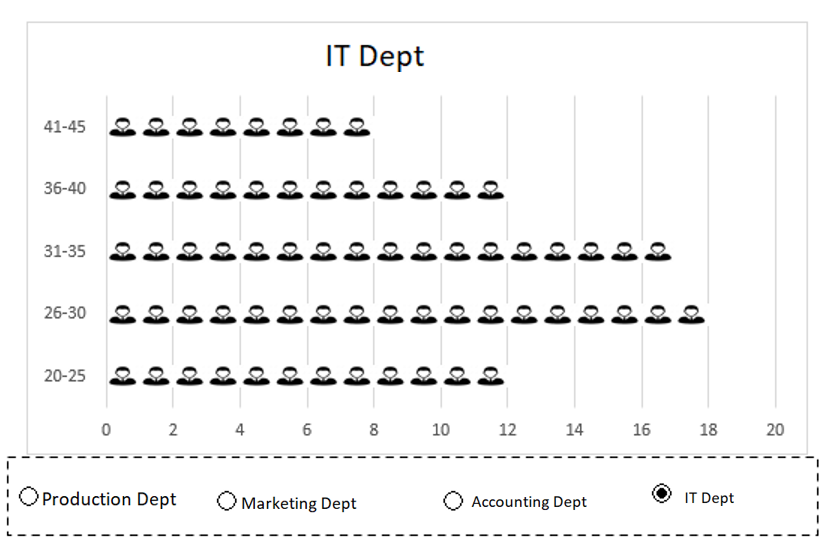
The pictogram is part of my list of advanced Excel charts . The best thing I like about this chart is that we can use any type of image in it, there are no limitations regarding this.
And you don’t have to worry about the image you added, it stays there in the clipboard. I’m sure this table will help you present your data better.
HOW TO CREAT A REATE PEOPLE GRAPH
PEOPLE GRAPH
I’ve always been fascinated by infographics and story-driven visuals. These kinds of things help me tell a story with data. A pictogram is a great example . But beyond that, there’s a chart in Excel that most of us aren’t aware of. This is called : People Graph
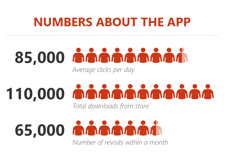
It was first introduced with Microsoft Excel 2013 to help people create infographics. In a people chart, instead of a column, bar, or line, we have icons to present the data. And it looks nice and professional.
1 Seven Steps to Inserting a People Chart
Creating a people chart in Excel is simple and easy; it only takes a few clicks. Here’s the data table I’m using.
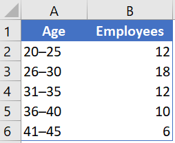
-
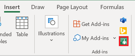
- First, go to Insert on the ribbon in the Add-in group and click on People graph, the little green button.
-
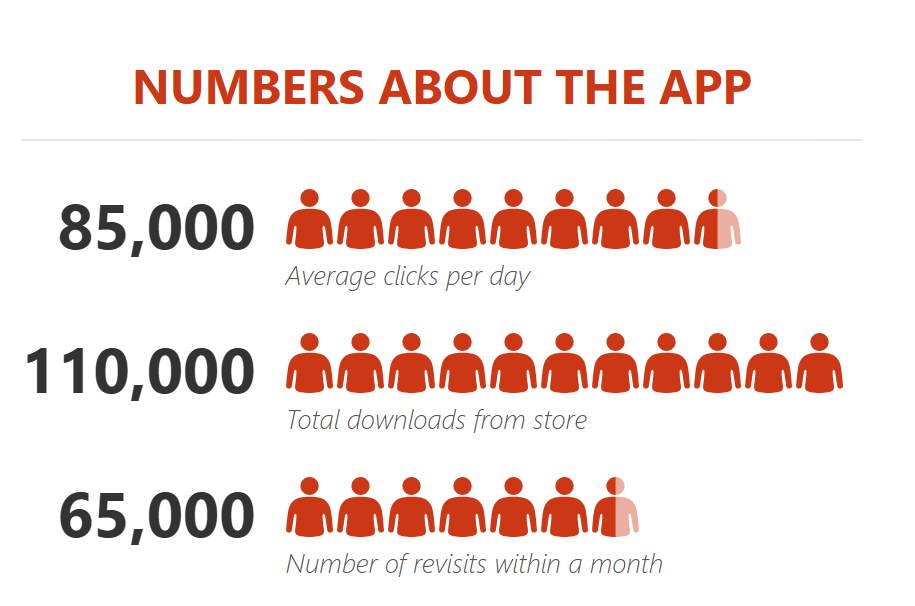
- It will insert a people chart with dummy data.
 3. Now your next step is to connect the data to the chart.
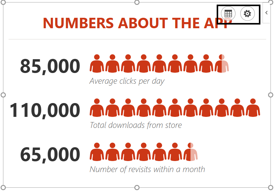
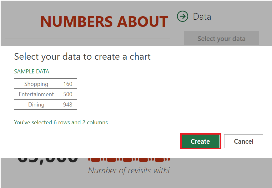
- Click the data icon, then click the button to select your data.
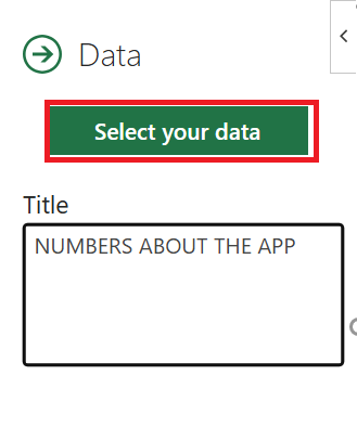
- Now select the data table( A1:B6) and click on the Create button.
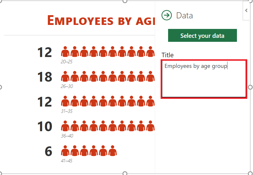
- The last thing is to all a title for your chart.
- Click the data icon again and replace the default title with the desired title.
Congratulations ! Your first infographic is ready to tell its story.
2 Customization and other options
As I said, it’s easy to insert a people chart. But, there are a few customization options that can be done after that.
1. Chart type
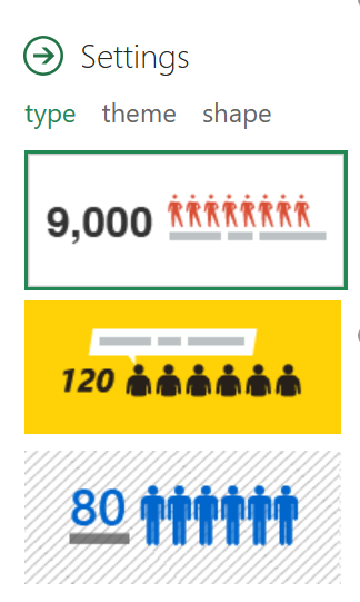
There are 3 predefined chart types we can use. Click the parameter button and select the type you want.
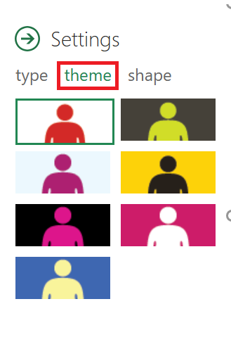
2. Theme
We can also use different themes for our chart. There are 7 predefined themes that we can use. Click the settings button and select the type you want.
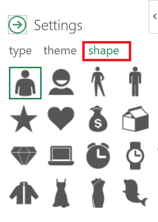
3. Shape (Icon)
We can’t use a single shape for all data types. That’s why there are 16 different shapes to choose from. Click the Settings button and select the shape you want.
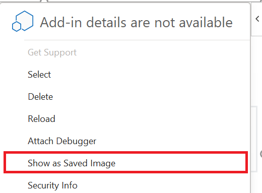
4. Save as image
There is an option to save it as an image. With this, we can use it further in PowerPoint, send it in an email, upload it to the web, etc.
5. More
- When updating a value in the source data, be sure to click once on the chart to update it.
- You can also paste it as an image into the spreadsheet by copy and paste.
Infographics are great for presenting data in a lively way. And I think creating a people chart in Excel is really fun.
-
HOW TO CREATE A TORNADO OR FUNNEL CHART
TORNADO OR FUNNEL CHART
An Excel tornado chart or funnel chart is useful for those who want to analyze their data for better decision-making. Its best use is for sensitivity analysis, but you can also use it for comparison purposes. That’s why it’s on our list of advanced charts for Excel.
1 What is a Tornado or Funnel Chart?
The Excel Tornado chart resembles a double-sided bar chart (resembling a tornado or funnel) in which you have two data bars opposite each other, making them easier to compare. As I mentioned, it’s a useful tool for sensitivity analysis, but you can also use it whenever you need to compare values.
2 Create a Funnel or Tornado Chart
In Excel, there is no default option to create a tornado chart, but you can use the default bar chart and customize it. In this article, we will learn how to create it.
Make sure to download this sample file to follow along. To create a funnel or tornado chart in Excel, you need to follow the steps below:
-
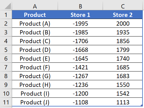
- First, you need to convert the data in Shop1 to a negative value. This will help you display the data bars in different directions. To do this, simply multiply it by -1.
-
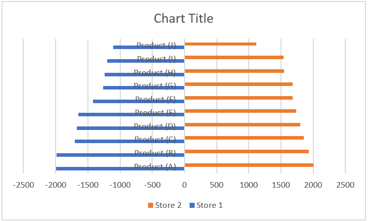
- After that, insert a bar chart using this data. Go to Insert tab ➜ Charts ➜ Bar Chart and with this, you will get a bar chart like below where you have two sides (one side is for positive values and the other is for negative values).
-
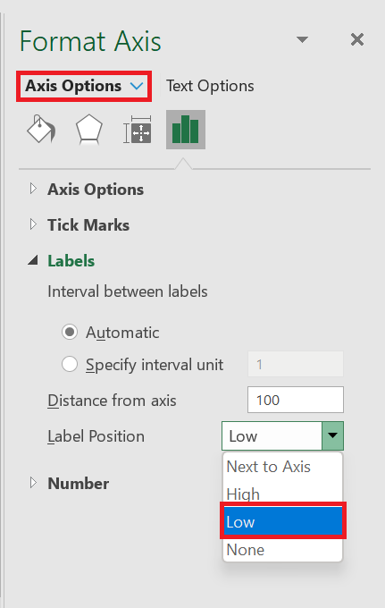
- From there, select the axis label and open the formatting options and in the formatting options, go to Axis options ➜ Labels ➜ Label position . Change the label position to » Bottom « .
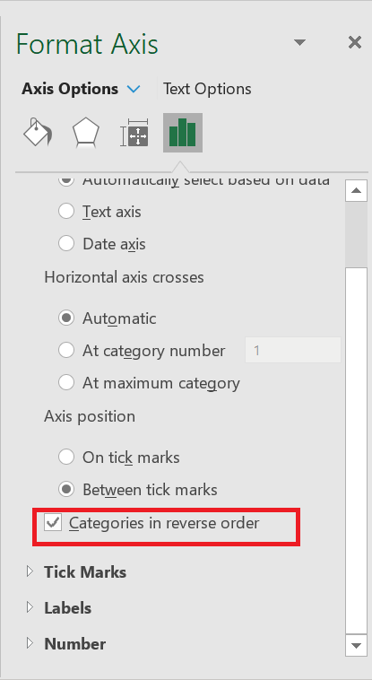
- Next, you need to change the axis position in reverse order. This will adjust the bars on both sides, and to do this, go to Axis Options ➜ Axis Position ➜ check « X-axis in reverse order ».
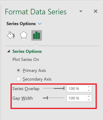
- Now you need to change the series gap and gap width. This will help streamline the data bars with each other and for this go to Series Options -> Change Series Overlap to 100% and Gap Width to 10%.
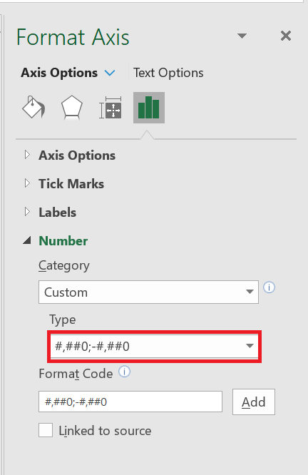
- to change the formatting of the numbers on the horizontal axis. And for that, go to Axis Options ➜ Number ➜ select Custom ➜ Paste the following format and click add.
- Finally, just like the step above, you need to change the data label format for Shop 1 so that it does not display negative signs. Enable the data label then go to label option ➜ Number ➜ select customize ➜ paste the following format and click add.
- From there, select the axis label and open the formatting options and in the formatting options, go to Axis options ➜ Labels ➜ Label position . Change the label position to » Bottom « .
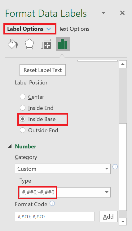
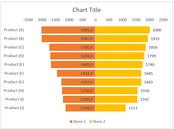
You now have your first tornado graph in your spreadsheet, like below.
You can also create a dynamic chart range for your chart so that you don’t have to update it again and again when you need to update the data.
3 Create a Funnel or Tornado Chart Using Conditional Formatting
Unlike how we used the method above, you can also use conditional formatting. To create a tornado chart with conditional formatting:
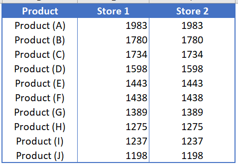
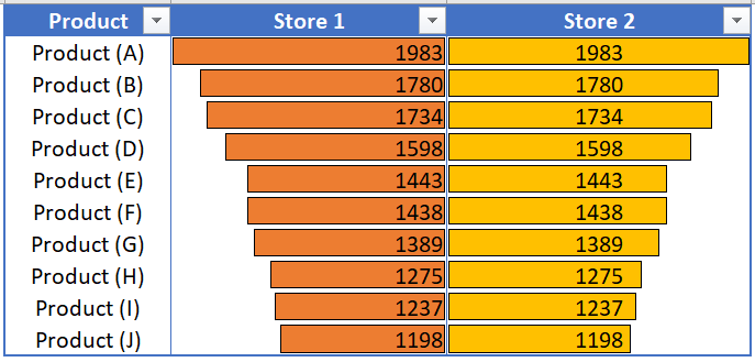
- You just need to plot your data as I have in the snapshot below. As you can see, you have data for both stores (Store 1 and Store 2) in the table.
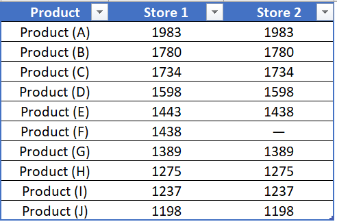
- So first, align the column of magazine 1 to the right and the column of magazine 2 to the left.
- The next thing is to create conditional formatting. You need to apply it to both columns one by one.
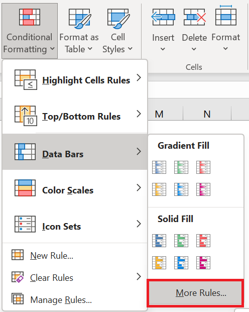
- From there, select the 1 column store and go to Home tab ➜ Styles ➜ Conditional Formatting ➜ Data Bars ➜ Other Rules .
- In the « other rules » dialog box, you need to define the following items to create data bars:
- Color: Any color you want.
- Border: Solid (if desired)
- Orientation: right to left.
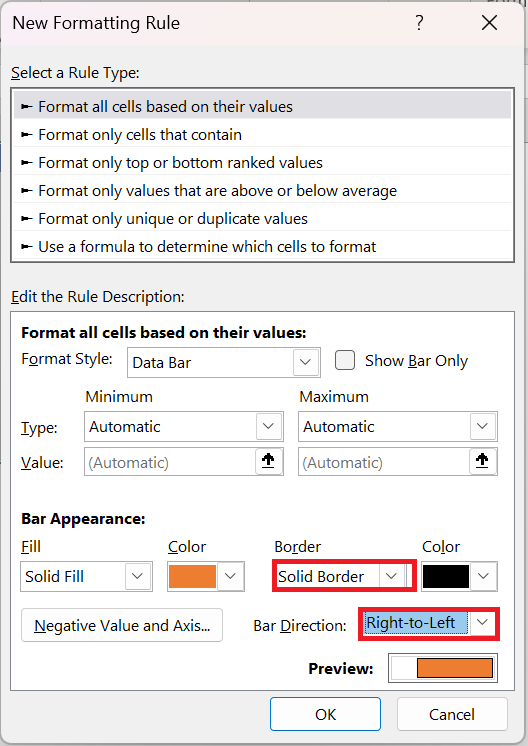
- After that, click OK to apply the data to the Store 1 column.
- The next thing you need to do is apply a bar to store 2 columns using the same method you used for the second one. Simply select the column and apply the data bars from the additional rules, using the settings below:
- Color: Any color you want
- Border: Solid (if desired)
- Orientation: left to right.
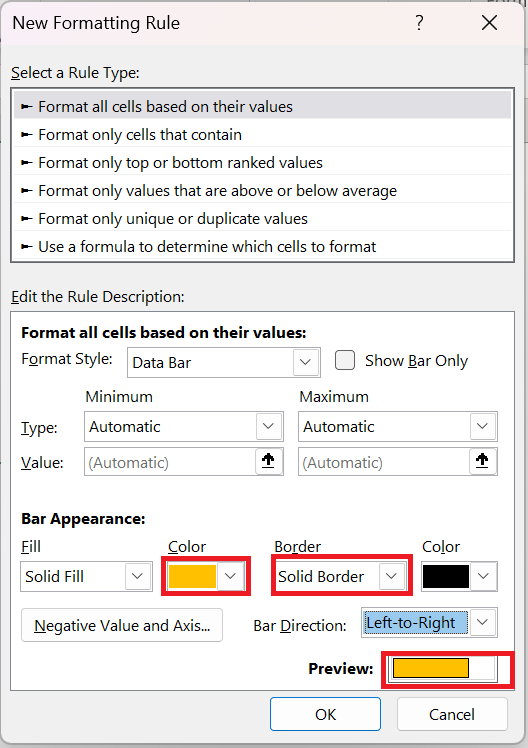
- At this point, you have a table containing a tornado chart to which you have applied data bars with conditional formatting.
4 Use the REPT( ) function to create a Tornado graph
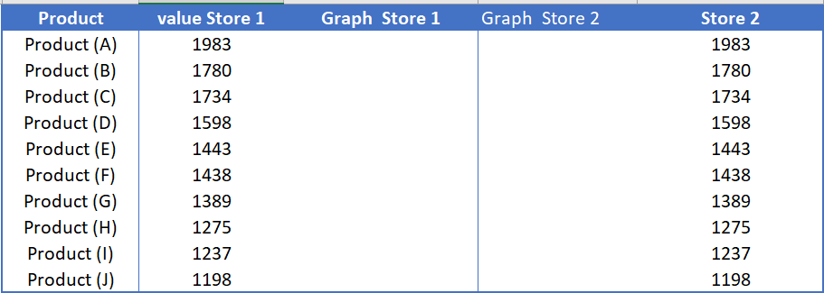
But, there is one more thing we can try, and that is the REPT( ) function . To create a TORNADO chart with the REPT( ) function , you can follow the steps below:
-
-
- First, you need to set up your data as we did in the snapshot below. Here, you have one column with product names and two columns for each store (one for values and the second for values).
-
-
-
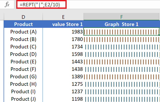
- From here we need to insert the REPT function in the data bar column of store 1 and for this insert the formula below in the first cell and drag it to the last cell . =REPT(« | »;E2/10)
-
-
-
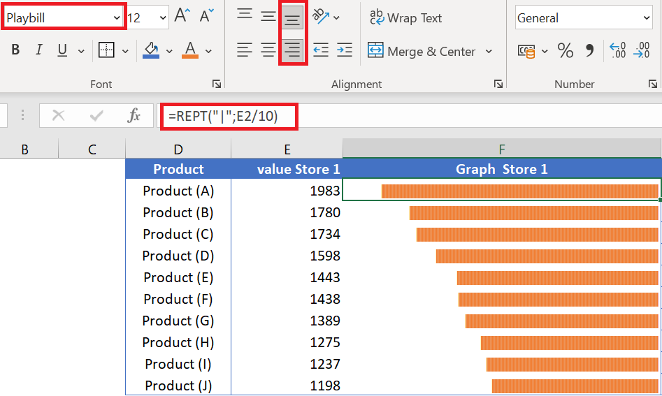
- After that, select the entire column and change the following:
- The « Playbill » font (with this font you can have a data bar look).
- Change the column width to the largest data bar or larger.
- Change the font color to orange.
- Change text alignment from right to left.
-
- Next, you need to follow the same method to add data bars to the Store2 column and change the following:
- The font is » PlayBill » (with this font you can have a data bar look).
- Change the column width to the largest data bar or larger.
- Add a font color
- Change text alignment from left to right.
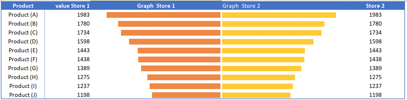
Some people call these tornado diagrams, a useful tool for comparative decision making. You can compare two different items or a single item for different time periods.
-
HOW TO CREATE A POPULATION PYRAMID CHART
POPULATION PYRAMID CHART
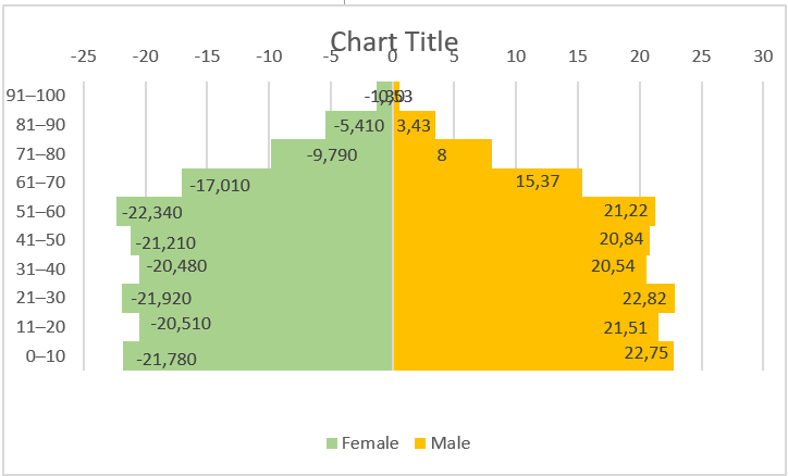
A population pyramid chart is a specific chart that helps us present and analyze the population of both sexes using age groups.
A population pyramid, also called a population chart, is a graphical illustration that shows the distribution of different age groups in a population, which forms the shape of a pyramid as the population increases. In Excel, we can create a population pyramid chart using a bar chart, as shown below.
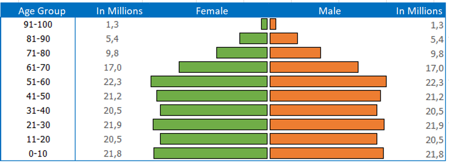
To create a pyramid chart, click on the Insert tab on the ribbon, then Insert Bar Chart, then do a little customization, that’s it.
But here’s the twist. I discovered that apart from this traditional method, we can also use two different methods. And today, in this article, I would like to share these three methods [exact steps] with you. So, let’s get started.
1 Simple Steps to Create a Population Pyramid Chart Using a Bar Chart
Before creating this graph, we need to prepare the data. A table with the total population, the female population in negative values, and the male population in positive values.
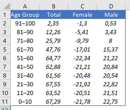
Note : The column for total population is not mandatory but make sure you have a negative female population.
- First, we need to insert a bar chart. To do this, select the age group, female and male data columns and insert a bar chart from the Insert ➜ Charts ➜ 2D Bar ➜ Grouped Bar tab .
- Now we have a graph like below and further we need to customize it to create a population pyramid.
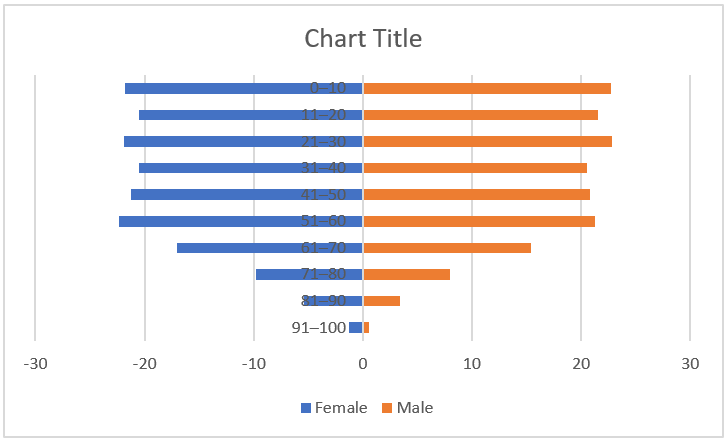
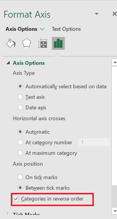
- From here we need to create a vertical axis in reverse order and go to Format Axis ➜ Axis Options ➜ Axis Position ➜ check « Abscissa in reverse order ».
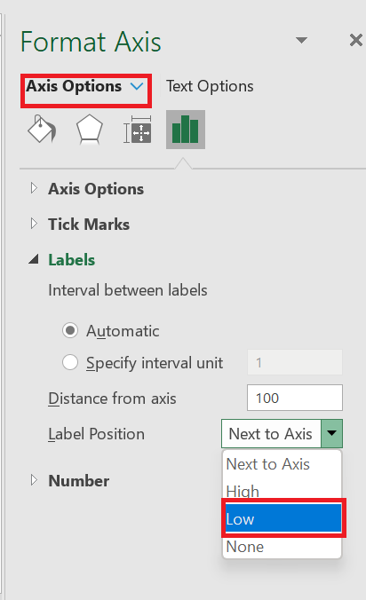
- After that, go to Format Axis ➜ Axis Options ➜ Labels ➜ change the label position to “ Bottom ” .
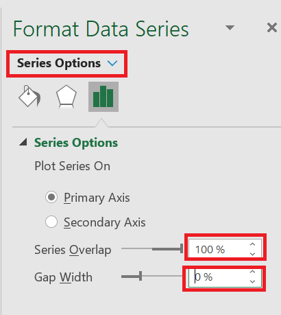
- Next, we need to change the series overlap to 100% and the range width to 0%. To do this, go to Format Axis ➜ Series Options.
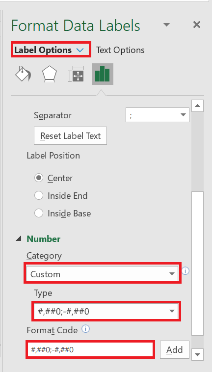
- Finally, we need to convert the negative data labels for the female data bar to positive. To do this, select the data labels and go to Format Data Labels ➜ Label Options ➜ Number and select Custom from the category and add in the format « ###0.00;###0.00 ».
Our pyramid chart is ready to flip.
2 Use conditional formatting to easily create a pyramid chart
We can also create a pyramid chart using conditional formatting and here are the steps to do so.
- First, create a table with data on the male and female population with age groups.
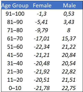
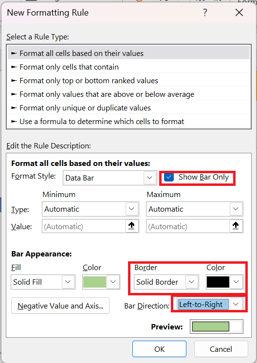
- male or female column and apply conditional formatting data bars from Home tab ➜ Styles ➜ Data Bars ➜ Other Rules .
- After that, in the new formatting dialog box, check the « Show bar only » box, add a solid border and change the direction or orientation of the bar (female and male bars should be in the opposite direction).
- Now select the second data column and add data bars to it in the same way, and you will get a pyramid chart like below.
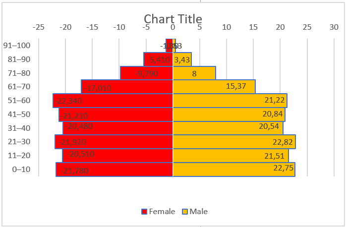
- Finally, for a finishing touch, add two columns on both sides of the chart to add data labels.
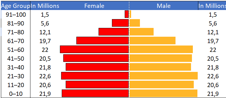
3 Create a population pyramid chart in the cell
I’m a big fan of the REPT( ) function and the best thing is that you can use it to create a simple population pyramid.
- First, create a table like below.
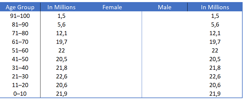
- Now add the formula below in the female and male columns and drag it down.
Female column := IFERROR(REPT(« | »;$F4*8); » »)
Male column: =IFERROR(REPT(« | « ;$ I4*8); » »)
- After that change the font style to Playbill (Font Size – 10) or you can also use Stencil (Font Size – 10).
- Finally, change the font color for both columns and align the female column to the right and the male column to the left.
The painting is ready.
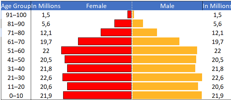
You might be wondering that a pyramid chart is only for demographic data, but the truth is you can use it for all kinds of data.