Votre panier est actuellement vide !
Étiquette : data_analysis
FREQUENCY Function in Excel
✅ What Is the FREQUENCY Function?
The FREQUENCY function in Excel counts how often values occur within a range of values (called « bins »). It returns a vertical array of numbers that show the count of items falling into each bin.
Syntax
=FREQUENCY(data_array, bins_array)
- data_array: The range or array of numbers to analyze.
- bins_array: The intervals that group the values.
⚠️ Important: This is an array formula. In older versions of Excel (before 365/2021), you must press CTRL + SHIFT + ENTER (or CMD + SHIFT + ENTER on Mac). In Excel 365+, it’s automatically handled.
Examples and Test Data
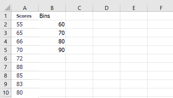
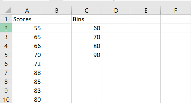
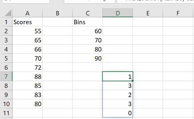
Example #1: Exam Scores
Steps:
- Select 5 vertical cells (one more than number of bins).
- Use this formula:
=FREQUENCY(A2:A10, C2:C5)
- Press CTRL+SHIFT+ENTER (older Excel) or just Enter (Excel 365+).
- Result:
Interval Frequency <=60 1 61–70 3 71–80 1 81–90 4 >90 0 Example #2: Children’s Heights
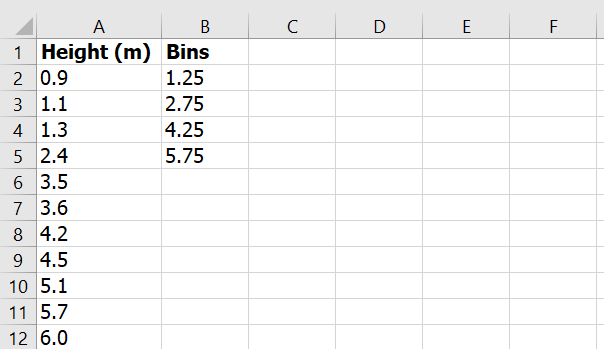
Steps:
=FREQUENCY(A2:A12, C2:C5)
Result:
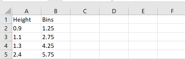
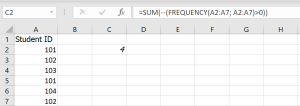
Range Frequency <=1.25 2 1.26–2.75 2 2.76–4.25 3 4.26–5.75 3 >5.75 1 Example #3: Count Unique Failed Students
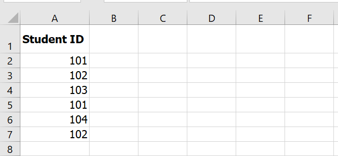
Formula:
=SUM(–(FREQUENCY(A2:A7, A2:A7) > 0))
Explanation:
- FREQUENCY(…, …) > 0 identifies which IDs are unique.
- — converts TRUE/FALSE to 1/0.
- SUM(…) adds them up.
✅ Result: 4 unique failed students
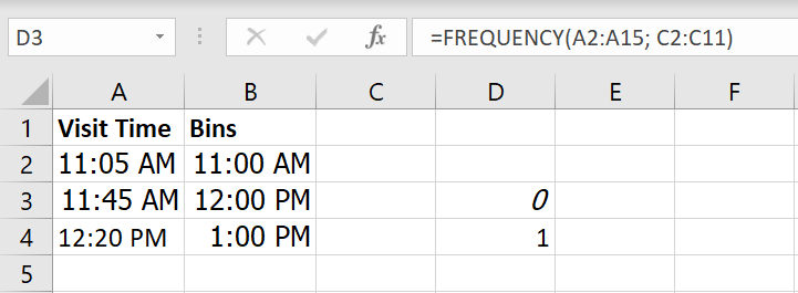
Example #4: Store Visit Frequency (Hourly)
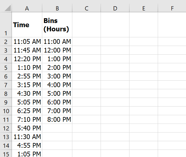
Formula:
=FREQUENCY(A2:A15, C2:C11)
✅ Result: Frequencies of visits within each 1-hour window.
Sample Data to Use in Excel
Here’s how you can set up the data in your Excel workbook:
Sheet1 – Exam Scores
Sheet2 – Heights
Sheet3 – Failed Students
Sheet4 – Store Visits
Summary: Key Notes
- Always select N+1 cells where N = number of bins.
- Use CTRL + SHIFT + ENTER in older Excel versions.
- FREQUENCY helps group values: marks, ages, times, etc.
- It returns an array of frequencies.
- Best used for distributions, surveys, or trend analysis.
Lognormal Distribution in Excel – Detailed Explanation
The lognormal distribution is used in statistics to model a random variable whose logarithm is normally distributed. In Excel, this is easily calculated using the LOGNORM.DIST function. Below is a more detailed explanation, including the syntax, steps to use it, and a sample dataset for testing.
Syntax of LOGNORM.DIST Function
The LOGNORM.DIST function returns the lognormal distribution of a value x with a given mean and standard deviation for the natural logarithm of the value.
Formula:
=LOGNORM.DIST(x, mean, standard_dev, cumulative)
Arguments:
- x: The value for which you want to calculate the lognormal distribution. (Must be greater than zero)
- mean: The arithmetic mean of the natural logarithm of x.
- standard_dev: The standard deviation of the natural logarithm of x.
- cumulative: A logical value that determines the form of the function:
- TRUE: Returns the cumulative distribution function (CDF).
- FALSE: Returns the probability density function (PDF).
What is CDF and PDF?
- CDF (Cumulative Distribution Function): It gives the probability that a random variable will take a value less than or equal to x.
- PDF (Probability Density Function): It gives the probability of the random variable being equal to a specific value.
How to Use LOGNORM.DIST in Excel:
Step-by-Step Example:
Let’s calculate the lognormal distribution using a sample dataset.
Step 1: Create the Data
Consider the following data of stock prices:
Stock Price (x) Mean (ln(x)) Standard Deviation (ln(x)) 8 2.08 0.85 4 1.39 0.61 10 2.30 0.92 Step 2: Calculate the Natural Logarithm of Stock Prices (ln(x))
Use the LN() function in Excel to get the natural logarithm of each stock price.
- For x = 8, =LN(8) gives 2.08.
- For x = 4, =LN(4) gives 1.39.
- For x = 10, =LN(10) gives 2.30.
Step 3: Calculate the Mean and Standard Deviation of ln(x)
Now, calculate the mean and standard deviation of the ln(x) values:
- Mean (µ):
- =AVERAGE(B2:B4) –> Mean = 1.92
- Standard Deviation (σ):
- =STDEV.S(B2:B4) –> Standard Deviation = 0.53
Step 4: Use the LOGNORM.DIST Function
Now, calculate the lognormal distribution for each stock price using the formula LOGNORM.DIST(x, mean, standard_dev, cumulative).
- For x = 8 (Cumulative Distribution):
- =LOGNORM.DIST(8, 1.92, 0.53, TRUE)
Result: 0.8815 (Cumulative Distribution)
- For x = 8 (Probability Density Function):
- =LOGNORM.DIST(8, 1.92, 0.53, FALSE)
Result: 0.1246 (Probability Density Function)
Testing with a Sample Dataset:
To demonstrate the function, let’s use a sample dataset for testing:
Stock Price (x) Mean (ln(x)) Standard Deviation (ln(x)) Cumulative (TRUE) PDF (FALSE) 10 2.30 0.92 =LOGNORM.DIST(10, 2.30, 0.92, TRUE) =LOGNORM.DIST(10, 2.30, 0.92, FALSE) 5 1.61 0.50 =LOGNORM.DIST(5, 1.61, 0.50, TRUE) =LOGNORM.DIST(5, 1.61, 0.50, FALSE) 15 2.71 1.10 =LOGNORM.DIST(15, 2.71, 1.10, TRUE) =LOGNORM.DIST(15, 2.71, 1.10, FALSE) Key Takeaways:
- LOGNORM.DIST is a useful function for financial analysis, especially when analyzing stock prices or option pricing (e.g., Black-Scholes model).
- The function is available in Excel 2010 and later versions.
- The cumulative distribution gives the probability of a value being less than or equal to x, while the probability density gives the likelihood of the variable being exactly x.
- The LOGNORM.DIST function helps in handling data that follows a skewed distribution, making it more accurate than using a normal distribution for such data.
Errors to Watch Out For:
- #VALUE!: If non-numeric values are used as arguments.
- #NUM!: If x is less than or equal to 0, or if the standard deviation is non-positive.
- Ensure that the arguments for x, mean, and standard_dev are numeric.
Conclusion:
The LOGNORM.DIST function simplifies the calculation of lognormal distributions in Excel, providing a quick and easy way to analyze data that follows a log-normal distribution. It is a vital tool in fields such as finance, medical data analysis, and real estate.
Chi-Square Test in Excel – Detailed Overview
The Chi-Square test is a statistical method used to evaluate whether there is a significant association between observed data and expected data under a specific hypothesis. This test can be used to determine whether two categorical variables are independent or if they follow a specific distribution.
Here, we’ll dive into two common types of Chi-Square tests and provide examples, including how to perform these tests using Excel.
Chi-Square Test for Independence:
This test helps to determine whether two categorical variables are independent of one another. For example, a restaurant manager may want to know if the quality of service (rated by customers as excellent, good, or poor) is dependent on customers’ salary categories (low, medium, or high).
Steps for Performing Chi-Square Test for Independence:
- Formulate the Hypotheses:
- H0 (Null Hypothesis): The variables are independent.
- H1 (Alternative Hypothesis): The variables are dependent.
- Create a Contingency Table:
A contingency table contains the observed frequencies, which show the count of occurrences for each combination of categories. - Calculate Expected Frequencies:
The expected frequency for each cell is calculated based on the marginal distribution of the data using the formula:
Expected Frequency=(Row Total×Column Total)Total Sample Size\text{Expected Frequency} = \frac{(\text{Row Total} \times \text{Column Total})}{\text{Total Sample Size}}
Calculate the Chi-Square Statistic:
The Chi-Square statistic is calculated using the formula:χ2=∑(O−E)2E\chi^2 = \sum \frac{(O – E)^2}{E}
Where:
-
- OO is the observed frequency.
- EE is the expected frequency.
Calculate Degrees of Freedom:
The degrees of freedom are calculated as:Degrees of Freedom=(r−1)(c−1)\text{Degrees of Freedom} = (r – 1)(c – 1)
Where rr and cc are the number of rows and columns in the table.
Calculate the P-Value:
The p-value indicates the significance of the results. If the p-value is less than 0.05, we reject the null hypothesis.Example:
Let’s say a restaurant manager is testing whether the quality of service depends on customers’ salary levels. She collects data in a contingency table showing how many customers with low, medium, or high salary rated the service as excellent, good, or poor.
- Expected Frequencies: These can be calculated using the formula mentioned above.
- Chi-Square Calculation: Using the Chi-Square formula, calculate the chi-square statistic.
- P-Value: Use the CHITEST function in Excel to calculate the p-value.
- If the p-value is less than 0.05, we reject H0, meaning the quality of service is dependent on the salary of the customers.
Chi-Square Goodness of Fit Test:
The Chi-Square goodness of fit test is used to determine if a sample matches a population distribution. It is commonly used to test if the observed distribution fits an expected distribution, such as determining if data follows a normal distribution.
Formula for the Goodness of Fit Test:
The formula for calculating the Chi-Square statistic in a goodness of fit test is:
χ2=∑(Oi−Ei)2Ei\chi^2 = \sum \frac{(O_i – E_i)^2}{E_i}
Where:
- OiO_i is the observed frequency.
- EiE_i is the expected frequency.
Example:
A furniture company wants to test if the number of furniture items in different sections of a warehouse is evenly distributed. Suppose they have data showing how many items of each type (e.g., chairs, tables, sofas) are in each hall. The expected value for each category is 250 items, as the total number of items is divided equally across the halls.
- Calculate the expected frequencies for each category.
- Perform the Chi-Square calculation and compare the result with the critical value.
- If the calculated Chi-Square value exceeds the critical value, reject the null hypothesis, indicating that the distribution is not uniform.
Performing the Chi-Square Test in Excel:
In Excel, you can easily perform the Chi-Square test using built-in functions. Here’s how you can do this step-by-step:
Steps to Perform Chi-Square Test in Excel:
- Input Your Data:
Enter your observed data into a table in Excel. - Calculate Expected Frequencies:
Use Excel formulas to calculate the expected frequencies based on your data. - Calculate the Chi-Square Statistic:
In each cell of the table, apply the formula:
Chi-Square Points=(O−E)2E\text{Chi-Square Points} = \frac{(O – E)^2}{E}
Then, sum all the values to get the total Chi-Square statistic.
- Find the Critical Value:
You can either use a Chi-Square critical value table or Excel’s CHISQ.INV.RT function to calculate the critical value, using the degrees of freedom and the significance level (typically 0.05). - Calculate the P-Value:
Use the CHITEST function to calculate the p-value for your data:
=CHITEST(observedrange,expectedrange)=CHITEST(observed_range, expected_range)
If the p-value is less than 0.05, you can reject the null hypothesis.
Example Database for Testing:
To test these concepts, you can use a dataset showing the distribution of different types of furniture (e.g., chairs, tables, sofas) across different halls. Here’s a sample dataset:
Type of Furniture Hall A Hall B Hall C Hall D Total Chairs 92 85 98 90 365 Tables 60 70 58 61 249 Sofas 98 92 100 88 378 Others 50 60 45 40 195 Total 250 250 250 250 1000 - Use Excel formulas to calculate expected values.
- Perform the Chi-Square calculation for each cell.
- Sum up the values to get the total Chi-Square statistic.
- Compare the calculated value with the critical value to determine if the null hypothesis should be rejected.
Performing the Test in Excel:
- Enter your data in Excel.
- Use the CHITEST or CHISQ.TEST function to calculate the p-value.
- Compare the p-value with the significance level (usually 0.05). If it’s less than 0.05, reject the null hypothesis.
Summary:
The Chi-Square test in Excel is a powerful tool for analyzing categorical data and testing hypotheses about the independence or distribution of variables. By using functions like CHITEST or CHISQ.TEST, you can easily calculate the Chi-Square statistic and p-value, allowing you to determine whether your data follows the expected distribution or if two variables are related. Make sure to set up your data correctly, calculate expected frequencies, and use Excel’s functions to perform the test efficiently.
- Formulate the Hypotheses:
P-Value in Excel: A Comprehensive Guide with Practical Examples and Data Set
Introduction to P-Value
The P-Value is an essential statistical measure used to evaluate the significance of results in data analysis, especially in regression and correlation analysis. It helps assess whether the observed relationship or difference between two data sets is statistically significant or if it occurred by chance.
The P-Value plays a crucial role in hypothesis testing, where we aim to determine whether to accept or reject the null hypothesis. In this article, we will dive into how to calculate and interpret the P-Value in Excel, providing you with practical examples and a data set so you can test the results yourself.
What is the P-Value?
The P-Value is a statistical metric used to test the null hypothesis (H₀) in hypothesis testing. It helps determine whether there is enough evidence to reject the null hypothesis.
- If the P-Value is less than 0.05, it indicates that the observed difference or relationship is statistically significant, and we reject the null hypothesis.
- If the P-Value is greater than 0.05, we fail to reject the null hypothesis, suggesting that any observed difference could be due to random chance.
Calculating the P-Value in Excel: Methods and Functions
T.TEST Function
The T.TEST function in Excel is one of the easiest ways to calculate the P-Value. It allows you to compare two data sets and perform a t-test to test the null hypothesis.
Syntax of T.TEST:
=T.TEST(array1, array2, tails, type)
- array1: Range of data for the first sample
- array2: Range of data for the second sample
- tails: Type of test (1 for a one-tailed test, 2 for a two-tailed test)
- type: Type of t-test (1 for paired, 2 for equal sample sizes, 3 for unequal sample sizes)
Practical Example 1: Comparing Scores Before and After an Intervention
Let’s use a dataset with test scores before and after an intervention. We will use the T.TEST function to test if the intervention had a significant effect on the scores.
Data:
Student Before After 1 50 55 2 60 65 3 45 50 4 55 58 5 48 52 We want to test the hypothesis that the intervention improved scores. The formula in Excel would be:
=T.TEST(B2:B6, C2:C6, 1, 2)
This will return the P-Value, which will allow us to determine if the improvement is statistically significant.
Using the Analysis ToolPak
The Analysis ToolPak in Excel is an advanced feature that makes it easier to perform statistical tests, including t-tests. Here’s how to use it for calculating the P-Value:
- Activate Analysis ToolPak:
- Go to File > Options > Add-ins > Manage > Excel Add-ins > Analysis ToolPak and check it.
- Select the T-Test:
- Go to the Data tab, click on Data Analysis, and select t-Test: Paired Two Sample for Means.
- Enter Data Ranges:
- Variable 1 Range: Data for before the intervention.
- Variable 2 Range: Data for after the intervention.
- Alpha: 0.05 (significance level).
- Output Range: Cell to display results.
The tool will calculate the P-Value and display it in the chosen output range.
T.DIST Function
The T.DIST function is used when you already have the test statistic and degrees of freedom, and you want to obtain the associated P-Value.
Syntax:
=T.DIST.RT(x, degrees_freedom)
- x: The test statistic value.
- degrees_freedom: The degrees of freedom (usually n-1).
Practical Example with a Data Set
To better understand the P-Value calculation, let’s create a fictional dataset and apply the methods discussed.
Data on Students’ Scores Before and After a Test
Student Before After 1 52 58 2 48 53 3 60 66 4 55 59 5 47 51 6 62 67 7 55 59 8 49 53 9 50 56 10 51 55 Objective: Test if the intervention led to a significant improvement in the scores.
Calculation with T.TEST:
Use the T.TEST function to compare the results before and after the intervention:
=T.TEST(B2:B11, C2:C11, 1, 2)
This will give a P-Value, which can help us determine if the intervention had a statistically significant effect.
Analysis:
- If the P-Value is less than 0.05, we reject the null hypothesis, indicating that the intervention had a significant effect.
- If the P-Value is greater than 0.05, we accept the null hypothesis, suggesting no significant effect.
Using the Analysis ToolPak:
- Select t-Test: Paired Two Sample for Means.
- Enter the data ranges.
- Obtain the P-Value in the output range.
Interpreting Results
T-Test Results
After calculating the P-Value using different methods, here’s how to interpret the results:
- P-Value < 0.05: Reject the null hypothesis, indicating that the intervention had a significant effect on students’ scores.
- P-Value ≥ 0.05: Accept the null hypothesis, suggesting no significant difference between the scores before and after the intervention.
Important Things to Remember
- The P-Value always ranges between 0 and 1, and the smaller the value, the more likely it is that the results are not due to random chance.
- Hypothesis testing is crucial: Make sure to define both the null and alternative hypotheses before conducting your analysis.
- The Analysis ToolPak simplifies complex statistical tests and is especially useful for users unfamiliar with Excel’s advanced functions.
Conclusion
Calculating the P-Value in Excel is an essential skill for performing statistical analyses. By using functions like T.TEST, T.DIST, or the Analysis ToolPak, you can easily perform hypothesis tests to determine if your data supports a claim. With the provided dataset, you can practice these methods and enhance your understanding of hypothesis testing in Excel.
FAQ (Frequently Asked Questions)
Q1. Can the P-Value be negative?
No, the P-Value is always positive and cannot be less than 0 or greater than 1.Q2. What does a weak or strong P-Value mean?
A weak P-Value (less than 0.05) indicates statistical significance, suggesting the null hypothesis should be rejected. A strong P-Value (greater than 0.05) suggests the null hypothesis cannot be rejected.Q3. What causes the P-Value to decrease?
The P-Value decreases when you increase the sample size, when there is a larger difference between data sets, or when the data points are closer together.Q4. What alpha should be used for interpreting the P-Value?
The most common alpha value is 0.05 (5%), but it can be adjusted based on the context, sometimes to 0.01 or 0.10.This guide provides a comprehensive understanding of how to calculate, interpret, and apply the P-Value in Excel, offering practical examples and a dataset to test the results. By mastering these techniques, you can make data-driven decisions based on statistical evidence.
Displaying Repeated Row and Column Headings in Excel Worksheets
If you frequently need to print large and complex Excel worksheets, you may encounter the issue where only the first page contains the column headers. You can easily scroll through the document without losing sight of the column titles because the header row is frozen. However, when printing the document, the top row is only printed on the first page. If you’re tired of flipping prints back and forth to see what type of data each column or row contains, here’s how to solve the problem.
Repeat Header Rows on Each Page in Excel
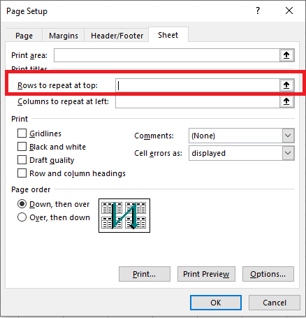
When your document is long and needs to be printed, you may notice that only the first page has the column headers at the top. You can set page layout options to repeat the top row on every printed page.
- Open the worksheet you are going to print.
- Go to the Page Layout tab.
- Click Print Titles in the Page Setup group.

- Ensure you are on the Sheet tab in the Page Setup dialog box.
- Look for Rows to repeat at top in the Print Titles section.
- Click the Collapse Dialog Box icon next to the Rows to repeat at top field.
The Page Setup dialog box collapses, and you return to the worksheet. You will notice the cursor changes to a black arrow, which is useful for selecting a whole row with a single click.

- Select the row(s) you want to print on every page.
- To select multiple rows, click on the first row, hold down the mouse button, and drag to the last row you want to select.
Click Enter again or click the Collapse Dialog Box button to return to the Page Setup dialog.
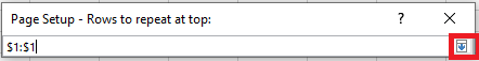
Now, your selection will appear in the Rows to repeat at top field.
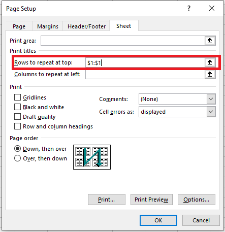
You can skip steps 6-8 and directly type the range using the keyboard. However, be cautious about how you enter it — you must use absolute references (with the dollar sign $). For example, if you want to see the first row on each printed page, the reference should look like this: $1:$1.
Click Print Preview to see the result.
Get a Header Column on Every Printed Page
When your worksheet is too wide, the header column will only appear on the first printed page. If you want to make your document more readable, follow the steps below to print the column with the row titles on the left side of each page.
- Open the worksheet you want to print.
- Follow steps 2-4 as mentioned in the section for Repeating Header Rows.
- Click the Collapse Dialog Box icon next to Columns to repeat at left.
- Choose the column(s) you want to appear on each printed page.
- Click Enter again or click the Collapse Dialog Box button to verify that the selected range appears in the Columns to repeat at left field.
- Press Print Preview in the Page Setup dialog box to review your document before printing.
Now, you won’t have to flip through the pages to find the meaning of each row’s values.
Print Row Numbers and Column Letters
Excel typically refers to the columns of the worksheet by letters (A, B, C) and the rows by numbers (1, 2, 3). These letters and numbers are called row and column headers. Unlike row and column titles, which are printed only on the first page by default, these headers are not printed at all. If you want to see these letters and numbers on your prints, follow these steps:
- Open the worksheet you want to print with row and column headers.
- Go to the Page Layout tab.
- In the Sheet Options group, check the box Print under Headings.
If the Page Setup window is still open on the Sheet tab, simply check the Row and Column Headings box in the Print section. This will also make row and column headers visible on every printed page.
- Open the Print Preview pane (File / Print or Ctrl + F2) to check the changes.
The Print Titles feature can really simplify your life. Printing row and column titles on each page allows you to easily understand the information in the document. You won’t get lost in the prints when row and column titles appear on every page. Try it, and you’ll definitely benefit from it!
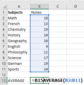
How to Calculate the Average in Excel
In mathematics, the average (more precisely the arithmetic mean) is calculated by summing a group of numbers and then dividing that total by the count of the numbers.
For example, if three athletes complete a race in 10.5 seconds, 10.7 seconds, and 11.2 seconds respectively, the average time would be:
= (10.5 + 10.7 + 11.2) / 3,
which gives 10.8 seconds.However, in Excel, you don’t need to write this kind of mathematical expression manually. Excel provides powerful built-in functions such as AVERAGE() that automatically handle these calculations.
AVERAGE() Function
The AVERAGE() function in Excel returns the arithmetic mean of the specified numbers. Its syntax is:
=AVERAGE(number1, [number2], …)
- number1, number2, etc., are the values you want to average. The first argument is required, and up to 255 arguments are allowed.
- These values can be numbers, cell references, or ranges.
How to Use AVERAGE()
The AVERAGE() function is one of the simplest and most frequently used in Excel. Here are some practical examples:
- To calculate the average of numbers directly:
=AVERAGE(1, 2, 3, 4) → returns 2.5 - To average an entire column:
=AVERAGE(A:A) - To average an entire row:
=AVERAGE(1:1) - To average a specific range:
=AVERAGE(B2:B11)
Without the AVERAGE function, you’d have to manually input:
=(B2+B3+B4+…+B11)/10,
or use:
=SUM(B2:B11)/COUNT(B2:B11)You can also average non-contiguous cells:
=AVERAGE(A1, C1, D1)Mixed input types (ranges, values, references) are supported:
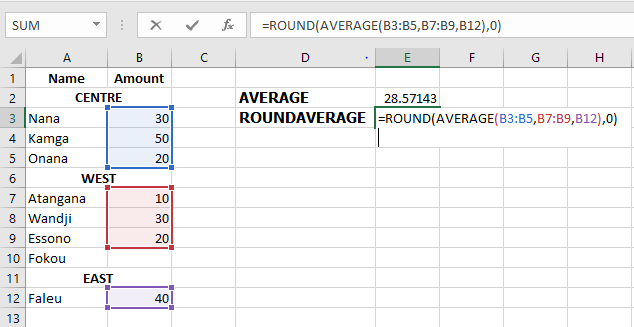
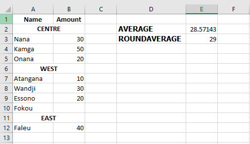
=AVERAGE(B3:B5, B7:B9, B12)To round the result to the nearest whole number:
=ROUND(AVERAGE(B3:B5, B7:B9, B12), 0)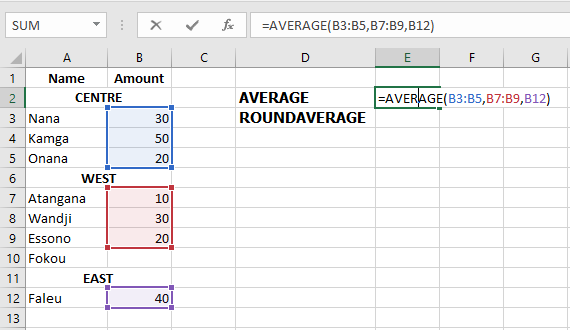
You can also average percentages or times.
Important: The AVERAGE() function includes zero values. If you want to ignore zeros, use AVERAGEIF() instead.
AVERAGE() – Key Notes
- Zeros are included in the average.
- Empty cells, text, Boolean values (TRUE, FALSE) are ignored—unless typed directly in the formula, in which case TRUE=1, FALSE=0.
- Distinguish between zero and an empty cell: zeros are counted, blanks are not. This is affected by the « Show a zero in cells that have zero value » Excel setting (File > Options > Advanced).
AVERAGEA() Function
AVERAGEA() works like AVERAGE() but includes all non-empty cells, including:
- Numbers
- Text (treated as 0)
- Logical values (TRUE = 1, FALSE = 0)
=AVERAGEA(value1, [value2], …)
Examples:
- =AVERAGEA(2, FALSE) → returns 1
- =AVERAGEA(2, TRUE) → returns 1.5
AVERAGEIF() Function
AVERAGEIF() calculates the average of cells that meet a specific condition.
Syntax:
=AVERAGEIF(range, criteria, [average_range])
Where:
- range: cells to test
- criteria: the condition
- average_range (optional): cells to average if different from range
Examples:
Exact match:
=AVERAGEIF(A2:A9, « Orange », B2:B9)
Or using a cell reference:
=AVERAGEIF(A2:A9, E1, B2:B9)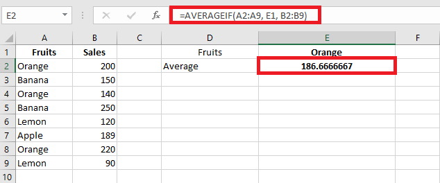
Rounded result:
=ROUND(AVERAGEIF(A2:A9, « Orange », B2:B9), 2)Partial match (wildcards):
- * for any sequence
- ? for a single character
E.g., average all « Orange »-related items:
=AVERAGEIF(A2:A9, « Orange* », B2:B9)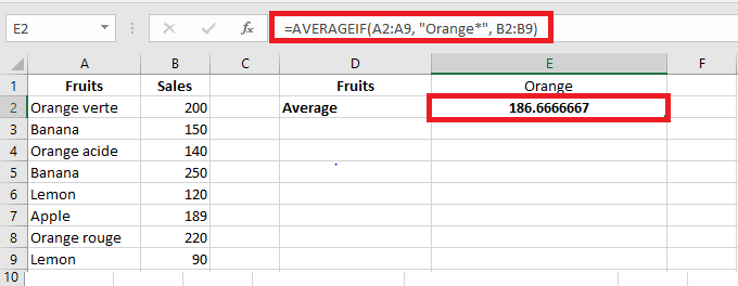
Exclude « Orange »:
=AVERAGEIF(A2:A9, « <>*Orange* », B2:B9)Numeric conditions:
Average values greater than 20:
=AVERAGEIF(A2:A10, « >20 »)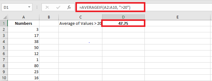
Exclude zeros:
=AVERAGEIF(A2:A10, « <>0 »)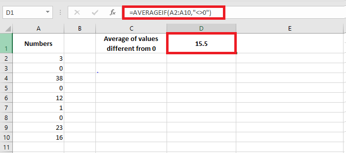
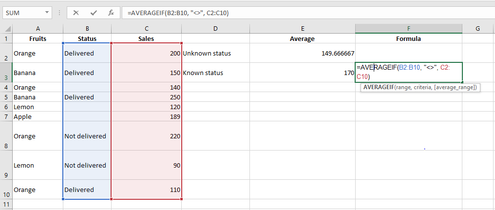
Empty/non-empty cells:
- Empty: =AVERAGEIF(B2:B10, « = », C2:C10)
- Textually blank (e.g. = » »): =AVERAGEIF(B2:B10, « », C2:C10)
- Non-empty: =AVERAGEIF(B2:B10, « <> », C2:C10)
AVERAGEIFS() Function
AVERAGEIFS() averages cells that meet multiple conditions (AND logic).
Syntax:
=AVERAGEIFS(average_range, criteria_range1, criteria1, [criteria_range2, criteria2], …)
Examples:
Multiple conditions:
Average sales of « Orange » where sales > 100:
=AVERAGEIFS(B2:B10, A2:A10, « Orange », B2:B10, « >100 »)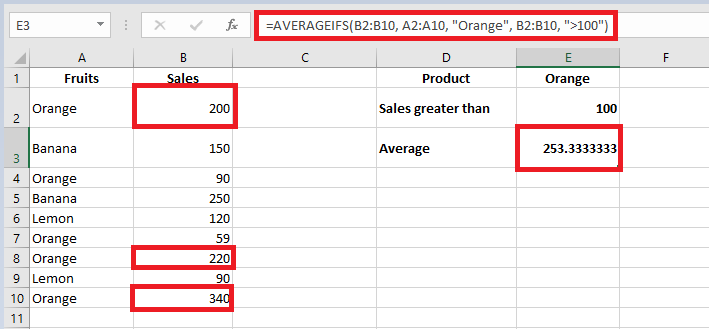
Date conditions:
Average quantity delivered before 21-Aug-2022 with a non-empty status:
=AVERAGEIFS(D2:D10, B2:B10, « <21/08/2022 », C2:C10, « <> »)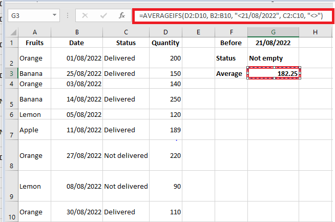
Important Notes on AVERAGEIF and AVERAGEIFS
- Empty or non-numeric cells in average_range are ignored.
- If no cells match criteria, the result is #DIV/0!.
- In AVERAGEIF(), the average_range doesn’t need to match the size of the range, but the top-left cell determines alignment.
- In AVERAGEIFS(), all criteria ranges must match the size of average_range.
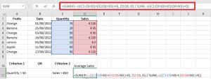
How to Average with OR Logic (Multiple Conditions)
Since AVERAGEIFS() uses AND logic, to apply OR logic, you’ll need custom formulas.
Example 1: OR logic with text values
Average sales of « Banana » or « Apple »:
=AVERAGE(IF(ISNUMBER(MATCH(A2:A8, {« Banana », « Apple »}, 0)), B2:B8))
Or using cell references (e.g. E1:E2 contain « Banana » and « Apple »):
=AVERAGE(IF(ISNUMBER(MATCH(A2:A8, E1:E2, 0)), B2:B8))
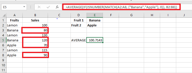
Press Ctrl + Shift + Enter to confirm (array formula).
Example 2: OR logic with numeric conditions
Average sales in column D where either column C or D > 50:
=SUM(IF(((C2:C8>50)+(D2:D8>50))>0, D2:D8, 0)) / SUM(–((C2:C8>50)+(D2:D8>50)>0))
Adaptable for different thresholds, e.g. D2:D8>100.
Example 3: OR logic with empty/non-empty cells
Non-empty cells in column B or C:
=SUM(IF(((B2:B8<> » »)+(C2:C8<> » »))>0, D2:D8, 0)) / SUM(–(((B2:B8<> » »)+(C2:C8<> » »))>0))
Empty cells in column B or C:
=SUM(IF(((B2:B8= » »)+(C2:C8= » »))>0, D2:D8, 0)) / SUM(–(((B2:B8= » »)+(C2:C8= » »))>0))
Conclusion
Excel offers powerful and flexible ways to calculate averages using functions like AVERAGE(), AVERAGEA(), AVERAGEIF(), and AVERAGEIFS(). You can also craft custom formulas to implement OR logic or handle special cases such as blank cells and conditional criteria. With the right understanding, you can efficiently analyze your data in virtually any scenario.
The DROITEREG Function in Excel
Microsoft Excel is not a statistical software, but it does provide several statistical functions. One of these functions is LINEST(), designed to perform linear regression analysis and return associated statistics.
LINEST() Function – Syntax and Basic Uses
The LINEST() function calculates the statistics of a straight line that explains the relationship between the independent variable and one or more dependent variables, and returns an array describing the line. It uses the least squares method to find the best fit for your data. The equation of the line is as follows:
- Simple Linear Regression Equation:
y=bx+ay = bx + a
- Multiple Regression Equation:
y=b1x1+b2x2+⋯+bnxn+a
Where:
- y – The dependent variable you are trying to predict.
- x – The independent variable used to predict y.
- a – The intercept (indicating where the line intersects the Y-axis).
- b – The slope (indicating the rate of change in y as x changes).
In its basic form, the LINEST() function returns the intercept (a) and slope (b) for the regression equation. It can also return additional statistics for regression analysis.
The syntax for the LINEST() function in Excel is:
LINEST(y_connus; [x_connus]; [constante]; [statistique])
Where:
- y_connus (required) is a range of dependent values for the regression equation. This is usually a single column or row.
- x_connus (optional) is a range of independent values. If omitted, it is assumed to be the array {1,2,3,…} of the same size as y_connus.
- constante (optional) – A logical value that determines how the intercept (constant a) should be treated:
- If TRUE or omitted, the intercept a is calculated normally.
- If FALSE, the intercept a is forced to 0, and the slope (coefficient b) is calculated to fit y=bxy = bx.
- statistique (optional) is a logical value that determines if additional regression statistics should be returned:
- If TRUE, LINEST() returns an array with additional regression statistics.
- If FALSE or omitted, LINEST() returns only the intercept constant and the slope coefficient(s).
Since LINEST() returns an array of values, it must be entered as an array formula by pressing Ctrl + Shift + Enter. If entered as a regular formula, only the first slope coefficient will be returned.
Additional Statistics Returned by LINEST()
When the statistique argument is set to TRUE, the LINEST() function returns the following statistics for your regression analysis:
Statistic Description Slope coefficient b value in y=bx+ay = bx + a Intercept constant a value in y=bx+ay = bx + a Standard error of slope The standard error for one or more b coefficients. Standard error of intercept The standard error for the intercept a. Coefficient of determination (R²) Indicates how well the regression equation explains the relationship between the variables. Standard error of estimate (Y) Displays the precision of the regression analysis. F-statistic or observed F-value Used to perform the F-test for the null hypothesis to determine the overall quality of the model fit. Degrees of freedom (df) The number of degrees of freedom. Regression sum of squares Indicates how much of the variation in the dependent variable is explained by the model. Residual sum of squares Measures the amount of variance in the dependent variable that is not explained by your regression model. How to Use LINEST() in Excel: Formula Examples
The LINEST() function can be tricky to use, especially for beginners, as you need to not only correctly create the formula but also properly interpret its output. Below are some examples of how to use LINEST() formulas in Excel that will hopefully help deepen your understanding.
- Simple Linear Regression: Calculate Slope and Intercept
To obtain the intercept and slope of a regression line, you use LINEST() in its simplest form: provide a range of dependent values for the y_connus argument and a range of independent values for the x_connus argument. The last two arguments can be set to TRUE or omitted.
For example, with y values (sales numbers) in C2:C13 and x values (advertising costs) in B2:B13, our simple linear regression formula would be as simple as:
=LINEST(C2:C13, B2:B13)
To correctly enter it into your worksheet, select two adjacent cells in the same row, say E2:F2 in this example, type the formula, and press Ctrl + Shift + Enter to complete it.
The formula will return the slope coefficient in the first cell (E2) and the intercept constant in the second cell (F2):
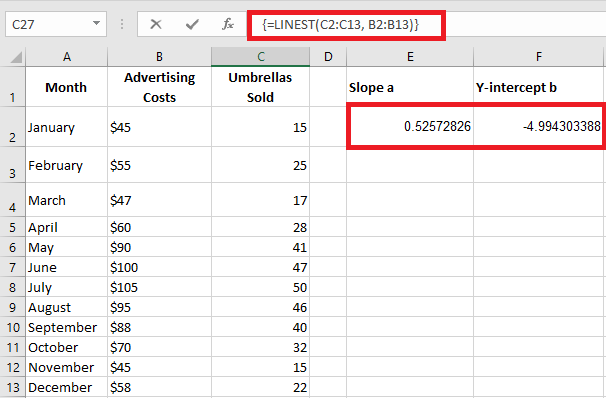
- Slope is approximately 0.52 (rounded to two decimal places). This means that for every increase of 1 in x, y increases by 0.52.
- The intercept is -4.99. This is the expected value of y when x = 0. If plotted on a graph, this is where the regression line crosses the Y-axis.
By plugging these values into a simple regression equation, the formula to predict sales based on advertising costs is:
y=0.52x−4.99
For example, if you spend 50€ on advertising, you should sell approximately 21 umbrellas:
0.52×50−4.99=21.01
You can also separately obtain the slope and intercept values using the corresponding function or by embedding the LINEST() formula inside INDEX:
Slope:
=SLOPE(C2:C13, B2:B13)
=INDEX(LINEST(C2:C13, B2:B13), 1)
Intercept:
=INTERCEPT(C2:C13, B2:B13)
=INDEX(LINEST(C2:C13, B2:B13), 2)
- Multiple Linear Regression: Slope and Intercept
If you have two or more independent variables, make sure to enter them in adjacent columns and provide the entire range to the x_connus argument.
For example, with sales figures (y values) in D2:D13, advertising costs (one set of x values) in B2:B13, and average monthly rainfall (another set of x values) in C2:C13, you use this formula:
=LINEST(D2:D13, B2:C13)
Since the formula will return an array of 3 values (2 slope coefficients and the intercept constant), select three contiguous cells in the same row, enter the formula, and press Ctrl + Shift + Enter.
Note that the multiple regression formula returns the slope coefficients in reverse order of the independent variables (from right to left), i.e., bn, b(n-1), …, b2, b1.
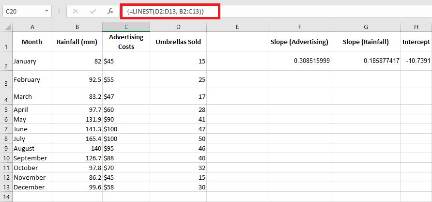
To predict the number of sales, we apply the returned values from the LINEST() formula to the multiple regression equation:
y=0.3x2+0.19x1−10.74
For example, with 50€ spent on advertising and an average rainfall of 100 mm, you should sell approximately 23 umbrellas:
0.3×50+0.19×100−10.74=23.26
- Predicting the Dependent Variable in Simple Linear Regression
In addition to calculating the values of a and b for the regression equation, theLINEST() function in Excel can also estimate the dependent variable (y) based on the known independent variable (x). You can use LINEST() in combination with the SUM or SUMPRODUCT functions.
For example, to calculate the number of umbrella sales for the next month, say October, based on the previous months’ sales and an advertising budget of 50€, the formula would be:
=SUM(LINEST(C2:C10, B2:B10)*{50.1})
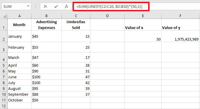
Instead of hardcoding the x value into the formula, you can provide it as a cell reference. In this case, you must also enter the constant 1 in some cells, as you cannot mix references and values in an array constant.
With the x value in E2 and the constant 1 in F2, either of the following formulas will work perfectly:
Regular formula (entered with Enter):
=SUMPRODUCT(LINEST(C2:C10, B2:B10)*(E2:F2))
Array formula (entered with Ctrl + Shift + Enter):
=SUM(LINEST(C2:C10, B2:B10)*(E2:F2))
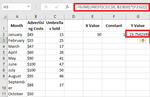
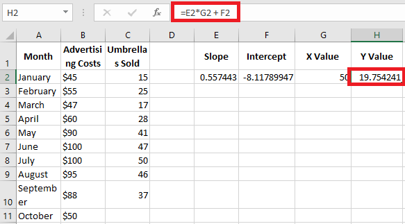
To verify the result, you can obtain the intercept and slope for the same data and then use the linear regression formula to calculate y:
=E2*G2 + F2
Where E2 is the slope, G2 is the x value, and F2 is the intercept.
- Multiple Regression: Predicting the Dependent Variable
If you’re dealing with multiple predictors (i.e., a few different sets of x values), include all those predictors in the array constant. For example, with an advertising budget of 50€ (x₂) and an average monthly rainfall of 100 mm (x₁), the formula would be:
=SUM(LINEST(D2:D10, B2:C10)*{50.100.1})
Where D2:D10 are the known y values, and B2:C10 are two sets of x values.
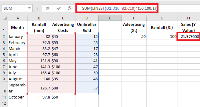
Be mindful of the order of x values in the array constant. As mentioned earlier, when Excel’s LINEST() function is used for multiple regression, it returns the slope coefficients from right to left. In our example, the Advertising coefficient is returned first, followed by the Rainfall coefficient. To correctly calculate the predicted number of sales, multiply the coefficients by the corresponding x values and place the array constants in this order: {50.100.1}. The last element is 1, as the last value returned by LINEST() is the intercept, which should not be altered.
Instead of using an array constant, you can enter all the x values in some cells and reference those cells in your formula, as shown in the previous example.
Regular formula:
=SUM(LINEST(D2:D10, B2:C10)*(F2:H2))
Array formula:
=SUM(LINEST(D2:D10, B2:C10)*(F2:H2))
Where F2 and G2 are the x values, and H2 is 1.
LINEST() Formula: Additional Regression Statistics
As you may recall, to get additional statistics for your regression analysis, set the last argument of the LINEST() function to TRUE. Applied to our sample data, the formula becomes:
=LINEST(D2:D13, B2:C13, TRUE, TRUE)
Since we have two independent variables in columns B and C, we select a range of 3 columns (two x values + intercept) and 5 rows, enter the above formula, press Ctrl + Shift + Enter, and get this result:
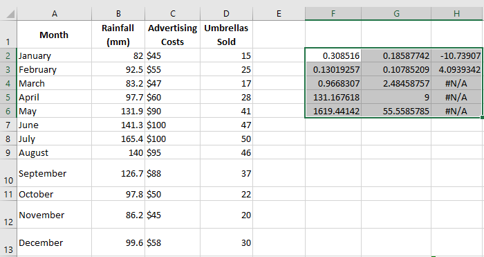
To remove #N/A errors, you can nest DROITEREG() within IFERROR() like this:
=IFERROR(LINEST(D2:D13, B2:C13, TRUE, TRUE), « »)
The screenshot below shows the result and explains the meaning of each value:
- Slope coefficients and intercept constant have been explained in previous examples, so let’s look at other statistics:
Coefficient of Determination (R²):
The value of R² is the result of dividing the regression sum of squares by the total sum of squares. It tells you how much of the variation in y is explained by the x variables. It can be any number between 0 and 1, i.e., from 0% to 100%. In this example, R² is around 0.97, meaning that 97% of our dependent variables (umbrella sales) are explained by the independent variables (advertising + average monthly rainfall), which is a great fit!Standard Errors:
These values typically show the precision of the regression analysis. The smaller the numbers, the more confident you can be in your regression model.F-statistic:
You use the F-statistic to confirm or reject the null hypothesis. It’s recommended to use the F-statistic along with the p-value to decide if the overall results are significant.Degrees of Freedom (df):
The LINEST() function in Excel returns the residual degrees of freedom, i.e., the total df minus the df for regression. You can use the degrees of freedom to get critical F values from a statistical table and compare those critical F values to the F-statistic to determine a confidence level for your model.Regression Sum of Squares (SSreg):
This is the sum of the squared differences between the predicted y values and the mean of y, calculated by this formula: ∑(y^−yˉ)2\sum (\hat{y} – \bar{y})^2. It shows how much of the variation in the dependent variable is explained by your regression model.Residual Sum of Squares (SSres):
This is the sum of the squared differences between the actual y values and the predicted y values. It shows how much of the variation in the dependent variable is not explained by your regression model. The smaller the residual sum of squares compared to the total sum of squares, the better your regression model fits your data.Key Points to Know About LINEST()
To use LINEST() effectively in your spreadsheets, you might want to know a little more about its « internal mechanisms »:
- y_connus and x_connus:
In a simple linear regression model with one set of x variables, y_connus and x_connus can be ranges of any shape as long as they have the same number of rows and columns. If you’re doing multiple regression with more than one set of independent x variables, y_connus must be a vector, meaning a range of a single row or column. - Forcing the Intercept to Zero:
When the constante argument is TRUE or omitted, the intercept a is calculated and included in the equation: y=bx+ay = bx + a. If constante is set to FALSE, the intercept a is assumed to be 0 and omitted from the regression equation: y=bxy = bx. - Precision:
The precision of the regression equation calculated by LINEST() depends on the dispersion of your data points. The more linear the data, the more accurate the results from the LINEST() formula. - Redundant x Values:
In some situations, one or more independent x variables may not provide any additional predictive value, and removing these variables from the regression model doesn’t affect the predicted y values’ accuracy. This phenomenon is known as collinearity. The LINEST() function checks for collinearity and omits any redundant x variables it identifies in the model. - LINEST() vs. SLOPE() and INTERCEPT():
The underlying algorithm of the LINEST() function differs from the algorithm used in SLOPE() and INTERCEPT(). As a result, when the source data is undetermined or collinear, these functions may return different results.
Troubleshooting the LINEST() Function
If your LINEST() formula returns an error or produces incorrect output, it’s likely for one of the following reasons:
- If the LINEST() function only returns a single number (slope coefficient), you probably entered it as a regular formula rather than an array formula. Make sure to press Ctrl + Shift + Enter to properly complete the formula. When you do this, the formula is enclosed in {braces} that are visible in the formula bar.
- #REF! Error: Occurs if the x_connus and y_connus ranges have different dimensions.
- #VALUE! Error: Occurs if the x_connus or y_connus contains at least one empty cell, a text value, or a textual representation of a number that Excel doesn’t recognize as a numeric value. This error also occurs if the constante or statistique argument cannot be evaluated to TRUE or FALSE.
Using TENDANCE() for Multiple Regression in Excel
It is common to want to use multiple values to predict a single one. While this may not be obvious from the discussion in this chapter, it is possible to simultaneously use several variables as predictors.
Using two or more predictors simultaneously can often improve the accuracy of predictions compared to using only one predictor by itself.
Combining Predictors
In such a situation, SLOPE() and INTERCEPT() will not help, as they are not designed to handle multiple predictors. Instead, Excel provides you with TENDANCE() and LINEST() functions, which can handle both single and multiple predictor situations. This is why you won’t see SLOPE() and INTERCEPT() discussed further in this course. They serve as a useful introduction to the concepts involved in regression but are underpowered for handling multiple predictors, where the capabilities are better provided by TENDANCE() and LINEST() when you only have one predictor.
Note:
It is easy to conclude that TENDANCE() and LINEST() are analogous to SLOPE() and INTERCEPT(), but they are not. The results from SLOPE() and INTERCEPT() combine to form an equation based on a single predictor. LINEST() takes the place of SLOPE() and INTERCEPT() for both simple and multiple predictors. TENDANCE() only returns the results of applying the prediction equation. Just like with a single predictor variable, you can use TENDANCE() with more than one predictor variable to return predictions directly in the spreadsheet.
On the other hand, LINEST() does not return the predicted values directly, but it provides the equation that TENDANCE() uses to calculate the predicted values (and also gives a variety of diagnostic statistics that are discussed in Chapters 16 and 18). The name LINEST() is a contraction for « linear estimation. »
Example: Regression with Multiple Predictors
Figure resents the results of a multiple regression analysis along with results from two standard regression analyses.
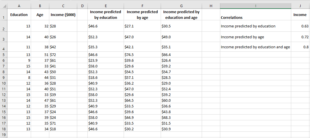
In the figure, columns E and F each contain predicted values based on a single variable, as discussed earlier in this chapter. Column E shows the regression results for income based on education, and column F shows the results for income based on age.
One way to evaluate the accuracy of the predicted values is to calculate their correlation with the predictors. These correlations are shown in cells J2 and J3 in Figure 4.18. In this sample, the correlation between education level and the predicted income by education is 0.63, and the correlation between age and the predicted income by age is 0.72. These are good, strong correlations and indicate that education and age are useful predictors of income. However, there might still be room for improvement.
In column G, the following array formula is used:
= TENDANCE(C2:C31, A2:B31)
Note the difference between this formula and, say, the one in column E: = TENDANCE(C2:C31, A2:A31)
Both formulas use the income values in C2:C31 as the known_y values. However, the formula in column E, which predicts income from education, only uses the education values from column A as known values. The formula in column G, which predicts income from both education and age, uses the education values from column A and the age values from column B as known values.
The correlation between the actual income values in column C and those predicted by both education and age in column G is shown in cell J4 of Figure 4.18. This correlation, 0.80, is somewhat stronger than the correlation between income and income predicted by education (0.63) or income predicted by age (0.72). This means that, to the extent that this sample is representative of the population, you can make a more accurate income prediction when you use both education and age than when using either variable alone.
CALCULATING CORRELATION IN EXCEL
One of the simplest statistical calculations you can perform in Excel is correlation. Although simple, it is extremely useful for understanding relationships between two or more variables. Microsoft Excel provides all the tools you need to perform a correlation analysis; you just need to know how to use them.
Basics of Correlation
Correlation is a measure that describes the strength and direction of a relationship between two variables. It is commonly used in statistics, economics, and social sciences for tasks like budgeting, business plans, and more.
The method used to study how closely related variables are is called correlation analysis.
Here are a few examples of strong correlation:
- The number of calories you consume and your weight (positive correlation)
- The outside temperature and your heating bills (negative correlation)
And here are examples of data with weak or no correlation:
- Your cat’s name and its favorite food
- The color of your eyes and your height
One essential thing to understand about correlation is that it shows only how closely two variables are related. However, correlation does not imply causation. Just because changes in one variable are associated with changes in another does not mean one variable actually causes the other to change.
Correlation Coefficient in Excel: Interpreting Correlation
The numerical measure of the degree of association between two continuous variables is called the correlation coefficient (r).
The value of the coefficient is always between -1 and 1 and measures both the strength and direction of the linear relationship between the variables.
Strength
The larger the absolute value of the coefficient, the stronger the relationship:
- The extreme values of -1 and 1 indicate a perfect linear relationship when all data points fall on a line. In practice, a perfect correlation, whether positive or negative, is rarely observed.
- A coefficient of 0 indicates there is no linear relationship between the variables. This is what you’re likely to get with two sets of random numbers.
- Values between 0 and ±1 represent a range of weak, moderate, and strong relationships. As r approaches -1 or 1, the strength of the relationship increases.
Direction
The sign of the coefficient (positive or negative) indicates the direction of the relationship.
- Positive coefficients represent a direct correlation and produce an upward slope on a graph – as one variable increases, the other also increases, and vice versa.
- Negative coefficients represent an inverse correlation and produce a downward slope on a graph – as one variable increases, the other tends to decrease.
For better understanding, consider the following correlation graphs:
- A coefficient of 1 indicates a perfect positive relationship – as one variable increases, the other increases proportionally.
- A coefficient of -1 indicates a perfect negative relationship – as one variable increases, the other decreases proportionally.
- A coefficient of 0 means no relationship between the two variables – the data points are scattered all over the graph.

Pearson Correlation
In statistics, multiple types of correlation are measured based on the type of data you’re working with. In this section, we’ll focus on the most common one.
The Pearson correlation, also known as the Pearson Product-Moment Correlation (PPMC), is used to evaluate the linear relationships between data when a change in one variable is associated with a proportional change in the other. Simply put, the Pearson correlation answers the question: Can the data be represented on a line?
In statistics, this is the most popular type of correlation, and if you come across a « correlation coefficient » without further qualification, it’s likely the Pearson correlation.
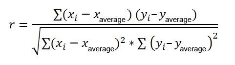
Here’s the most commonly used formula for calculating the Pearson correlation coefficient, also known as Pearson’s r:
Sometimes, you might encounter two other formulas for calculating the sample correlation coefficient (r) and the population correlation coefficient (ρ).
Calculating Pearson’s correlation manually involves a lot of computation. Fortunately, Microsoft Excel has made it very simple. Depending on your dataset and objective, you can use any of the following techniques:
- Find the Pearson correlation coefficient using the CORREL() function.
- Create a correlation matrix by performing a data analysis.
- Find multiple correlation coefficients using a formula.
- Plot a correlation graph to get a visual representation of the relationship.
Calculating the Correlation Coefficient in Excel
To find the correlation coefficient in Excel, you can use the CORREL() or PEARSON() function and get the result in a split second.
- CORREL() Function
The CORREL() function returns the Pearson correlation coefficient for two sets of values. Its syntax is very simple and straightforward:
CORREL(array1, array2)
Where:
- array1 is the first range of values.
- array2 is the second range of values.
Both arrays must have the same length.
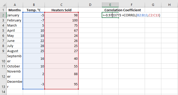
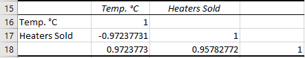
For example, assuming we have a set of independent variables (x) in B2:B13 and dependent variables (y) in C2:C13, our correlation coefficient formula would be:
=CORREL(B2:B13, C2:C13)
Alternatively, we can swap the arrays and still get the same result:
=CORREL(C2:C13, B2:B13)
In all cases, the formula shows a strong negative correlation (around -0.97) between the average monthly temperature and the number of heating units sold.
Key Things to Know About the CORREL() Function in Excel
To successfully calculate the correlation coefficient in Excel, keep in mind these 3 simple facts:
- If one or more cells in an array contain text, logical values, or blanks, those cells are ignored; cells with null values are included in the calculation.
- If the arrays provided are of different lengths, an #N/A error will be returned.
- If one of the arrays is empty or if the standard deviation of their values is zero, a #DIV/0! error will occur.
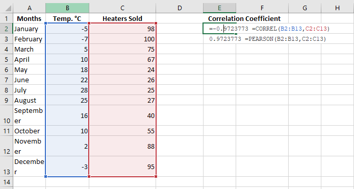
PEARSON() Function
The PEARSON() function in Excel does the same thing – it calculates the Pearson correlation coefficient.
=PEARSON(array1, array2)
Where:
- array1 is an independent values range.
- array2 is a dependent values range.
Since PEARSON() and CORREL() both calculate the Pearson linear correlation coefficient, their results should match, and they typically do in recent Excel versions (2007 and onward).
In Excel 2003 and earlier, however, the PEARSON() function may display rounding errors. Therefore, in older versions, it’s recommended to use CORREL() instead of PEARSON().
For our example dataset, both functions give the same result:
=CORREL(B2:B13, C2:C13)
=PEARSON(B2:B13, C2:C13)
Creating a Correlation Matrix
When you need to test the interrelationships between more than two variables, it’s useful to build a correlation matrix, sometimes called a multiple correlation coefficient.
A correlation matrix is a table that shows the correlation coefficients between variables at the intersections of the corresponding rows and columns.
To create a correlation matrix in Excel, you’ll use the Correlation tool from the Analysis ToolPak add-in. This add-in is available in all versions of Excel from 2003 to 2019, but it’s not activated by default. If you haven’t activated it yet, do so now by following these steps:
- In Excel, click File > Options.
- In the Excel Options dialog box, select Add-ins from the left sidebar, ensure Excel Add-ins is selected in the Manage box, and click Go.
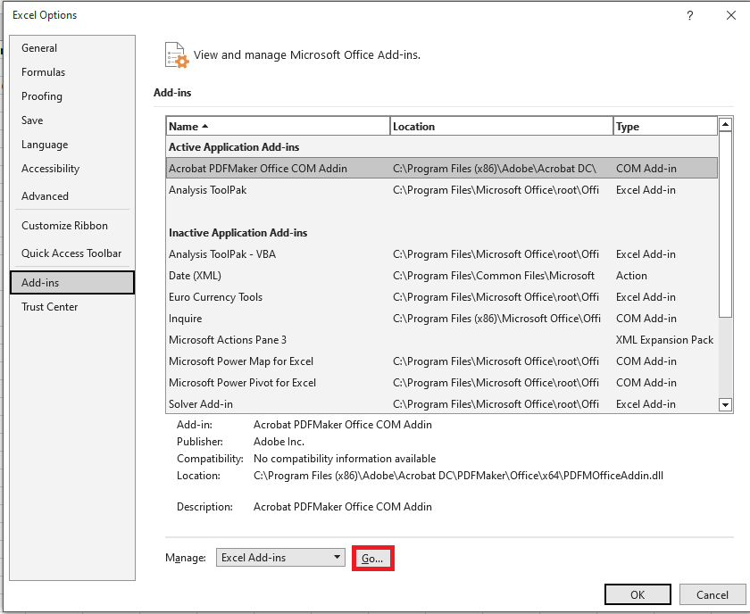
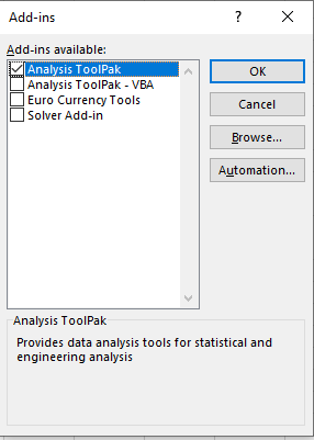
- In the Add-ins dialog box, check the box for Analysis ToolPak and click OK.
This will add the Data Analysis tools to the Data tab of your Excel ribbon.
Once the data analysis tools are added, you’re ready to perform a correlation analysis:
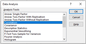
- In the top-right corner of the Data tab/group, click the Data Analysis button.

- In the Data Analysis dialog box, select Correlation and click OK.
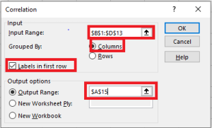
- In the Correlation Analysis dialog box, configure the settings as follows:
- Click in the Input Range box and select the range of your source data, including column headers (e.g., B1:D13 in our case).
- Under Grouped By, ensure Columns is selected (since your data is grouped by columns).
- Check Labels in First Row if your selected range includes column headers.
- Choose the desired output option. For output on the same sheet, select Output Range and specify the reference for the leftmost cell where the matrix should appear (e.g., A15).
- Once finished, click OK.
Your correlation coefficient matrix will be completed.
Performing Multiple Correlation Analysis with Formulas
Creating a correlation table with the Data Analysis tool is easy, but this matrix is static, meaning you need to run a new correlation analysis every time the source data changes.
The good news is you can easily create a similar table yourself, and this matrix will automatically update whenever you modify the source values.
To do this, use this generic formula:
CORREL(OFFSET(first_range_variable, 0, ROWS($1:1)-1), OFFSET(first_range_variable, 0, COLUMNS($A:A)-1))
In our case, the first variable range is $B$2:$B$13 (note the $ sign which locks the reference), and the correlation formula looks like this:
=CORREL(OFFSET($B$2:$B$13, 0, ROWS($1:1)-1), OFFSET($B$2:$B$13, 0, COLUMNS($A:A)-1))
Now, let’s build a correlation matrix:
- In the first row and column of the matrix, input the variable labels in the same order as they appear in your source table.
- Enter the above formula in the leftmost cell (e.g., B16).
- Drag the formula down and across to fill the matrix with as many rows and columns as needed (3 rows and 3 columns in our example).
The resulting matrix will contain multiple correlation coefficients. The coefficients returned by our formula will match those provided by Excel in the previous example.
Potential Issues with Correlation in Excel
The Pearson moment correlation only reveals a linear relationship between two variables. This means that your variables could be strongly related in a non-linear manner and still have a correlation coefficient close to zero.
Additionally, Pearson’s correlation doesn’t distinguish between dependent and independent variables. For example, when using CORREL() to find the relationship between average monthly temperature and the number of heaters sold, we obtained a -0.97 coefficient, which shows a strong negative correlation. However, if we reverse the variables, we would get the same result, leading someone to incorrectly conclude that higher heater sales cause a drop in temperature, which clearly doesn’t make sense.
Moreover, Pearson’s correlation is very sensitive to outliers. If you have one or more data points that differ significantly from the rest, it can distort the relationship between the variables. In such cases, it may be wise to use Spearman’s rank correlation instead.
Understanding Correlation Better
Correlation is based on covariance, represented by Sxy:
This formula may look familiar if you’ve seen the section on variance. There, you saw that variance is calculated by subtracting the mean from each value and adjusting the deviation, i.e., squaring the deviation. Note that the denominator in the covariance formula is N – 1. This is the same reason as for variance: when working with a sample from which you want to infer about a population, the degrees of freedom instead of N are used to make the estimate independent of sample size.
Excel provides a function called COVARIANCE.S() to use with a sample of values and COVARIANCE.P() to use with a population of values.
To move from covariance to correlation, you can easily divide the covariance by the product of the standard deviations of X and Y:
r = Sxy / (Sx * Sy)
This formula helps remove the effect of the standard deviations of the variables from the measurement of their relationship. As a result, the correlation coefficient is bounded between -1.0 (perfect negative correlation), +1.0 (perfect positive correlation), and 0.0 (no relationship).
Standard Deviation Calculation in Excel
In descriptive statistics, both the arithmetic mean (also called the average) and the standard deviation are closely related concepts. While most people understand the mean, the standard deviation is less understood.
What is Standard Deviation?
The standard deviation is a measure that indicates how much the values in a dataset deviate (spread out) from the mean. In other words, the standard deviation tells you whether your data points are close to the mean or if they vary significantly.
The purpose of the standard deviation is to help you understand if the mean truly represents a « typical » value. The closer the standard deviation is to zero, the less variability there is in the data, and the more reliable the mean is. A standard deviation of 0 means every value in the dataset is exactly equal to the mean. The higher the standard deviation, the more variation there is in the data, making the mean less precise.
To better understand how this works, consider the following data:
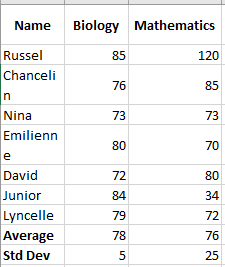
For biology, the standard deviation is 5 (rounded to the nearest whole number), indicating that most students’ scores are within 5 points of the average. Is this good? Yes, it shows that biology scores are quite consistent.
For mathematics, the standard deviation is 25. This indicates a significant spread in the scores, meaning some students achieved much better scores and/or some scored much lower than the average.
In practice, analysts often use standard deviation as a measure of investment risk— the higher the standard deviation, the higher the volatility of returns.
Standard Deviation of Sample and Population
When dealing with standard deviation, you may often hear the terms « sample » and « population, » referring to the completeness of the data you are working with. The main difference is:
- The population includes all elements of a dataset.
- The sample is a subset of data that includes one or more elements from the population.
Researchers and analysts deal with the standard deviation of a sample and a population in different situations. For instance, when summarizing the exam results of a class, a teacher would use the population’s standard deviation. Statisticians calculating the national average score would use a sample standard deviation since they are presented with data from a sample, not the entire population.
Understanding the Standard Deviation Formula
The reason the nature of the data is important is that the formulas for the standard deviation of a sample and a population are slightly different:
Sample Standard Deviation vs Population Standard Deviation
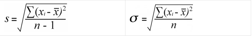
Where:
- xᵢ represents individual values in the dataset
- x is the mean of all the values
- n is the total number of values in the dataset
Having trouble understanding the formulas? Breaking them down into simple steps could help. But first, let’s take a look at some example data to work with:
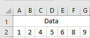
Calculate the Mean (Average)
First, you calculate the mean of all the values in the dataset (x in the formulas above). To calculate manually, you add the numbers and divide the sum by the count of numbers:
(1 + 2 + 4 + 5 + 6 + 8 + 9) / 7 = 5
To find the average in Excel, use the AVERAGE() function, e.g., =AVERAGE(A2:G2).
For each number, subtract the mean and square the result.
This is the part of the standard deviation formula that says: (xᵢ – x)².
To visualize what happens, look at the following images.
In this example, the mean is 5, so we calculate the difference between each data point and 5.
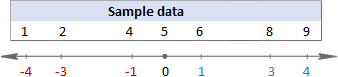
Then, square the differences, converting them all to positive numbers:

Sum the squared differences.
To say « sum up » in mathematics, you use sigma Σ. So, what we are doing now is summing up the squared differences to complete this part of the formula: Σ(xᵢ – x)².
16 + 9 + 1 + 1 + 9 + 16 = 52
Divide the total of squared differences by the number of values.
So far, the formulas for sample and population standard deviation are identical. At this point, they differ.
For the sample standard deviation, you obtain the sample variance by dividing the total of squared differences by the sample size minus 1:
52 / (7 – 1) = 8.67
For the population standard deviation, you calculate the average of the squared differences by dividing the total by the count of values:
52 / 7 = 7.43
Why this difference in the formulas?
Because in the sample standard deviation formula, you need to correct for the bias in estimating a sample mean instead of the true population mean. You do this by using n – 1 instead of n, known as Bessel’s correction.
Take the square root.
Finally, take the square root of the numbers above to get the standard deviation (rounded to 2 decimal places):
Sample Standard Deviation vs Population Standard Deviation
√8.67 = 2.94 vs √7.43 = 2.73In Microsoft Excel, standard deviation is calculated the same way as in statistics, but all calculations are done in the background. The key for you is to choose the appropriate standard deviation function, which the next section will help you with.
How to Calculate Standard Deviation in Excel
Overall, there are six different functions to calculate standard deviation in Excel. Which one to use depends mainly on the nature of your data—whether you’re working with an entire population or a sample.
Functions to Calculate Sample Standard Deviation
To calculate standard deviation based on a sample, use one of the following formulas (all based on the “n-1” method described above):
STDEV( )
STDEV(number1, [number2], …)is the oldest Excel function to estimate the standard deviation based on a sample and is available in all Excel versions from 2003 to 2019.In Excel 2007 and later,
STDEV()can take up to 255 arguments including numbers, arrays, named ranges, or cell references. In Excel 2003, it accepts up to 30 arguments.Logical values and text representations of numbers directly provided in the argument list are counted. Within arrays and references, only numbers are counted—blank cells, TRUE and FALSE values, text, and error values are ignored.
NOTE
The
STDEV()function is obsolete and retained only for backward compatibility. Microsoft does not guarantee support in future versions. In Excel 2010 and later, it is recommended to useSTDEV.S()instead.STDEV.S( )
STDEV.S(number1, [number2], …)is an improved version ofSTDEV()introduced in Excel 2010.Like
STDEV(), it calculates sample standard deviation based on the classical formula mentioned above.STDEVA( )
=STDEVA(value1, [value2], …)is another function to calculate sample standard deviation. It differs from the others in how it handles logical and text values:- All logical values are included, whether in arrays, references, or direct input (
TRUE= 1,FALSE= 0). - Text values in arrays or references are counted as 0, including empty strings (
""), text representations of numbers, and any other text. Directly typed number-texts are counted as their numeric equivalents. - Blank cells are ignored.
NOTE
For a standard deviation formula to work properly, there must be at least two numeric values; otherwise, Excel returns a
#DIV/0!error.Functions to Calculate Population Standard Deviation
If you are working with the entire population, use one of the following functions, based on the “n” method:
STDEVP( )
STDEVP(number1, [number2], …)is the older Excel function for calculating population standard deviation.In newer versions like Excel 2010, 2013, 2016, and 2019, it has been replaced by the improved
STDEV.P(), but is still available for backward compatibility.STDEV.P( )
=STDEV.P(number1, [number2], …)is the modern replacement forSTDEVP(), providing improved accuracy. It’s available in Excel 2010 and later.Like the sample functions,
STDEVP()andSTDEV.P()count only numeric values within arrays and references. However, in direct arguments, they also consider logical values and number-like texts.STDEVPA( )
STDEVPA(value1, [value2], …)calculates population standard deviation, including text and logical values. It treats non-numeric values just likeSTDEVA()does.NOTE
Regardless of the standard deviation function, Excel will return an error if an argument includes error values or text that cannot be interpreted as a number.
Which Standard Deviation Function to Use in Excel?
The abundance of standard deviation functions in Excel can be confusing, especially for beginners. To choose the correct formula, ask yourself these three questions:
- Are you calculating standard deviation for a sample or an entire population?
- Which version of Excel are you using?
- Does your dataset include only numbers, or also logical and text values?
Use:
STDEV.S()for sample standard deviation (Excel 2010+), orSTDEV()(Excel 2007 and earlier).STDEV.P()for population standard deviation (Excel 2010+), orSTDEVP()(Excel 2007 and earlier).STDEVA()andSTDEVPA()if your dataset includes logical/text values.
While
STDEVA()andSTDEVPA()are rarely used on their own, they can be useful in larger formulas where arguments are returned as text or logical values by other functions.Standard Deviation Formula Examples
Once you’ve chosen the right function for your data, writing the formula is easy—the syntax is simple and self-explanatory. Here are some examples:
Calculating Standard Deviation for a Sample and Population
Depending on your data:
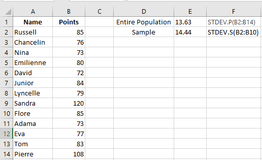
- To calculate standard deviation for the entire population (e.g., range B2:B14):
=STDEV.P(B2:B14)
- To calculate standard deviation for a sample (e.g., range B2:B10):
=STDEV.S(B2:B10)
As shown in the screenshot, the values will differ slightly (the smaller the sample, the larger the difference).
In Excel 2007 and earlier, use:
- Population:
=STDEVPA(B2:B14)
- Sample:
=STDEVA(B2:B10)
Calculating Standard Deviation for Text Representations of Numbers
Text representations of numbers are numbers formatted as text. These may come from:
- External sources
- Text functions like
TEXT(),MID(),RIGHT(),LEFT(), etc.
For example, if product codes like “Jeans-105” contain numeric values, you can extract them using:
=RIGHT(A2,LEN(A2)-FIND("-",A2,1))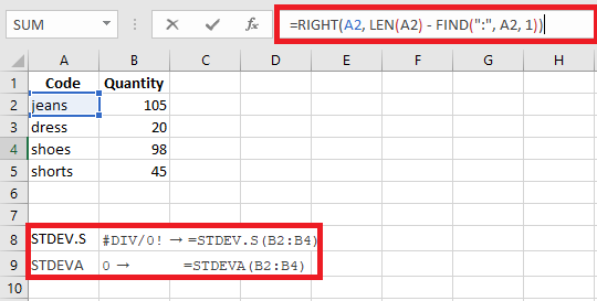
But if you try a standard deviation function on these extracted values, you might get
#DIV/0!or0because Excel sees them as text.To solve this, you can:
Use formulas like:
=STDEV.S(RIGHT(A2,LEN(A2)-FIND("-",A2)), RIGHT(A3,...), ...)
Or
- Use
VALUE()(or--) to convert text to numbers:=STDEV.S(VALUE(RIGHT(A2,LEN(A2)-FIND("-",A2))), ...)
Or better yet, extract to a helper column and apply
STDEV.S()to that column.How to Calculate the Standard Error of the Mean
In statistics, the standard error of the mean (SEM) estimates how far the sample mean is from the true population mean. While standard deviation shows variability within data, SEM shows variability between sample means.
The formula is:
SEM = SD / √n
Where:
- SD = sample standard deviation
- n = sample size
In Excel:
=STDEV.S(range)/SQRT(COUNT(range))
Example:
=STDEV.S(B2:B10)/SQRT(COUNT(B2:B10))
How to Add Standard Deviation Bars in Excel
To visually display standard deviation:
- Create your chart (Insert tab → Charts group).
- Click on the chart to select it, then click the Chart Elements button.
- Click the arrow next to Error Bars, then choose Standard Deviation.
This adds the same standard deviation bars for all data points.
This is how you calculate standard deviation in Excel.