Votre panier est actuellement vide !
Catégorie : Excel diagram
How to create dynamic chart labels
How to create dynamic chart labels?
You’ve probably encountered workbooks containing charts where you edit a worksheet entry, and the chart labels don’t change. This often creates confusion. Now learn how to link series labels and chart titles to worksheet cells. Suppose you want to plot future GDP in the United States (US) and China. You want the chart title to contain the year in which Chinese GDP exceeds US GDP, and the series label to contain each country’s annual growth rate . In C5 and C8, you can change the estimated growth rates from their current values of 3% for US GDP and 10% for Chinese GDP.
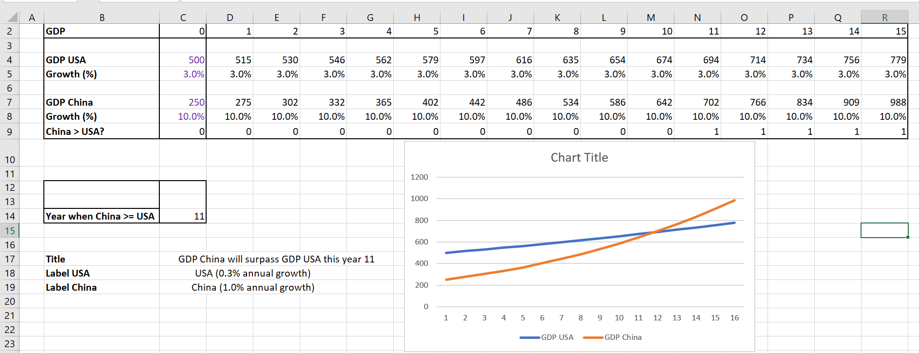
Create dynamic labels.
The goal is to link your chart title and labels to cells that change when growth rates change. Do the following:
1. Copy the formula IF (D7>=D4;1;0) from D10 to E10: R10 enters a 1 if the Chinese GDP is greater than the US GDP.
2. In cell C14, determine the year in which China overtakes the United States with the formula =IFERROR(MATCH( 1,D 10:R10,0); »none »). Note that if China never overtakes the United States, this formula returns none .
3. In cell C17, the formula = IF( S15= »none »; « US Remains Leading »; « China’s GDP will overtake US GDP this year » &TEXT(C14, »0″)) creates the desired chart title. Note that if China never overtakes the US, your chart title will be US Remains Leading . Otherwise, your chart title is tied to C14, so the chart title will contain the year in which China overtakes the US. The » 0″ in the TEXT function ensures that the year is formatted as an integer.
4. In cell C18, the formula = « USA(« &TEXT(C5, »0.0% »)& » annual growth) » creates the chart title for the USA series. The « 0.0 % » part of the text function ensures that the growth rate is formatted as a percentage.
5. In cell C19, the formula = « China(« &TEXT(C 8, « 0.0% »)& » annual growth) » creates the chart title for the China series.
6. You are now ready to create the chart with dynamic labels.
7. Press Ctrl, select the non-continuous range C2 : R2 , C4:R4 , C7:R7 and create a scatter plot (third option).
8. Select Add Chart Element on the Design tab and select Chart Title / Centered Overlay . In the formula bar, type an equal sign (=), point to cell C17 and press Enter . You now have a dynamic chart label.
9. Select the USA data series and right-click and choose Select Data . Click Edit & Fill in the Edit Series dialog box as follows:
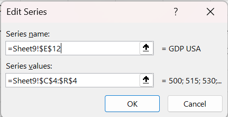
Create a dynamic label for the USA series.
This links the USA series label to cell C18, which contains the annual growth rate. Similarly, you link the China series label to cell C19, as shown in the following figure.
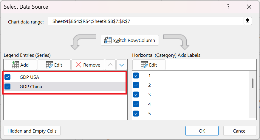
You have now completed a chart with dynamic labels.
How to track sales performance over time
Track sales performance over time
You want to use icons (up, down, or flat arrow) to track during each month whether a seller’s ranking improved, decreased, or remained the same.
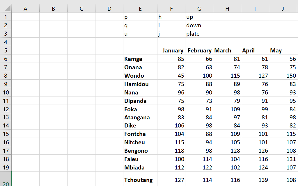
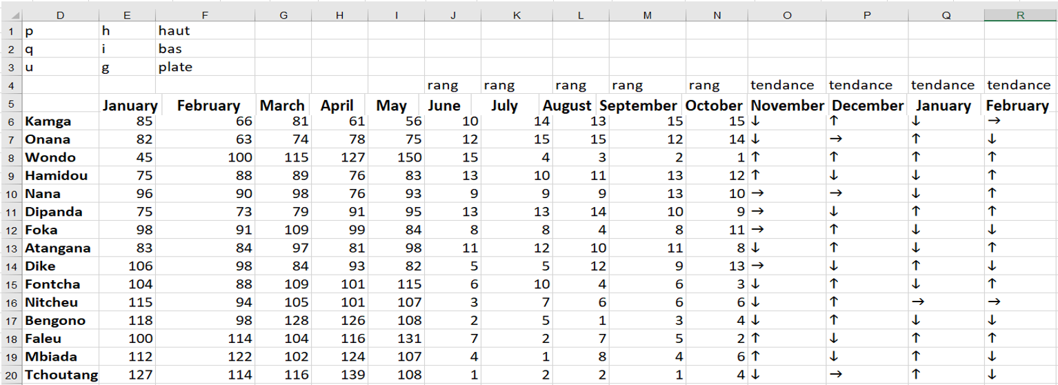
You can use Excel icon sets, but then you’ll have to insert a set of icons for each month, which is a tedious task. A more efficient way to create these icons is to enter an h when you want an up arrow, enter an i when you want a down arrow, and enter a g when you want a flat arrow. Then, if you change the font to Wingdings 3, you have the desired arrows because the letters of the alphabet in Wingdings 3 correspond to the symbols shown in the following figure.
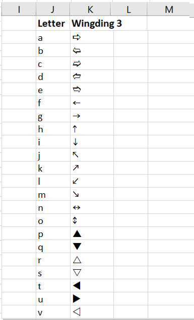
This is the correspondence between the letters and the Wingdings 3 symbols.
To create the icons shown in Figure 20 , follow these steps:
■ Copying the formula RANK( E6; E$6:E0; 0) from J6 to J6:N20 calculates the sales rank of each person during each month.
■ Copy of the SI formula (K6 <J6; « h » ; IF (K6> J6 ; « i » ; « g « )) from O6 to O7 : R20 creates an h if the person’s rank has improved, an i if the person’s rank has decreased, and ag if the seller’s rank has remained the same.
■ After changing the font of the range O 6: R20 to Wingdings 3, you see the icons displayed in the following.
The advantage of this approach is that you can use if statements to customize the conditions that define the icons.
How to use an image to replace data bars
Use an image to replace data bars
Typically, product sales are summarized using boring columns or bars, where the column height or bar width is proportional to the product sales. Wouldn’t it be more fun to summarize product sales with a picture of your product, proportional to actual sales? To illustrate the idea, check out the Using a Picture spreadsheet and the chart shown in the following figure.
In this example, you assume that your company sells Coca-Cola, so you want to summarize the monthly sales with a Coca-Cola bottle whose size reflects the magnitude of the monthly sales. To begin, select the C 5: D12 and in the Insert tab, select the first 2D column chart option (Clustered Column). Then right-click on a column and Format Data Series . In the dialog box that appears, go to the Fill option and select Fill with a picture or texture , as shown in the following figure.
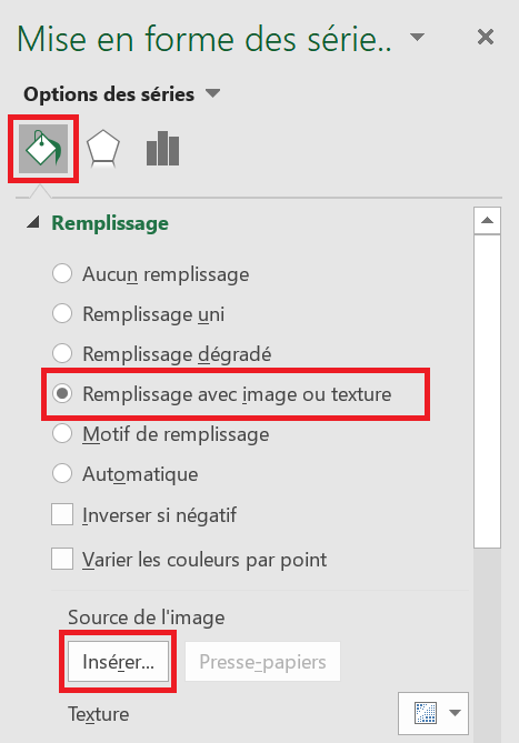
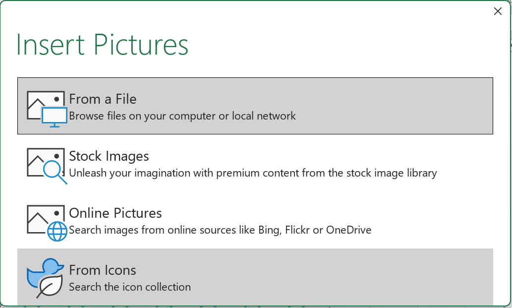
Below the Image Source heading , click Insert , and you will see the window shown in the following figure. After selecting the desired Coca-Cola bottle and clicking Insert, the image is inserted into the chart, with the height of the Coca-Cola bottle being proportional to the actual sales.
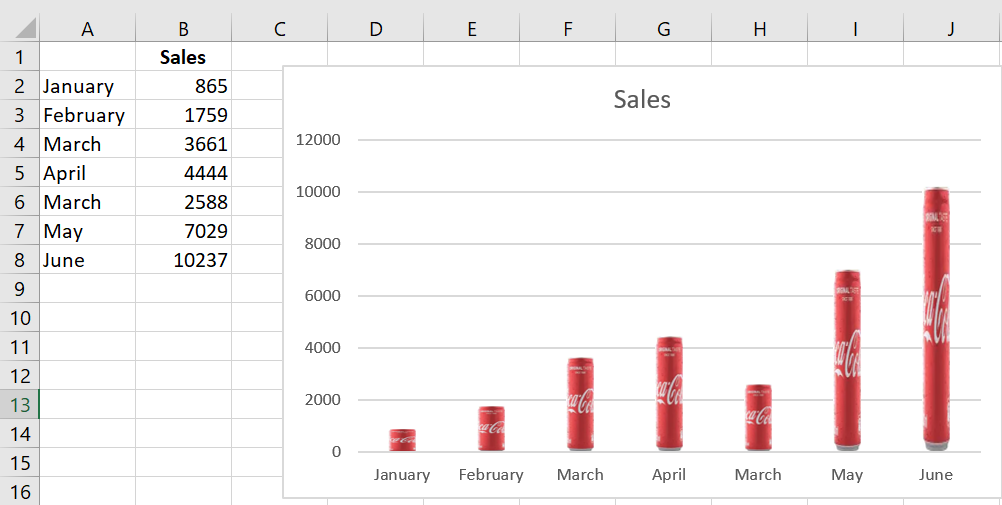
Coca-Cola sales are summarized with a bottle of Coca-Cola.
How to place data labels on a chart based on cell contents
Place data labels on a chart based on cell contents
Place Data Labels worksheet .
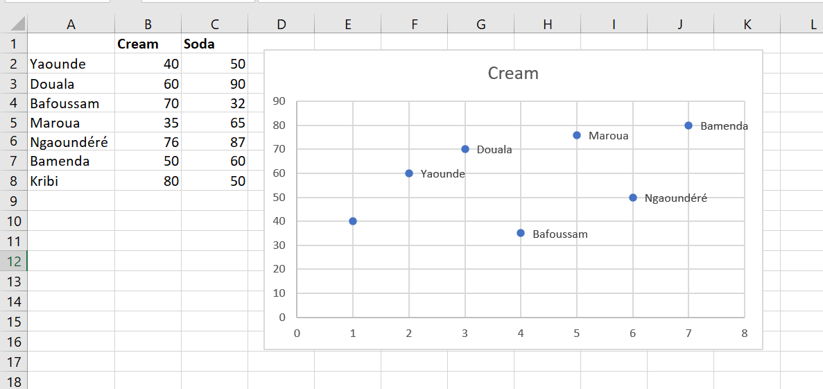
To begin creating this chart, select the cell range B1 : C8 and choose the first scatter plot choice on the Insert tab. (The scatter plot is the icon with dots next to the pie chart.) This creates the scatter plot of the figure without the city labels. To create the city labels, select the chart. On the Design tab , select Add Chart Element , choose Data Labels , and then More Data Label Options , as shown in the following figure.
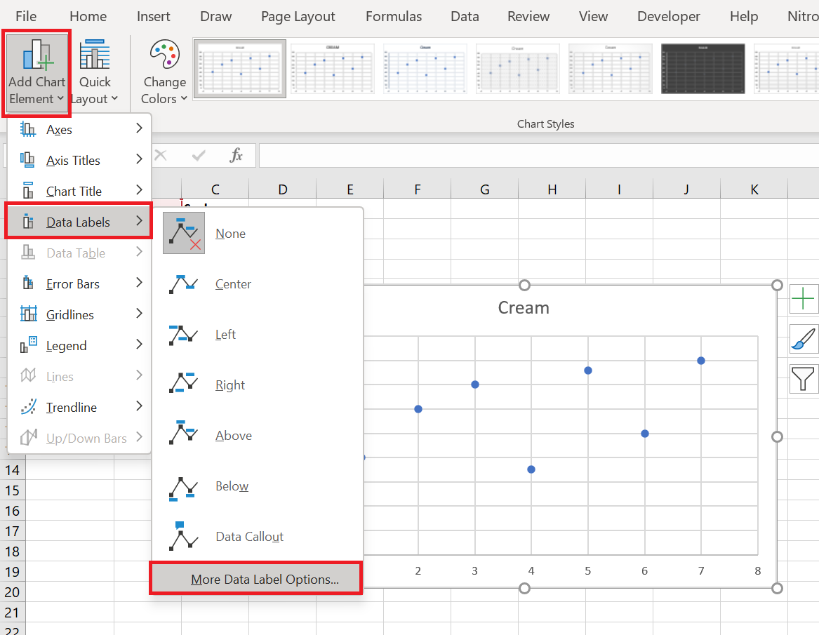
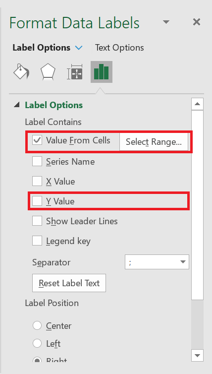
In the dialog box that appears, check Value from cells and uncheck Y Value as shown in the following figure.
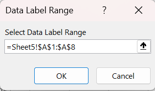
Now you can select the cell range A2 : A8 to insert the city labels into the chart as shown in the following figure.
How to create a line chart
The need to create a line chart
The first step in creating a chart is to determine the data you will graph. The following figure shows the data used to create the chart in this section.

In this format, it’s difficult to make assessments about how different real estate agents performed throughout the year. It’s difficult to compare results between months, let alone between real estate agents. However, by converting this data into a line graph, some comparisons become obvious to the viewer. In this case, the entire data set can be plotted graphically, and then the rows and columns swapped. When this is done, it immediately becomes clear that every time a real estate agent has a month off, they follow it with a good month of sales.
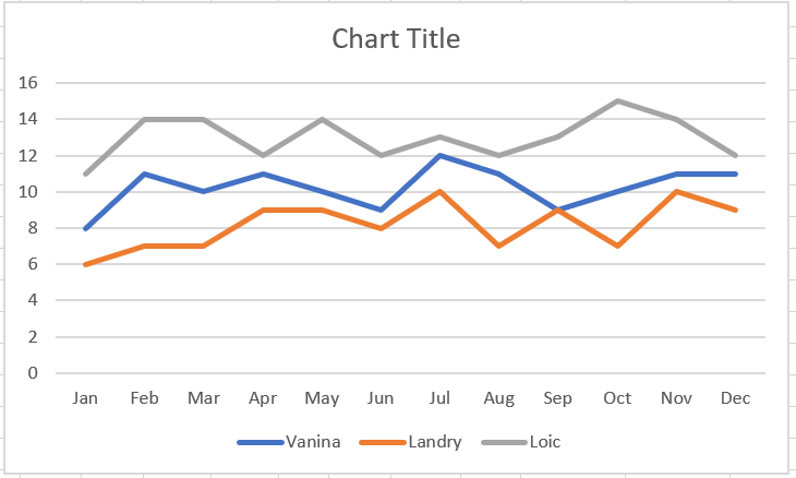
To create the line graph shown in the previous figure :
1 Select the sales data of the three real estate agents for the twelve months of the year.
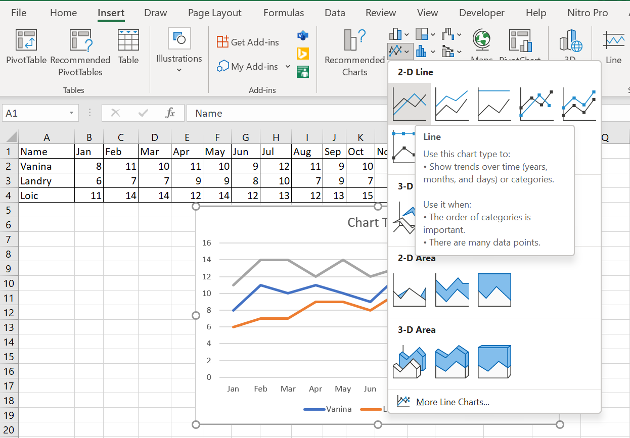
2 Click the Insert tab on the ribbon and select « Insert Line or Area Chart » in the Chart group.
3 From the drop-down menu, select Curve in the 2D Curve category, as shown in Figure 3.4
How to reset the vertical axis to zero
Reset the vertical axis to zero
The vertical axis on a trend chart should normally start at zero. In these situations (negative values or fractions), it’s usually best to keep Excel’s default scaling. However, if you only have positive whole numbers, make sure the vertical axis starts at zero.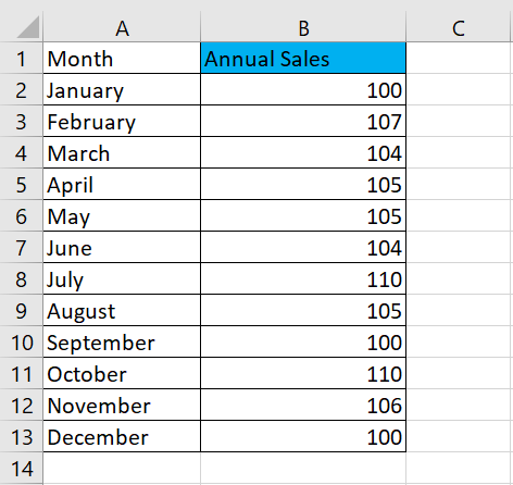
Indeed, the vertical scale of a chart can have a significant impact on the representation of a trend. For example, compare the two charts shown in the following figure. Both charts contain the same data. The only difference is that in the upper chart, I did nothing to correct the vertical scale assigned by Excel (it starts at 96), but in the lower chart, I corrected the scale so that it starts at zero.
Figure: Vertical scales should always start at zero.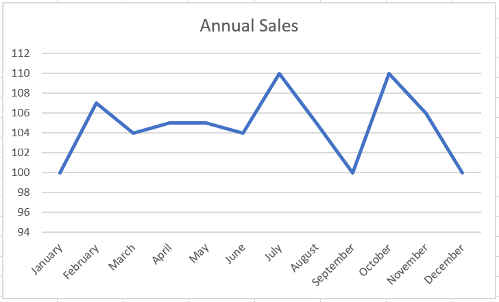
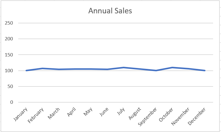
Now, you might think the top chart is more accurate because it shows the ups and downs of the trend. However, if you look at the numbers closely, you’ll see that the units represented have increased from 100 to 110 in 12 months. This isn’t exactly a significant change, and there’s no doubt that such a picture is unjustifiable. In truth, the trend is relatively flat, but the chart shows that the trend is upward.The lower graph more accurately reflects the true nature of the trend. I achieved this effect by locking the Minimum value on the vertical axis to zero.
To adjust the scale of the vertical axis, follow these simple steps:
1. Right-click the vertical axis and choose « Format Axis » from the menu that appears.
The Format Axis dialog box appears.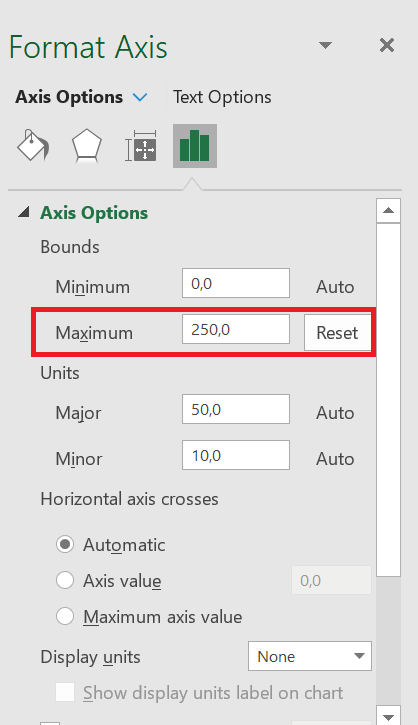
2. In the Format Axis dialog box, expand the Axis Options section and set the value in the Minimum box to 0.
3. Set the value in the Maximum box to 250 (double the actual value). This ensures that the trend line is placed in the middle of the chart.
4. Click Close to apply your changes.
Many would argue that the lower chart obscures small-scale trends that may be important. In other words, a difference of 7 units can be significant in some companies.How to create a comparative Trends
Comparative Trends
The following figure shows a chart that presents a side-by-side comparison of three periods. With this technique, you can display periods of different colors without breaking the continuity of the overall trend.
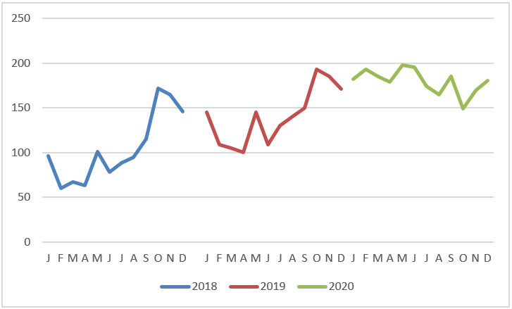
Here’s how to create this type of chart:
1. Structure your source data similarly to the structure shown in the following figure.
Notice that instead of placing all the data in one column, you are displaying the data in the respective years. This tells the chart to create three separate lines, taking into account the three colors.
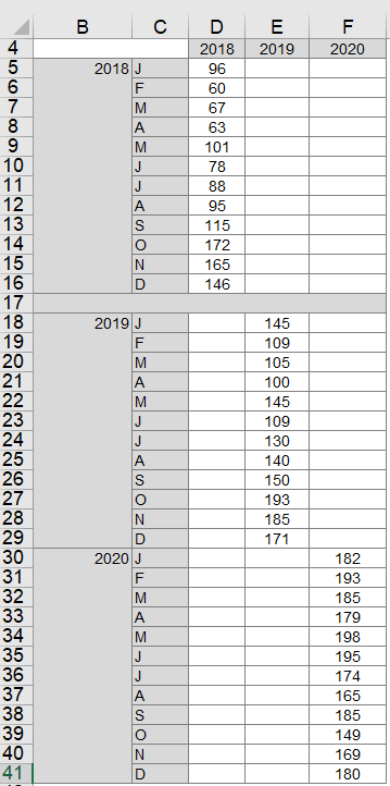
2. Select the entire table and create a line chart.
This step creates the chart shown earlier. 3. If you want to get fancy, click on the chart to select it, then right-click and select Change Chart Type from the context menu that opens.
4. When the Change Chart Type dialog box opens, select Stacked Column Tables.
As you can see in the following figure, the chart now shows the trends for each year in columns.
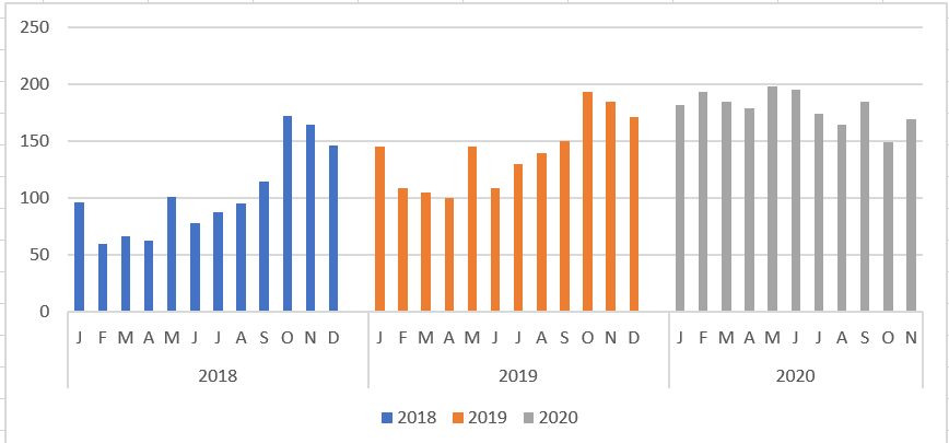
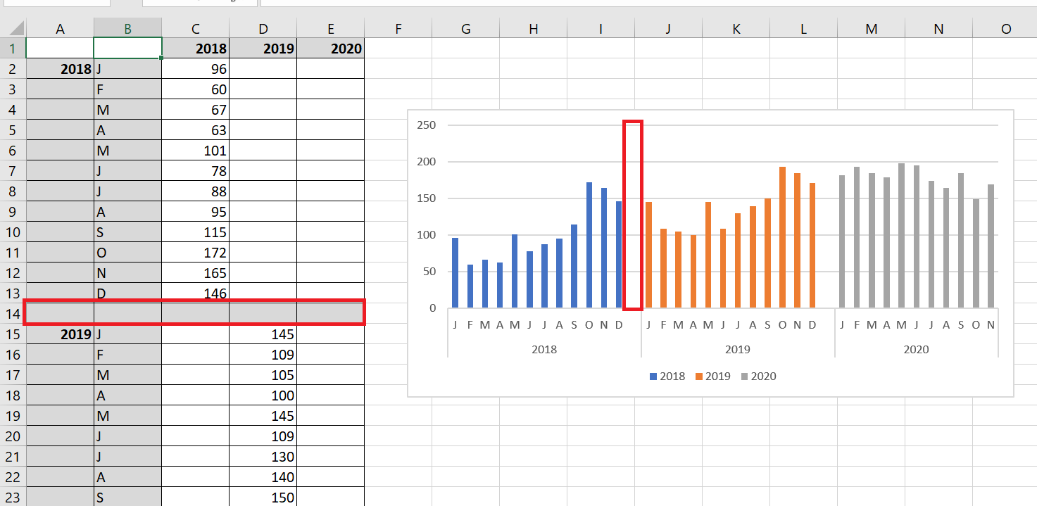
Do you want a gap between the years? Adding a gap in the source data (between each 12-month sequence) adds a gap in the chart, as shown in the following figure.
7 Create Combo Charts
You want to create a chart that shows actual and target sales for each month. The histogram in the following figure is created from the figure’s database. To create it, select the range A1 : C8 and, on the Insert tab, select Histogram and choose the first 2D column chart, shown in the following figure.
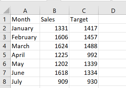
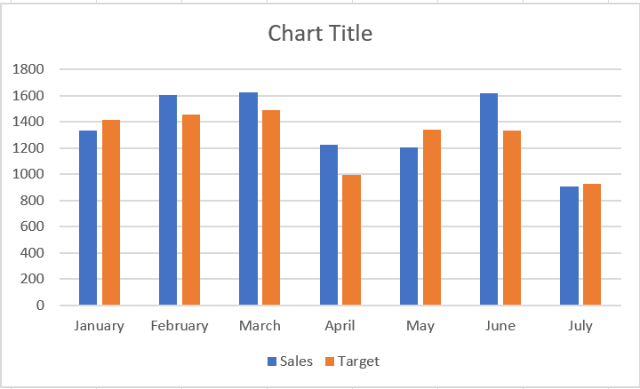
Using two columns makes it difficult to see the contrast between actual and target sales, so use a combination chart in which one series is plotted as a line and the other as a column.
To create a combination chart, follow these steps:
1. Right-click one of the series in the following figure and select Change Chart Type.2. In the dialog box that appears, select Grouped Column – Row . This gives the combination graph shown in the following figure.
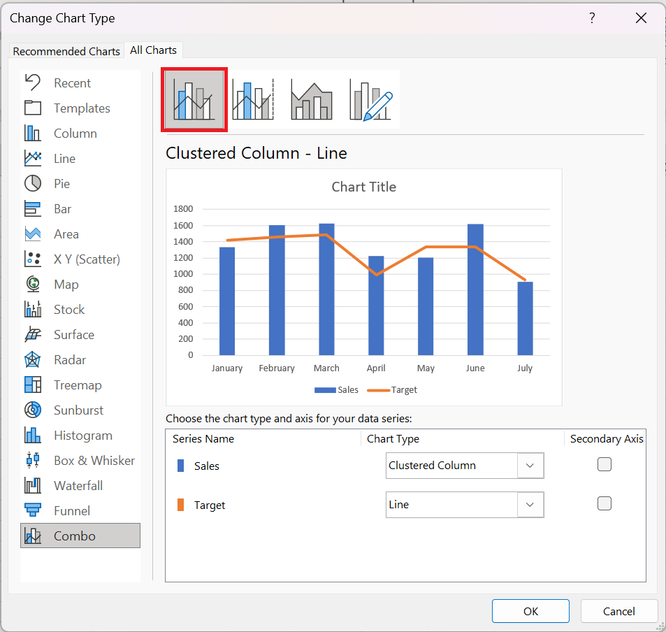
This technique works well with two time series.How to Create a bar chart to check if the inventory is within a set range
Create a bar chart to check if the inventory is within a set range
Often, you need to track a quantity (inventory, cash, number of accidents) and you want to know if the quantity remains between historical upper and lower limits. A bar chart provides a useful tool for monitoring the evolution of a process over time. The following figure shows an example of a bar chart.
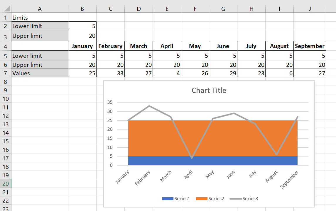
A bar chart summarizes inventory levels.
To create the bar chart, follow these steps:
1. You entered your lower limit on inventory (5) in B2 and your upper limit (25) on inventory in B3.
2. In line 5, you enter the lower limit for each month by copying the formula = $B$2 from B5 to C 5:J 5.
3. Copying the formula = $B $3 – $B$2 from B6 to C 6:J 6 calculates the upper limit – lower limit, as shown in the following figure.
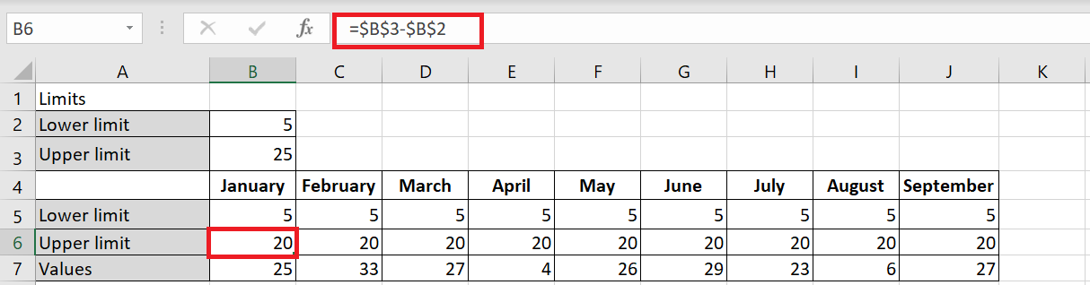
Name this row Upper Limit , as this row will be used to generate the row representing your upper inventory limit of 25 units.
4. Select the range B 5: J7 and select a stacked area chart (the second 2D area option), from the Insert tab of the ribbon.
Values data series on the chart that appears, right-click Change Chart Type Data Series and choose the first Line chart option, as shown in the following figure.
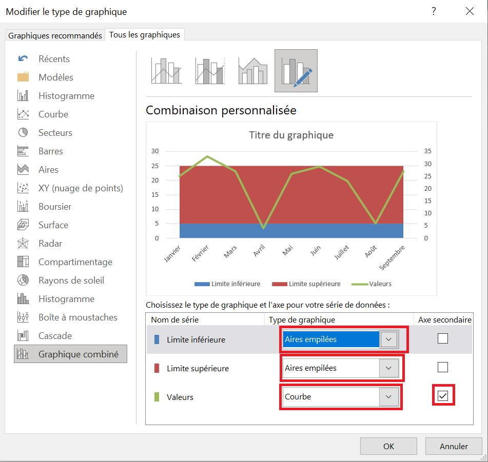
6. Add a secondary axis to the Values series, which you would later remove from the chart.
7. Right-click the Upper Limit and Lower Limit series and select Stacked Areas. Click OK to close the dialog box.
8 On the chart that appears, right-click the Lower Bounds data series and select Format Data Series . In the dialog box that appears, click the Fill category and select No Fill.
Your bar chart shows that you are having great difficulty maintaining inventory levels between your desired lower and upper limits.
How to add a trendline with a Secondary Axis
Trend with a Secondary Axis
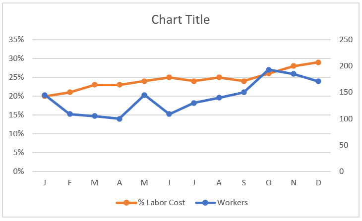
In some trend components, you have series that have two different units of measurement. For example, the chart in the following figure shows a trend for the number of workers and a trend representing the percentage of labor cost.
You often need to plot two different units of measurement, such as percentages.
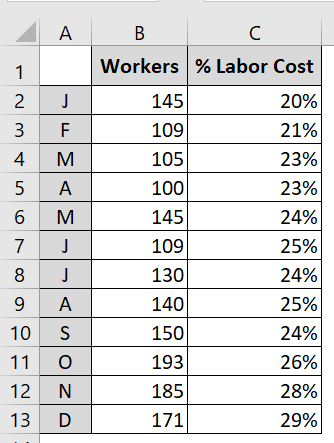
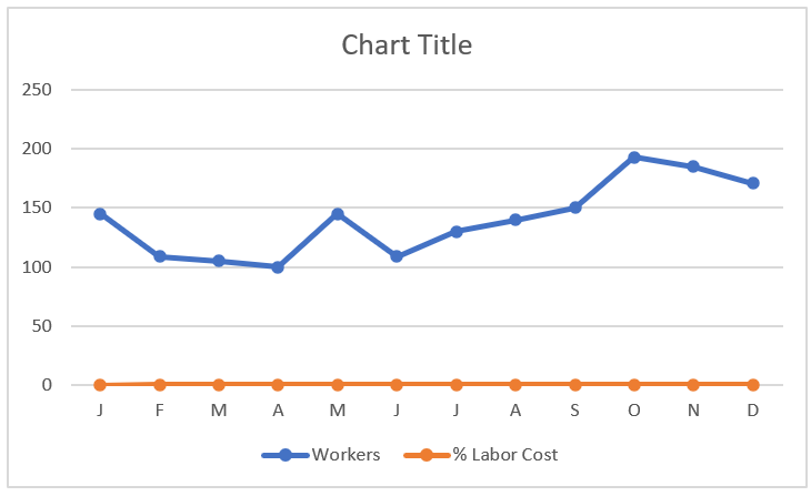
These are two different units of measurement that, when mapped, produce the unimpressive chart you see in the following figure. Because Excel constructs the vertical axis to accommodate the larger number, the percentage change in labor costs gets lost at the bottom of the chart. Even a logarithmic scale doesn’t help in this scenario. Since
the default vertical axis (or primary axis) doesn’t work for both series, the solution is to create another axis to accommodate the series that doesn’t fit on the primary axis. This other axis is the secondary axis.
The trends for the percentage of labor cost get lost at the bottom of the chart.
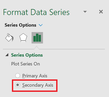
To place a data series on the secondary axis, follow these steps:
1. Right-click the data series in question and select Format Data Series from the menu that appears. This opens the
Format Data Series dialog box . 2. In the
Format Data Series dialog box , expand the Series Options section, and then click the Secondary Axis radio button.
Placing a Data Series on the Secondary Axis.
The following figure shows the newly added axis on the right side of the chart. All data series on the secondary axis have their vertical axis labels displayed on the right side.
How to Separate pre- and post-merger performance
Separate pre- and post-merger performance
Let’s say your company merged with another company on January 10, 2021, and you’re calculating daily sales. You might want to insert a vertical line into your chart to indicate the merger date. If you draw the vertical line with the Excel Shapes function and the chart is moved, the line will be in the wrong place. To fix this, start by selecting the range E 10: F32 ; create a scatter plot with lines (third option). In the range B 15: C16 , enter the merger date and the lower and upper limits on the y-coordinates of your vertical line. In this case, the lower limit = 0 and the upper limit = 120. Copy the range B 15: C16 and right-click on your chart to select Paste Option , which will insert the vertical line on the date January 10.

The vertical line indicates that January 10, 2021 was the merger date.
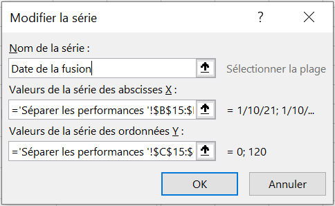
To change the legend to Merge Date , right-click the legend and select Select Data . A dialog box appears as shown in the following figure.
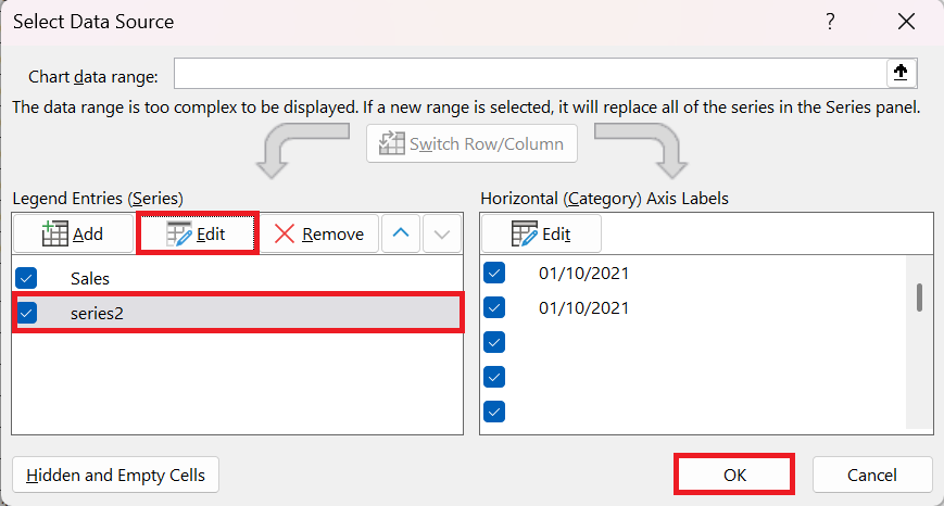
In this dialog box, select Series2 and click Edit to change the name Series2 to Merge Date , as shown in the following figure.